Which Colors Complement Sherwin Williams Alabaster in a Living Room Design?
In the interior designing world, selecting and combining a perfect color palette is like bringing or giving life to the space. When we are working with Sherwin Williams Alabaster, as it has its elegance, choosing a complementary color is a great task.
As Alabaster has its look and elegance, it will elevate any space. As it sets its center stage in the room, picking a proper complementary color is necessary.
Now the question is: Which color should now be paired alongside Alabaster? The below article will show which and why you should pair the color with Sherwin Williams Alabaster. Choose a shade that gives a character and serene ambiance to the living room, like the Alabaster from Sherwin Williams.
The color can be of subtle neutral shade to bold accents. There are a plethora of options for complementing Alabaster. You need to make sure which pair suits your taste and theme.
1. Urban Bronze Colour Palette

The Urban Bronze Colour belongs to the brown family. Sometimes, it is considered as very dark greige because of lots of gray in it—brown paint color with a grey undertone. Not only in the living room, but it can be painted in the kitchen, the bedroom, the front door, the kitchen cabinet, and the feature wall. The dark nature of the Urban Bronze color will make a good pair for Alabaster.
The white creamy shade of alabaster, along with the bold accent of Urban Bronze, will radiate the space. As the Alabaster is a neutral color, adding a pop color like Urban Bronze is the right choice. Choose your kitchen cabinet color and floor color, which cannot be changed, and match the color with this combination. This will make the living room more radiant and welcoming. Sometimes, the bold accent of bronze will be balanced by the creamy white Alabaster.
2. Clary Sage Natural Colour Palette
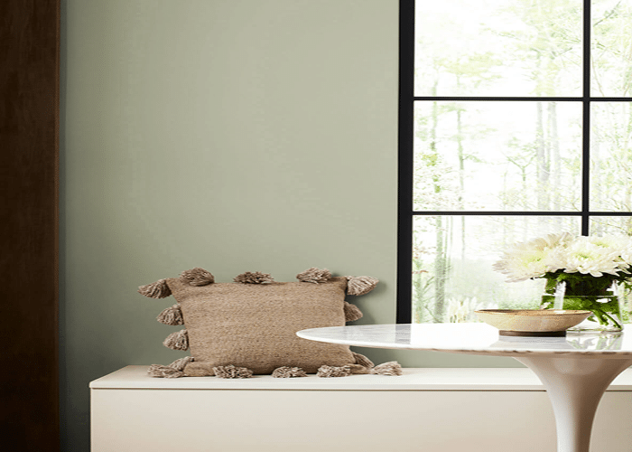
The Clary Sage Natural Colour belongs to the green family. The name sage green because it looks like the freshly picked sage from the garden. It has a medium grey-green tone in its color. It has a subtle yellow color. Since you want to paint in the living room, combining Alabaster and sage green is one of the best choices. As both the shades are of soft, subtle, and warm tones, they will dance well together.
This will make the living room look warm, calm, and welcoming. Apart from the living room, this color combination can be extended to the kitchen and other adjacent rooms to the living room. Like other colors, this color looks different in different lighting conditions. Even the color appearance differs in the palace they have been painted. In the south-facing, they look warmer, and in the north, they look cooler.
3. Repose the Gray Cool Colour Palette
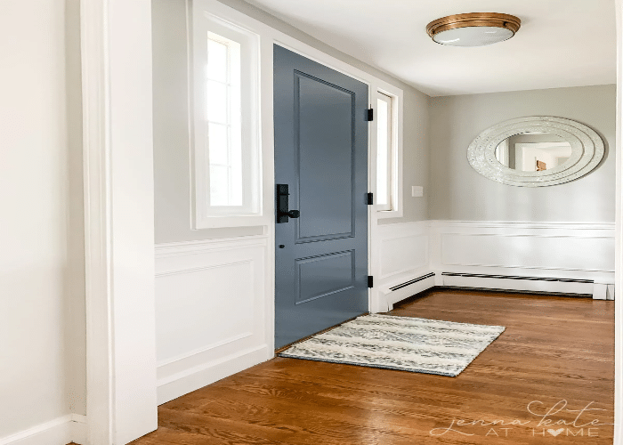
The Repose Gray Cool Colour is the popular greige color. It is a mixture of grey and beige. It is a neutral and inoffensive color palette. This color has blue and green undertones. You can see a blue and green undertone while painted in the north-facing. It is also a mix of grey and beige while painted in a south-facing room. This color can be pulled off in the living room for its subtle undertone.
It is a mix of tones that will radiate and give more character to the space. The color appearance differs according to the lighting conditions. The grey color in this shade mostly works in many spaces. As the Alabaster is creamy white, it will complement well with Repsoe Gray Cool. The Alabaster color will add a base to the Repose Gray Cool color.
4. Sea Salt Serene Colour Palette
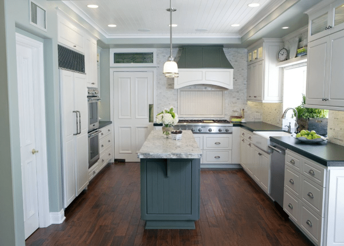
We would suggest going for a Sea Salt palette if you want a coastal theme for your living room. It is a beachy, serene color. The sea salt color can be used in bathrooms, too, as they are associated with water. It provides a more relaxing atmosphere. The sea salt color has a greenish-grey tone. The color is almost like a chameleon.
It can change its color according to its lighting conditions. The greenish-grey tone will go well with the same subtle tone of white. The sea salt is a bit warmer, and it gives slightly greener vibes. When it is painted in north-facing rooms, it gives some blue color. The creamy white Alabaster and greenish-gray Sea Salt will dance well together. It will be the perfect choice for the living room as it represents a coastal theme.
5. Redend Point Soft Warm Colour Palette
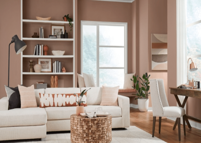
The Redend Point Soft Colour is of mid-toned clay color. It ranges from pinky brown to more of a terracotta color. This color gives crazy vibes. This color can be incorporated with any other subtle, neutral color. It is the perfect choice for the living room as it gives the radiance of both the pop color pink and brown. The bright lighting conditions will radiate the room with this color.
It has warm undertones, which will go hand in hand with creamy white Alabaster. The Redend Point gives a welcoming feel, which makes you feel at home. The earthy tone in the living room will give a character and feature to the space. Placing the furniture according to the painting of the room will play a major role.
Final Thoughts
As we know, there were many options for pairing Sherwin Williams Alabaster; the above 5 options will suit any living room. The above article would have been an exploration of color theory.
The Alabaster is versatile; it can be paired with soft tones and vibrant accents. The choice of the combination solely depends on your taste and the type of theme you want in your living room.
The exchange of color radiance between the Alabaster and its complementary color gives a potential look to the living room. Painting the right combination in the living room, Sherwin Williams Alabaster can elevate the space from ordinary to extraordinary.
It depends on personal preference and the desired atmosphere. Some amount of color psychology and creative thoughts is enough to make the living room more bright and lively.

