How to Use an Analogous Color Scheme in Your Room
Choosing the right color scheme for a room often leads to the assumption that bold contrasts are the key to impact. However, this can sometimes create a disjointed or overstimulating feel.
An analogous color scheme offers a more harmonious, balanced alternative. Widely used in spaces like bedrooms and living rooms, this approach promotes relaxation while maintaining visual interest.
Let’s look into how to effectively use this scheme to enhance your space.
What is an Analogous Color Scheme?

An analogous color scheme uses colors next to each other on the color wheel, creating a harmonious, cohesive look. This scheme is perfect for rooms that need a soothing atmosphere, like bedrooms and living rooms.
Analogous colors are three or more colors placed next to each other on the color wheel. For example, blue, blue-green, and green form an analogous palette that blends smoothly.
The color wheel shows how adjacent colors naturally complement each other, making it easy to create a balanced and unified look in any space.
Analogous vs. Complementary Colors
| Feature | Analogous Colors | Complementary Colors |
|---|---|---|
| Color Position | Next to each other | Opposite each other |
| Overall Look | Soft and balanced | Bold and high-contrast |
| Best For | Calm spaces | Vibrant spaces |
| Example | Blue, green, teal | Blue and orange |
| Mood | Relaxing | Energetic |
Analogous Color Palettes
- Warm Palettes: Red, orange, and yellow create a cozy, energetic vibe perfect for areas like living rooms or dining spaces.
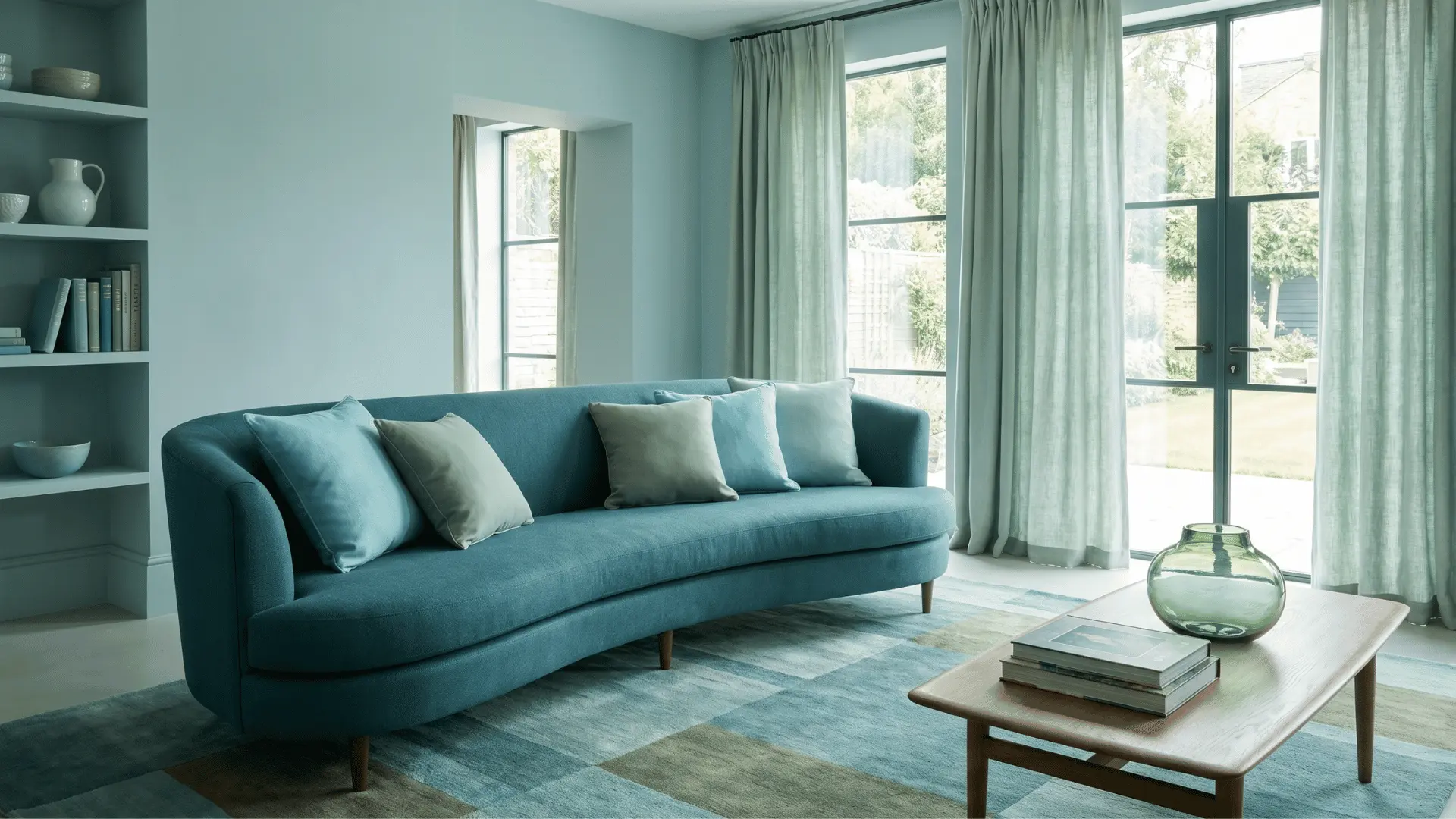
- Cool Palettes: Blue, blue-green, and green offer a calming, serene atmosphere, ideal for bedrooms or bathrooms. These palettes bring a sense of relaxation and peace to the room.
An analogous color scheme harnesses the natural harmony of neighboring colors on the color wheel, offering both tranquility and balance when used in interior design.
How to Style an Analogous Room
Styling a room with an analogous color scheme involves balancing colors, tones, and textures for a cohesive yet dynamic space. Follow these steps to apply the scheme effectively.
1. Applying the 60-30-10 Rule
To avoid overwhelming the space, follow the 60-30-10 rule:
- 60% of the room should be the dominant color (walls or large furniture).
- 30% should be a secondary color (curtains, chairs).
- 10% should be an accent color (decor, pillows).
This creates balance while ensuring no single color overpowers the room.
2. Mixing Light and Dark Tones
Use different shades of the same hue to add depth. Mix light and dark tones of your primary color to prevent the room from looking flat.
For example, pair a soft blue with a darker navy for added dimension without disrupting harmony. This approach keeps the design visually engaging and prevents a monotonous look.
3. Combining Textures and Neutrals
Incorporate neutral colors like white, beige, or grey to anchor the room and give the eyes a break from the vibrant hues.
Combine different textures, such as linen, wood, and silk, to add interest and avoid monotony. These elements also help balance the color intensity and make the space feel more inviting.
4. Balancing Intensity
If you’re using bold hues, apply them in small doses, like in accent pieces, rather than covering entire walls. Mixing bold colors with neutrals softens their impact and creates a soothing effect.
By balancing the 60-30-10 rule, mixing tones, and adding textures, you’ll create a stylish, comfortable room that fully utilizes the potential of an analogous color scheme.
Typical Applications of Analogous Color Schemes in Rooms
Analogous color schemes create a smooth, harmonious flow of color in any room. Different combinations of adjacent colors make spaces feel unified and inviting.
1. Bedroom
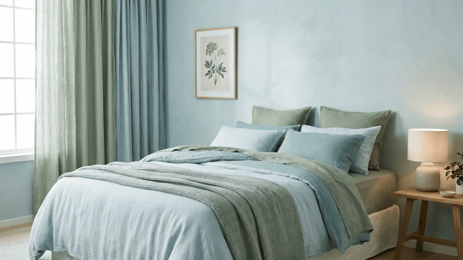
For bedrooms, choose calming analogous colors like soft blues, greens, and purples. These hues promote relaxation and are perfect for creating a peaceful retreat.
You might combine light blue, blue-green, and green to evoke serenity without overwhelming the senses.
2. Living Room/Dining Room
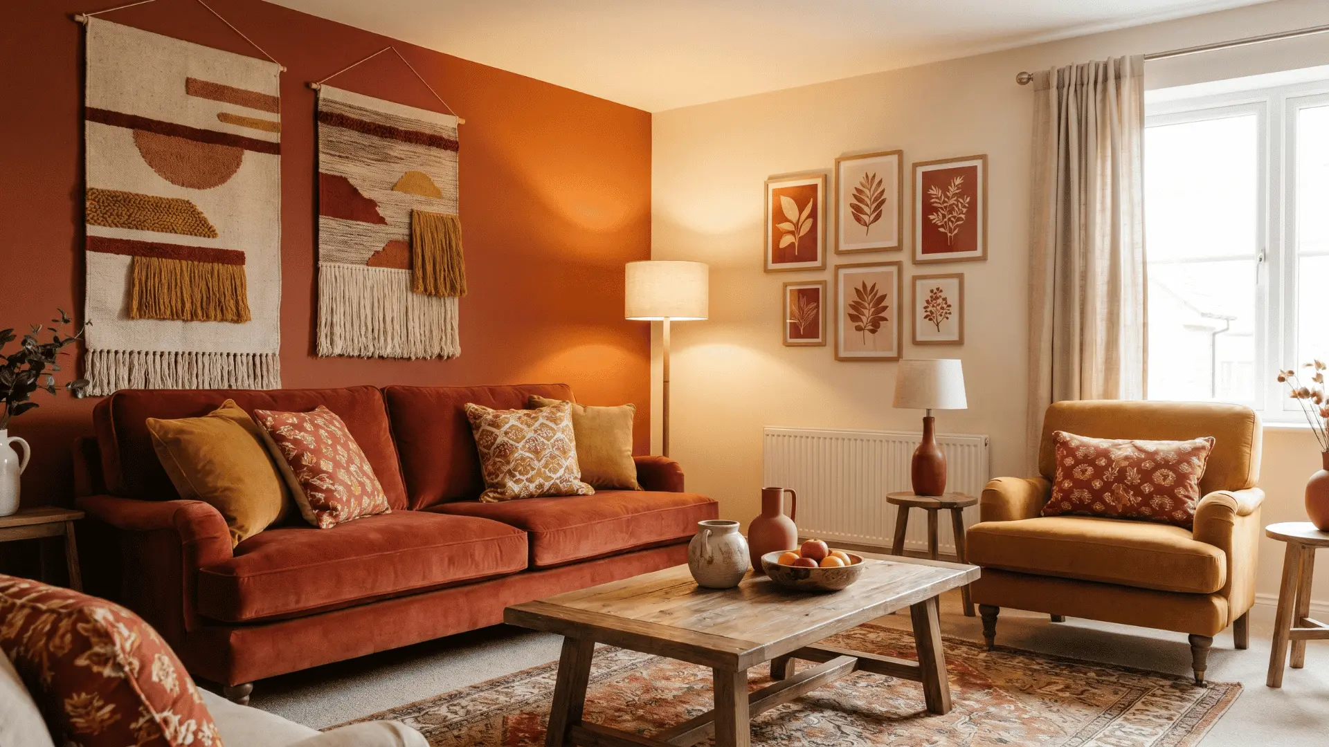
In living rooms and dining areas, warm color schemes like red, orange, and yellow can create an inviting, cozy atmosphere.
Use these colors in varying shades to bring energy and warmth to your space. A combination of yellow, orange, and red can make a space feel vibrant and welcoming.
3. Kitchen
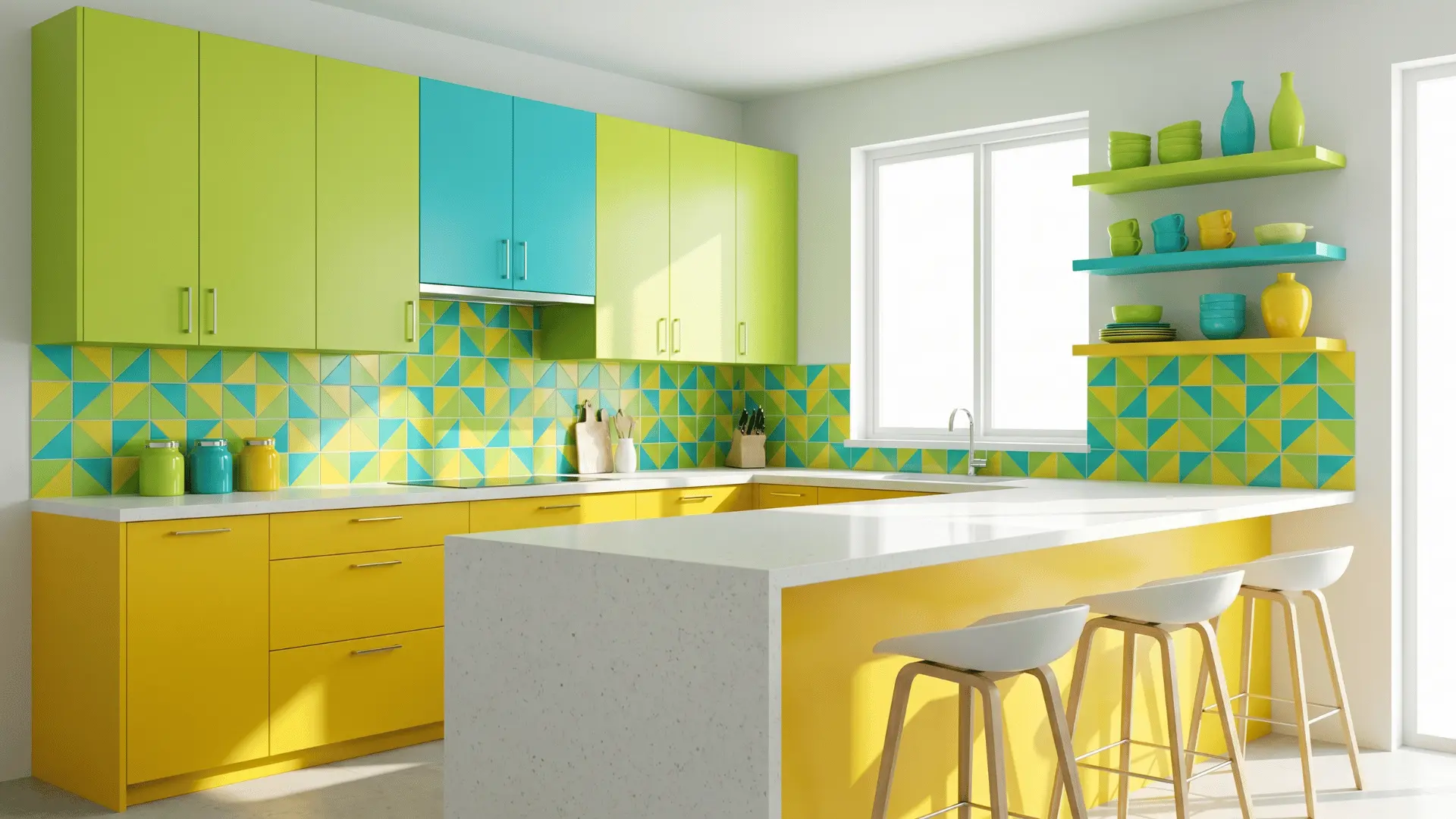
Kitchens benefit from fresh and energizing analogous color schemes. For example, combining lime green, turquoise, and yellow can create an upbeat and lively space for cooking and gathering.
These colors stimulate energy and creativity while maintaining a harmonious look. A vibrant palette can also encourage a positive and productive atmosphere during meal prep and family time.
4. Bathroom
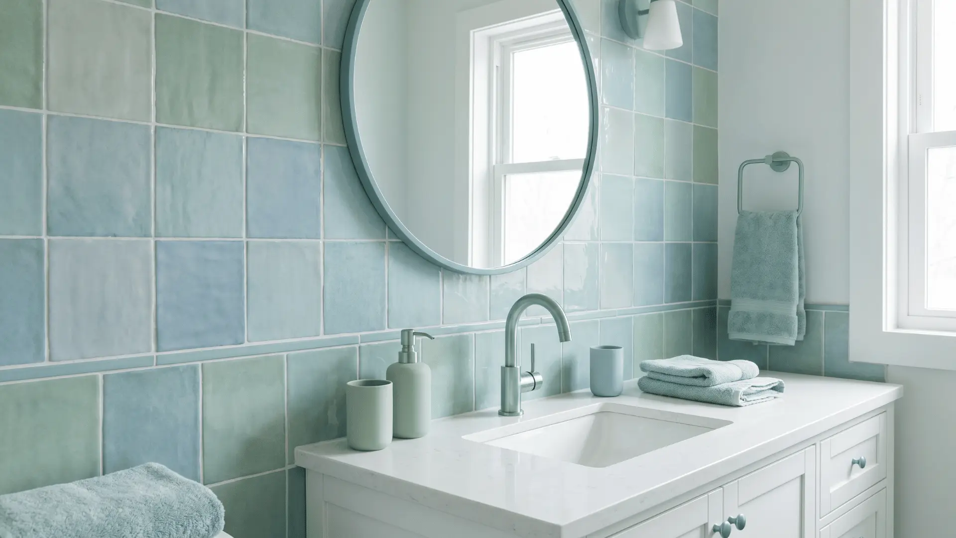
In bathrooms, soft analogous colors like blue, blue-green, and green work well to create a tranquil, spa-like atmosphere.
These colors bring a sense of calm and cleanliness, making them ideal for personal spaces where relaxation is key.
The soothing hues can also help you unwind after a long day, adding a serene touch to your routine.
5. Hallways
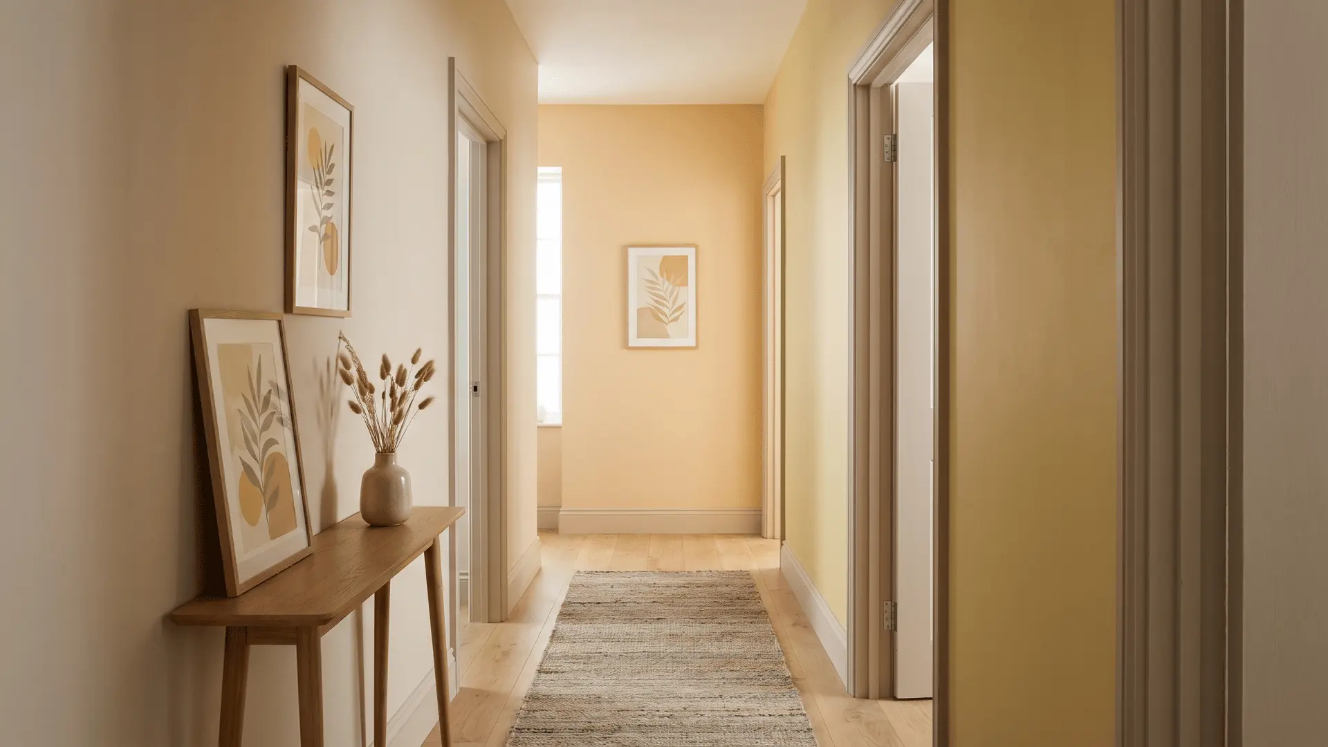
For hallways, use analogous colors in softer tones like beige, yellow-orange, and yellow. These colors help guide the eye from one room to the next, creating a seamless and warm transition between spaces.
A subtle, harmonious palette in the hallway sets the tone for the rest of the home, making the space feel welcoming and inviting.
6. Spaces with Flow
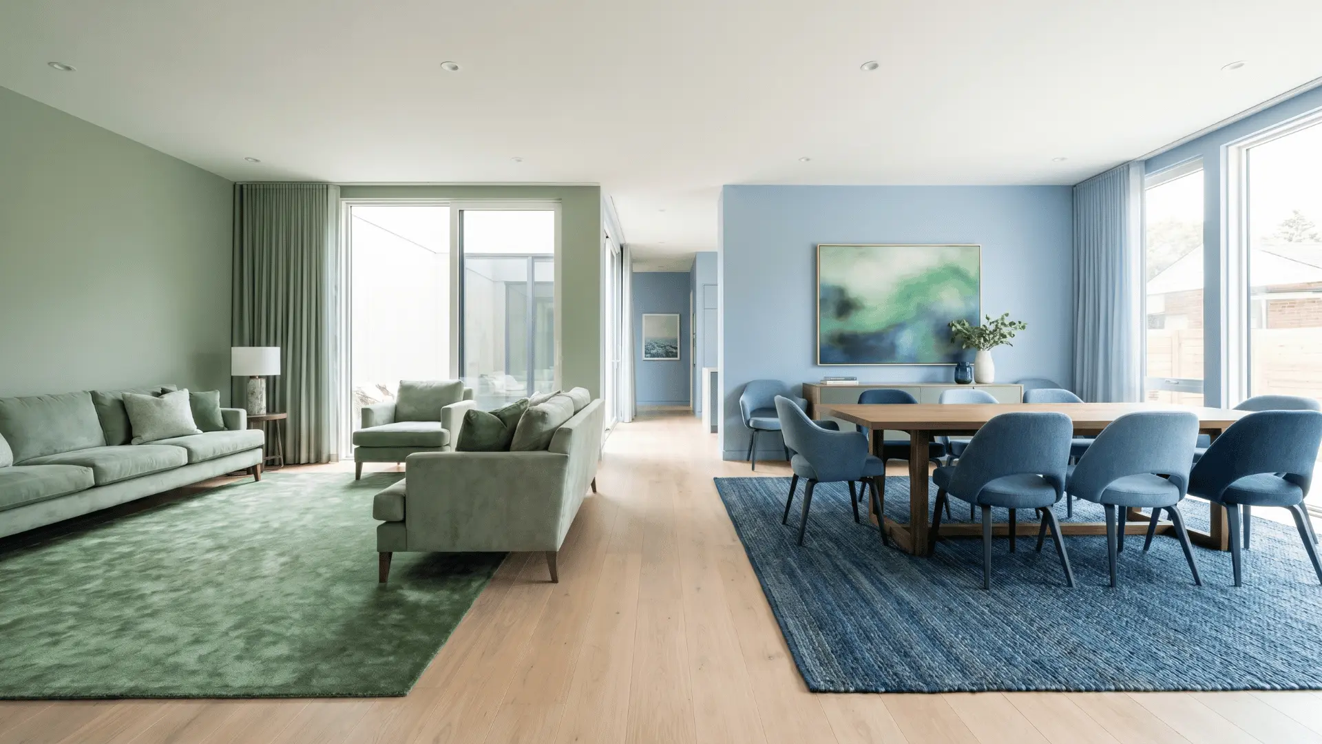
In open-concept spaces like living rooms and dining areas, analogous color schemes help rooms transition smoothly from one to the next.
By using colors that are adjacent on the color wheel, you create a sense of continuity and flow between spaces. For example, soft greens in the living room can flow seamlessly into light blues in the dining room.
By using the right analogous color combinations for each room and considering the flow between adjacent spaces, you can create a cohesive and beautiful home.
Common Mistakes to Avoid
When using an analogous color scheme, it’s easy to make missteps. Here are common mistakes to avoid for a balanced and harmonious room.
- Overusing Bold Colors: Using bold, saturated colors on every surface can overwhelm the room. Balance them with neutral tones and lighter shades to maintain harmony.
- Ignoring Contrast: Without proper contrast, the room can feel flat. Add variation in light and dark tones to create depth and visual interest.
- Lack of Texture Variety: Relying only on color can make the space feel one-dimensional. Mix textures like wood, fabric, and metal to keep it dynamic and engaging.
- Not Considering Room Function: Some colors work better in certain rooms. For example, warm tones are great for living rooms but may be too stimulating for bedrooms. Always consider the room’s purpose when choosing colors.
Avoiding these common mistakes will help you create a more balanced and visually interesting room that fully leverages the potential of an analogous color scheme.
Conclusion
An analogous color scheme can transform your space by creating a harmonious, balanced atmosphere.
By understanding key principles like the 60-30-10 rule, mixing tones, and incorporating textures, you can style any room with ease.
Whether you’re aiming for calming bedroom hues or vibrant living room tones, the right color combinations can make all the difference.
Remember, the key to a successful analogous scheme is maintaining balance and flow. Ready to transform your space? Start experimenting with these tips and see the results for yourself!