How to Choose a Bookcase or Display Cabinet for a Room With Mixed Wood Tones
You’ve got honey-colored oak floors, a dining table a few shades darker, and an old cabinet from a relative in something reddish. Now you want to add a bookcase or display cabinet, and you’re stuck. Should it match the floor? The table? The old cabinet? Or should you give up and paint everything white?
Good news: you don’t need a room full of matching furniture. Most homes collect wood pieces over time, and mixed wood tones can look relaxed and personal when the choices are deliberate. Here’s a step-by-step way to pick the right finish for your new piece.
Step 1: Find Your Main Wood Tone
Start by noticing which wood takes up the most visual space. Usually that’s the floor, but in a room with a big dining table, wood paneling, or built-ins, it could be something else. That’s your dominant tone. Everything else, like side tables, frames, or a chair, is a supporting tone.
Then look at two things for each wood:
- Depth: Is it light, medium, or dark? Take a black-and-white photo with your phone. Differences in lightness become much easier to see.
- Undertone: Does it lean warm (yellow, orange, red) or cool (gray or ashy)? Holding a sheet of white printer paper next to the wood makes the undertone easier to spot.
Don’t rely on names alone. “Oak” can describe anything from pale, nearly white wood to a deep golden stain, and “walnut” finishes range from chocolate brown to gray-brown. Judge what you see, not what the label says.
Jot down a quick summary, such as “medium, warm floor; dark, warm table; light, cool chairs.” That note will guide every decision after this.
Step 2: Blend In or Stand Out?
Once you know what you’re working with, you have two broad options.
Blend. Choose a finish close to one of your existing tones, usually the dominant one. This works well in smaller rooms or rooms that already feel busy, because the bookcase recedes and the things on its shelves take center stage.
Contrast. Choose a finish that’s clearly lighter or darker than the floor. A dark cabinet on a light floor, or a light one on a dark floor, reads as a decision. Contrast helps a tall piece become a focal point and keeps a room full of similar mid-tones from looking flat.
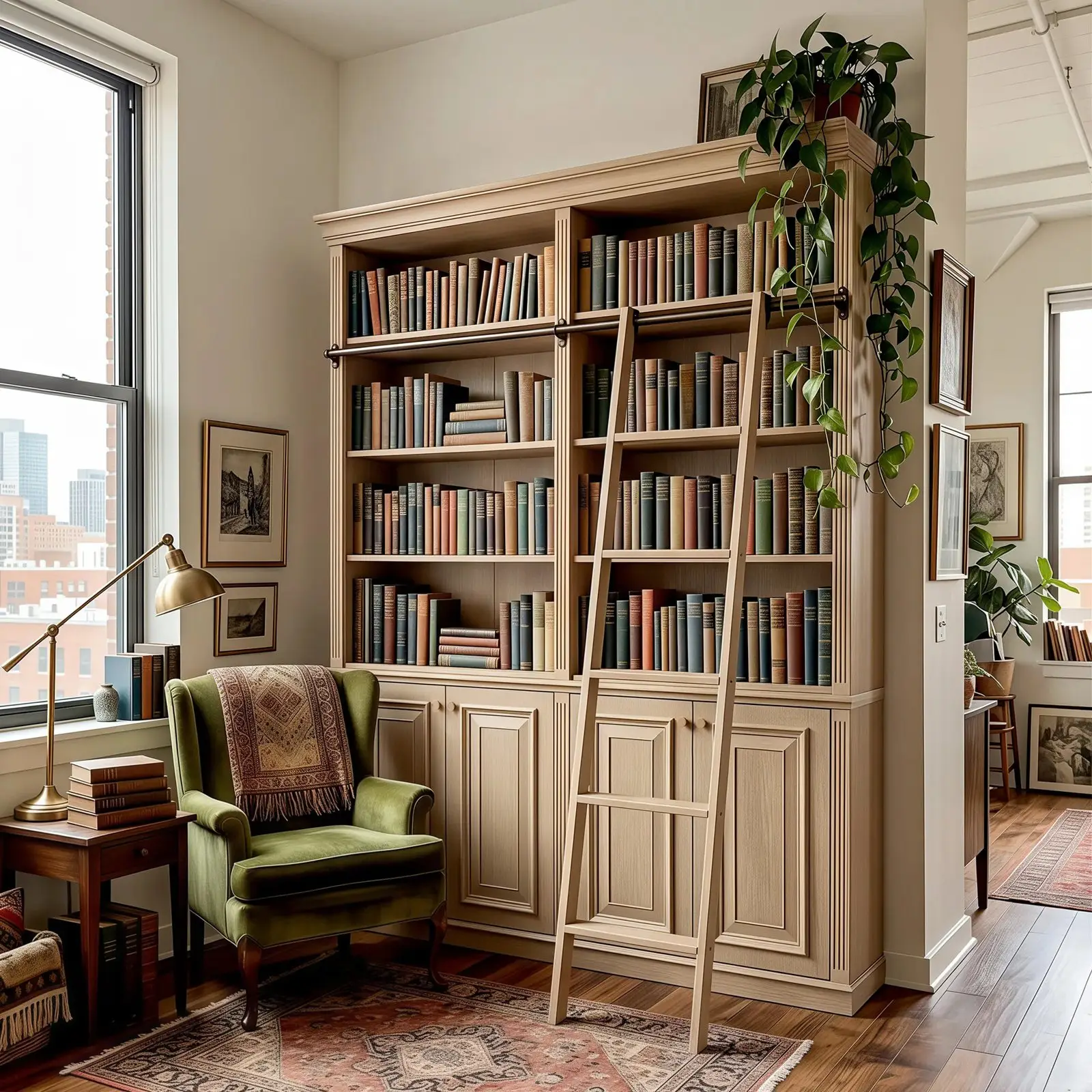
A pale bookcase reads as clear contrast against a darker, warm wood floor, while the rug and side table pick up the floor’s warmer tones. Image: HOMSEE
The tricky zone is “almost, but not quite.” A cabinet that’s only a shade or two off from the floor can look like a match that didn’t work out. If you can’t get close, go clearly different.
Neither approach is a rule, and plenty of rooms use both. One more thing that often helps: keep undertones related even when the depth changes. A dark, warm finish usually sits comfortably with a light, warm floor. That said, rooms with strong cool elements, like gray walls, black metal, or stone, can carry cooler wood just fine.
Step 3: Look Past Color to Grain, Sheen, Frames, and Hardware
Color is only part of the picture.
- Grain: Bold, busy grain adds texture; a quiet grain looks calmer. If your floor already has strong grain, a piece with a subtler pattern can keep the room from feeling busy.
- Wood look vs. wood material: A wood-grain look doesn’t tell you what a piece is made of. Many finishes are veneers or printed surfaces over engineered wood, so read the product description if the material matters to you.
- Sheen: Matte and satin finishes tend to sit quietly beside most wood floors, while glossy ones reflect more light and draw the eye. Two woods of slightly different color can look more compatible when their sheen is similar.
- Frames and glass: On a display cabinet, a metal or painted frame around the glass changes how much wood you actually see. A black frame adds a neutral that can bridge different woods.
- Hardware: Knobs and pulls are small, but repeating a metal from elsewhere in the room, like a brass lamp or black window frames, helps the piece belong.
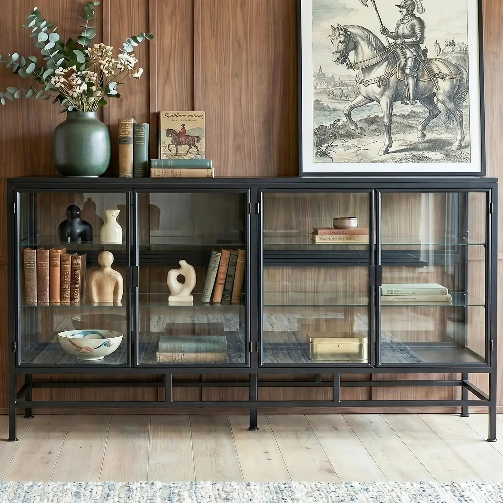
A black metal frame and glass doors show very little wood, so the cabinet sits comfortably between a dark wood wall and a lighter floor. Image: HOMSEE
Step 4: Apply It to Your Bookcase or Display Cabinet
A tall bookcase shows a lot of surface, so its finish has more impact than a small side table’s. A display cabinet with glass doors shows less wood on the front, which can make it easier to fit into a room where tones are already mixed.
As you browse, sort options by your plan. If you’ve decided to blend, look for finishes close to your dominant tone. If you’ve decided on contrast, look for something clearly lighter, darker, painted, or metal-framed. Browsing a category like HOMSEE bookcases and display cabinets lets you compare different finishes and frame styles side by side, and some designs there are listed in more than one finish, such as natural and brown versions. Treat product photos as a starting point, and read each listing for material and finish details rather than assuming they’re the same across a range.
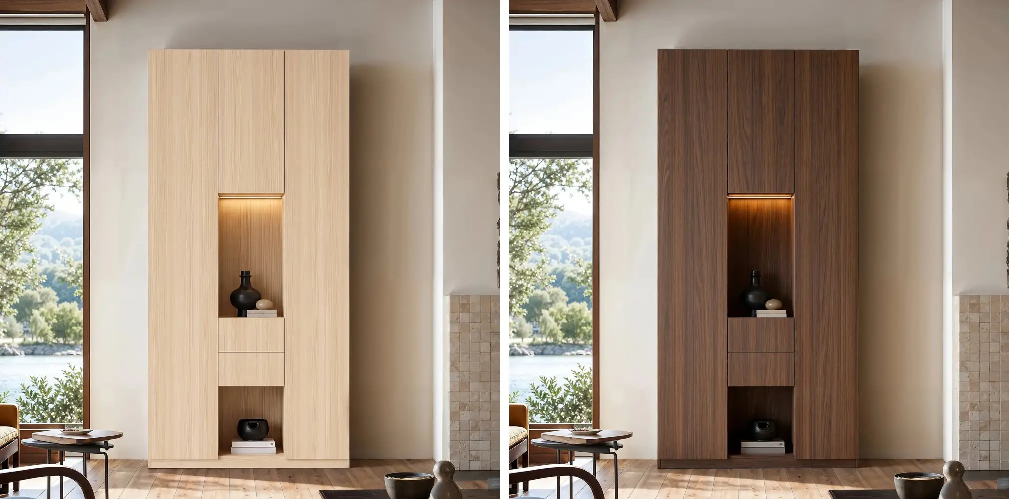
The same cabinet in the same room, in two finishes: the natural version (left) stands out as a light contrast, while the brown version (right) stays closer to the medium-toned floor. Image: HOMSEE
Step 5: Check the Color in Your Own Light
A finish that looks golden in a bright product photo can look darker or grayer in a north-facing room at night. Before you commit:
- See a sample if one is available, and hold it next to your floor and table.
- Check it in daylight and again in the evening under your usual lamps. Warm bulbs can push wood toward orange, while cooler bulbs can make it look grayer.
- No sample? Ask the seller for more photos, ideally taken in natural light or showing close-ups of the finish.
- Look at photos on more than one screen, since displays show color differently.
Step 6: Tie the Woods Together With Small Repeats
A few small connections help mixed woods feel planned rather than accidental.
- Repeat each wood tone somewhere else in the room, even in a picture frame or tray. A tone that appears only once can look like an outlier.
- Keep metal finishes consistent across hardware, lamps, and frames.
- Let a rug or textiles pick up colors from both the floor and the furniture.
- Use the shelves themselves: books, baskets, and ceramics in related colors soften the contrast between the cabinet and its surroundings.
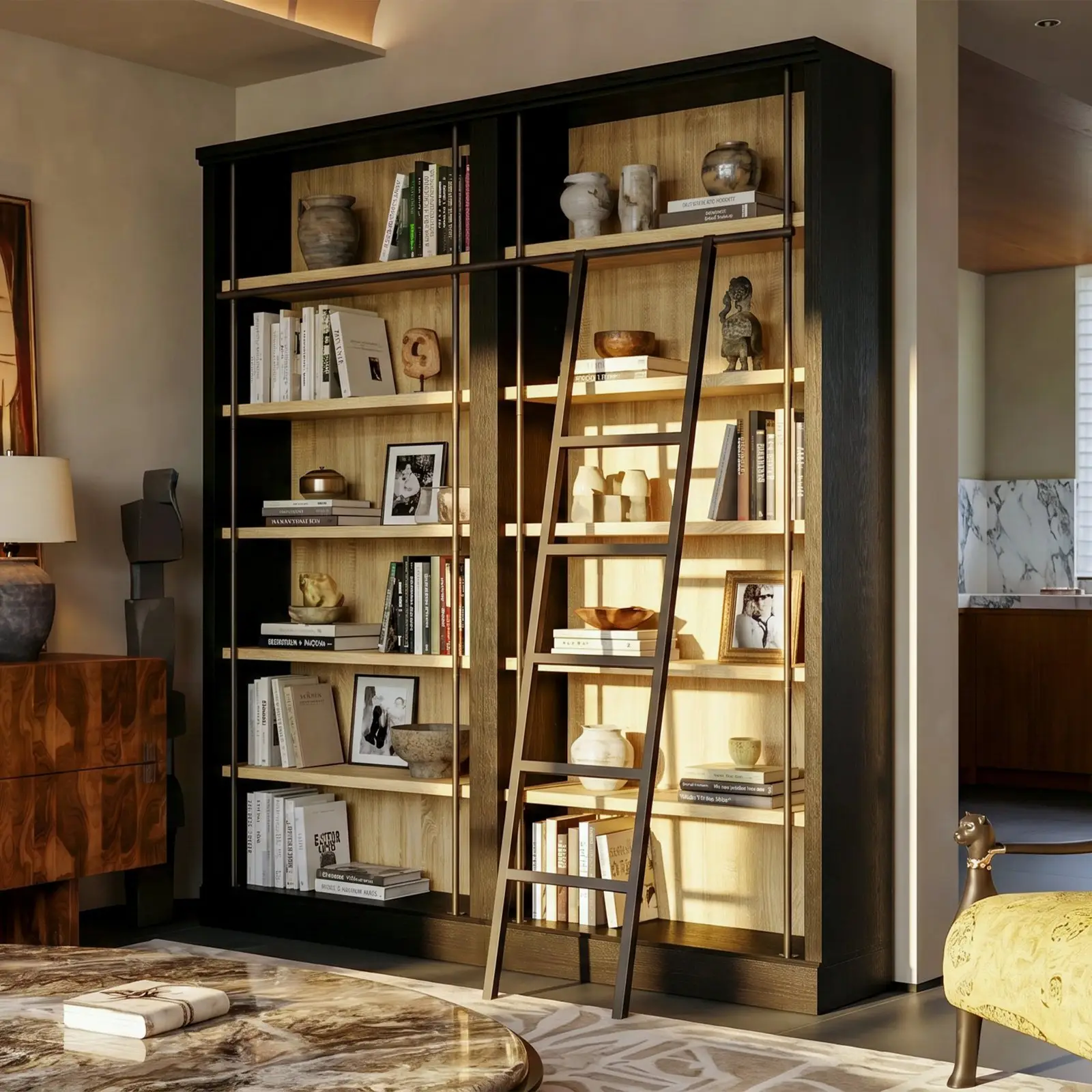
A dark frame around light wood shelves combines two tones in one piece, and the wood bowls and frames on display echo the walnut-toned cabinet beside it. Image: HOMSEE
Here are two hypothetical examples to show how this can play out.
A living room with layered browns. The floor is medium, warm oak, and the coffee table is a dark walnut tone. A new bookcase in a light, matte natural finish is clearly lighter than the floor, so it reads as contrast rather than a near-miss. A walnut-toned frame on one shelf and a rug in warm browns and cream link all three woods.
A dining room with reddish floors. The floor has a strong red undertone and the table is pale. Rather than matching either, a display cabinet with a black metal frame and glass doors goes on the main wall. Black chair legs and a black pendant light repeat the frame, and the glass keeps the cabinet from feeling heavy.
Quick Checklist Before You Buy
- Dominant tone: Which wood covers the most area, and is it light, medium, or dark?
- Undertone: Does it lean warm or cool?
- Approach: Are you blending or contrasting, and is the difference big enough to look deliberate?
- Grain: Will the new grain compete with the floor or another large piece?
- Sheen: Matte, satin, or gloss, and does it sit well with what’s already there?
- Frames and hardware: Do they repeat a metal or color in the room?
- Light: Have you checked the finish, or detailed photos of it, in both daylight and evening light?
Mixed woods are a normal part of a lived-in home. With a clear sense of your main tone and a few deliberate repeats, a new bookcase or cabinet can look like it has always been there.