How Do Shades of Sage Green Contrast with Neutral Colors Like Beige or Gray?
Among the various color combinations, the contrast of shades of sage green and neutrals has emerged as a creative and captivating choice.
Sage green, with its calming and natural essence, has quickly become a favorite, while neutral colors like beige and gray maintain their positions as timeless classics. The contrast of these two color palettes reflects a calm and gentle aesthetic.
Sage green got its name from the earthy and minty herb Sage, which has woody stems and leaves that are green-grayish in color.
It is often used for cooking, aromatherapy, and, in a more mythical way, to keep away spirits. On a practical level, sage does remove 94 percent of airborne bacteria.
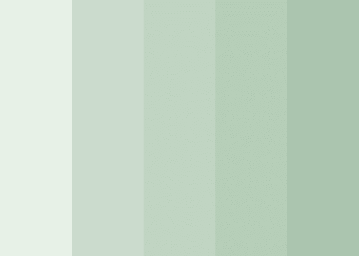
Various Shades of Green
1. Warm Shades of Green
These are shades of sage green that have warmth in their undertones. They often reflect tones of yellow and brown. Olive sage, khaki sage, honeydew sage, golden sage, amber sage, saffron sage, and mossy sage are some warm shades of green.
2. Cool Shades of Green
Cool shades of sage green are those that have cool undertones and often reflect colors like blue and gray. Mint sage, eucalyptus sage, silver sage, and slate sage are some cool shades of green.
Types of Neutral Colors

Neutral colors are muted colors that seem to lack color but have various underlying hues. Neutral shades have a calming effect that gives the image of a calm nature-inspired setting. The most common neutral colors are white, beige, brown, gray, and black. Here is a list of the different neutral shades with different undertones:
1. Warm Neutral Colors
Warm neutral colors are those that have warm undertones, often leaning towards red, orange, or yellow without being overly vibrant. Popular warm neutral colors include beige, tan, warm gray, cream, ivory, camel, caramel, terracotta, deep black, and rust.
2. Cool Neutral Colors
Cool neutral colors are those that have cool undertones leaning towards blue, green, or purple. The most common cool neutral colors are slate gray, cool gray, steel blue, charcoal, slate blue, and clay gray.
Striking Contrast of Shades of Green with Cult Favorite Neutrals
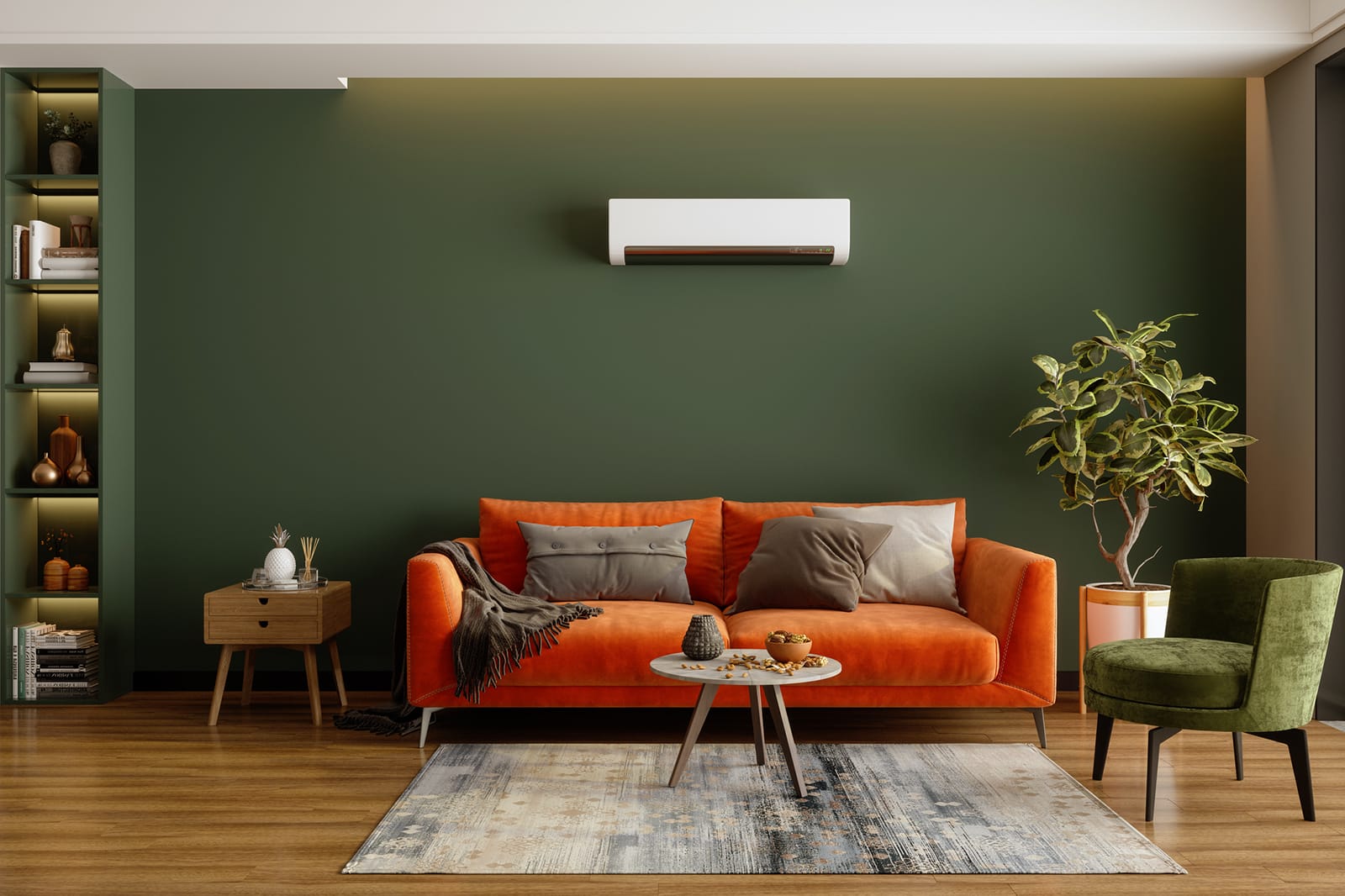
The shade of sage green can contrast beautifully with neutral colors, creating a captivating and harmonious balance. This soft and muted color is versatile enough to be paired with neutrals without making the combination look monotonous and dull. It serves as that little pop of color without being tacky and loud.
A major factor involved in pairing the neutral shades with a shade of sage green is that the shades complement each other. Here are some popular combinations that involve shades of green and neutrals that fit different aesthetics.
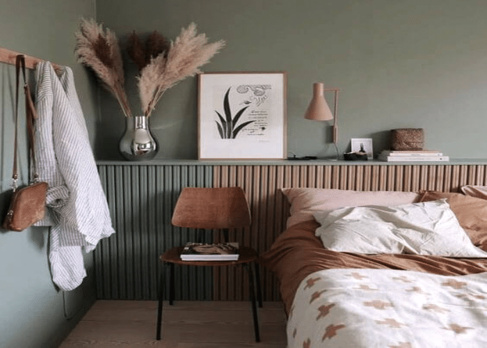
1. Rustic
Combining tan and olive sage will balance out the two shades, setting a rustic ambiance. Had silver-green sage been used instead of olive sage, it would have washed out the tan.
2. Soft and Serene
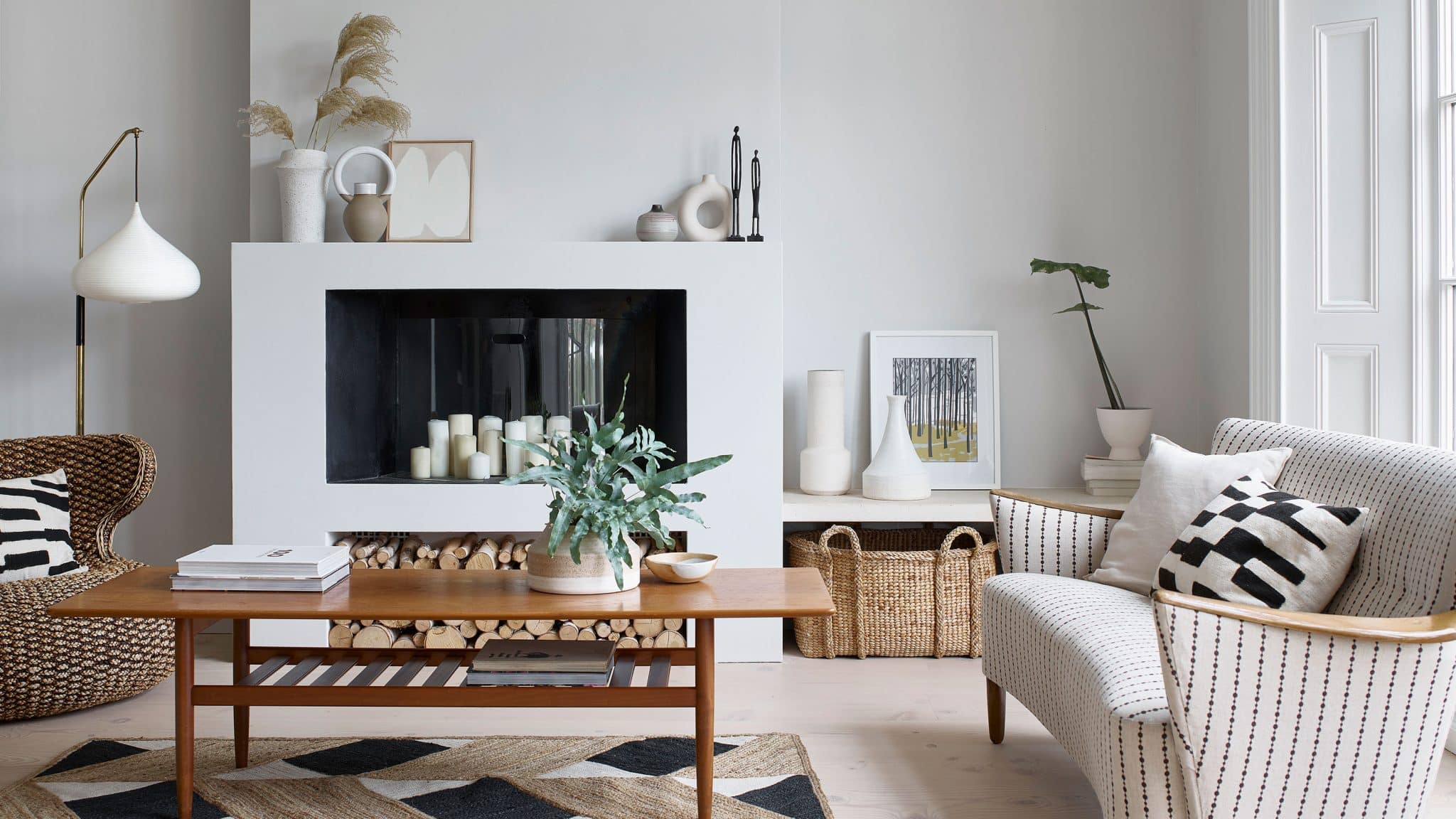
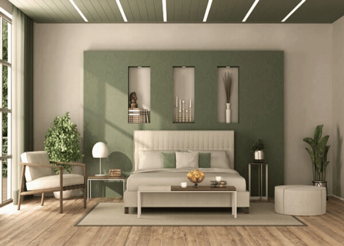
Soft sage with light gray or warm beige will give the impression of a calm, homely setting without either shade overpowering the other.
3. Modern and Elegant
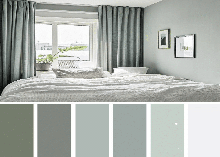
Cool mint sage with white and silver green sage with cool gray are combinations that will give the impression of a clean and spotless space with loads of breathing space and light, giving a contemporary and sleek look.
4. Coastal
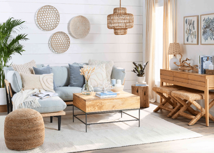
Seafoam sage with blue undertones and sandy beige reflects the colors associated with the ocean and the beach and is perfect for a coastal setting. Imagine having a charcoal and silver-green sage setting against the bright, sunny beach.
5. Minimalist
Cool sage and silver green sage with deep brown and pale tan are perfect for minimalist lovers. These shades complement each other really well and align with the aesthetics of a minimalistic, creating a sense of spaciousness.
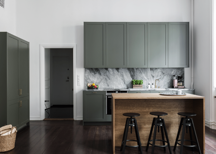
6. Subtle Contrast
Soft sage green with creamy beige has a warm undertone to it, reflecting a sense of peace and calmness. Soft sage green with white would have changed the essence and would have given the impression of a bright and clean setting.
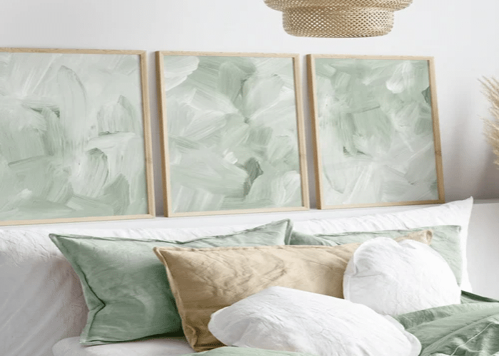
7. Bold Neutrals
Vibrant eucalyptus sage green with deep charcoal gray maintains a high contrast look of a modern and energetic vibe. The cool-toned shades work well with the modern setting and appear bold, making a statement.
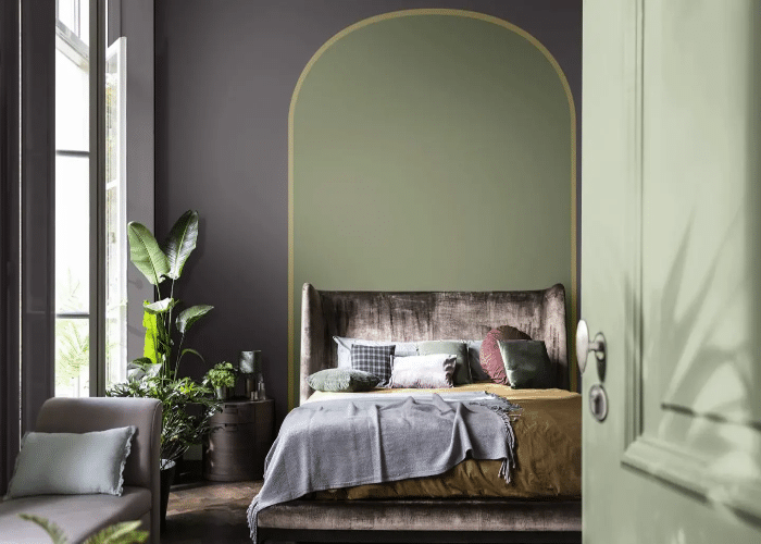
8. Industrial
Grayed sage green with concrete gray and black balances the line between edgy and urban. It includes the daring and edgy vibe of choosing concrete gray or black. It evens it out with the neutrality and sophistication of grayed sage green without ruining the industrial aesthetic.
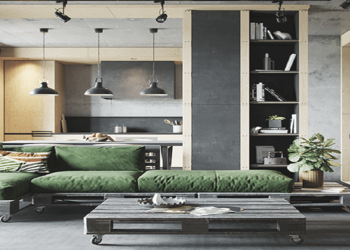
You can notice how modern and minimalist settings have made use of cool sage green and neutrals like silver-green sage and cool gray, whereas more homely and earthy settings like rustic and coastal have used warmer sage green and neutrals like soft sage, olive sage, warm beige, and tan.
Conclusion
The appealing contrast between the shade of sage green and neutral tones, whether it be the gentle warmth of beige or the cool sophistication of gray, offers a huge range of possibilities.
Sage green is often associated with tranquility, peace, wisdom, balance, and nature. The way herb comes in a variety of hues. The color, too, ranges from a pale silvery green to a brighter shade that tips toward olive green.
The play of the organic nature of sage green and the timeless neutrality of beige or gray creates an easygoing flow that reflects different styles, moods, and aesthetics.

