12 Creative DIY Letter Painting Ideas to Try
Every painted letter tells a story beyond its alphabetical meaning.
These pieces become focal points in homes, bringing personality to blank walls.
Through letter art, I’ve helped families create meaningful displays that spark joy.
The process itself provides creative therapy, letting artistic expression flow freely.
What starts as simple letters often becomes cherished decor that lasts years.
Unique Ideas for DIY Letter Painting
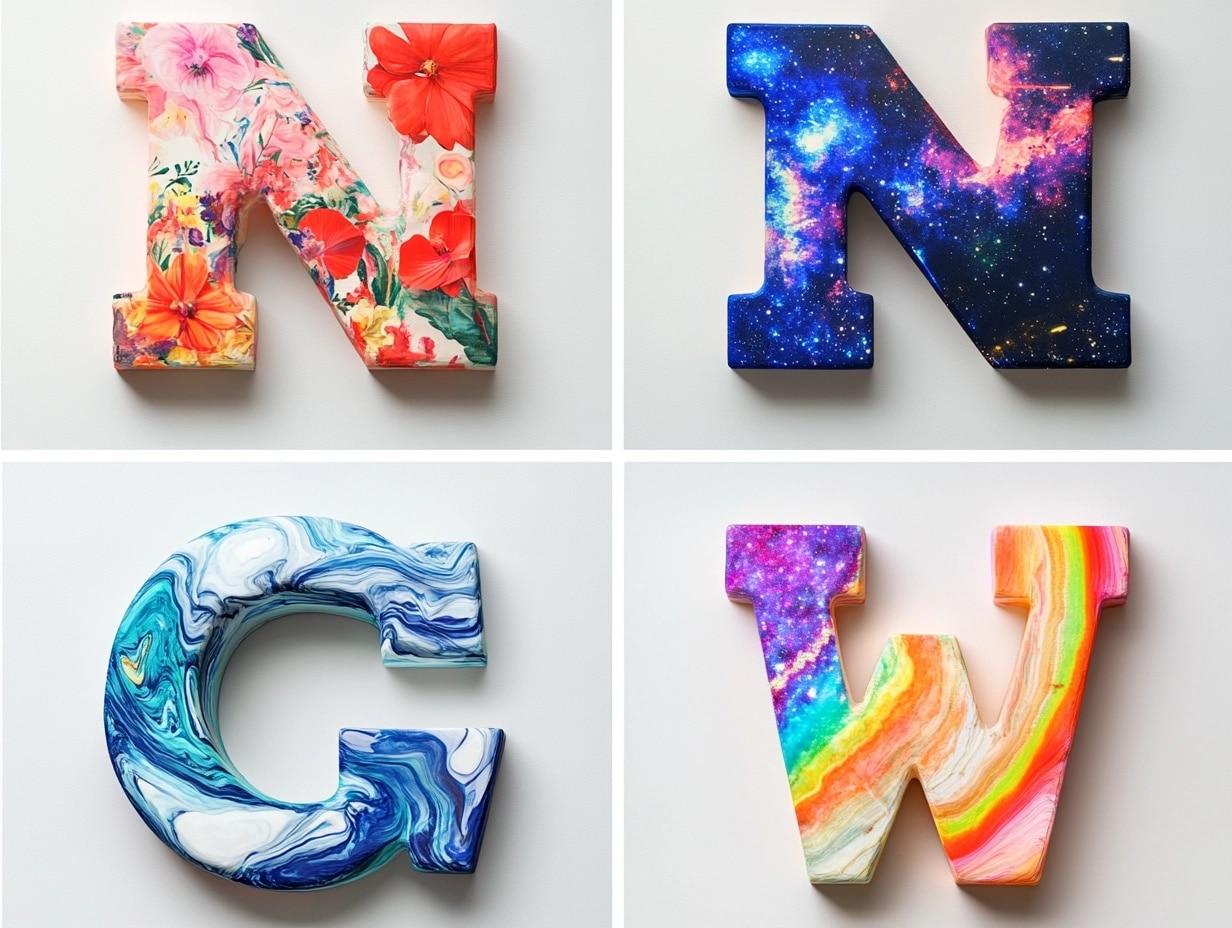
1. Floral Pattern Letters
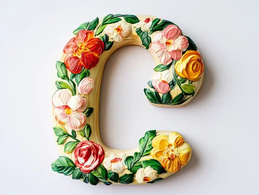
I transformed plain wooden letters into garden-inspired artwork that brightens my reading nook.
Each letter features hand-painted blooms that seem to grow naturally across the surface.
The flowers range from tiny buds to full blossoms, creating depth and movement.
Small leaves and vines connect the flowers, making each letter flow into the next.
The white background helps the colorful petals stand out beautifully.
DIY Steps:
- Sand wooden letters are completely smooth.
- Apply white primer base coat.
- Sketch flower placement lightly.
- Paint the largest blooms first.
- Add smaller flowers and buds.
- Create connecting vine details.
- Seal with a clear protective jacket.
2. Galaxy-Inspired Letters
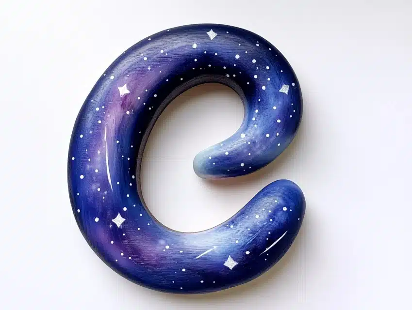
I created these magical letters that capture the mystery of a starlit night sky.
The deep purple background fades into midnight blue, creating perfect cosmic depth.
Tiny white dots and swirls mimic distant stars and spinning galaxies.
Small touches of silver paint create shooting stars across each letter.
The finished pieces seem to glow with their inner light.
DIY Steps:
- Paint black base coat first.
- Blend purple and blue sections while wet.
- Add lighter blue highlights for nebulas.
- Create star clusters with white paint.
- Add metallic accents carefully.
- Layer glow-in-dark paint for stars.
- Seal with a high-gloss finish.
3. Ombre Gradient Letters
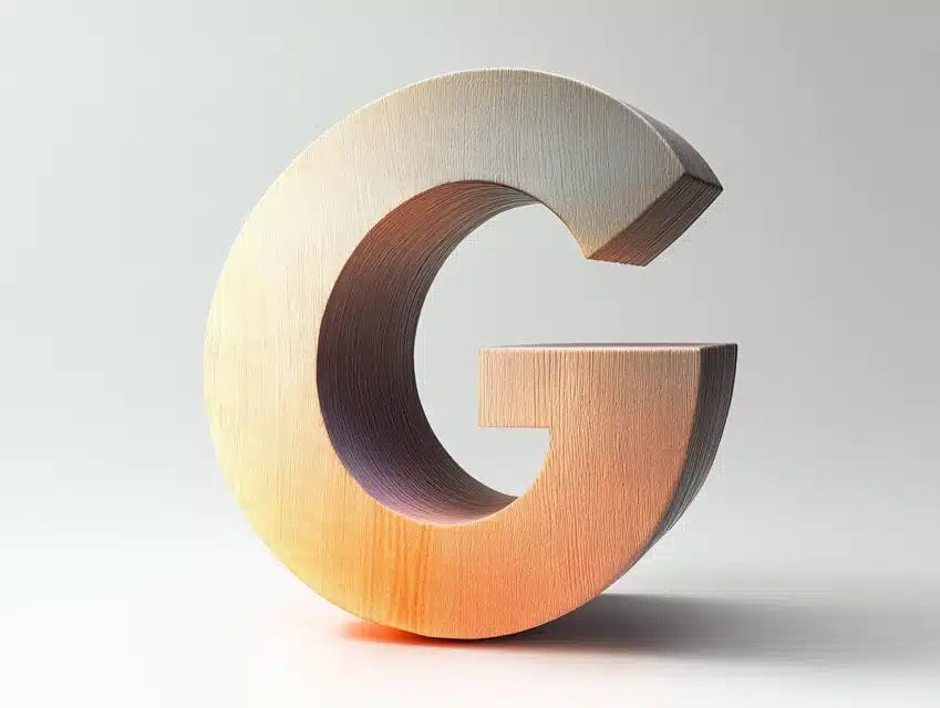
I designed these letters to flow from light to dark, creating a stunning visual impact.
Each letter transitions smoothly through five different shades of the same color.
The gradient moves from top to bottom, creating a waterfall effect.
Light catches the different tones, making the letters appear dimensional.
The smooth color changes draw attention without overwhelming the space.
DIY Steps:
- Select five coordinating paint shades.
- Mix additional transition colors.
- Start with the lightest shade at the top.
- Blend each section while wet.
- Use special gradient brushes.
- Check lighting effects.
- Apply matte protective finish.
4. Metallic Masterpiece
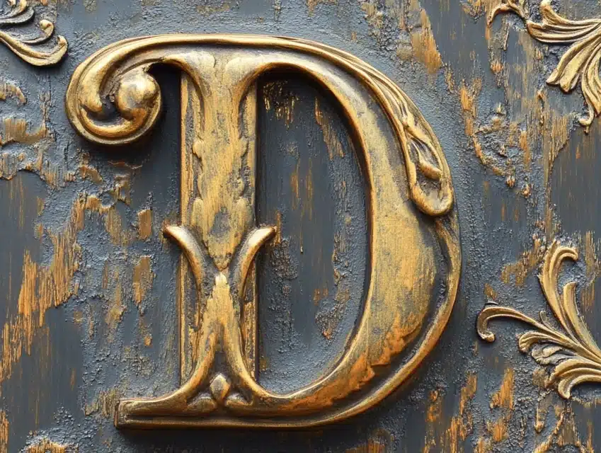
I transformed ordinary letters into gleaming metallic artwork that catches every ray of light.
The surface shimmers with rich gold tones that change appearance throughout the day.
Special painting techniques create an aged patina in certain areas.
Raised patterns add texture and catch the light differently across the surface.
The letters make a dramatic statement against dark wall colors.
DIY Steps:
- Apply metal-grip primer first.
- Create textured base patterns.
- Layer multiple metallic shades.
- Add dimensional highlights.
- Create aged effects in corners.
- Polish certain areas for contrast.
- Seal with a special metal coating.
5. Chalkboard Surface Letters
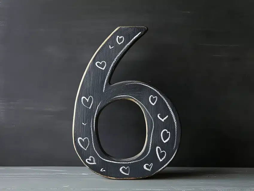
I turned standard letters into interactive pieces that change with our daily moods.
The deep black surface provides perfect contrast for any chalk color or design.
Special chalkboard paint creates a smooth, writable surface that erases cleanly.
The letters serve as mini message boards throughout our home.
Even the edges feature a precise finish that prevents chalk dust from collecting.
DIY Steps:
- Sand surfaces are completely smooth.
- Apply special chalkboard primer.
- Paint thin, even coats.
- Let cure for 48 hours.
- Season the surface with chalk dust.
- Create template designs.
- Add hanging hardware.
6. Marble Effect Creation
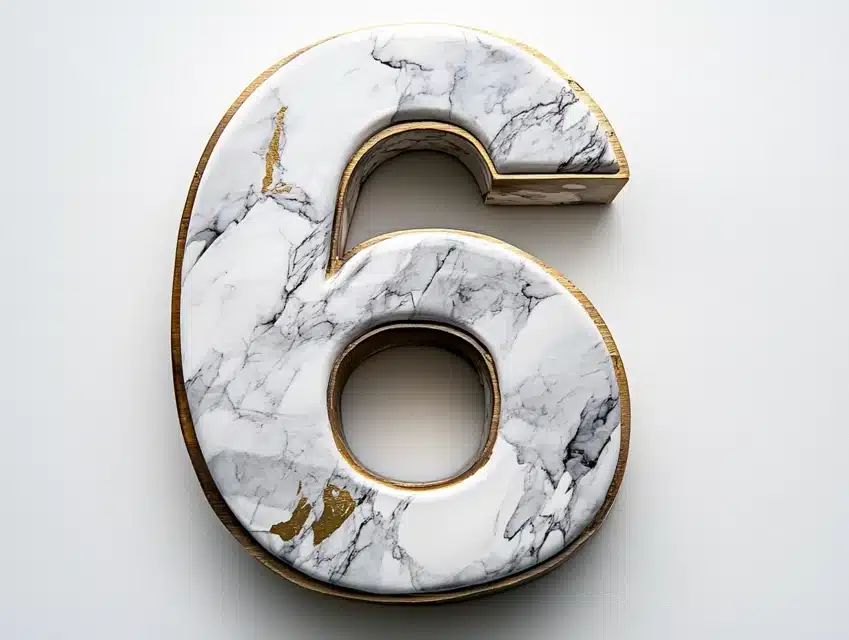
I crafted these elegant letters that mimic expensive marble without the weight.
Delicate veining in gray and white creates authentic stone-like patterns.
Gold accents trace through certain veins, adding unexpected luxury.
The surface appears to have deep layers, just like real marble.
Each letter features slightly different patterns, making them look naturally carved.
DIY Steps:
- Paint a solid white base coat.
- Create gray marble veins while wet.
- Add darker accents for depth.
- Swirl colors gently together.
- Layer translucent white over veins.
- Add metallic veining details.
- Seal with a high-gloss finish.
7. Abstract Artistry
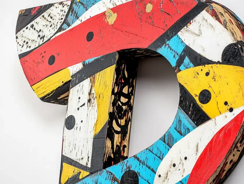
I designed these letters to become conversation pieces through bold artistic expression.
Sweeping brush strokes in contrasting colors create movement across each surface.
Geometric shapes intersect with fluid lines, creating visual interest.
Small splashes of metallic paint catch light unexpectedly.
The random patterns somehow work together in perfect harmony.
DIY Steps:
- Create a color palette first.
- Paint bold background shapes.
- Layer contrasting patterns.
- Add geometric elements carefully.
- Include texture variations.
- Create balance through spacing.
- Seal with artist-grade varnish.
8. Animal Print Letters
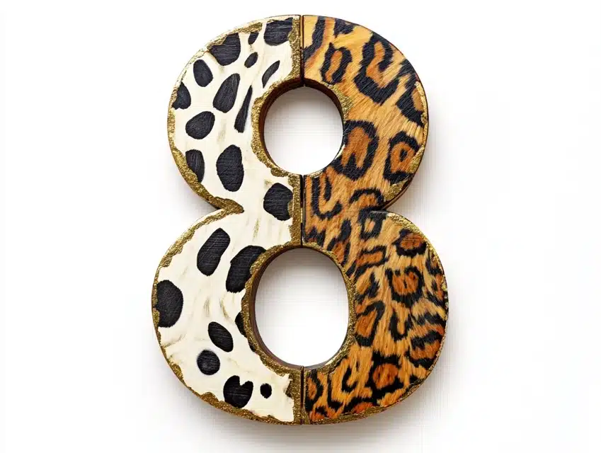
I created these wild statement pieces that bring safari style into any room.
Each letter showcases different animal prints, from leopard spots to zebra stripes.
Like real animal markings, the patterns flow naturally across curves and corners.
Subtle gold accents highlight certain spots, adding unexpected glamour.
The finished pieces create a dramatic impact while maintaining a sophisticated style.
DIY Steps:
- Paint a neutral base color.
- Create pattern guides lightly.
- Layer darker pattern shapes.
- Add highlight colors carefully.
- Create texture with special brushes.
- Build depth with shadow tones.
- Seal with a protective finish.
9. Farmhouse Style Letters
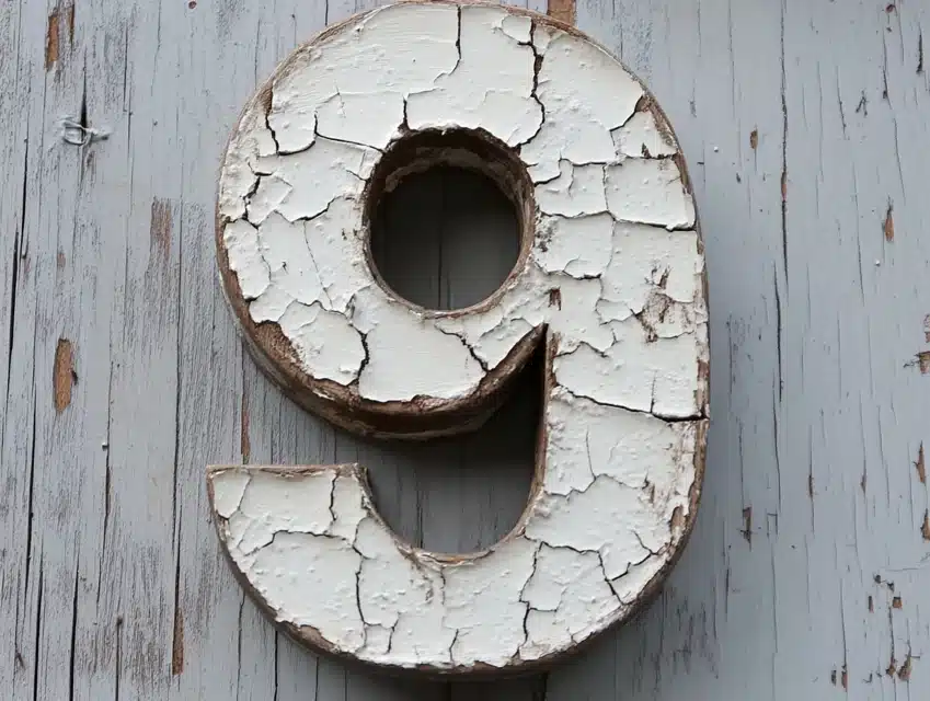
I aged these letters to look like they came straight from a vintage sign shop.
The surface shows carefully created wear patterns that suggest years of character.
Subtle cracks and chips appear natural rather than manufactured.
White paint shows through darker layers, creating authentic aging effects.
Each letter tells its own story through distinctive distressing patterns.
DIY Steps:
- Apply a light base coat first.
- Layer different paint colors.
- Create distressed edges carefully.
- Add subtle crack effects.
- Rub through layers selectively.
- Create authentic wear patterns.
- Seal while preserving texture.
10. Rainbow Splash Design

I transformed plain letters into joyful explosions of color that make everyone smile.
Paint splatters create perfect imperfection across each surface.
The colors blend where they meet, creating new shade combinations.
Tiny droplets contrast with larger splashes for visual interest.
White spaces between colors help each shade stand out clearly.
DIY Steps:
- Protect the work area completely.
- Create a white base coating.
- Mix paint to the proper consistency.
- Practice splatter techniques first.
- Layer colors thoughtfully.
- Allow complete drying between colors.
- Seal with a clear protective coat.
11. Polka Dot Design

I created these playful letters that bring cheerful energy to any space.
The dots vary in size and spacing, creating a natural rhythm across each letter.
Color combinations follow a careful pattern while appearing random.
Some dots overlap to create new shapes and color blends.
The white background makes each colored dot pop with vibrant life.
DIY Steps:
- Paint a solid white background.
- Create a dot sizing guide.
- Use proper tools for each size.
- Layer colors strategically.
- Add metallic dot accents.
- Create overlap effects.
- Seal with a clear coat.
12. Typography Art Letters
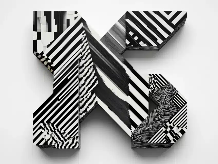
I designed these letters to celebrate the beauty of text and pattern.
Bold stripes and geometric shapes create a modern graphic impact.
Small text elements add intricate detail between larger patterns.
The black and white palette keeps the design sharp and clean.
Each letter becomes a unique piece of typography art.
DIY Steps:
- Sketch the design layout first.
- Apply base color coating.
- Create precise pattern lines.
- Add text elements carefully.
- Layer geometric shapes.
- Check pattern alignment.
- Seal with a matte finish.
Conclusion
After creating hundreds of painted letters, I’ve learned that each piece offers unique creative opportunities.
These projects allow endless possibilities for personal expression through color and design.
The key lies in proper preparation and patience between layers.
Even beginners can achieve professional results by following these techniques.
Remember that practice leads to more confident brush strokes and better results.
Frequently Asked Questions
What Materials Do I Need to Start Painting Letters?
Start with quality wooden or paper mache letters, acrylic paints, brush sizes, primer, and sealant.
I recommend getting practice letters before working on your final pieces. Good lighting and a clean workspace are essential.
How Do I Prepare Letters for Painting?
I clean surfaces thoroughly, sand if needed, and apply proper primer.
I let each prep layer dry completely.
I always test paint colors on the back of letters first.
Good preparation prevents peeling and ensures better paint adhesion.
Which Paint Types Work Best for Letter Art?
I use acrylic paints for most projects. They’re easy to work with, dry quickly, and come in many finishes.
Consider metallic paints, chalk paint, or specialty finishes for special effects.
Always seal finished pieces for durability.
How Can I Fix Mistakes While Painting?
Let mistakes dry completely before fixing them. Sand lightly if needed, then repaint. Keep your original paint colors for touch-ups.
Remember that small imperfections often add character to handmade pieces.
How Do I Protect Finished Letters?
Apply several thin coats of clear sealer appropriate for your paint type. Different finishes (matte, satin, gloss) create various effects.
Allow proper drying time between coats. Keep letters out of direct sunlight to prevent fading.

