A Guide To The Best Paint Color for Bedroom
Your bedroom should be the most relaxing room in your home. But the wrong paint color can make it feel restless, heavy, or just plain off without you even knowing why.
Choosing the best paint color for a bedroom isn’t just about picking what looks good on a chip. It’s about understanding how color affects your brain, your mood, and your sleep.
The right shade can help you unwind faster, sleep better, and wake up feeling refreshed.
In this guide, we break down exactly which colors work, which ones don’t, and how to pick the right shade for your specific room.
What Makes a Bedroom Paint Color “Right” for Sleep and Comfort
Not every color belongs in a bedroom. The right paint color does more than look good; it helps your brain slow down, and your body relax.
Your brain responds to color automatically. Cool tones like blue, green, and soft gray calm brain activity. Warm, bright tones like red and orange stimulate your mind and keep you alert.
The right shade needs to sit in the middle ground:
- Too dull: the room feels flat and uninviting
- Too bright: the room feels energizing at the wrong time
- Too bold: keeps your eyes “working” instead of resting
One thing most people get wrong: assuming any light color is a safe pick. Undertones and lighting both matter.
A white with pink undertones feels very different from one with gray or yellow undertones, and light can shift how any color looks on your wall.
Best Bedroom Paint Colors Based on How They Affect You
The best bedroom color isn’t just about looks, it’s about how it makes you feel. Different colors affect your mood, stress levels, and sleep quality.
Here are the top choices and what they actually do for you:
Soft Blues: Best for Deep Relaxation
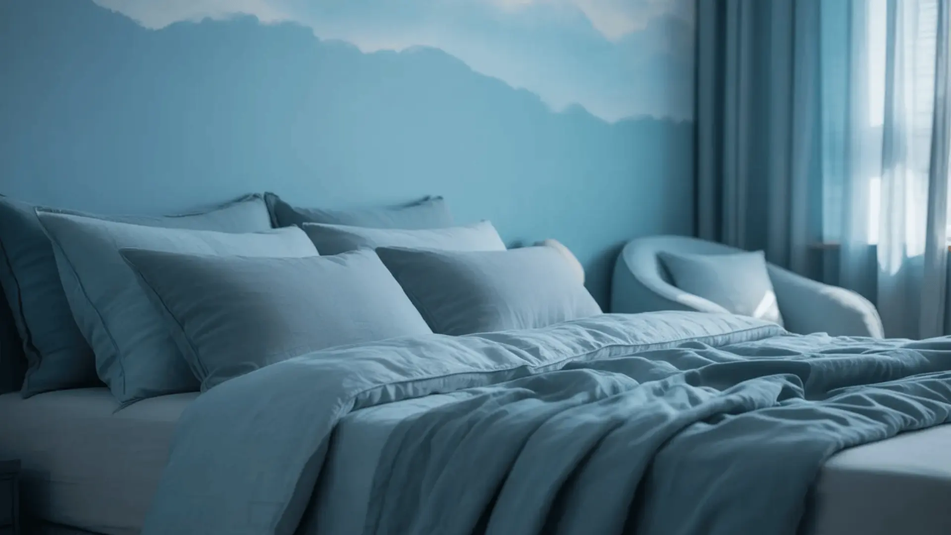
Blue tones lower your heart rate and reduce mental stimulation. Your brain naturally starts to slow down when it sees blue, making it easier to fall and stay asleep.
It works best for people who struggle with stress or anxiety, anyone who has trouble switching off at night, and rooms used mainly for rest.
Just watch the depth; very dark blues can feel cold or heavy. Stick to softer shades like powder blue or dusty slate.
Recommendations: Benjamin Moore’s Quiet Moments, Sherwin-Williams Interesting Aqua
Sage Green: Balanced and Natural Calm
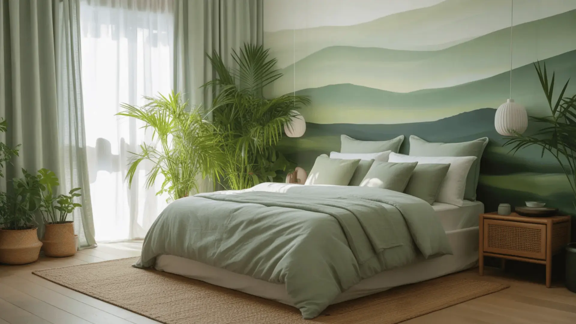
Sage green brings nature indoors. Your brain connects muted greens with natural environments, trees, open fields, and fresh air.
That quiet connection lowers stress without making the room feel boring. It works best for bedrooms you spend a lot of time in, for anyone tired of the usual white or gray, and for rooms with decent natural light.
Just watch out foryellow undertones;sage greens with yellow in them can look muddy in low or artificial light.
Recommendations: Sherwin-Williams Privilege Green, Dulux Overtly Olive
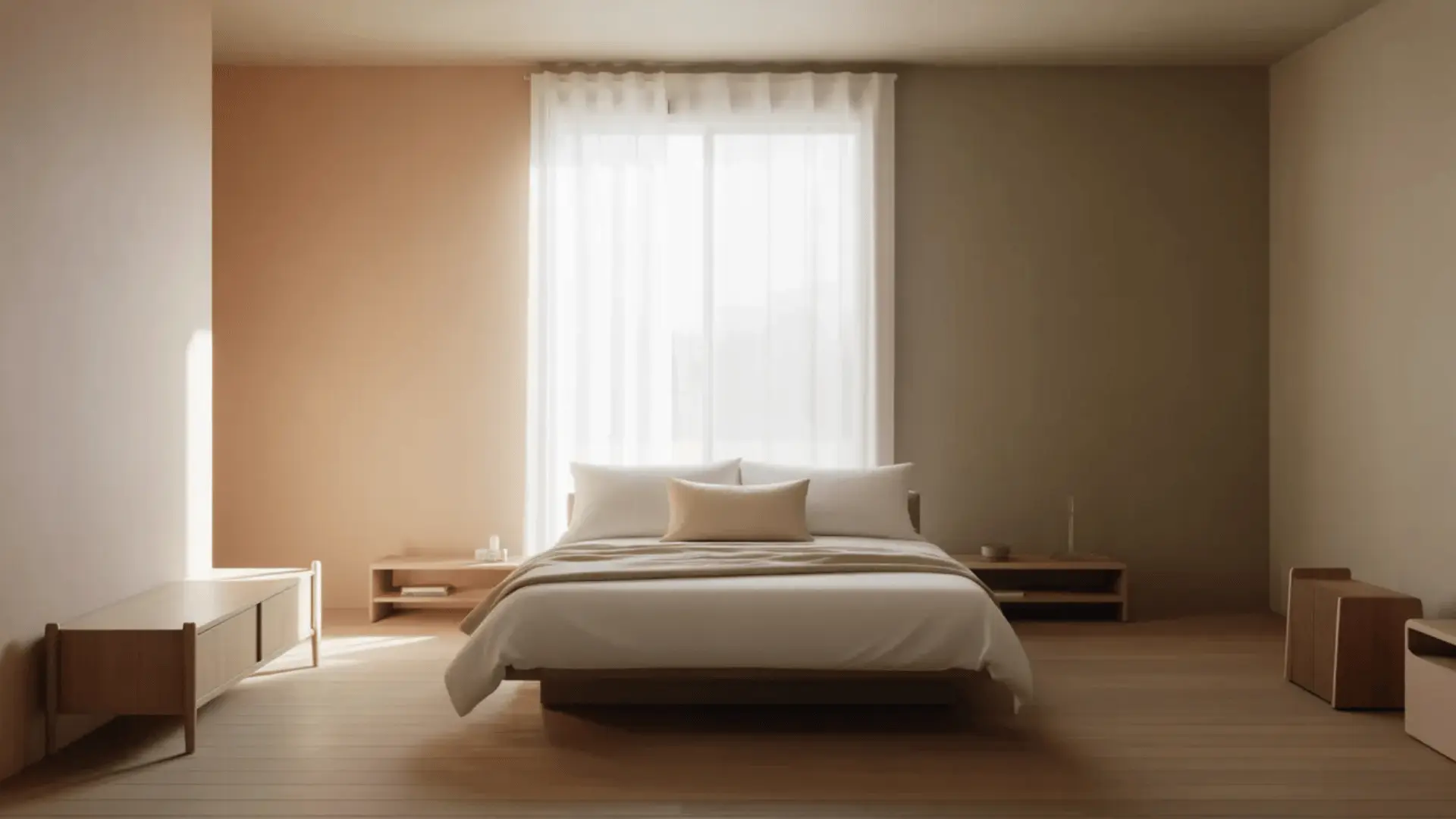
Warm Neutrals: Safe Choice
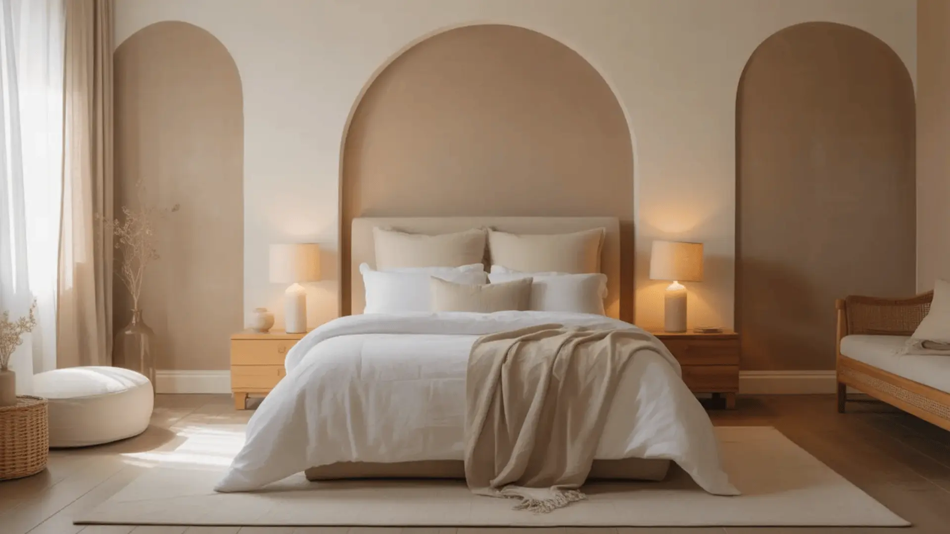
Beige, cream, and greige (gray + beige) cause almost zero visual stimulation. That mental ease makes them one of the most sleep-friendly color families, and they pair well with nearly any furniture or decor.
They work best for small bedrooms that need to feel open, shared bedrooms where two people need to agree, or anyone who wants a timeless, low-risk option.
Just watch the undertone; the wrong one can make a neutral look flat or dingy. Always check your sample in both natural and artificial light.
Recommendations: Sherwin-Williams Accessible Beige, Benjamin Moore Pale Oak
Lavender and Soft Pastels: Gentle Calm with Personality
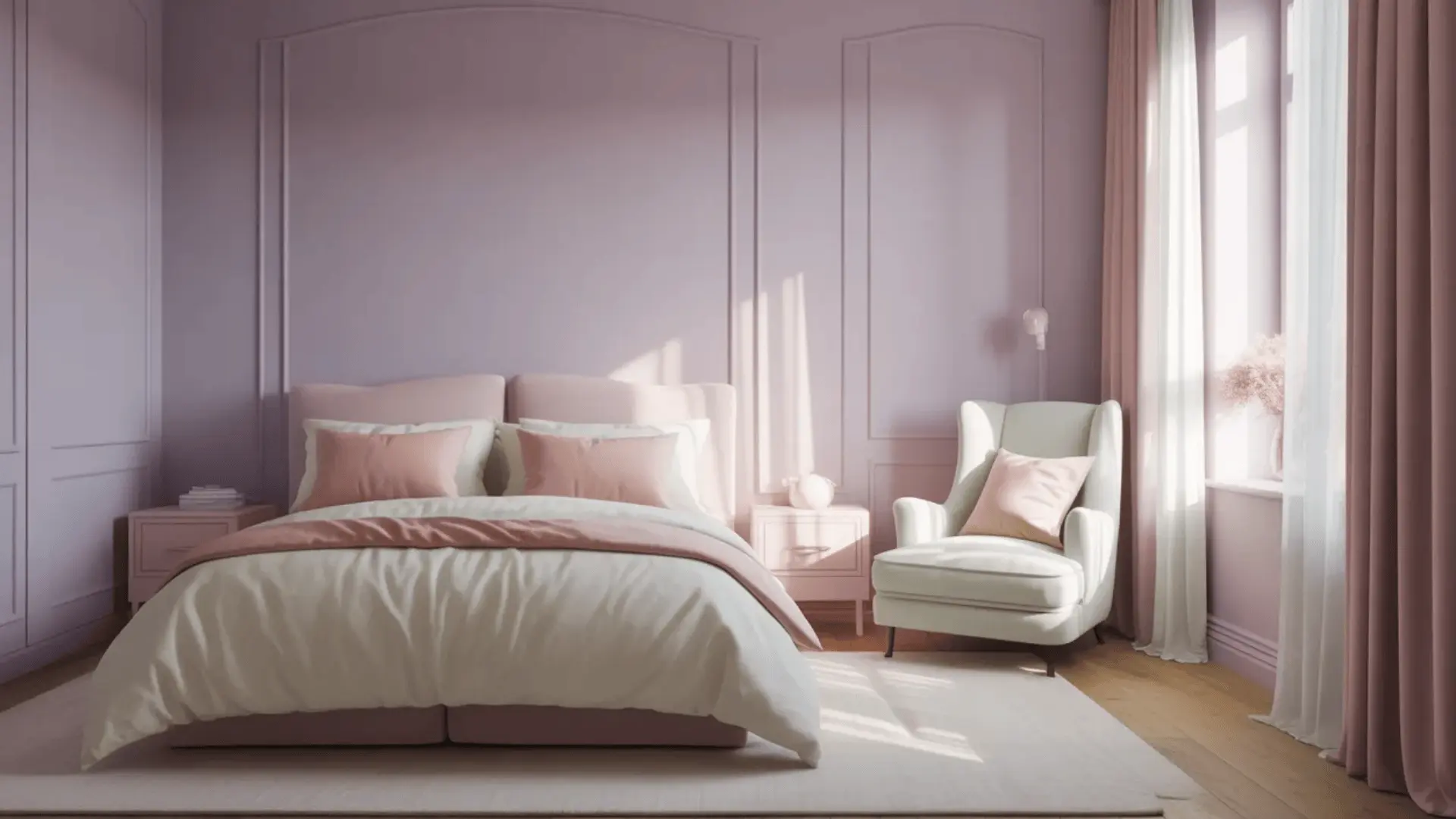
Soft pastels sit in a sweet spot. The light tone keeps things calm, while the subtle hue adds just enough warmth to make the space feel personal and cozy without adding energy.
They work best for personal bedrooms where you want some character, or spaces that feel too plain with just white or neutral tones.
Just keep the saturation low;a soft, dusty lavender soothes, but a vivid purple distracts.
Recommendations: Sherwin-Williams Hyacinth, Farrow & Ball Calluna
How Room Conditions Change Your Color Choice
A color that looks perfect in one room can look completely wrong in another. Your room’s conditions matter just as much as the color itself.
These three factors will help you choose:
1. Lighting: Natural vs. Artificial
Lighting changes how every color looks on your wall. Bright rooms can handle deeper tones. Low-light rooms need warmer or lighter shades.
The direction your room faces also matters; north-facing rooms stay cool, south-facing rooms stay warm. Warm bulbs pull out yellow undertones; cool bulbs make blues and grays feel stark.
Watch out: a cool gray in a low-light room can quickly look lifeless.
2. Room Size
Light colors make small bedrooms feel open and airy. Deeper tones add warmth in large bedrooms and stop the space from feeling cold.
The key is matching the tone’s weight to the room’s scale; too light in a large room feels empty, too dark in a small room feels heavy.
Misconception: dark colors don’t always make a room feel smaller in good lighting; a deep tone can feel cozy and dramatic, not cramped.
3. Existing Furniture and Decor
Warm furniture (wood, cream, tan) pairs best with warm-toned paint. Cool furniture (white, gray, black) works better with cool-toned paint.
Getting the undertones to align is what makes a room feel pulled together rather than visually off. When in doubt, pull the undertone from your largest furniture piece and build your color around it.
Watch out: mismatched undertones are one of the most common decorating mistakes.
Colors to Avoid (and Why They Don’t Work in Bedrooms)
Some colors work against relaxation, no matter how good they look elsewhere. They either overstimulate your mind or make the space feel heavy and closed in.
Colors that overstimulate:
- Bright reds and neon shades: Red raises your heart rate. Neon tones are visually jarring and hard to ignore.
- Strong yellows: Too bold and saturated over four walls. Too energizing for a sleep space.
Colors that absorb light:
- Pure black and very deep tones: These absorb light instead of reflecting it, making a bedroom feel heavy, closed in, and hard to wake up in.
The exception: None of these are completely off-limits; it’s about how much wall they cover. A bold shade on an accent wall adds drama without overwhelming the room.
Small doses through pillows, art, or decor let you bring strong colors in safely. The rule is simple: the more stimulating the color, the less wall space it should take up.
How to Choose the Right Shade (Not Just the Color)
Picking a color family is just the first step. Two shades of the same color can feel completely different once they’re on your wall.
Undertones are the subtle hue beneath the main color. It’s why two whites or two grays can look completely different side by side:
- Warm undertones (yellow, red, peach) feel cozy and inviting
- Cool undertones (blue, gray, green) feel clean and crisp
What matters is whether the undertone matches your lighting and furniture. A mismatch will feel off even if you can’t explain why.
Saturation matters just as much. For bedrooms, muted, low-saturation shades almost always work best. They’re easier on the eyes and more relaxing to live with every day.
Conclusion
The best paint color for a bedroom is one that helps you relax, sleep better, and feel at ease in your own space.
There’s no single right answer, but there is a right process. Understand your undertones, check your lighting, and test samples on the wall before committing.
Soft blues, sage greens, warm neutrals, and muted pastels are all strong starting points. Avoid anything too bright or too saturated. Your bedroom should feel calm, not stimulating.
Ready to repaint? Pick two or three shades from this guide, test them in your room, and let your space tell you what works. Browse our related guides for more bedroom decorating tips.


