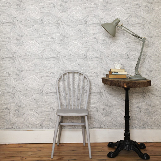
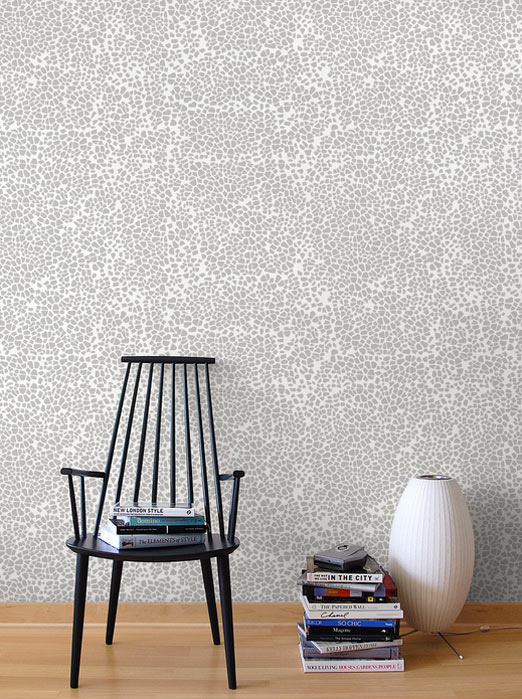
i’m starting to dive into decorating (or at least fantasizing about it) and we’ve landed on two wallpapers for our master bedroom! since we’ll be decorating this house piece by piece, wallpaper is a good way for us to get a lot of proverbial bang for our buck and some instant gratification. the idea behind this wallpaper is that we want something to balance out that big wall of built ins and frame the view of the pool (see pictures of the room here). we like the idea of monochromatic and graphic, so these two amazing papers were an obvious choice. so tell me, which would you choose?! i’m leaning towards the second one and lou is leaning towards the first. it may or may not be a decorating standoff.


image credits and wallpaper sources: seascape wallpaper & a stone’s throw away


i adore you all for weighing in! thank you!! this will be the first of many decorating standoffs, so i'll be asking for more advice down the road i'm sure!
Hi Sarah,
I would also choose the second one, reminds me of pebbles in the sea or in a lake – very pretty and calming, but not boring.
kx
Hi Sarah! I love both of your wallpaper choices, but I especially love the first one because it seems less "busy." I feel like the first wallpaper would compliment the view and some of the items you had in your previous master bedroom and work well with many different decorative elements. However, I do feel like you could get stuck decorating in a certain scheme since it is less abstract than your second choice. I can't wait to see which of the two you decide!
I love the 2nd one Sarah! Modern and playful all in one
definitely the second. very playful and interesting.
thank you everyone for your thoughts! this is exciting!!!
Go for the first… It brings the pool inside.. I think the first is pretty busy and you may get tired of it in a shorter time frame..
definitely love the second one! the first seems a bit too busy for me
Love the waves myself. Seems more flowing and graphic. The dots seem a bit more distracting.
both are super cute but I think the first one is less distracting and more interesting. good luck! loooove your new place!
I love the 2nd one! Such a great pattern!
The waves remind me of a little sea horse which I love. =)
Love the first one – waves. More relaxing, less cluttered/distracting. Seems so appropriate with a view of the pool, too.
My vote is for the first one, definitely! Love that.
thank you all, but seriously….you are split down the middle! haha!!!
makes me confident that we can't really go wrong at least.
I would have to go with the first – even though the pattern seems so specific it can be versatile – can swing towards a masculine, rugged, sea-faring vibe or a relaxing paradise that can be punched up with brights or subdued with water-appropriate tones.
But that being said it is probably either the thing you will be surprised that you never get sick of and have a new appreciation for every time you look at it…or the thing that you replace first. Always a gamble
Completely in love with both of them. Such a hard decision!
#1 is good… but i love #2 !
I love them both! I'd have to go with the first one that looks like ocean waves!
LOVE the first one! the waves are so calming.
Don't see how you could go wrong with either but I love the subtle movement of the first one, and the less contrast between pattern and ground. That said….love the 2nd one too!
#1 is my choice!
oh, i'm liking the first. kinda want to steal it for my future awesome pad…
i love the first one, it seems to have 'movement' to it!
I don't really like either of them but I'd definitely go with your choice over Lou's (for once!).
FIRST!!!!
Both are beautiful. But if it was me making the decision, I would go with the second one because it looks as if it has texture and it plays with one's imagination. It's something I would want for my own room.
#2!!!!!
They are both pretty awesome, so I think you're safe! If I had to pick for myself it would be the second one. Its very playful and yet still sophisticated. I check your blog daily, Sarah, and you have quickly won me over and have become my favorite blog! You are such a sweet person and are truly relatable! xx
I would go for number two, I love it. So soothing and natural looking with the pebbles. Number one seems a tad cartoony.
I really like both and had to keep paging up and then down again to compare them! But the first one sits better with me: it feels more calm, whereas the second one feels a bit chaotic.(Just paged up and down again, and yep, definitely the waves!)
Hi Sarah!
Absolutely love, love, love the waves! I want it!
I like the first!
Hello! I found the first one more prototype…The second one is more "easy" on eye. For my home, personally, I prefer something that I will not see somewhere else and I think this is the first one