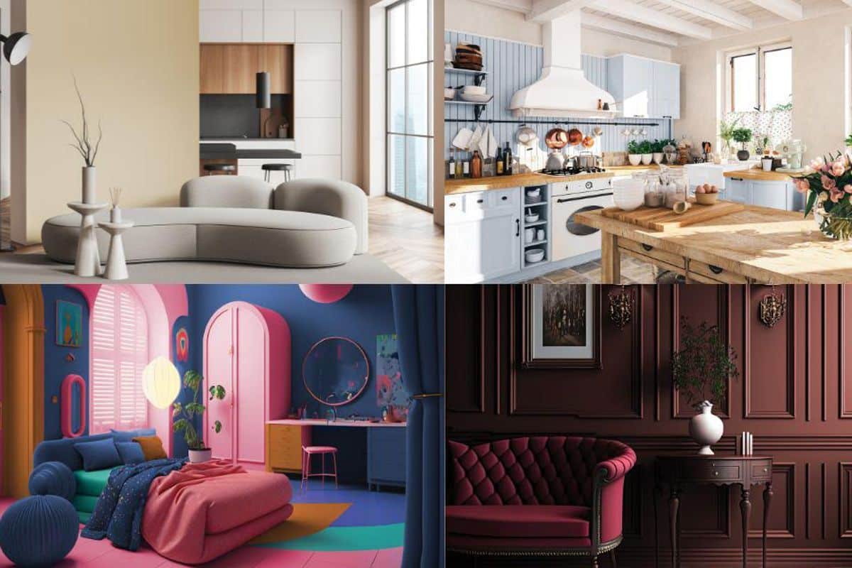
6 Most Flattering Wall Colors of 2024
If you think the wall color enhances only the beauty of your room, then you’re probably interpreting the entire idea of sorting the colors for your home completely wrong.
Your wall color should define your personality and reflect your taste.
Moreover, numerous research studies confirm that the color you use to paint the walls of your room affects your mood.
Yes! A flattering wall color can brighten your day, making you feel refreshed and happy.
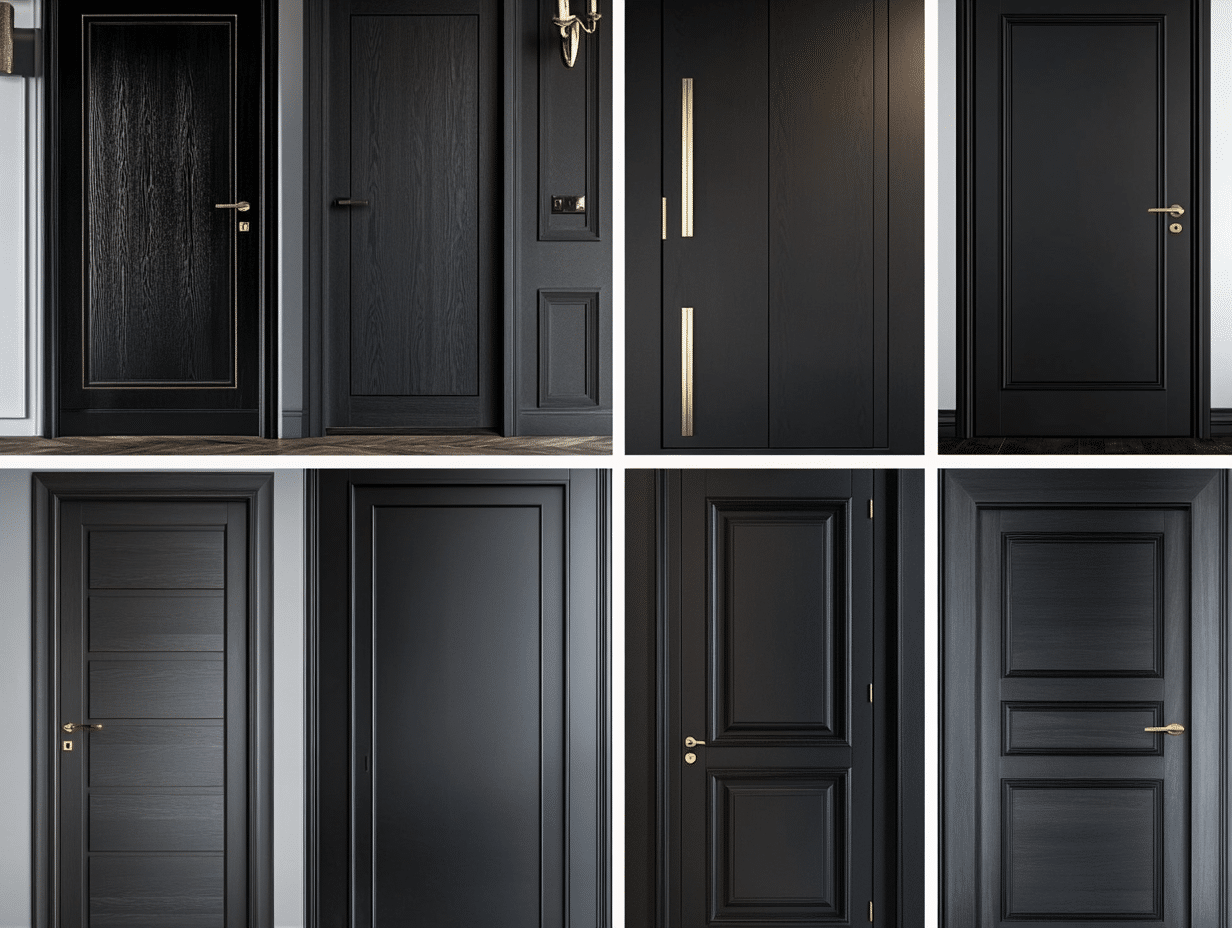
While black wall paint ideas are becoming a significant trend in interior design, there’s more for everyone uncomfortable with the idea of all-black.
Versatility is the keyword of the coming year in terms of choosing wall paint colors.
This means that you need not necessarily have to convert your color preference for re-painting your walls or painting your new home in order to stay on trend.
What is the Most Flattering Wall Color?
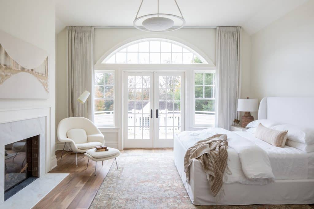
A neutral wall color palette will dominate the home paint industry due to its multifaceted attributes.
In simpler words, this genre of color provides a clean sight of sophistication that is likable by both minimalists and maximalists and persons of all ages.
This article will look at some of the most flattering wall paint colors that will leave a long-lasting impact on your home.
For those intrigued by the elegance and depth that darker tones can offer, exploring our black wall paint ideas will unveil unique ways to incorporate this bold choice into your spaces, blending sophistication with modern aesthetics.
Top Flattering Wall Color Choices for Your Home
1. Benjamin Moore Tissue Pink
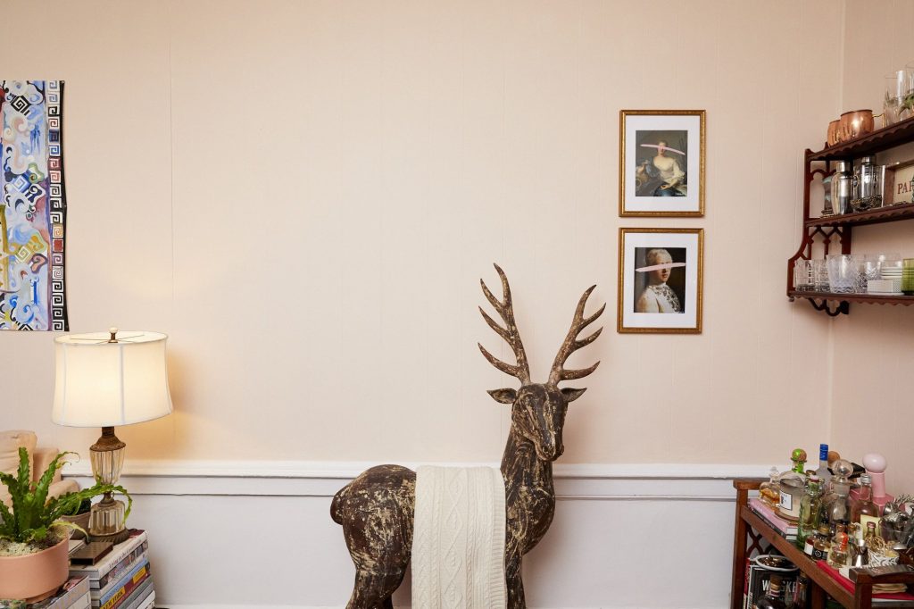
The softest pink with a touch of red undertone, BM Tissue Pink is the replica of sweet femininity.
As you can guess, the charm it emits is calm and welcoming, which helps in giving a sense of comfort.
Therefore, you can paint the walls of living rooms and bathrooms to give off a vibe that soothes your mind and soul at the end of a long, hectic day.
Tissue Pink is unlike the usual “girly” pink because it blends with the room’s light, giving it a diminished pinkish tone, making it the perfect neutral shade.
2. Sherwin Williams Sea Salt

For most people, the beach is the perfect vacation spot after a tiring work schedule throughout the year.
The SW Sea Salt color on your walls gives you the perfect sea view daily!
A vibrant mix of gray and green with an understated blue shade – this color is not your usual aqua green.
You won’t even be able to understand there’s a mix of green unless the appropriate play of light comes into effect.
3. Farrow and Ball Calamine
Remember using the calamine lotion to soothe those skin rashes, little cuts, nettle stings, and insect bites as a child?
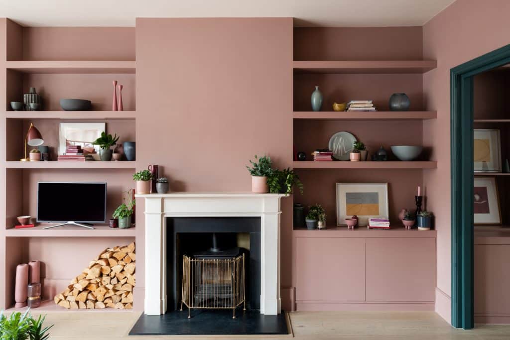
That is exactly where this pretty pink gets its name from! Reviving your nostalgia, Calamine is a fresh new combination of pink and gray.
As you would expect, the pink gives the color a tinge of feminine touch, and the gray effectively tones down the on-your-face sugary feel.
The perfect color for painting walls of large living rooms, you will find losing away all the stress as you dive into its comfort.
Before using this color, check that the room receives ample natural light, or this might give a dark impression.
4. Behr Blank Canvas
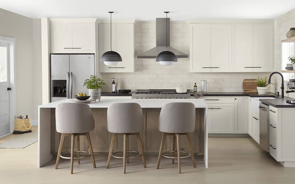
Behr Blank Canvas depicts the maximum potential that the blank wall in your room can reach.
It is an off-white color that you would expect to have a gray undertone.
But it stuns you with a pale brown shade that radiates an earthy vibe.
One of the warmest colors with an LRV of 84, this shade is Behr’s 2023 Color of the Year.
When you try it out yourself, you’ll understand why.
Perfect for small rooms that don’t see much light of the day, this color can make it look larger and brighter.
It is also great for kitchens, living rooms, and mudrooms, especially with complementary colors.
5. Clare Rose Season
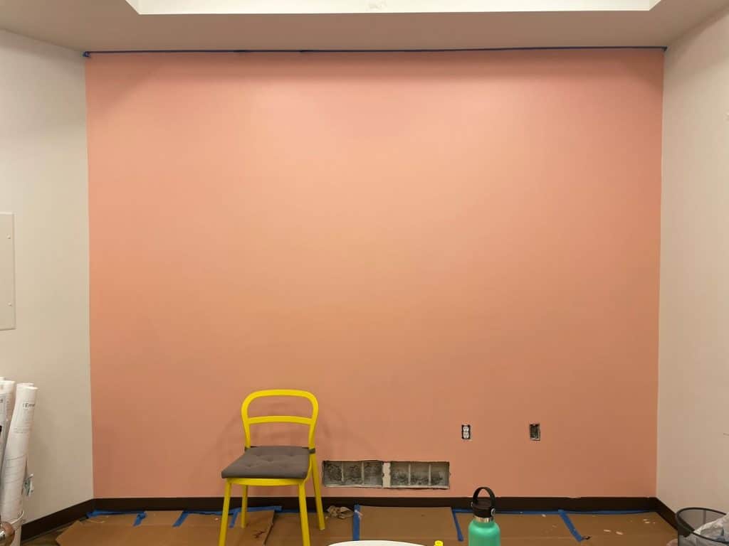
A neutral colors with a touch of pink happens to be one of the most flattering wall colors.
And we honestly can’t get over our obsession with such cute pinks, especially when they are as warm as the Rose Season shade by Clare!
A crisp light red, it’s more of the color of blush than either a pink or a red.
If it feels too girly for your taste, we recommend trying it out on your bedroom wall first, and we guarantee you might even regret not painting the living room wall with it!
A medium tone that is neither too bold nor too soft, this color emits healing vibes.
6. Dunn Edwards Terra Rosa
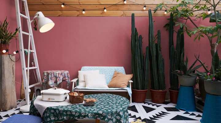
The name itself speaks much about the color – brown of the terracotta mixed with rosy hue (or burgundy).
The application of this color provides a rich and dazzling versatile pinkish hue that instantly enlivens one’s mood.
If you are not into deeper shades, a lighter tone of the same color will give you the therapeutic benefits of the shade without you having to compromise on your color taste.
Apply one coat over a primer base on your walls and experience the feel of a retreat session!
Wrapping it Up
Wall colors are evolving. They are elevating from being just a source of pleasure to the eye to becoming healing energy sources.
The current concept of the home paint industry is that colors should invigorate your body and relax your mind.
Given the stress and busy work schedule of the population, coming home should be something that you and your family should look forward to.
No wonder the neutral paint palette for the walls is a trend that is here to stay.
With so many refreshing and soothing colors in your hand, which one will you paint your walls with? Let us know in the comment section below.

