Colour Theory Trends for Creating Balance in Renovated Interiors
The visual harmony is a silent pursuit when one decides to remodel their home. The central element in this is colour, which can uplift, create an impression, and determine space without the need to displace a single wall. The longstanding art and design concept of colour theory is in the limelight of interior design, which aspires to be stylish and down-to-earth.
Integrating Psychology and Practical Design
The use of colours is emotionally heavy. Mellow colours such as muffled purple or cool slate encourage calmness, whereas saturated colours such as crimson or tangerine stimulate. Green wet wall panels give a sleek look and a natural, serene effect in humid rooms such as the bathroom or kitchen. Their tone is that of refreshing, and the surface provides durability and hygiene without compromising on the looks.
The Rise of Earth-Based Palettes
Current design trends increasingly favour grounded, soil-toned shades. Clay, terracotta, moss, and sand offer depth while staying neutral. These colours speak of quiet strength and nostalgia, making them ideal for reading corners, dining nooks, or any place where presence and reflection are encouraged.
Accent Colours that Work
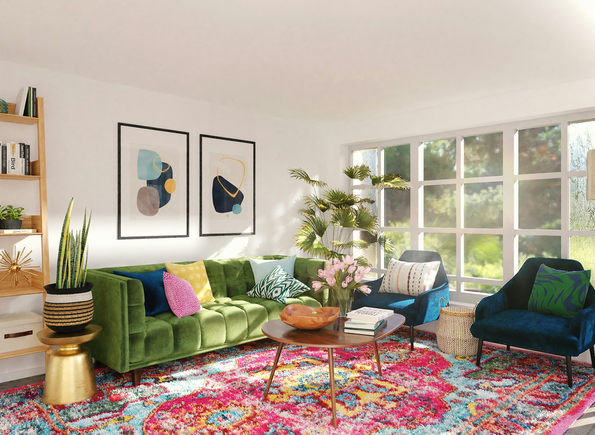
While muted tones dominate larger surfaces, vibrant shades are making their mark in detail. Teal sideboards, mustard armchairs, or even magenta shelving add energy without chaos. When applied sparingly, these saturated accents can sharpen an otherwise soft palette, giving it rhythm and contemporary flair.
Using Contrast to Build Focus
Balance isn’t only found in subtlety. Juxtaposing light and dark—such as a navy ceiling paired with pale walls—draws attention and carves architectural presence into flat spaces. Trend-forward homes increasingly experiment with dramatic contrasts that feel modern but never jarring.
Tone-on-Tone Layering for Texture
Monochromatic doesn’t mean monotony. Layering various intensities of a single hue across textiles, wall paint, and accessories adds complexity. A living room wrapped in different shades of blue, from powder to indigo, feels cohesive while also visually engaging. This technique softens hard edges and allows material finishes to shine.
Connecting Spaces Through Colour Flow
Rather than abrupt shifts between rooms, consider creating subtle gradients across shared walls. Moving from peach in a hallway to dusky rose in a lounge feels organic. These transitions preserve each room’s personality while ensuring the entire floor plan reads as a continuous experience.
Light as a Colour Partner
Sunlight changes how colour behaves. Cool greys may appear blue in natural light but lean green under warm bulbs. Factoring in orientation and artificial lighting ensures that tones remain consistent and intentional throughout the day. Trend-aware renovators are pairing soft pastel walls with warm white LEDs to maintain depth and clarity.
Bringing Nature Indoors with Organic Shades
Architects keep erasing the line between the interior and exterior. Faded shades of green, sun-faded yellow, and blue of the sea create an effect of the outdoors and calm hyperactive minds. When coupled with wood, stone, or fibre woven tones, these form a sanctuary-like environment normally associated with a spa environment or a holiday resort.
Thoughtful Colour, Lasting Impact
When used in renovation schemes, the application of colour theory goes well beyond pigment on a wall. It is the art of creating emotion, motion and personality within a place that is intended to change with the people in it. Whether it is natural palettes or an accent’s boldness, the colours selected today will define the way the room will be perceived in the future. There is no use of colour that is not purposeful, and then the thing will be not only beautiful, but it will be whole.


