
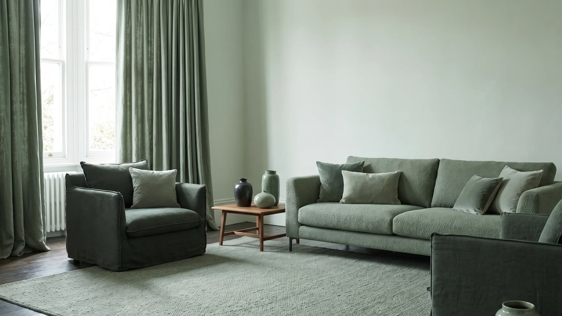
Monochromatic Interior Design Ideas and How to Create the Look
A single color can carry a whole room when you use it right. That is the whole idea behind monochromatic interior design.
Use one hue in several shades for a look that feels calm, not flat. Many homeowners try it and end up with a room that feels dull or cold.
This post explains what monochromatic interior design means and why it works on the eye. Then it shows how to build one, step by step, with real examples.
What Is Monochromatic Interior Design?
Monochromatic interior design uses one base color in different shades, tints, and tones across a room. A shade mixes the color with black.
A tint mixes it with white. A tone mixes it with gray. The hue stays the same, but the lightness or darkness changes from the wall to the sofa to the trim. This is not the same as an all-white or all-gray room.
Any color works, from navy blue to terracotta to deep green, as the Benjamin Moore color guide points out. Done well, a monochromatic room feels calm and put together, not plain.
Monochromatic vs. Other Color Schemes
Monochromatic is just one way to pick colors for a room. Here is how it lines up against the other schemes.
|
Color Scheme |
What It Means |
|---|---|
|
Monochromatic |
One hue in several shades, tints, and tones |
|
Colors that sit next to each other on the color wheel |
|
|
Complementary |
Two colors from opposite sides of the wheel |
|
Triadic |
Three colors spaced evenly around the wheel |
|
Split-Complementary |
One base color plus the two colors next to its opposite |
|
Tetradic (Square) |
Four colors, grouped in two opposite pairs |
|
Achromatic |
Black, white, and gray, with no color at all |
The Psychology Behind a Monochromatic Room
The base color you pick shapes how a room feels, not just how it looks. Blue tends to calm a space down, which is why it works well in bedrooms and home offices.
Green feels balanced and easy on the eye, close to what you see outdoors. Red and burgundy bring energy, so they suit dining rooms more than nurseries.
Warm neutrals like greige or cream feel cozy rather than cold. An all-gray room without any warmth can feel flat and a bit sad. Texture and lighting matter as much as the color itself.
How to Create a Monochromatic Interior Design (Step by Step)
Building a monochromatic room is not hard once you know the right order. Here is how to do it, step by step.
-
Step 1: Pick one base color. Choose a hue that fits the room’s light and how you use the space. A north-facing room can handle a bolder color than a dark, small room.
-
Step 2: Build a range of shades. Pick four to six shades of that color, from light to dark. Use paint strips from the same family so every shade stays true to the hue.
-
Step 3: Add texture. Bring in fabric, wood, and stone in different finishes. Texture keeps a single-color room from looking flat.
-
Step 4: Add one metal or natural accent. Choose one metal finish, like brass or chrome, or a natural material like wood grain. Stick with just one so the room stays calm.
-
Step 5: Balance the room with the 60-30-10 rule. Use your main shade for about 60 percent of the room. Add a second shade for 30 percent, then an accent shade for the last 10 percent.
-
Step 6: Layer your lighting. Add ambient, task, and accent lighting. The same color can look different under each type of light, so test it before you commit.
10 Monochromatic Interior Design Examples by Color
These ten rooms show how far one color can go when it is used well. Each one highlights a different hue in a different room.
1. Navy Blue Home Office

A navy home office pairs matte walls with a walnut desk and brass hardware. The dark blue keeps the room feeling settled, not sleepy, especially under a warm desk lamp.
2. Sage Green Bedroom

A sage green bedroom mixes a soft painted wall with linen bedding in a lighter shade. Wood furniture and a wool rug add warmth so the room does not feel cold.
3. Charcoal Gray Living Room

A charcoal living room works when you layer in boucle, velvet, and a pale gray rug. Without that mix of texture, the same gray can feel heavy and flat.
4. Terracotta Kitchen

A terracotta kitchen pairs matte tile with warm wood cabinets and brass pulls. The earthy tone feels grounded rather than loud, even in a small galley layout.
5. Burgundy Dining Room

A burgundy dining room looks best with brass light fixtures and a dark wood table. Candlelight brings out the red undertones, making it ideal for dinner parties.
6. Warm Greige Living Space

A greige open-plan space blends a warm wall color with linen sofas and light oak floors. Warm undertones keep the room feeling soft instead of flat. The result reads calm, not boring.
7. Blush Pink Nursery

A blush pink nursery pairs a chalky wall paint with linen curtains and a cream rocking chair. The soft tone stays gentle without feeling too sweet.
8. Olive Green Reading Nook

An olive reading nook works with a leather chair, a wool throw, and a brass floor lamp. The deep, muted green feels private and calm. Warm wood tones keep the corner from feeling cold.
9. Black and White Powder Room

A black-and-white powder room uses matte paint on the walls with a glossy white sink and chrome fixtures. The mix of finishes keeps a small, dark room from feeling closed in.
10. Powder Blue Bathroom

A powder blue bathroom pairs light blue tile with white grout and woven storage baskets. The pale tone makes a small bathroom feel bigger and brighter.
Monochromatic Design by Room Type
The right hue often depends on the room itself. Here is what to think about, space by space.
-
Living Room: In a living room, pick a hue you can live with in bigger doses. Walls, sofas, and rugs all carry it.
-
Bedroom: In a bedroom, keep the palette calming. Save the darkest shade for an accent wall or bedding, not every wall.
-
Kitchen: In a kitchen, matte finishes hide fingerprints better than gloss if you go with a darker shade.
-
Bathroom: In a bathroom, tile and stone carry a tonal range better than fabric ever will.
-
Home Office: In a home office, choose a hue that supports focus, like blue or green, over a loud, bold color.
-
Small Spaces: In a small room, lighter tints make the space feel bigger, so save the darkest shade for one small accent.
Pros and Cons of Monochromatic Interior Design
Like any design choice, a single-color room comes with upsides and a few trade-offs. Here is a quick side-by-side look.
|
Pros |
Cons |
|---|---|
|
Feels calm and put together |
Can look flat without enough texture |
|
Makes small rooms feel bigger |
Harder to add variety later on |
|
Simple to plan and shop for |
The wrong undertone can feel cold |
|
Works with almost any style |
Limited contrast can feel one-note |
|
Tends to age well over time |
Needs more thought on lighting |
Tools and Materials That Make It Easier
A few basic tools make it much easier to get the shades right before you commit. Keep these close by.
-
Paint fan decks from one brand, so every shade comes from the same family.
-
Fabric swatches in velvet, linen, and boucle to compare texture side by side.
-
Peel-and-stick paint samples to check color under your room’s real light.
-
A simple mood board, on paper or your phone, to test combinations first.
-
Metal hardware samples in brass, chrome, or matte black, so you can pick one finish and stick with it.
Expert Tips for a Monochromatic Room That Doesn’t Fall Flat
Test paint on the wall at different times of day before you decide, since light changes how a color reads.
Keep one clear focal point, like a rug, art, or a bold chair. Give the eye one place to land. Mix matte and glossy finishes within the same color family for extra depth.
A single natural touch, like a plant or real wood grain, adds warmth paint alone cannot give. Designers featured in the Homes & Gardens guide to monochrome rooms share this small habit.
Conclusion
One color, used well, can make a room feel calm and pulled together. That was this guide’s goal. It set out to show what monochromatic interior design means and why it works.
It also showed how to build one, step by step, without it turning flat.
Pick a hue that fits your room’s light and daily use, then build shades around it. Add texture, one accent, and good lighting. Try it in one room first before you commit to more.
Frequently Asked Questions
What are five monochromatic colors?
Five monochromatic colors are shades, tints, and tones of one hue. For blue, that could be navy, denim, sky blue, powder blue, and pale blue. The same method works for any color you choose.
What are some ideas for decorating a monochromatic room?
Layer different textures like velvet, linen, and wood. Vary the shades from light to dark across walls, furniture, and trim. Add metal accents or patterned textiles to keep the room interesting.
What are the 7 color schemes?
The seven main color schemes are monochromatic, analogous, complementary, split-complementary, triadic, tetradic, and achromatic. Each uses the color wheel differently.
What color palette is trending now?
Warm, earthy tones are trending in home interiors right now, including terracotta, olive green, burgundy, and warm neutrals. Homeowners are also moving away from stark, cold grays.
What are 7 colors that go well together?
A balanced set that works well together is navy, cream, terracotta, sage green, gold, charcoal, and blush. Together, they mix cool and warm tones for a pulled-together room.
What color does Gen Z like?
Gen Z tends to like warm, natural tones such as earthy brown, powder pink, moss green, and burgundy. These have replaced much of the gray and black that were popular a decade ago.


