Sherwin Williams Pearly White (SW 7009): A Paint Review
Choosing a white paint sounds simple—until you start seeing all the subtle undertones. I’ve been there too, wondering if a white will look too creamy, too cold, or just plain wrong once it’s on the wall.
That’s why I put this guide together: to help you decide if Sherwin-Williams Pearly White (SW 7009) is the right fit for your space.
We’ll go over how it looks in real rooms, how it behaves in different lighting, how it compares to other whites, and what finishes, pairings, and samples work best. Let’s figure it out together.
Pearly White (SW 7009) by Sherwin-Williams

Sherwin-Williams Pearly White is a soft, warm white with just enough depth to keep it from feeling flat. It works well in almost any room and creates a peaceful, clean background without reading too yellow or too stark.
If you want a white that feels cozy but still fresh, Pearly White hits the sweet spot.
Basic Color Profile
HEX code: #F2F0E4
LRV (Light Reflectance Value): 77
Color family: Warm white
Pearly White reflects a fair amount of light while still having enough body to show up on the wall. It’s often described as a soft, greige-white, a warm white with just a hint of beige-gray grounding it.
Undertones Explained
Pearly White has gentle beige and greige undertones that give it warmth while keeping it calm. It doesn’t have yellow or pink notes like some other warm whites.
- In natural daylight, it looks creamy and clean without reading yellow.
- Under warm bulbs or low light, the beige side becomes a bit more noticeable, creating a soft and lived-in feeling.
Because of its balanced undertones, it works in homes that lean both modern and traditional. But like with any white sampling, it is key.
Pearly White in Real Spaces
Pearly White shows up differently depending on the lighting and finishes around it. Here’s how it typically performs across different rooms.
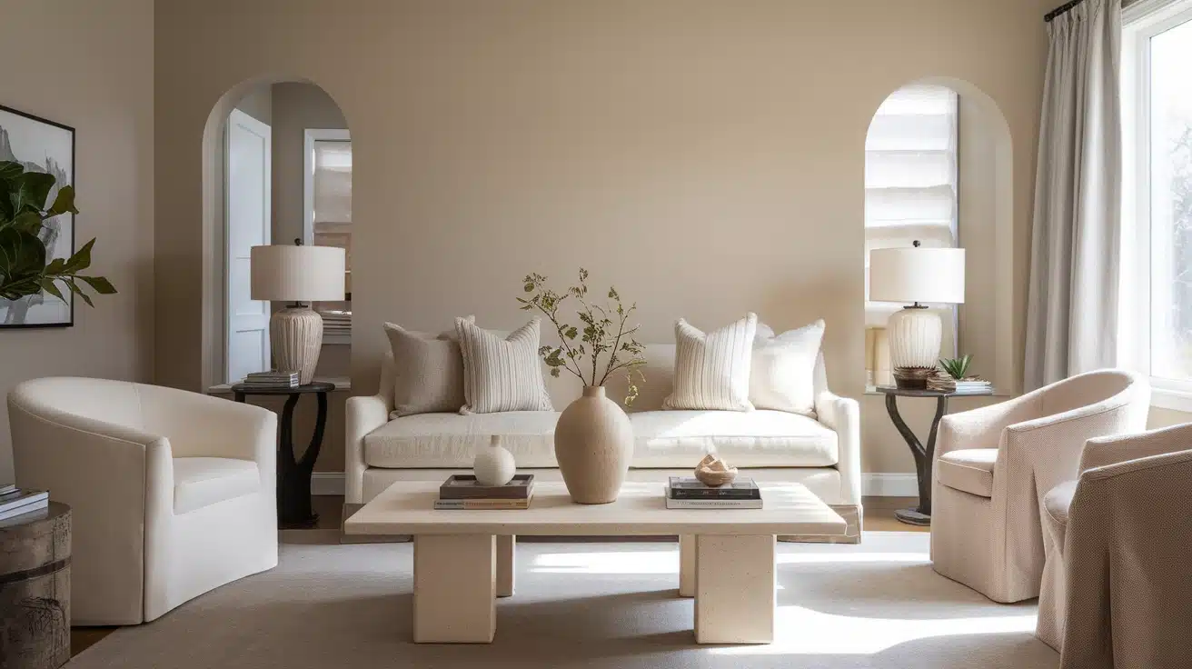
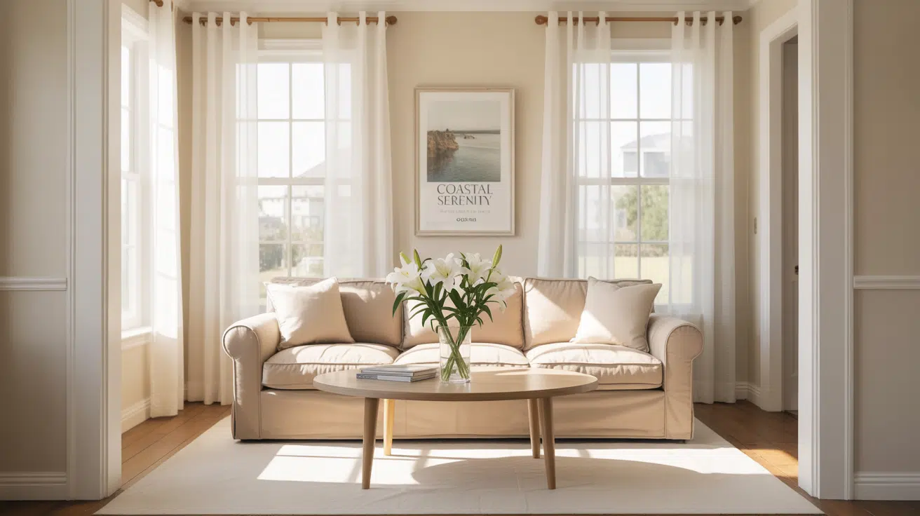
Living Room

Pearly White brings in warmth without making the room feel dark. It pairs well with linen sofas, medium-tone wood floors, and soft metal finishes like brass or brushed nickel.
Kitchen Cabinets

On cabinets, Pearly White gives a creamy look that still feels clean and neutral. It looks especially good paired with white quartz, natural wood, or mixed metal hardware.
Bedroom Walls

In bedrooms, Pearly White creates a calm, soft backdrop. It works well behind upholstered headboards or layered bedding, and it helps the room feel cozy without feeling enclosed.
Bathrooms

This color adds warmth to bathrooms while staying neutral. It complements white tile, light counters, and soft metals like chrome or black. Great in spaces with limited natural light.
Exterior Use
Pearly White can be used on exteriors, but you’ll want to test it first. Outdoor light tends to wash colors out, so it may look lighter than expected. It still brings warmth without being too yellow.

It’s best used on shaded porches, trims, or walls that don’t get strong afternoon sun. Pair it with a satin or low-luster finish for best results; it holds up well and gives a clean, soft surface without too much glare or flatness.
How Lighting Affects It
Lighting changes everything when it comes to how Pearly White reads in a space. Here’s a quick guide:
North-facing rooms: It may lean slightly beige or greige, but stays soft and balanced.
South-facing rooms: The color looks creamy and clean without turning yellow.
East-facing rooms: Appears brighter in the morning, with a subtle warm glow.
West-facing rooms: Warm afternoon light enhances its cozy feel.
Always test it in your space; light shifts the tone more than you’d expect.
Pearly White vs. Other Sherwin-Williams Whites
With so many white paints out there, it helps to compare Pearly White to similar favorites. Here’s how it stacks up:
Pearly White vs. Alabaster

Alabaster (SW 7008, #EDEAE0) has stronger beige undertones and feels creamier overall.
Choose Alabaster if you want a more traditional, cozy feel. Pick Pearly White if you want a fresher look that still feels warm.
Pearly White vs. Greek Villa

Greek Villa (SW 7551, #F8F5EC) is lighter, with a touch more yellow warmth.
Greek Villa works well with wood tones and rustic finishes. Pearly White offers a more subtle, greige-leaning warmth.
Pearly White vs. Pure White

Pure White (SW 7005, #F8F8F6) is brighter and more neutral with minimal undertones.
Use Pure White for trim or modern, crisp finishes. Use Pearly White for a softer wall color with warmth.
Undertone and LRV Comparison Table
| Paint Color | Undertones | LRV | Warm or Cool |
|---|---|---|---|
| Pearly White | Beige / Greige | 77.00 | Warm |
| Alabaster | Warm Beige | 82.00 | Warm |
| Greek Villa | Yellow-Cream | 84.00 | Warm |
| Pure White | Soft Neutral | 84.00 | Neutral |
Testing these together in your own space will show you which white works best with your lighting and decor.
Best Color Pairings for Pearly White
Pearly White is incredibly versatile; it works with a variety of trim, accent colors, and furniture finishes. Here’s how to make it shine.
Trim and Ceiling Suggestions
- Pure White (SW 7005, #F8F8F6): Clean contrast that keeps the palette soft.
- High Reflective White (SW 7757, #F9F9F4): A crisp white for trim or ceilings if you want brightness.
- Pearly White (SW 7009): For a seamless look, you can use the same color on walls and trim in different finishes.
Flat on ceilings and satin or semi-gloss on trim work best for clean edges and soft reflection.
Accent Wall and Furniture Colors
- For gentle contrast: try navy, charcoal, or forest green.
- For warmth: pair it with taupe, warm beige, or soft wood tones.
- For color: muted blush, olive, or dusty teal all work well with Pearly White.
Neutral upholstery, brushed metals, and soft textures will keep the room calm and pulled together.
Hardware and Flooring Compatibility
I’ve noticed that Pearly White works with a wide range of finishes, but certain pairings bring out its warmth best.
For hardware, brushed brass adds a classic softness. Chrome or polished nickel keeps things clean and fresh. Matte black provides contrast and a more modern edge.
For flooring, light oak and natural maple give a fresh, airy feel. Medium browns like walnut or hickory add richness. Creamy stone or neutral tile creates a seamless tone-on-tone look.
Always sample finishes together; Pearly White changes with light and surroundings.
Paint Finish Recommendations
The right finish changes how Pearly White reflects light and holds up over time.
Matte: Works well in bedrooms or ceilings. Keeps things soft and hides flaws.
Eggshell: A great choice for living rooms and hallways; easy to maintain and has a soft glow.
Satin: Perfect for kitchens and bathrooms. More durable and brings out just a hint of sheen.
Test finishes with your lighting and wall texture before doing the whole room.
Sampling and Buying Options
Before you commit to painting an entire space, test Pearly White in your home to see how it looks in your light.
Where to Get Peel-and-Stick Samples
- Samplize: Real Sherwin-Williams paint on removable swatches
- Sherwin-Williams stores: Offer sample cards and 8-oz. test jars
- Hardware stores: May carry paint chips or custom-mixed samples
View samples in different lighting, morning, afternoon, and evening, for the full picture.
Where to Buy the Paint
- Sherwin-Williams.com – Purchase online for delivery or pickup
- Sherwin-Williams retail stores – Get custom advice, finishes, and in-stock availability
- Local hardware stores – May tint Sherwin-Williams formulas upon request
- Delivery and curbside pickup are often available for convenience
Paint Equivalents in Other Brands
If you’re not using Sherwin-Williams, these colors come close to Pearly White’s tone and softness.
Benjamin Moore:
- Swiss Coffee (OC-45, #F8F4E3) – Creamy with soft beige warmth
- White Dove (OC-17, #F0EDE4) – A balanced, warm white with a slightly deeper tone
Behr:
- Flurries (HDC-WR14-1, #F2EDE3) – Warm and muted with similar softness
- Blank Canvas (DC-003, #F3F0E7) – Clean off-white with just enough warmth
Always test side by side to compare light reflection and undertone in your own space.
Conclusion
Now that you’ve seen what Sherwin-Williams Pearly White (SW 7009) has to offer, you can decide if it’s the right warm white for your home.
You’ve learned how it looks in different rooms, how it compares to other favorites, and which finishes and colors bring it to life. Test your samples in real lighting, and you’ll know exactly how it behaves.
And if you’re still unsure about this color, I’ve got more white paint guides to help you find the one that fits your style best. Don’t forget to check them out on the website.