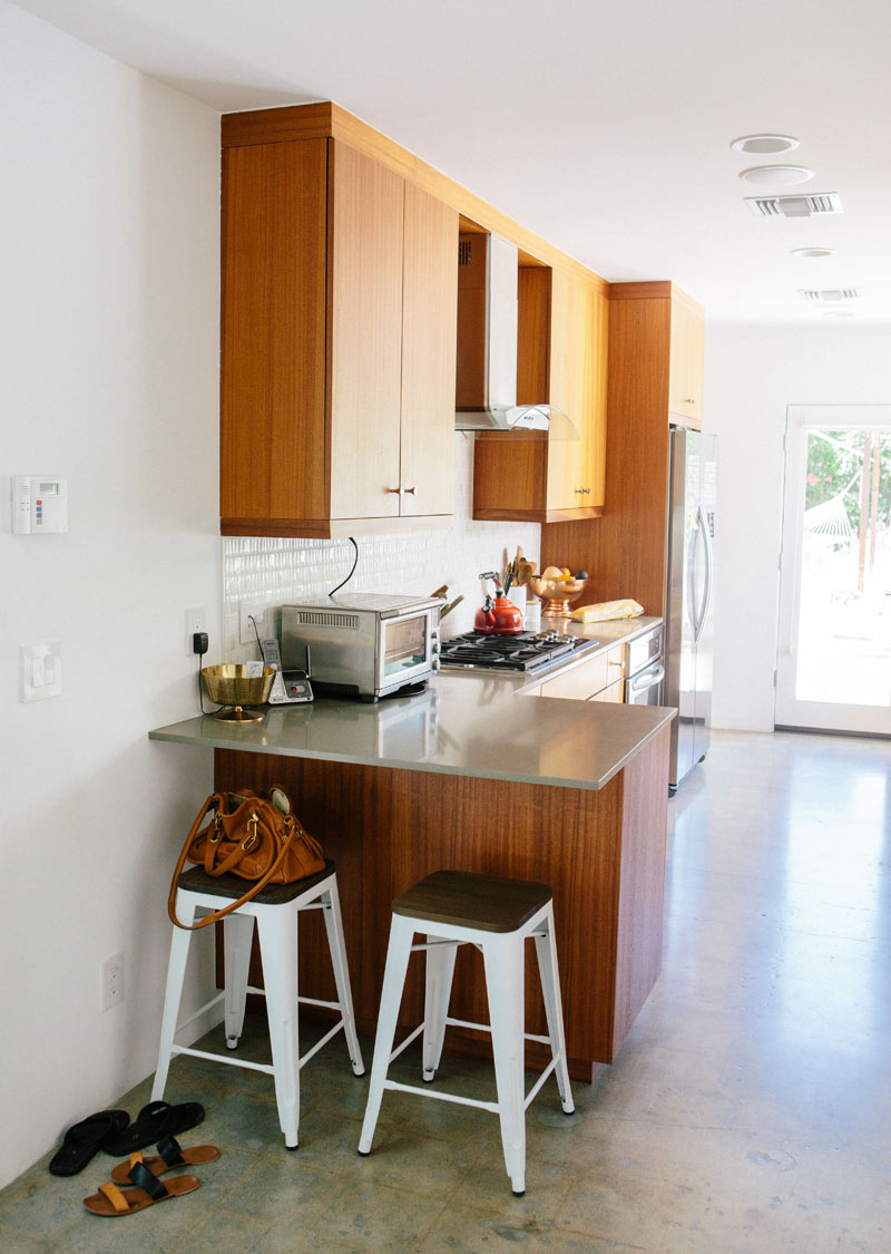
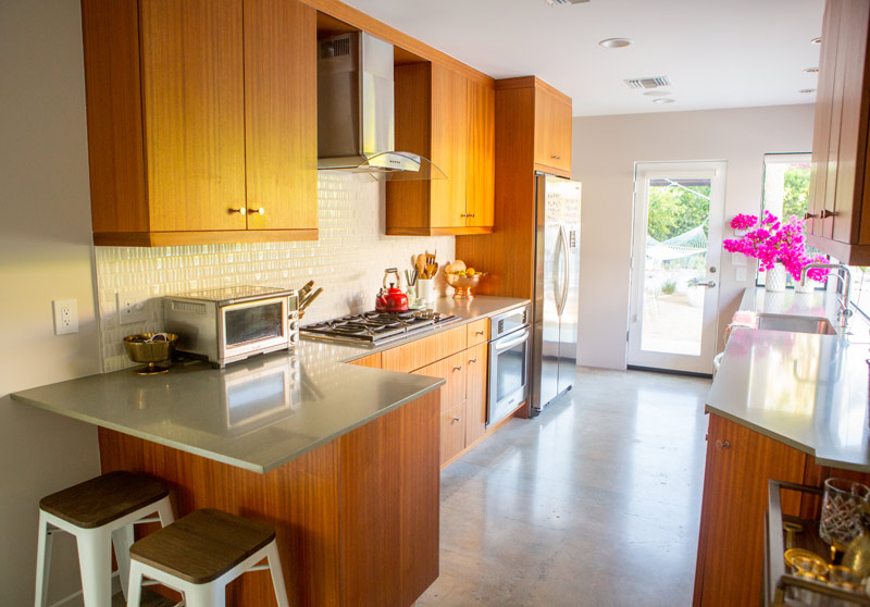
Hello my friends, welcome to our kitchen! This is where the REAL magic happens. I’m talking about cookies, of course! But in all seriousness, is it not true that whenever guests come over everyone gathers in the kitchen at some point? Even when it’s a galley kitchen with barely any space to socialize, it’s a hub! When we moved into the house the kitchen was white (seen above) and in all this time we hadn’t really thought to personalize it much. I guess it felt like a room of function for me. A room I loved, for sure, but didn’t know how to put my own spin on.
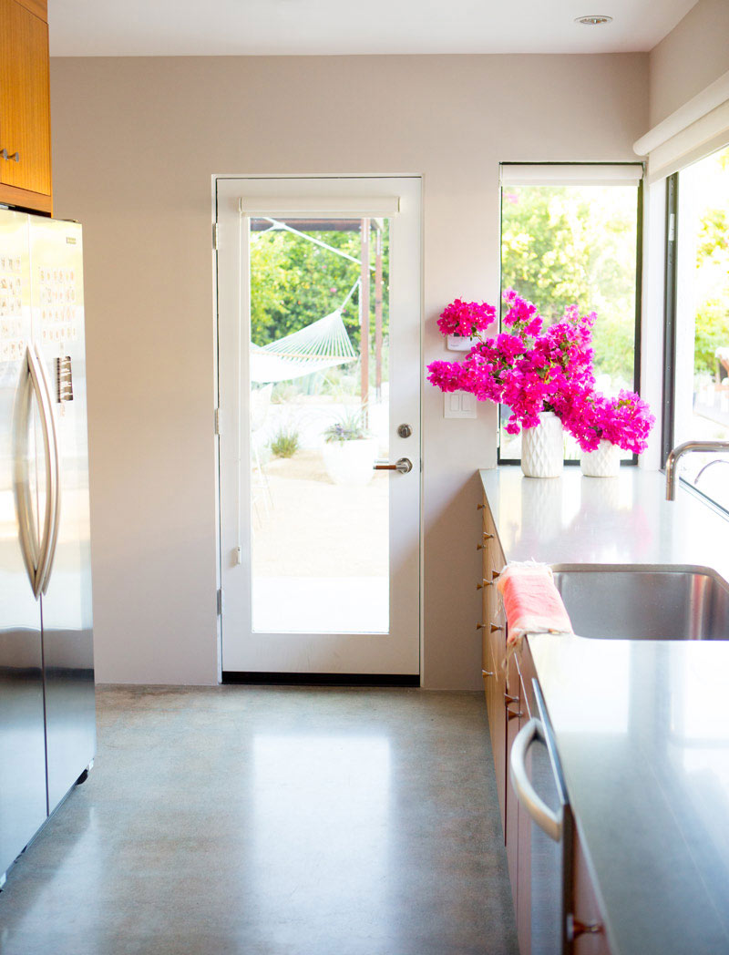
Truth be told, I still wasn’t really thinking about it the day I was playing around with Benjamin Moore’s amazing tool Design What Matters. I was having fantasies about mixing things up in the dining room and then it dawned on me- the kitchen is what really needed the paint love! And, as of course the story goes, it was only a matter of days before this beautiful color (Benjamin Moore “Abalone”) was up on the walls and I was falling in love with our kitchen all over again! That’s my favorite thing about paint- it’s such a quick and easy way to change up your space. It’s always so exciting, right? I love that the color takes on a bit of warmth from the cabinets and the tonality is light enough that it still fits with the rest of the house while also providing a bit of separation. It’s just amazing what a bit of paint can do to a space! What do you think, do you love it as much as I do? xx- Sarah {more after the jump}

This post was sponsored by Benjamin Moore. Thank you for supporting our incredible sponsors!


Lovely!!!!
Thank you Rose!
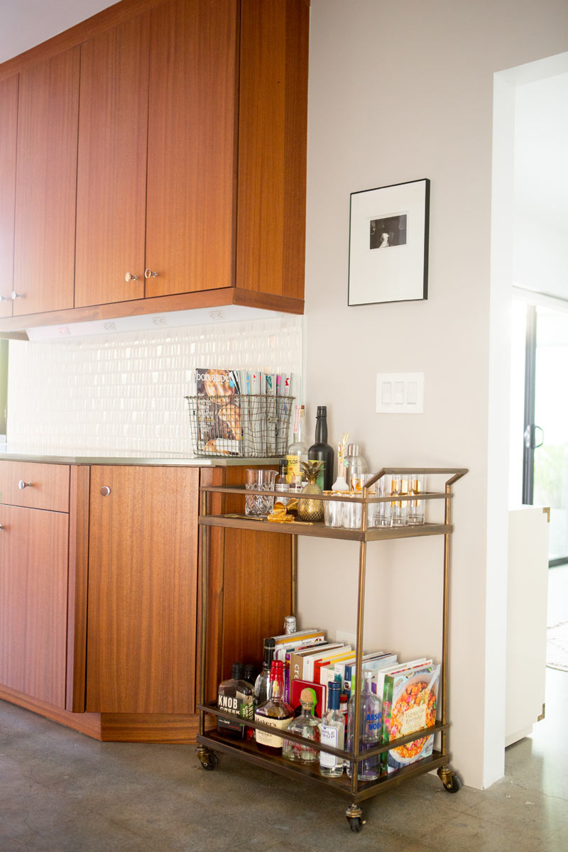
At first the new paint doesn’t feel like a drastic change happened but the second last photo shows that the wood color of your kitchen cabinets comes out much nicer now and the whole kitchen is much more in harmony.
http://blackwhitevivid.com
Hi Kati! I agree, it doesn’t seem too dramatic but actually makes a huge difference in the feel of the room. I love it so much!
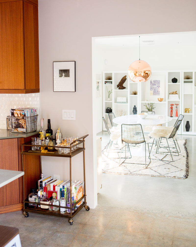
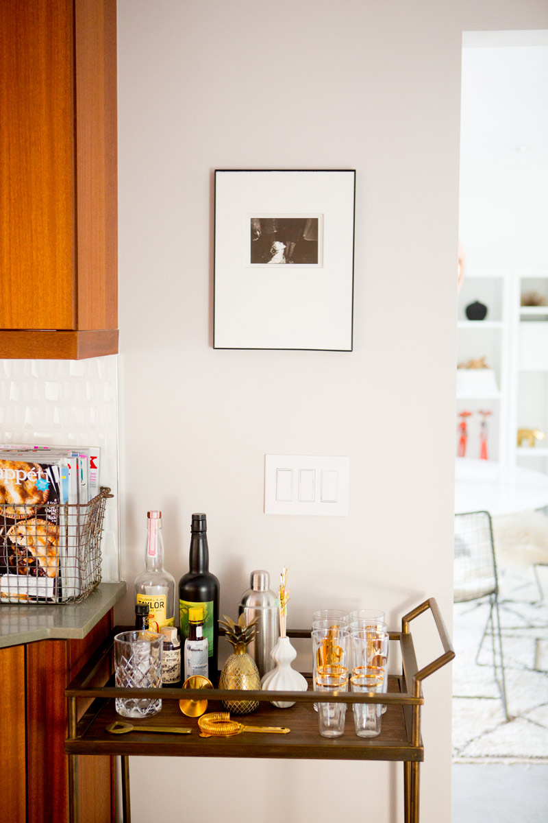
this paint color is magical. i love it! also, what is the photo above the bar cart? it looks super fun, but can’t completely make it out.
Thanks Caitlin! That’s a photo from a photographer friend of Lou’s. It’s a woman dancing at a wedding.
so beautiful and warm
Thanks so much Madeline! xx
SO lovely! Great choice Sarah
Thank you Jacquelyn! <3
This looks awesome!
Thanks Abigail, happy you like it as much as I do!!
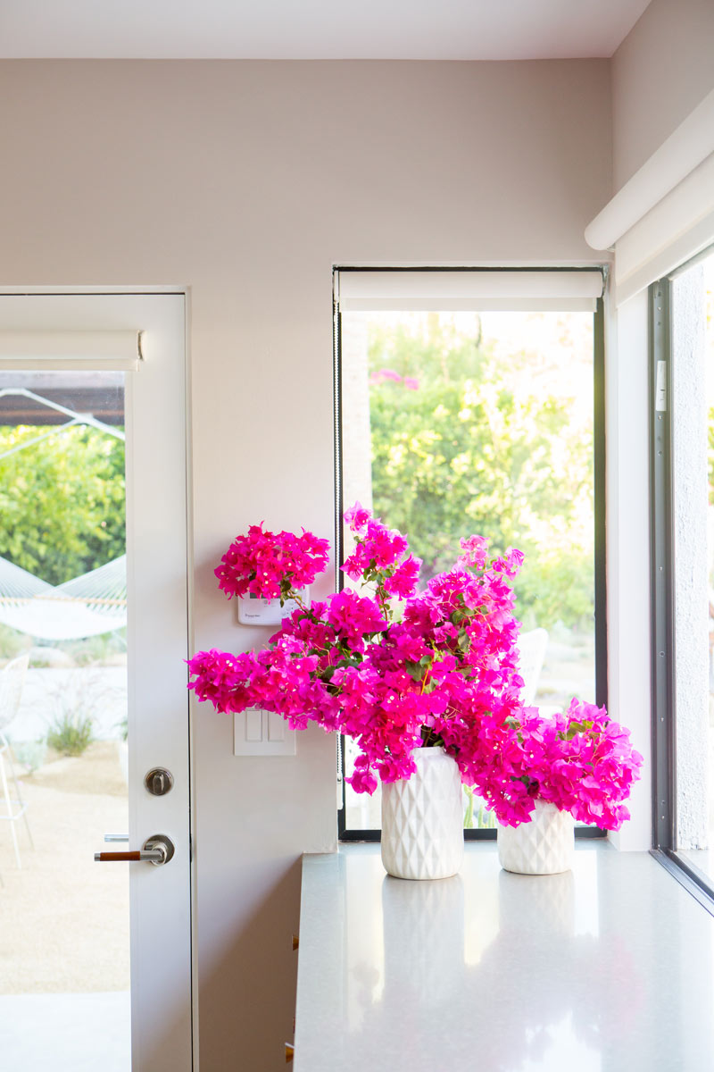
The color is subtle, but it does warm up the room. Your kitchen looks great! I really love the hot pink flowers you added to add a pop of color!
-Chanelle :: thekimchronicles.com
Thanks Chanelle! They’re bougainvillea and they grow like crazy around here!
“Design What Matters” is a seriously awesome tool! I’m not good with visualizing so to be able to see how the colors actually look in a room is fantastic. And you’re right – nothing changes up a room like a fresh coat of paint! I feel a project comin’ on….
Right?! Time to get going!!! It’s so much fun! xx
Such a soft neutral, really works with your cabinets and floor. I might also extend the counter material down alongside the seating area where the stools are. It would look a bit more finished and modern – though it looks great now as well. How is your kitchen floor done – is that patterned waxed concrete? I like it!
I agree Elle, the countertop would look amazing if it extended down the side. In my dream world it would all be replaced with carerra marble or something similar. The floors are polished concrete. Thanks for all the kind words!
It’s quite beautiful, Sarah! The entire room is just so gorgeous. I do adore your style. Also.. bar cart! Where did you get it? It’s exactly what I have been looking for.
Thanks Latrina! The bar cart is from Target! xx
Stunning! I love a neutral kitchen. And those bougainvillaea look INSANE in your modern kitchen.
Thanks so much Vanessa!
Hi Sarah, love this post, the colors …it’s all gorgeous. May I inquire as to the source of the dining room bookshelves?
Thanks, Liz
Hi Liz, Thank you for the kind words! The dining room shelves are from Room and Board (we had them painted white).
Looks AWESOME, Sarah, so neat to finally (??) see your kitchen! I don’t think I’ve seen it before and always assumed you were photographing your food photos on the counter, but apparently not! Doesn’t matter, just an observation/assumption
Hope you’re having a good day. Cheers.
I adore those cabinets and the counters are lovely too!
Love your home, I want to live there now!!
I must ask, where is that amazing dining room table from?
Best,
Hannah
Thanks Hannah! It’s a Saarinen table reproduction. I’m not sure of the exact company who made it, unfortunately- we purchased it locally.
This is beautiful! My husband and I live in a mid century modern home with a narrow kitchen off the side of the house that’s similar to yours. Since we can’t have an open kitchen to the inside of the house, we have dreamed of having it open to the outside like yours. It gives me hope that someday our kitchen can look beautiful too. Here’s our kitchen and blog if you’re curious: http://www.jjmodern.com/?p=251 Thanks for the inspiration!