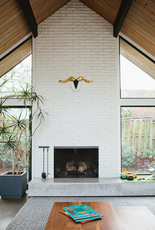
I’m in love with this home tour from Apartment Therapy, photographed by Leela Cyd. It’s right up Lou’s design alley, he’d be SO right at home in such a well edited space, where nothing extraneous remains and everything has it’s place. I need a space to be filled up a bit more to feel like home to me, but I can definitely appreciate the minimalist approach and this home is shining example of it! Fortunately Lou is flexible and can live happily in a space that’s quite the opposite of minimalist. What do you think? Do you love this well-edited spaced or do you prefer a little more to look at? xx- Sarah {more after the jump}
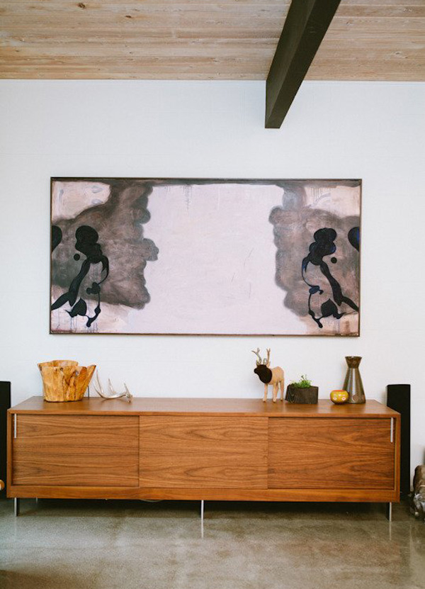
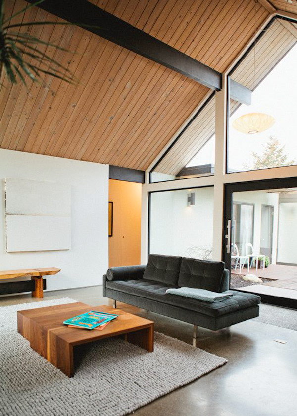
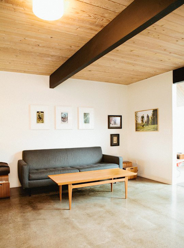


i am all about minimalism as of recently. within the last 6-8 months, i've realized that a cluttered home makes for a cluttered brain – at least for me! i've taken drastic measures to get rid of lots of 'stuff" i.e. junk that i don't need or want. this is a beautiful space….done just right!
I can appreciate the space, it is very beautiful, but I need a little…more to feel like home. It just looks a little stark and too magazine-y.
This, I have to agree, looks a little magazine-y. Or, like someone is coming over and you want to seem like you don't live in your house. Truth be told, I have way too much stuff for a house like this. Although beautiful and I see the appeal. I want to feel like I can put my purse down, kick off my shoes, and take off all my loud heavy jewels and not be making the house dirty. Ya' know? You're lucky that Lou likes tidy. Mine would live in a pile of mail and used tissues and dirty laundry. It's actually a thing we argue about most. sigh.
This is right up my alley! I love having a house with nothing so that I can come home & just be completely relaxed. So pretty!
This looks like the type of home that is about to be sold – when the owners take out anything personal down to the bare minimum so that a new buyer could visualize their stuff here.
White brick wall around the fireplace looks tacky when so much better materials available & why paint over a brick wall…
Oh im sold on this one! I prefer simplicity with a couple bold statements throughout the house. Love the look of this place! Thanks for sharing xx
love all the openness, thanks for sharing!
I like to have a little bit more in my apartment, but I can totally relate when people like to have their homes tide up. This one feels comfortable even with out tons of accessorizes.
I love all of them!
oh the openness and the furniture!
Hey – any idea what kind of plant that is in the top picture? Love it and have been wanting one…
I saw one in my neighborhood at a cafe (in SF) and took a picture, but can't seem to find one at a plant store — not sure where to look but thinking if I knew the name it would help…Thoughts???
Please fix the title—should be ITS FINEST. not IT'S.