What Colors Make a Room Look Bigger? Top 19 Shades
Most people assume small rooms are stuck feeling small, but the walls aren’t really the problem. The paint usually is, and the right shade can change everything.
Knowing what colors make a room look bigger helps stretch tight spaces visually, bounce light into dark corners, and make cramped layouts feel surprisingly roomy and breathable.
Below is a breakdown of designer-loved colors that open up compact spaces, the science behind why they work, which shades to avoid, and smart design pairings.
Why the Right Paint Colors Make a Small Room Feel Bigger?
Paint color does more than decorate; it shapes how big or small a room actually feels. Light reflection and tone work together to stretch walls visually and open tight spaces.
Cool, light colors bounce natural light around the room, while warm or dark shades absorb it.
This temperature difference directly changes how expansive or closed-in your small space appears.
Beneath every color lies a hidden undertone that shapes the mood. Warm undertones like beige or pink pull walls inward, while cool blues and greens visually push them outward.
Lighter, cooler, muted shades soften harsh edges and let light flow freely across surfaces. The result is an airy, open feel that makes even the smallest room breathe with ease.
Best Paint Colors to Make Small Rooms Feel Larger
Picking the right shade can completely reshape a tight space.
Below are designer-loved paint colors, grouped by tone, that work like magic to make compact rooms feel bright, breezy, and beautifully roomy:
1. Soft Whites & Off-Whites

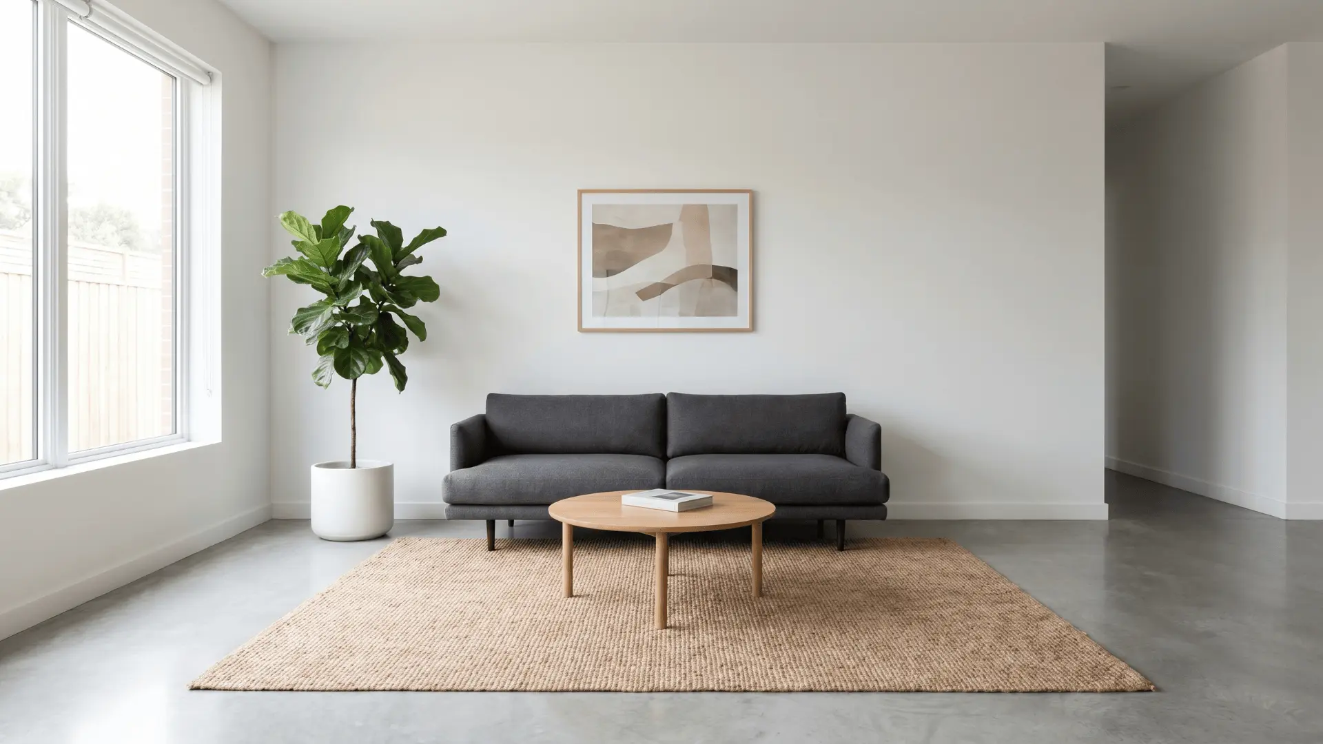
Nothing opens a small room faster than a well-chosen white. These shades reflect light and keep things feeling clean and spacious:
1) White Dove (OC-17)
White Dove is a popular white paint that reflects daylight beautifully. It makes small rooms look bright and airy without ever appearing too cold or clinical.
This shade suits living rooms, hallways, and bedrooms equally well. Its soft, balanced tone helps snug spaces breathe and appear noticeably more spacious and inviting.
2) Alabaster (SW-7008)
Alabaster is a warm off-white with a soft, creamy undertone. It gives tight rooms a cozy look while still reflecting enough light to leave things appearing open and fresh.
This color goes nicely with natural wood tones and neutral decor. It adds quiet warmth to cozy corners without making the room seem heavy or closed in.
3) Swiss Coffee (OC-45)
Swiss Coffee is a light, mellow off-white with a soft, gentle glow. It brightens small rooms and creates a clean, calm mood without looking too stark or plain.
This shade is ideal for rooms that get limited natural light. Its warm finish lifts tight spaces and leaves everything looking neat and comfortably uncluttered.
4) Greek Villa (SW-7551)
Greek Villa is a creamy off-white that suits almost any decorating style. It warms up small rooms, softens sharp edges, and gives tight spaces a sunny, welcoming look.
This color does especially well in rooms that receive natural light. It helps dim corners appear brighter and gives limited areas a fresh, relaxed, and comfortable atmosphere.
2. Light Neutrals

Neutrals do the quiet work of making rooms feel larger without drawing attention to themselves. These grays and greiges hit that balance perfectly:
5) Repose Gray (SW-7015)
Repose Gray is a soft, light gray that suits nearly any room. It adds gentle depth to small spaces without making them appear darker or visually boxed in.
This color looks great in both natural and artificial light. Its neutral tone leaves tight rooms looking modern and fresh while staying easy to match with most furniture.
6) Gray Owl (OC-52)
Gray Owl is a cool, pale gray with subtle blue undertones. These undertones visually push walls outward, helping small rooms appear noticeably larger and more open.
It creates a calm and balanced mood throughout the entire space. This makes it a great pick for bedrooms, bathrooms, or any snug room that needs a light refresh.
7) Perfect Greige (SW-6073)
Perfect Greige combines warm beige and cool gray into one balanced tone. It adds soft character to small rooms while leaving them looking light, neutral, and comfortable.
This color is very easy to decorate around. It goes nicely with wood tones, whites, and soft fabrics, giving tight spaces a cozy look without appearing cluttered.
8) Edgecomb Gray (HC-173)
Edgecomb Gray is a warm greige that reads both natural and grounded. It sits beautifully alongside daylight and earthy decor, giving small rooms a quiet, balanced look.
This shade is a natural fit for living rooms and entryways. Its gentle warmth helps cozy spaces appear more open and connected with the rest of your home.
3. The Blues

Cool blues naturally push walls back and add a calm, airy quality to tight spaces. These shades bring that effect without feeling cold:
9) Palladian Blue (HC-144)
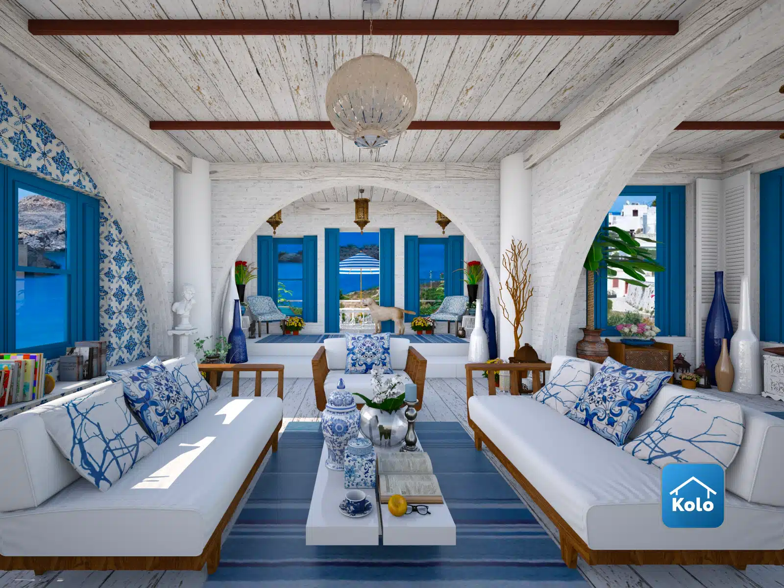
Palladian Blue is a soft, watery blue with a calm, spa-like quality. It adds visual depth to small rooms while holding the mood relaxed, breezy, and serene.
This color suits bathrooms, bedrooms, and reading nooks especially well. Its gentle tone makes snug spaces look peaceful and a little more open than they actually are.
10) Breezy (SW-7616)
Breezy is a cool, light blue that visually pulls walls back. This recession effect makes tight rooms appear wider and more open without any structural changes needed.
Its mellow undertones maintain a calm and relaxed atmosphere. Breezy is ideal for bedrooms, small offices, and any limited space that could use a lighter, more open look.
11) Breath of Fresh Air (806)
Breath of Fresh Air is a soft, pale blue that makes any room feel instantly lighter and more open. Its cool, airy tone is calm without being cold.
This color suits bedrooms, bathrooms, and small living areas very well. It reflects light gently and gives tight spaces a relaxed, clean, and quietly refreshing look.
12) Mineral Springs (CC-848)
Mineral Springs is a powdery, muted blue that brings a quiet, settled calm to any room. Its soft tone sits somewhere between blue and gray, making it very easy to live with.
This color looks great in bedrooms and bathrooms where a peaceful mood matters most. Its dusty, cool finish gives small spaces a clean, restful look without feeling too stark.
4. Soft Green & Sage

Greens bring a grounded, organic quality that makes small rooms feel calmer and more open. These muted shades do it best:
13) Clary Sage (SW-6178)
Clary Sage is a muted, dusty green that reads calm and grounded. It complements neutrals and adds quiet roominess to tight spaces without overwhelming the look.
This shade suits bedrooms, bathrooms, and reading corners especially well. Its soft tone brings a natural, earthy quality that helps small rooms appear relaxed and connected to nature.
14) Sea Salt (SW-6204)
Sea Salt is a coastal sage that combines green, gray, and blue tones. It creates a calm, beachy mood that makes tight rooms appear breezy and naturally bright.
This color suits bathrooms and bedrooms near natural light very well. Its serene, layered tone leaves small spaces looking open, peaceful, and connected to the outdoors.
15) Healing Aloe (1562)
Healing Aloe is a muted green with a soft, organic quality. It brings nature indoors and helps small rooms look calm, peaceful, and a little more open.
This shade complements natural materials like wood, rattan, and linen beautifully. Its quiet tone adds a refreshing, earthy quality that makes snug spaces more comfortable and livable.
16) Lacewing (SW-6729)
Lacewing is a fresh, lively green that brightens up small rooms quickly. It adds personality and energy to snug spaces while maintaining a light and welcoming mood.
This color is a good choice for kitchens or small home offices. Its vibrant but soft tone livens things up without looking too bold or visually overwhelming.
5. Soft Blush & Reds

Warm blush tones add softness and light without the heaviness of bold color. These shades brighten tight spaces beautifully:
17) First Light (2102-70)
First Light is a gentle blush that adds warmth without ever looking heavy. It leaves small rooms appearing fresh and polished, making it perfect for bedrooms and relaxed living spaces.
This color whispers pink rather than announcing it too loudly. Its subtle tone brightens tight rooms and creates a calm, inviting mood that suits many different styles.
18) Blush (SW-6617)
Blush is a mellow pink that adds soft color without overpowering the room. Its quiet tone leaves small spaces looking bright, airy, and visually wider than they actually are.
This shade is a great option for bedrooms and small bathrooms. It complements white trim and natural textures, adding gentle warmth to any cozy area.
19) Foxy (SW-6333)
Foxy is a bold, deep shade that adds real drama to small rooms. When used thoughtfully, it creates depth and dimension, making the walls appear to fade back.
This color is best used as an accent or in rooms with good lighting. Its richness gives snug spaces a cozy, layered look that reads intentional and well-designed.
When to Avoid Certain Colors for Small Rooms?
Choosing the wrong paint can shrink a small room faster than any furniture mistake. Some shades absorb light and close in walls rather than opening them up. Here is what to avoid:
| Color Type | Why to Avoid | Examples |
|---|---|---|
| Mid-tones and Dark Shades | Close in the room visually, making compact spaces feel heavier and tighter | Charcoal, deep brown, slate |
| Saturated Colors | Absorb light rather than reflect it, directly shrinking how large walls appear | Deep red, mustard yellow, muddy green |
| Bold Shades in Low-Light Rooms | Overwhelm small spaces without strong natural light or reflective surfaces to balance | Navy, forest green, burnt orange |
| High-Contrast Two-Tone Walls | Visually chop up the room, making it feel divided and smaller than it actually is | Dark bottom, light top combinations |
| Warm Undertones on All Walls | Pull walls inward rather than pushing them outward, reducing the sense of space | Peach, terracotta, warm beige |
How to Pair Paint with Smart Room Design?
Paint sets the foundation, but room design seals the spacious feel. Lighting, furniture scale, and décor work together with color to shape how open and airy a small room actually appears.
Pair light paint colors with reflective surfaces like mirrors, glass tables, and metallic accents. Add minimal furniture and open layouts so light can travel freely without bumping into bulky, space-eating pieces.
The best results come from a full design approach where color, furniture, and layout work in harmony. Treating each element as part of one cohesive plan opens up maximum room in any small space.
Remember, even the perfect paint color can’t rescue a cramped layout. Oversized, dark, or poorly placed furniture blocks natural light flow and instantly cancels out every visual benefit your walls provide.
Wrapping Up
Now you know what colors make a room look bigger, the right paint can stretch tight walls, bounce light, and turn cramped layouts into breathable, comfortable spaces.
Lighter, cooler, and muted shades carry the most impact, while bold or saturated tones often shrink rooms when used without enough natural light or balance.
This matters because paint is the cheapest, fastest fix for any small space. The right shade saves money, time, and the trouble of major renovations or layout changes.
Ready to pick your perfect shade? Browse our complete color guide and design tips section to find more ideas that suit your home’s style.
Frequently Asked Questions
Should the Ceiling Be the Same Color as the Walls in a Small Room?
Yes, Painting the Ceiling the Same Shade as the Walls (or Slightly Lighter) Blurs the Boundary Between Them, Tricking the Eye Into Seeing More Vertical Space.
Does Paint Finish Affect How Big a Small Room Looks?
Yes, Satin and Eggshell Finishes Reflect More Light than Flat or Matte, Making Walls Appear Brighter, and the Room Feel Slightly Larger without Changing the Actual Color.
What’s the Best Paint Color for a Small Room with No Windows?
Bright Off-Whites Like Swiss Coffee or Alabaster Work Best, Since They Reflect Every Bit of Artificial Light Available and Prevent the Windowless Space from Feeling Like a Cave.