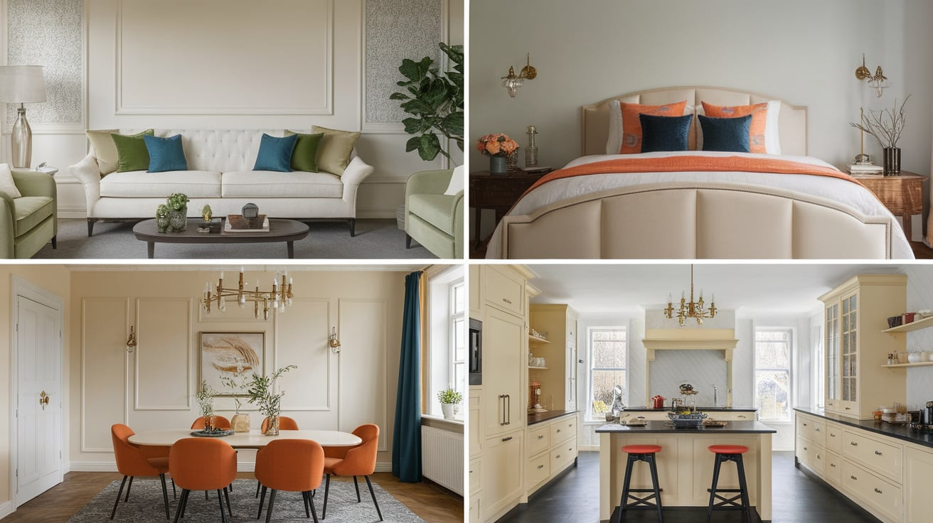
What Colors Go with Cream: 30 Easy Matching Ideas
Cream is one of those colors that feels calm, soft, and easy to live with. But when it comes time to style it, many people get stuck.
Should you pair cream with dark colors, soft neutrals, or bold shades? The good news is that cream works with more colors than you might think.
In this guide, you’ll find simple and practical ideas for colors that go with cream.
Why Cream is Easy to Match
Cream works well because it sits between white and beige, making it a soft neutral that blends easily with many colors.
- It has a warm tone that feels inviting and cozy
- It pairs well with both light and dark colors
- It works across styles, from modern to classic
- It looks good in homes, outfits, and accessories
A few smart choices are all it takes to make cream look polished and well-put-together.
Best Colors That Go with Cream
Cream pairs well with many shades because it sits softly between white and beige. The right color can make it feel warm, fresh, bold, or calm without much effort.
1. Navy Blue
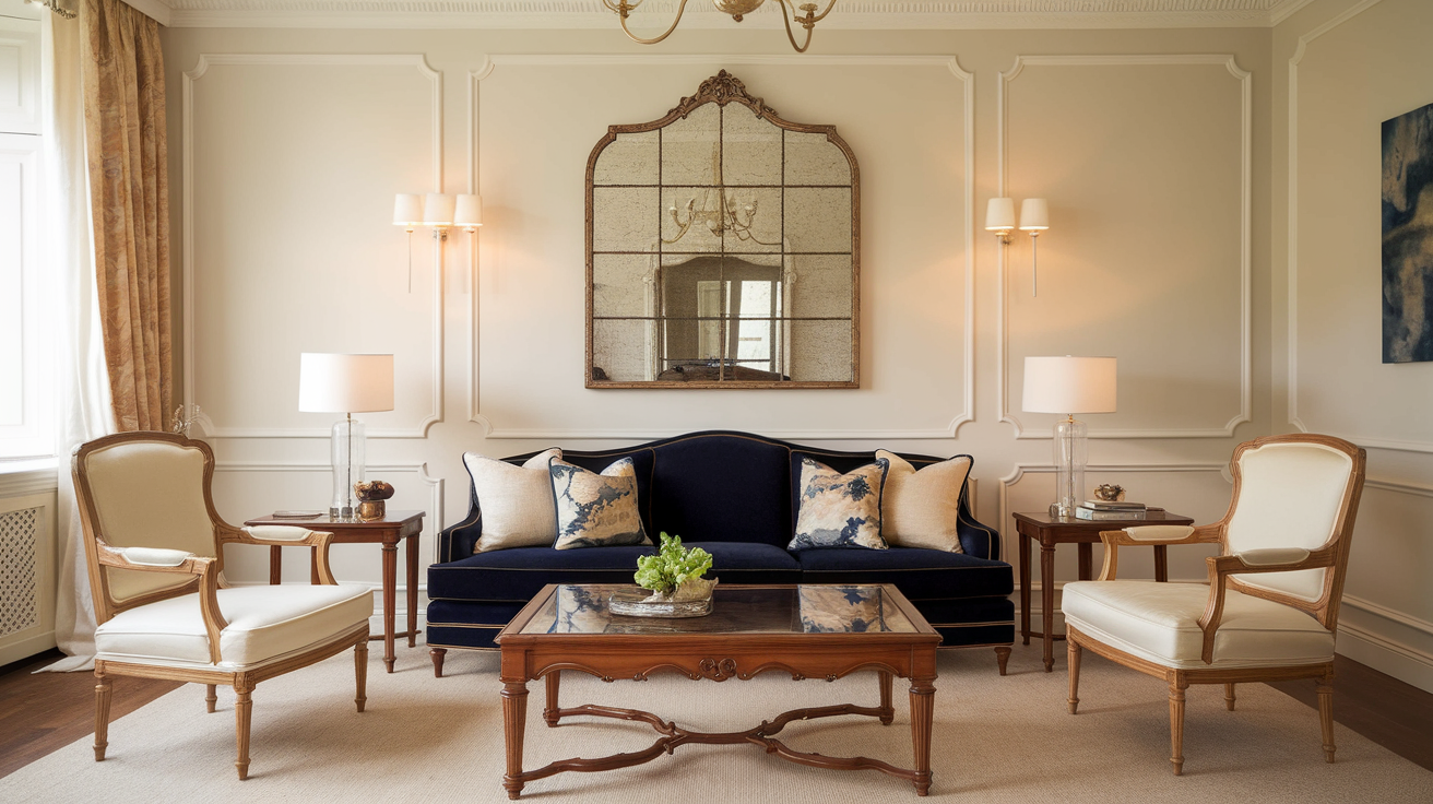
Navy blue adds strong contrast to cream without feeling harsh or heavy. It helps cream look cleaner, brighter, and more polished right away.
This pairing works well in both modern and classic spaces. Navy also grounds cream so it doesn’t feel too light or washed out. Together, they create a timeless look that feels balanced and intentional.
- Shades:Sherwin-Williams Naval, Benjamin Moore Hale Navy
- Best for: Living rooms, bedrooms, feature walls
- Style tip: Pair with warm wood to soften the contrast
2. Charcoal Gray
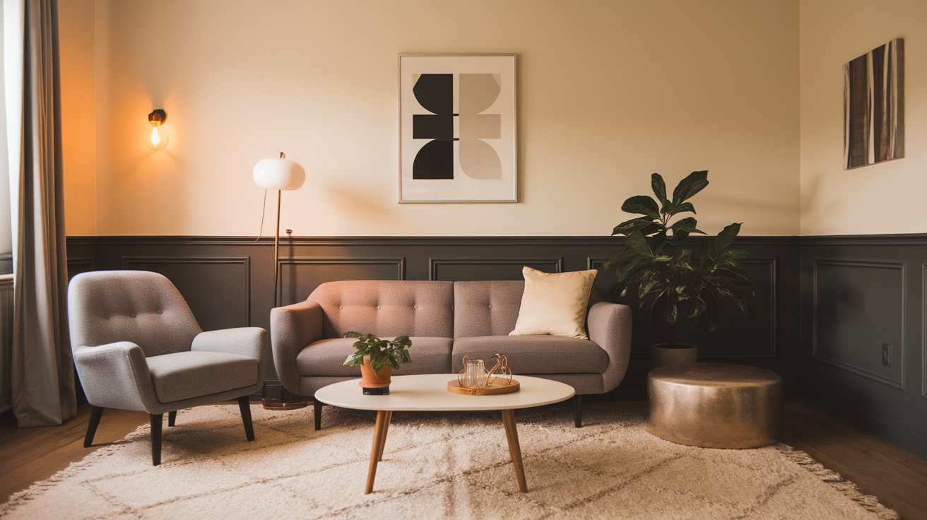
Charcoal gray is softer than black but still gives cream a sharp, clean edge. It adds depth while keeping the overall look calm and mature.
This combo feels modern without feeling cold or dull. Charcoal helps cream feel more defined and structured. It works especially well in simple or minimal designs.
- Shades:Benjamin Moore Kendall Charcoal, Sherwin-Williams Iron Ore
- Best for: Kitchens, offices, modern interiors
- Style tip: Use matte finishes for a softer look
3. Beige
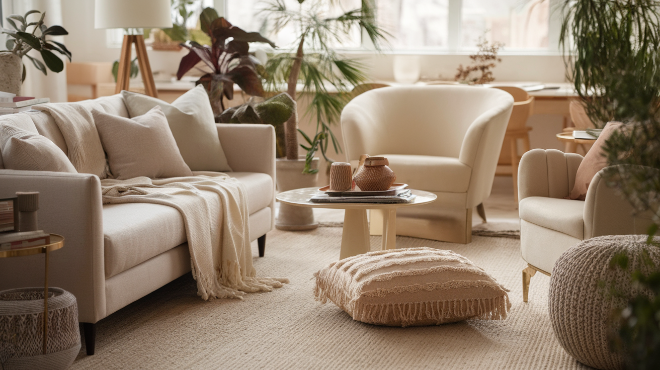
Beige and cream create a smooth, layered neutral look that feels easy and calming. This pairing works best when the shades are slightly different so they don’t blend together.
It gives a soft and cozy feel without feeling boring. Mixing textures helps keep the look interesting. Together, they feel warm and welcoming.
- Shades:Sherwin-Williams Accessible Beige, Benjamin Moore Natural Cream
- Best for: Bedrooms, cozy living areas
- Style tip: Add texture through rugs and fabrics
4. Camel
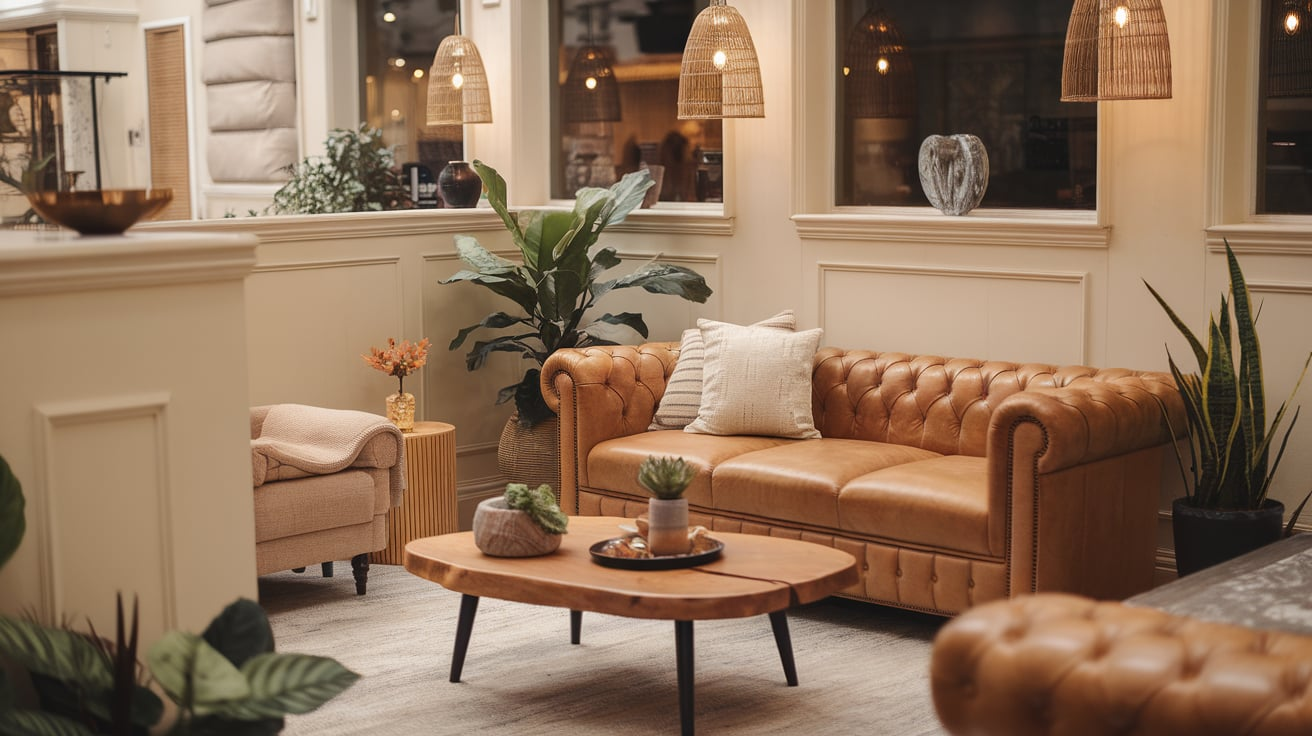
Camel adds warmth and richness to cream without overpowering it. It helps cream feel grounded and less pale. This combo looks simple but very well styled.
Camel works as a strong supporting color while letting cream shine. It feels polished and timeless in both homes and outfits.
- Shades:Benjamin Moore Alexandria Beige, Sherwin-Williams Camelback
- Best for: Accent walls, furniture, décor
- Style tip: Pair with brass or gold accents
5. Chocolate Brown
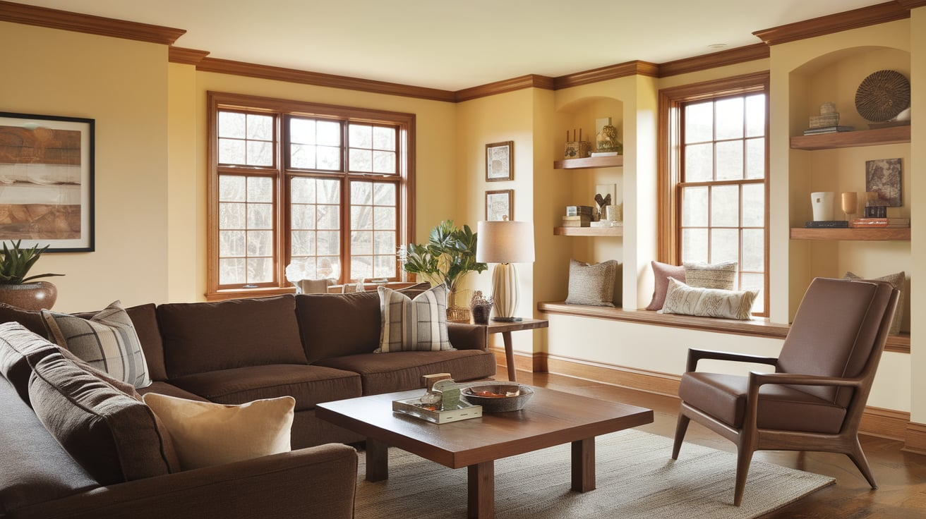
Chocolate brown gives cream a deep, cozy contrast that feels classic and rich. It adds warmth without needing bright colors.
This pairing works well when you want a comfortable and grounded look. Brown makes cream feel fuller and more inviting. It’s especially effective when used through wood or leather textures.
- Shades:Sherwin-Williams Turkish Coffee, Benjamin Moore Bittersweet Chocolate
- Best for: Furniture, trim, accent pieces
- Style tip: Balance with lighter textiles
6. Olive Green
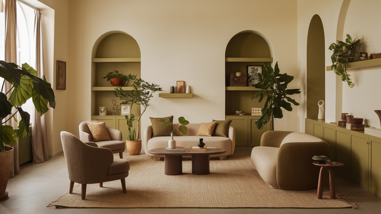
Olive green brings an earthy and relaxed feel to cream. It adds color while still feeling soft and natural. This combo works well in both bright and low-light spaces.
Olive helps cream feel calm and balanced. It’s an easy choice for everyday living and casual style.
- Shades:Sherwin-Williams Clary Sage, Benjamin Moore Tate Olive
- Best for: Living rooms, kitchens
- Style tip: Add plants to enhance the look
7. Sage Green
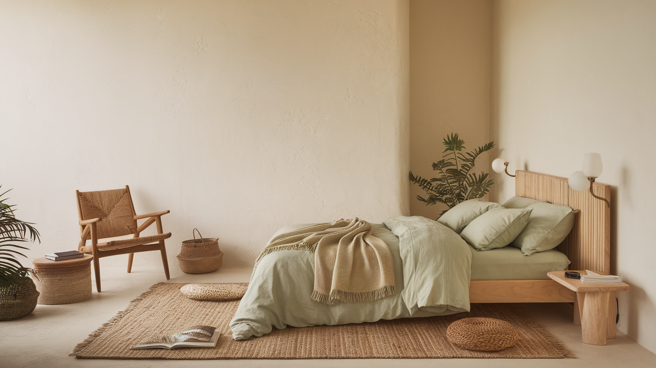
Sage green keeps cream looking fresh and light. It adds a gentle touch of color without taking attention away from cream.
This pairing feels peaceful and well-balanced. Sage also softens the overall look and makes spaces feel calm. It’s ideal for creating a relaxed mood.
- Shades:Benjamin Moore Saybrook Sage, Sherwin-Williams Sea Salt
- Best for: Bedrooms, bathrooms
- Style tip: Pair with linen or cotton textures
8. Terracotta
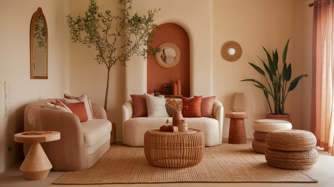
Terracotta adds warmth and character to cream. It brings in an earthy tone that feels cozy and natural. This pairing works best when terracotta is used in small amounts.
It keeps the look warm without feeling heavy. Terracotta helps cream feel more lively and grounded.
- Shades:Sherwin-Williams Cavern Clay, Benjamin Moore Terra Cotta Tile
- Best for: Accent walls, décor
- Style tip: Keep surrounding colors neutral
9. Mustard Yellow
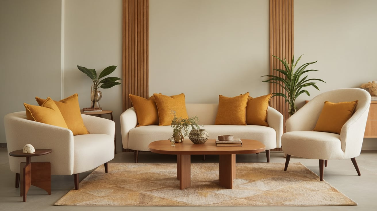
Mustard yellow brings energy to cream while staying warm and soft. It adds brightness without feeling too bold or loud.
This pairing feels cheerful and modern when used carefully. Mustard helps cream stand out more clearly. It works best as an accent rather than the main color.
- Shades:Benjamin Moore Golden Honey, Sherwin-Williams Nugget
- Best for: Cushions, small accents
- Style tip: Limit to one or two elements
10. Dusty Blue
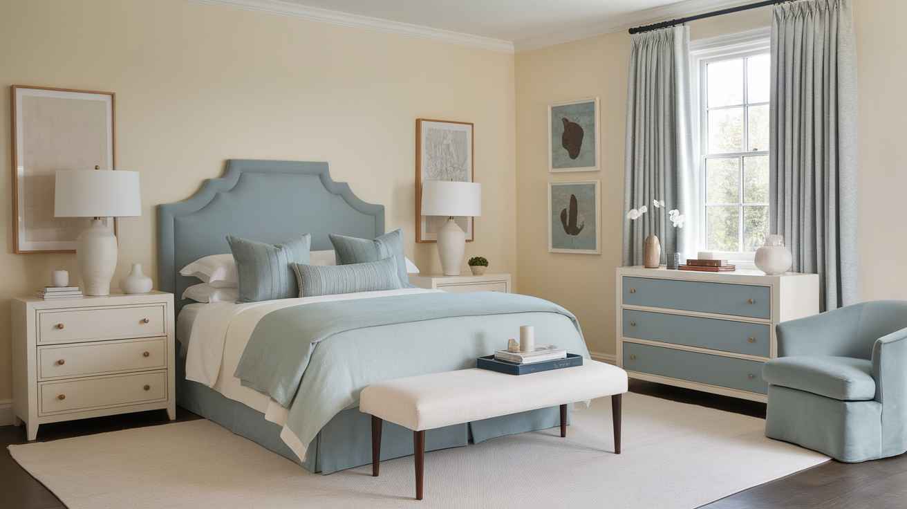
Dusty blue cools down cream in a soft and balanced way. It adds contrast without feeling sharp or cold. This pairing feels calm, clean, and slightly modern.
Dusty blue keeps the look relaxed and easy on the eyes. It works well for both spaces and clothing.
- Shades:Sherwin-Williams Smoky Blue, Benjamin Moore Boothbay Gray
- Best for: Bedrooms, curtains
- Style tip: Use warm lighting
11. Teal
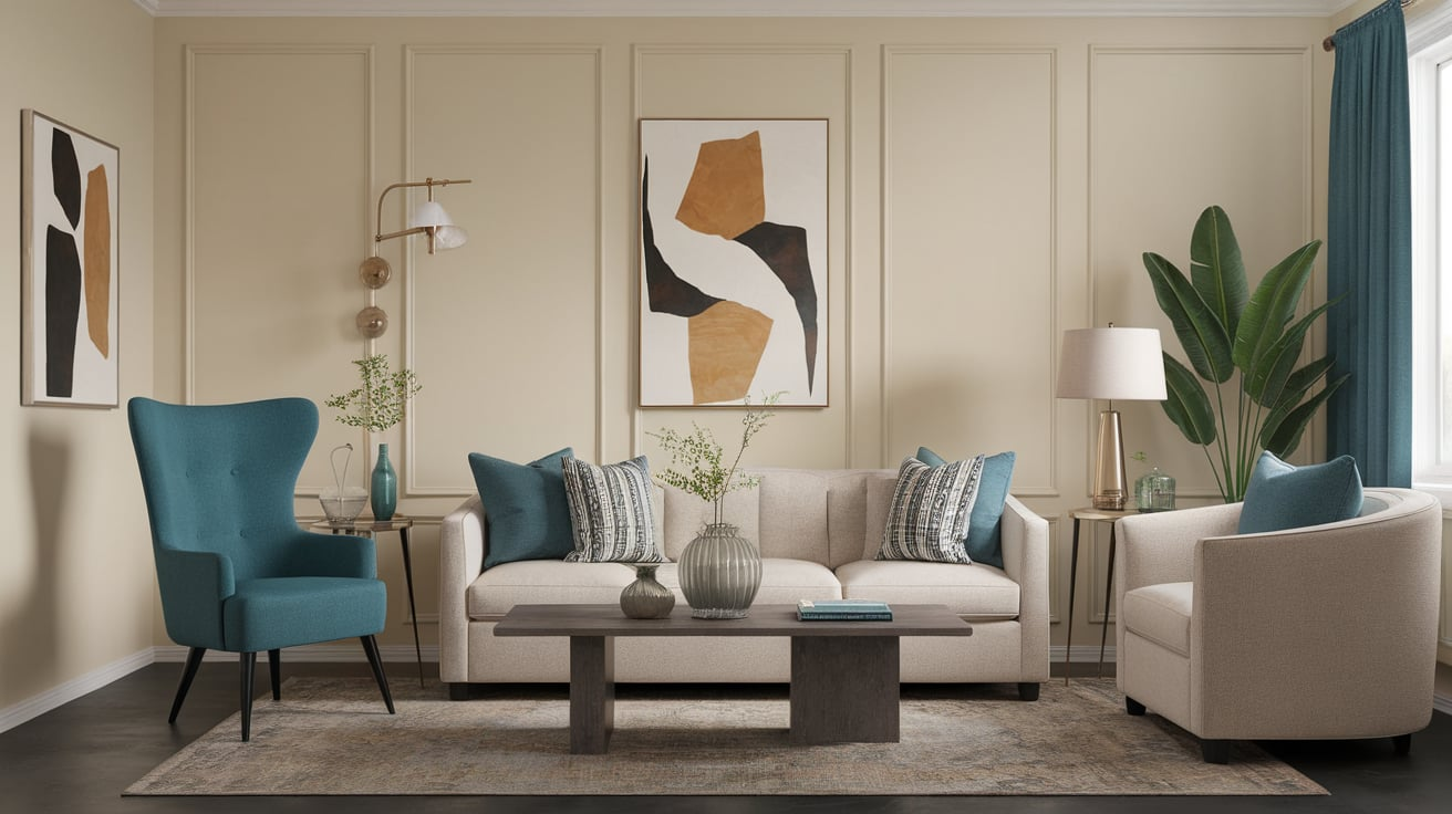
Teal adds depth and richness to cream without overpowering it. It sits between blue and green, which helps balance cream’s warmth.
This pairing feels bold yet calm at the same time. Teal gives cream a more modern and styled look. It works best when cream stays dominant and teal is used as support.
- Shades:Benjamin Moore Aegean Teal, Sherwin-Williams Riverway
- Best for: Accent walls, sofas, statement décor
- Style tip: Keep teal to one main feature
12. Forest Green
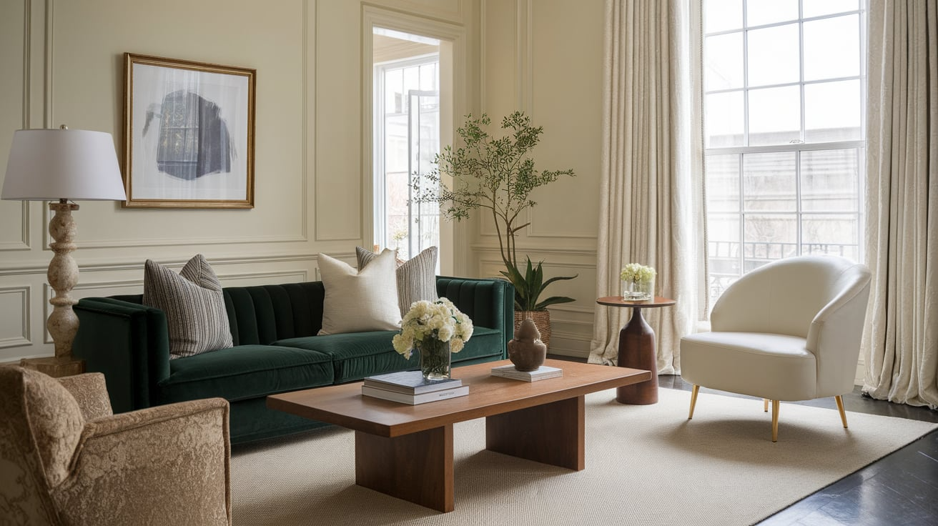
Forest green makes cream feel elegant and grounded. It adds a deep, natural contrast that still feels soft. This combo works well when you want a rich but calming look.
Forest green helps cream feel warmer and more refined. It suits both classic and modern spaces.
- Shades:Sherwin-Williams Ripe Olive, Benjamin Moore Essex Green
- Best for: Living rooms, dining spaces
- Style tip: Pair with wood furniture
13. Emerald Green
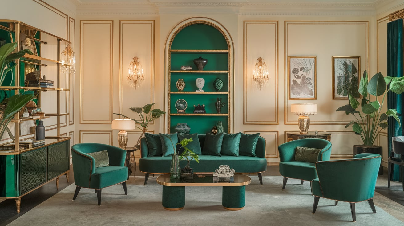
Emerald green brings a touch of luxury to cream. It adds bold color while keeping the look balanced. This pairing feels polished and slightly dramatic.
Emerald makes cream stand out without feeling dull. It works best when used in smaller amounts.
- Shades:Benjamin Moore Emerald Isle, Sherwin-Williams Hunt Club
- Best for: Accent chairs, décor pieces
- Style tip: Add gold or brass details
14. Blush Pink
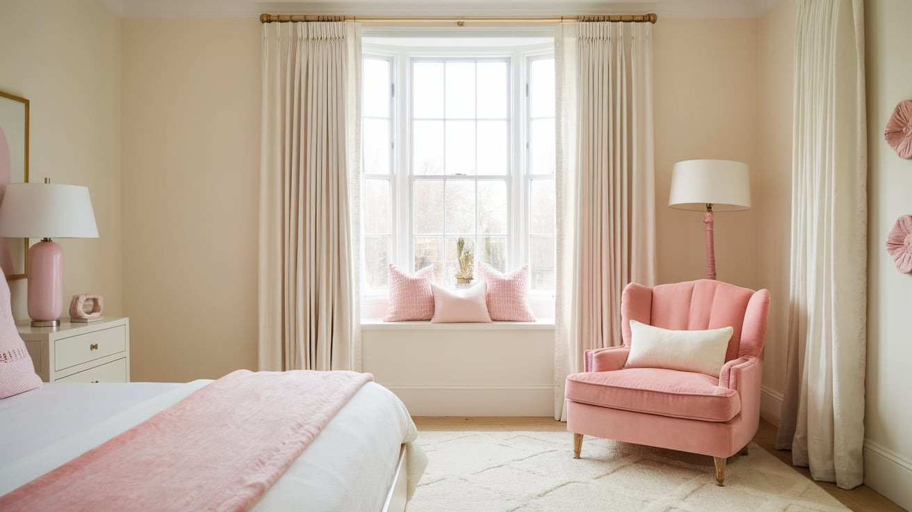
Blush pink softens cream and makes it feel fresh and gentle. The two colors blend smoothly without clashing. This pairing feels light, calm, and welcoming.
Blush adds warmth without being too sweet. It works well for relaxed and cozy settings.
- Shades:Sherwin-Williams Intimate White, Benjamin Moore First Light
- Best for: Bedrooms, nurseries
- Style tip: Keep pink muted and soft
15. Peach
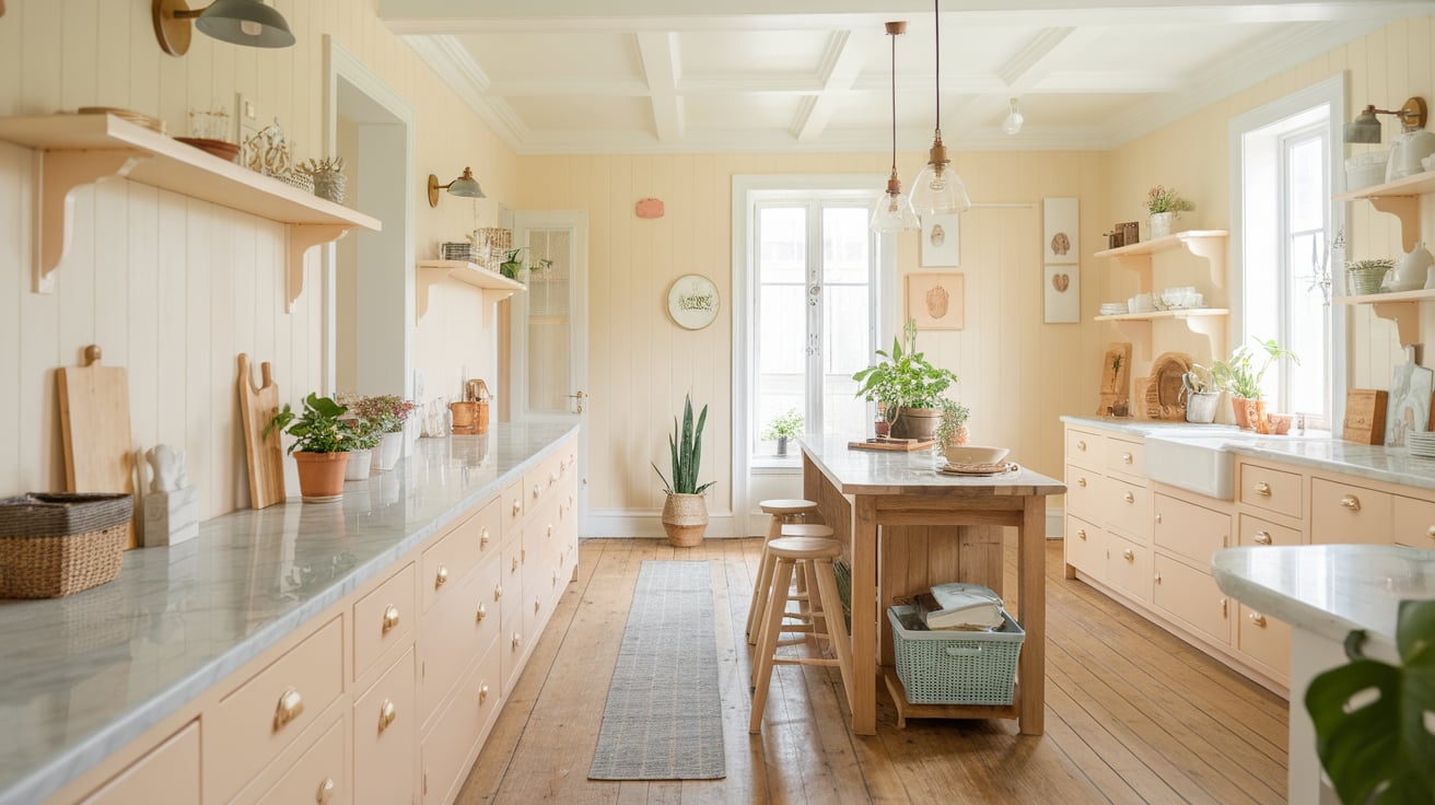
Peach brings warmth and brightness to cream. It works especially well when cream has a slight yellow or peach undertone.
This pairing feels cheerful but still soft. Peach adds color without overpowering cream. It’s best used in light or medium shades.
- Shades:Benjamin Moore Soft Shell, Sherwin-Williams Peach Blossom
- Best for: Living rooms, accent décor
- Style tip: Balance with neutral furniture
16. Lavender
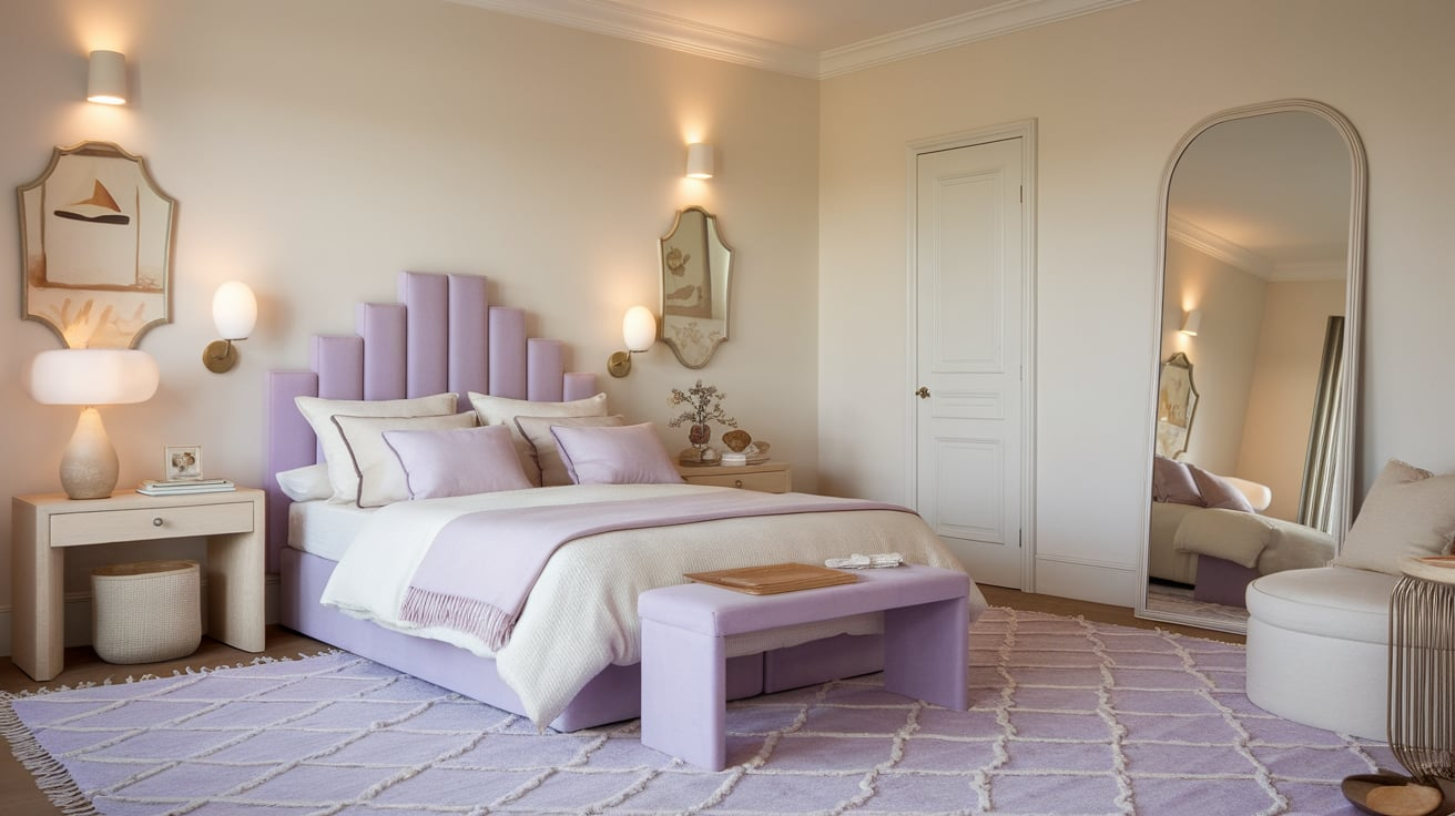
Lavender adds a calm and gentle contrast to cream. It brings in color without making the space feel busy. This pairing feels relaxed and slightly romantic.
Lavender works best when it’s muted rather than bright. It keeps cream looking soft and balanced.
- Shades:Benjamin Moore Lavender Secret, Sherwin-Williams Potentially Purple
- Best for: Bedrooms, quiet corners
- Style tip: Use warm lighting
17. Burgundy
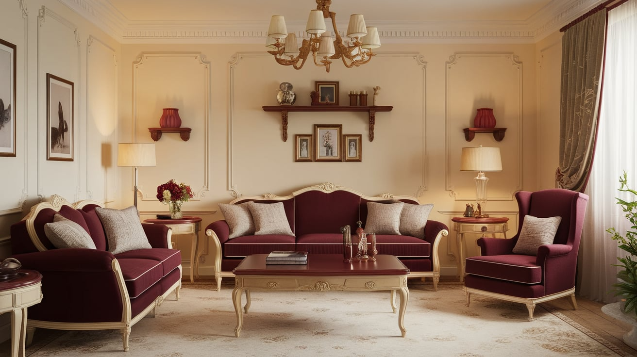
Burgundy gives cream a rich and cozy feel. It adds depth and warmth without feeling too dark. This pairing feels elegant and well put together.
Burgundy helps cream look more refined. It works especially well in cooler seasons.
- Shades:Sherwin-Williams Cordovan, Benjamin Moore New London Burgundy
- Best for: Dining rooms, feature accents
- Style tip: Balance with cream-heavy areas
18. Rust
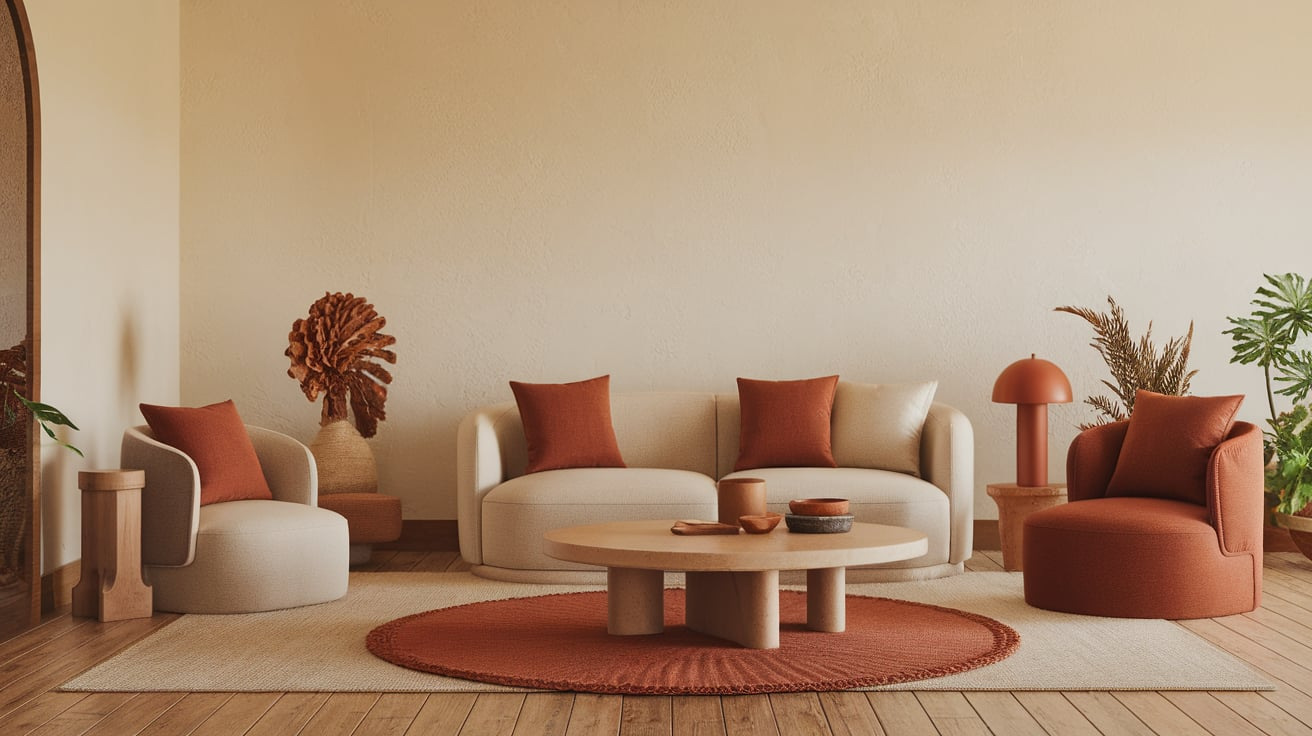
Rust brings an earthy and grounded tone to cream. It adds warmth while keeping the look natural. This pairing feels cozy and lived-in.
Rust helps cream feel less plain and more styled. It works best as an accent color.
- Shades:Sherwin-Williams Redend Point, Benjamin Moore Rustic Brick
- Best for: Cushions, rugs, décor
- Style tip: Use in small doses
19. Gold
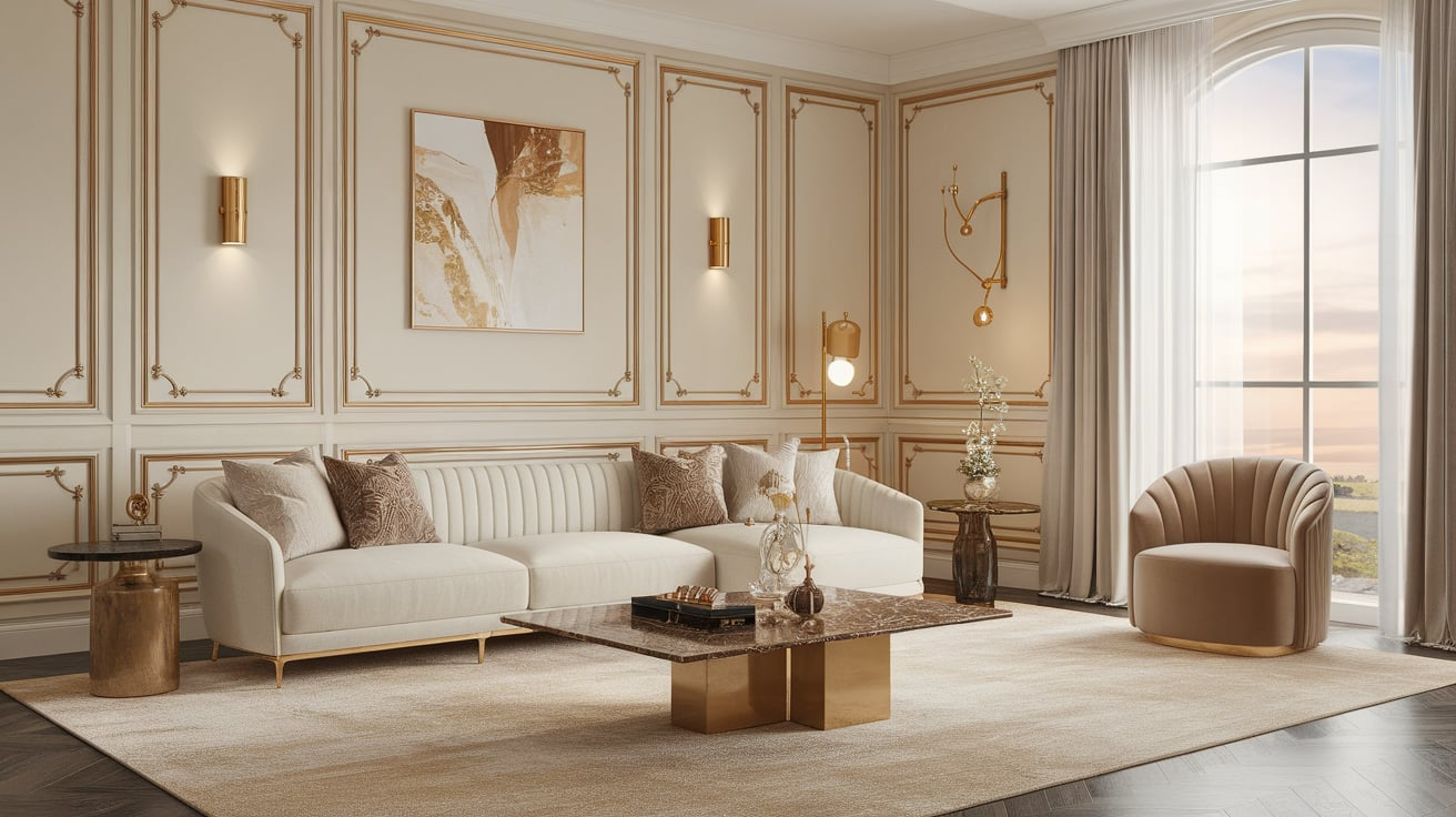
Gold adds warmth and a touch of shine to cream. It makes cream feel richer and more polished. This pairing works well without needing bold colors.
Gold accents help highlight cream’s softness. It’s best used in small details.
- Shades:Sherwin-Williams Polished Brass, Benjamin Moore Rich Gold
- Best for: Hardware, mirrors, lighting
- Style tip: Stick to warm metallics
20. Soft Black
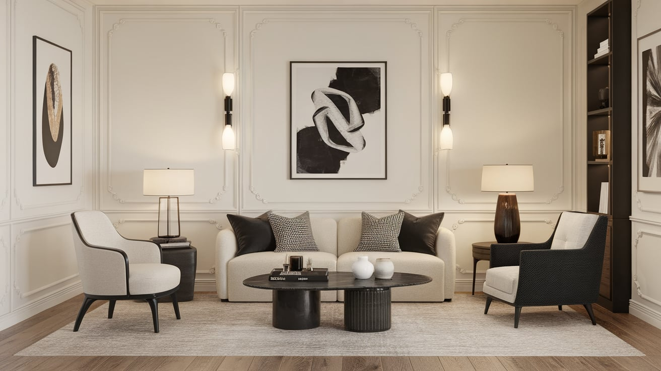
Soft black creates strong contrast with cream without looking too harsh. It gives cream a clean and modern edge.
This pairing feels sharp but still balanced. Soft black helps cream stand out clearly. It works well when mixed with warm textures.
- Shades:Benjamin Moore Wrought Iron, Sherwin-Williams Tricorn Black
- Best for: Kitchens, trim, modern spaces
- Style tip: Add wood to soften the look
21. Warm White
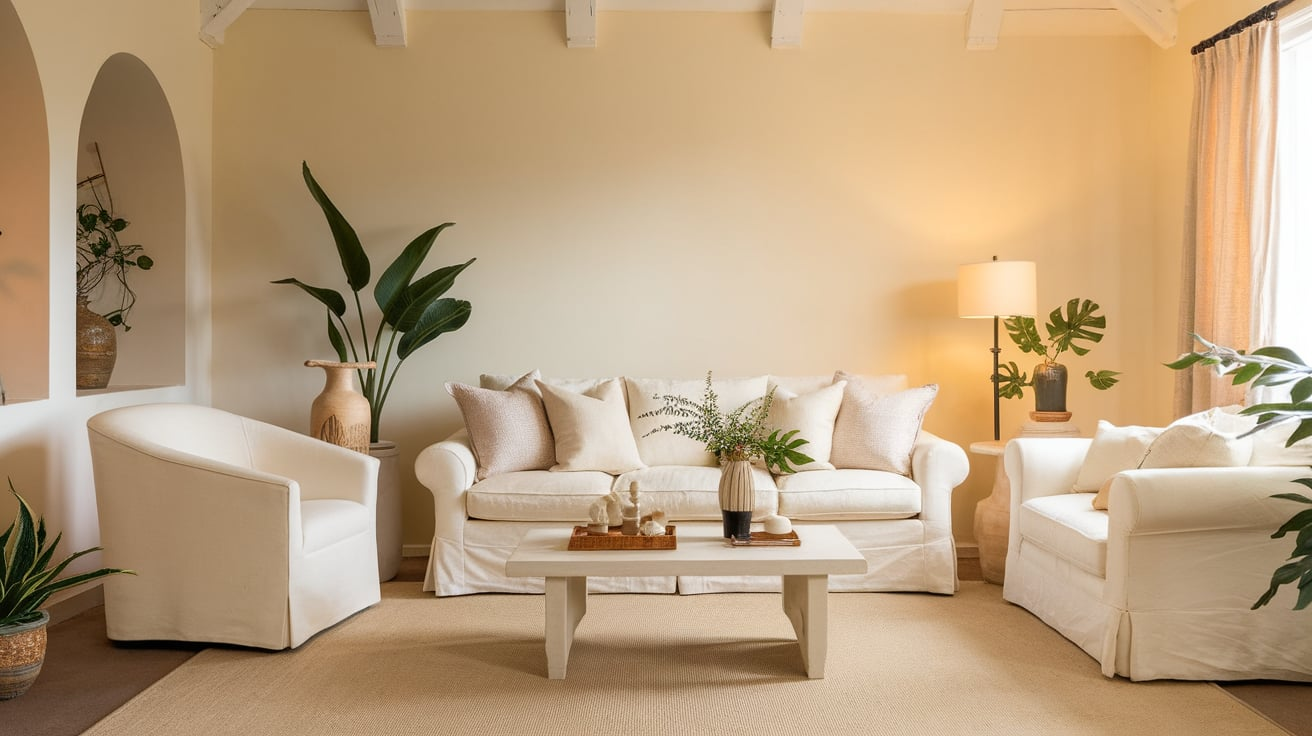
Warm white works beautifully with cream when you want a light and airy look. It keeps the space bright without creating a harsh contrast.
This pairing feels soft, clean, and very natural. Warm white helps cream look intentional rather than dull. It works best when the shades are clearly different.
- Shades:Sherwin-Williams Alabaster, Benjamin Moore White Dove
- Best for: Walls, ceilings
- Style tip: Avoid cool whites nearby
22. Greige
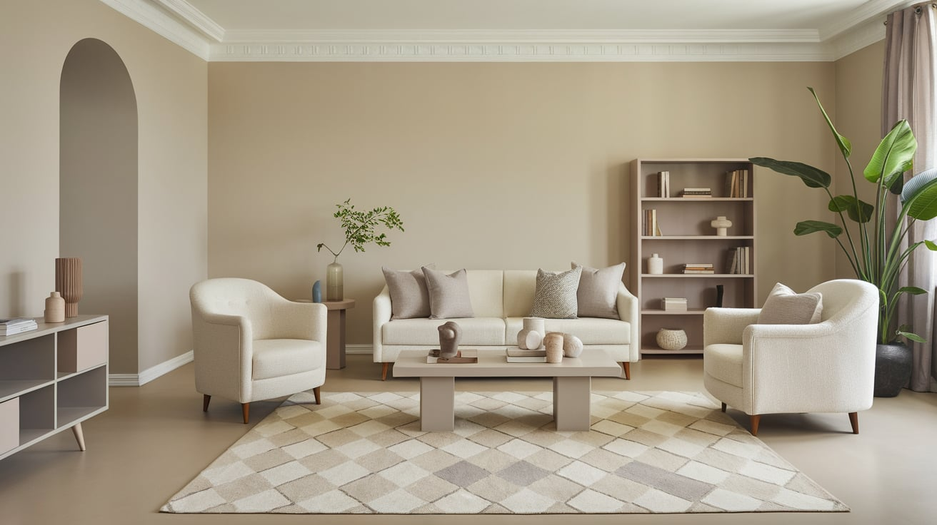
Greige blends gray and beige, making it an easy match for cream. It adds depth while keeping the look calm and balanced.
This pairing feels modern but still warm. Greige helps tone down cream without cooling it too much. It’s a safe choice for larger areas.
- Shades:Sherwin-Williams Agreeable Gray, Benjamin Moore Edgecomb Gray
- Best for: Whole-home palettes
- Style tip: Choose warm undertones
23. Taupe
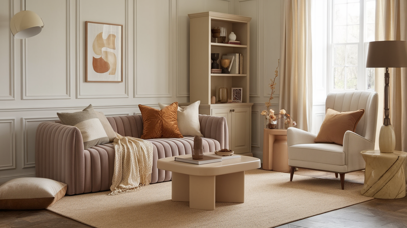
Taupe adds softness and structure to cream. It sits between gray and brown, which helps balance cream’s warmth. This pairing feels calm and polished.
Taupe works well when you want a quiet and elegant look. It keeps cream from feeling too light.
- Shades:Benjamin Moore Pashmina, Sherwin-Williams Taupe Tone
- Best for: Sitting areas, bedrooms
- Style tip: Layer with soft fabrics
24. Mocha
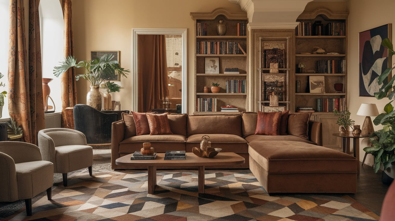
Mocha brings a rich, warm tone to cream. It adds depth without feeling too dark or heavy. This pairing feels cozy and grounded.
Mocha helps cream look fuller and more inviting. It works well with natural textures.
- Shades:Sherwin-Williams Java, Benjamin Moore Mink
- Best for: Furniture, accent walls
- Style tip: Pair with lighter décor
25. Denim Blue
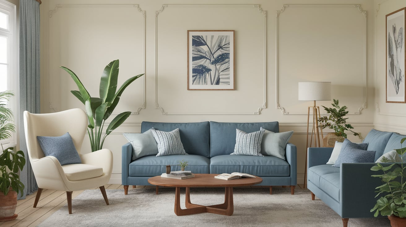
Denim blue gives cream a relaxed and casual feel. It adds color without looking too bold or formal. This pairing feels easy and comfortable.
Denim blue keeps cream looking fresh and lived-in. It works well in both homes and outfits.
- Shades:Benjamin Moore Van Deusen Blue, Sherwin-Williams Denim
- Best for: Family rooms, casual spaces
- Style tip: Mix with white accents
26. Sky Blue
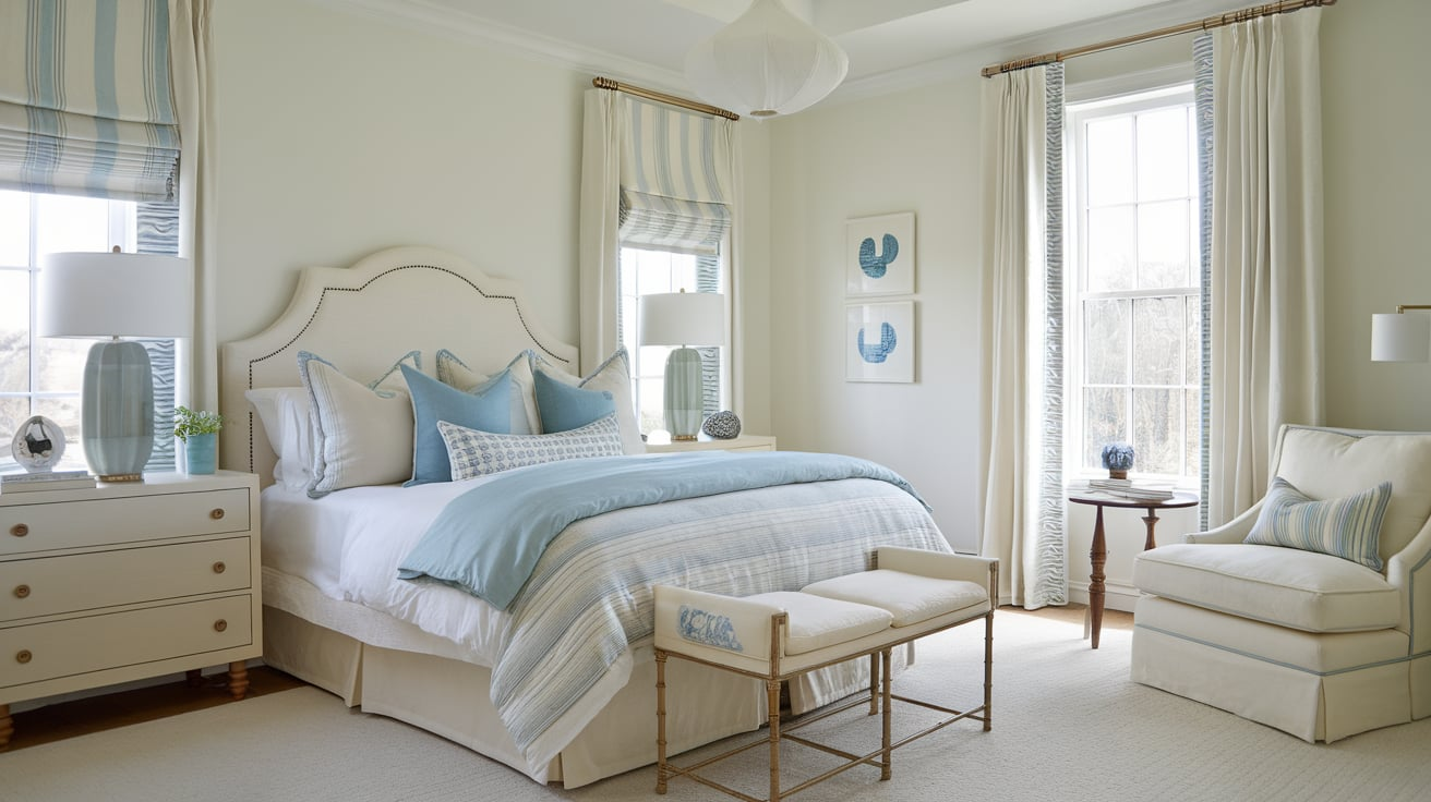
Sky blue lightens cream and gives it a fresh touch. It creates a soft contrast that feels open and calm. This pairing works well in bright spaces.
Sky blue helps cream feel clean and airy. It’s best used in light shades.
- Shades:Sherwin-Williams Rainwashed, Benjamin Moore Breath of Fresh Air
- Best for: Bedrooms, bathrooms
- Style tip: Keep the palette light
27. Mint Green
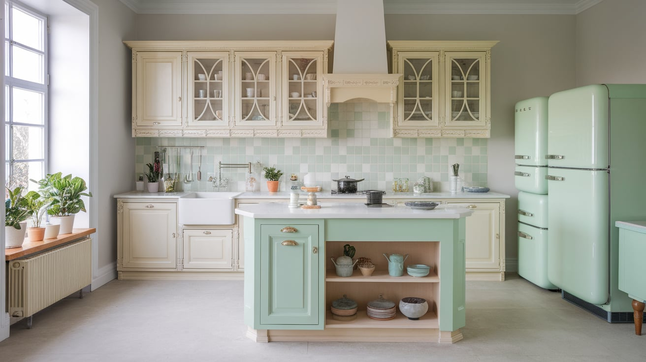
Mint green adds a fresh and playful note to cream. It brings in color while keeping the look light. This pairing feels cheerful but still calm.
Mint helps cream feel modern and clean. It works best in small accents.
- Shades:Benjamin Moore Soft Mint, Sherwin-Williams Mint Condition
- Best for: Kitchens, décor accents
- Style tip: Use sparingly
28. Copper
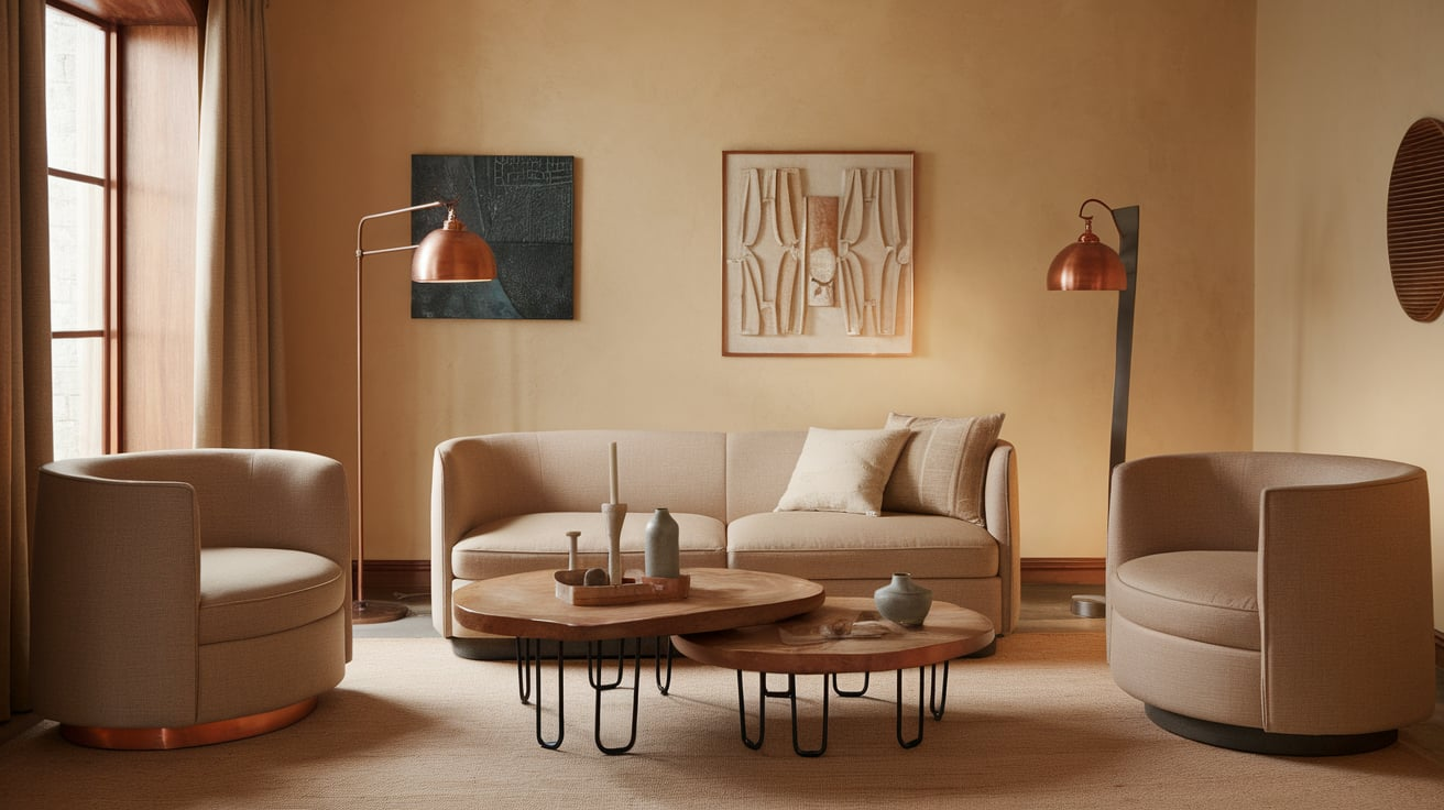
Copper adds warmth and shine to cream. It feels cozy and slightly rustic. This pairing helps cream look richer and more styled.
Copper works best as an accent. It adds interest without overpowering the space.
- Shades:Sherwin-Williams Copper Wire, Benjamin Moore Copper Kettle
- Best for: Lighting, hardware
- Style tip: Pair with matte finishes
29. Silver

Silver adds a clean and modern contrast to cream. It cools down cream in a gentle way. This pairing feels simple and polished.
Silver works best with softer finishes rather than shiny chrome. It keeps cream from feeling too warm.
- Shades:Benjamin Moore Silver Satin, Sherwin-Williams Passive
- Best for: Modern interiors
- Style tip: Choose brushed metals
30. Soft Coral
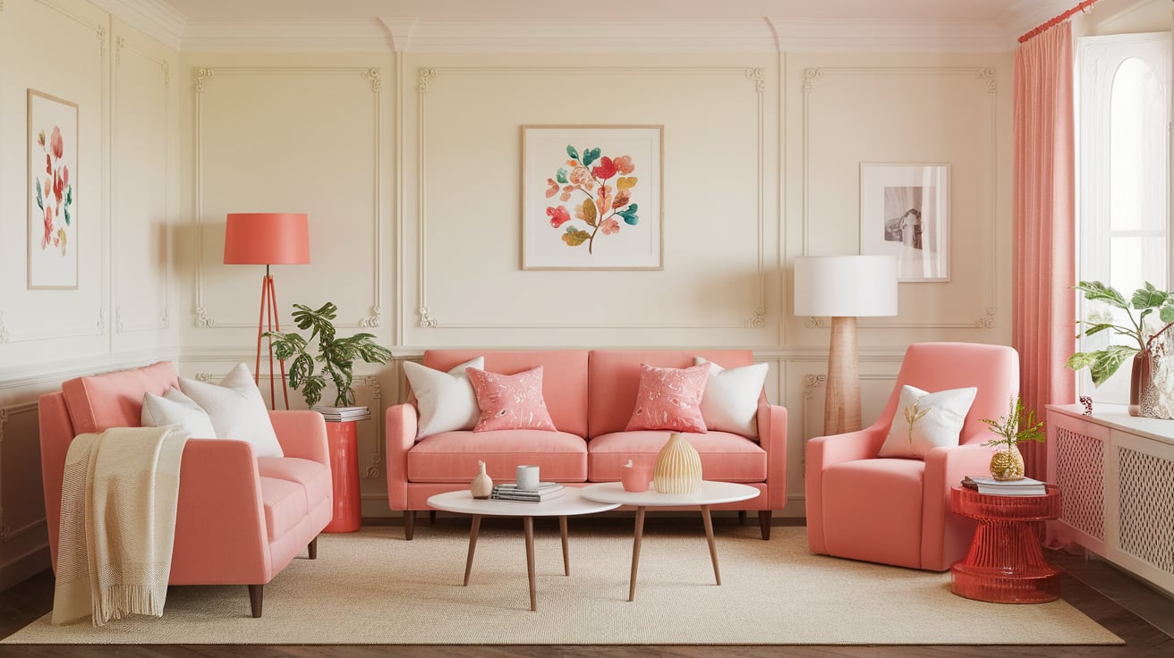
Soft coral brings warmth and life to cream. It adds color without feeling loud or overpowering. This pairing feels friendly and fresh.
Soft coral works best when it’s muted. It keeps cream looking light and inviting.
- Shades:Sherwin-Williams Coral Reef, Benjamin Moore Soft Glow
- Best for: Accent décor, summer spaces
- Style tip: Balance with neutrals
Cream Color Palettes to Copy
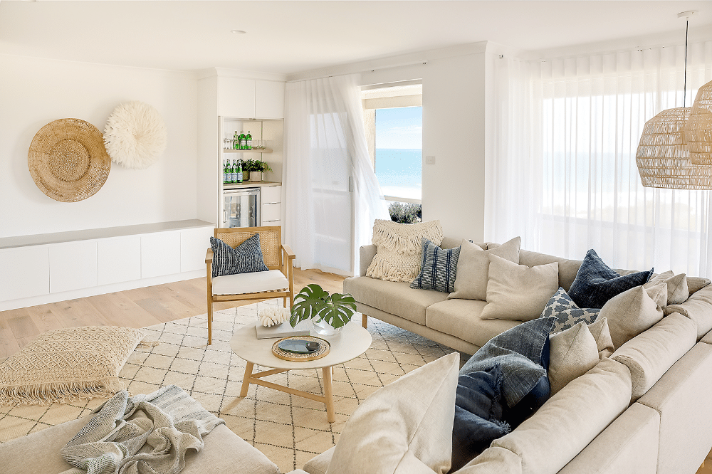
Cream works best when it’s part of a simple, well-balanced palette. These ready-made color combos make it easy to style cream without guessing or overthinking.
| Palette Style | Main Colors | Accent Colors | Best Used In |
|---|---|---|---|
| Minimal And Modern | Cream, Charcoal | Soft Black, Warm Wood | Living rooms, modern homes |
| Cozy And Earthy | Cream, Beige | Olive, Terracotta | Bedrooms, relaxed spaces |
| Bright And Fresh | Cream, Warm White | Dusty Blue, Mint | Bathrooms, summer interiors |
| Classic And Preppy | Cream, Navy | Gold, Camel | Offices, formal rooms |
| Soft And Romantic | Cream, Blush | Taupe, Soft Gray | Bedrooms, nurseries |
| Warm And Natural | Cream, Camel | Chocolate Brown, Wood | Living areas, fall décor |
| Calm And Coastal | Cream, Sky Blue | Sandy Beige, White | Beach-style homes |
| Rich And Elegant | Cream, Burgundy | Gold, Mocha | Dining rooms, evening spaces |
Use these palettes as a starting point, then adjust the shades based on your lighting and personal style.
Conclusion
Cream is one of those colors that truly works almost anywhere when paired the right way.
From soft neutrals to rich, bold shades, it gives you a lot of freedom to create a look that feels warm and balanced. The key is to pay attention to contrast, undertones, and how much color you add around it.
Use the color ideas and palettes in this guide as a starting point, then adjust them to fit your style and space.
If you’re still unsure, try samples first and trust what feels right to you.

