What Color Is Onyx: Hex Code, Shade & Palette
Ask ten people what color onyx is, and most will just say “black.” But if you’re wondering exactly what color is onyx, the actual shade has more nuance than that one word suggests.
It takes its name from the gemstone, and much like the stone, it carries a slight gray undertone underneath its dark surface, along with a coolness that can shift depending on the light around it.
That’s part of why it shows up in so many places, from fine jewelry to interior walls to brand logos.
This blog covers the exact hex code for onyx, visual examples of how it looks under different lighting conditions, ways to style it across design, fashion, and interiors, and the color palettes and pairings that best bring out its meaning.
What Color is Onyx?
Onyx is a deep black color with subtle gray undertones. It is usually represented by the hex code #353839 and appears softer than pure black because of its cool, muted depth.
That flexibility is what makes it so easy to work with, whether it shows up in jewelry, an outfit, a living room wall, or a logo if you’re leaning toward committing a whole room to it.
The name comes from the onyx gemstone, known for its glossy black surface and long-standing association with strength and refinement, even though the stone also comes in white, green, brown, and banded varieties.
The word itself traces back to the Greek “onyx,” meaning “claw” or “fingernail,” a nod to the stone’s smooth, pale-banded resemblance to a nail bed.
Onyx Color: Hex Code, RGB, CMYK & Values
Onyx’s exact values across Hex, RGB, CMYK, HSL, and Pantone let you use the color precisely in design or print. Hex and RGB work best for digital screens, while CMYK is built for print materials like packaging or business cards.
Pantone adds a standardized reference point, keeping the shade consistent across different printers and manufacturers. This matters most for branding, where onyx needs to look the same wherever it appears.
| Format | Value |
|---|---|
| Hex | #353839 |
| RGB | 53, 56, 57 |
| CMYK | 7, 2, 0, 78 |
| HSL | 195°, 4%, 22% |
| LRV | ~4 (very dark) |
| Pantone (closest) | Black 6 C |
How Does Onyx Look in Different Lighting?
Like any dark shade, onyx doesn’t look exactly the same in every setting; the light around it changes how it reads.
1. Natural Daylight

Natural daylight brings out onyx in its purest form, making its deep black base and cool gray undertones appear more noticeable. The balanced light helps reveal the shade’s natural depth without shifting it toward warmer or cooler tones.
This makes daylight a useful reference point when comparing onyx shades for interiors, photography, or digital designs.
2. Warm Indoor

Warm, yellow-toned indoor lighting softens onyx’s deep black appearance, bringing out subtle brown undertones and giving the shade a cozier, richer feel compared to cooler lighting.
This warmer shift makes onyx work well in spaces with wood finishes, soft fabrics, and ambient lighting where a relaxed atmosphere is preferred.
In swatch comparisons specifically against warm oak flooring, onyx’s coolness softens just enough to read closer to graphite than to true black, a useful cue if you’re pairing it with wood-heavy rooms.
3. Cool LED Lighting

Cool, blue-toned LED lighting tends to bring out onyx’s gray undertones even more, making it look sharper and slightly cooler than it would under warmer light sources.
Because of this shift, it’s worth checking how onyx looks under the specific lighting it’ll actually be used in, whether that’s a room, a product photo, or a screen, rather than relying on how it appears in just one setting.
I noticed the same shift photographing black herringbone tile bathrooms: the grout lines read almost blue-black under LED spotlights but settle into a warmer charcoal under morning daylight.
Ways to Use Onyx Color in Design
Onyx shows up in jewelry, fashion, branding, luxury products, and interiors alike, proving just as adaptable on screen as it is across industries and living spaces.
1. In Digital Design

On screens, this shade creates a softer alternative to pure black while maintaining strong contrast and readability.
- This color holds up well in digital design, not just physical spaces.
- It offers strong contrast against white or light backgrounds, making it a practical, easy-to-read choice for text and interface elements.
- It’s also often preferred over pure black #000000, since true black can look a little harsh or flat on screens, while this shade feels slightly softer and more refined without losing that deep, dark presence.
2. Fashion

This deep shade adds a refined, understated look to clothing, jewelry, and accessories across different styles.
- This shade turns up across jewelry, clothing, and accessories wherever a sleek, understated black feels more fitting than a flashier alternative.
- In jewelry, it appears in rings, cufflinks, and pendants, working just as well set in gold as in silver, which is why it shows up in both minimalist modern pieces and vintage-style jewelry.
- In clothing, it shows up in tailored suits, evening wear, handbags, and shoes, often chosen over true black for a softer, more refined finish.
- Its versatility across seasons and settings is what makes it read as intentional rather than plain.
3. Interior Design
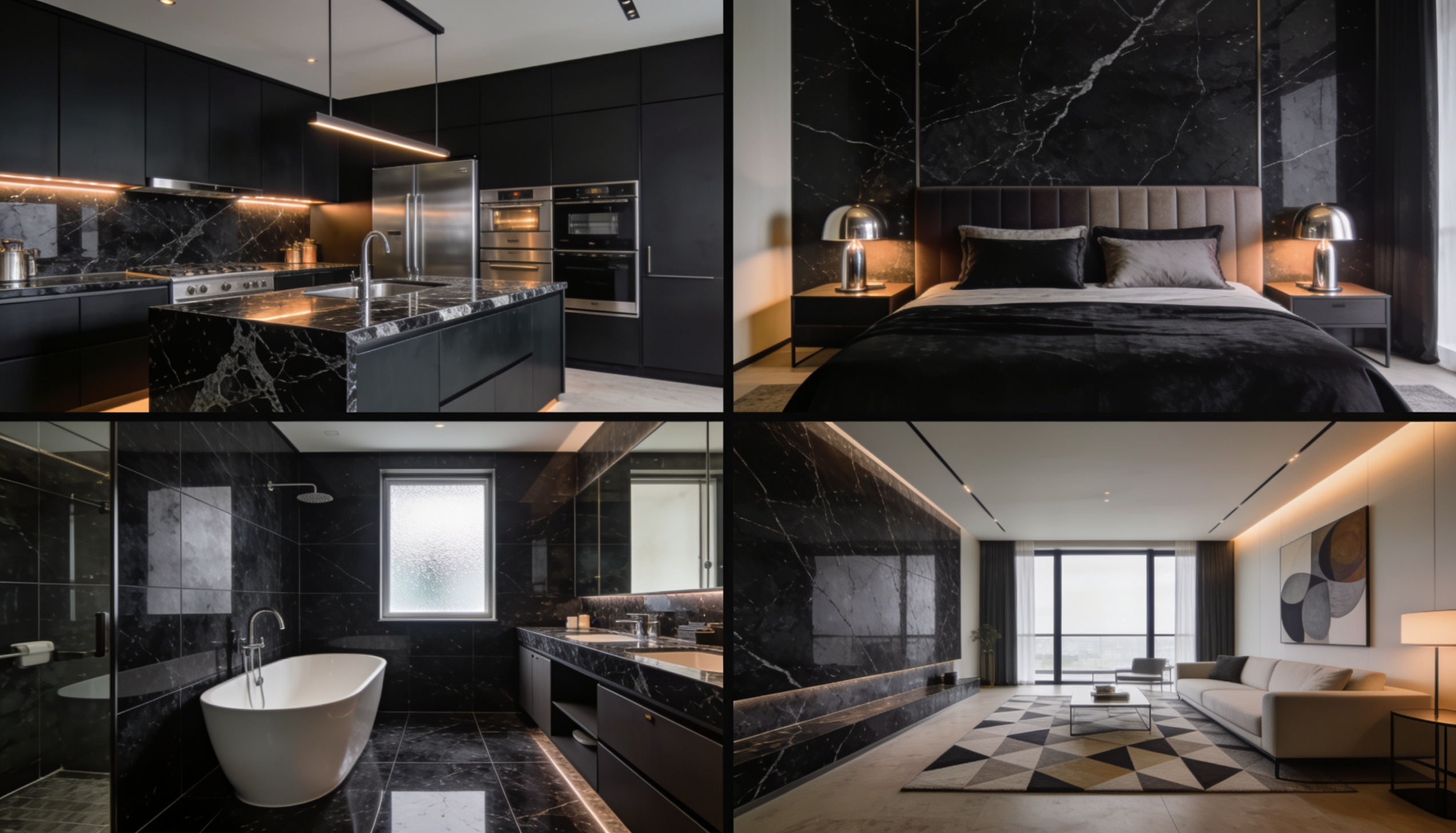
Used in home decor, this color brings depth, calmness, and a touch of luxury to different spaces.
- In bedrooms, it appears in bedding, headboards, or furniture pieces, bringing calm and quiet luxury when balanced with soft lighting.
- In kitchens, it’s a popular pick for countertops and island bases, grounding the space without demanding attention.
- In bathrooms, it appears in tile, fixtures, or vanity finishes, adding depth and richness without making a compact space feel closed in.
4. Branding

Brands use this shade to create a premium, polished identity that feels sophisticated without appearing too bold.
- Brands working in luxury, tech, and beauty tend to gravitate toward this shade when they want their design to feel premium without shouting for attention.
- It shows up especially often in packaging and unboxing photography, where its slightly softer edge (versus pure black) photographs cleanly even under harsh studio lighting.
- It consistently appears in high-end packaging, leather goods, and watches as a quiet signal of quality.
- It photographs well even in flat product shots, which is why it appears so often in unboxing videos and premium product photography.
Best Onyx Color Combinations & Palettes
Onyx pairs well with a wide range of colors, since its deep, neutral base makes it easy to build a palette around. Whether you’re going for bold contrast or a more subtle, tonal look, these combinations tend to work especially well.
| Color Pairing | Palette Feel | Why It Works |
|---|---|---|
| Onyx + White | Clean and high-contrast | White brightens the depth of onyx, creating a sharp, balanced look that feels crisp and classic. |
| Onyx + Gold | Warm and refined | Gold adds warmth and shine against onyx’s dark base, making the palette feel rich without looking too heavy. |
| Onyx + Silver | Cool and modern | Silver blends well with onyx’s cool undertone, giving the combination a sleek and polished finish. |
| Onyx + Emerald Green | Bold and jewel-toned | Emerald adds color depth and energy while still feeling balanced next to the darkness of onyx. |
| Onyx + Burgundy | Deep and dramatic | Burgundy brings warmth and richness, while onyx keeps the palette grounded and refined. |
| Onyx + Charcoal | Tonal and understated | Charcoal sits close to onyx, creating a layered dark palette with subtle depth instead of sharp contrast. |
| Onyx + Beige | Soft and balanced | Beige lightens the overall look and keeps onyx from feeling too intense, especially in interiors and fashion. |
Popular Onyx Paint Shades From Different Brands
Onyx paint comes in a few different takes depending on the brand, so here are four worth considering.
- Benjamin Moore: Onyx by Benjamin Moore has almost no undertone, so it stays a clean, true black in any light. Best for front doors, cabinets, and accent walls in an eggshell or satin.
- PPG: Onyx by PPG leans slightly cooler, with a subtle stone-like quality rather than a jet-black appearance. Best for larger walls in a matte finish, where a softer black feels less heavy.
- Behr: Warm Onyx by Behr has a hint of brown, making it feel cozier than a true black. Best for living rooms and bedrooms in a matte or flat finish.
- Dutch Boy: Onyx Shade is the lightest and coolest of the four, closer to dark slate than true black. Best for bathrooms or home offices in a satin or eggshell finish.
Quick tip on finishes: matte and flat hide imperfections best and give a soft, modern look, while satin and eggshell are easier to clean and hold up better on doors, trim, and furniture that get touched a lot.
Onyx vs. Other Black Shades: Key Differences
While onyx is often grouped with other near-black shades, small differences in undertone and finish set it apart. Here’s how it compares to a few commonly confused colors.
| Color | Hex | Overall Look | Undertone | Finish/Feel | How It Differs From Onyx |
|---|---|---|---|---|---|
| Onyx | #353839 | Deep black with soft depth | Cool to neutral | Smooth, solid, slightly muted | Onyx is not as flat as pure black and often has a subtle gray depth that makes it feel softer. |
| Jet Black | #252525 | Pure, intense black | Neutral | Flat and very dark | Jet black is darker and stronger than onyx, with little to no visible undertone. |
| Charcoal | #4a4a4a | Dark gray-black | Cool gray | Soft and muted | Charcoal is lighter and grayer than onyx, making it feel less intense and more relaxed. |
| Ebony | #5d6658 | Rich black with warmth | Slight brown or warm undertone | Deep and polished | Ebony feels warmer than onyx because it can carry a soft brown-black tone. |
| Obsidian | #0b0c0c | Very dark black | Cool | Glassy and reflective | Obsidian has a sharper, shinier look, while onyx usually feels more solid and less reflective. |
| Graphite | #474a51 | Dark metallic gray | Cool silver-gray | Slightly metallic | Graphite appears grayer and more metallic, while onyx stays closer to a true black shade. |
Conclusion
What makes onyx work is its range. The same shade can look sharp and cool next to silver, or warm and inviting next to gold.
It feels crisp in daylight and softens under warm bulbs. That kind of flexibility is rare for a color this dark.
Onyx behaves more like a spectrum than a single fixed shade, shifting slightly depending on where and how it’s used.
With the hex values, lighting notes, and pairing ideas covered here, choosing the right version of onyx for a wall, a logo, or an outfit really just comes down to matching the shade to the mood you’re going for.
Frequently Asked Questions
Is Onyx Considered a Warm or Cool Color?
Onyx is usually considered a cool neutral because of its subtle gray undertones, though lighting can make it appear warmer.
What Colors Are Similar to Onyx?
Colors similar to onyx include jet black, charcoal, ebony, graphite, and obsidian, but each has different undertones.
Why is Onyx Named After the Gemstone?
The color takes its name from the onyx gemstone, which is known for its dark, glossy appearance and layered natural patterns.