Misty Sherwin-Williams SW 6232: Complete Color Review
Finding the right blue-gray paint color can be trickier than it seems. Some shades feel too cold, too dark, or too muted once they’re on the wall.
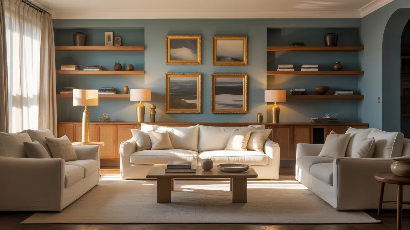
Misty Sherwin-Williams is a soft blue-gray paint color that brings a calm, balanced feel to many spaces. Its subtle look works well in bedrooms, bathrooms, living rooms, and kitchen cabinets without feeling overpowering.
Its muted undertones, versatile styling options, and timeless appeal make it a favorite for both modern and classic homes.
In this review, you’ll learn about Misty Sherwin-Williams undertones, lighting effects, coordinating colors, room ideas, and the best ways to use it in your home.
What is Sherwin-Williams Misty?
Sherwin-Williams Misty (SW 6232) is a soft, muted blue-gray paint color known for its gentle and soothing appearance. This subtle shade blends gray and green tones, giving it a calm and balanced feel that works well in various spaces.
Misty has a soft, understated look that works in bedrooms, bathrooms, living rooms, and kitchens.
Its gray-green blend feels calm without being dark or overpowering.
Characteristics of Sherwin-Williams Misty
| Feature | Details |
|---|---|
| Paint Code | SW 6232 |
| Color Name | Misty |
| Color Type | Light Blue-Gray |
| Undertones | Cool blue with gray hints, slight green under certain lighting |
| LRV | 62-64 |
| Hex Code | #CDD2D2 |
| RGB Values | RGB(205, 210, 210) |
What Makes Misty Sherwin-Williams a Popular Choice?
Misty remains a popular choice for its soft, calming look, which works well in many home styles and lighting conditions.
- Balanced Light Tone: Misty is light but not too pale, giving rooms a fresh color without feeling washed out.
- Cool Blue-Gray Undertones: The subtle blue-gray mix keeps the color calm, versatile, and easy to live with.
- Versatile Design Compatibility: Misty works beautifully in coastal, modern, minimalist, and traditional interiors.
- Light-Reflective Quality: With an LRV of 62–64, it brightens spaces while maintaining a soothing atmosphere.
- Easy Color Pairing: The shade pairs well with crisp whites, warm woods, deeper blues, and soft neutrals.
- Tranquil and Timeless Feel: Misty creates a serene atmosphere that feels relaxed and enduring, not overly trendy.
Misty is a reliable choice for creating calm, balanced interiors. Proper lighting and complementary colors can make rooms feel brighter, more inviting, and effortlessly serene.
Styling Your Home with Misty Sherwin-Williams
Misty works well in almost any room. A single fresh coat can quickly refresh a space and give it a soft, welcoming feel.
See how Misty can bring calm and style to different areas of your home.
1. Bedroom

Crisp, soft shades like Sea Salt (SW 6204) and Agreeable Gray (SW 7029) pair beautifully with Misty on bedroom walls.
This combination creates a calm, cozy retreat that feels serene without appearing cold. It works well in rooms where you want a restful, airy atmosphere.
Decor Elements to Include
- Light wood bed frames or nightstands
- Plush bedding in whites or soft neutrals
- Woven rugs or jute accents
2. Bathroom

Soft, airy shades like Comfort Gray (SW 6205) and Rainwashed (SW 6211) pair beautifully with Misty on bathroom walls.
This combination creates a serene, spa-like space that feels fresh and inviting. It works well with bathrooms where you want a light, soothing atmosphere.
Decor Elements to Include
- Marble or quartz countertops in soft cream or light gray
- Matte black or oil-rubbed bronze fixtures
- Plush towels in soft aqua or muted beige
3. Kitchen

Soft, modern shades like Repose Gray (SW 7015) and Sea Salt (SW 6204) pair beautifully with Misty on kitchen walls.
This combination creates a bright, airy kitchen that feels fresh without being stark. It works well in both small kitchens and open-concept layouts.
Decor Elements to Include
- Countertops in marble or quartz with subtle gray veining
- Hardware in matte black or brushed brass
- Natural wood bar stools or accents
Misty vs Other Top Blues/Grays
The comparison below shows how Sherwin-Williams Misty differs from other popular soft blues and gray-blues in LRV, undertones, and overall feel.
| Color Name | LRV | Undertones | Best For | How It Differs From Misty |
|---|---|---|---|---|
| Sea Salt SW 6204 | 63 | Green-blue | Bathrooms, kitchens | Cooler and slightly greener than Misty |
| Rainwashed SW 6211 | 57 | Soft aqua | Living rooms, bedrooms | Has stronger aqua tones, brighter and fresher than Misty |
| Comfort Gray SW 6205 | 63 | Warm gray | Bedrooms, hallways | Warmer and more neutral, less blue than Misty |
| Repose Gray SW 7015 | 60 | Soft gray | Living rooms, kitchens | More neutral gray, less airy and soft than Misty |
| Silvermist SW 7621 | 64 | Cool gray-blue | Bedrooms, bathrooms | Cooler and more muted, less cozy than Misty |
Misty stands out for its soft, balanced blue-gray tone. It feels calming, versatile, and more inviting than many cooler or stronger blue-gray shades.
Misty Sherwin-Williams Complementary Colors
Misty works best when paired with colors that enhance its soft blue-gray undertones. Using the right shades can make spaces feel balanced and calming.
- Soft Greens: Gentle greens in furniture, décor, or accent walls create a fresh, natural contrast that complements Misty.
- Light Grays: Muted gray tones highlight Misty’s blue undertones while keeping rooms serene and elegant.
- Warm Wood Tones: Natural wood in cabinets, furniture, or flooring adds warmth and depth, balancing Misty’s coolness.
- Muted Blues: Softer or broader blue accents create layered, cohesive spaces without overpowering Misty.
- Soft Taupe or Beige: Subtle neutral accents bring warmth and versatility, pairing well in living areas and bedrooms.
Pairing Misty with these complementary shades brings harmony and depth to any room. It creates spaces that feel both tranquil and inviting, perfect for modern or classic interiors.
Tips for Painting Your Walls with Misty Sherwin-Williams
Misty looks best when properly tested and applied under the right lighting conditions. A few simple painting tips can help the color appear smoother and more balanced.
- Test the color in different lighting before painting the entire room.
- Use a quality primer to help the paint show its true shade.
- Choose high-quality rollers and angled brushes for a smoother finish.
- Apply two coats for better color consistency and depth.
- Use painter’s tape for cleaner edges around trim and ceilings.
- Paint in low-humidity conditions for more even drying.
Taking the time to properly prep the walls can improve the final result. With the right application, Misty creates a soft, calming, and polished finish.
Can Misty Be Used on Exterior Surfaces?

Misty works beautifully on coastal- or tropical-style homes, creating a soft, elegant, serene, and timeless exterior finish.
When using this shade outside, it’s important to consider sun exposure, as direct sunlight can make the color appear lighter or slightly washed out.
Pair Misty with white or soft cream trim, natural wood doors or shutters, and light-colored landscaping accents to create a balanced, inviting, and harmonious exterior look.
This blue-gray suits modern coastal and classic tropical homes, with subtle undertones that enhance timeless curb appeal.
Common Mistakes to Avoid with Misty
Misty looks best when paired with the right lighting and surrounding colors. A few common mistakes can make the shade appear too cool, washed out, or flat.
- Using it in Poorly Lit Rooms: Limited natural light, especially in north-facing spaces, can make Misty look gray or muted.
- Pairing with Harsh Warm Colors: Bright yellows or deep oranges may clash with the cool, soft undertones of the paint.
- Ignoring Lighting Changes: Misty can appear cooler or slightly greener depending on the lighting conditions.
- Painting Every Surface in Small Spaces: Using Misty on all walls and trim in compact rooms can feel monotonous or overly cold.
- Skipping Large Paint Samples: Small swatches often fail to show how the color will look on a full wall or in a room.
- Overlooking Warm or Neutral Accents: Without complementary furnishings or decor, the room may feel too sterile or flat.
Testing Misty in different lighting conditions and pairing it with balanced warm or neutral accents helps achieve a calm, inviting, and serene look throughout your space
Conclusion
Misty Sherwin-Williams is a versatile paint color that brings a soft, calm, and balanced feel to many different spaces.
Its muted blue-gray undertones work beautifully with a wide range of styles, from coastal and modern to farmhouse and traditional interiors.
With the right lighting, trim colors, and decor pairings, Misty Sherwin-Williams can make rooms feel brighter, softer, and more inviting without looking overpowering.
If you want a blue-gray paint color that feels timeless, relaxed, and easy to style, Misty Sherwin-Williams is definitely worth considering. Test it in your space and see how beautifully it changes throughout the day.
Have you tried Misty Sherwin-Williams in your home? Share your thoughts and favorite pairings in the comments below.
Frequently Asked Questions
How Does Misty Perform in High-Moisture Areas?
It brightens small spaces, and a satin or semi-gloss finish resists humidity and is easy to clean and maintain, making it highly practical for kitchens or bathrooms.
Can Misty be Mixed with Warmer Tones?
Yes, Misty pairs nicely with soft beiges or taupes to create a balanced, cozy, and inviting look that feels warm and harmonious.
Is Misty Suitable for Furniture or Cabinetry?
Yes, it works beautifully on cabinets and furniture, complementing both light and dark wood finishes effortlessly while adding subtle depth and elegance.