The Ultimate Guide to Perfect Gallery Wall Spacing and Layout
Want to put up photos but worried about getting the spacing right?
A gallery wall can make your space look better, but only when you follow the right steps for layout and spacing.
This guide will show you the basics of hanging art and photos in a way that looks good and makes sense.
You’ll learn the right gaps to leave between pieces, how to plan your layout on paper first, and the tools you need to get the job done right.
Whether you have family photos, art prints, or a mix of both, I’ll help you put them together in a way that looks clean and organized.
Ready to start? Let’s learn how to make your walls stand out with proper spacing and arrangement.
What is a Gallery Wall and Why Does Spacing Matter?
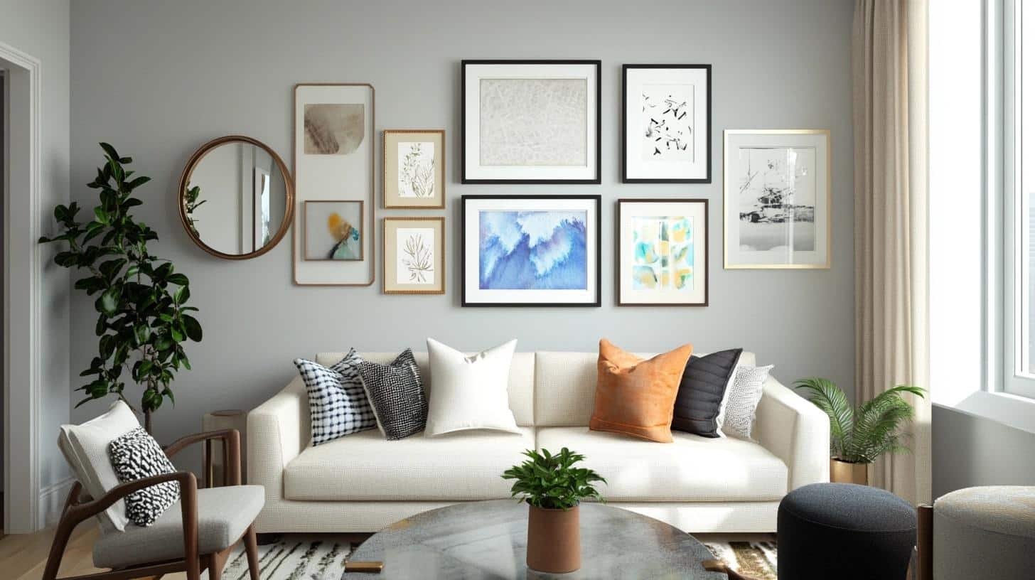
A gallery wall is a collection of framed items like art, photographs, or prints arranged on a wall to create a focal point in your room. Good spacing helps your display look put together and planned, rather than random or messy.
What Makes a Gallery Wall?
A gallery wall brings together different items on one wall. These can include:
- Framed photographs
- Art prints
- Personal items
- Wall decor
- Mirrors
- Small decorative objects
Why Proper Spacing Counts?
The right space between items makes your display look well-planned. Good spacing:
- Makes each piece easy to see
- Creates a balanced look
- Helps viewers focus on the art
- Makes the whole display look organized
Common Mistakes to Watch Out For
Many people make these spacing errors:
- Putting frames too close together
- Using uneven gaps between pieces
- Not planning the layout first
- Making the display too big or small for the wall
- Not measuring before hanging
Understanding Frame Spacing: How Much Space Between Frames is Ideal?
Getting the right space between your frames can make your wall display look polished. Let’s look at the key rules for spacing that work well in most homes.
General Guidelines for Frame Spacing
The sweet spot for frame spacing is usually 2 to 3 inches. This gap gives each piece room to breathe while keeping the group looking connected. Think about:
- Small rooms: Stay closer to 2 inches for a clean look
- Large walls: Use up to 3 inches to fill the space well
- Room style: Match the spacing to your room’s feel – less space for a cozy look, more for an open feel
Symmetrical vs. Asymmetrical Layouts: Does Spacing Differ?
Symmetrical layouts use the same spacing between all pieces. This works well when you want:
- A formal, structured look
- Equal focus on each piece
- Easy-to-follow arrangement
Asymmetrical layouts can use different spaces between items. This works when you want:
- A more casual feel
- Freedom to add pieces over time
- A mix of different-sized items
Frame Size Matters: Adjusting Space for Larger or Smaller Frames
Big frames need more room than small ones. Here’s how to adjust:
- For big frames (over 16×20 inches): Use 3-4 inch gaps
- For medium frames (11×14 inches): Keep to 2-3 inch gaps
- For small frames (8×10 inches or less): 1.5-2 inch gaps work well
When mixing sizes:
- Put similar-sized frames near each other
- Use medium spacing (2.5 inches) as your base
- Check the look from across the room to make sure it feels right
How to Plan and Arrange a Gallery Wall Layout
Setting up your wall display takes planning. Here’s how to put it all together step by step, from picking your spot to getting everything lined up just right.
Step-by-Step Process for Designing a Gallery Wall
1. Pick Your Wall
- Look for a wall without windows or doors
- Make sure there’s good lighting
- Check if you can see it well from different spots
2. Plan Your Layout
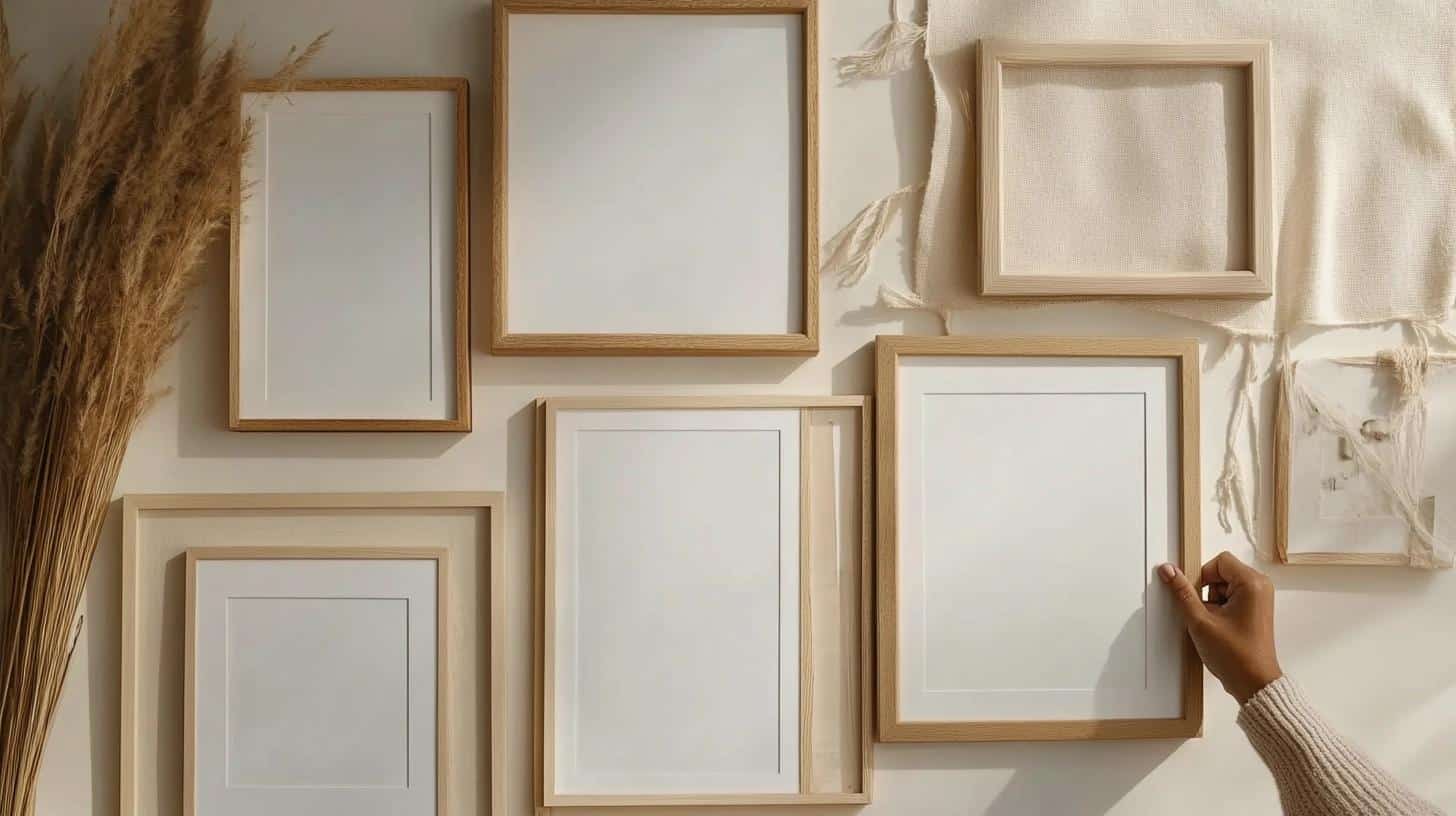
- Count your frames
- Start with 5-7 pieces for a small wall
- Add more for bigger walls, but keep it simple
- Leave room to grow if you want to add more later
3. Test Your Layout

- Put all frames on the floor
- Try different setups
- Take photos of each try
- Step back to see what works best
Templates and Tools for Layout Precision
Make a Plan:
- Cut paper the same size as your frames
- Stick papers on the wall with tape
- Mark hanging spots on the papers
- Keep the papers up until you’re ready to hang
Tools You’ll Need:
- Measuring tape
- Level
- Pencil
- Ruler
- Hammer and nails
Symmetry and Alignment Tips for Flawless Results
Getting Everything Straight:
- Pick a middle point on your wall
- Work out from the center
- Keep frames at eye level (57-60 inches from floor)
- Check each row stays straight
- Make sure tops and sides line up when needed
Making it Work Together:
- Group similar items near each other
- Keep the heaviest pieces toward the middle
- Space items evenly from the center out
- Step back often to check how it looks
- Fix any spots that seem off before hanging
Gallery Wall Design Rules and Best Practices
Let me share key rules that will help you make your wall display look well-planned and put together. These tips will help you avoid common issues and create a layout that looks professional.
The 2/3 Rule: How It Can Help Your Layout
Understanding the Rule:
- Fill about two-thirds of your wall space with your display to create good balance.
- Leave one-third of the wall empty to let your display stand out properly.
- Use this empty space around the edges to frame your gallery naturally.
Applying to Different Walls:
- On a 10-foot wall, plan your display to take up about 6-7 feet.
- For smaller walls, like above a couch, keep the display width close to the furniture width.
- Make sure your display stops about 8-12 inches from the ceiling.
Tips for Using the Rule:
- Measure your wall space first and mark the two-thirds area.
- Keep all your frames within this marked space.
- Use the remaining space to create a border around your display.
Common Mistakes to Avoid When Designing a Gallery Wall
Too Many Frames:
- Stick to a number of pieces that fits your wall size comfortably.
- Remove pieces that make the wall look too full or busy.
- Leave enough space between items so each piece gets attention.
Wrong Spacing Problems:
- Uneven gaps between frames make the display look messy.
- Too much space makes pieces look disconnected.
- Too little space creates a cramped, tight feeling.
Poor Alignment Issues:
- Frames hanging at different heights create an unbalanced look.
- Pictures that don’t line up properly catch the eye in a bad way.
- Crooked frames make the whole wall look off-balance.
Quick Fixes:
- Use a level for each frame you hang.
- Double-check your measurements before making nail holes.
- Step back often to look at the big picture.
- Fix any spacing issues before adding more pieces.
Visual Inspiration for Gallery Wall Layouts
1. Grid Layout
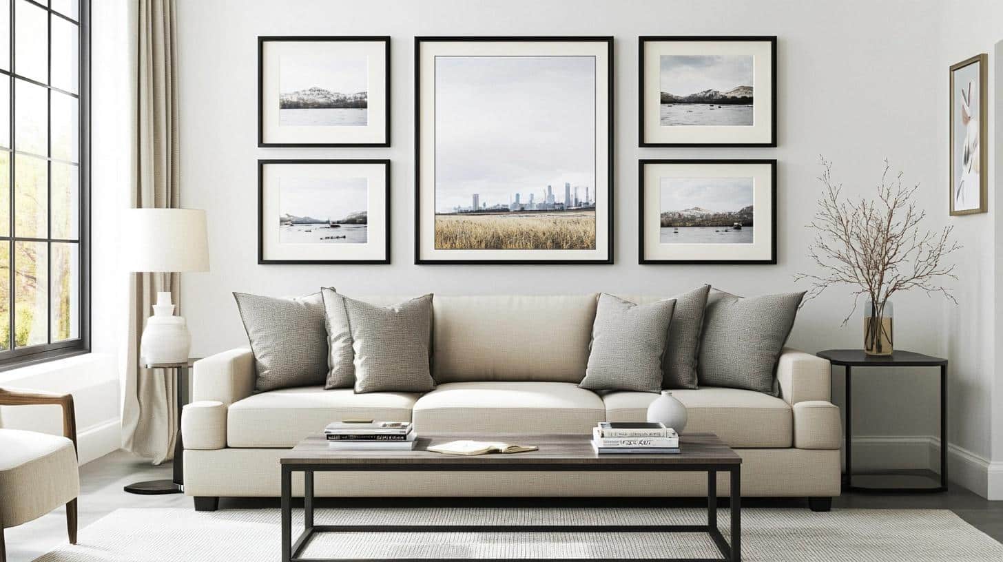
Six identical black frames form a neat 2×3 arrangement above a modern sofa. Each frame holds black and white photos with precise 2-inch gaps between them. The clean lines and matching sizes create a tidy, balanced wall that matches the room’s modern style.
Key Points to Consider:
- Frame Selection: Same size, style, color
- Spacing: Equal gaps (2-3 inches)
- Wall Position: Center alignment
- Style Match: Room decor harmony
2. Linear Layout
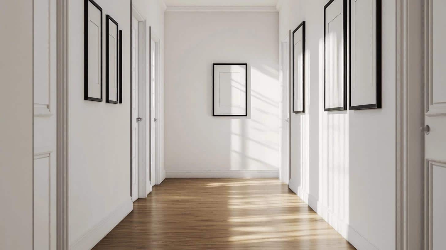
Five medium-sized frames line up perfectly along a hallway wall, each showing colorful art prints. The frames maintain steady 3-inch spaces between them, sitting at eye level. This straight-line setup makes the narrow hall feel longer and more put-together.
Key Points to Consider:
- Frame Selection: Same size, style, color
- Spacing: Equal gaps (2-3 inches)
- Wall Position: Center alignment
- Style Match: Room decor harmony
3. Organic Layout
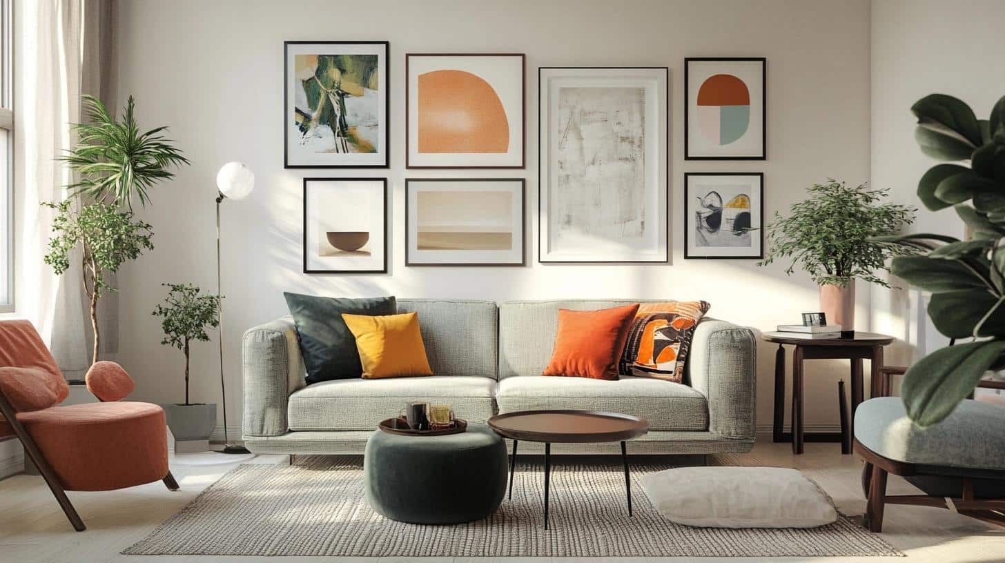
Different-sized frames spread out naturally on the wall, mixing small sketches with larger paintings. White, black, and wood frames create interest while keeping a loose but balanced feel. The layout starts dense in the middle and spreads out toward the edges.
Key Points to Consider:
- Frame Selection: Mixed sizes, styles, colors
- Spacing: Equal gaps (2-3 inches)
- Wall Position: Center alignment
- Style Match: Room decor harmony
4. Salon Style Layout
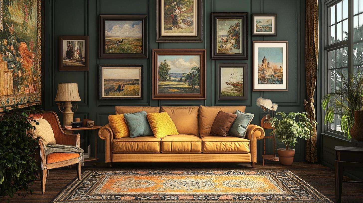
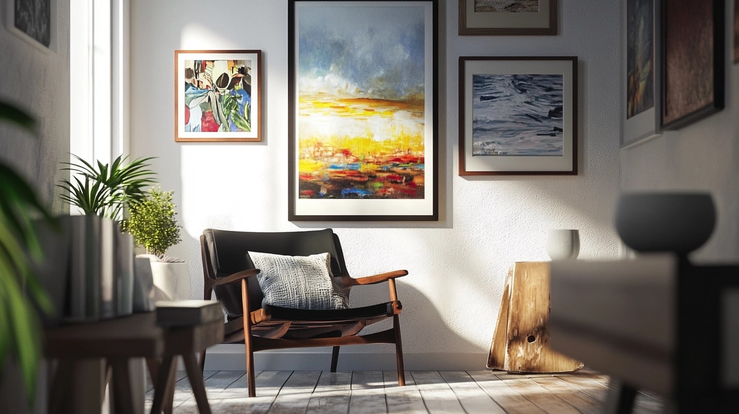
Various frames cover most of the wall, placing big art next to smaller pieces. Black and gold frames hold a mix of prints and photos, filling the space from sofa to ceiling. Small gaps between pieces create one big display.
Key Points to Consider:
- Frame Selection: Mixed sizes, styles, colors
- Spacing: Equal gaps (2-3 inches)
- Wall Position: Center alignment
- Style Match: Room decor harmony
5. Staircase Layout
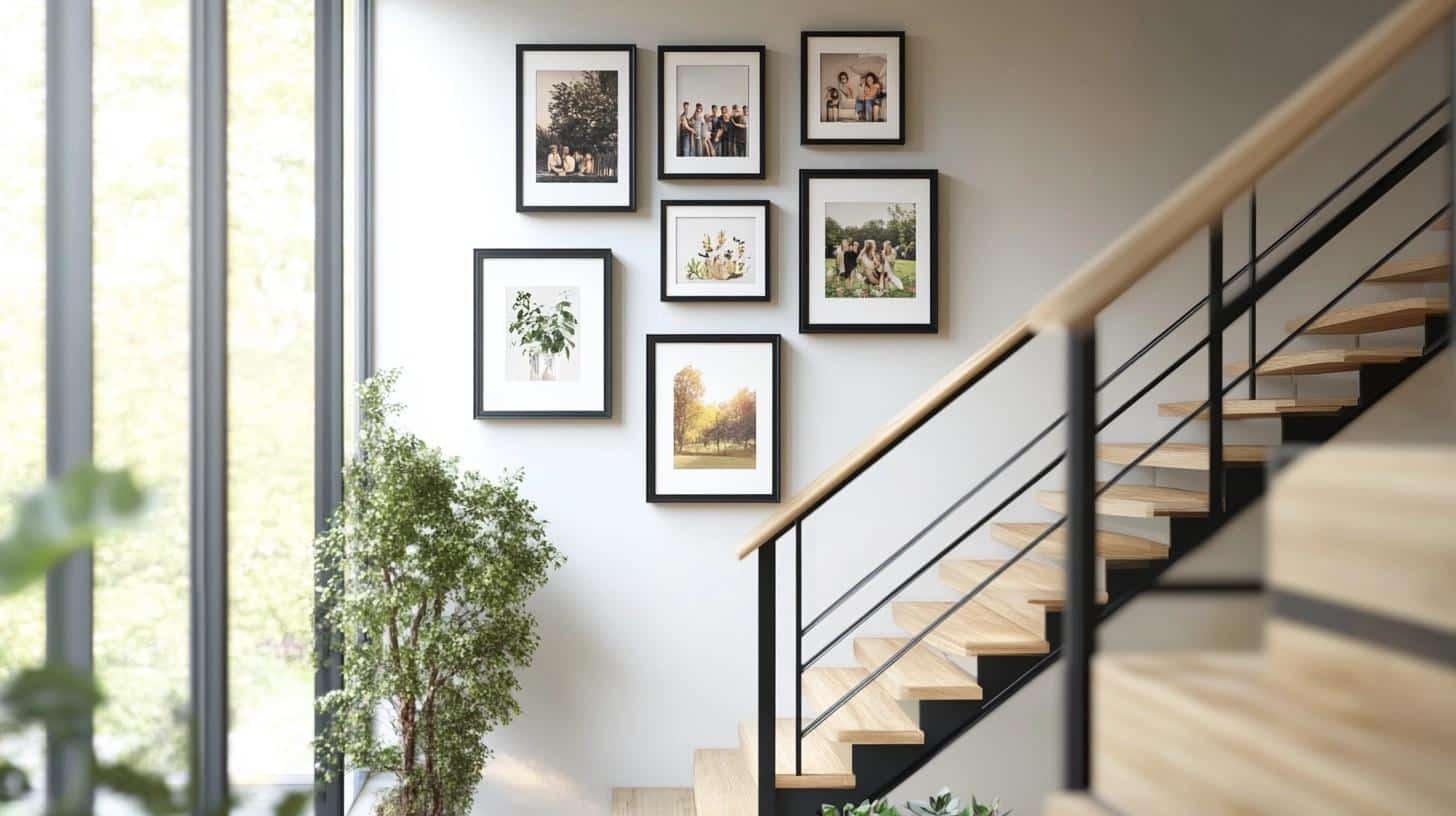
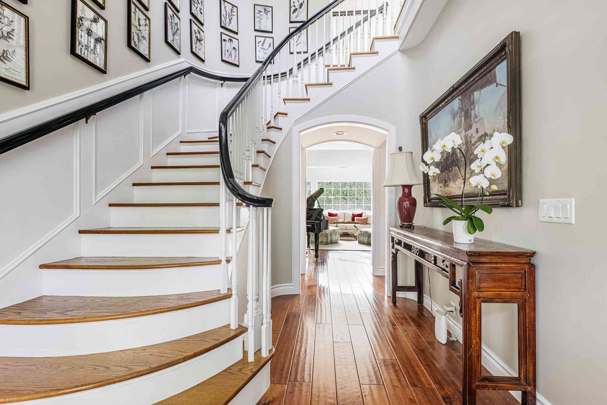
Eight frames follow the stairs’ slope, each one stepping up like the steps below. The frames hold family photos, getting slightly smaller as they go up, keeping the same space between each piece.
Key Points to Consider:
- Frame Selection: Gradual size change
- Spacing: Equal gaps (2-3 inches)
- Wall Position: Step alignment
- Style Match: Room decor harmony
6. Center-Focused Layout
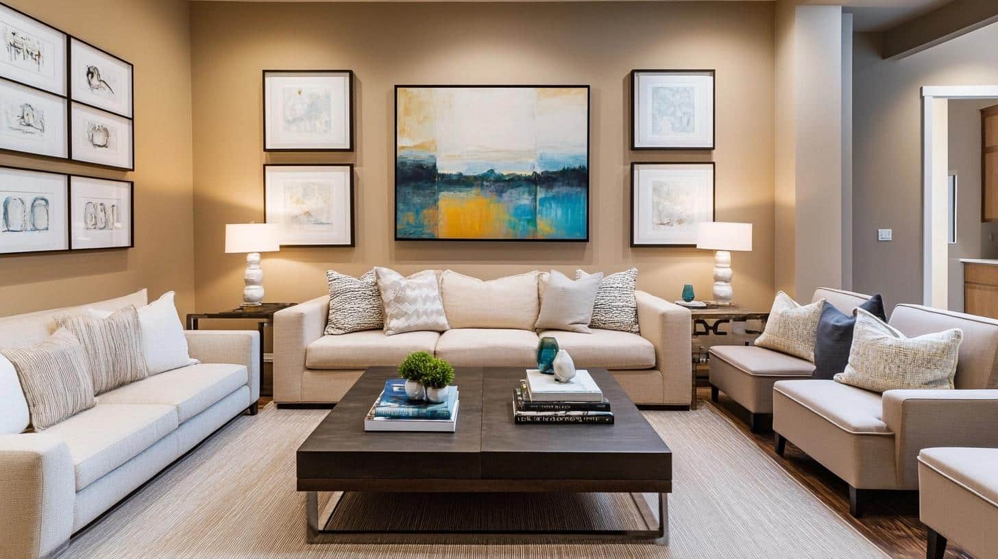
A large statement piece sits in the middle, with eight smaller frames placed evenly around it. The central art draws the eye first, while surrounding pieces in matching frames add depth to the display without taking attention from the main piece.
Key Points to Consider:
- Frame Selection: Mixed sizes, consistent style
- Spacing: Equal gaps (2-3 inches)
- Wall Position: Center alignment
- Style Match: Room decor harmony
7. Floor-to-Ceiling Layout
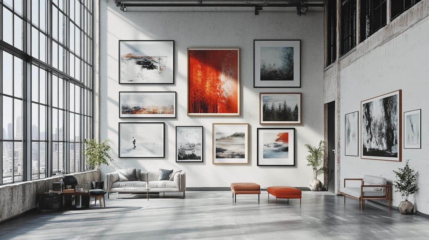
The wall fills with frames from bottom to top, using twenty pieces of varied sizes. The frames create a full wall of art, starting with larger pieces at the bottom and getting smaller toward the ceiling. Each row keeps steady spacing for a neat look.
Key Points to Consider:
- Frame Selection: Size variety, matching style
- Spacing: Equal gaps (2-3 inches)
- Wall Position: Full wall coverage
- Style Match: Room decor harmony
8. Shelf or Ledge Layout
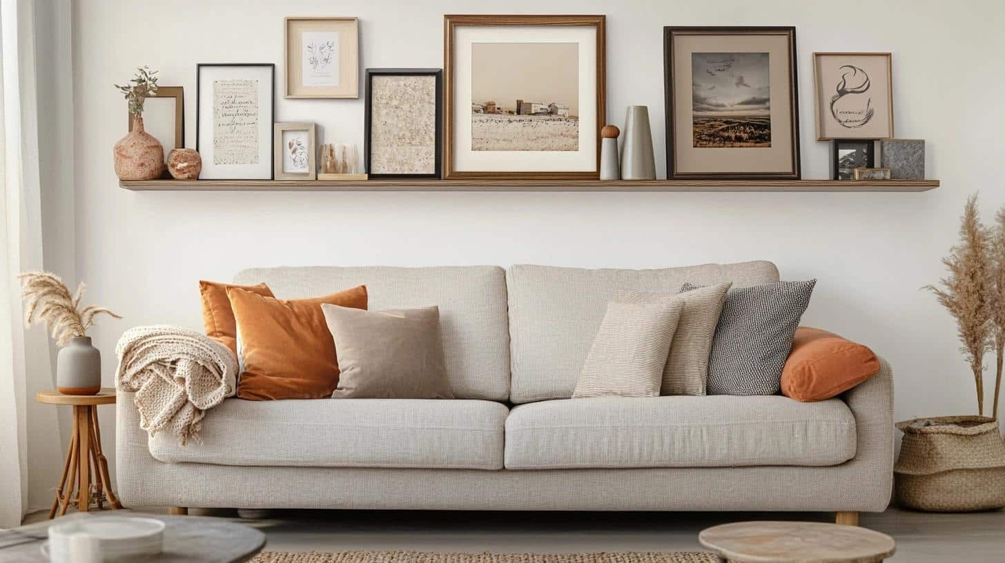
Three long white shelves hold different-sized frames that lean against the wall. The frames overlap slightly on each shelf, with taller pieces at the back and shorter ones in front. Small objects between frames add extra visual interest.
Key Points to Consider:
- Frame Selection: Mixed sizes, flexible arrangement
- Spacing: Layered placement
- Wall Position: Shelf height variation
- Style Match: Room decor harmony
Templates and Tools for Layout Precision
1. Paper Templates for Easy Frame Placement
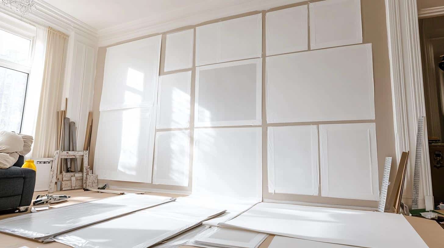
Cut paper pieces help you see the final look before making any holes. You can try different spots and heights without any damage to your walls. The paper lets you work out the best spots for each frame, mark nail points, and make changes until you’re happy with how everything fits together. This method makes it much easier to avoid mistakes and get the layout right on your first try.
Key Points:
- Required Items: Kraft paper, scissors, pencil, painter’s tape, measuring tape
- Setup Steps: Measure frames, cut paper to size, tape to wall, mark nail spots
- Safety Notes: Keep floor clear while working, use stable step stool, test tape on small wall area first
2. Picture Hanging Level or Laser Level
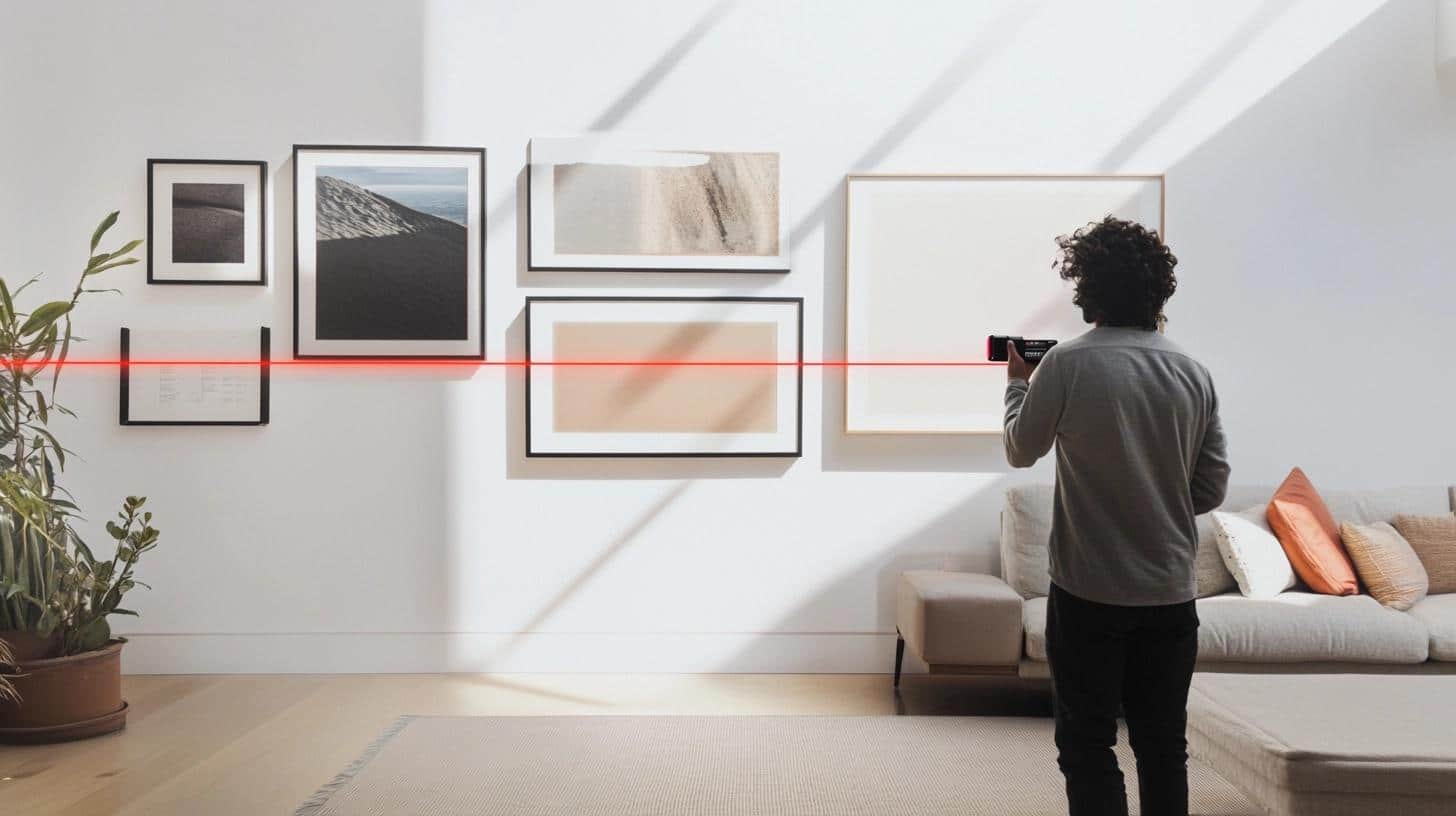
A level tool helps make sure all your frames sit perfectly straight on the wall. The laser feature shows clear lines that guide you while hanging each piece. This removes any doubt about whether frames are straight and helps you create clean rows and columns. It’s especially useful when working with multiple frames that need to line up with each other.
Key Points:
- Required Items: Level tool, batteries, marking pencil, ruler
- Setup Steps: Check battery life, find wall center, mark line points, test accuracy
- Safety Notes: Avoid looking directly at laser, secure tool properly, keep away from children
3. Measuring Tape or Ruler for Exact Spacing
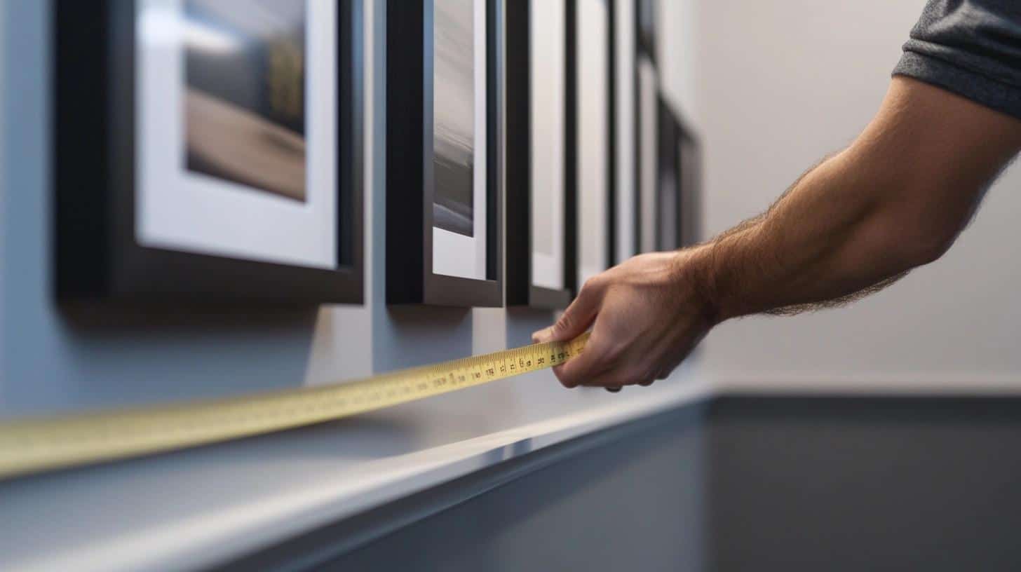
These basic tools help you keep exact spaces between frames for a clean, balanced look. You can mark spot after spot with the same gap size, making sure everything lines up perfectly. This method works well for any wall size and helps you space frames evenly from the center point outward. Good measurements make the difference between a random arrangement and one that looks professionally done.
Key Points:
- Required Items: Metal measuring tape, pencil, eraser, notepad for measurements
- Setup Steps: Mark center point, measure gaps, note measurements, check twice
- Safety Notes: Keep tools clean and dry, watch for sharp edges, store properly
4. Painter’s Tape for Temporary Guides
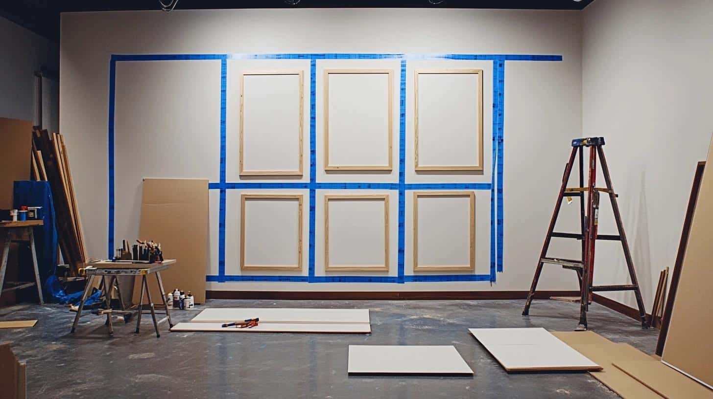
This special tape lets you mark frame spots without hurting your wall paint. You can use it to outline where each frame will go and to mark straight lines for hanging. The tape peels off easily when you’re done and won’t leave sticky residue behind. It’s perfect for testing different layouts and making sure everything looks good before you start hanging frames.
Key Points:
- Required Items: Blue painter’s tape, scissors, clean cloth for wall
- Setup Steps: Clean wall surface, cut tape strips, mark lines, test adhesion
- Safety Notes: Remove tape within 24 hours, test on small area, clean wall after
5. Frame Spacing Calculator Tools
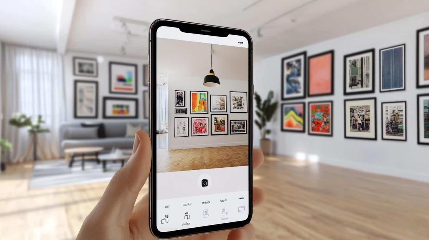
Digital tools take the math work out of planning your wall layout. These helpers figure out exactly where each frame should go based on your wall size and the number of pieces you want to hang. They save time and prevent errors by doing all the complex spacing calculations for you. You’ll get precise measurements that ensure your frames fit perfectly in your space.
Key Points:
- Required Items: Phone/computer, notepad, measuring tape, calculator
- Setup Steps: Measure wall, count frames, input numbers, write down results
- Safety Notes: Double-check all measurements, save calculations, make backup notes
6. Picture Hanging Kits for Easy Setup
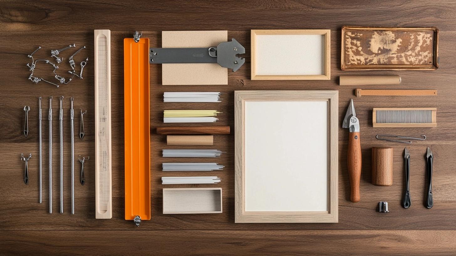
These all-in-one kits provide everything needed to hang your frames securely. They typically include different sizes of hooks and nails for various frame weights, plus tools to help you measure and mark spots. Using a complete kit ensures you have matching hardware that works together and the right tools for each step of the hanging process.
Key Points:
- Required Items: Complete hanging kit, hammer, wall anchors if needed
- Setup Steps: Sort supplies, check weight limits, pre-mark spots, test hooks
- Safety Notes: Use correct weight hooks, check for pipes/wires, wear safety glasses
Symmetry and Alignment Tips for Flawless Results
A good-looking wall display starts with proper alignment. Let me show you how to make your frames line up well and create a balanced look that makes sense to the eye.
Creating a Strong Center Point
The middle of your display sets the tone for everything else. Make these choices count:
- Put your biggest or most eye-catching piece in the center
- Keep heavier items near the middle to balance the weight
- Make sure your center piece sits at eye level (57-60 inches from floor)
- Use this piece as your guide for placing all other frames
- Mark clear spots on both sides of your center piece for even spacing
Getting Your Lines Right
Make sure everything lines up properly:
- Use a level to check each frame’s position
- Line up the tops of frames that sit next to each other
- Match bottom edges when hanging pieces in a row
- Keep a consistent distance from the ceiling
- Make sure corner pieces match in height
- Check your spacing as you add each new piece
Making Everything Work Together
Create a display that looks planned and put together:
- Group similar frame colors near each other
- Match frame styles in each section
- Keep spacing the same between pieces in a row or column
- Think about how shapes work together
- Fill empty spots with smaller pieces if needed
- Look at your display from different spots in the room
Tips for Success
- Start with your center and work out
- Check your work often with a level
- Step back to look at the big picture
- Fix small issues right away
- Take your time with each piece
- Keep measuring tools handy
Using Spacing Calculators and Apps for Precision
Online Tools That Help:
- Photo wall planning websites let you input your wall size.
- Mobile apps can scan your wall and suggest layouts.
- Simple calculators help find the center point of your wall.
How to Use These Tools:
- Measure Your Wall
- Input Your Numbers
- Get Your Results
- Make Adjustments
Troubleshooting Common Issues with Gallery Wall Layouts
Let me help you fix the most common problems that pop up with gallery walls and show you how to stop them from happening again.
Uneven Frames or Spacing: How to Fix It
Fixing Spacing Problems:
1. Check Your Current Layout
- Take a photo of your wall to spot problems
- Use sticky notes to mark spots that need fixing
- Note which frames need to move
2. Make the Fix
- Take down frames in the problem area
- Fill and touch up old nail holes
- Re-measure spaces between frames
- Mark new spots with fresh pencil marks
- Put up one frame at a time, checking level
3. Double-Check Your Work
- Stand back 10 feet to look at the whole wall
- Use your level on each frame
- Measure spaces between frames again
Quick Fixes for Common Issues:
- Crooked frames: Add level-lock hangers
- Gaps too wide: Move frames closer in small steps
- Frames too close: Shift each piece outward half an inch
- Uneven rows: Use a laser level to reset the line
How to Prevent Frames from Shifting Over Time
Best Hanging Methods:
1. Use the Right Hardware
- Pick hooks rated for your frame weight
- Install two hooks per frame for bigger pieces
- Get hooks with built-in levels
- Use proper wall anchors in spots without studs
2. Secure Your Frames
- Put rubber bumpers on frame corners
- Add sticky strips to bottom corners
- Use security clips for valuable pieces
- Check weight limits for your wall type
3. Keep Things Stable
- Clean dust from hooks monthly
- Check frame wires for wear
- Tighten any loose hardware
- Fix loose corners right away
Long-Term Protection:
- Keep frames away from air vents
- Watch for sun damage to your art
- Clean frames with a dry cloth only
- Check wall stability twice a year
Conclusion
Getting your gallery wall spacing right takes a bit of planning, but it’s worth the effort.
Remember to start with the 2/3 rule, keep 2-3 inches between frames, and use the right tools to hang everything straight.
The key points are simple: measure twice, use a level, and take your time with the layout.
Most issues come from rushing the process or not planning ahead.
Want to make your wall look even better? Save this guide and follow each step as you work. If you run into problems, come back to the troubleshooting section.
The most important thing is to start with a plan and stick to it.
Ready to begin? Grab your measuring tape, gather your frames, and start creating your perfect gallery wall display.
Frequently Asked Questions
How far apart should frames be spaced on a gallery wall?
Keep frames 2-3 inches apart. This spacing works for most walls and creates a clean look that’s easy to view.
What tools can help achieve perfect spacing?
Use a measuring tape, level, pencil, and ruler. A laser level helps with straight lines. Painter’s tape marks spots without wall damage.
How do I adjust spacing for larger frames?
Big frames (over 16×20″) need 3-4 inch gaps. Medium frames use 2-3 inches. Small frames work with 1.5-2 inch gaps. Match spacing to frame size.
Can I create a gallery wall on a small or large wall?
Yes! Small walls look good with 5-7 pieces. Large walls can hold more. Just follow the 2/3 rule – cover about two-thirds of the wall space with your display.

