
Sherwin-Williams Blustery Sky (SW 9140): Full Color Review
Choosing a dark paint color can feel tricky, especially when it shifts under different lighting. Blustery Sky is one of those shades that looks simple at first but reveals more the longer you live with it.
It sits between blue and gray, with a subtle undertone that reacts to its surroundings in quiet but noticeable ways.
Today, I’ll walk you through how this color actually behaves on walls, what makes it different from similar shades, and how to pair it so it feels balanced in your space. By the end, you’ll have a clear idea of whether it fits your room.
Let’s start with what this color really is.
Getting to Know Sherwin-Williams Blustery Sky
Blustery Sky (SW 9140) by Sherwin-Williams is a dark, muted paint color that’s often described as a blue-gray with subtle green undertones.
Basic Color Profile
- Color code: SW 9140
- LRV (Light Reflectance Value): 22
- Color family: Dark blue-gray with subtle green undertones
Blustery Sky is not a pure blue. Gray and green are mixed into its base, reducing its saturation and softening its intensity.
The result is a calm, storm-like neutral, cool, and deep without being bold or overwhelming.
Undertones Explained
Blustery Sky features a blue-gray as its primary hue, with a subtle green undertone just beneath the surface.
The gray in the base pulls brightness out of the blue, making the color feel more neutral than vivid. The green undertone is hidden in balanced light, but reactive; it surfaces depending on the conditions in your room.
- In bright natural light, the blue reads more clearly and crisply.
- In low or dim light, the gray takes over, softening the overall look.
- Under warm artificial light, the green undertone becomes more noticeable.
This undertone shift is part of what gives Blustery Sky its moody, layered quality. But it also means the color can feel dull or slightly muddy in rooms with poor lighting.
Blustery Sky in Real Spaces
Blustery Sky is a color that responds to its environment, and knowing how it behaves room by room helps you place it with confidence.
1. Kitchens

Blustery Sky brings contrast and structure to kitchens, particularly against light-colored cabinetry.
The dark blue-gray grounds the space visually, giving the room a more deliberate, composed feel without competing with the cabinetry or countertops.
2. Bathrooms
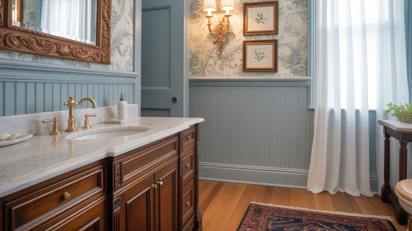
In bathrooms, the color reads cooler and sharper; the hard surfaces and typically bright lighting bring out its blue quality clearly.
In bathrooms with limited natural light, however, it can shift toward a flat gray, so lighting placement matters here more than in most rooms.
3. Living Rooms
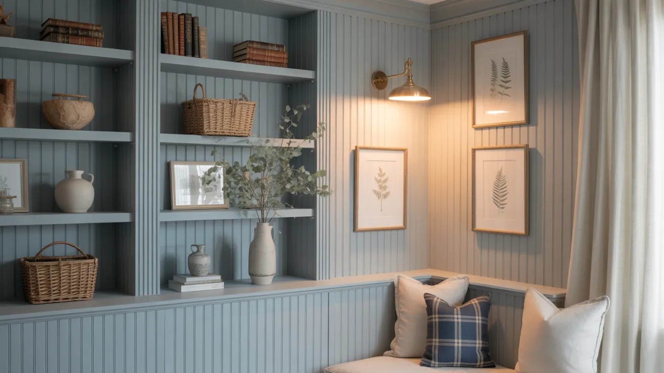
Blustery Sky adds depth to a living room without dominating it. It works well as a background tone, present and intentional, but not demanding attention.
Furniture and textiles remain the focus while the walls provide a calm, layered backdrop.
4. Bedrooms
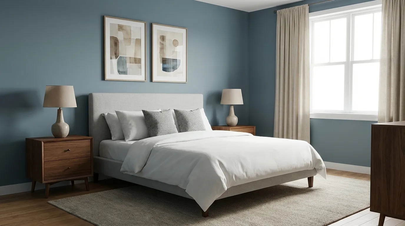
In a bedroom, Blustery Sky creates an enclosed, cocoon-like atmosphere.
Its low LRV absorbs rather than reflects light, naturally reducing brightness in the room and lending the space a quieter, more restful quality, making it well-suited for a space meant for winding down.
No matter the room, the key is light, how much you have, what type it is, and where it comes from will determine which side of Blustery Sky you live with every day.
How Lighting Affects It
Lighting plays a major role in how Blustery Sky looks. The same paint can shift noticeably depending on the direction your room faces and the time of day.
- North-facing rooms: These receive cooler, indirect light, which pushes Blustery Sky further into gray-blue territory and deepens its muted quality.
- South-facing rooms: Warm, consistent light softens the color and brings it into a more balanced read, neither too gray nor too blue.
- East-facing rooms: Morning light gives Blustery Sky a crisp, clean appearance. As the day progresses and the light fades, the color can shift slightly toward cooler, quieter tones.
- West-facing rooms: Evening sunlight warms the color considerably and can bring out the hidden green undertone, sometimes in unexpected ways.
Because the color shifts with the light, inconsistent lighting can lead to unpredictable results throughout the day.
Always test a sample on multiple walls and observe it in the morning, afternoon, and evening before making your final decision.
Blustery Sky vs. Other Sherwin-Williams Blues
Sherwin-Williams offers several dark, moody blue-gray shades, and the differences between them can be subtle. Below is a closer look at how Blustery Sky stacks up against some of the closest alternatives.
Blustery Sky vs. Storm Cloud (SW 6249)
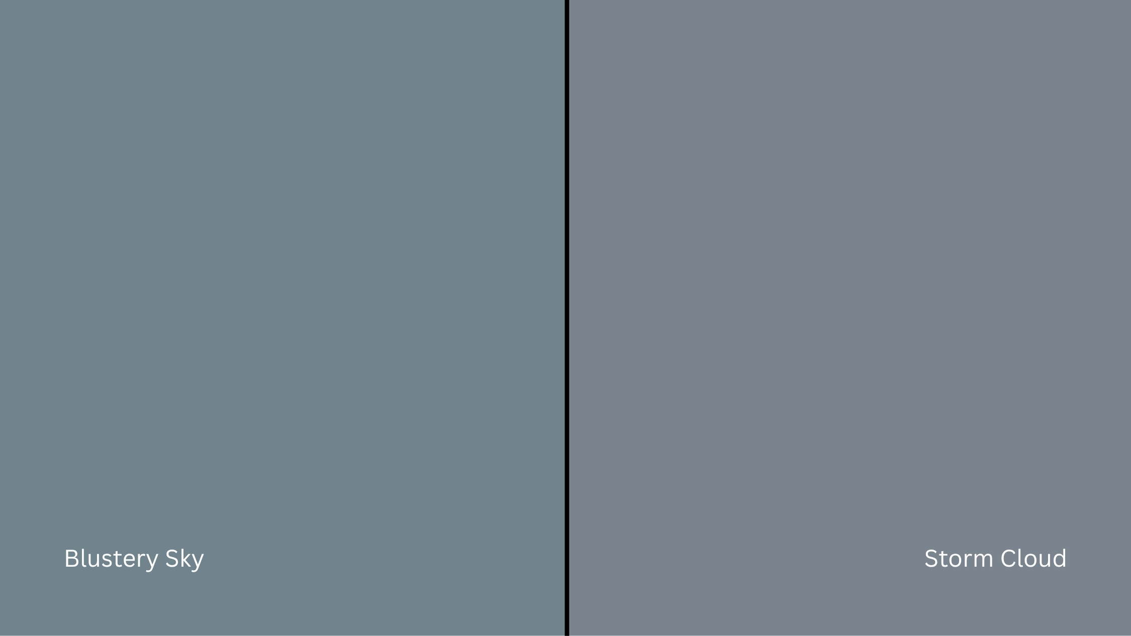
Storm Cloud is a softer, slightly lighter blue-gray that reads as more airy and less intense on the wall.
- Storm Cloud is less muted and carries less visual weight.
- Blustery Sky is deeper and heavier, with a more pronounced stormy quality.
If you want something a touch lighter and easier to live with in smaller spaces, Storm Cloud is the safer pick. If you want more depth and drama, Blustery Sky delivers it.
Blustery Sky vs. Naval (SW 6244)
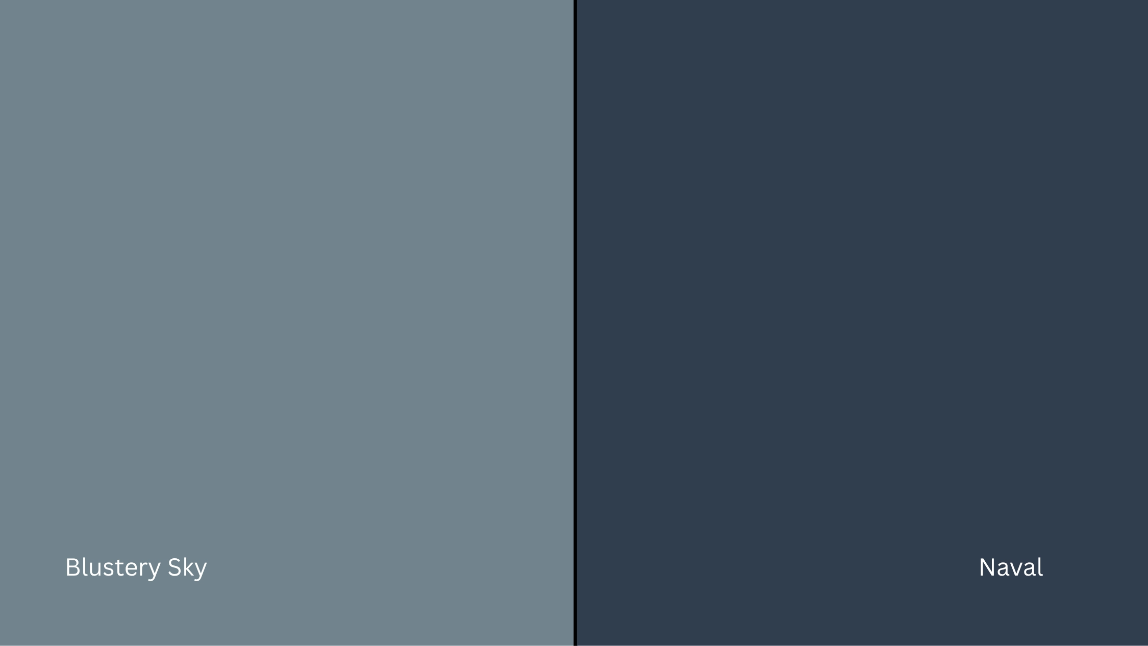
Naval is one of Sherwin-Williams’ most popular dark blues, a rich, saturated navy with a strong blue presence.
- Naval leans into true navy territory, bold and deeply saturated.
- Blustery Sky is softer and more neutral, with gray tempering the blue throughout.
Choose Naval if you want a confident, statement-making blue. Choose Blustery Sky if you want something that reads more like a refined neutral than a classic navy.
Blustery Sky vs. Cyberspace (SW 7076)
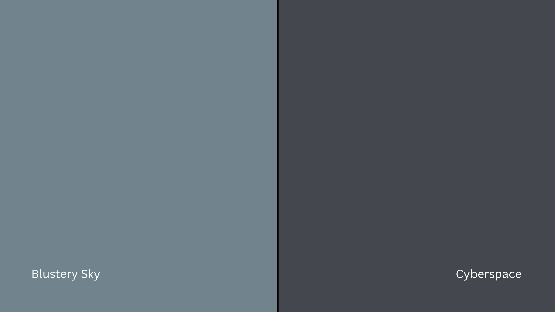
Cyberspace is darker, pushing further toward charcoal, with less blue visible on the wall.
- Cyberspace appears almost dark gray-green in many lighting conditions.
- Blustery Sky retains more blue presence and stays clearly in blue-gray territory.
Blustery Sky sits between bold blue and neutral gray, a middle ground that Cyberspace moves away from in favor of something darker and more grounded.
LRV and Undertone Comparison
| Paint Color | Undertones | LRV | Warm or Cool |
|---|---|---|---|
| Blustery Sky (SW 9140) | Blue-gray, green | ~22 | Cool |
| Storm Cloud (SW 6249) | Blue-gray | ~30 | Cool |
| Naval (SW 6244) | Blue, navy | ~4 | Cool |
| Cyberspace (SW 7076) | Gray-green | ~4 | Cool-Neutral |
All three alternatives are worth sampling alongside Blustery Sky in your actual space.
The differences are real, but they’re also lighting-dependent; what looks distinct on a swatch can shift considerably on a full wall.
Best Color Pairings for Blustery Sky
Blustery Sky is a strong, moody color, but it’s surprisingly versatile when paired with the right trim, accents, and finishes.
Here is how to match it throughout the home for a balanced, intentional look.
Trim and Ceiling Suggestions
Pairing Blustery Sky with the right white keeps the room from feeling too heavy or closed in. Here are some options that work best:
Extra White (SW 7006): A crisp, clean white with no strong undertones. It maximizes contrast against Blustery Sky and keeps the look sharp and defined.
Alabaster (SW 7008): A softer, slightly warm white that reduces the harshness of the contrast, making the pairing feel more relaxed and livable.
Pure White (SW 7005): A balanced option that sits between crisp and soft, offering clean contrast without feeling stark.
If you’re painting the ceiling the same color as the trim, use one of these whites in a flat finish to avoid drawing attention upward in an already dark room.
Accent Wall and Furniture Colors
For a calm, layered look, pair Blustery Sky with soft warm neutrals like cream, warm taupe, or dusty linen. For stronger contrast, lean into deep tones such as charcoal, burnt sienna, or dark olive.
For furniture, neutral upholstery in off-white or light gray keeps things cohesive, while a rich wood piece or bold accent chair adds the warmth the color’s cool base naturally lacks.
Hardware and Flooring Compatibility
For hardware, warm metals like brushed brass or unlacquered bronze balance the color’s coolness. Polished chrome keeps it modern; matte black adds drama.
For flooring, warm wood tones like walnut or honey oak shift the room’s warmth perception most effectively.
Lighter woods keep things airy, dark-stained floors deepen the mood, and cool gray tile creates a smooth tonal effect.
No matter what you choose, always test samples together in your actual room. Blustery Sky is responsive to everything around it.
Paint Finish Recommendations
The finish you choose changes how Blustery Sky reads on the wall, sometimes dramatically.
- Matte: Delivers a soft, muted look that absorbs light and minimizes imperfections.
- Eggshell: Offers balanced light reflection for a clean, everyday-livable finish.
- Satin: A higher sheen reflects more light, making undertones more noticeable.
- The shinier the finish, the more reactive the color, and the stronger the blue and green shifts become.
For most walls, eggshell is the safest starting point. Reserve satin for trim or high-traffic areas, and matte for spaces where you want the color to feel its quietest.
Sampling and Buying Options
Before you commit to a gallon, it’s worth testing Blustery Sky in your own space. Lighting, room size, and surrounding materials all affect how it reads, and this color is reactive enough that skipping the sample step is a real risk.
Where to Get Peel-and-Stick Samples
The easiest way to test Blustery Sky without painting a section of your wall is with peel-and-stick samples.
- Samplize offers real paint samples with an adhesive back, removable, repositionable, and damage-free.
- Local hardware stores often carry Sherwin-Williams chips or small sample pots.
- Sherwin-Williams retailers typically offer both painted cards and tester jars for brushing directly onto your wall.
Stick samples on multiple walls and check them in both morning and evening light to see how the blue, gray, and green undertones shift throughout the day.
Where to Buy the Paint
Blustery Sky is available both online and in-store.
- sherwin-williams.com offers direct ordering with store pickup or home delivery.
- Sherwin-Williams store locations carry it in a range of finishes.
- Some larger hardware retailers stock Sherwin-Williams paint or can place custom orders.
- Check ahead for curbside pickup or delivery availability at your nearest location.
Wherever you buy, make sure you note the exact color code, SW 9140, to avoid any mix-up at the counter. Getting the formula right the first time saves you from a costly repaint.
SW Blustery Sky Equivalents in Other Brands
If Sherwin-Williams isn’t accessible to you, a few other brands offer blue-gray shades that closely match Blustery Sky.
Keep in mind that each brand uses its own formula, so undertones and finish can vary, always sample side by side before making a final call.
| Brand | Color Name | Code | Notes |
|---|---|---|---|
| Benjamin Moore | Starry Night Blue | 2067-20 | Similar depth, slightly more blue |
| Behr | Distant Thunder | 760F-6 | Blue-gray with a comparable muted tone |
| Valspar | Quiet Storm | 6f727c | Close blue-gray, slightly cooler |
| PPG | Stone’s Throw | PPG1008-7 | Dark blue-gray with similar weight |
Conclusion
Blustery Sky is not just another dark paint. It changes with light, shifts between tones, and responds to everything around it. That makes it both interesting and slightly unpredictable if you do not test it properly
Once you understand how it behaves, it becomes much easier to place it in the right room and pair it with the right elements.
From lighting to finishes, small choices can change how the color feels every day.
If you are considering Blustery Sky, take the time to sample it and observe it closely. Try it in your space and see how it works before making your final decision.