Reviewing Sherwin Williams Mega Greige (SW 7031)
Picking the right neutral is never as simple as grabbing a gray or a beige off the shelf. Sherwin-Williams Mega Greige sits right in between, and that’s exactly what makes it so interesting.
This guide covers everything you need to know before you commit to this color. You’ll learn how it behaves in real rooms, what lighting does to its undertones, how it compares to similar shades, and what pairs well with it.
By the end, you’ll know exactly whether Mega Greige belongs in your home.
Getting to Know Mega Greige by Sherwin-Williams
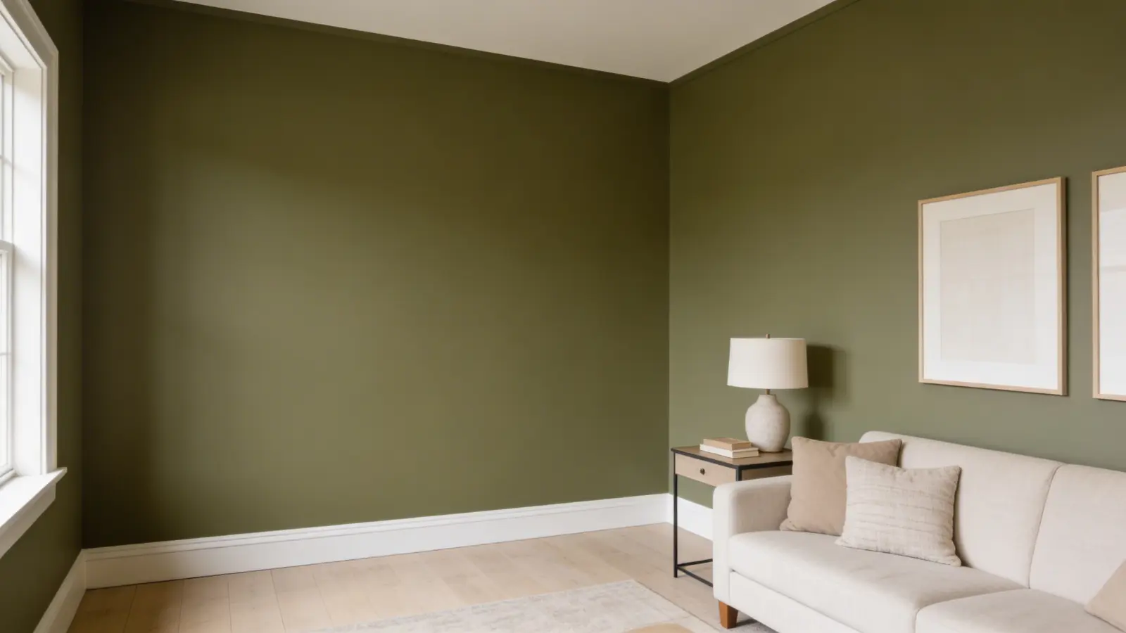
Mega Greige (SW 7031) is a warm, mid-toned neutral from Sherwin-Williams’ neutral paint colors collection. It blends gray and beige into one balanced shade, which is exactly what “greige” means.
Basic Color Profile
- Color code: SW 7031
- HEX: #ADA295
- RGB: 173, 162, 149
- LRV (Light Reflectance Value): 37
- Color family: Neutral greige
Undertones in Mega Greige and Why They Shift
Mega Greige has a warm base, but its undertones are layered and subtle.
The primary undertones are brown and taupe. These give it warmth and depth. Hidden deeper is a very faint green note and, occasionally, a slight violet cast. These rarely dominate but can show up depending on your lighting.
Here’s what causes undertone shifts:
- Warm artificial lighting (like incandescent or warm LED bulbs) can draw out the brown and taupe, making the color feel richer and cozier.
- Cool LED lights with a high color temperature can pull out the gray side and sometimes hint at violet.
- Natural daylight keeps it looking balanced and closest to true greige.
- Dimly lit spaces can make it feel dull or muddy; this is when the color struggles most.
Because Mega Greige doesn’t lock into one undertone, it’s very stable across different finishes and furniture styles. But it also means you should always sample it in your actual space before committing.
How Mega Greige Looks in Different Rooms
Mega Greige is used widely across interior spaces. Here’s how it tends to perform in each one:
1. Kitchens
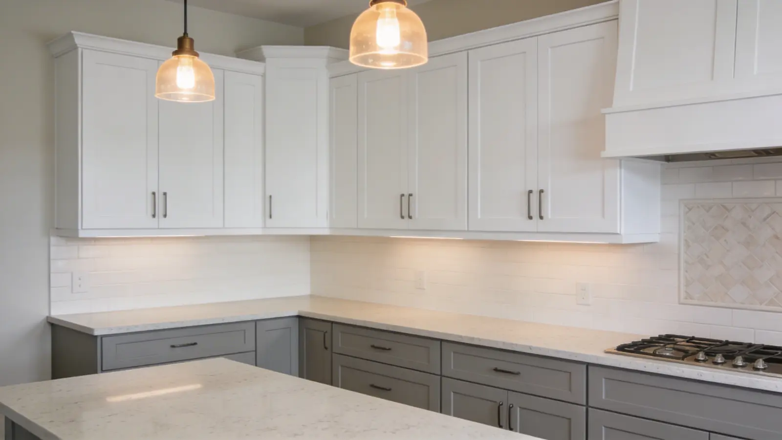
In kitchens, Mega Greige brings warmth without looking yellow or orange. It works especially well with white uppers and wood lower cabinets.
The color holds up well under warm pendant lighting and doesn’t wash out under bright overhead fixtures.
It also pairs beautifully with most countertop materials; white quartz, gray granite, and butcher block all look at home against it.
2. Bathrooms
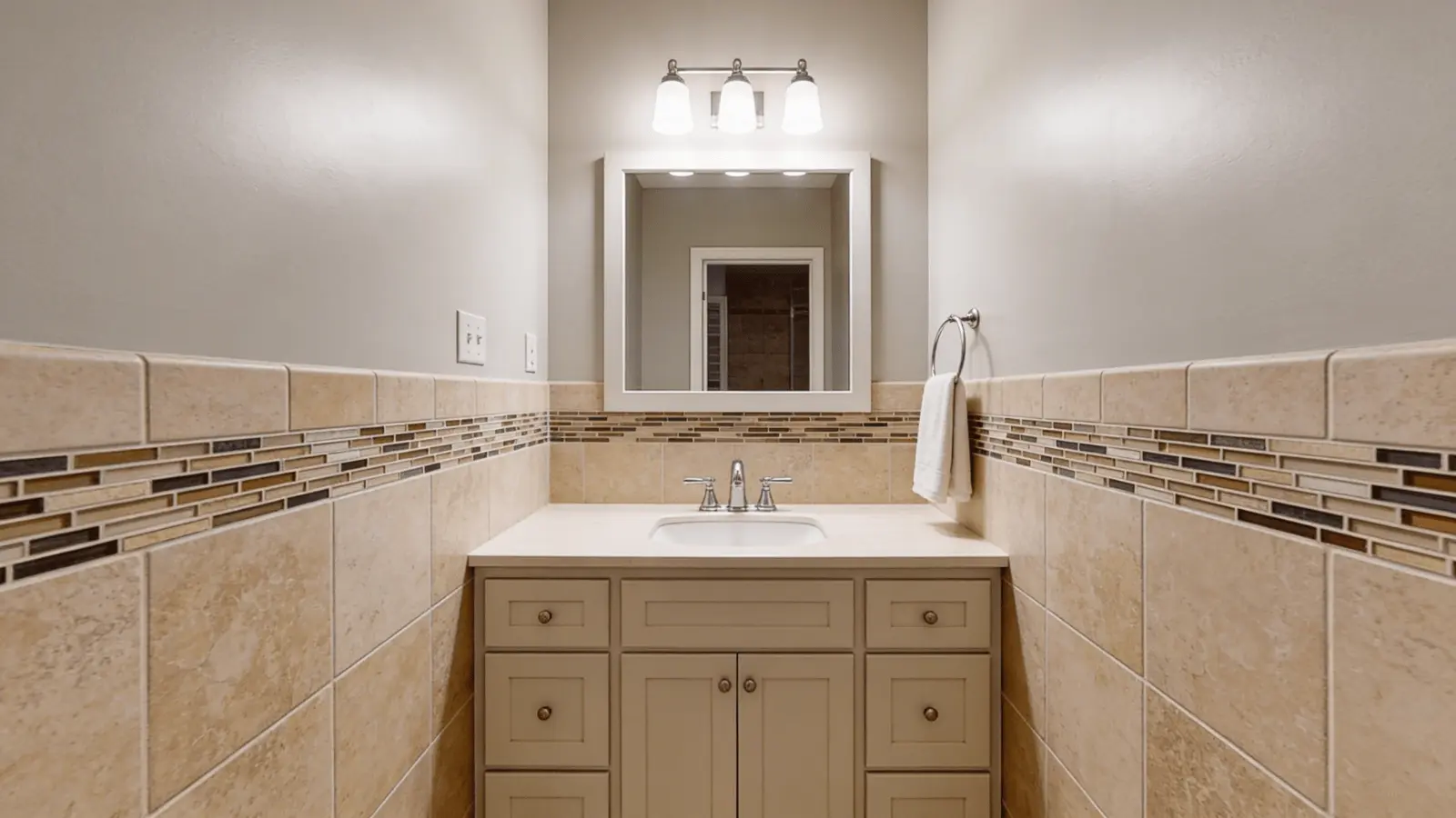
In bathrooms, Mega Greige creates a warm, spa-like feel. It works best with warm-toned or natural stone tiles.
Be cautious in windowless bathrooms; limited natural light can make the color feel flat or slightly muddy. A well-lit bathroom with warm fixtures, though, is where this color really comes alive.
3. Living Rooms
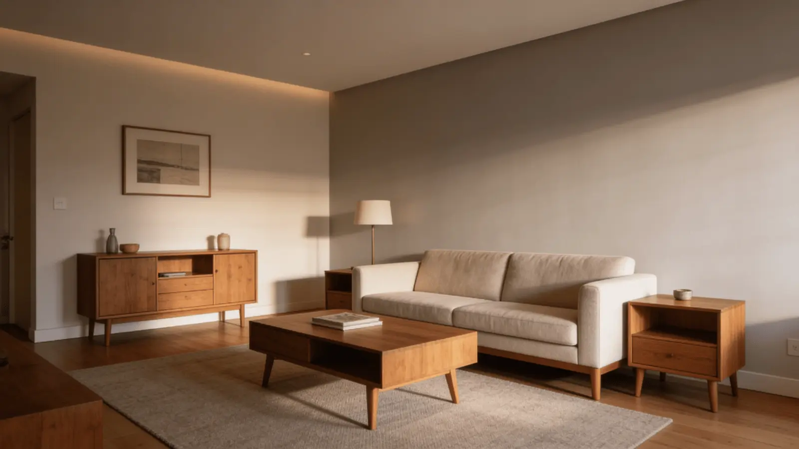
Living rooms are where Mega Greige truly earns its reputation. It reads warm and grounded without being heavy.
It suits a wide range of furniture styles, from modern farmhouse to transitional to traditional. Its low saturation means it doesn’t compete with art, textiles, or accent pieces.
4. Bedrooms
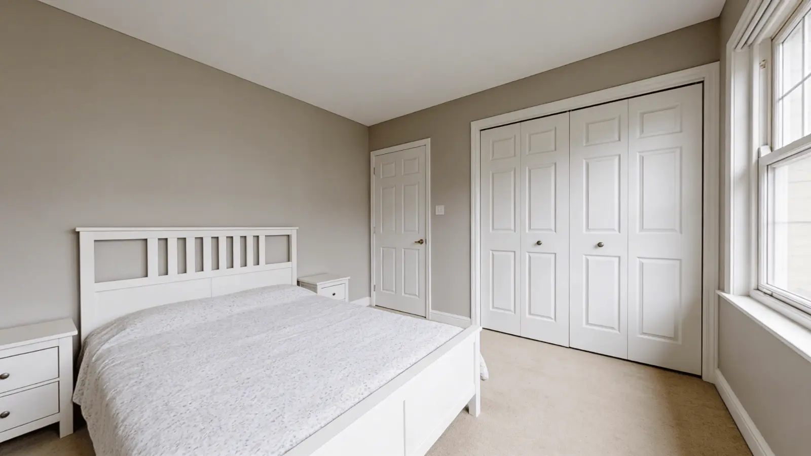
In bedrooms, Mega Greige creates a cozy and calm atmosphere. The warm undertones promote a relaxed feel without the space feeling too dark.
Just keep an eye on the window direction, more on that in the next section.
How Lighting Changes Mega Greige Throughout the Day
Lighting is the biggest variable with any greige. Mega Greige responds noticeably to both natural and artificial light.
Natural Light by Direction
- North-facing rooms: These get cooler, indirect light all day. Mega Greige holds its warmth here better than most grays; it won’t turn cold or flat.
- South-facing rooms: Warm, abundant light brings out the beige and brown tones beautifully. This is where Mega Greige looks most inviting.
- East-facing rooms: Morning light keeps it crisp and balanced. By afternoon, it softens, leaning slightly more neutral.
- West-facing rooms: Evening sunlight gives it a warm, golden glow. This is one of the best directions for Mega Greige.
Artificial Lighting Effects
- Warm bulbs (2700K–3000K): Enhance the brown and taupe tones, making the color feel cozy and rich.
- Neutral white bulbs (3500K–4000K): Keep the color looking balanced and true to the swatch.
- Cool daylight bulbs (5000K+): Shift it toward gray and may reveal a slight violet cast.
Always observe your sample under both natural and artificial light before deciding. Lighting shifts the perception of this color more than you’d expect.
Mega Greige vs. Other Sherwin-Williams Neutrals
Sherwin-Williams has several warm neutrals that look similar on a chip but behave very differently on walls. Here’s how Mega Greige compares to the most common alternatives.
Mega Greige vs. Agreeable Gray (SW 7029)
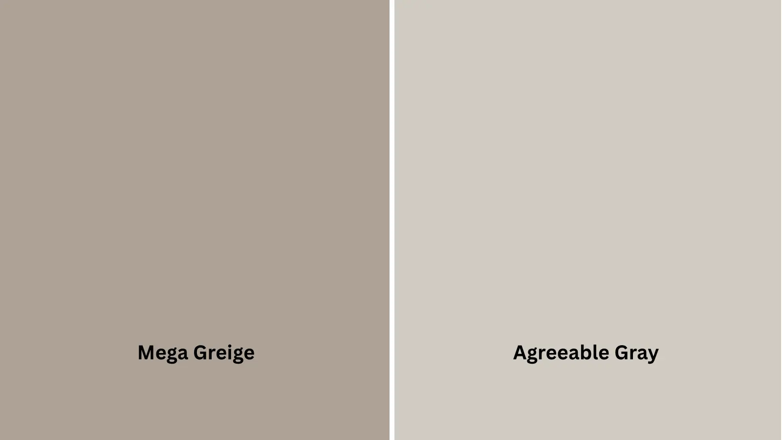
Agreeable Gray (SW 7029) is lighter, with an LRV of 60, significantly brighter than Mega Greige’s 37. It leans slightly cooler and behaves more like a true greige.
Mega Greige is deeper, warmer, and richer. Choose Agreeable Gray for a lighter, airier feel. Go with Mega Greige when you want more depth and a warmer, grounded look.
Mega Greige vs. Accessible Beige (SW 7036)
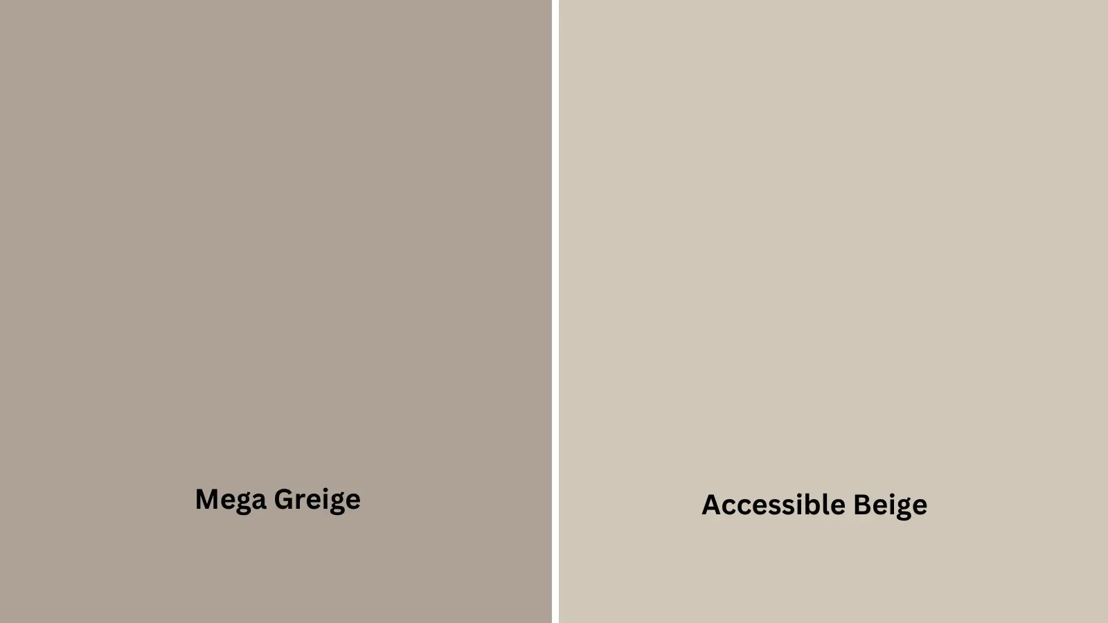
Accessible Beige (SW 7036) has an LRV of 58 and reads as a warmer, more beige-forward color. It doesn’t have the gray balance that Mega Greige does.
Mega Greige is slightly darker and more saturated. If you want something that clearly reads as beige, Accessible Beige is the pick. If you want that gray-beige balance, Mega Greige is better.
Mega Greige vs. Anew Gray (SW 7030)

Anew Gray (SW 7030) has an LRV of 47, making it lighter than Mega Greige but darker than Agreeable Gray. It shares a similar strip and undertone direction.
The key difference is depth; Mega Greige has more of it. If Mega Greige feels too dark for your space, Anew Gray is a natural step up.
Mega Greige vs. Perfect Greige (SW 6073)
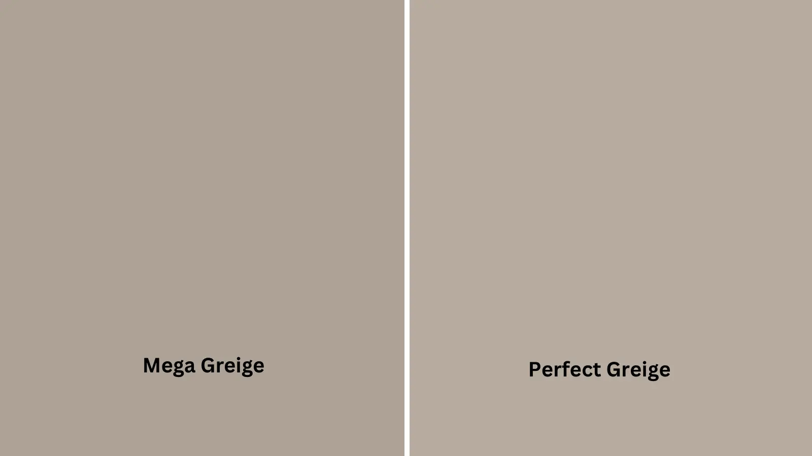
Perfect Greige (SW 6073) leans warmer and more taupe than Mega Greige. It has red-pink undertones and can flash creamy in warm light. Mega Greige is more balanced, less likely to read pink.
If your space has warm wood tones and you want them to pop, Perfect Greige leans into that. Mega Greige stays more neutral.
LRV Comparison Table
| Color | LRV | Undertones | Feel |
|---|---|---|---|
| Mega Greige SW 7031 | 37 | Brown, taupe, faint green | Warm, grounded |
| Agreeable Gray SW 7029 | 60 | Gray-beige, faint green | Light, flexible |
| Accessible Beige SW 7036 | 58 | Warm beige, orange base | Warm, beige-forward |
| Anew Gray SW 7030 | 47 | Greige, neutral | Balanced, mid-tone |
| Perfect Greige SW 6073 | — | Red-pink, creamy | Warm, taupe-heavy |
Similar LRVs don’t mean similar appearances. Always test samples side by side in your actual space.
What Colors Work Best with Mega Greige
Mega Greige is flexible, but it pairs best with colors that either complement its warmth or provide clean contrast.
Trim and Whites
Choosing the right white for trim makes a big difference.
- SW Pure White: A clean, balanced white that creates a fresh contrast without going too stark. Works well in modern and transitional spaces.
- SW Alabaster: A warmer white with soft cream tones. Pairs beautifully with Mega Greige for a cohesive, layered look.
- SW Shoji White: A softer off-white that blends seamlessly and keeps the space feeling calm.
Avoid overly cool or bright whites; they can create an undertone clash with Mega Greige’s warm base.
Accent Colors
Mega Greige pairs well across a wide range:
- Navy blue and charcoal: Strong contrast, great for accents, throw pillows, or a feature wall in a living room.
- Sage green and dusty olive: Harmonize with the warm undertones and feel grounded and natural.
- Muted coral or terracotta: Add warmth and energy without clashing.
- Deep bronze or rust: Earthy tones that complement Mega Greige’s richness.
Avoid strong cool colors like icy blue or slate gray; they can make Mega Greige look muddy by contrast.
Materials and Finishes
The right materials bring out the best in this color.
- Wood tones: Medium and warm-toned woods like walnut, oak, and cherry look excellent alongside Mega Greige. They share the same warm frequency.
- Metals: Brass and gold add warmth and feel sophisticated. Matte black creates a bold, modern contrast. Chrome works, but it can feel slightly cold.
- Stone and tile: Natural stone in warm grays and taupes pairs well. Avoid very cool or blue-toned tiles; they can create undertone tension.
How Paint Finish Affects Mega Greige’s Appearance
The finish you choose changes how Mega Greige looks on your walls, more than most people realize.
- Matte: Absorbs light and softens the color. Undertones are more subtle. Great for low-traffic areas like bedrooms and ceilings.
- Eggshell: Reflects just enough light to give a balanced, true reading of the color. Works well in living rooms and dining areas.
- Satin: More reflective, which can bring out the taupe and green undertones more clearly. Good for kitchens, bathrooms, and hallways, spaces that need durability.
Higher sheen = more visible undertones. If you’re unsure, go with eggshell for the most accurate color representation.
What to Expect Before Choosing Mega Greige
Mega Greige works well, but not everywhere. Knowing when it fits and when it doesn’t will save you from repainting.
It works best when:
- You want a warm, grounded neutral with depth
- Your room gets moderate to good natural light
- You have warm-toned finishes like wood floors or brass hardware
- You’re going for a transitional, farmhouse, or traditional look
Avoid it when:
- Your room has very little natural light; it can look flat or muddy
- You want a light, airy gray feel; the LRV of 37 means it won’t brighten a room the way lighter shades do
- Your existing finishes are very cool-toned; the warm undertones may clash
Key things to check before committing: lighting direction, existing materials, and your desired mood. Always apply a large sample to your wall and view it in the morning, midday, and evening.
Key Takeaways About Mega Greige
- SW 7031 is a warm, medium-depth greige with an LRV of 37
- Primary undertones are brown and taupe, with faint green and violet notes
- It holds warmth even in north-facing rooms, a key strength over most grays
- Works beautifully in south and west-facing rooms with warm natural light
- Best paired with warm whites, wood tones, brass, and earthy accents
- Sheen level affects undertone visibility; eggshell is the safest choice
- Not ideal for dark or low-light spaces
Conclusion
Sherwin-Williams Mega Greige is one of those rare neutrals that feels warm, grounded, and polished all at once. It works across a range of styles and holds its color even in tricky lighting.
That said, it’s not for every space; low-light rooms and cool-toned finishes can work against it.
Sample it on your walls and watch how it shifts throughout the day before committing. Get that step right, and you’ll have a color that feels timeless.
Have you tried Mega Greige in your home? Drop a comment below and let me know how it turned out!