Harmony in Interior Design A Room by Room Guide
Your room is fully furnished. You’ve picked the colors, bought the furniture, hung the art. And yet something still feels off.
You can’t quite name it. But the space just doesn’t feel right.
That feeling usually comes down to one thing: a lack of harmony in interior design.
And the good news? It’s fixable. You don’t need to start over or spend more money. You just need to know which design elements to adjust and how they work together.
This guide covers exactly that, with practical steps you can use today.
What is Harmony in Interior Design?
Harmony in interior design is the visual and sensory agreement between all elements in a space. It is not about matching, it is about connection.
Harmony is different from matching. A linen sofa, a wooden side table, and a woven rug can look completely different and still feel connected through shared tone and material quality.
It goes beyond looks. A harmonious space feels calm. Your eye settles the moment you walk in instead of searching for a place to land.
When harmony is missing, you feel it even if you cannot name it. The room looks complete on paper, but something still feels off.
Harmony is also not expensive to achieve. Most fixes come from adjusting what is already there, not adding more.
Core Design Principles Behind Harmony
Harmony in a room comes from a few simple design ideas working together. When each element feels connected, the space looks calm and put together.
- Unity: Every element, from furniture to lighting, should feel chosen with the same intention. Nothing should look random.
- Balance: Spread visual weight evenly using either symmetrical (mirror-like) or asymmetrical (different but equal) layouts.
- Scale: Measure before buying so furniture fits the room properly and doesn’t feel too big or too small.
- Rhythm: Create flow by repeating one element in at least three places to guide the eye naturally.
- Contrast: Use one bold feature against a softer background to add interest without making the space feel busy.
Using Color for Harmony

Color is one of the fastest ways to build or break harmony in interior design. Many people treat it as a final step. In reality, color should lead the process. It sets the tone for every decision that follows.
The 60 30 10 Rule
This guideline helps distribute color in a balanced way:
- 60 percent is your dominant color, typically walls and large furniture.
- 30 percent is your secondary color, such as rugs or accent chairs.
- 10 percent is your accent color used in smaller decorative elements.
This structure prevents any one color from overwhelming the space.
Building Your Palette Thoughtfully
Getting color balance right is not about matching everything, but making sure tones feel connected.
- Use a Color Bridge: Add rugs or textiles that blend warm and cool tones to connect the space.
- Focus on Undertones: Similar-looking colors can clash if their undertones differ.
- Check Real Lighting: Always test colors in your room under natural and artificial light.
- Choose Neutral Bases: Warm whites, taupes, and greiges keep the space balanced.
- Maintain Color Flow: Carry at least one undertone between rooms for a smooth transition.
Small details like undertones and lighting can completely change how colors work together.
How to Apply Harmony in Your Space
Every principle covered so far comes together at the practical level. Here is how to apply them directly, starting with the decisions that shape a room the most.
1. Set One Clear Focal Point

Every room needs one visual anchor: a fireplace, a statement sofa, a bed, or a strong piece of artwork. The specific object matters less than the commitment to one.
Arrange all remaining furniture to face or point toward that anchor. Keep the path to it clear and leave breathing room around it. A crowded focal point loses its impact entirely.
2. Mix Styles without Creating Visual Noise

Mixing modern and traditional pieces works well when there is one shared element connecting them, a color, a material, or a finish that runs through both styles.
Avoid pushing all furniture against the walls. It creates a hollow, disconnected center. Watch the scale gap, too. A very large piece next to a very small one, without something mid-sized to bridge them, creates tension that decor alone cannot fix.
3. Layer Textures and Patterns with Intention

Texture stops a room from feeling flat. Combining wood with linen, metal with velvet, or matte with gloss creates depth that color alone cannot achieve.
Keep it to three or four distinct textures per room. For patterns, pair one large, one medium, and one small. Two patterns of the same scale in the same room will always compete for attention.
4. Lighting as a Unifying Element

A single ceiling light flattens everything and strips the room of dimension. Lighting works best in three layers: ambient for general illumination, task for specific functions, and accent to highlight a feature or create a mood.
Mismatched fixtures quietly break visual continuity. Choosing fixtures that share one finish, matte black, brushed nickel, or warm brass, brings a room together fast.
5. Living Room

The living room contains more visual elements than any other space. That is why harmony matters most here. Allow one dominant color to anchor the room, whether across the sofa, the rug, or a major wall.
Ensure one material appears at least three times. Wood, brass, or linen can quietly tie the space together when repeated intentionally.
Mix seating sizes carefully and keep the focal point immediately obvious from the entry. If your eye does not know where to land, simplify the layout first.
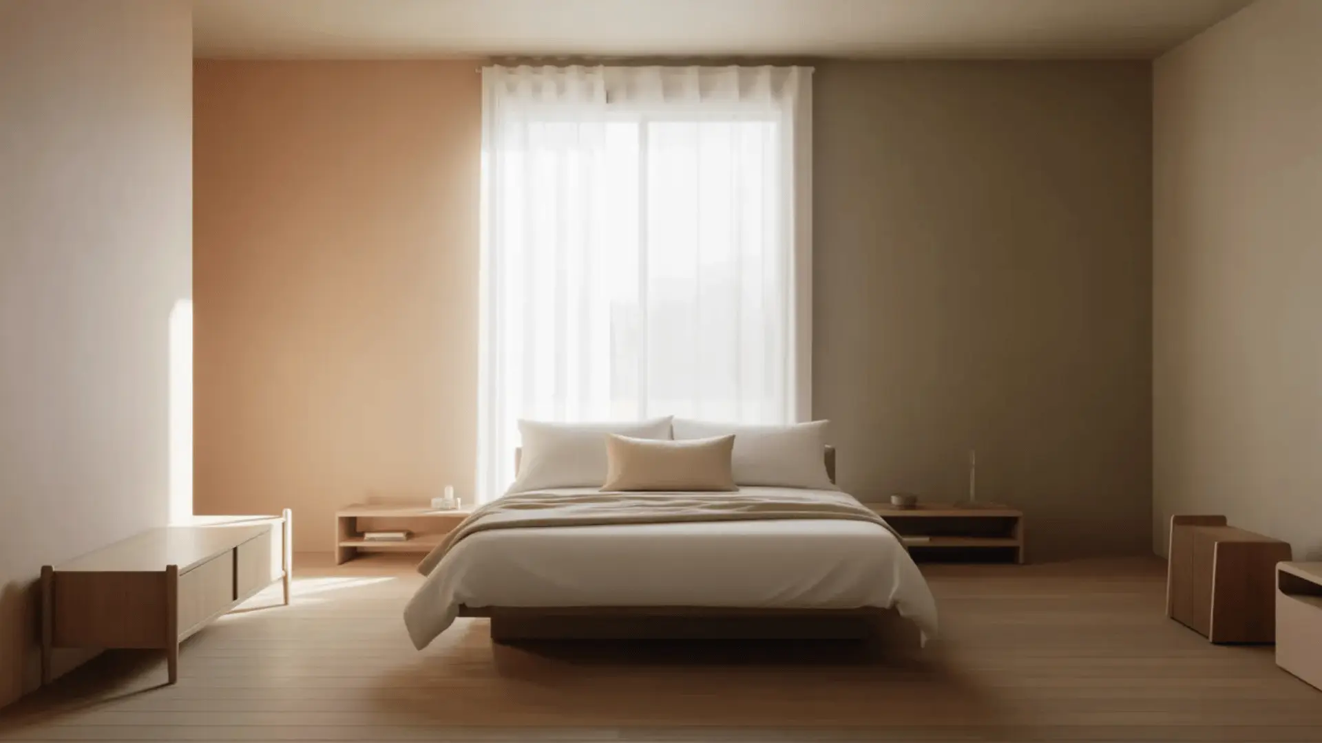
6. Bedroom

Bedrooms often collect furniture from different periods, making cohesion more difficult. Limit the palette to two or three tones and avoid introducing new colors through decor.
Center the bed on the primary wall with symmetrical nightstands and matching bedside lighting on both sides.
Layer two to three textures within the same color family for depth. In smaller bedrooms, keep contrast minimal to prevent the space from feeling crowded.
7. Kitchen and Dining Area

These spaces are often visually connected but designed separately, which creates subtle disharmony.
Match hardware finishes across both areas: cabinet pulls, faucets, and lighting fixtures should all share a single consistent finish.
Carry one material from the kitchen into the dining area and use the same wall color across both zones. When these elements align, the transition between cooking and dining feels intentional rather than accidental.
Common Mistakes That Break Harmony
Most harmony issues are not caused by poor taste. They stem from a few predictable decisions:
- Treating walls, floors, and ceilings as separate choices rather than one visual system. A warm-toned floor paired with a cool-toned wall will always feel disconnected.
- Buying pieces individually without considering the room as a whole. Bring measurements, photos, and finish samples into every major purchase decision.
- Allowing too many elements to compete for attention at once. One focal point, one dominant color, and one repeated material are usually enough.
- Ignoring transitions between rooms. One shared undertone or finish is often all it takes to connect adjacent spaces.
Conclusion
Achieving harmony in interior design does not require a complete overhaul or a large budget. It requires alignment.
A shared undertone. A repeated finish. A clear focal point. Small decisions that reinforce one another. The rooms that feel right are rarely the most expensive ones. They are the most intentional.
Start with one space. Apply one principle. Adjust deliberately. Harmony builds gradually, through clarity and consistency.
That is how cohesive design is created, one thoughtful decision at a time.