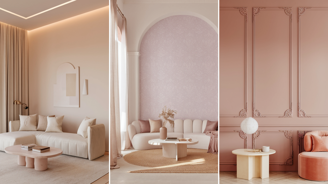
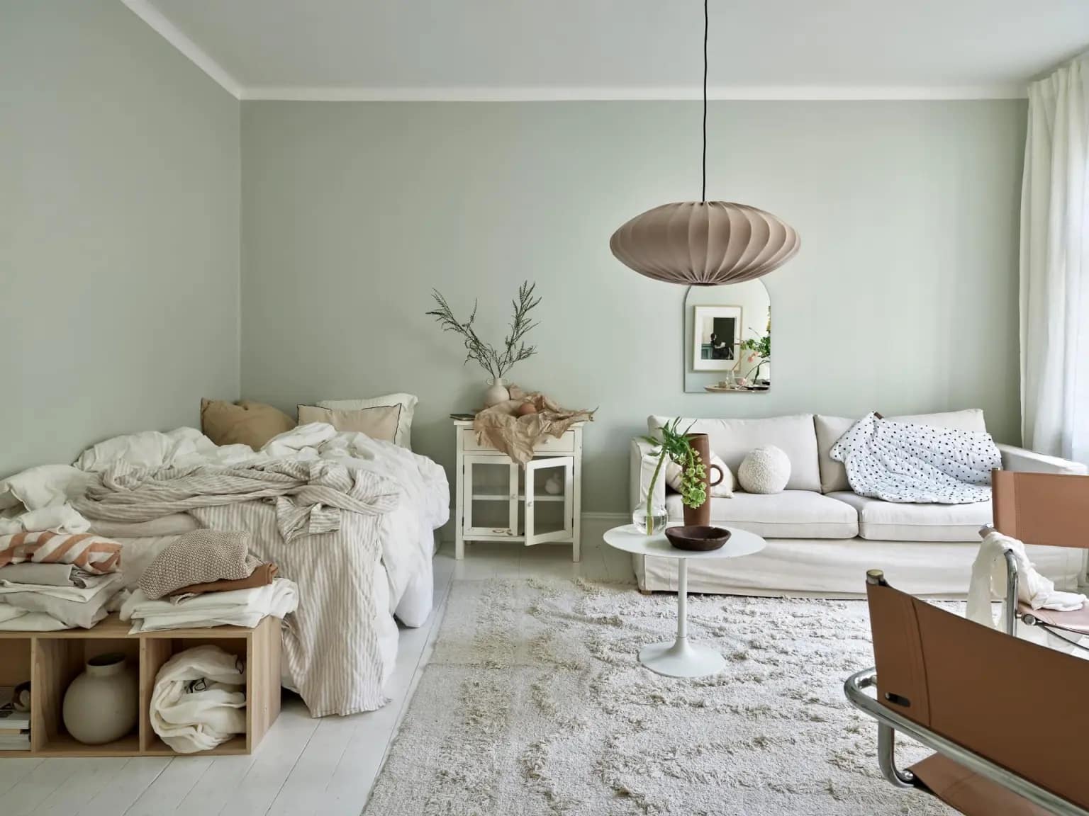
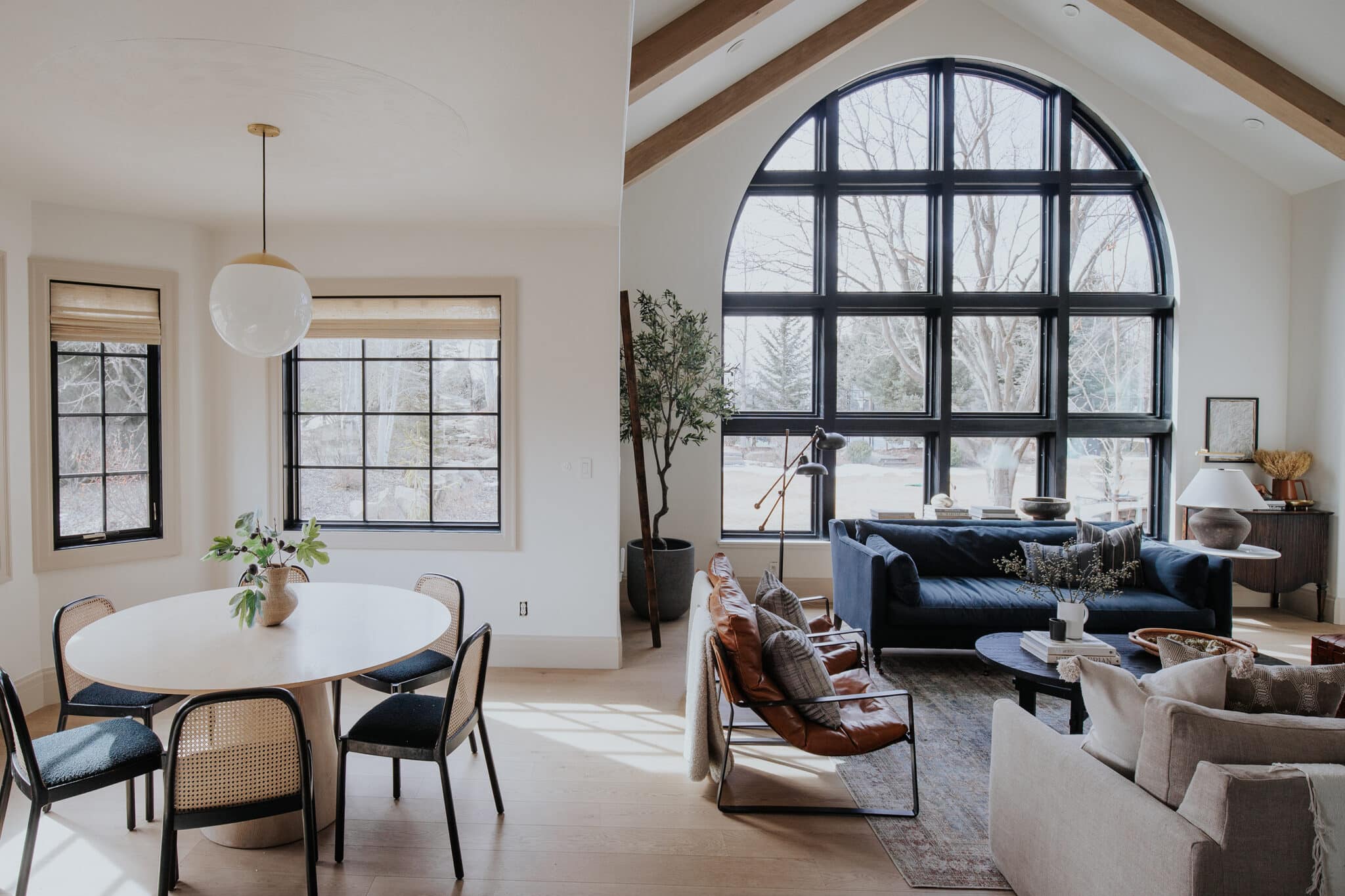
17 Best White Paints with Pink Undertones
Have you ever painted a wall white, only to realize it looks kind of pink? You’re not the only one.
It can feel frustrating when the color shifts once it dries or when the light changes. What was meant to feel calm or clean might suddenly feel off.
This guide is here to help you figure it out before picking your paint. You’ll learn what pink undertones are, why they show up, and how to spot them.
We’ll walk through the best shades to try, where they work best, and how to test colors at home. You’ll feel more confident choosing a white that actually looks the way you want it to.
What are Pink Undertones in White Paint?
Undertones are the tiny bits of color you see in white paint once it’s on the wall. They’re not always clear in the can, but they come through with light or next to other colors.
Pink undertones show up when red tones are mixed into white. Some paints are made this way on purpose. Others can turn pink when lighting or nearby colors affect how we see them.
Light makes a big difference. A warm bulb can pull out pink tones. A cooler bulb may hide them. Wall size, time of day, and even flooring can make your white paint look more pink or less.
Top White Paints with Pink Undertones
White paint isn’t always plain white. Some shades carry soft hints of other colors, like pink. These subtle changes can warm up a room and make it feel more relaxed.
The following shades bring just enough color to add comfort while still looking light and neutral.
Benjamin Moore Picks
1. White Blush OC-86

White Blush OC-86 This soft white brings a light, rosy feel without being too bold. It’s perfect in sunny rooms, where natural light brings out the subtle warmth.
It pairs well with soft woods and light neutrals. You might use it in living rooms, reading corners, or hallways that get consistent daylight.
2. Pink Damask OC-72

Pink Damask OC-72 color leans more toward a gentle pink than most whites, but it still feels soft. It’s good for spaces where you want a bit of warmth without using a full pink shade.
It looks especially nice with cream or linen tones and adds comfort to bedrooms or guest rooms.
3. White Opulence OC-69

White Opulence OC-69 paint has a creamy base and a very mild pink tint. It’s often used in rooms that feel too cool and need a bit of visual warmth.
It sits nicely with gold accents, warm grays, and soft lighting. You can use it in family rooms or even calm home offices.
4. Atrium White OC-145

Atrium White OC-145 The red base in this white can shift more pink when the lighting changes, especially in rooms with less sunlight.
It works well when you want something that feels warm but doesn’t overpower other colors. Try it in spaces with neutral decor, like light browns or soft beiges.
5. Ballet White OC-9

Ballet White OC-9 is a very light off-white that can take on a pink tone when paired with warm lighting. It brings a quiet touch of color without drawing too much attention.
Many people like it for open layouts or spaces that connect different rooms. It also works with light wood tones.
6. Opaline OC-33

Opaline OC-33 Though it may appear off-white on a swatch, this shade changes with the lighting in your home.
In a warm room or under soft bulbs, the pink tone becomes more noticeable. It suits spaces with white trim or light taupe furnishings and adds depth without strong contrast.
Sherwin-Williams Picks
7. Alabaster SW-7008

Alabaster is a soft white that blends into many spaces. On its own, it feels calm and flexible. But next to cool colors or under warm lights, a pink tone may start to show.
It’s often used in entryways, kitchens, or main living areas where you want a soft and gentle base.
8. Snowbound SW-7004

Snowbound SW-7004 is a clean white that reads cool at first, but can lean pink depending on the light. South-facing rooms bring out a warmer look.
It works with both modern and classic decor. You can use it with dark floors for contrast or with soft textures to keep things calm.
9. Moderate White SW 6140

Moderate White SW 6140 shade has a calm cream base with a quiet pink touch. It’s a comfortable option for shared spaces like living rooms or dens.
It pairs well with neutral furniture and can help balance rooms that feel too stark. Consider it for areas with natural wood or terracotta tiles.
10. Roman Column SW 7562

Roman Column SW 7562 white offers a clean feel with just a bit of warmth. In the right space, its pink undertone becomes more noticeable, especially near beige, taupe, or warm brown.
It’s a safe pick for open areas and tends to blend well with simple, soft furnishings and layered textures.
11. White Dogwood SW 6315

White Dogwood SW 6315 shade is closer to a light pink but can feel more like a soft white in large, sunny spaces.
It’s helpful for adding interest to walls without committing to a bright color. Try it in nurseries, powder rooms, or dressing areas where you want a calm and soft look.
12. Shell White SW 8917

Shell White has a gentle pink base that doesn’t overpower. It stays neutral enough for trims and doors but also works on full walls.
People often choose it for bathrooms, closets, or laundry rooms to keep things light but not too stark. It also pairs well with ivory.
Other Picks and Designer Favorites
13. Farrow & Ball’s Calamine

Farrow & Ball’s Calamine, known as a soft pink, this shade can act more like a white in large, bright areas. It’s cooler than others on the list, but still adds a gentle feel.
Use it in modern spaces or homes with pale oak, brushed metal, or white fabrics to create a clean and soft finish.
14. Valspar Soft White 7004-9

In warm lighting, Valspar Soft White 7004-9 shade picks up a peachy pink tone that feels soft and settled. It brings a nice change to basic white and works well in bedrooms or lounges.
It looks nice with soft beige, tan, or mid-tone wood furniture, making the space feel balanced and inviting.
15. Behr Cotton Knit

Behr Cotton Knit is a creamy white that holds a soft pink tone that shows in the afternoon light. It works nicely in homes with natural tones or stone textures.
Many use it in large spaces to bring warmth without going too dark. It can help soften sharp lines in furniture or tilework.
16. Behr Cameo White MQ3-32

Behr Cameo White MQ3-32 shade has a very quiet pink tint that becomes more visible in warm rooms. It’s popular in homes with wood floors or neutral palettes.
The color feels calm and gentle, making it useful in transitional spaces like hallways or stair landings.
17. Clare Paint Timeless

Clare Paint Timeless is a soft white that has a hint of blush that lifts the space without taking over. Designers like it for bedrooms, nurseries, or reading rooms.
It pairs well with linen, clay, and rattan textures. It’s especially helpful when you want something warmer than plain white but not fully colored.
Where to Use White with Pink Undertones
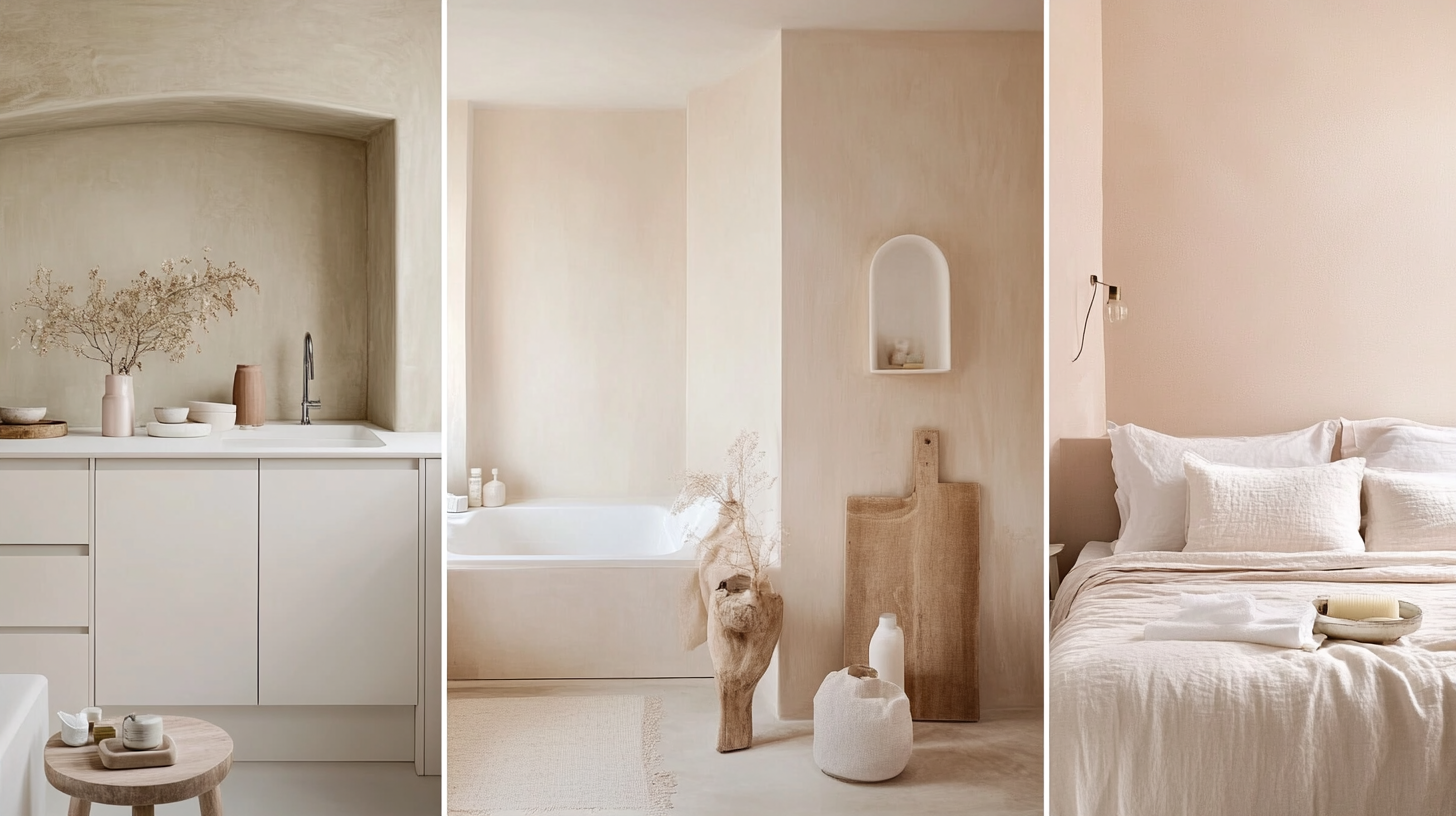
White paint with a pink base brings warmth to different areas of your home.
These shades work well in both small and large spaces, especially where natural light changes through the day.
They are often used to soften rooms that feel too cool or plain. Picking the right spot can help the color show its best side without being too strong.
Best Rooms for These Shades
- Kitchens: Soft whites make the space feel warm. Pink undertones can brighten a kitchen with cool counters.
- Bathrooms: Small rooms benefit from gentle tones. These whites add warmth without being bold.
- Bedrooms: If you want a calm, relaxed feeling, a pink-tinted white works well.
Exterior Use
- Climate Considerations: Sunny areas can make pink tones pop. Cloudy places might tone them down.
- Natural Light Changes: Morning sun brings out the pink. Evening shadows might hide it. Test before you commit.
How to Choose the Right Shade
- Test with real samples: Apply small swatches of paint directly to your walls, not just on boards or paper. Try to test near corners, windows, and doorways to see how the shade reacts in each area.
- Check at different times of day: View the painted samples in the morning, midday, and evening. Natural light changes throughout the day and can shift how much of the pink tone appears.
- Compare side by side: Place at least two or three swatches next to each other. Looking at them together helps you spot the subtle color changes that might not be clear when viewed alone.
- Use brand paint tools: Many paint companies have free apps that let you upload a photo of your room. You can preview shades directly on your walls, which helps narrow down your choices before buying samples.
- Look at finishes too: If you plan to use a specific finish, like satin or matte, try to test the exact type. Some finishes make colors appear deeper or brighter than others.
Common Mistakes to Avoid
It’s easy to expect one thing from a paint swatch and end up with something that feels off once it’s on the wall. A white shade that looks simple in the store might show more color than expected at home.
Several small steps are often missed during the paint selection process. Paying attention to these can save you from repainting later.
- White turns too pink: This often happens when the sample isn’t viewed in your space. What seems clear in a can might shift on the wall, especially after drying.
- Light affects color: The kind of bulbs you use and how much sunlight your room gets can change the way paint appears. Even reflections from nearby items or windows make a difference.
- Finish changes the feel: A glossy finish can make undertones stand out more. On the other hand, matte or flat options might reduce the effect. Always test the finish you plan to use, not just the color.
Several small steps are often missed during the paint selection process. Paying attention to these can save you from repainting later.
Conclusion
You’ve seen how white paint can shift once it’s on your walls. Pink tones can sneak in and surprise you, but now you know what to watch for.
This helped break down the colors that carry a soft pink base, when they work best, and how light or finish can change the feel.
By learning what to look for, you’re better prepared to choose a shade that feels right. No more second-guessing after the paint dries.
If you want more tips on color choices or matching shades, check out our other guides. They’ll help you plan with confidence.

