A Guide to Selecting Best Paint Colors to Brighten a Room
Do your rooms look darker than you’d like?
I know how frustrating it is when paint colors make spaces feel small and gloomy instead of open and bright.
I’ll show you exactly how to choose colors that will make your rooms feel bigger, brighter, and more inviting – without making costly mistakes that you’ll regret later.
In this guide, I’ll walk you through my steps for picking the perfect paint colors, including which shades work best for different lighting situations, how to test colors properly, and simple tricks to create the bright, welcoming space you want.
So, without wasting further time, let’s jump into our blog
Color Theory Behind Brightening Your Space with Paints
I’ve studied how colors work together and am excited to share what I’ve learned about brightening rooms with the right paint choices.
Understanding color theory helps you make smart paint choices.
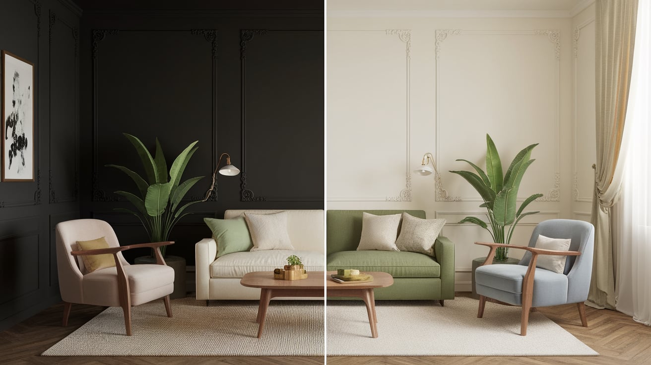
Light colors bounce more light around a room, while dark shades soak it up.
The key aspects of color theory for room brightness include:
- Light shades like cream, pale yellow, and soft white reflect up to 80% of light in your room
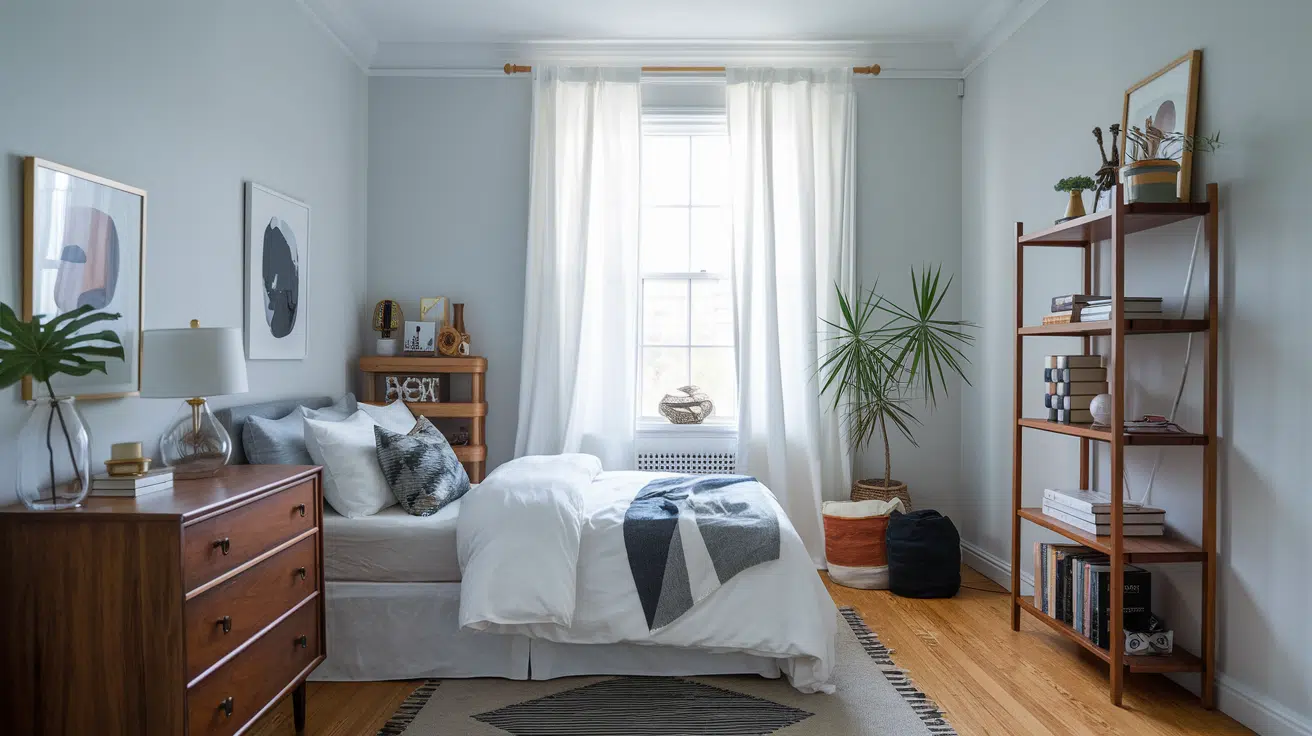
- Cool tones such as light blue and gentle green create a sense of openness
- Warm whites and ivory shades bring a soft glow without harsh glare
When working with color theory, consider how different times of day affect your space. The morning sun brings out warm colors, while the afternoon light works well with cool tones.
Testing paint samples at different hours lets you see how colors change throughout the day.
I’ve found these color theory basics helpful in my projects, and I can’t wait to show you my tried-and-tested paint choices for each room type.
Key Considerations when Selecting Paint Colors
I want to highlight the key factors that can make or break your paint color choice. I’ve learned these through years of helping people pick the perfect shades.
Light Sources in Your Room
Natural sunlight changes how colors look at different times.
The direction your windows face matters, too. South-facing rooms get bright light, while north-facing ones need lighter paint shades.
Room Size and Shape
Small rooms often look better with light colors, and high ceilings pair well with warmer shades.
I always check room measurements before suggesting paint colors to my clients.
Current Room Design
Your furniture, flooring, and fixtures affect paint choices.
I tell my clients to look at their current decor first. The right paint should make these elements stand out, not clash with them.
Testing Environment
I always suggest checking paint samples in your actual room. Store lighting can be misleading.
Put sample patches on different walls and watch them for a full day.
Personal Style Needs
Style the room according to its purpose.
A home office needs colors that are different from those of a bedroom. Your color comfort level matters, too—pick shades you’ll enjoy seeing daily.
What Paint Finishes Work Best for Brightening a Room?
| Paint Finish | Sheen Level | Description | Best Uses | Advantages | Considerations |
|---|---|---|---|---|---|
| High-Gloss | Very High | Highly reflective, mirror-like surface. | Trims, moldings, doors. | – Maximizes light reflection. – Easy to clean. |
– Highlights imperfections; requires a smooth surface. |
| Semi-Gloss | High | Slightly less reflective than high-gloss but still shiny. | Bathrooms, kitchens, accent walls. | – Enhances brightness. – Moisture and stain resistant. |
– Slightly highlights imperfections. |
| Satin | Moderate | Soft, smooth sheen with moderate light reflection. | Living rooms, bedrooms, hallways. | – Balanced light reflection. – Durable and easy to maintain. |
– Requires careful application to avoid marks. |
| Eggshell | Low | Low-luster finish with minimal sheen. | Walls in rooms with decent natural light. | – Subtle light reflection. – Hides imperfections better than gloss. |
– Less reflective; not ideal for very dark rooms. |
| Matte (Flat) | Very Low | Absorbs light, creating a velvety, non-reflective surface. | Ceilings and walls with imperfections. | – Hides surface flaws effectively. – Creates a cozy ambiance. |
– It does not brighten; it is less durable and harder to clean. |
Top Color Families for Brightening the Rooms
Brightening a room starts with selecting the perfect paint color. The right shade enhances light and elevates the overall mood of the space.
Whites
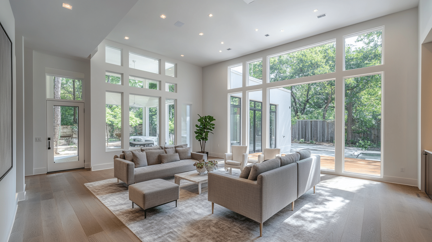
Description: Clean, pure shades with high reflectance, creating a sense of openness and brightness.
My Top Recommendation: Sherwin Williams High Reflective White (SW 7757).
Why It Brightens a Room: Reflects maximum light, making spaces feel larger and more airy.
Best Uses: Ceilings, walls, trim, and doors for a crisp, fresh look.
Warm Neutrals
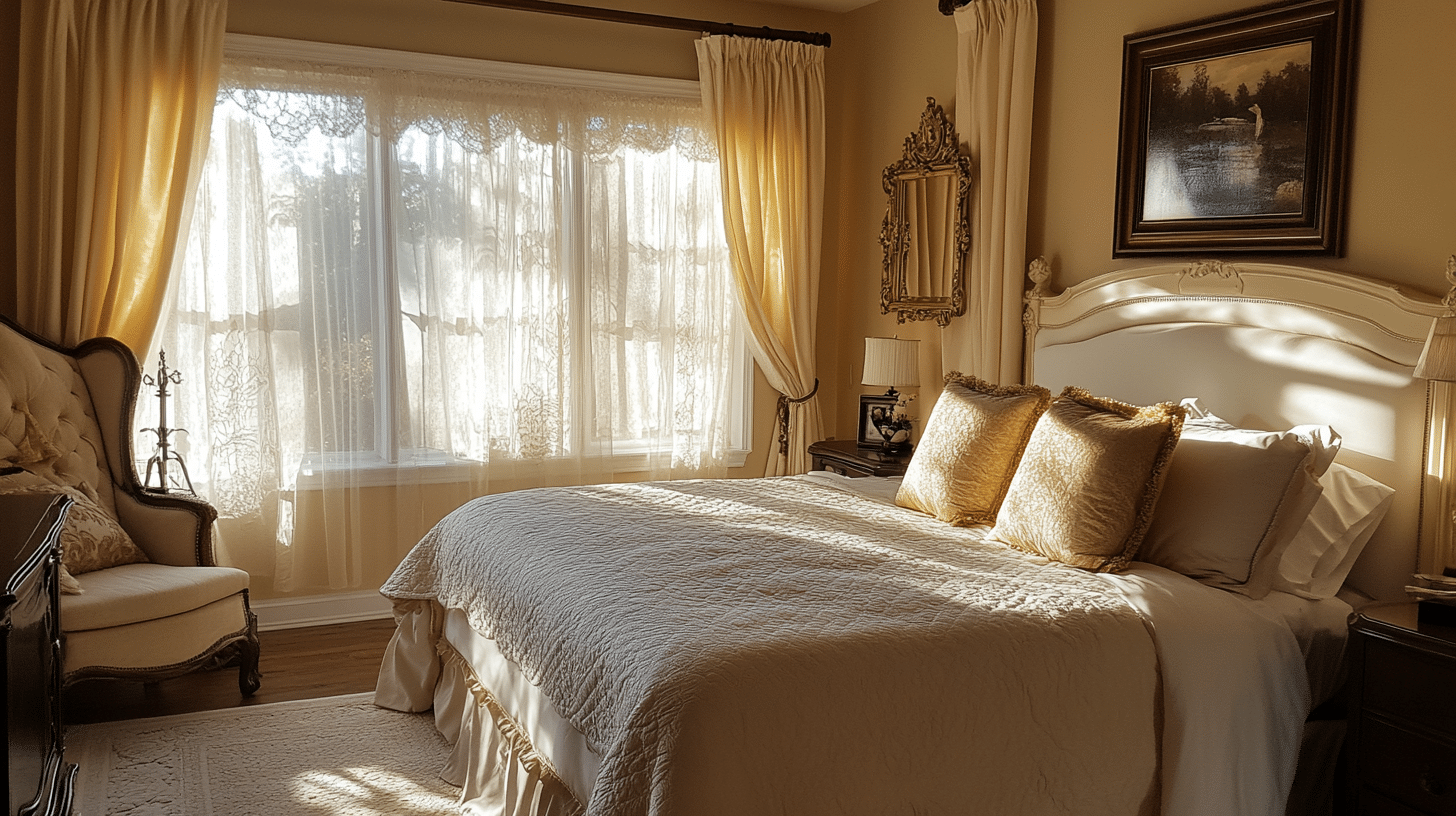
Description: Soft beiges and taupes that add warmth without dulling the space.
My Top Recommendation: Sherwin Williams Eider White (SW 7014).
Why It Brightens a Room: Provides a warm, inviting atmosphere while maintaining high light reflectance.
Best Uses: Living rooms, bedrooms, and open-concept spaces for a cozy yet bright feel.
Light Grays
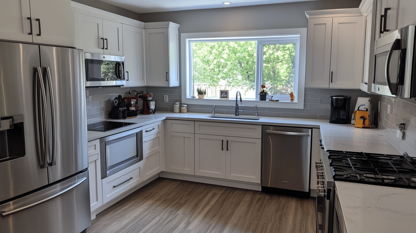
Description: Subtle gray tones with high light reflectance value and slight undertones for depth.
My Top Recommendation: Sherwin Williams Repose Gray (SW 7015).
Why It Brightens a Room: Adds depth and modern sophistication while keeping the room bright and neutral.
Best Uses: Living rooms, kitchens, and home offices for a balanced, polished look.
Pastels
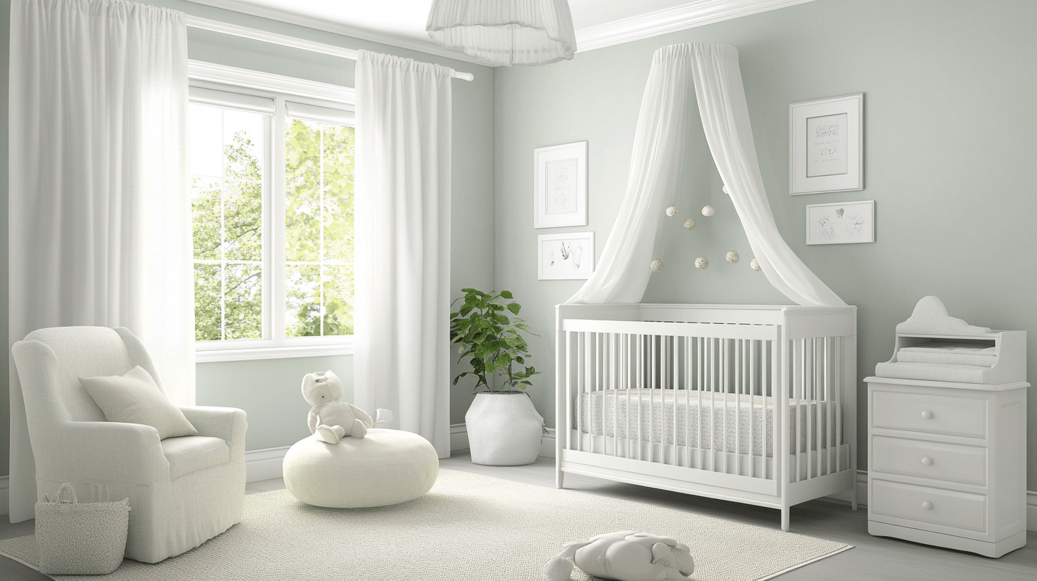
Description: Soft, muted tones of colors like blue, green, pink, and yellow.
My Top Recommendation: Pale blue, mint green, blush pink, lemon chiffon.
Why It Brightens a Room: Adds a subtle pop of color while reflecting plenty of light.
Best Uses: Bedrooms, bathrooms, nurseries, or spaces that need a soft, cheerful vibe.
Soft Yellows
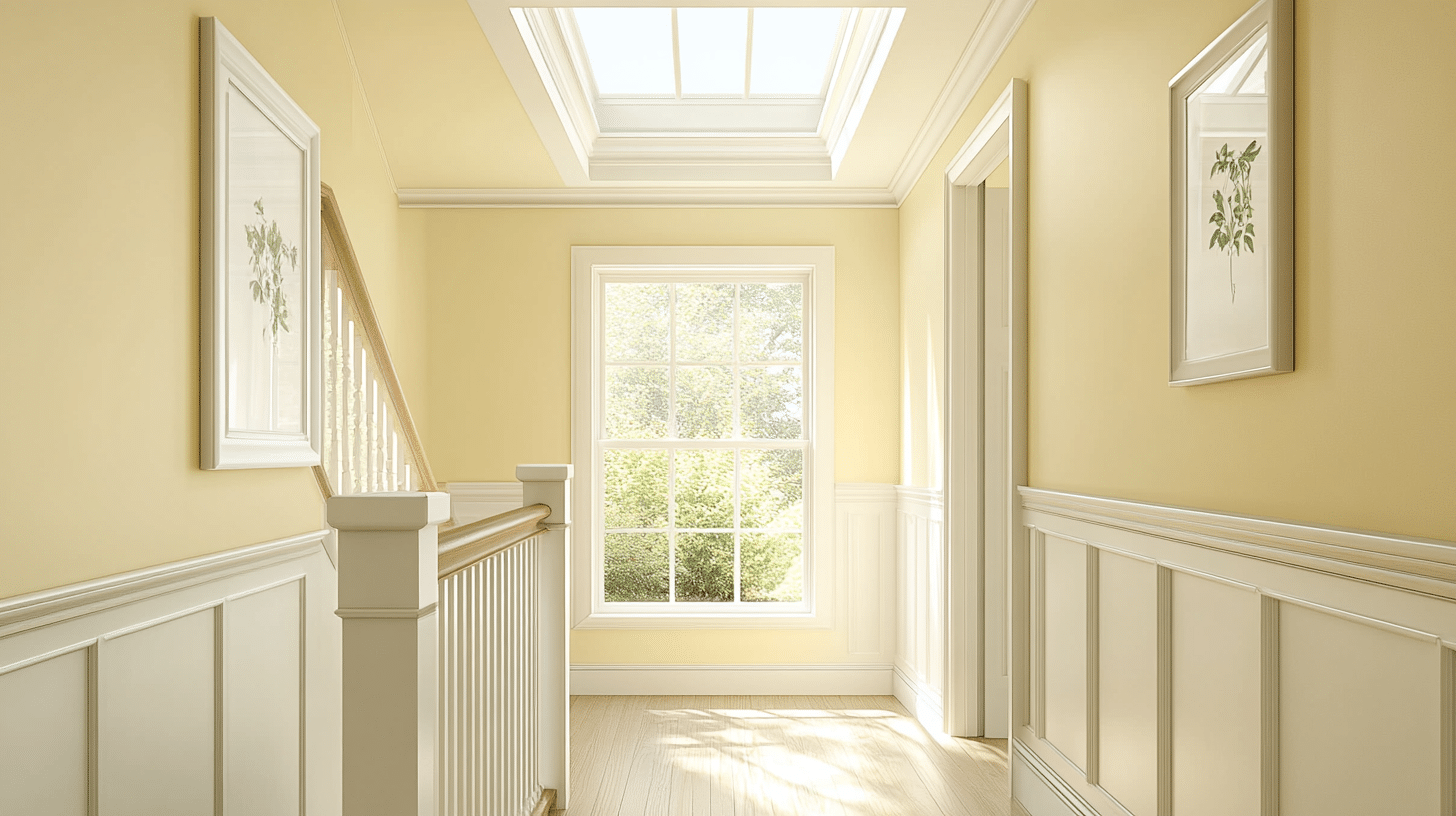
Description: Gentle, sunny hues that mimic the warmth of natural sunlight.
My Top Recommendation: Sherwin Williams Lemon Twist (SW 6909).
Why It Brightens a Room: Mimics sunlight to create a cheerful, uplifting atmosphere.
Best Uses: Kitchens, hallways, and small rooms for an energetic and welcoming space.
Cool Blues
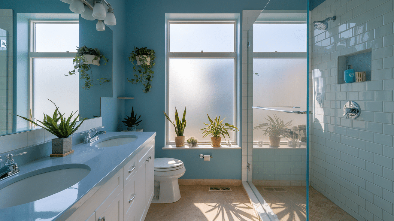
Description: Light, airy blues with high light reflectance for a calm and refreshing feel.
My Top Recommendation: Sherwin Williams Iceberg (SW 6798).
Why It Brightens a Room: Enhances natural lighting while adding a tranquil, serene vibe.
Best Uses: Bathrooms, bedrooms, and living rooms for a fresh, relaxing ambiance.
Pale Greens
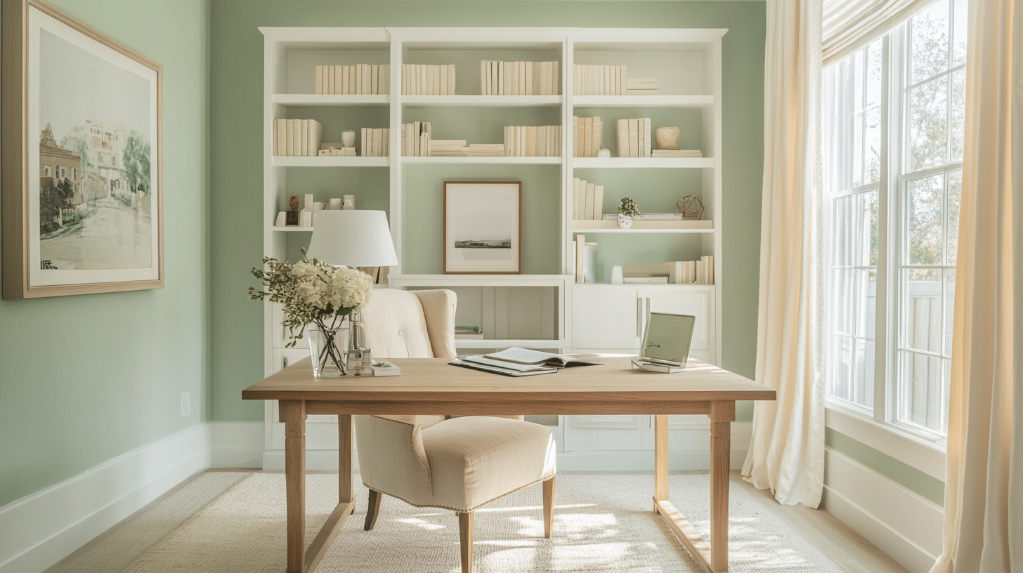
Description: Soft, nature-inspired greens that feel fresh and uplifting.
My Top Recommendation: Sherwin Williams Sea Salt (SW 6204).
Why It Brightens a Room: Reflects light while creating a subtle connection to nature.
Best Uses: Living rooms, kitchens, and bathrooms for a serene, earthy aesthetic.
From whites to soft yellows and serene greens, each color family offers unique opportunities to enhance light and mood in your space.
Best Paint Brands for Creating Bright, Airy Spaces
Selecting high-quality paint from reputable brands is essential when aiming to brighten a room.
Here are ten top paint brands renowned for their exceptional products that can enhance the luminosity of your space:
1. Benjamin Moore Regal Select Interior Paint
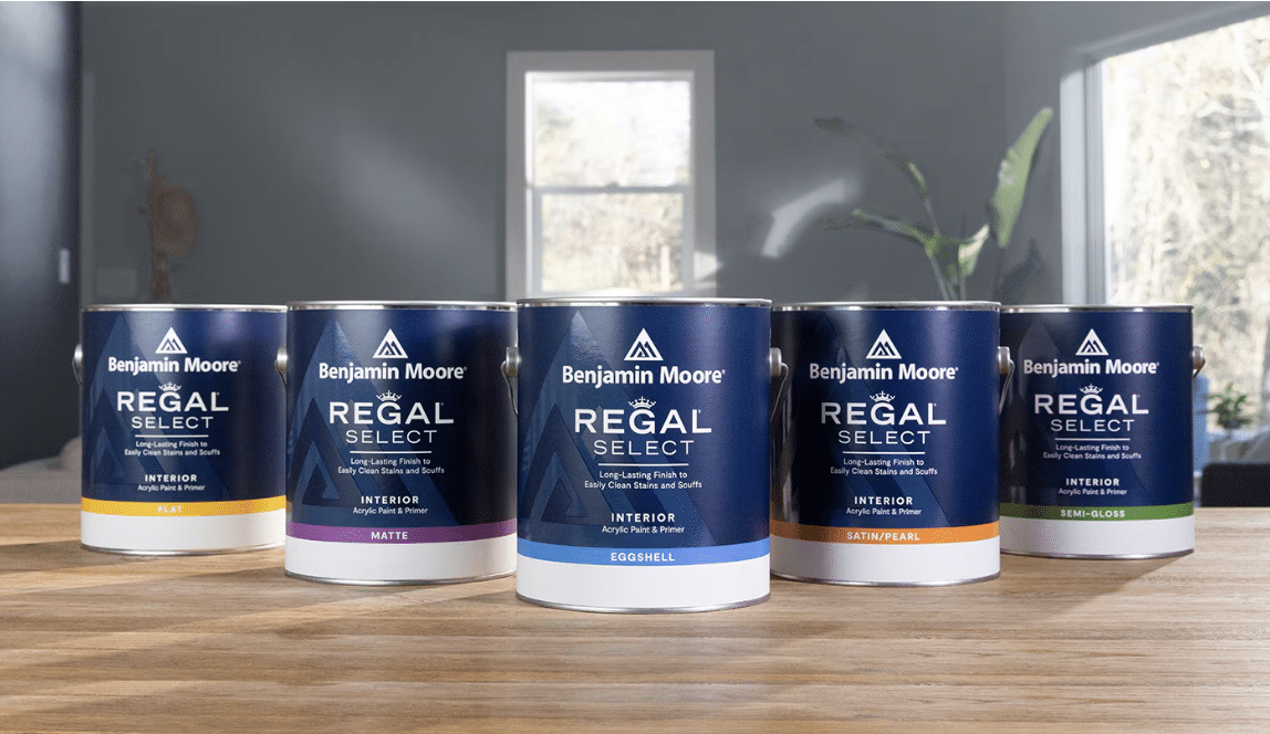
Benjamin Moore Regal Select Interior Paint offers excellent coverage and durability. It’s known for its smooth application and washable finish, which is ideal for high-traffic areas.
Type of Paint: Acrylic latex
Finish: Matte, eggshell, satin, and semi-gloss
Best Colors in the Range: Simply White, Chantilly Lace, and White Dove
2. Sherwin-Williams SuperPaint Interior Acrylic Latex
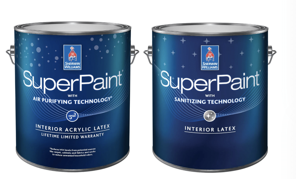
Sherwin-Williams SuperPaint Interior Acrylic Latex combines paint and primer, providing exceptional coverage and durability. It resists stains and scrubbing, making it perfect for active households.
Type of Paint: Acrylic latex
Finish: Satin, semi-gloss, and flat
Best Colors in the Range: Alabaster, Pure White, and Snowbound
3. Farrow & Ball Estate Emulsion
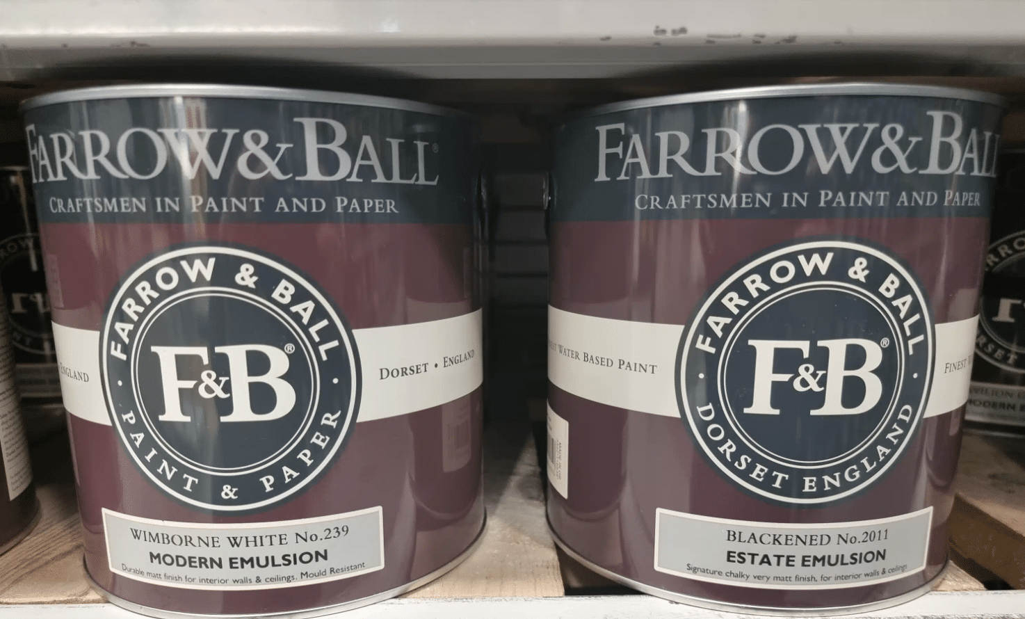
Farrow & Ball Estate Emulsion is a water-based paint that offers a flat finish with a rich depth of color. Its eco-friendly formulation is ideal for those seeking a sustainable option.
Type of Paint: Water-based
Finish: Matte (2% sheen)
Best Colors in the Range: Wimborne White, All White, and Pointing
4. Behr Premium Plus Ultra Interior Paint
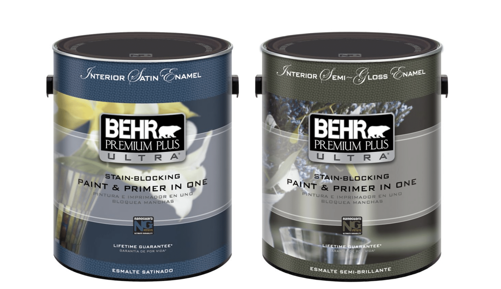
Behr Premium Plus Ultra Interior Paint offers excellent value with its paint and primer combination. It provides great coverage and a long-lasting finish, perfect for various interior spaces.
Type of Paint: Acrylic latex
Finish: Eggshell, satin, and semi-gloss
Best Colors in the Range: Ultra Pure White, Swiss Coffee, and Bit of Sugar
5. Valspar Signature Interior Paint + Primer
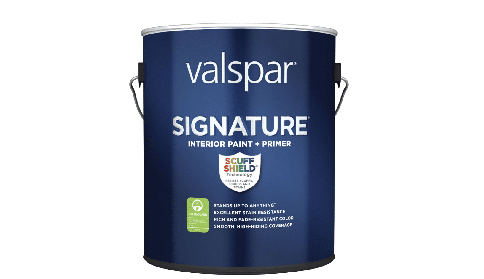
Valspar Signature Interior Paint + Primer is formulated with ScuffShield technology for enhanced durability and stain resistance. It’s ideal for busy households and high-traffic areas.
Type of Paint: Acrylic latex
Finish: Flat, eggshell, satin, and semi-gloss
Best Colors in the Range: Cream Delight, Du Jour, and Dove White
6. Dulux EasyCare Washable & Tough

Dulux EasyCare Washable & Tough paint resists everyday stains and is 20 times tougher than standard emulsion. It’s perfect for homes with children or pets.
Type of Paint: Acrylic latex
Finish: Matt and soft sheen
Best Colors in the Range: Jasmine White, Timeless, and White Cotton
7. Glidden Premium Interior Paint

Glidden Premium Interior Paint delivers reliable coverage at a budget-friendly price point. It’s good for renters and home refreshes where value matters.
Type of Paint: Acrylic latex
Finish: Flat, eggshell, satin, and semi-gloss
Best Colors in the Range: White On White, Bright White, Natural White
8. Benjamin Moore Aura Interior Paint
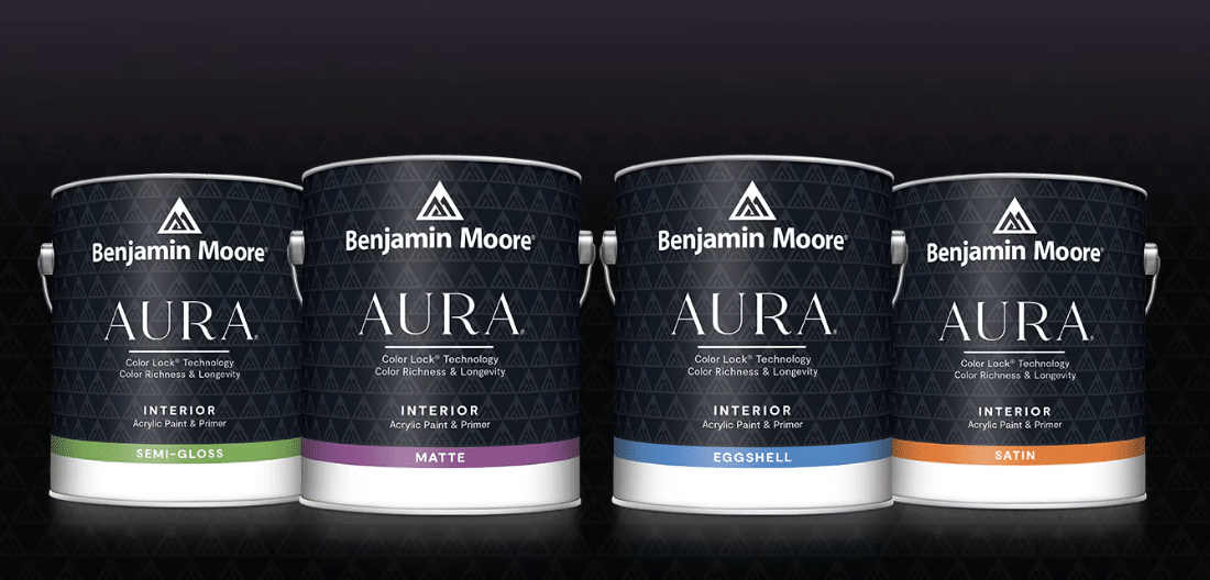
Benjamin Moore Aura Interior Paint delivers exceptional performance with its Color Lock technology. It offers superior coverage and fade resistance, which is ideal for bold or light shades.
Type of Paint: Acrylic latex
Finish: Matte, eggshell, satin, and semi-gloss
Best Colors in the Range: Super White, Chantilly Lace, and Decorator’s White
9. Sherwin-Williams Emerald Interior Acrylic Latex
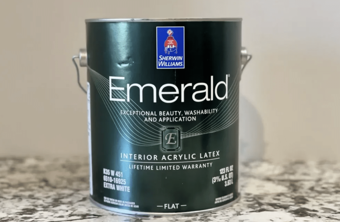
Sherwin-Williams Emerald Interior Acrylic Latex offers exceptional washability and a smooth finish. It’s perfect for those seeking a premium, durable paint option.
Type of Paint: Acrylic latex
Finish: Flat, satin, and semi-gloss
Best Colors in the Range: Extra White, Greek Villa, and Alabaster
10. Farrow & Ball Modern Emulsion
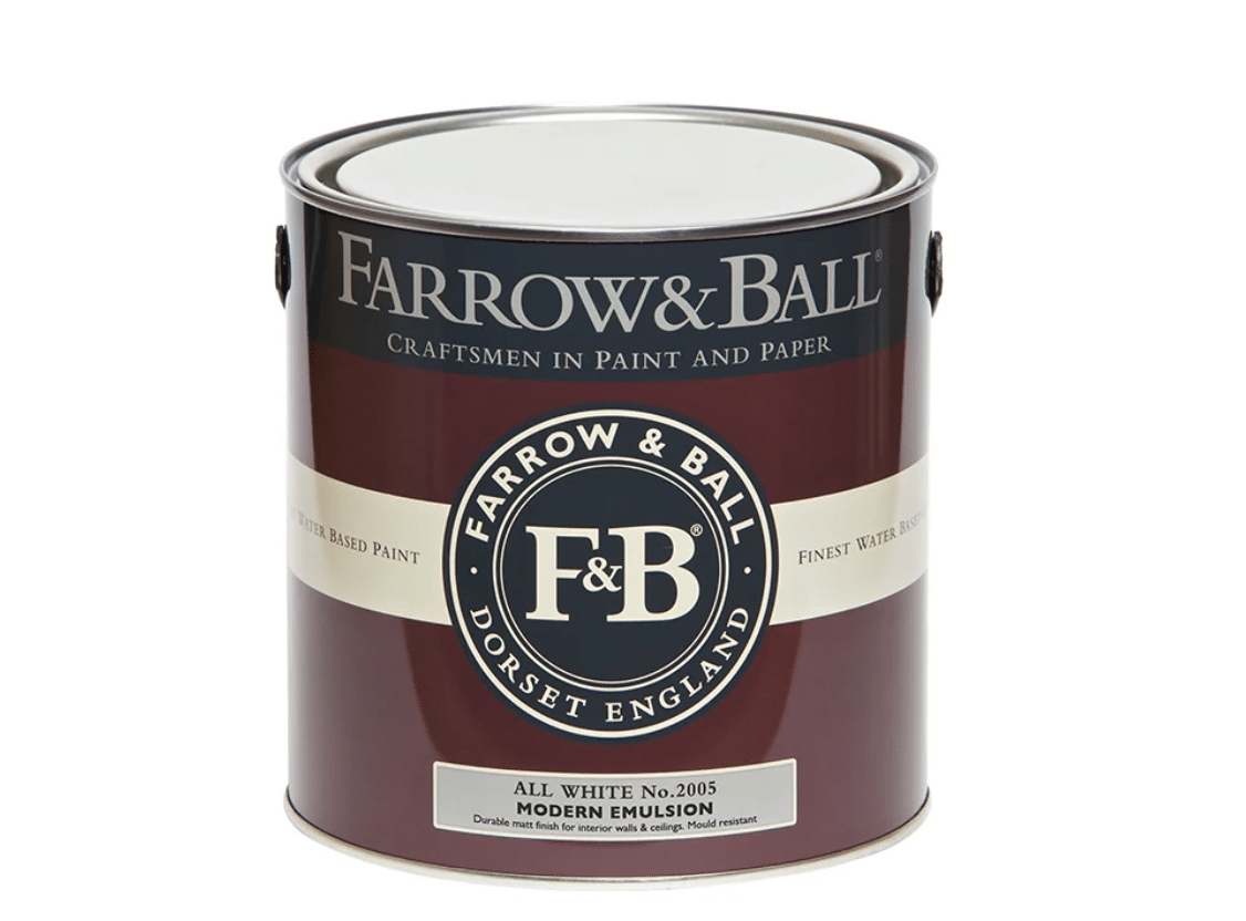
Farrow & Ball Modern Emulsion is a washable, water-based paint ideal for modern living. It offers a soft sheen and excellent durability.
Type of Paint: Water-based
Finish: Satin (7% sheen)
Best Colors in the Range: Wevet, Ammonite, and School House White
Enhancing Brightness with Painting Techniques

During my 15 years as a painter, I’ve developed unique methods to brighten spaces. Here are my tested techniques that make even the darkest rooms feel alive with light.
Paint Direction for Height
I discovered this technique when working on a basement renovation project. The low ceilings made the space feel cramped until I tried this method.
Benefits:
- It makes ceilings appear higher
- Creates visual interest without overwhelming
- It opens up cramped spaces
- Works especially well in narrow hallways
- Ideal for rooms under 8 feet tall
Light-Enhancing Borders
I learned this trick while helping a client with a north-facing room. The change was so striking that it’s now part of my standard brightening toolkit.
Benefits:
- It pulls in more natural light
- Spreads brightness throughout the room
- It makes windows appear larger
- Brightens doorways naturally
- Adds subtle shine without glare
Corner Brightening Tips
After years of painting dark rooms, I noticed how corners absorbed light. This simple adjustment made a remarkable difference in room perception.
Benefits:
- It makes rooms feel wider
- Reduces shadowy areas
- Creates better light flow
- Improves room proportions
- It makes furniture placement easier
Two-Tone Wall Method
This technique came from a challenging dining room project. The client wanted brightness without losing warmth – this solution delivered both.
Benefits:
- Adds visual interest
- Creates balanced lighting
- It makes rooms feel larger
- Maintains cozy atmosphere
- Hides wear and tear at the base level
Shadow Management
I developed this method after noticing how shadows affected room brightness. It’s now my go-to solution for rooms with limited natural light.
Benefits:
- Balances overall room lighting
- Reduces dark spots
- It makes rooms feel more open
- Improves artificial lighting effectiveness
- Creates consistent brightness levels
Paint Mistakes to Avoid
I’ve painted hundreds of rooms, and these are the most common mistakes I see people make. Skip these errors to keep your space bright and open.
The Most Common Paint Mistakes:
- Picking paint colors based only on store displays or phone screens
- Not checking how the paint looks during different times of day
- Using too many dark colors in a room with limited natural light
- Putting glossy paint on walls with surface flaws or bumps
- Painting all walls the same color in a small, dark room
- Forgetting to clean walls before painting which dulls the finish
- Not using primer leads to uneven light reflection
- Mixing warm and cool tones without planning
- Using flat paint in rooms that need light reflection
- Choosing trendy dark colors without thinking about brightness
These mistakes are easy to make but simple to avoid. Let me show you how to test paint samples in your space properly.
Wrapping It Up
Picking the right paint colors doesn’t have to be hard. In this blog, we learned how to properly check room lighting, choose finishes, and test colors.
These simple steps help create brighter, more open spaces.
Remember: light colors, proper testing, and good preparation are your keys to success.
Start with a small room, try a few samples, and see how the light changes them throughout the day.
Ready to get started? Pick your first room and grab some test samples. Your brighter space is just a paint job away.

