
How to Choose Neutral Curtains That Work With Your Walls and Furniture
Neutral curtains can bring warmth, balance, and visual harmony to any living space. However, choosing the right shade involves more than selecting white, beige, or gray. Wall colors, wooden furniture, flooring, and upholstery all influence how curtains appear within a room.
The key is understanding color undertones, selecting complementary textures, and comparing fabric samples before making a final decision. With careful coordination, neutral curtains can enhance a room without overwhelming its existing design.
Understand Your Wall Colors and Undertones
Wall colors provide the foundation for selecting neutral curtains. Even similar-looking shades can have different undertones that influence the room’s atmosphere.
Warm neutrals contain subtle yellow, red, or brown influences, while cool neutrals lean toward blue, gray, or green.
Choosing Curtains for Warm-Toned Walls
Cream, beige, ivory, and warm white walls generally coordinate well with soft, earthy curtain colors.
Consider these combinations:
- Cream walls: Oatmeal or light beige curtains create a gentle transition.
- Warm white walls: Sand-colored curtains introduce subtle contrast.
- Beige walls: Soft ivory or muted taupe curtains add visual depth.
- Greige walls: Natural flax or stone-colored fabrics can complement mixed undertones.
For example, cream walls paired with oak furniture and beige upholstery may benefit from warm linen-inspired curtains that maintain a cohesive appearance.
Coordinating Curtains With Cool-Toned Walls
Cool gray, crisp white, and blue-gray walls often work well with stone, soft gray, or cool ivory curtains.
However, warmer curtains can also soften cool interiors. Repeating similar warm accents through cushions, rugs, or wooden furniture helps connect the overall design.
Match Curtains With Wood Furniture and Flooring
Wood finishes influence the warmth and character of a room. Their color and grain should be considered alongside curtain shades.
Light Wood Finishes
Light oak, ash, and pale wood finishes often complement oatmeal, ivory, and natural flax-colored curtains.
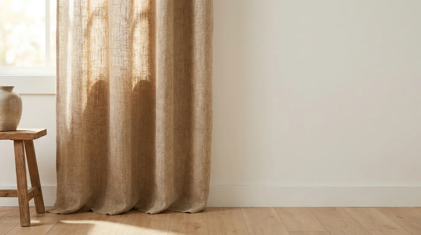
For example, a room featuring light oak flooring and white walls could pair well with Rawlune’s Organic Motif Woven Linen Curtain in its Sunbaked Linen color option.
Its woven appearance can introduce subtle texture while maintaining an understated palette.
Medium and Dark Wood Finishes
Walnut, cherry, and dark-stained furniture create stronger visual contrast.
Lighter curtains can balance these finishes without making the room appear overly heavy.
Rawlune’s Textured Architectural Blackout Drapery offers color options such as Soft Ivory and Linen Sand, which homeowners can compare against darker furnishings.
The objective is not to match wood colors exactly but to establish a comfortable relationship between different surfaces.
Coordinate Curtains With Your Furniture
Furniture upholstery occupies considerable visual space, making it an important factor in curtain selection.
Rather than matching the sofa perfectly, choose curtains that introduce slight variations in shade or texture.
Some practical combinations include:
- Beige sofas: Ivory, oatmeal, or soft taupe curtains.
- Gray sofas: Stone gray or carefully selected warm beige curtains.
- White furniture: Textured neutral fabrics for additional depth.
- Brown leather seating: Cream or sand-colored curtains for softer contrast.
For instance, warm ivory curtains can complement a gray sofa and walnut side tables when similar warm tones appear elsewhere in the room.
Choose the Right Fabric Texture
Fabric texture influences how neutral colors appear and interact with surrounding materials.
Smooth fabrics generally create a cleaner appearance, while woven materials introduce depth and visual interest.
Linen and Cotton for Natural Interiors
Linen, cotton, and blended fabrics can complement wooden furniture, natural stone, and minimalist interiors.
Rawlune’s custom curtains offer across collections such as Sand Linen™ and Field Cotton™, which emphasize natural-looking textures and softer draping.
These collections do not use Memory Shaping, allowing a more relaxed curtain appearance.
Structured Fabrics for Contemporary Rooms
Modern interiors featuring clean architectural lines may benefit from more defined pleats.
Rawlune’s Eclipse Blackout™ collection uses Memory Shaping by default to create a structured appearance.
Homeowners can choose between relaxed and structured designs based on their furniture, architectural details, and personal preferences.
Consider Natural Light and Light Control
Lighting can noticeably change how neutral curtains appear.
A beige fabric may appear warmer or cooler depending on the direction of daylight, the color temperature of artificial lighting, and the surrounding finishes.
Before choosing a shade, examine how it responds to:
- Morning daylight and natural shadows.
- Stronger afternoon sunlight.
- Evening lamps and ceiling fixtures.
Light control also matters. Rawlune offers four levels: Sheer, Light Filtering, Room Darkening, and Blackout.
These categories provide different degrees of light management. However, blackout fabric does not guarantee complete darkness after installation, and sheer fabric may not provide sufficient nighttime privacy.
Compare Physical Fabric Samples Before Buying
Digital photographs are useful for inspiration, but screen settings can influence how curtain colors appear.
Physical samples allow homeowners to compare fabric shades directly with their walls, furniture, and flooring.
Rawlune’s Curtain Sample Kit includes an oversized fabric sample measuring approximately 20 × 47 inches (50 × 120 cm), so you can see more of the weave and compare the shade with your walls, wood finishes, and upholstery. Hold it upright near the window and check it again with your evening lights on before deciding.
How to Compare Samples Effectively
Follow these practical steps:
- Check wall compatibility: Hold samples against painted surfaces to identify undertone differences.
- Compare wood finishes: Examine fabric colors beside flooring, tables, or cabinetry.
- Evaluate upholstery: Place samples near sofas and chairs.
- Observe lighting changes: Review colors during daylight and evening.
- Inspect texture: Consider how the weave complements surrounding materials.
For example, comparing Sunbaked Linen and Soft Ivory against cream walls and walnut furniture can help homeowners identify their preferred combination.
Samples provide valuable guidance, although finished curtains may appear different depending on lighting, pleating, and installation.
Check Measurements Before Ordering
Once the preferred fabric and color are selected, homeowners should review curtain dimensions and installation requirements.
Curtain length, positioning, and fullness influence the finished appearance.
Rawlune provides official measurement guidance for its custom curtain configurations. Following the relevant product instructions helps homeowners choose suitable dimensions without relying on generic sizing assumptions.
Conclusion
Choosing neutral curtains requires careful consideration of wall undertones, wood finishes, furniture colors, fabric textures, and natural light. Warm shades can create a welcoming atmosphere, while cooler neutrals may complement contemporary interiors. Comparing physical samples and reviewing measurement requirements can help homeowners make more informed decisions. With thoughtful coordination, neutral curtains can enhance the room’s existing design while contributing comfort, texture, and lasting visual appeal.


