Office Door Numbers that Complete the Design
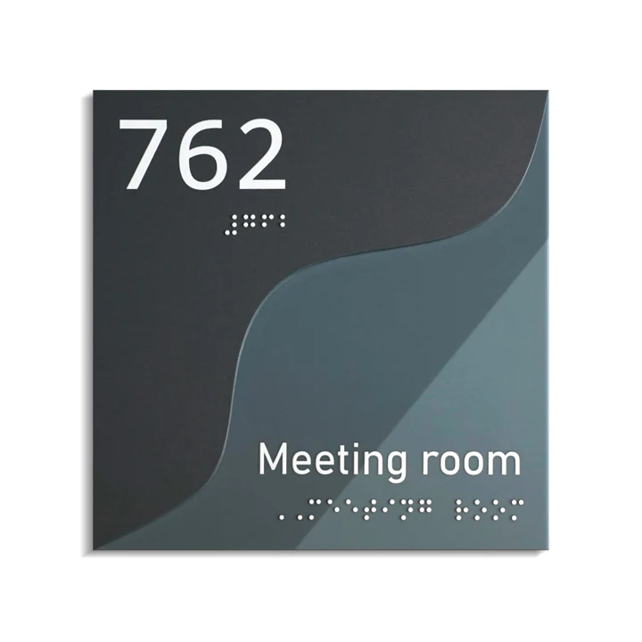
In modern offices, every element contributes to atmosphere — from lighting and materials to fonts on a wall. Even something as small as signage can define how a workspace feels. They’re no longer just labels for orientation. Office door numbers — Bsign are part of design language, communicating a company’s style, values, and attention to detail.
Beyond Functionality
Numbers on office doors used to serve a purely practical purpose. Today, they’re also a subtle design statement. When chosen thoughtfully, they can balance the mood of a room, enhance visual rhythm in a hallway, and even echo the brand’s personality.
A well-designed office is more than a place to work — it’s a space that tells a story. And the numbers on its doors are small but powerful characters in that narrative.
Different Styles Different Choices
No two offices are the same. Their architecture, color palette, and materials determine which door numbers fit best.
- Modern offices favor simplicity. Flat acrylic plates with black or white fonts blend perfectly with glass doors, steel frames, and clean geometric forms. Minimalist stainless steel numbers also look timeless, reflecting light without dominating the space.
- Industrial interiors — with raw brick walls, visible pipes, and concrete floors — pair well with darker materials. Matte black steel or engraved metal numbers reinforce the rugged, confident look while remaining functional.
- Creative studios often go bolder. Here, door numbers become design accents — colorful acrylic, playful shapes, or laser-cut wood that contrasts with neutral walls. The goal is not uniformity but character.
Classic or executive offices require a different tone: elegance. Brushed brass tones or dark wood plates with engraved numerals work beautifully against traditional furniture and warm lighting. They suggest heritage and reliability without appearing old-fashioned.
Customization that Reflects Identity
Every company has its own visual DNA, and signage can express it. The font used in the logo, the main brand color, or a specific texture can appear in the door numbers too.
Customization doesn’t have to be extravagant. Even a small detail — a consistent typeface or the same metallic finish as the door handles — ties the whole space together. Subtle coordination like this creates a sense of order that visitors feel instantly.
Bsign’s handcrafted approach to signage allows designers to integrate office door numbers seamlessly into the existing brand aesthetic, ensuring each piece feels intentional rather than added later.
Finding Balance in Design
Good signage doesn’t compete with architecture; it complements it. The most successful door numbers respect proportions, light, and surface texture. For example, a high-contrast number plate works best in darker hallways, while softer tones suit bright, open offices.
Lighting also plays a role. Slight shadows behind floating numbers can add depth without clutter. In narrow corridors, vertically aligned plates keep the rhythm consistent. Design harmony isn’t about perfection — it’s about flow.
The best offices feel natural because every detail, even the smallest number on a door, supports the overall experience.
When Details Make the Space
You notice great design not because it shouts, but because it feels right. Office door numbers are part of that quiet precision — details that guide, organize, and communicate care.
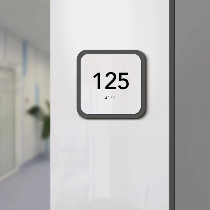
Whether they’re made of wood, acrylic, or steel, these numbers remind us that functionality and beauty can share the same space. When they fit the interior, people might not mention them at all — and that’s the greatest compliment to design.
A thoughtful office isn’t only about desks and screens. It’s about how every surface, every material, and every number contributes to a story of professionalism and balance.

