
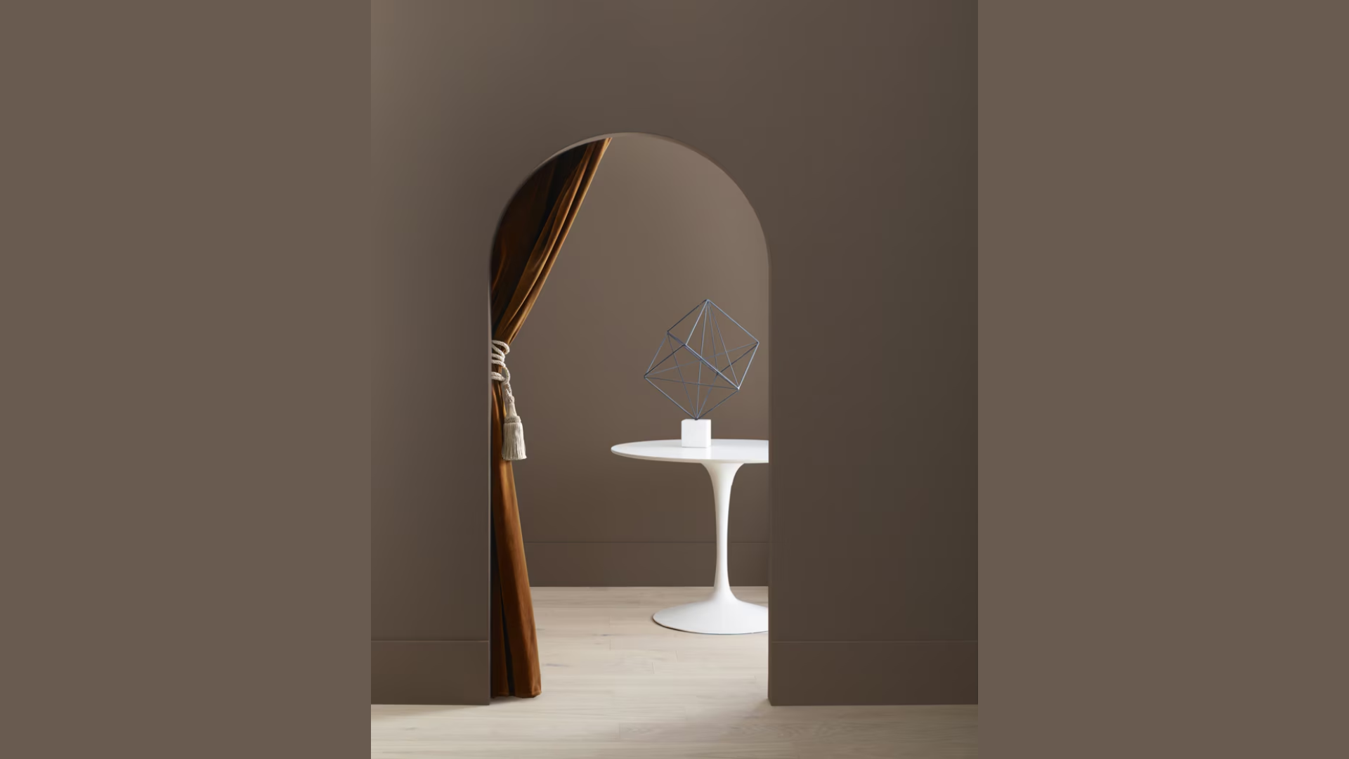
25 Benjamin Moore’s Historical Colors for your Home
Looking for paint colors that will stand the test of time?
Benjamin Moore’s Historical Colors tell meaningful stories through their tints and shades.
These colors, which have roots in early American homes and buildings, bring warmth and character to any room.
Many homeowners feel lost when picking colors that are both classic and fresh.
Choosing from hundreds of paint swatches can be overwhelming.
But here’s the good news: Benjamin Moore has carefully chosen these historical shades to work beautifully in today’s homes.
In this guide, you’ll learn:
- How to pick the right historical color for your space
- The stories behind these time-tested shades
- Tips for using these colors in modern ways
As a paint specialist with 15 years of experience, I’ve helped countless homeowners find their perfect historical color match.
Let me show you how to make these enduring shades work in your home.
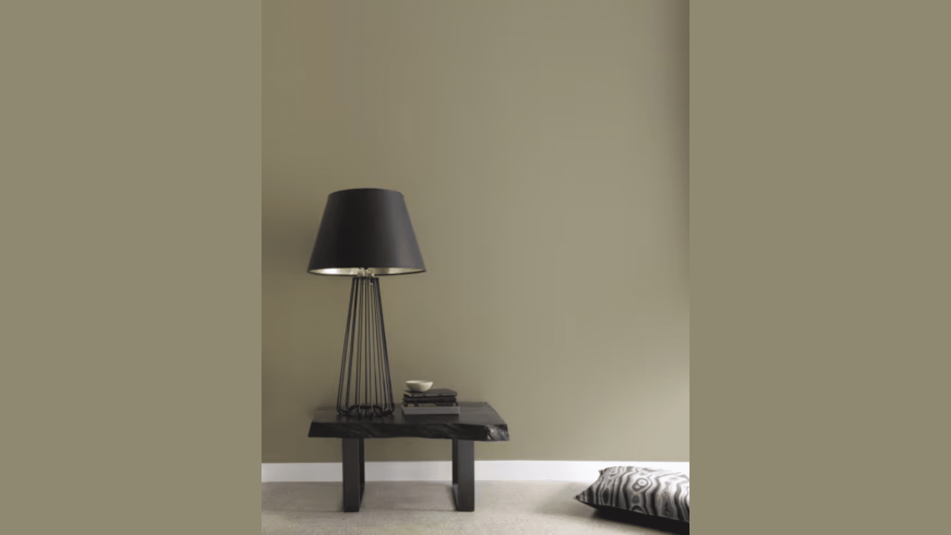
Top Classic Neutrals from Benjamin Moore
1. Revere Pewter HC-172
This warm gray paint has just the right mix of beige and gray tones that brighten up any space.
It changes with the light throughout the day, looking warmer in natural sunlight and cooler under artificial lighting.
I’ve seen this color make small rooms feel open and large rooms feel cozy.
- Balances warm and cool undertones
- Never looks too dark or too light
- Pairs well with white trim
- Good coverage in two coats
Perfect for:
- Living rooms
- Home offices
- Hallways
- Open floor plans
2. Chantilly Lace OC-65
Pure white, without any yellow or blue hints, makes this color stand out.
When I use this paint, the walls look clean and fresh without feeling cold or stark.
It also brings out the best in artwork and furniture placed against it.
- No undertones
- High light reflection
- Shows the true colors of the artwork
- Makes rooms feel larger
Perfect for:
- Kitchens
- Bathrooms
- Art studios
- Modern bedrooms
3. Manchester Tan HC-81
A soft gray that reminds me of morning mist, this paint creates a peaceful feeling in any room.
It has slight blue undertones that emerge in certain lights but stay true to its gray base throughout the day.
- Subtle blue notes
- Good in both sun and shade
- Works with most wood tones
- Long-lasting finish
Perfect for:
- Dining rooms
- Master bedrooms
- Reading nooks
- Home libraries
4. Edgecomb Gray HC-173
This paint sits right between beige and gray, making it a true greige that works in any setting.
I find it helps create a welcoming feel while staying current and fresh.
It never feels too warm or too cool.
- Perfect greige balance
- Hides wall imperfections well
- Easy to clean
- Looks good in any light
Perfect for:
- Family rooms
- Entryways
- Guest bedrooms
- Home offices
Benjamin Moore’s Most Popular Soft Blues and Greens
5. Van Courtlandt Blue HC-144
This gentle blue paint, with green notes that shift throughout the day, creates a sense of peace in any room.
When I paint with it, the color feels as soft as a morning sky but stays steady and true as daylight changes.
The mix of blue and green helps connect indoor spaces with nature.
- Shifts subtly in different lights
- Gives rooms a calm feeling
- Matches with wood tones
- Hides minor wall flaws
Perfect for:
- Bedrooms
- Sunrooms
- Study areas
- Meditation spaces
6. Palladian Blue HC-144
This light color brings the feeling of fresh air into a room.
Every time I use it, the space feels more open and bright.
It has just enough color to make a statement while remaining soft enough to be used as a background for art and furniture.
- Makes rooms feel bigger
- Changes nicely with natural light
- Matches most decor styles
- Long-lasting finish
Perfect for:
- Master bathrooms
- Home offices
- Breakfast nooks
- Guest rooms
7. Woodlawn Blue HC-147
A mid-tone blue that feels like a cloudy sky, this paint brings a steady, grounding presence to any room.
I find it creates a backdrop that’s both interesting and calm.
The gray notes help it stay balanced in any light.
- Rich but not dark
- Stays true in artificial light
- Works with many color schemes
- Good dirt resistance
Perfect for:
- Dining rooms
- Studies
- Powder rooms
- Bedrooms
8. Whitestone 2134-60
This light blue paint creates spaces that feel like taking a deep breath.
When I paint with it, rooms seem to open up and feel more peaceful.
It’s light enough to brighten spaces but has enough color to make a gentle impact.
- Brightens dark spaces
- It never looks too cold
- It blends well with white trim
- Smooth application
Perfect for:
- Nurseries
- Reading corners
- Bathrooms
- Home yoga spaces
Benjamin Moore’s Most Popular Warm Earth Tones
9. Shaker Beige HC-45
This paint brings warmth to any room without feeling heavy.
When I use it, spaces feel welcoming and relaxed.
The touch of gray keeps it current, while the beige base adds comfort.
It’s one of those colors that makes furniture and art stand out while creating a pleasing background.
- Balances warm and gray tones
- Works in any lighting
- Hides wall marks well
- Easy to touch up
Perfect for:
- Living rooms
- Family rooms
- Foyers
- Dining spaces
10. Georgian Green HC-115
Deep and rich, this green paint creates rooms that feel like old libraries or cozy studies.
I’ve seen it turn plain walls into statement pieces.
It has depth without being dark and richness without being loud.
- Rich color depth
- Good light absorption
- Pairs well with wood
- Strong coverage
Perfect for:
- Studies
- Dining rooms
- Reading nooks
- Powder rooms
11. Roxbury Caramel HC-42
Light as morning fog, this paint brings a gentle presence to any space.
When I paint with it, rooms feel bigger and brighter while keeping their warmth.
The green hint adds life without being obvious.
- Changes in natural light
- Makes spaces feel open
- Matches most colors
- Smooth finish
Perfect for:
- Bedrooms
- Living areas
- Home offices
- Hallways
12. Chestertown Buff HC-9
This golden beige paint warms up rooms like late afternoon sunlight.
It creates spaces that feel welcoming at any time of day.
It has enough color to be interesting but stays quiet enough to work with any style.
- Gives rooms a sunny feel
- Works with all wood tones
- Good in low light
- Lasting durability
Perfect for:
- Kitchens
- Entryways
- Living rooms
- Dining areas
13. Hampshire Gray HC-101
This paint blends blue and green notes to create spaces that feel both fresh and settled.
I’ve found it brings a sense of calm while keeping rooms interesting.
It shifts subtly as light changes but stays true to its soft nature.
- Gentle color shifts
- Pairs with many colors
- Even coverage
- Easy cleaning
Perfect for:
- Master bedrooms
- Sitting rooms
- Home offices
- Guest rooms
Benjamin Moore’s Rich Reds and Browns
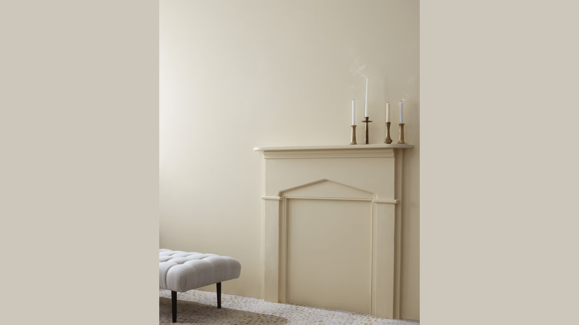
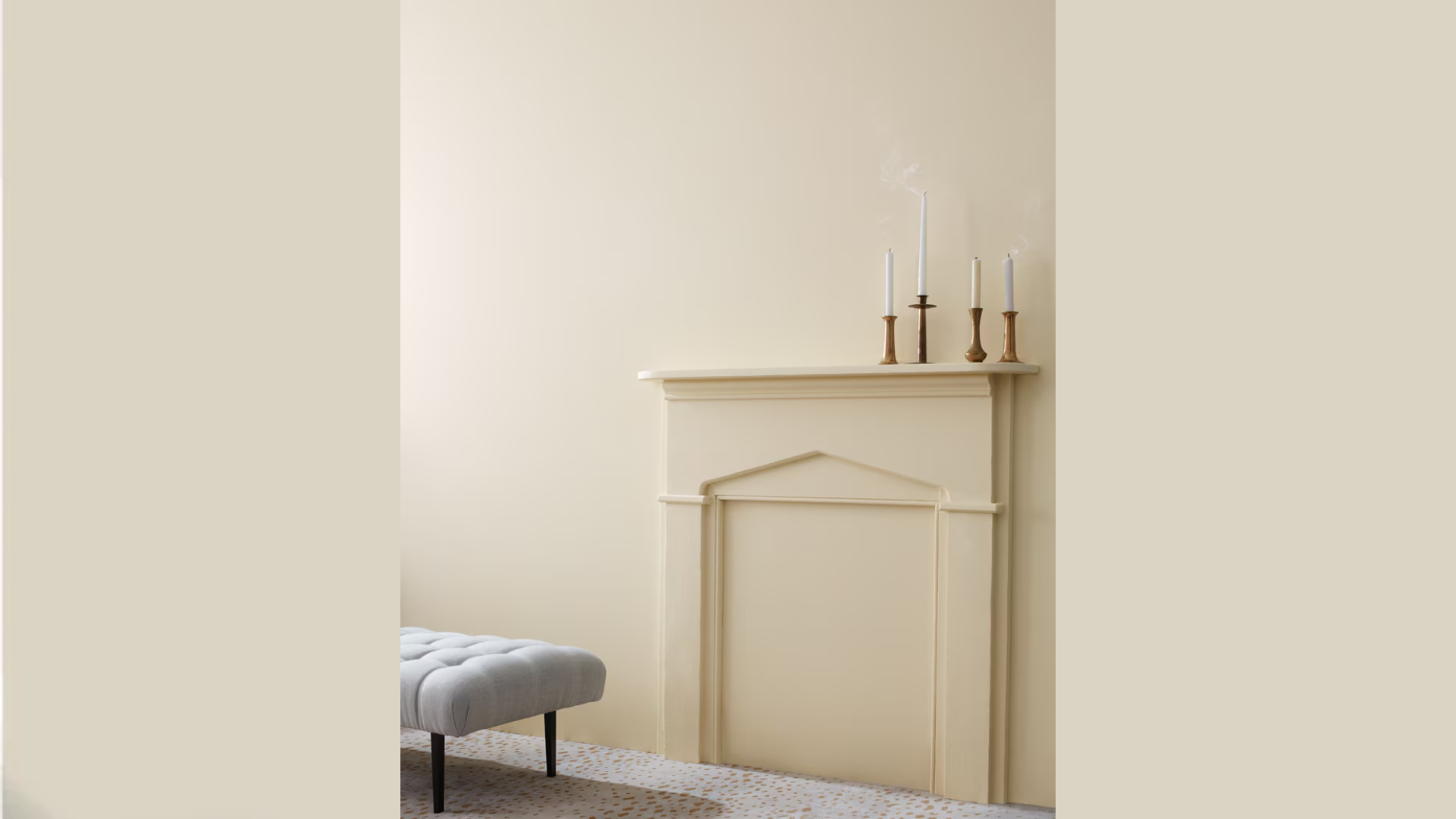
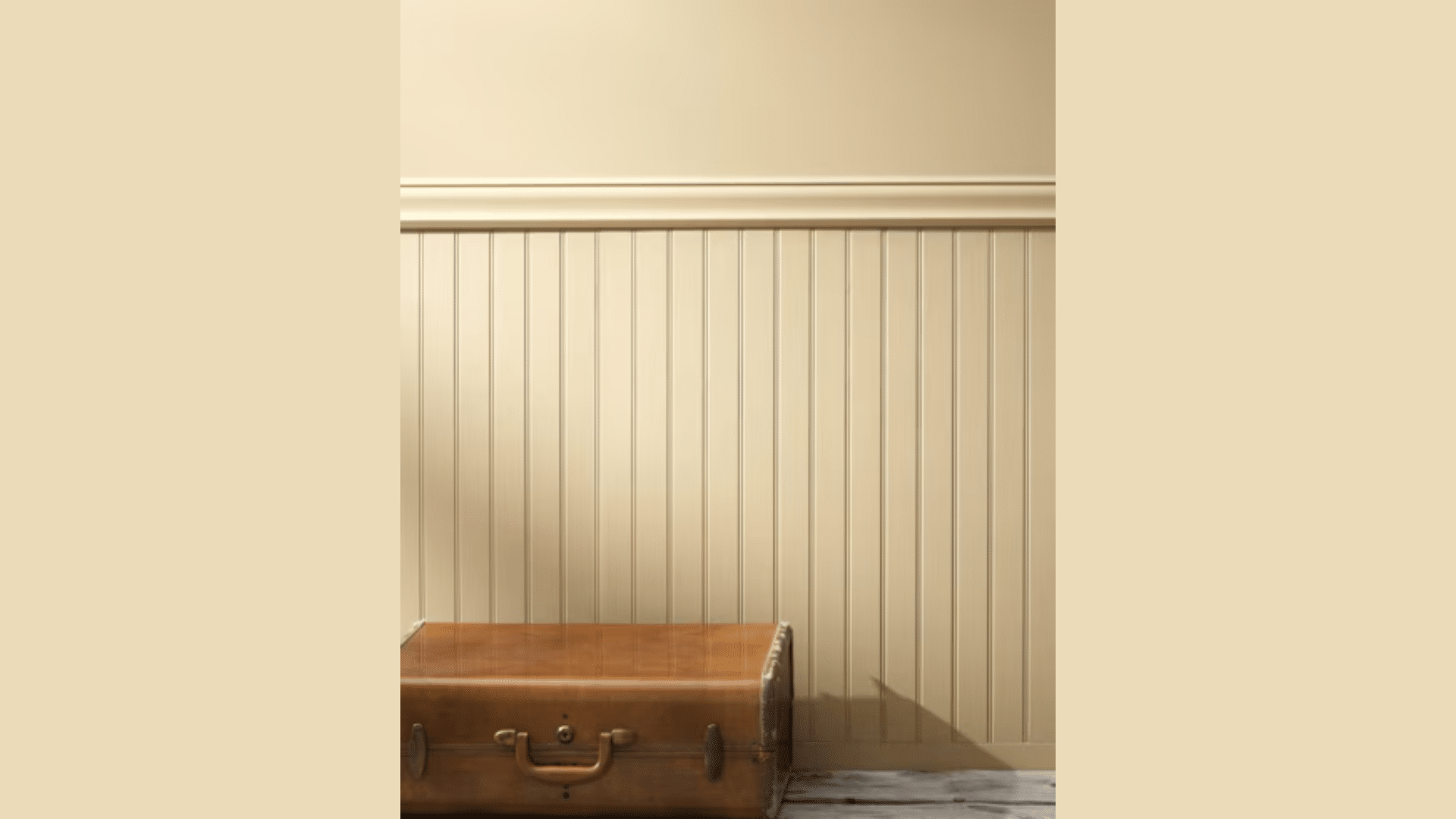
14. Concord Ivory HC-26
This paint fills rooms with a warm glow like early morning sunshine.
When I use it, spaces feel bright and inviting without being too yellow.
It creates a perfect base that makes both light and dark furniture look their best.
- Gives off a soft glow
- Works in dim or bright light
- Matches all wood types
- Covers well in two coats
Perfect for:
- Living rooms
- Breakfast nooks
- Home libraries
- Formal dining rooms
15. Standish White HC-32
This deep paint brings a steady presence to any room.
I’ve seen it transform simple spaces into grounded, mature areas.
Its depth of brown and sophistication of gray make it work in both modern and classic settings.
- Rich color depth
- Absorbs and reflects light well
- Hides wall flaws
- Easy maintenance
Perfect for:
- Home offices
- Media rooms
- Dens
- Master bedrooms
16. Gardenia AF-10
Soft and warm like fresh cream, this paint makes rooms feel cozy and bright.
When I paint with it, spaces feel open yet intimate.
The golden hints come through beautifully in natural light while keeping spaces warm under artificial lighting.
- Brightens dark corners
- Shows texture nicely
- Pairs with any color
- Smooth application
Perfect for:
- Kitchens
- Living areas
- Bedrooms
- Dining spaces
17. Middlebury Brown HC-68
This deep brown paint brings richness and warmth to any space.
It creates rooms that feel like they’re giving you a warm hug.
The red hints add life to the brown base, making it feel both classic and current.
- Deep color saturation
- Works with natural materials
- Good stain resistance
- Long-lasting finish
Perfect for:
- Studies
- Game rooms
- Accent walls
- Cozy corners
18. Norwich Brown HC-19
This beige paint goes beyond basic to create spaces with real character.
Every time I use it, rooms feel established and welcoming.
It has more depth than standard beige while staying light enough to keep spaces open.
- Rich but not dark
- Changes nicely with light
- Pairs with most colors
- Good coverage
Perfect for:
- Family rooms
- Entryways
- Guest rooms
- Sitting areas
Deep, Moody Tones By Benjamin Moore
19. Buckland Blue HC-151

This deep blue paint creates rooms that feel like sheltering spaces.
When I work with it, walls take on a rich depth that changes with the light.
The blue notes peek through at different times of day, adding life to what could be a plain dark gray.
- Changes with light angles
- Creates cozy spaces
- Adds room depth
- Strong coverage
Perfect for:
- Theater rooms
- Private offices
- Master bedrooms
- Reading rooms
20. New London Burgundy HC-61
This deep red paint brings a sense of warmth and strength to any room.
It creates spaces that feel bold yet comforting.
It has the richness of red wine without being too bright or loud.
- Rich color layering
- Good light balance
- Stays true in shadows
- Even application
Perfect for:
- Dining rooms
- Libraries
- Wine rooms
- Formal living areas
21. Webster Green HC-130
This deep green paint feels like walking through an old forest.
When I use it, rooms take on a sense of age and story.
It creates spaces that feel grounded and peaceful while keeping interest through subtle color shifts.
- Natural color depth
- Works in low light
- Pairs with brass and wood
- Smooth finish
Perfect for:
- Studies
- Dens
- Sitting rooms
- Accent walls
22. Wethersfield Moss HC-62
This green paint brings the feeling of nature indoors.
It creates spaces that feel connected to the outside world while staying warm and welcoming.
It has enough gray to keep it soft while maintaining its green heart.
- Natural color shifts
- Good in bright light
- Matches natural materials
- Durable finish
Perfect for:
- Garden rooms
- Living rooms
- Breakfast areas
- Home offices
Bright and Lively Colors By Benjamin Moore
23. Regent Green 2136-20
This green paint brings life and strength to any room.
When I paint with it, spaces feel full of energy while keeping their class.
It catches light in different ways throughout the day, making rooms feel fresh and alive at any hour.
- Strong but not bright
- Looks good all-day
- Mixes with neutrals well
- Full coverage
Perfect for:
- Living rooms
- Sunrooms
- Dining areas
- Home offices
24. Golden Straw 2152-50
This yellow paint fills rooms with light like morning sunshine.
I’ve seen it turn dark spaces into bright, happy areas.
It has just enough warmth to make rooms feel sunny without being too bold.
- Brightens dark spaces
- Works in any light
- Clean finish
- Easy touch-ups
Perfect for:
- Kitchens
- Breakfast nooks
- Craft rooms
- Children’s spaces
25. Saybrook Sage HC-114
This yellow-green paint brings a gentle liveliness to rooms.
When I use it, spaces feel fresh and calm at the same time.
It has enough color to wake up a room while staying soft enough for everyday living.
- Balanced brightness
- Changes with seasons
- Pairs with wood tones
- Smooth look
Perfect for:
- Family rooms
- Studies
- Guest rooms
- Reading corners
How to Select the Ideal Historical Color for Your Space?
1. Start With Room Purpose
Think about how you use each room:
- Living rooms do well with warm shades like Powell Buff
- Bedrooms feel restful with Van Courtlandt Blue
- Kitchens shine with clean tones like Edgecomb Gray
- Home offices stay focused on Richmond Gray
2. Check Your Light
Natural light changes everything. Here’s what I tell my clients:
- North-facing rooms: Pick warmer colors to balance cool light
- South-facing rooms: Any historical color works well
- East-facing rooms: Colors look brightest in the morning
- West-facing rooms: Colors warm up in the afternoon
3. Size Matters
Small rooms need careful color choices:
- Light colors like Concord Ivory make spaces feel bigger
- Darker shades like Hamilton Blue can make large rooms feel cozier
- Medium tones like Hancock Gray work in any size room
4. Test Before You Paint
This is the most important step. Here’s how:
- Get sample cards first
- Paint large squares on your wall (at least 2 feet by 2 feet)
- Look at them during different times of day
- Check how they look with your furniture
- Wait 24 hours before deciding
5. Consider Your Style
Your current furniture and decor should guide your choice:
- Traditional furniture pairs well with deeper historical tones
- Modern pieces pop against lighter historical shades
- Mixed styles work with medium-toned neutrals
Remember: Paint samples might look different on your walls than they do in the store.
Take your time making this decision—it’s worth getting it right the first time.
Effective Tips for Using Benjamin Moore’s Historical Colors
Let me share the most useful tips I’ve gathered from years of working with these colors.
These simple ideas will help you use historical colors with confidence.
1. Light and Space
Small changes in how you use color can make a big difference:
- Paint trim one shade lighter than the walls for subtle depth
- Use lighter colors above eye level to make ceilings feel higher
- Put darker shades below chair rails to ground the space
- Pick muted tones for rooms you use at night
2. Make Colors Work Harder
Here’s how to get the most from each shade:
- Paint Edgecomb Gray in shadowy corners to brighten them
- Use Wythe Blue to make south-facing rooms feel cooler
- Apply Powell Buff to reflect light in dark hallways
- Choose Hamilton Blue to make a fireplace stand out
3. Balance Your Colors
Follow these simple rules for better results:
- Match warm colors with cool ones
- Use brighter shades for smaller areas
- Pick softer tones for large walls
- Repeat colors in different spots to tie rooms together
4. In Modern Homes
Make historical colors feel fresh:
- Paint one feature wall in Van Courtlandt Blue
- Use Hancock Gray with white trim for clean lines
- Try Richmond Gray with simple furniture
- Pick Concord Ivory for open floor plans
5. In Older Homes
Respect the old while adding something new:
- Keep original trim colors when possible
- Match new paint to existing historical features
- Use period-correct colors in main rooms
- Try updated shades in modern additions
Remember: Good lighting helps you see colors clearly.
Always test your paint at different times of the day before making the final choice.
Conclusion
Benjamin Moore’s historical colors offer something rare in home design: colors that look good now and will still look good years from now.
In my experience working with these paints, they make decorating easier because they work so well together.
Think of these colors as trusted friends for your home.
They bring comfort to modern spaces and fresh life to older homes.
Whether you choose the gentle warmth of Powell Buff or the quiet strength of Hamilton Blue, you’re picking a color that has proved itself over time.
I hope this guide helps you feel more confident about trying these classic shades.
Start with one room, test your samples, and watch how these colors change your space.
Your perfect historical color is waiting to be found.
Do you have questions about using these colors in your home?
Leave a comment below, and I’ll help you choose the right shade for your space.
Frequently Asked Questions
Are Benjamin Moore’s Historical Colors More Expensive Than Regular Paint?
No, these colors cost the same as other Benjamin Moore paints in the same finish.
You’re paying for the quality of the paint, not the historical name.
Can I Use Historical Colors in a House Built After 1900?
Yes, these colors work in homes of any age.
They’re based on historical colors but are made to match today’s styles and living spaces.
Will Historical Colors Make My House Look Old-Fashioned?
Not at all.
These colors have lasted because they are basic, useful shades that fit any style.
Depending on how you use them, they can feel traditional or modern.


