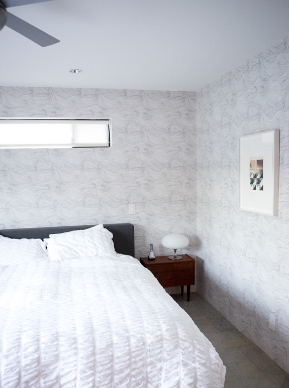
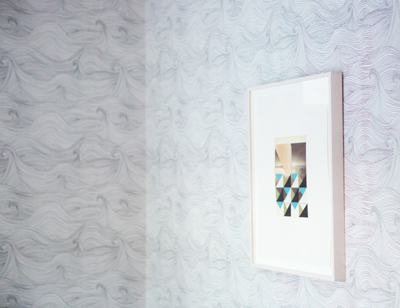
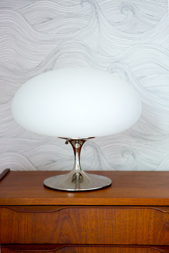
so, this was a long time coming. you may remember this post where we were trying to decide between two wallpapers. ultimately we decided to go with the seascape wallpaper by abigail edwards because we thought it would help create a peaceful, quiet space. and we both love the ocean and thought that the waves framing the view of the pool (not shown) in the sliding glass doors would be rad. and i think it is.
our bedroom is still a long way from done- i’d love to switch out those bedside table lamps for something hanging and gold (like this or these), get new bedding with some extra soft and textural throw pillows, a cozy rug for the floor and bring in another piece of art. and i think i’d like to see either more color or another plant. i haven’t decided. all of that will happen after we’ve traded in the patio furniture for a proper couch. it’s slow moving, but one foot in front of the other! *all sources listed at the bottom of the post, in case you’re interested!
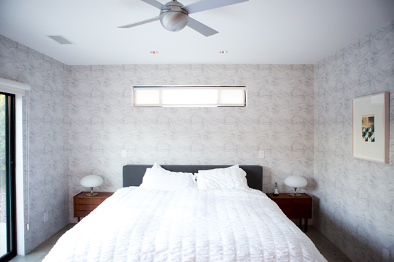
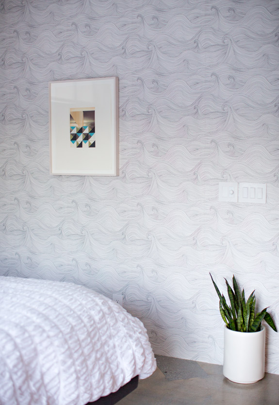
we spent the bulk of our resources for the house so far in window coverings, a water filtration system, and a washer & dryer. fun stuff i tell you! which is why the ceiling fan and wallpaper we picked for this room felt like a real treat. i’m practicing my patience as we piecemeal this sweet home together.
{more after the jump}
there was a great debate in our house about the tv in the bedroom. i was against the idea but lou insisted that we’d be glad it was there when we got sick or just wanted to spend a cozy night in bed watching movies. he won and he’s right. it’s pretty nice, even if it doesn’t get much use. i tried my hardest to counteract the big black box by putting our wedding photos out! it’s the first time we’ve ever had photos of ourselves anywhere in the house but the fridge and i kind of love it. seeing them brings me right back to our wedding day and fills my heart right up.
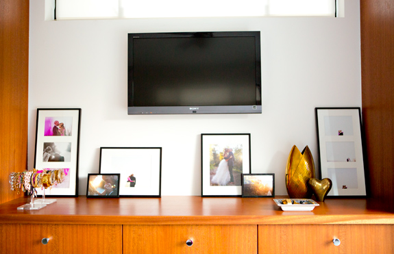
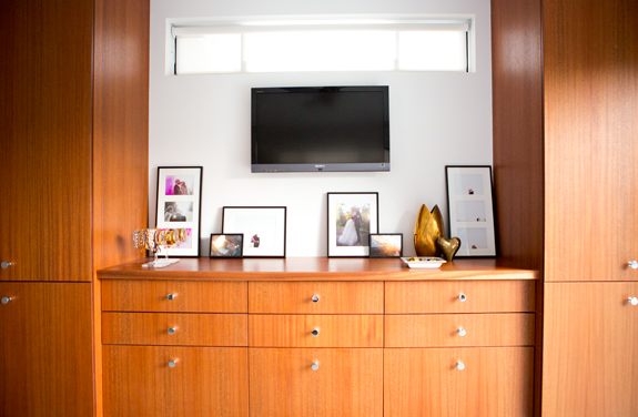
wallpaper: abigail edwards, bedding: west elm, bedside lamps: vintage laurel mushroom lamps, bedside tables: vintage, ceiling fan: modern fan company, art: kevin appel, wedding photos: max wanger


thanks everyone!
@rita- yay!! i love your wedding photos, show em off! 🙂
@maria thank you! they're built-ins…. came with the house so i have no idea!
@loumora savor it, it won't likely happen again anytime soon! 🙂
@jen- YES to bravo tv in the bedroom!!!!
it looks amazing, Sarah! I love seeing photos of your home/decor. so inspiring.
thanks so much paige! i will definitely post lots more this year as soon as we can afford to move forward with more decorating! 🙂
ah! i'm such an idiot. max shot our wedding as well and i've been struggling to figure out how i want to frame some of the sequential shots (where we are little! ha.). i don't know WHY i didn't think of a tryptych! silly me. i just couldn't think of any way other than blowing stuff up and really, no one needs THAT many big shots of themselves in their house! sometimes you just have to see something in real life, i guess! thank you thank you!
The wallpaper turned out amazing! When you first were deciding between the two choices, I always invisioned it only on the one wall, but I LOVE that you've engulfed the entire room in it. So pretty! Bravo Bravo!
that wallpaper is the bees knees!
PS my friend is gonna be on Millionaire Matchmaker on Bravo TONIGHT come check it out on the bog :o)
Stunning! Can't wait to see the rest of the house.
HOLD THE PHONE! did you just publicly say that i, lou mora was right about something!? hot damn! thanks babe.
it's beautifil, sarah! where are the closets from?
My favorite paper of all time. Great choice- looks perfect! I have to admit, I hate the tv in the bood-wa too but I love watching my guilty pleasure shows (everything on Bravo thank you) alone and without my husband rolling his eyes every 2 minutes.
I love the wallpaper, great choice!
Love your peek of the dark gray bed. Can I ask where its from ?
LOVE the room. Looks AMAZING !!
thanks laura and @shb! the bed is from crate and barrel! it's the tate bed: http://www.crateandbarrel.com/tate-bed/f49823
Love the Kevin Appel work, how would one go about purchasing a piece?
thanks kate! you can email him here: info@kevinappelstudio.com to find out more about purchasing or his upcoming shows.
I agree- it really looks amazing. Upon first glance, the walls actually looked textured to me, in a soft, comforting way. What great wallpaper that is!
Would love to know where your closets are from! Looks beautiful 🙂
That wallpaper is so calming.
This is certainly really fantastic. Hey, there are a really cool weblog here!
Within the lot of helpful content!! Thanks a lot and maintain the great labor of love!
This is really fantastic… You have a great blog at this point!!
Most of the articles are smart, insightful in addition to
entertaining… Thank you so much plus keep up this fantastic work…
I love the planter too. Source? That wallpaper could rock me to sleep. ahhh
A few years ago I’d have to pay someone for this intromafion.
That’s really thinking of the highest order
The ceiling fans make the room more beautiful and make me feel peaceful. The rooms are so nice!!
Eric,Hopefully, I'm correctly reading facetiousness in "silver lining".If not, I think you're missing the point and one of the major reasons Mark (and me too) is against the drug war.
Thanks air. I do think studying masculinity can yield valuable insights into societies and histories – many things previously invisible suddenly become clear. Except of course you are putting men in their usual place at centre stage.
PS à ¸£à ¸²à ¹‚à ¸Šà ¸¡à ¸Âà ¸™ à ¹‚à ¸£à ¸‡à ¸žà ¸±à ¸Âà ¹ƒà ¸ˆà ¸™à ¸±à ¸Âà ¹€à ¸¥à ¸‡ | Oakyman’s blog I was recommended this web site by my cousin. I’m not sure whether this post is written by him as nobody else know such detailed about my trouble. You are incredible! Thanks! your article about PS à ¸£à ¸²à ¹‚à ¸Šà ¸¡à ¸Âà ¸™ à ¹‚à ¸£à ¸‡à ¸žà ¸±à ¸Âà ¹ƒà ¸ˆà ¸™à ¸±à ¸Âà ¹€à ¸¥à ¸‡ | Oakyman’s blogBest Regards Agata
when you are upload multiple files with the beta version, be sure not to click on any of the help links or you'll be screwedas i learned just yesterday… that is your uploading page will disappear which i assume means you have to start over and type in everything again! argh!
the bedroom is looking so good. the color combination of this room is so gorgeous to watch. the wallpapers are looking wonderful. the silver color ceiling fan adds beauty to this room.
I have shown this to my husband and children. they are both loving your decoration. hope to redecorate our home like this.
thank you for sharing.
Beautiful Design for a home but your TV wall Unit looks little messy to me. Those frames are distraction while watching TV. Please don’t mind. Color combinations are excellent. Thanks