Happy day my friends! Today is gonna be all about bathrooms- the ins and outs of determining whether you need a full reno or just some cosmetic updates, as well as what I’ve been dreaming about for our two bathrooms! {A big thank you to Kohler for their support and sponsorship of this post!}
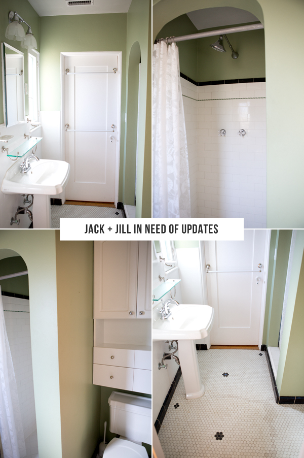
First up: the green Jack and Jill bathroom. I totally understand the vision of the owner who previously remodeled this bathroom. Our house is Spanish, built in 1926, their design makes sense in keeping with that theme in a very literal (but moderately updated) way. But my design loving heart yearns to make this bathroom into something special- a showpiece rather than something that just simply makes sense. Here’s the great thing about it though- we can make cosmetic updates and make this room SING! Here are a few images I pulled for inspiration.
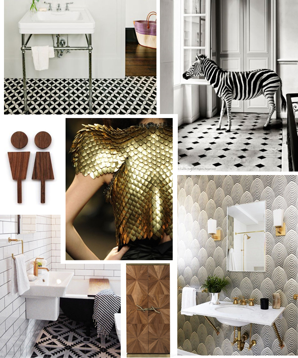
{Images via: 1 / 2 / 3 /4 / 5 / 6 /7}
I’ve never tackled a bathroom remodel before- so when I started thinking about the design process and all of the elements- it became a little daunting. It’s not like I’m familiar with a million places to get sinks and faucets the way I am with rugs and pillows. So I started shopping around on the major bathroom brands sites and became even more overwhelmed. But then I discovered Kohler– and realized that they really stock almost EVERYTHING I need to make both our bathrooms the dream bathrooms that my design obsessed brain can’t stop envisioning- and the site design makes it almost effortless instead of completely daunting. And if coming up with inspiration and ideas is a challenge for you, they have an IDEAS section of their website that has inspiration ideas and mood boards as well as a planning resources section that is invaluable.
So here’s how I planned the bathroom- I took my laptop into the room, a measuring tape and I sat on the floor and went through Kohler’s website. Literally. On the floor, in the space, letting my imagination and the space speak to me. The site also has an amazing feature that lets you create folders- so I created a folder for the room and just added pieces that I loved to it as I went- this was huge because it really helped me visualize it all together. And then I measured to make sure the pieces I loved and envisioned would fit.
I thought about things like replacing the shower with something modern and realized that I didn’t want to take away from some of the original charm- that the coved entrance to the shower was more important to me than my love of modern glass shower doors, but that installing this overhead shower and these faucets would turn it into a space I’d be happy to shower in. Once I’d picked out all of the fixtures I started thinking about some other design elements. I love the original tile that’s in there but it’s in rough shape. And I crave a little more drama in a bathroom, so I started the hunt for some black and white tiles that would pay homage to the Spanish style of the home but also give the modern clean fixtures I’d picked something to stand out against! I also want to make it more spacious- installing a more streamlined sink, replacing the light fixtures with something with less visual weight and taking out those built-in cabinets and installing open shelves will do just that!
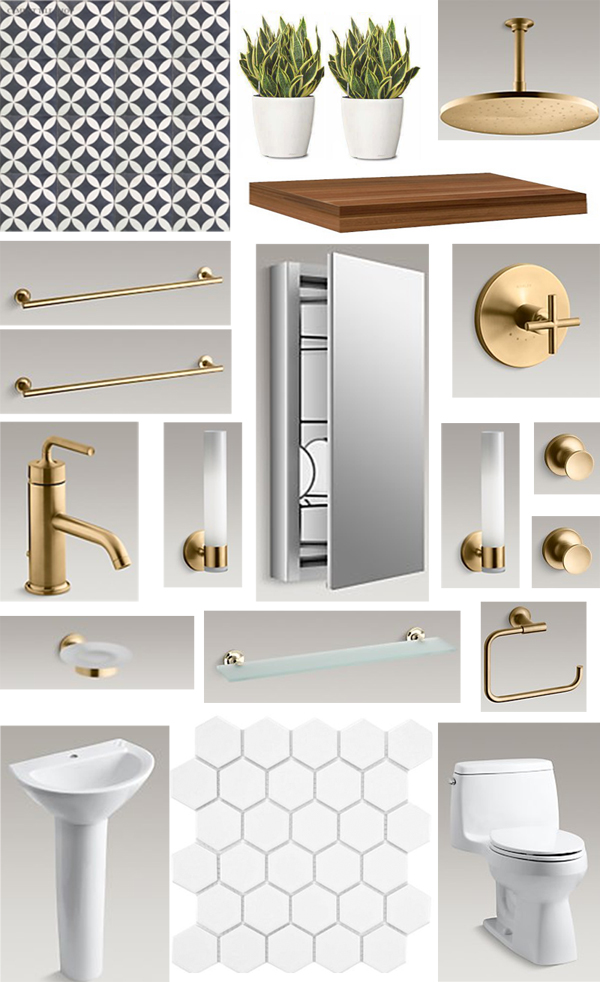
{Sources: b+w tile, shower head, floating shelf, towel bars, medicine cabinet mirror, shower valve, faucet, sconces, towel hooks, soap holder, vanity shelf, towel ring, sink, white tile, toilet}
Above is my design inspiration board for the room featuring the Kohler products I picked as well as tile and a few other design elements I’d love to add. It gives me chill bumps to see it- I know that the day we manage to transform this bathroom will be a VERY exciting one!!!
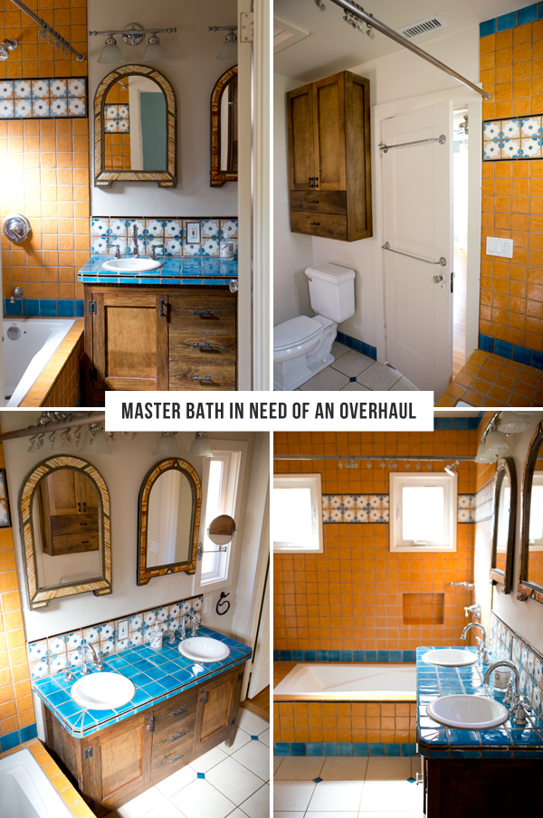
Next up: the master bath. I think sometimes you have to live in a space to truly understand what can be improved upon. I know some of you are fans of this room as is- and I get that, I can see the charm too. But it’s totally not our style (also I promise it looks significantly prettier in the photos than in person). And functionally, there’s just a few things that don’t make sense. For instance- most of the light in the room comes from windows that are IN the shower. Which means that if the shower curtain is open and drying out, the room is relatively dark (these photos were all taken pre-curtain, so it’s effectively much darker in there now that it’s a functional shower. It also has really extra tiny sinks- which I actually really love BUT not in a master bedroom.
The third quirky thing I realized is that there are two doors to get into the bathroom- one at the end of the extremely long hallway, and one from our bedroom. The one from our bedroom makes sense- it’s a master suite bathroom. But the hallway entrance is unnecessary- we already have a guest bathroom and that door makes an already small-ish bathroom even smaller! It also prevents us from hanging art at the end of the long beautiful hallway. These old houses tend to have a lot of doors, but they’re not always the most functional!
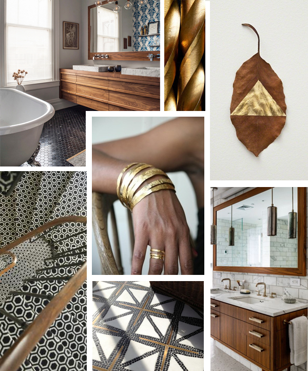
Sources: 1 / 2 / 3 / 4 / 5 / 6 / 7
So with these quirks in mind I once again sat on the bathroom floor with my measuring tape, the inspiration board above, the Kohler website and started playing around with ideas. My first was to remove the door and move the bath/shower to the other side of the room. This will allow us to install a big, bright window where the two tiny ones are that are currently hidden behind a shower curtain. This means the toilet will move to the opposite side as well. The other perk of doing this is that it gives us extra space to install a longer vanity- to truly take advantage of every square inch of the space. It will also make the space feel bigger.
Since we’re already pretty much going to have to gut the bathroom, it gives me the perfect excuse to replace the ALL of the tiles with something that’s a more modern interpretation of Spanish. Below you’ll see the moodboard I created with all of the items I’d pull together to make this our dream bathroom. I love that like the other bathroom it’s modern, but honors the Spanish style of the house with the tile. And I really love that there’s some cohesion between the master bath and the guest bath. They’d both have their own distinct feel, but they go together and make sense living under the same roof.

{SOURCES: tub, bath & faucet trim, spout and handle, black/white tile, subway tile, mirror, sink faucets, vanity, drawer pulls, sinks, towel bars, toilet, toilet tissue holder, hanging planters}
OK, so I’m a bathroom reno newbie- I still have yet to actually dip my toes into the part I imagine to be the most challenging (contractors!) but as far as design is concerned- I feel like I’ve got this. And that it’s FAR less intimidating than I expected it to be. Honestly, I think that if I had to source everything from a half dozen stores I might go bonkers trying to pick out pieces! I hope this helps you all with any upcoming projects you have (we have a kitchen on the horizon which is full-on: walls to be knocked down and complete rearrangement of just about every single inch- and I’m thinking I’ll start the design process just about the same way I did with these- a mood board and then tackling it one step at a time!) Good luck my fellow home reno-ers! Please please please chime in below if you have any tips or experience to offer up to a newbie like myself! xx- Sarah
