What Color Represents Peace?
The right shades can change our mental state, creating islands of calm in our minds and spaces.
This blog uses the colors most strongly connected to peace: blue, with its sky-like serenity, and pure white, with its clean simplicity.
Green with its natural healing power, and lavender with its gentle spiritual warmth.
We’ll examine how these colors can be combined, which rooms benefit most from each shade, and the personality traits associated with peaceful color preferences.
Some practical ways to incorporate these calm tones into your home, wardrobe, and visual communications.
The Colors That Best Represent Peace
1. Blue – The Universal Symbol of Peace
Blue reminds us of calm skies and peaceful waters. When we see blue, our hearts slow down, and we feel safe.
The UN uses blue in its flag because it makes everyone feel like things will be okay.
Blue works great in bedrooms to help you sleep or in offices where you need to focus.
2. White – The Color of Purity and Harmony
White feels like a fresh start with no problems. Think about brides in white dresses or the white dove carrying an olive branch.
White has no distractions, giving your mind room to relax. In your home, white spaces feel clean and open, letting you breathe easier and think clearly.
3. Green – Peace Through Nature
Green surrounds us in healthy forests and gardens. Our bodies naturally relax around green things because they signal life and growth.
Looking at green plants actually lowers stress hormones in our blood.
Hospitals use green because patients heal faster when surrounded by nature’s peaceful color.
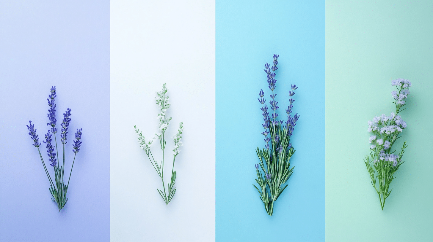
4. Lavender – Peace with a Spiritual Touch
Lavender feels like a gentle hug for your mind. It’s not demanding like bright purple but still has a touch of magic.
People often close their eyes and imagine lavender fields when they need to calm down.
Spas and meditation apps use this color to help you let go of stress.
Peaceful Color Combinations That Work Well
Let’s go through some different combinations that stand out as unique in their ways.
Blue and White
This combo feels like a fresh breath of air. Blue brings a sense of calm, while white adds openness.
This pair works well in bathrooms or bedrooms where rest is important.
Green and Beige
Nature’s favorite mix brings the outdoors inside. Green feels alive and growing, while beige adds warmth and comfort.
Try this in living spaces where people gather to talk and relax.
Lavender and Gray
This gentle mix feels both modern and soothing. Lavender adds soft warmth, while gray provides balance and steadiness.
It works nicely in home offices or quiet corners.
Cool Colors in Home Design
Let’s know more about how Green, Blue, White, and Lavender affect your space.
Best Rooms for Green
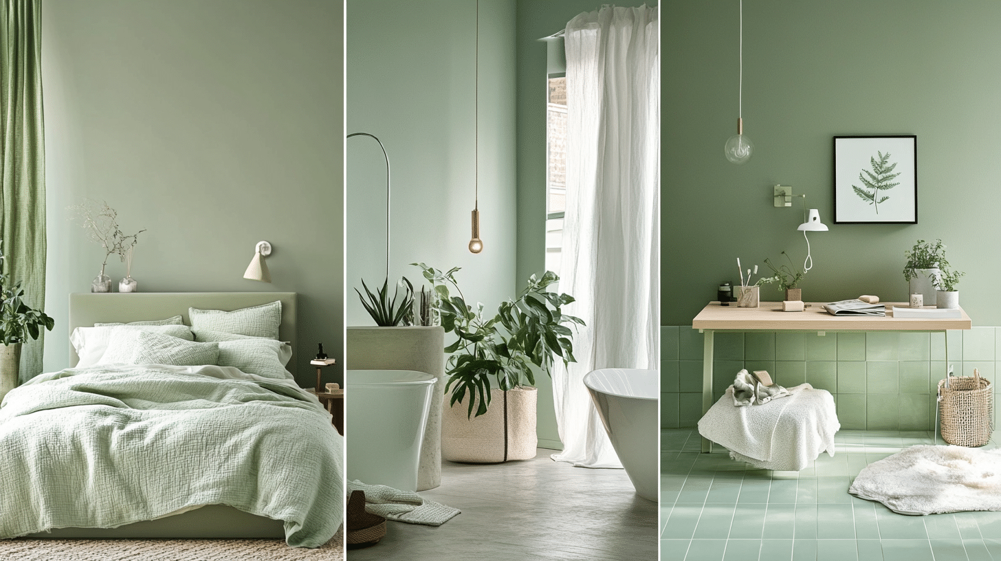
- Bedroom: Green helps ease you into sleep naturally. It signals your brain to slow down after a busy day. Many people find they rest better surrounded by soft green shades that remind them of leaves and grass.
- Office: Green helps you stay focused without burning out. Research shows people make fewer mistakes in green rooms. It’s like getting a small mental break each time you look around your workspace.
- Bathroom: Green bathrooms feel like natural spas. The color feels clean while still being warm. Morning routines in green spaces help you start the day feeling centered rather than rushed or tense.
Best Rooms for Blue
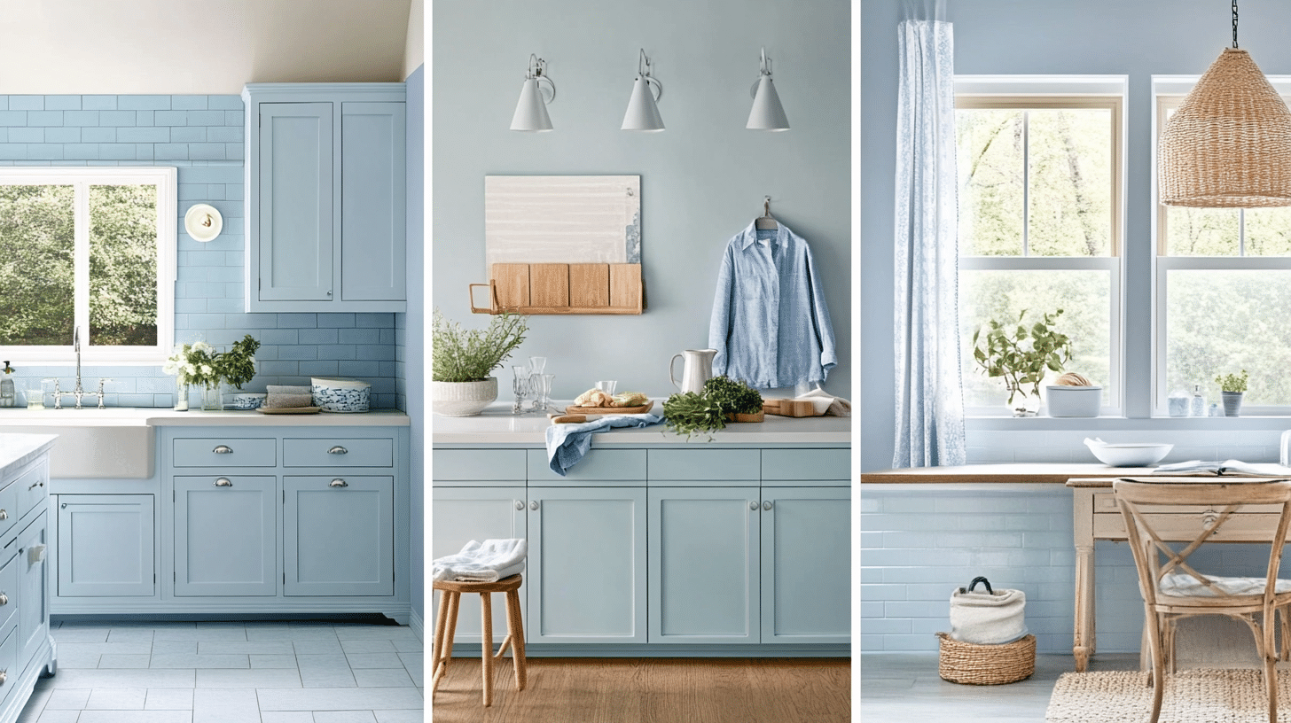
- Kitchen: Blue naturally reduces hunger slightly, helping with mindful eating. Food stands out against blue backgrounds. As a fun fact, flies tend to avoid blue rooms—a smart trick for kitchens with open windows in summer!
- Bath: Blue and water are perfect partners. The color makes small bathrooms look bigger and creates a fresh, clean feeling. Even quick showers feel more relaxing when surrounded by gentle blue tones.
- Work areas: Blue helps your mind work through complex tasks without feeling stressed. It works well in spaces where you need to think clearly and make good choices without emotional pressure.
Best Rooms for White
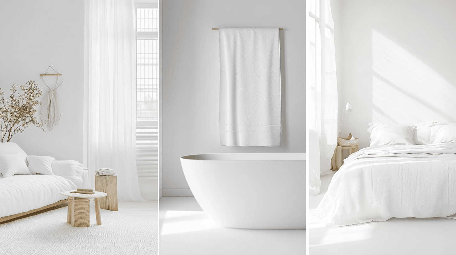
- Living room: White living spaces welcome everyone, making a blank canvas for good talks. Even small gatherings feel more open and breezy, and your favorite items become the main focus of your room instead of the walls.
- Bedrooms: White bedrooms create a calm retreat feeling. They tell your brain it’s time to let go of the day’s visual noise. White sheets and covers make beds look extra cozy and inviting.
- Bathrooms: White bathrooms stay in style and actually look cleaner. The color bounces light around, making morning routines brighter. It works as a base that can handle colorful towels or simple, calm looks equally well.
Best Rooms for Lavender
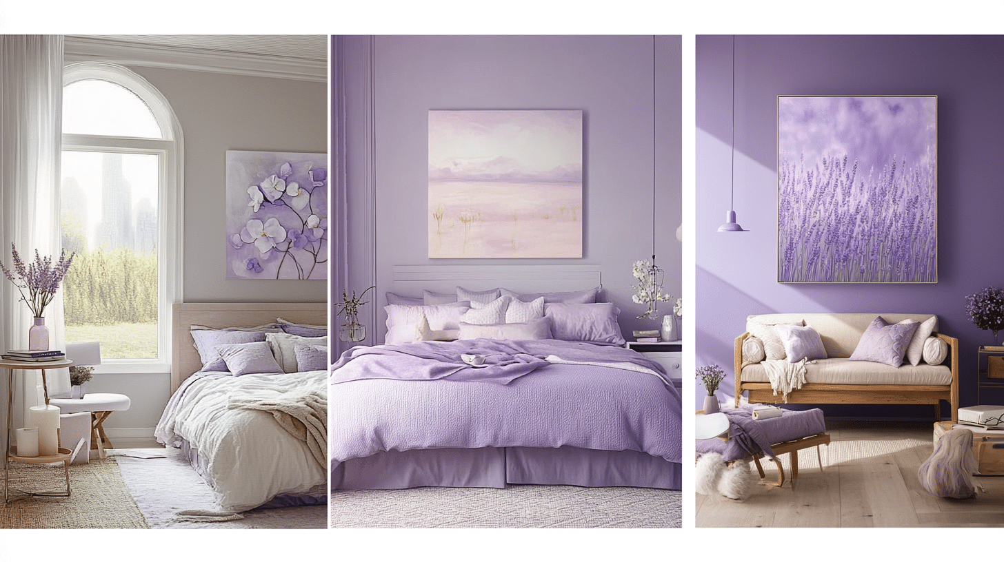
- Bedroom: Lavender has helped people sleep for generations. It quiets busy thoughts without feeling as cool as blue sometimes can. It works especially well for people whose minds race when trying to fall asleep.
- Teen room/studio: Lavender supports creative thinking while being calm enough for homework. It’s a grown-up color that still feels a bit magical—great for spaces where both school work and imagination happen.
- Entertainment area: Lavender creates a nice setting for good talks and movie nights. It helps guests feel both relaxed and mentally present, leading to better conversations than you might have in more bright, active-colored rooms.
Mood and Personality Traits of Peaceful Colors
The table below provides a briefing on the mood and personality traits of the specific peaceful colors.
| Color | Theme | Mood Created | Personality Traits |
|---|---|---|---|
| Green | The Color of Growth and Balance | Green feels calm, like nature. It supports emotional rest, fresh thinking, and peaceful, safe spaces. | People who love green are steady, thoughtful, supportive, and quiet leaders who value growth, peace, and deep respect. |
| Blue | The Color of Peace and Productivity | Blue brings peace and mental focus. It helps calm emotions and supports clear thoughts, especially in work or quiet spaces. | Blue lovers are loyal, calm, clear thinkers. They listen well, support others, and build trust through words and actions. |
| White | The Color of Peace and Purity | White offers stillness and space. It creates peaceful, open environments that feel clean, quiet, and emotionally soothing. | People drawn to white are thoughtful, organized, gentle, and calm. They enjoy peace and help bring order to their surroundings. |
| Lavender / Light Purple | The Color of Creativity and Spirituality | Lavender is soft and dreamy. It supports rest, calm thoughts, and creative moods, making it perfect for art or quiet reflection. | Lavender lovers are creative, sensitive, kind, and thoughtful. They express feelings well and enjoy peaceful surroundings. |
Using Peaceful Colors in Daily Life
Using peaceful colors in our daily lives can help us create a sense of calm and also help change our surroundings positively.
Home Decor
Soft blues, greens, and muted purples create a calm space. These shades work well in bedrooms, bathrooms, and meditation rooms.
Blue promotes relaxation, green brings balance, and purple adds a soothing touch, helping to create a stress-free environment.
Fashion and Clothing
Wearing light shades like beige, pastel blue, and soft gray can create a relaxed and peaceful look. These colors make an outfit feel calm and effortless.
Soft tones also help set a comforting mood, making them great for casual wear or work settings.
Graphic Design and Branding
Brands often use soft blues, greens, and neutrals to create a sense of trust and peace. These colors help customers feel at ease and connected.
Light, calming shades are commonly used in wellness, finance, and technology branding to build confidence and reliability.
Conclusion
Peaceful colors do more than just look nice—they can actually affect how we feel and help improve our mental well-being.
They have the power to change our moods and can also help create balance in our lives.
By thoughtfully introducing blues, whites, greens, and lavenders into our environments, we create spaces that support calm, focus, and balance.
Whether in our homes, wardrobes, or brand designs, these gentle hues offer practical tools for managing stress and fostering calmness.
As you consider the colors surrounding you each day, remember their quiet influence on how you feel, think, and interact with others. Our website has more such blogs.
Frequently Asked Questions
What is the National Color of Peace?
White. Recognized globally on truce flags and “Peace to All Nations” banners.
What Color Represents Anxiety?
Gray shades commonly link to anxious feelings and negative mental states.
What Symbolizes Peace?
White doves, olive branches, and the peace sign are universal symbols of harmony.