What Color Represents Calm: Blue, Green, Purple and Neutrals
What represents calm in our everyday lives is often the colors around us.
Colors influence our emotions and mental state in subtle ways.
When we feel stressed or anxious, certain colors can bring peace.
Research in color psychology shows that blue reminds us of clear skies and calm waters, evoking tranquility.
Green connects us to nature and promotes harmony.
Soft purples like lavender suggest gentleness, while neutral tones create quiet spaces for the mind.
Understanding the link between colors and calmness is not only interesting but practical.
By choosing the right colors for our homes, workspaces, and clothing, we can create peaceful environments that reduce stress.
Understanding Color Psychology
Color psychology examines how colors affect human emotions, thoughts, and behaviors.
This field studies the relationship between color stimuli and our responses to them.
When we see colors, our brain processes them through the visual cortex, triggering responses that influence mood and feelings.
These reactions aren’t just subjective—they cause measurable physical changes.
Red can increase heart rate, while blue can lower blood pressure and slow breathing.
Studies show warm colors (red, orange, yellow) tend to energize, while cool colors (blue, green, purple) promote relaxation.
The effect varies with intensity and context—bright red might feel intense, while soft pink feels gentle.
Color relationships also matter. Complementary colors create visual interest, while analogous colors create harmony.
With this knowledge, we can design spaces that support our emotional needs and goals
Colors that Represent Calmness
The most peaceful colors have been studied and used across cultures to create environments that naturally reduce stress and promote well-being.
Understanding these calming hues helps us make informed choices about our surroundings.
1. Blue: The Sky’s Tranquility
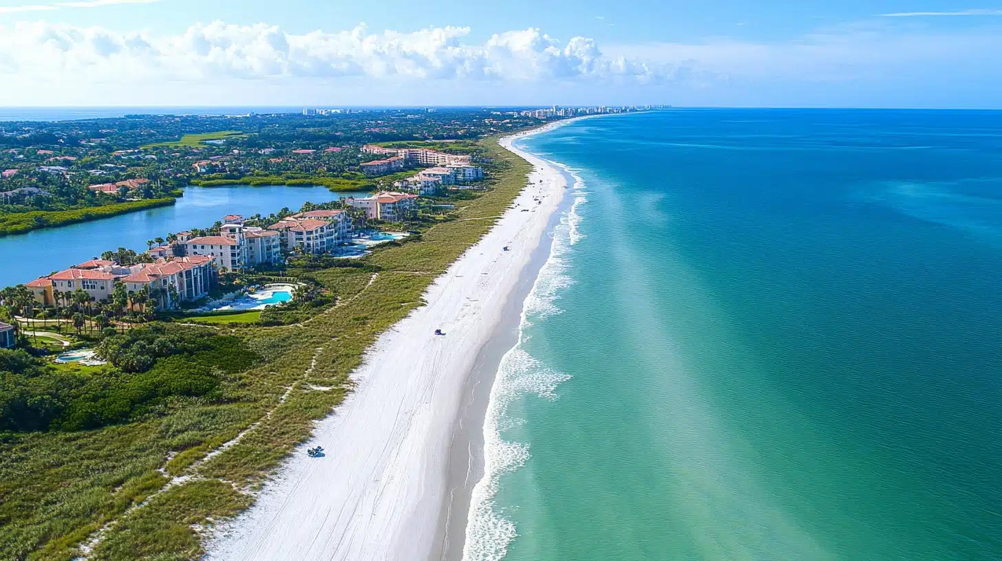
Blue wraps us in serenity like a clear summer sky.
Connected to vast oceans and open skies, this color physically slows our breathing and lowers blood pressure.
When stress mounts, blue spaces offer refuge.
Hospital walls, meditation apps, and spa retreats use blue for a good reason—it signals to our brain that it’s safe to relax.
The deeper the blue, the more profound the calm it creates.
2. Green: Nature’s Comfort
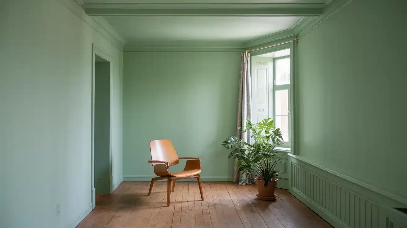
Green brings the outdoors in.
As the dominant color in nature, green reminds us of forests, meadows, and renewal.
Studies show time spent looking at green scenes reduces heart rate and muscle tension.
This is why therapy gardens work so effectively—green spaces help diffuse anxiety and promote healing.
From mint to sage, each shade brings its own level of peace.
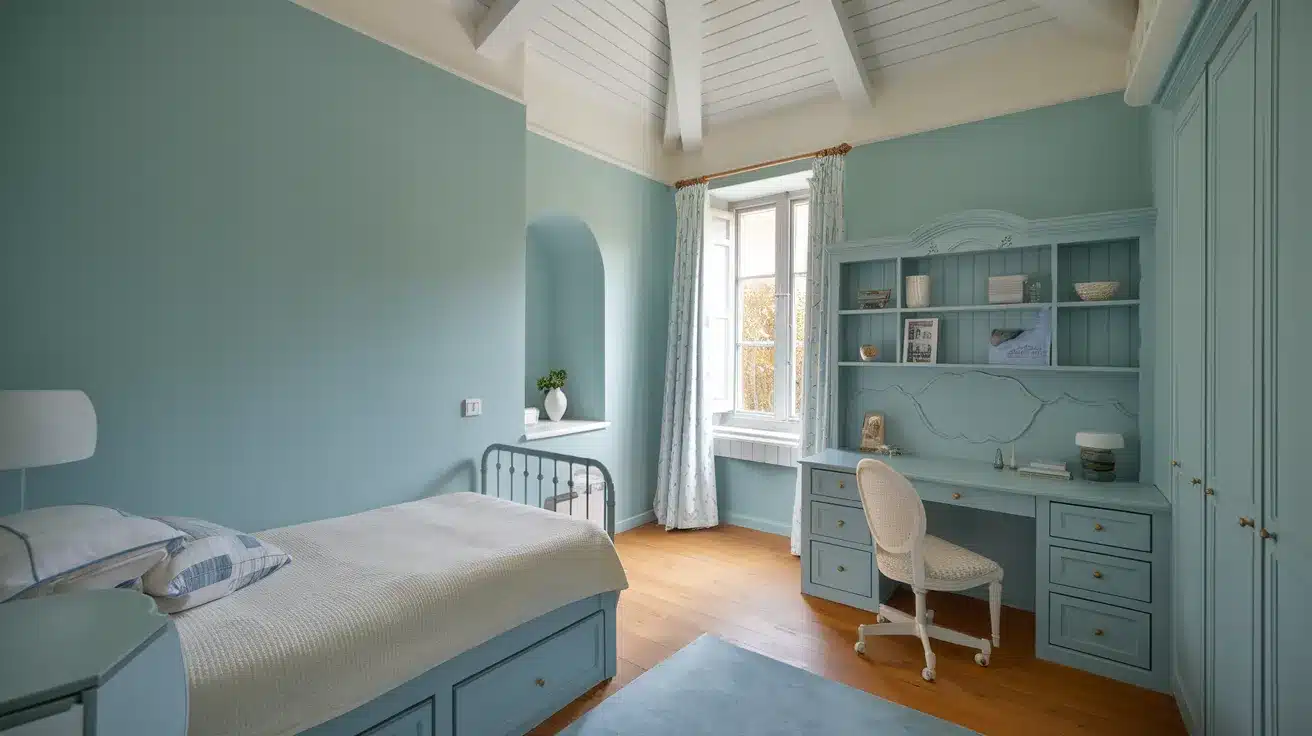
3. Purple: Gentle Lavender Calm
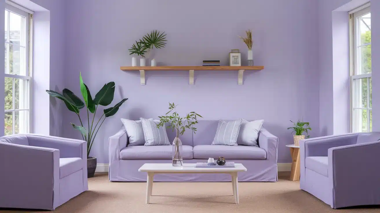
Light purples like lavender offer a unique form of tranquility.
These soft shades balance the stability of blue with hints of red’s warmth, creating a peaceful yet expressive atmosphere.
Lavender, in particular, promotes mental clarity alongside relaxation.
This makes purple perfect for creative spaces where you need both calm focus and gentle inspiration.
4. Neutral Tones: Quiet Foundations
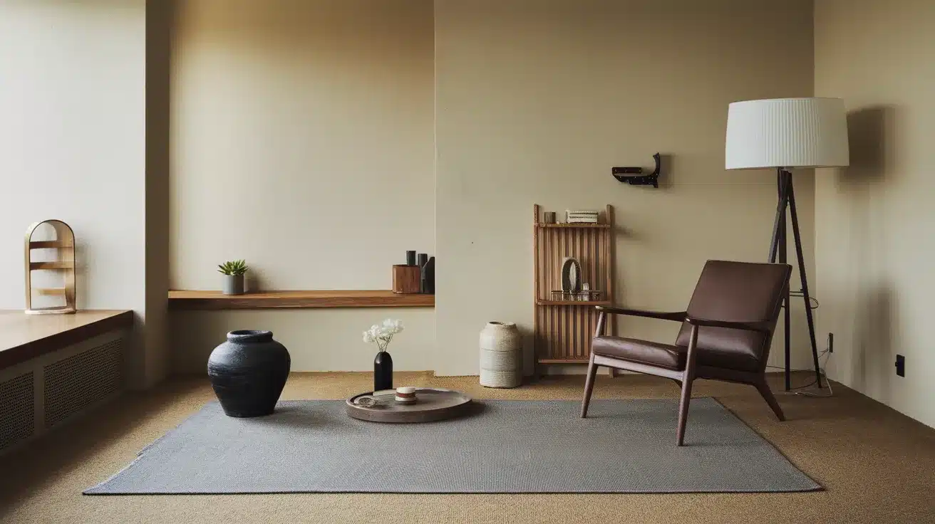
Soft neutrals create breathing room for the mind. Beige, cream, and pale yellow-green form peaceful backgrounds that don’t compete for attention.
These understated colors reduce visual noise, allowing thoughts to settle.
Modern spas and minimalist homes rely on these tones to create spaces that feel instantly calming.
Their subtle presence helps other elements shine while maintaining an overall sense of balance.
Scientific Backing of Color and Calmness
The connection between colors and emotional states isn’t just intuitive—it’s backed by robust scientific research.
Multiple studies across various fields have confirmed that certain colors can physically alter our stress responses, brain activity, and overall sense of well-being.
This growing body of evidence helps explain why we’ve always been drawn to particular colors for relaxation and healing.
Benefits of Blue Backed by Research
A 2013 study found that exposure to blue reduced heart rate, blood pressure, and respiration in stressed participants.
Blue was rated the most calming color.
A 2019 study showed that blue environments reduced anxiety and increased tranquility.
Blue light wavelengths help produce melatonin, regulating mood.
Benefits of Green Backed by Research
A 2010 study in Environmental Science & Technology found that just 5 minutes of viewing a green natural setting reduced cortisol levels and stress.
This supports the “biophilia hypothesis,” which suggests humans are connected to nature.
From 2010 to 2019, studies on “shinrin-yoku” (forest bathing) showed that green environments lower stress hormones, reduce blood pressure, and improve relaxation through parasympathetic nervous system activity.
A 2018 study found that green spaces in healthcare settings reduced anxiety and pain.
This led to shorter hospital stays for patients.
Benefits of Neutral Tone Backed by Research
A 2015 study found that neutral color schemes in minimalist environments reduced cognitive load and visual stress.
This created a sense of mental spaciousness, promoting calm.
A 2020 study found that beige and light gray environments provided a “background effect” that allowed for mental rest.
This reduced overstimulation in high-stress individuals.
Cultural Perspectives on Calming Colors
Color Perception is Contextual Colors don’t have universal meanings.
What feels calming in one culture might have a completely different emotional or spiritual significance in another.
For example:
- Blue is typically calming in Western cultures, but in some Middle Eastern traditions, it also carries spiritual protection.
- White represents purity in many cultures, but in Chinese tradition, it’s associated with mourning, unlike Western interpretations.
- Green represents forests and relaxation in Western cultures, whereas, in Buddhist traditions, it represents spiritual healing.
Conclusion
The science of color and calm encourages us to be intentional about the colors we use daily.
Blue calms our physiological responses, while green connects us to nature’s healing properties.
Purple balances tranquility with creativity, and neutrals provide mental space.
Research across multiple disciplines supports these effects, offering practical tools for managing our emotional environments.
However, color perception varies across cultures and individuals. What soothes one person might energize another.
By checking our personal responses to colors, we can choose those that resonate with our sense of peace. This helps create spaces that support our well-being.
Frequently Asked Questions
What is the Calmest Color?
The calmest color is often considered blue, as it is associated with the sky and ocean. Blue promotes tranquility, relaxation, and stress reduction.
How Can I Use Calming Colors to Reduce Stress?
To reduce stress, incorporate calming colors like blue, green, and soft neutrals into your environment.
Can Calming Colors Improve Sleep Quality?
Yes, calming colors like blue, green, and soft neutrals can improve sleep quality by creating a serene and restful environment.