11 Wall and Trim Color Combinations for Every Room
Choosing the right wall and trim combinations can be tricky when colors don’t complement each other. A poor pairing can leave rooms feeling unbalanced.
The right wall and trim ideas brighten rooms, create a polished, cohesive look, and let furniture and decor stand out naturally, making spaces feel welcoming
From soft neutrals to bold contrasts, color pairings can transform any room and add warmth
You’ll learn practical wall and trim combinations, easy tips for matching colors, and ways to make every room stylish and visually balanced.
How Do Wall and Trim Combinations Matter in Interior Design?
Trim helps frame walls, doors, windows, and ceilings with a polished appearance. It adds structure and makes interiors feel more organized.
Different wall and trim shades create contrast, depth, and visual balance indoors. Light trim brightens spaces, while dark trim adds stronger definition.
Matching trim creates a smooth and seamless interior finish naturally. Contrasting trim highlights edges and decorative details more clearly.
Wall and trim combinations also affect how spacious a room appears visually. Layered color schemes make interiors feel more connected and refined.
What to Consider Before Choosing Wall and Trim Colors?
Choosing the right wall and trim colors helps interiors feel more balanced and visually connected. Lighting, room size, and decor elements all affect how paint shades appear indoors.
- Room Size: Light trim makes small rooms feel open, while darker trim adds depth to larger spaces.
- Natural and Artificial Lighting: Warm lighting softens colors, while cool lighting makes shades appear brighter and sharper.
- Interior Theme: Match wall and trim colors with modern, farmhouse, traditional, Scandinavian, or contemporary interiors.
- Existing Decor Elements: Coordinate colors with flooring, furniture, curtains, and fabrics for a balanced overall look.
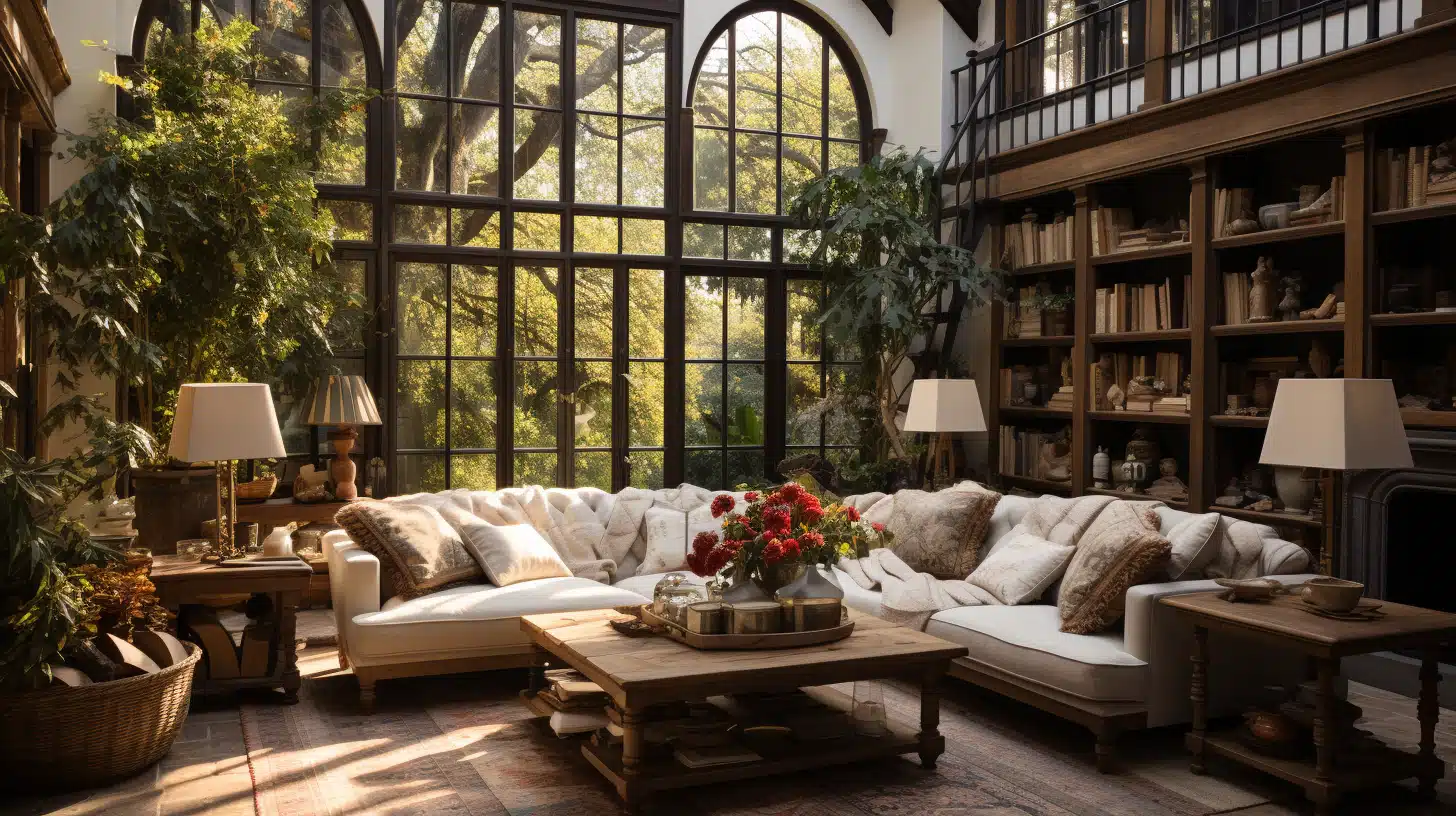
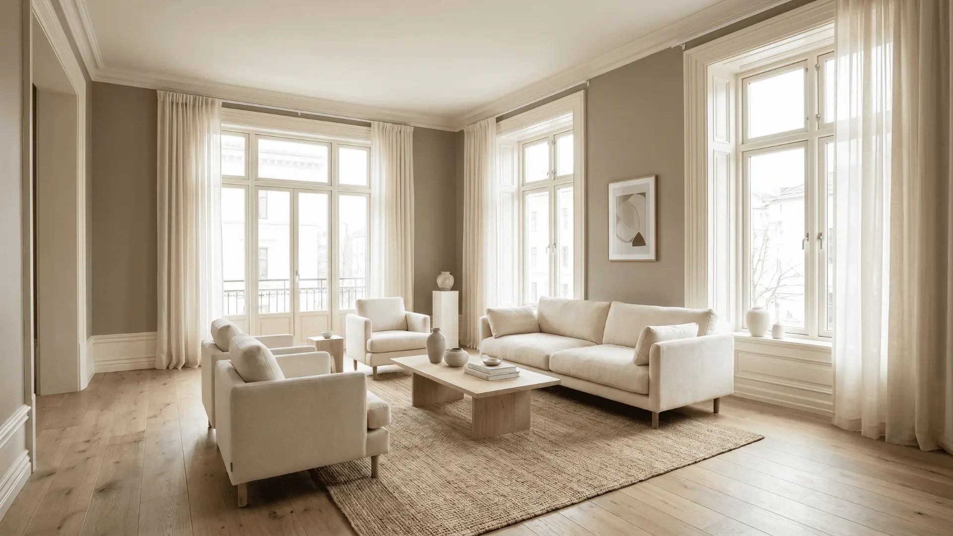
Soft Neutral Wall and Trim Pairings
Soft neutral wall and trim combinations create a clean and comfortable interior appearance. These balanced shades help rooms feel brighter, warmer, and easier to style naturally.
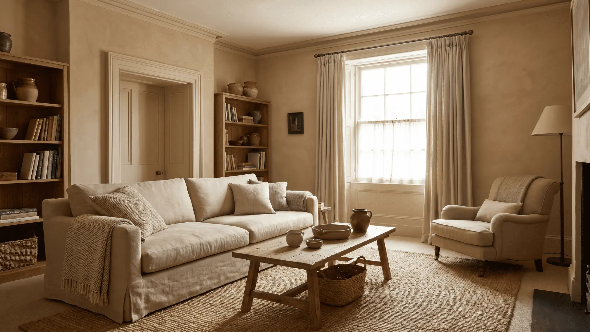
1. White Walls with Warm Beige Trim
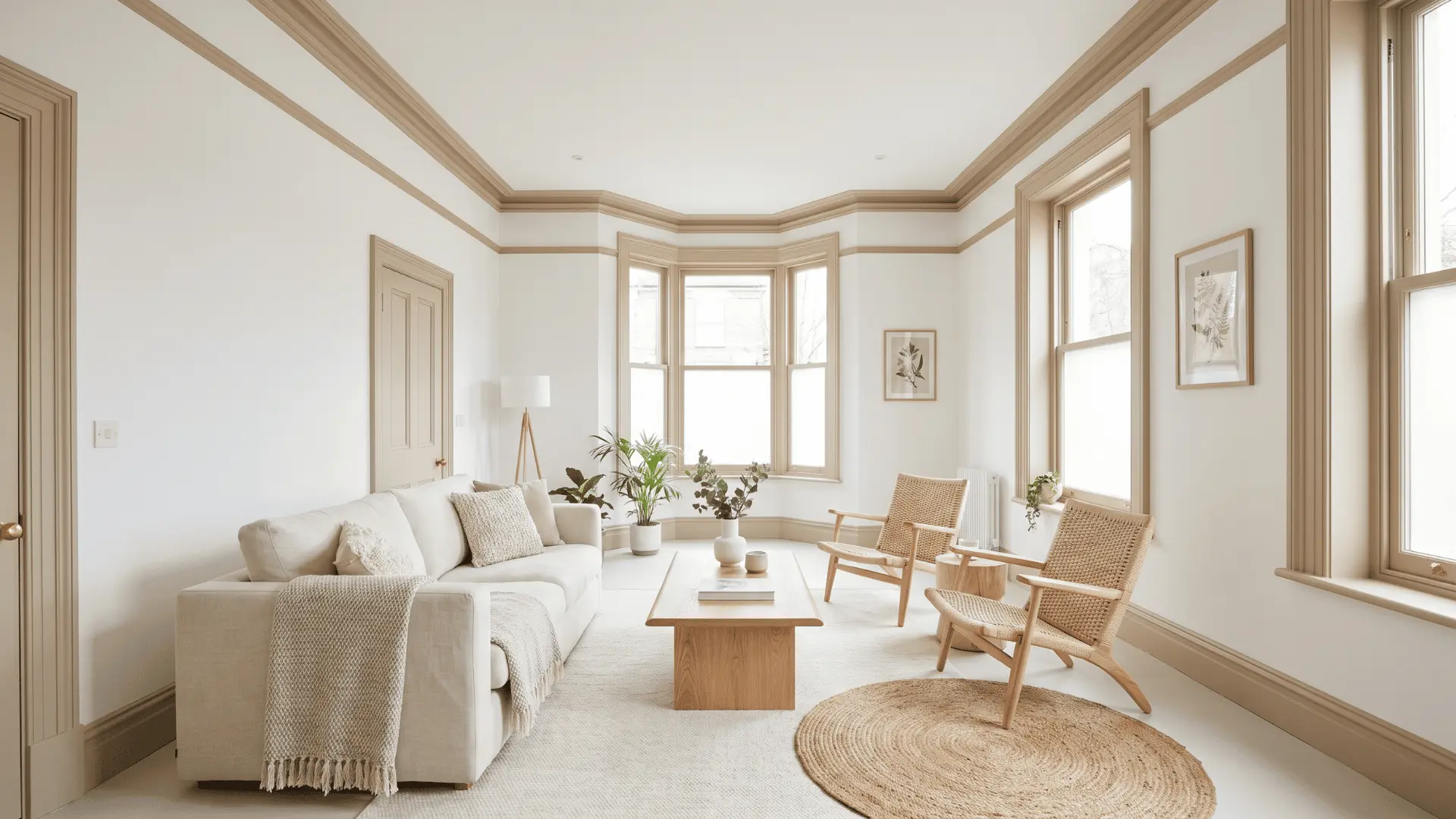
White walls with beige trim create a soft contrast that feels welcoming. The pairing keeps interiors bright while adding a cozy touch.
This combination works well in bedrooms, living rooms, and entryways. It suits homes with neutral furniture and soft lighting.
2. Greige Walls With Ivory Trim
Greige walls with ivory trim create a smooth mix of warm and cool tones. The subtle contrast gives interiors a clean and refined appearance.
This pairing fits modern homes with wooden furniture and neutral decor. It also works well in open-concept living spaces.
3. Sand Walls with Cream Trim
Sand walls with cream trim create an earthy and comfortable atmosphere indoors. The soft tones make spaces feel warm without appearing too dark.
This pairing suits family rooms, reading corners, and casual seating areas. It blends naturally with wooden and woven textures.
4. Pale Grey Walls with Soft White Trim
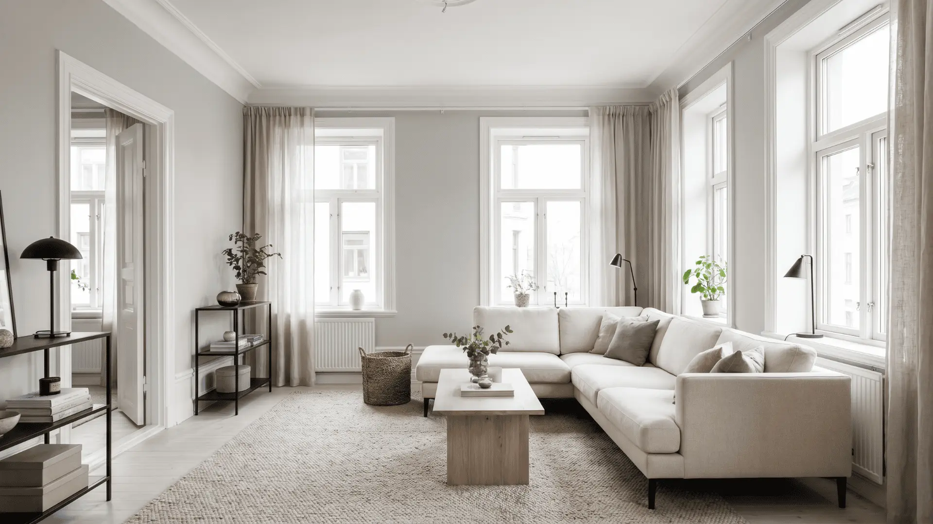
Pale grey walls with white trim give interiors a fresh and minimal finish. The clean palette helps rooms feel open and polished.
This combination works well in apartments, offices, and modern homes. It pairs easily with black accents and light-colored furniture.
High-Contrast Wall and Trim Ideas
Bold wall and trim combinations create stronger contrast and visual depth indoors. These color pairings help rooms feel modern, stylish, and more visually defined.
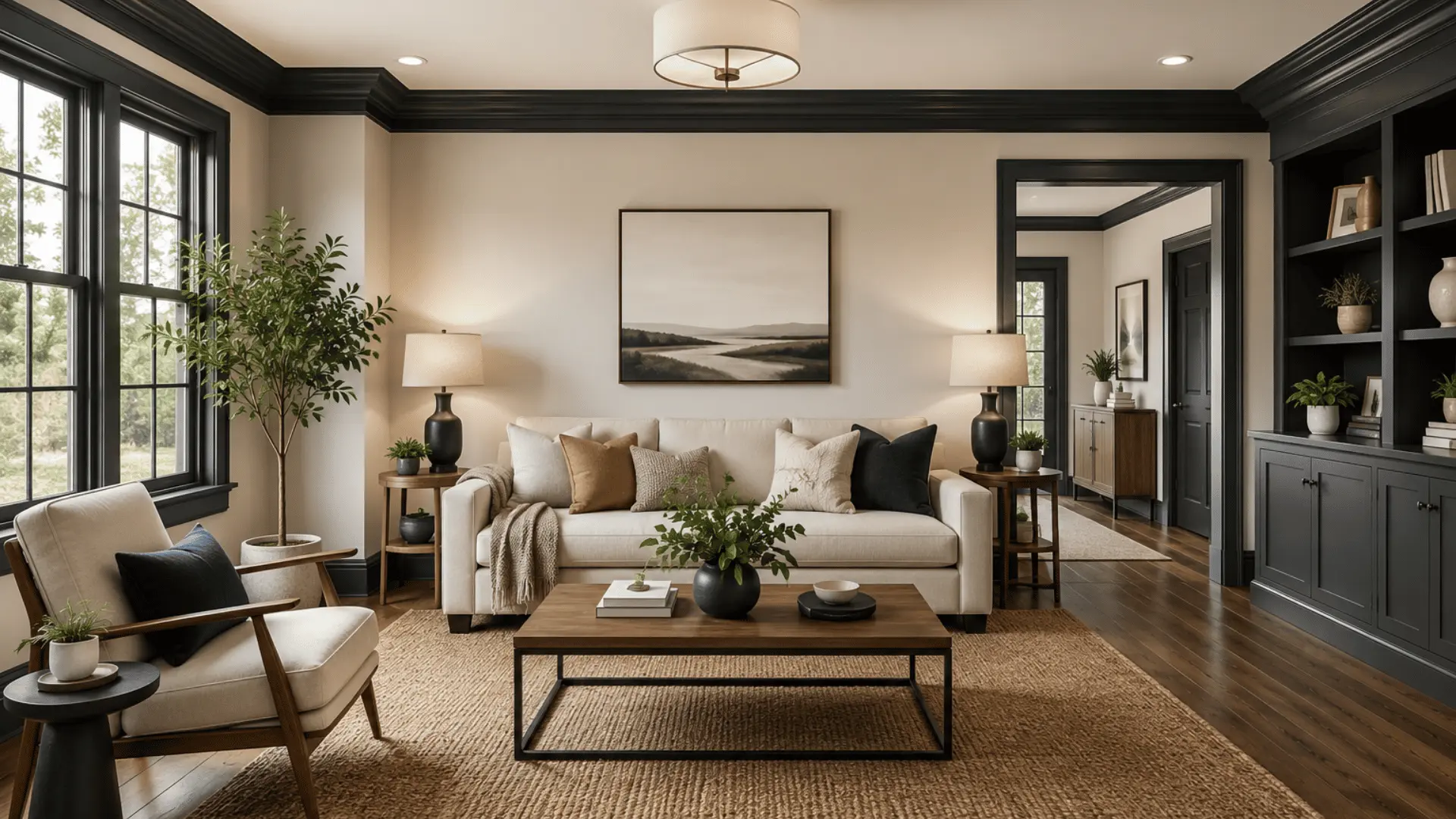
5. Crisp White Walls with Matte Black Trim
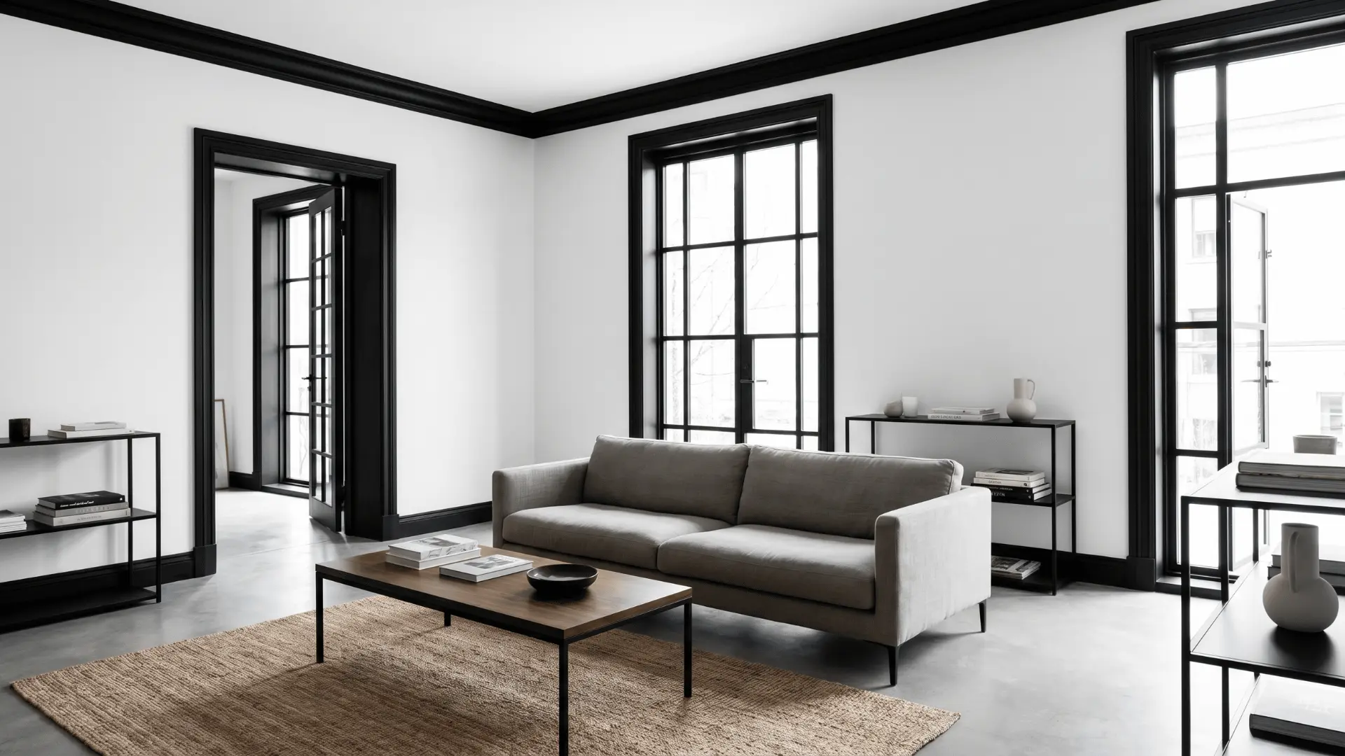
White walls with matte black trim create a sharp and modern interior look. The bold contrast works well in contemporary and industrial-style spaces.
This pairing highlights doors, windows, and ceiling details with a clean finish. It also blends easily with wood, metal, and minimal decor.
6. Deep Blue Walls with Yellow Trim
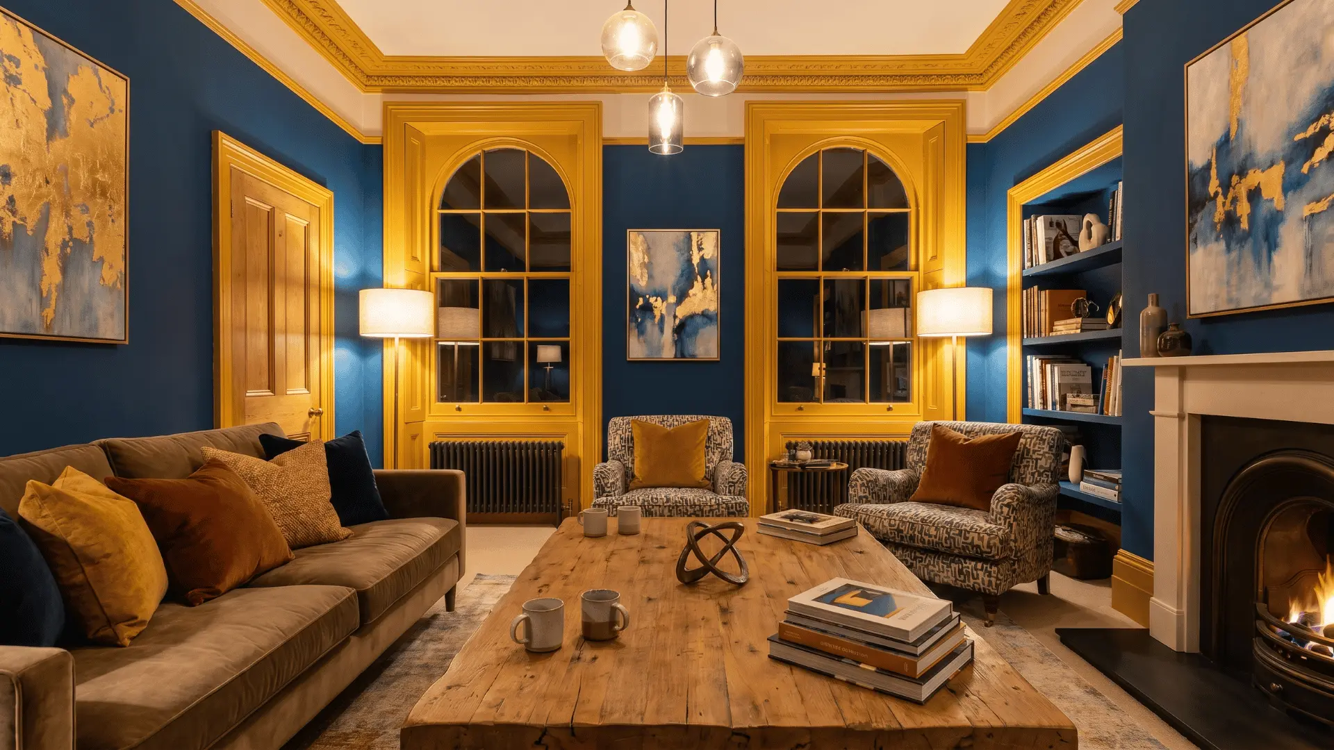
Deep blue walls with golden yellow trim create a rich and energetic contrast indoors. The bold pairing adds warmth and personality without feeling too bright.
This combination works well in creative spaces, studios, and colorful living rooms. It pairs nicely with warm lighting and textured decorative accents.
7. Dusty Pink Walls with Forest Green Trim
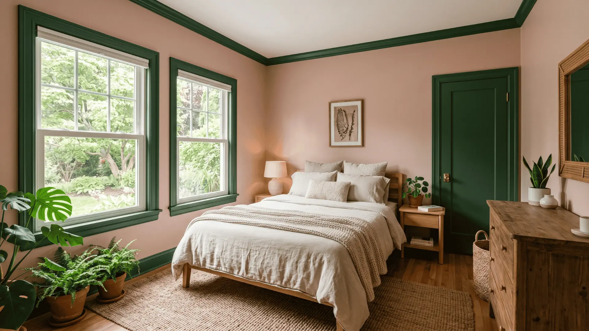
Dusty pink walls with forest green trim create a soft and balanced color palette. The earthy contrast adds warmth while keeping the room calm.
This pairing works well in bedrooms and relaxed living spaces naturally. It also blends beautifully with wooden textures and neutral furniture.
8. Charcoal Walls with Muted Olive Trim

Charcoal walls with muted olive trim create a bold yet balanced interior look. The darker palette works well in modern statement spaces.
Muted olive trim softens the richness of charcoal walls without reducing contrast. The combination feels grounded and visually polished indoors.
Tonal Wall and Trim Color Schemes
Tonal wall and trim combinations create a layered and cohesive interior appearance. These coordinated shades help rooms feel softer, calmer, and more visually balanced indoors.
9. Soft Blue Walls with Navy Trim
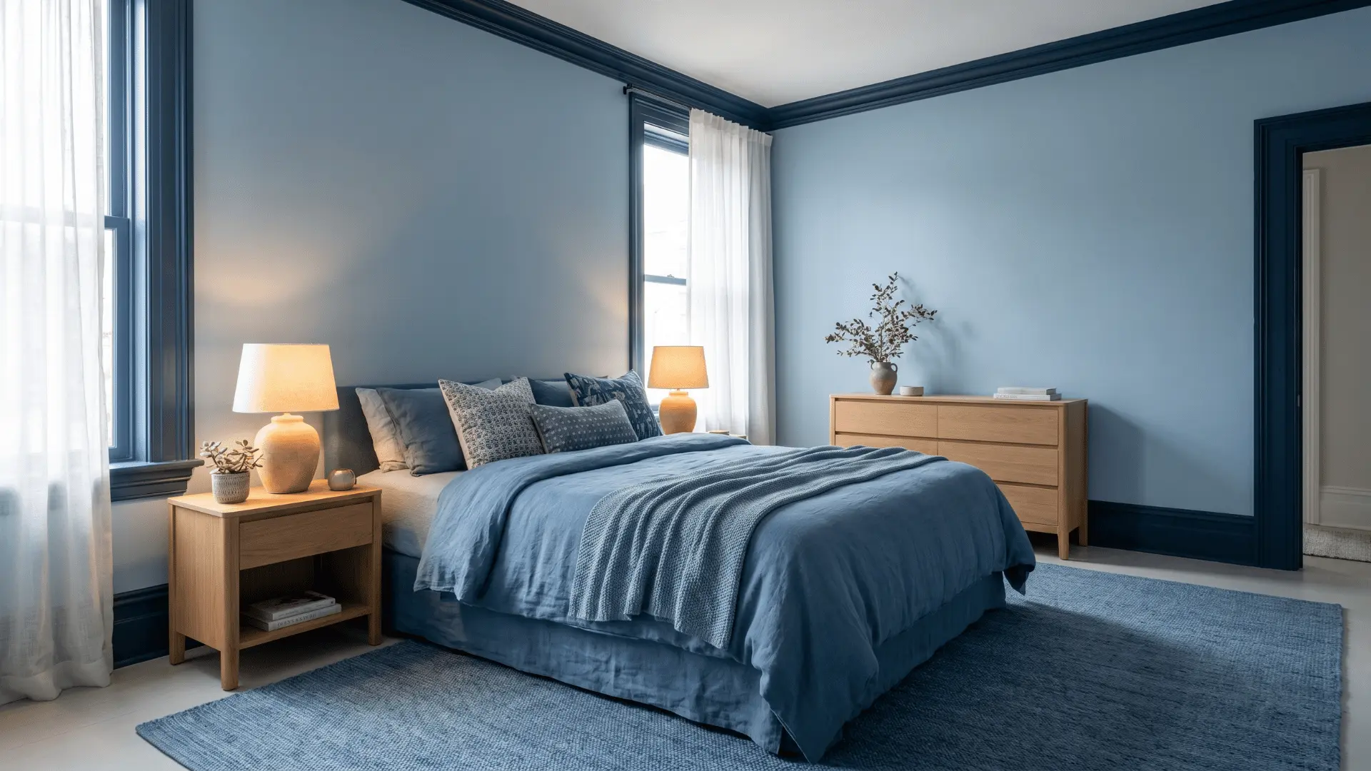
Soft blue walls with navy trim create a calm and layered monochromatic look. The deeper trim adds contrast while keeping the palette soft.
This combination works well in bedrooms and relaxing personal spaces. It creates a cozy atmosphere without feeling too dark.
10. Sage Green Walls with Moss Trim
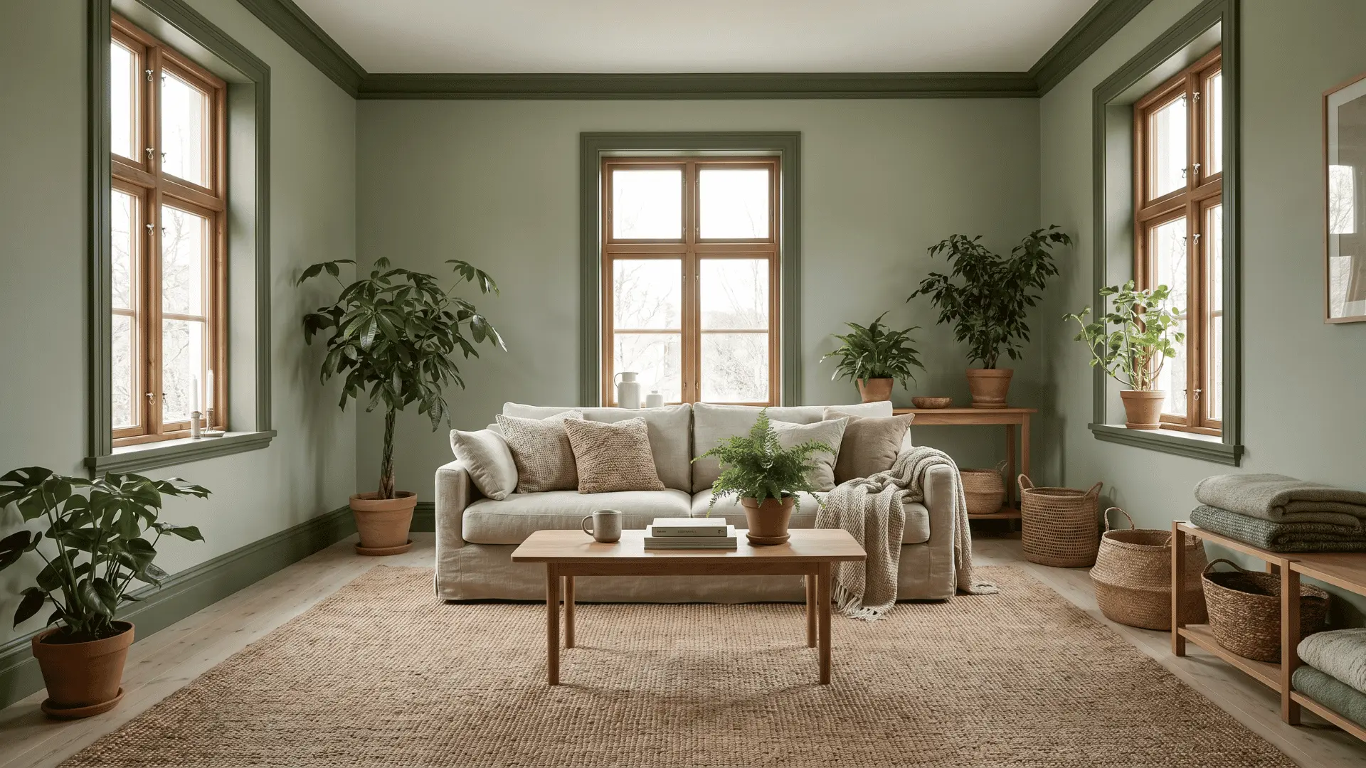
Sage green walls with moss trim create a calm and nature-inspired color palette. The tonal pairing feels soft, grounded, and easy on the eyes.
This combination pairs well with wooden furniture and woven textures naturally. It works beautifully in bedrooms, living rooms, and reading spaces.
11. Taupe Walls with Chocolate Brown Trim
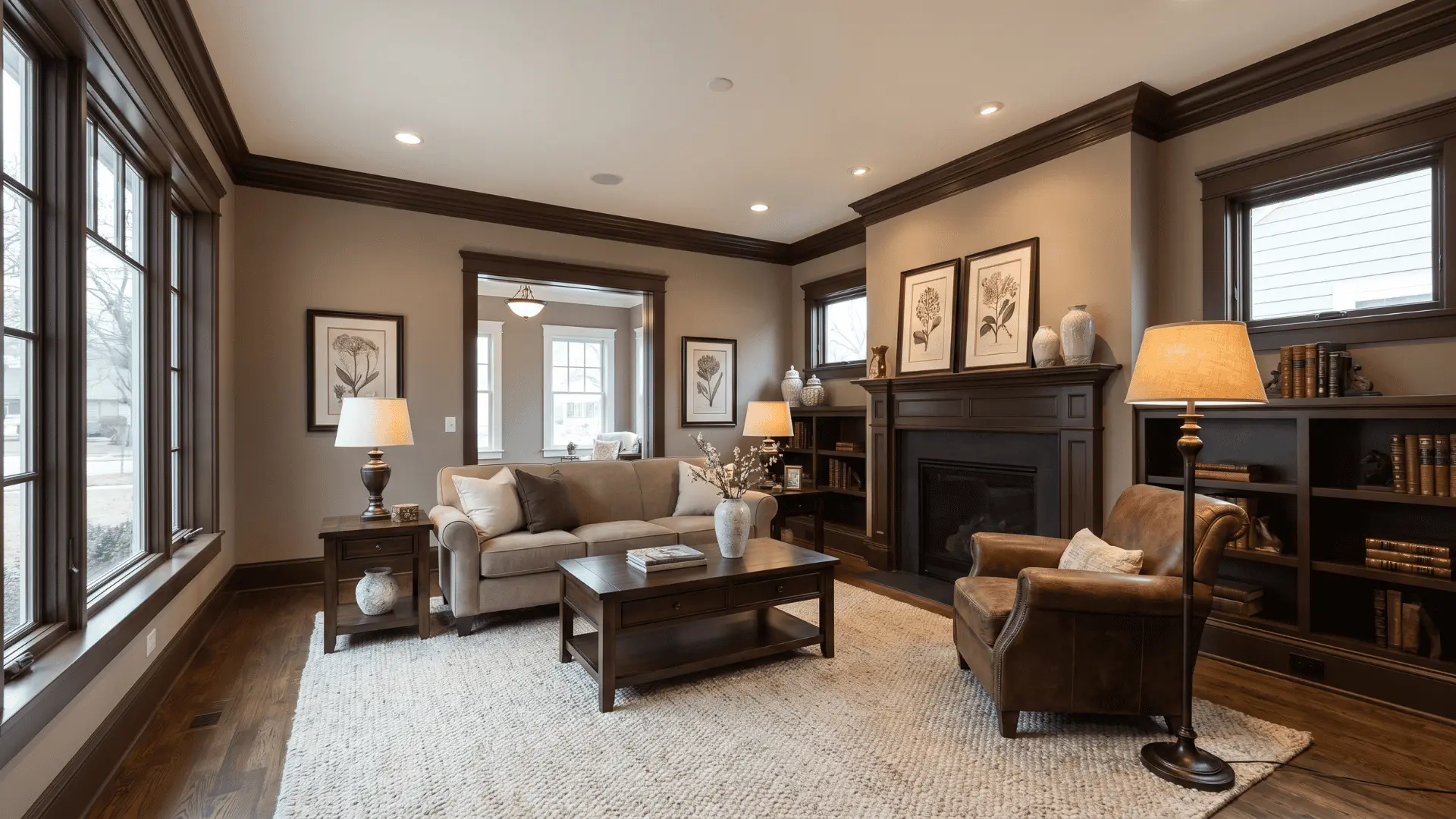
Taupe walls with chocolate brown trim create a warm and refined interior look. The darker trim adds richness while keeping the palette balanced.
This pairing suits formal spaces with classic or modern decor styles naturally. It also works well with leather finishes and dark wooden furniture.
Wall and Trim Color Combinations for Every Room
Different wall and trim combinations can completely change the mood and appearance of a room. The right pairing helps spaces feel brighter, warmer, and more visually balanced indoors.
| Room | Combination | Style |
|---|---|---|
| Living Room | Beige Walls + White Crown Molding | Soft and cozy |
| Olive Walls + Cream Trim | Earthy and relaxed | |
| Bedroom | Lavender Walls + Dove White Trim | Calm and airy |
| Forest Green Walls + Light Beige Trim | Warm and natural | |
| Kitchen | Butter Yellow Walls + White Trim | Bright and cheerful |
| Terracotta Walls + Cream Trim | Rustic and warm | |
| Bathroom | Ice Grey Walls + White Borders | Fresh and modern |
| Navy Walls + Soft Cream Trim | Elegant and balanced | |
| Hallway | Light Beige Walls + Olive Trim | Warm and welcoming |
| Grey Walls + Thin Black Framing | Sharp and modern |
Using the right wall and trim combinations can transform any room’s mood and appearance. Thoughtful pairings make spaces feel brighter, balanced, and welcoming.
Best Paint Finishes for Trim
Choosing the right paint finish for trim affects durability, cleaning ease, and overall appearance.
| Paint Finish | Durability | Cleaning Ease | Best Room Usage |
|---|---|---|---|
| Satin Finish | Moderate durability | Easy to clean | Bedrooms, living rooms |
| Semi-Gloss Finish | Highly durable | Very easy to clean | Kitchens, bathrooms, trim |
| Matte Finish | Lower durability | Harder to clean | Low-traffic spaces |
| High-Gloss Finish | Very durable | Easiest to maintain | Cabinets, statement trim |
Picking the right finish ensures trims stay beautiful and functional. Use finishes suited to room type and traffic for a long-lasting, polished look.
Simple Tips for Balanced Color Pairing
Creating a balanced interior starts with thoughtful wall and trim color choices. Small adjustments can make rooms feel cohesive and polished.
- Follow the 60-30-10 rule to balance dominant, secondary, and accent colors indoors.
- Keep undertones consistent so warm and cool shades do not clash visually.
- Pair dark wall colors with lighter accents to maintain balance and brightness.
- Repeat trim colors in decor items like cushions, curtains, or furniture finishes.
- Test sample swatches in daylight before choosing final wall and trim colors.
Using these tips ensures your color scheme feels harmonious and visually appealing. Experiment with combinations to find the perfect balance for your space.
Final Thoughts
Choosing the right wall and trim ideas can make rooms brighter, balanced, and inviting. Simple color pairings help furniture and decor stand out naturally.
From soft neutrals to bold contrasts, the right shades can transform any space and make interiors feel warmer and more cohesive.
Test paint samples and match undertones to ensure a polished final look. Small, thoughtful color choices can elevate any room.
Start with one room and experiment with coordinated shades.
Share your favorite wall and trim color combinations in the comments below and inspire others with your ideas!
Frequently Asked Questions
Should Kitchen Trim Colors Match Cabinet Colors?
They do not need to match exactly, but coordinated tones help kitchens feel cleaner and visually balanced.
What Trim Style Works Best with Minimalist Interiors?
Thin trim with neutral or monochrome shades works best in minimalist spaces with clean lines.
How Often Should Interior Trim Be Repainted?
Interior trim usually needs repainting every few years depending on moisture, sunlight exposure, and daily wear