Top 18 Living Room Paint Ideas with Accent Wall
Struggling to make your living room feel more balanced without changing everything? That’s where living room accent wall paint ideas can make a real difference.
A single wall can change how the entire space looks and feels when chosen correctly. But picking the right one is not just about color. It depends on placement, lighting, and how it fits with your room.
Today, I’ll show you how to choose the right accent wall, where to place it, and which styles work best based on your room size, lighting, and overall setup.
Factors for Choosing an Accent Wall for Your Living Room
Choosing an accent wall starts with clarity, not just color. The right choice depends on your goal, room layout, lighting, and how well it fits with your furniture and overall space.
1. Define Your Goal: Bold Statement or Subtle Depth
Start by deciding what role the accent wall should play.
A bold statement uses strong, contrasting colors to create a clear focal point. A subtle approach uses softer shades to add depth without drawing too much attention.
If the goal is unclear, the wall can look random instead of intentional. The right balance ensures your accent wall feels intentional, not forced or invisible.
2. Match Existing Elements: Furniture and Finishes
Your accent wall should connect with what’s already in the room to create a balanced and cohesive look.
- Check your sofa color: it’s usually the largest visual element, so the wall should complement it
- Look at flooring tones: wood, tile, or carpet undertones affect how colors appear
- Consider curtains and rugs: these add secondary colors that should align with the wall
- Match undertones: warm tones with warm, cool with cool to avoid visual conflict
- Avoid clashes: mismatched tones make the space feel disconnected
When all elements align, the accent wall feels intentional, and the room looks complete.
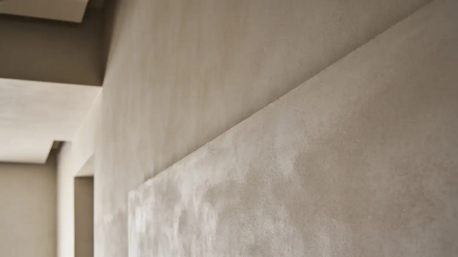
3. Understand Color Impact: Space Perception
Color affects how big or small your room feels.
Darker shades absorb light and make walls feel closer, which can add depth. Lighter shades reflect light and make the room feel more open.
Choosing the wrong tone can change the room’s feel entirely. Dark colors in small spaces can feel tight, while very light tones in large rooms may feel empty.
4. Check Lighting: Natural and Artificial Effects
Lighting changes how your accent wall color appears throughout the day. Natural light shows the true tone because it reflects evenly across the surface.
Artificial lighting can shift the color, making it warmer or slightly dull. That’s why a shade that looks rich in daylight may look flat at night.
Always test samples on the wall and check them in both daytime and evening lighting before finalizing.
Living Room Accent Wall Paint Ideas
Choosing the right style is just as important as picking the color. Each style creates a different visual effect, so it should match your room’s layout and design
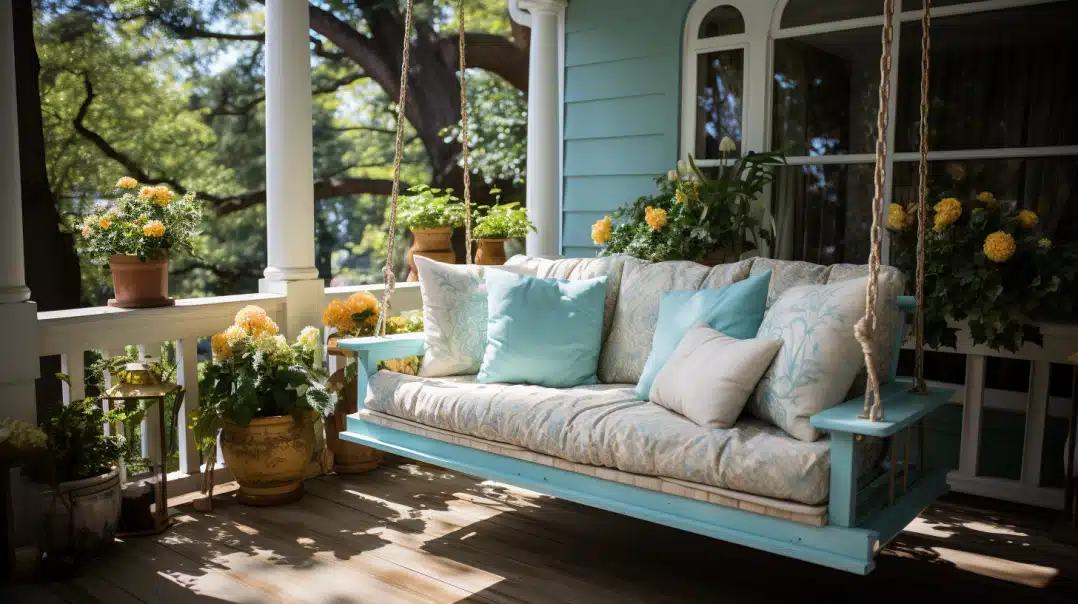
1. Solid Dark Accent Wall
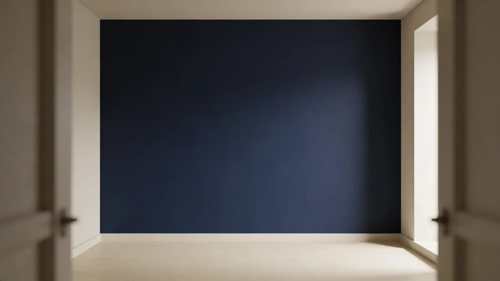
A solid dark accent wall creates a strong focal point and adds depth to the room. It works best in well-lit spaces where the color can stand out clearly without making the area feel closed.
Dark shades absorb light, which brings the wall visually closer. In smaller or low-light rooms, this can reduce openness and make the space feel heavy.
Recommendation: Navy blue, charcoal gray, deep green
2. Geometric or Pattern Designs
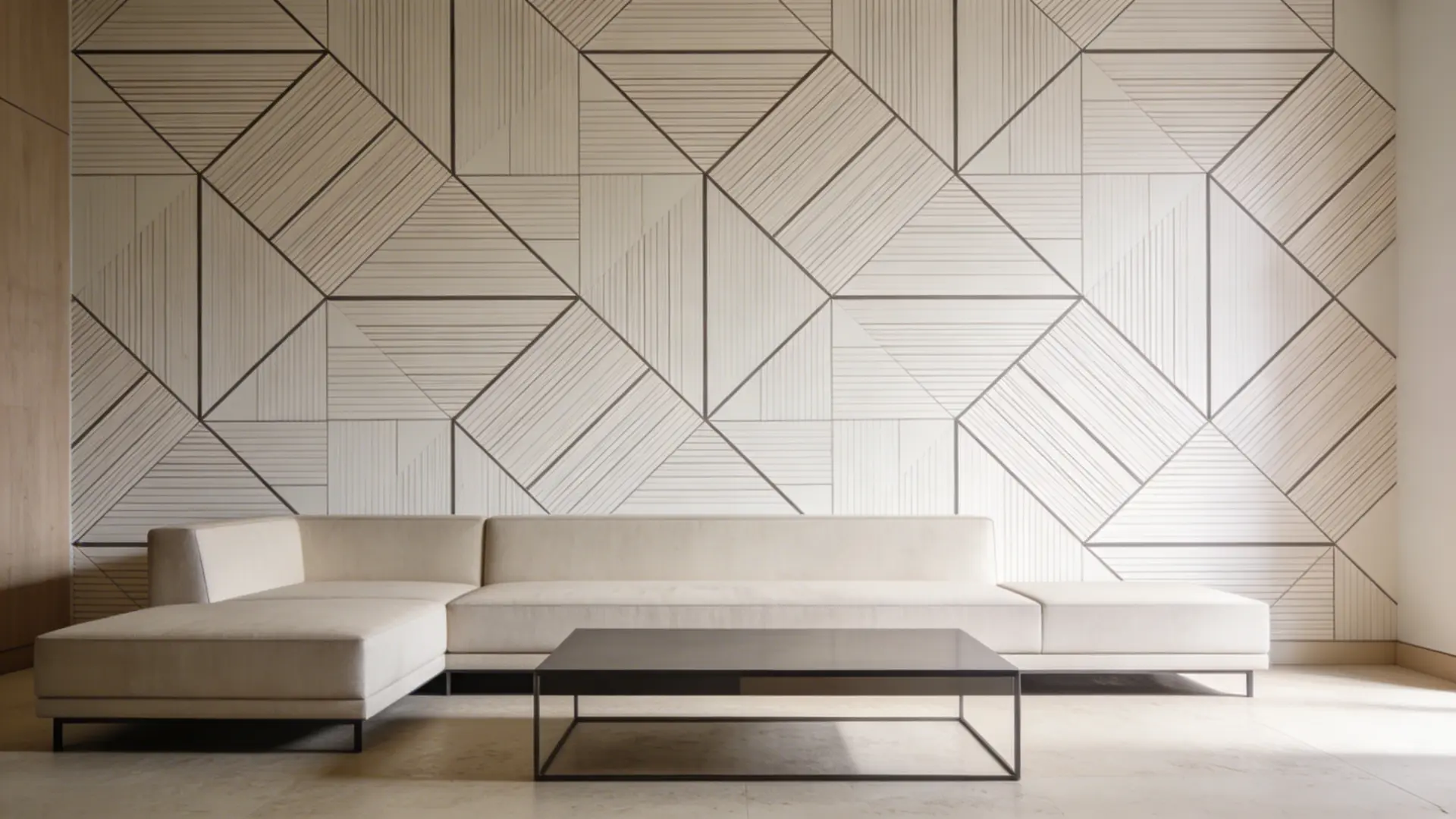
Geometric or pattern designs add structure and movement to the wall, making it more visually engaging than a plain surface. They work best in simple or modern interiors.
Shapes and lines create a clear focal point, but overly complex patterns can overwhelm smaller spaces and make them feel busy.
Recommendation: Black + white, navy + gray, green + beige
3. Textured Finishes
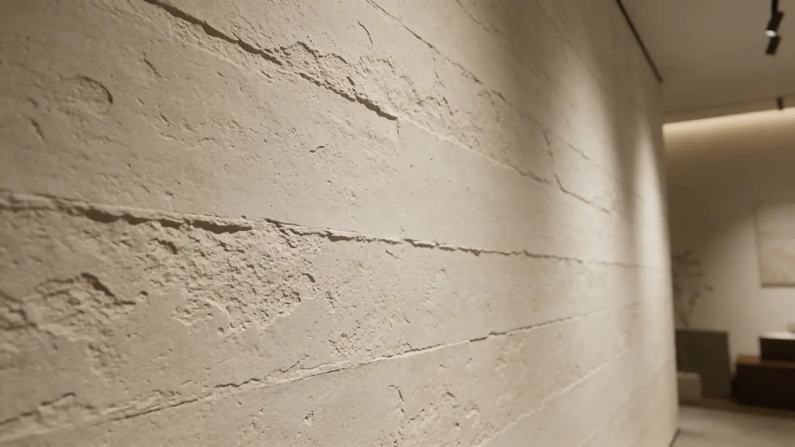
Textured finishes add depth through surface variation instead of relying only on bold colors or patterns. They create a layered look that makes the wall more visually interesting.
This style works well in spaces where subtle detail is preferred. However, without proper lighting, the texture may not be visible and can appear flat.
Recommendation: Warm gray, sandy beige, muted taupe
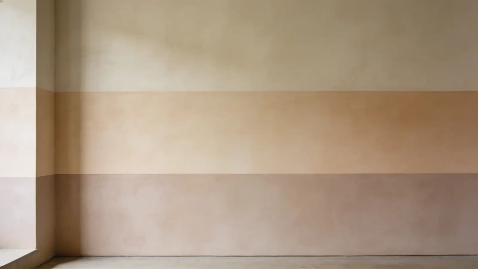
4. Soft Neutral Accent Wall
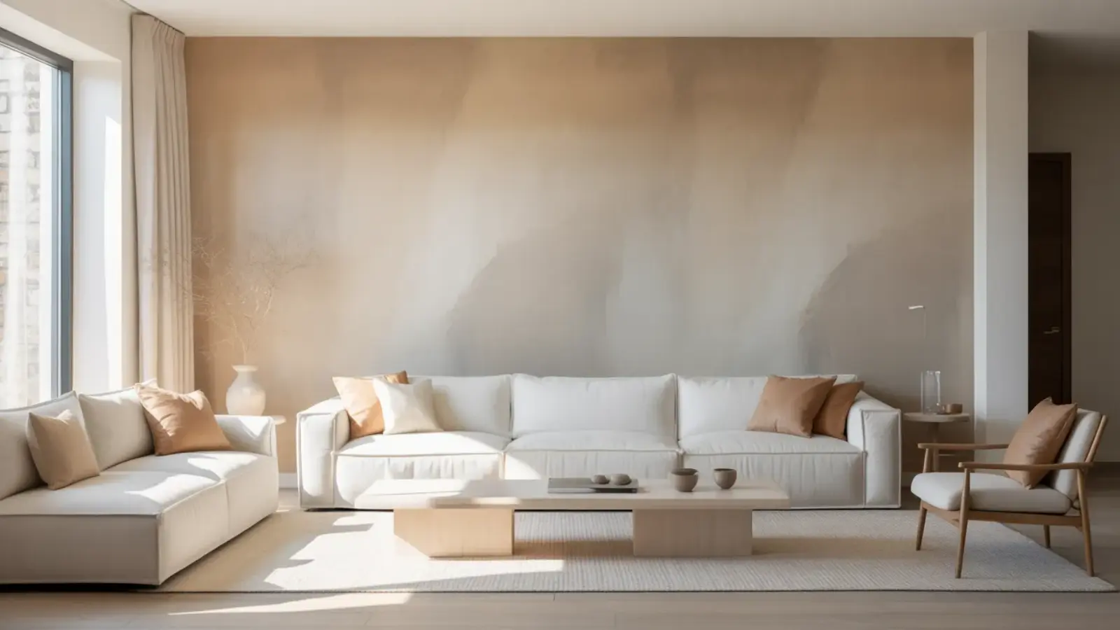
Soft neutral accent walls add depth without overpowering the space, making them ideal for smaller rooms or minimal interiors.
They create a calm and balanced look that blends easily with most furniture and decor. However, if the contrast is too subtle, the wall may not stand out and can appear flat.
Recommendation: Warm beige, light gray, off-white
5. Two-Tone Color Blocking
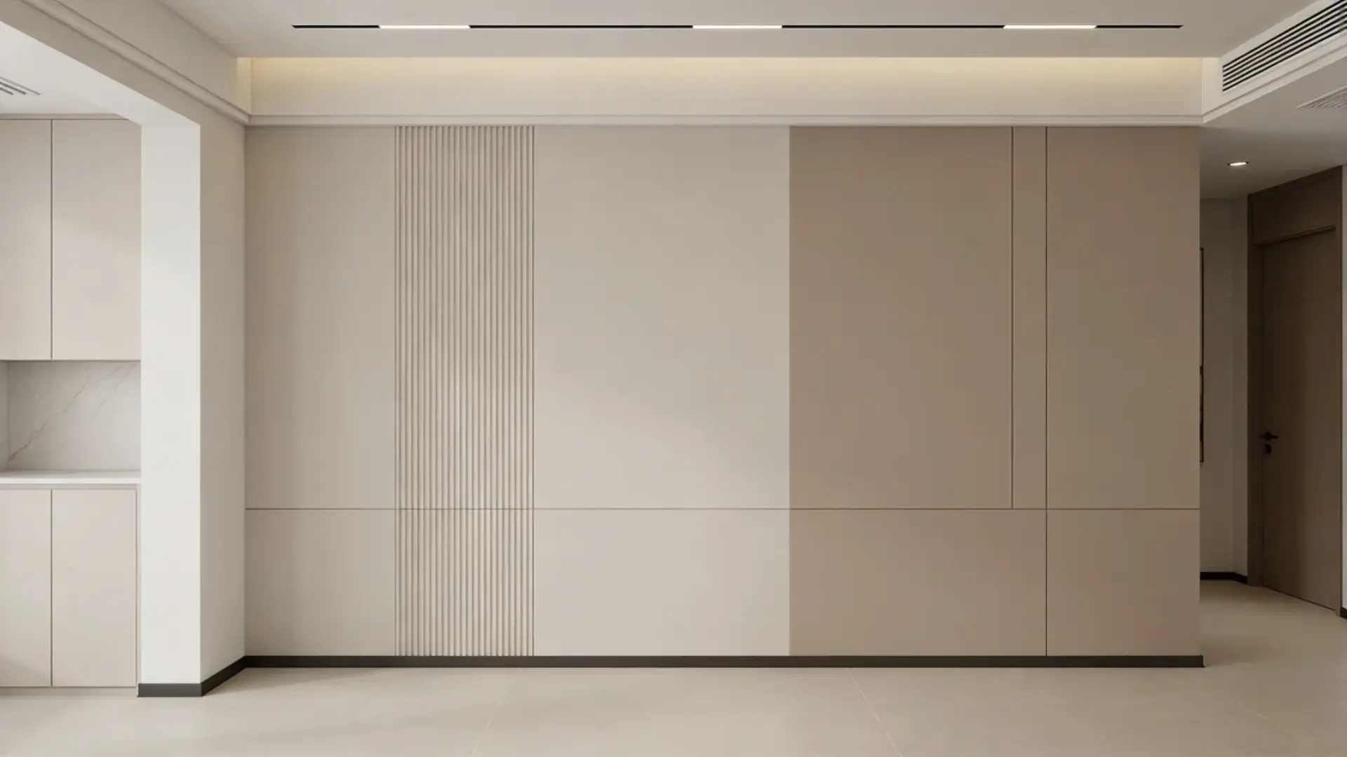
Two-tone color blocking divides the wall into sections using two complementary colors, creating a structured and balanced look. It adds visual interest without making the design feel overly busy.
This style helps define space clearly, but if the color combination is not cohesive, it can look disconnected and reduce the overall harmony.
Recommendation: Beige + white, gray + navy, terracotta + cream
6. Minimal Line Design Wall
A minimal line design wall uses simple painted lines to add subtle detail while keeping the space clean and modern. It works well in interiors where small design elements create visual interest.
This style maintains simplicity, but if the lines are uneven or poorly spaced, the wall can look unfinished and lose its overall appeal.
Recommendation: White + black, beige + brown, light gray + dark gray
7. Tone-on-Tone Layering
Tone-on-tone layering uses different shades of the same color to create a soft and cohesive look. It adds depth without strong contrast, making it ideal for calm and balanced interiors.
This style keeps the space visually connected, but if the shades are too similar, the effect may not be noticeable and can appear flat.
Recommendation: Light gray + dark gray, soft blue + navy, beige + tan
8. Vertical Stripes
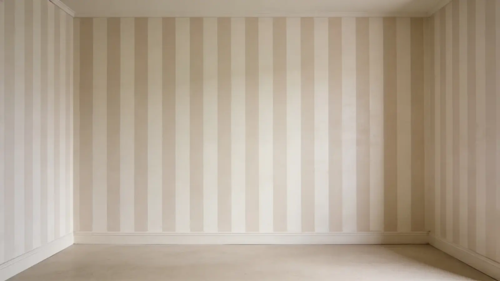
Vertical stripes draw the eye upward, making ceilings appear taller, and the room feel more open. This works well in spaces with low height where you want to improve vertical proportions.
It adds structure without adding furniture, but too many bold stripes can make the wall feel crowded.
Recommendation: White + light gray, beige + cream, soft blue + white
9. Horizontal Stripes

Horizontal stripes create a wider visual effect, helping narrow rooms feel more open and balanced. They are useful for improving proportions in compact layouts.
This style adds width visually, but if the stripes are too bold or thick, they can dominate the wall and reduce overall harmony.
Recommendation: Light gray + white, pale green + cream, soft blue + beige
10. Ombre Gradient Wall
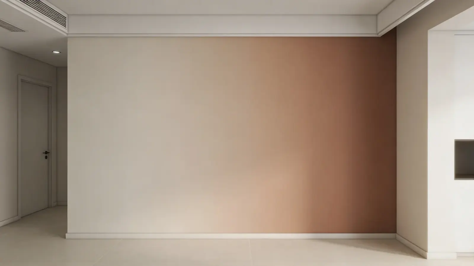
An ombre gradient wall blends one color into another to create a smooth and clean transition. It gives a soft and modern look without a sharp contrast.
This style works well in minimal spaces, but if the blending is uneven, the wall can appear patchy and lose its clean finish.
Recommendation: Light blue, beige, soft pink
11. Half-Painted Wall
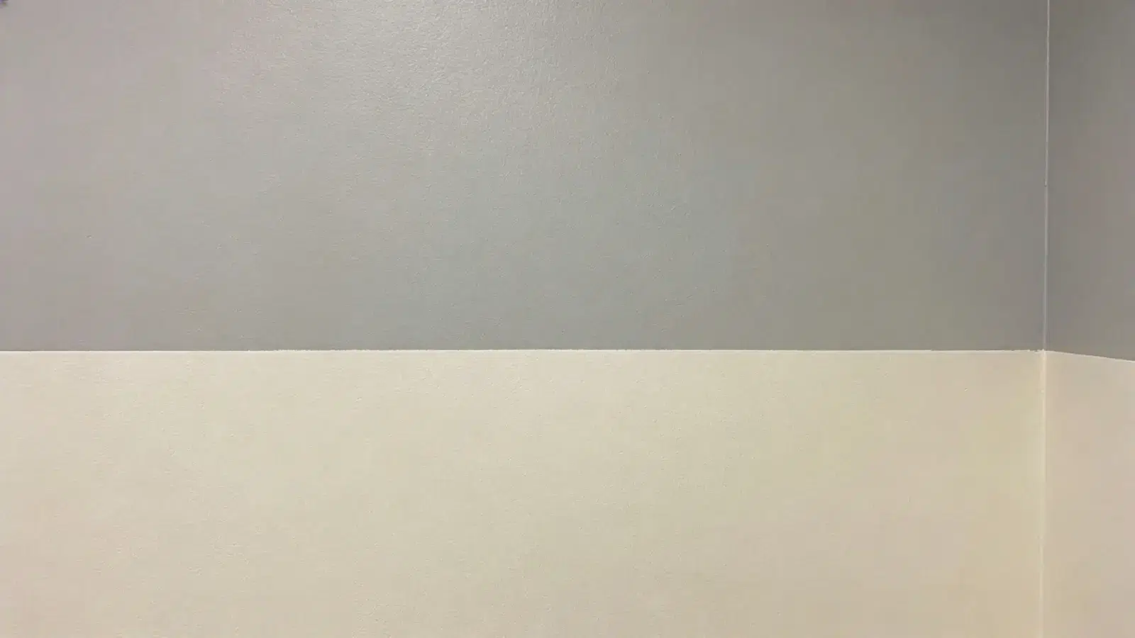
A half-painted wall divides the surface into two sections, creating a clean and structured look. It helps define space without making the room feel heavy or cluttered.
This style works well in minimal interiors, but if the paint line is placed incorrectly, it can disrupt proportions and look unbalanced.
Recommendation: White + gray, beige + terracotta, cream + olive
12. Venetian Plaster Effect
Venetian plaster creates a smooth finish with subtle variation, adding depth without bold contrast. It works well in spaces where a refined and polished look is preferred.
This style feels elegant, but poor application can result in uneven texture and reduce the overall visual effect.
Recommendation: Soft ivory, warm beige, light gray
13. Wood Panel Accent Wall
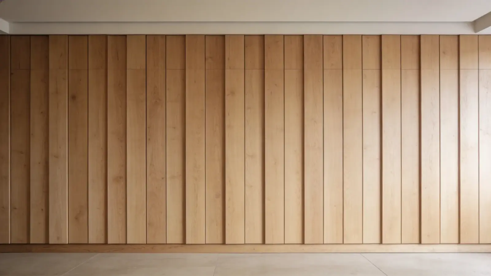
Wood panels add warmth and natural texture, making the space feel more grounded and comfortable. They work well in neutral or earthy interiors where a cozy look is desired.
However, using too much wood can make the room feel heavy and reduce the sense of openness.
Recommendation: Natural wood, walnut brown, light oak
14. Slat Wall Design
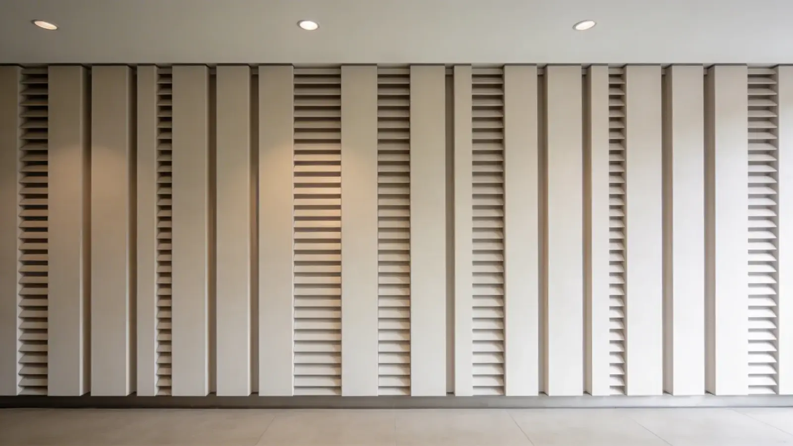
A slat wall design uses evenly spaced vertical panels to create a clean and modern look. It adds texture while maintaining a structured appearance.
This style works well in minimal spaces, but uneven spacing or alignment can make the wall look messy and reduce its visual appeal.
Recommendation: Black, dark brown, deep gray
15. Painted Arch Design
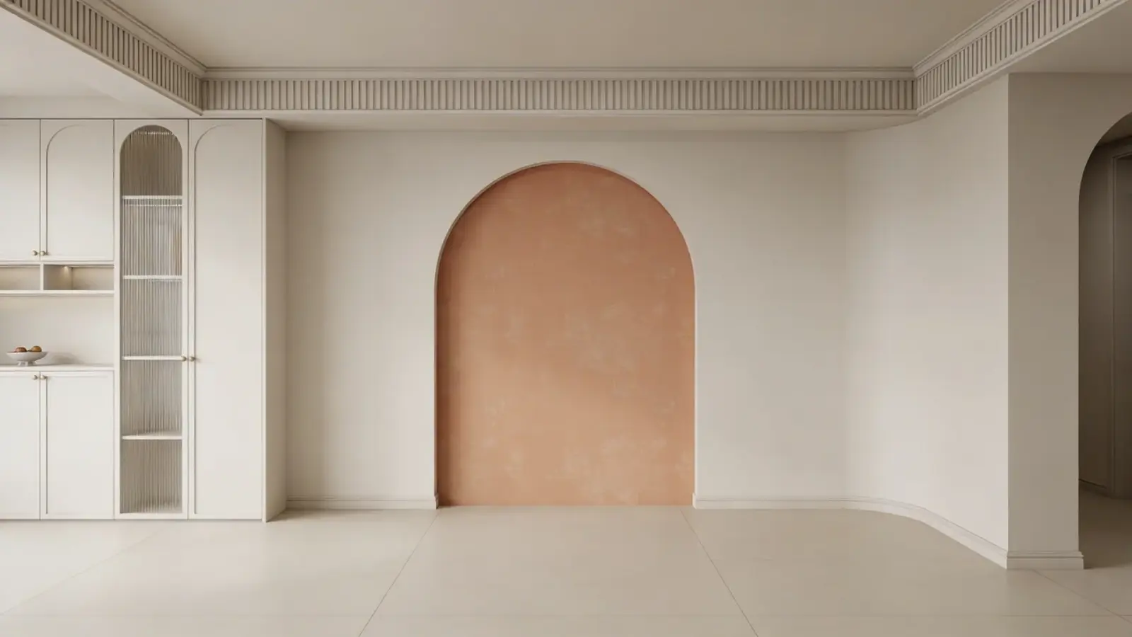
A painted arch creates a soft focal point behind furniture and helps define the area visually. It works well in minimal interiors where subtle design elements are preferred.
However, if the arch is not centered or sized correctly, it can look awkward and disturb the overall balance.
Recommendation: Soft peach, light sage green, pale blue
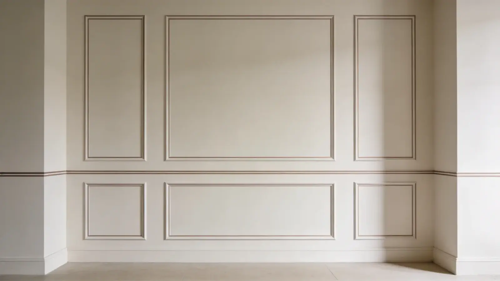
16. Frame Molding Accent Wall
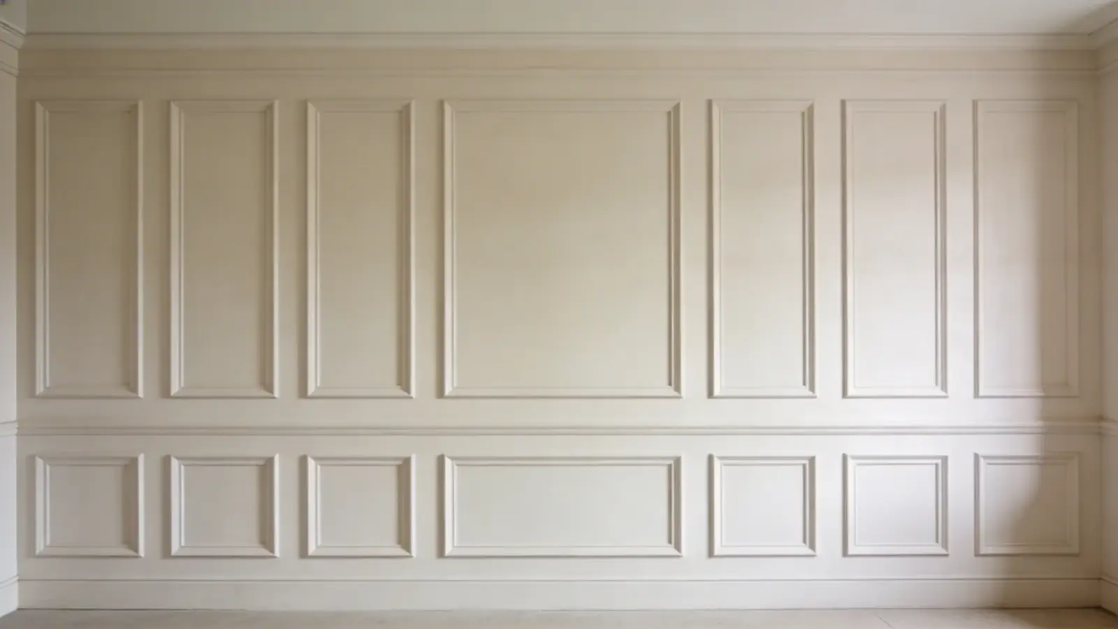
Frame molding adds structure by creating panel-like sections on the wall, giving it a clean and classic appearance. It adds depth without relying on bold colors or patterns.
This style works well in both modern and traditional interiors, but too much detailing can make the wall feel busy and cluttered.
Recommendation: White, light gray, dusty blue
17. Gallery Wall with Painted Base
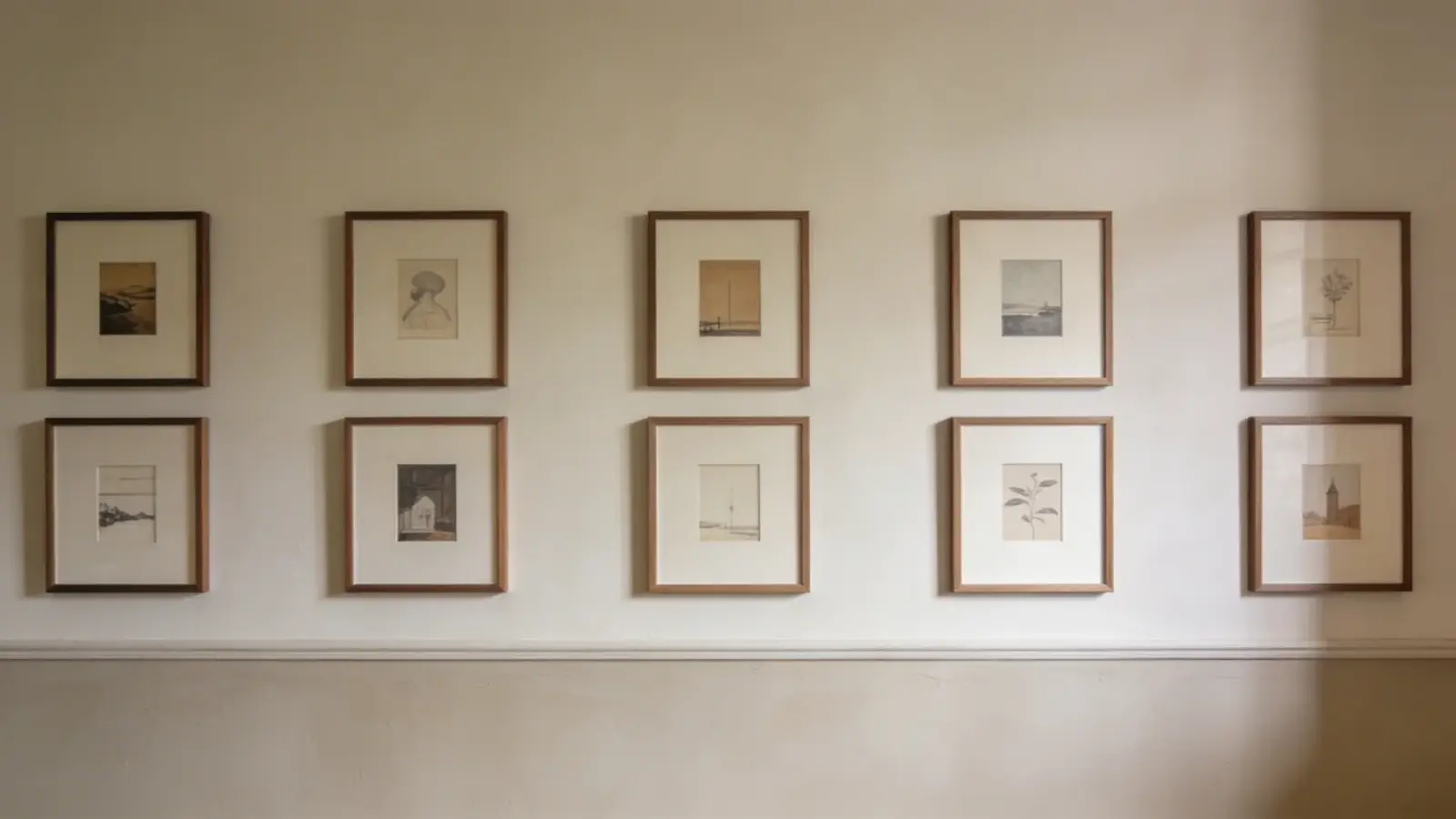
A gallery wall with a painted base combines artwork with a colored background to create layered depth. It allows you to personalize the space while keeping it visually organized.
This style works well in creative setups, but too many elements can make the wall feel cluttered and reduce clarity.
Recommendation: Dark gray, navy blue, forest green
18. Accent Wall with Built-In Shelves
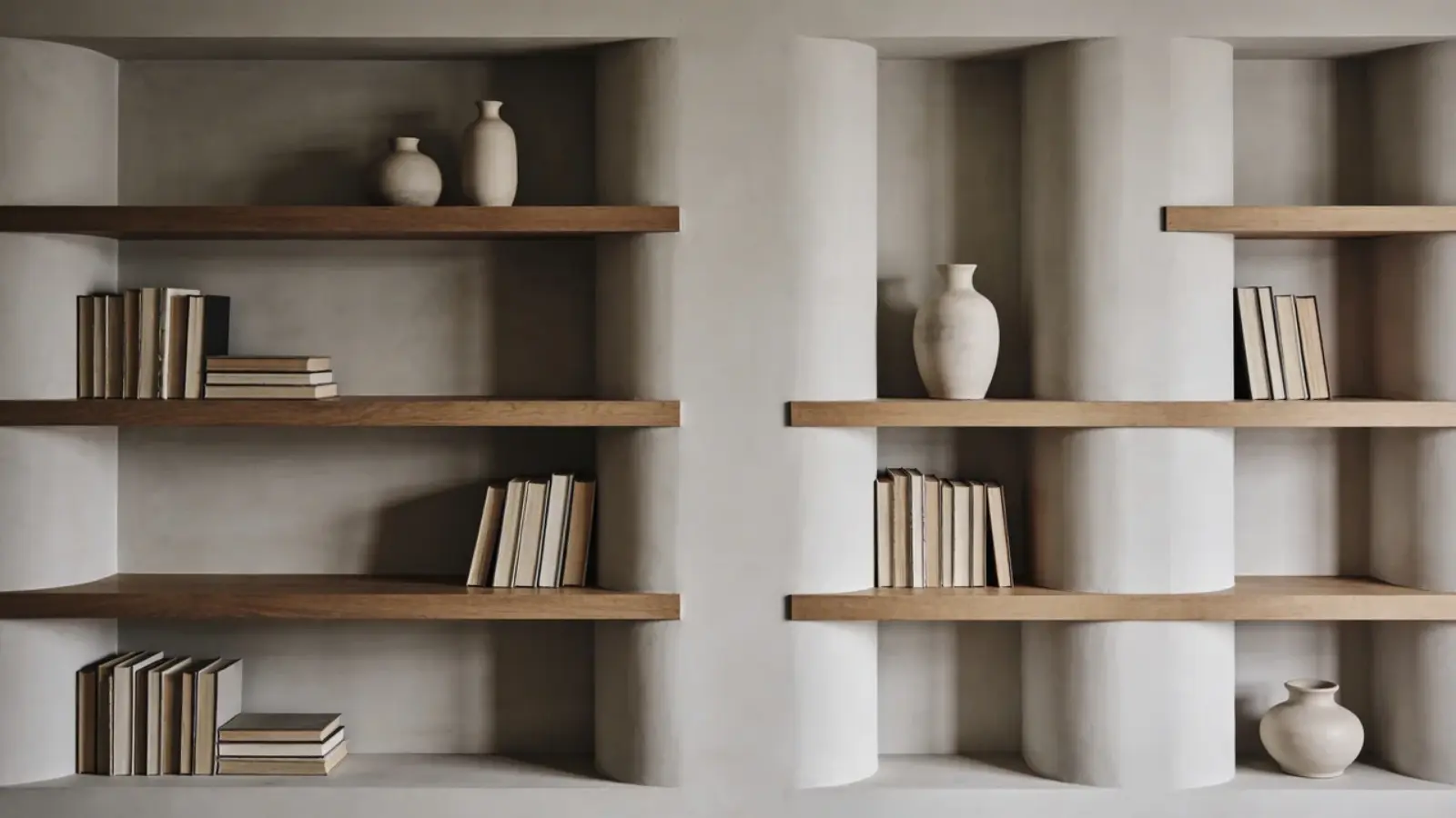
Painting behind built-in shelves highlights decor and adds depth to the space. It helps define the area and makes storage visually appealing.
This style works well in functional living rooms, but overcrowding shelves can reduce the impact and make the wall look cluttered instead of styled.
Recommendation: Charcoal, deep blue, olive green
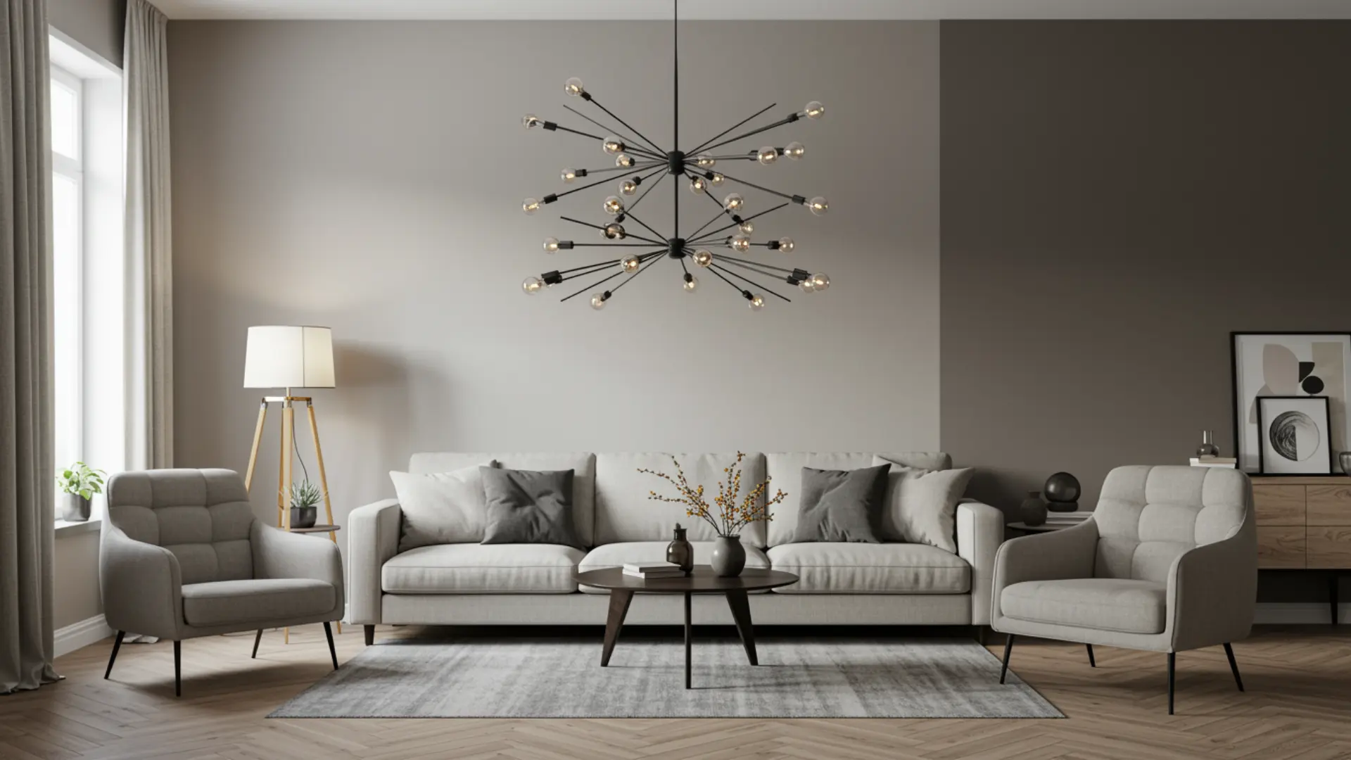
How to Balance the Accent Wall with the Rest of the Room
An accent wall should stand out, but still feel connected to the rest of the space. Balancing it properly ensures the room looks cohesive instead of uneven.
- Follow the 60-30-10 rule: Use 60% main color (walls), 30% secondary (furniture), and 10% accent (your feature wall) to keep proportions balanced
- Balance with furniture contrast: Pair dark walls with lighter furniture and vice versa to maintain visual clarity
- Repeat the accent color: Use cushions, rugs, or decor to echo the wall color and create consistency.
The human eye looks for patterns and repetition to make sense of a space. When a color appears in multiple areas, it creates a visual link between elements, making the room feel connected.
Where it fails:
- If the accent wall dominates everything, it overpowers the room.
- If the color isn’t repeated, the space feels disconnected and unplanned.
Where to Place the Accent Wall for Maximum Impact
The placement of your accent wall matters as much as the color. The right wall naturally draws attention, while the wrong one can feel random and ineffective.
Choose a Natural Focal Point
Start with the wall your eye naturally lands on when you enter the room. This is usually behind the sofa, the fireplace wall, or the TV wall.
These areas already draw attention, so adding an accent strengthens their impact. Instead of forcing focus on a random wall, you build on what already stands out in the space.
Highlight Existing Features
Use the accent wall to enhance features that already stand out in your space. This includes fireplaces, large windows, or built-in shelves.
These elements naturally attract attention, so a contrasting color makes them more noticeable.
If you choose a plain or empty wall, the accent can feel unnecessary and lack a clear purpose.
Consider Room Size and Layout
Match the placement with how your room is structured and used. In small rooms, choose the longest visible wall so the space feels more open and balanced.
In open layouts, use the accent wall to define different zones like seating or dining. This helps guide the eye and keeps the layout clear instead of scattered.
Certainly! Here is the section formatted with proper bullet points and colons for clarity and consistency:
Common Accent Wall Mistakes and Why They Fail
Even the right color can fall flat if it doesn’t suit your room’s layout and lighting. Avoid these common mistakes to keep your space balanced and visually appealing.
- Following Trends Without Considering Your Room: A color may look appealing online but clash with your furniture, layout, or overall decor, resulting in a mismatched appearance.
- Ignoring Lighting Conditions: Paint colors can appear very different throughout the day. A shade that looks rich in natural light may seem dull or overly strong under artificial lighting.
- Choosing the Wrong Wall: Painting a wall without a natural focal point reduces visual impact and makes the design feel random instead of intentional.
- Using Too Many Bold Elements Together: Strong colors, patterns, and statement decor can compete for attention, creating visual clutter and reducing harmony.
- Failing to Coordinate With Existing Elements: When undertones clash with flooring, furniture, or textiles, the accent wall feels disconnected rather than cohesive.
These mistakes can disrupt visual balance and make a room feel unplanned instead of thoughtfully designed.
Quick Checklist Before You Finalize Your Accent Wall
Before you start painting, take a moment to confirm the key decisions. This helps avoid mistakes and ensures the final result looks balanced.
- Room size and lighting are evaluated
- The right wall is chosen as a focal point
- Color contrast matches your goal (bold or subtle)
- Undertones align with furniture and flooring
- Style is selected (solid, pattern, or texture)
- Paint sample is tested in day and night lighting
Once these points are clear, your accent wall is more likely to look intentional and well-placed.
Conclusion
A thoughtfully chosen accent wall can change how your living room looks and feels without requiring major changes.
By aligning color, placement, lighting, and design, you create a space that feels balanced and visually complete.
The best living room accent wall paint ideas are not just stylish but also purposeful, enhancing both comfort and character. With the right approach, even a single wall can make a lasting impression.
Take time to assess your space, test samples, and trust your design instincts. Start planning today and upgrade your living room into a space that truly reflects your style.