Thunderous (SW 6201) by Sherwin Williams: Paint Review
Choosing a gray paint sounds simple until you realize how many types of deep, moody grays are out there. I’ve been there too, trying to figure out which one won’t feel too green, too flat, or just plain dark once it’s on the wall.
That’s exactly why I put this guide together: to help you decide if Sherwin-Williams’ Thunderous (SW 6201) is the right shade for your home.
I’ll walk you through how it looks in real rooms, how it compares to other rich grays and greens, and what colors it pairs best with. You’ll also get tips on testing, buying, and how it shifts in different lighting. Let’s figure this out together.
Thunderous (SW 6201) by Sherwin-Williams

Thunderous (SW 6201) by Sherwin-Williams is a rich, muted paint color that’s often described as an earthy green-gray. It’s part of the brand’s well-loved neutral collection and works well in a wide range of spaces, from traditional rooms to modern, nature-inspired interiors.
Basic Color Profile
HEX code: #6D6C62
LRV (Light Reflectance Value): 15
Color family: Deep green-gray with earthy undertones
This color is part of Sherwin-Williams’ Green Paint Colors collection, which is designed to support a calm and balanced environment.
Thunderous is a grounded, medium-dark neutral that walks the line between cozy and bold. It brings depth to a room without feeling too heavy or cold.
Undertones Explained
Thunderous has green and brown undertones that sit just beneath the surface. They don’t always show immediately, but can shift depending on your light source.
- In daylight, especially from south-facing windows, the green tones may look a little fresher and cleaner.
- Under warm artificial light, the brown base shows through more, giving the color a rich, earthy vibe.
These undertone shifts make Thunderous a versatile paint, but it’s also why sampling is key before committing to a full wall.
Thunderous in Real Spaces
Thunderous changes character depending on where you use it and how the light hits. Here’s what to expect in different spaces, so you can decide if it’s the right choice for your home.
How It Looks in Different Rooms
Let’s look at how Thunderous performs in popular rooms throughout the house.
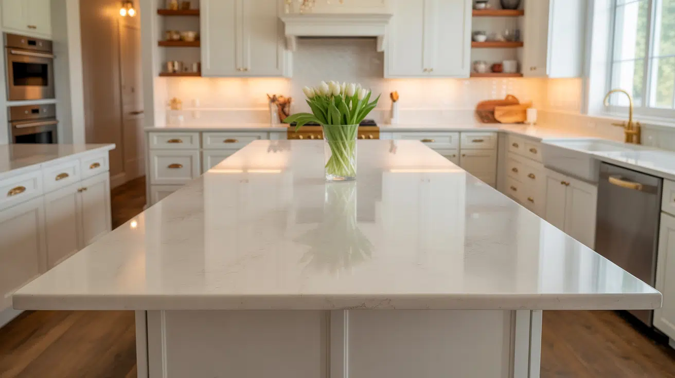
Kitchens

Thunderous brings warmth and depth to a kitchen. It works well with natural wood cabinets, matte black hardware, and brushed brass accents. It gives off a grounded feel that makes the kitchen feel cozy without being too dark.
Bathrooms

In bathrooms, Thunderous adds a moody, spa-like vibe. Pair it with light tiles, white trim, or warm metallic fixtures to keep things balanced. Be cautious in small bathrooms with minimal light, its darker tone might feel heavy unless offset by mirrors or lighter finishes.
Living Rooms

Thunderous is a great pick for living rooms if you want a relaxed, earthy atmosphere. It pairs well with leather, rattan, or soft textiles. Whether your style is rustic, boho, or transitional, it blends in smoothly while adding a little sophistication.
Bedrooms

This shade makes bedrooms feel calm, restful, and a bit dramatic. It pairs well with linen bedding, vintage wood, or even dark metal bed frames. Because of its green-gray base, it feels cozy without being too bold, perfect for creating a sleep-friendly retreat.
Thunderous works especially well in rooms where you want an inviting feel without going full-on dark or bold. It’s rich, but still feels livable.
How Lighting Affects It
Lighting really influences how Thunderous shows up on your walls. It can shift between deep green-gray and earthy taupe depending on the space and time of day.
North-facing rooms: These tend to make Thunderous lean cooler and more muted, bringing out its green-gray undertones.
South-facing rooms: Bright natural light softens the depth of the color and brings out more of its earthy warmth.
East-facing rooms: Morning light can make Thunderous look a little cooler at first, then shift warmer by midday.
West-facing rooms: Evening light enhances the brown undertones, giving it a cozier, almost taupe-like appearance.
Because Thunderous is such a chameleon, it’s smart to sample it on a few different walls and check how it shifts throughout the day. That way, you’ll know how it behaves in your space before committing.
Thunderous vs. Other Sherwin-Williams Grays
Sherwin-Williams offers many beautiful gray shades, which makes narrowing things down a bit tricky. Here’s how Thunderous compares to a few of the brand’s most talked-about neutral grays.
Thunderous vs. Retreat

Retreat (SW 6207, #7A8076) is a softer green-gray with a slightly higher LRV than Thunderous.
- Retreat feels cooler and lighter overall.
- Thunderous is richer and more grounded, with deeper brown undertones.
Go with Retreat if you want something breezy and muted. Pick Thunderous for a bolder, moodier base color.
Thunderous vs. Dorian Gray
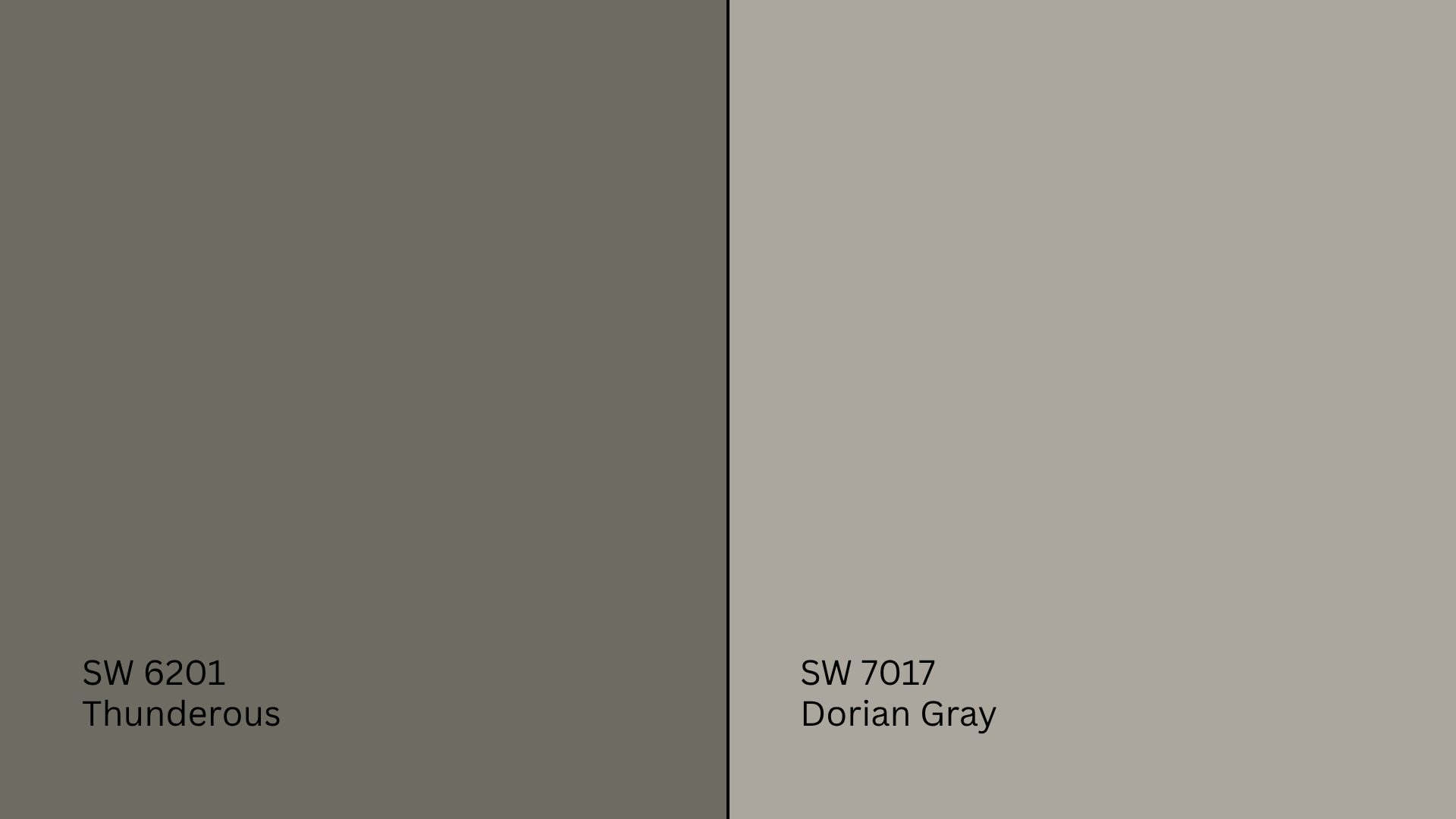
Dorian Gray (SW 7017, #ACA79E) is a classic mid-tone gray with greige undertones.
- Dorian Gray leans more taupe and neutral.
- Thunderous has stronger green and earthy tones.
Choose Dorian Gray if you want a true gray feel. Thunderous is better if you want warmth and depth without going beige.
Thunderous vs. Repose Gray

Repose Gray (SW 7015, #CCC9C0) is a light warm gray that’s super versatile.
- Repose Gray feels lighter, softer, and more flexible.
- Thunderous is much darker and more dramatic in comparison.
Stick with Repose Gray for bright, airy spaces. Use Thunderous to anchor a room with a cozy, grounded feel.
Thunderous vs. Urbane Bronze

Urbane Bronze (SW 7048, #54504A) is much darker and deeper than Thunderous, often used as an accent or exterior shade.
- Urbane Bronze is nearly black-brown with bronze tones.
- Thunderous is softer and more livable as a full wall color.
Choose Urbane Bronze if you want drama or a bold contrast. Go with Thunderous for a rich yet relaxed atmosphere.
Undertone and LRV Comparison Table
| Paint Color | Undertones | LRV | Warm or Cool |
|---|---|---|---|
| Thunderous | Green-brown | 15 | Warm |
| Retreat | Green-gray | 21 | Cool |
| Dorian Gray | Greige | 39 | Neutral |
| Repose Gray | Warm gray | 58 | Warm |
| Urbane Bronze | Bronze-brown | 8 | Warm |
All of these colors have their place, but each brings a different vibe to your space. Be sure to sample them in your actual lighting before choosing.
Best Color Pairings for SW Thunderous
I’ve found that Thunderous is a flexible, earthy neutral, but it really comes alive when paired with the right trim, accents, and materials. Here’s how I like to match it throughout the home for a balanced and grounded look.
Trim and Ceiling Suggestions
Pairing Thunderous with the right white helps lighten the space and create a nice contrast. Here are a few options that work well:
Extra White (SW 7006, #EEEFEA): A bright, clean white that makes Thunderous feel modern and crisp.
Alabaster (SW 7008, #EDEAE0): A soft, creamy white that warms up Thunderous without clashing.
Pure White (SW 7005, #EDECE6): A neutral white that’s neither too cool nor too warm; great for trim and ceilings.
If you’re painting the ceiling to match the trim, use one of these whites in a flat finish to keep the room feeling open.
Accent Wall and Furniture Colors
Thunderous pairs well with both warm and cool accents, depending on the mood you want to create.
For a soft, earthy palette, try dusty olive, creamy beige, muted terracotta, or warm taupe. These colors help Thunderous feel natural and layered, perfect for bedrooms, living rooms, or home offices.
If you want contrast and drama, consider deep navy, rich charcoal, burnt orange, or even black. These shades pop against Thunderous’s earthy green-gray and give the room a modern, bold twist.
For furniture, try warm wood tones like walnut or acacia. Neutral upholstery in light gray, cream, or tan keeps things balanced. You can also layer in bold textiles, leather accents, or vintage pieces to make the room feel grounded and intentional.
Hardware and Flooring Compatibility
Thunderous plays well with a wide range of finishes, but the right pairings can help it feel warmer or more modern.
For hardware, try brushed gold or antique brass if you want a rich, cozy vibe. Oil-rubbed bronze works beautifully in rustic spaces. For a clean, sharp edge, go with matte black or satin nickel.
When it comes to flooring, medium-to-dark woods like walnut, hickory, or stained oak add depth and warmth. If you prefer lighter floors, choose those with beige or taupe undertones to keep things soft and airy. For tile, go with natural stone, muted gray concrete, or travertine with warm veining.
Paint Finish Recommendations
I’ve learned that the finish you choose doesn’t just affect durability, it also changes how Thunderous looks in your room. Each finish interacts with light differently, which can shift the feel of this earthy shade.
Matte is perfect for low-traffic spaces like guest rooms or ceilings. It hides imperfections and gives Thunderous a smooth, velvety look. In this finish, the color feels richer and the undertones stay soft, especially in dim light.
Eggshell works well in bedrooms, dining rooms, or offices. It has a soft glow that reflects just enough light to keep the space inviting. This finish brings a little life to Thunderous without making it feel shiny or harsh.
Satin is great for high-traffic areas like kitchens, bathrooms, or hallways. It’s easy to wipe down and handles humidity well. Satin’s subtle sheen can make Thunderous feel more dynamic, and it may highlight the green or brown tones more strongly in daylight.
If you’re unsure which finish fits your space, test a few samples on different walls. Thunderous is sensitive to light shifts, and the finish you choose can really change how it reads.
Sampling and Buying Options
Before you commit to a full gallon, it’s a good idea to test Thunderous in your own space. Light, room layout, and surrounding decor can all influence how it looks.
Where to Get Peel-and-Stick Samples
The easiest way to preview Thunderous without painting is by using peel-and-stick samples.
- Samplize sells real Sherwin-Williams paint samples with a sticky back. They’re easy to move around and won’t damage your walls.
- Local Sherwin-Williams stores often carry sample chips and small test pots.
- Big box retailers may offer order-ahead options for Sherwin-Williams samples or can direct you to local pickup spots.
Stick your sample on multiple walls and check it during different times of day, especially under morning and evening light, to see how Thunderous shifts.
Where to Buy the Paint
You can buy Sherwin-Williams Thunderous online or in-store.
- Sherwin-Williams.com offers online ordering with options for in-store pickup or delivery.
- Sherwin-Williams retail locations carry Thunderous in most finishes and sizes.
- Authorized dealers and hardware stores may stock it or offer custom mixing upon request.
- Some stores also provide curbside pickup or local delivery, so call ahead to confirm what’s available near you.
Paint Equivalents in Other Brands
If you don’t have easy access to Sherwin-Williams paint or you’re trying to match Thunderous to another brand, there are a few close alternatives. Just keep in mind that each paint line uses a different formula, so undertones and finishes may not match exactly.
Benjamin Moore: Try Storm Cloud Gray (2140-40, #929183) or Taos Taupe (2111-40, #8E827A)for a similar earthy green-gray with warm depth.
Behr: Look at Cracked Pepper (PPU18-1, #4C4D4F) or Squirrel Tail (1476, #8D8679) for comparable dark gray shades with natural undertones.
Valspar: Check out Brandenburg Gate (8004-27F, #6D6C62) or Campground (8004-30F, #6F7168) for green-based neutrals in the same depth range.
These paints get close, but subtle shifts in undertone or finish can make a big difference. Always test them side by side if you can to see which one feels best in your space.
Conclusion
If you’ve made it this far, I’m guessing you’ve got a clearer idea of whether Sherwin-Williams’ Thunderous feels right for your space. You’ve seen how it shifts in different lighting, how finishes affect the tone, and which colors pair well with it.
I’ve been there myself; paint shopping can feel like a lot. But now you’ve got the key info to make it simpler. Just don’t skip the most important part: testing Thunderous on your own walls. Lighting changes everything.
Still not 100% sure? I’ve put together other paint guides on the website. You’ll find more options, real examples, and tips to help you choose with less stress and more confidence. Check them out before you decide!