Sherwin Williams Cyberspace (SW 7076): Paint Review
There’s something steady and confident about Sherwin-Williams Cyberspace. It’s bold without shouting, and dark without draining the room.
I’ve used it on cabinets, walls, and even on the front door, and every time, it brought a quiet strength to the space.
In this guide, I’ll walk you through what this color looks like in real homes, how it behaves in different light, and where to buy it.
You’ll also get clear ideas on choosing the right finish for each room. Everything here is based on real spaces, not swatches or perfect lighting setups.
Getting to Know Sherwin-Williams Cyberspace
Cyberspace (SW 7076)is a deep, moody paint color with strong blue and gray influences. It’s often described as a modern navy with a quiet, balanced presence that suits both bold statements and cozy retreats.
Basic Color Profile
HEX code: #44484D
LRV (Light Reflectance Value): 6
Color family: Navy blue with gray undertones
Despite being near the darkest end of the spectrum, Cyberspace doesn’t feel flat or overly dramatic. Its combination of cool blue and grounding gray makes it easy to incorporate in both classic and contemporary styles.
Undertones Explained
Cyberspace is rooted in blue with a clear gray undertone. This keeps it from looking too bright or too vibrant, offering a more muted, smoky effect.
- In daylight, the blue undertone takes the lead
- In artificial or low light, the gray base helps soften the color
This balance makes Cyberspace more versatile than pure navy, and it avoids unwanted shifts into purple or teal.
Cyberspace in Real Spaces
Cyberspace adapts well across the home. Here’s how it typically performs in different areas.
Bedrooms

Cyberspace gives bedrooms a calm, restful feel. It works well with white trim, warm wood tones, or soft fabrics. Light brings out the gray tones.
Add brass or gold accents for warmth, or use silver for a cooler style. It’s perfect for cozy, grounded spaces.
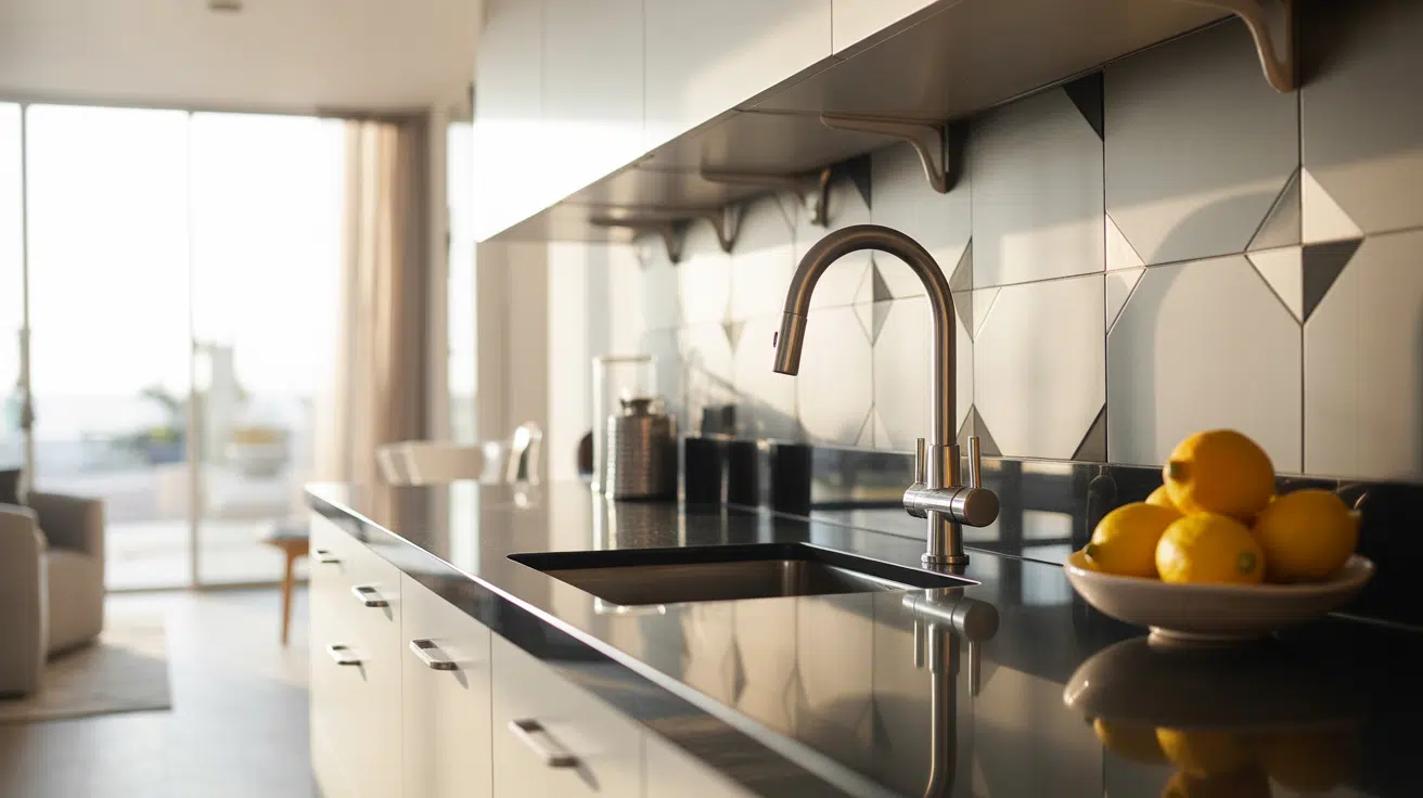
Kitchens and Cabinets
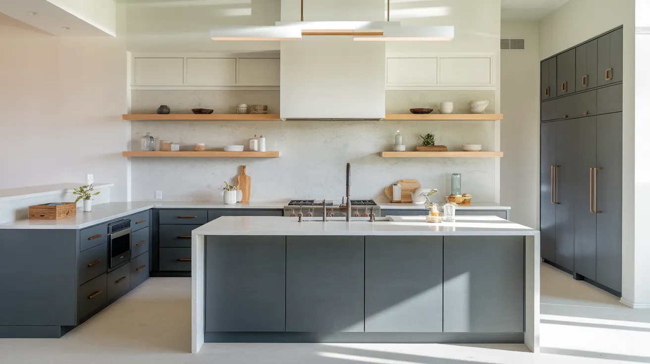
Cyberspace brings contrast and depth to kitchens and cabinetry. It pairs nicely with white counters, brushed metals, and simple hardware.
Use it on base cabinets, a kitchen island, or pantry doors. To avoid making the space feel dark, balance it with open shelving or light walls. It works well in both classic and modern kitchens.
Bathrooms

Cyberspace adds a sharp contrast to bright bathroom finishes. It pairs well with white tile, black fixtures, or natural wood vanities.
In smaller bathrooms, consider using it on just a vanity or feature wall. Good lighting is key, since the color’s depth can darken the space if not appropriately balanced with light-reflective surfaces.
Living Rooms and Accent Walls

Use Cyberspace in living rooms to create a grounded, dramatic look. It works well behind shelving, fireplaces, or as a backdrop for art.
Lighter furniture, soft textiles, and wood tones balance its depth. Natural light or layered lamps help maintain an open feel. It’s a solid pick for feature walls and built-ins.
Exteriors

On exteriors, Cyberspace offers a bold contrast with white trim, brick, or light siding. It’s deep and neutral, making it versatile for a wide range of home styles.
As a front door color, it adds curb appeal without feeling too loud. It handles sunlight well and resists fading. Pair it with simple metal hardware for a crisp finish.
How Lighting Affects Cyberspace
Lighting dramatically changes how Cyberspace reads. Here’s how it behaves in different conditions:
Directional Lighting
| Room Direction | Effect on Cyberspace | Best Use |
|---|---|---|
| North-facing | Cooler, grayer, more muted | Offices, cozy bedrooms |
| South-facing | Brighter, bluer, slightly lighter | Living rooms, kitchens |
| East-facing | Blue in the morning, dull by noon | Breakfast areas, bathrooms |
| West-facing | Flat midday, richer at sunset | Dining rooms, entryways |
Light Type
| Light Source | Color Impact | Best Use |
|---|---|---|
| Cool white LED | Enhances gray, feels cooler | Kitchens, laundry rooms |
| Warm white LED | Brings out blue, softens the feel | Bedrooms, living spaces |
| Daylight (5000K+) | Looks flat or overly cool | Workspaces, studios |
| Soft white (2700K) | Balanced tone, gentle appearance | Most rooms, especially the living |
Always test in your actual lighting to see how it plays out throughout the day.
Cyberspace vs. Other Sherwin-Williams Neutrals
1. Cyberspace vs. Naval

Naval (SW 6244,HEX #2F3D4C) is brighter and more traditional in tone than navy. It leans less gray than Cyberspace and has a higher LRV of 4. Cyberspace feels more grounded and modern.
2. Cyberspace vs. Peppercorn

Peppercorn (SW 7674,HEX #585858) leans more gray with a subtle brown undertone, making it warmer overall. Cyberspace reads cooler, with a distinct blue base and smoky depth.
3. Cyberspace vs. Iron Ore

Iron Ore (SW 7069, Hex #434341) is a softer black with charcoal undertones. It lacks the blue cast of Cyberspace, giving it a more neutral and slightly heavier feel on walls.
Undertone and LRV Comparison Table
| Paint Color | Undertone | LRV | Overall Tone |
|---|---|---|---|
| Cyberspace (SW 7076) | Blue with gray base | 6 | Cool, grounded |
| Naval (SW 6244) | True navy, minimal gray | 4 | Deep, classic blue |
| Peppercorn (SW 7674) | Gray with slight brown warmth | 10 | Warm, soft charcoal |
| Iron Ore (SW 7069) | Charcoal with subtle brown | 6 | Neutral, soft black |
This table helps visualize how Cyberspace compares in depth and temperature to similar dark neutrals in the Sherwin-Williams palette. Best Color Pairings for Cyberspace
Trim and Ceiling Suggestions
- Extra White (SW 7006, HEX #EEEFEA): Bright and clean, this stark white adds high contrast that makes Cyberspace stand out. It’s ideal if you want crisp edges and modern styling.
- Pure White (SW 7005, HEX #EDECE6): A slightly softer white with a hint of warmth. It balances Cyberspace without clashing and fits both contemporary and traditional rooms.
- Alabaster (SW 7008, HEX #EDEAE0): Creamy and warm, this choice softens the depth of Cyberspace and adds a welcoming touch in more relaxed settings.
Accent Wall and Furniture Colors
- Repose Gray (SW 7015, HEX #CCC9C0): This soft, warm gray gently bridges the gap between deep blue and neutral tones. It’s subtle enough to transition smoothly from wall to furniture.
- Oyster Bay (SW 6206, HEX #AEB3A9): A calming green-blue that works beautifully for coastal or spa-like spaces. It adds a natural feel next to the bold base of Cyberspace.
- Urban Bronze (SW 7048, HEX #54504A): A strong brown-gray that offers serious contrast. It deepens the palette and works well for built-ins, cabinets, or accent furniture.
Hardware and Flooring Compatibility
Cyberspace works exceptionally well with hardware in matte black, brushed brass, or satin nickel finishes. Matte black creates a sleek, modern contrast, emphasizing the color’s cool edge.
Brushed brass adds a warm touch that softens the boldness and introduces a touch of traditional charm.
Satin nickel, with its neutral tone, bridges both warm and cool palettes while keeping the look refined and understated.
For flooring, light oak adds brightness and keeps the room feeling open, providing a clean counterbalance to Cyberspace’s weight.
Patterned tile, especially in neutral palettes of black, white, or clay, offers visual interest and layers that highlight the deep complexity of Cyberspace without overwhelming the space.
Paint Finish Recommendations
Matte or Flat: Great for ceilings and low-traffic rooms like bedrooms or offices. It hides imperfections and gives Cyberspace a rich, velvety look with no shine.
Eggshell: A soft, low-sheen finish that adds a subtle glow without being reflective. Ideal for dining rooms, hallways, or accent walls that need a little polish.
Satin: A popular middle-ground option with a smooth, washable surface. Perfect for living rooms, bathrooms, and kitchens where durability and softness both matter.
Semi-gloss: More reflective and very durable, best for cabinets, doors, trim, and other high-contact areas where easy cleaning is a must.
High-gloss: Ultra-shiny and bold, it gives Cyberspace a dramatic, almost lacquered look. Use it on furniture or doors if you want high contrast and don’t mind careful prep.
Paint Equivalents in Other Brands
If you’re looking for a Cyberspace alternative in a different paint brand, here are some close matches that capture its deep, moody character.
Behr:
- Cracked Pepper (PPU18-01, HEX #4F5152): A smoky charcoal-black with soft blue-gray hints; a bit lighter and more neutral than Cyberspace.
- Nocturne Blue (HDC-CL-28, HEX #344D58): A deep blue-gray blend with a subtle softness; offers a similar muted navy feel, but slightly more blue-forward.
Benjamin Moore:
- Hale Navy (HC-154, HEX #434B56): A well-known dark navy with a solid balance of blue and gray; brighter than Cyberspace but still grounded and versatile.
- Soot (2129-20, HEX #373C41): A near-black with subtle cool undertones; less blue and more charcoal, but still rich and dramatic.
Valspar:
- Indigo Streamer (4010-4 HEX #22394a): A bold, dark navy that leans slightly more blue than Cyberspace; great for high-contrast spaces.
- Cobalt Cannon (5001-2C, HEX #4b5558): A steely blue-gray with cool depth; closer in feel to Cyberspace’s blend of blue and gray.
Tip: Always test paint samples in your space before committing. Lighting, surrounding colors, and finish can all impact how a shade appears on your walls.
Conclusion
Sherwin-Williams Cyberspace has been one of those colors I keep going back to. It works when I want something dark that still feels steady. On cabinets, doors, or full walls, it always adds weight without making the room feel closed in.
Now you’ve got the full picture—how it looks in real homes, what light does to it, and what to pair it with.
If you’re leaning toward a deeper shade but don’t want anything too cold or too busy, this might be the one.
And if you’re still figuring out your palette, I’ve got more colors worth looking at in the next post. Check other blogs for more information on the same.