Reviewing Sherwin Williams Stardew (SW 9138)
Looking for a soft blue that feels calm but not cold? Sherwin-Williams Stardew (SW 9138) might be just what you need.
This beautiful blue-gray color has a dreamy, peaceful look with just the right mix of warm and cool tones.
It works in many rooms and styles, adding a gentle touch of color without feeling too bold or too plain.
Stardew is one of those shades that can change slightly with the light, which makes it feel both cozy and fresh at the same time.
We’ll look at how Stardew looks in different spaces, what it pairs well with, and whether it’s the right blue for your home.
Let’s start by understanding what kind of color Stardew really is
Understanding the LRV of Sherwin-Williams Stardew
Light Reflectance Value (LRV) shows how much light a color bounces off the wall. The scale goes from 0 (black) to 100 (white).
Stardew has an LRV of 33, which means it reflects some light but also keeps its soft, rich look. It won’t make a room feel too dark.
In small rooms, it helps the walls feel open. In big rooms, it stays even and smooth across large spaces without looking patchy.
It does well in both bright and dark rooms, staying steady without looking washed out or muddy.
You can use it in living rooms, bedrooms, hallways, or home offices.
Think of Stardew’s LRV as a dimmer switch; it keeps your space feeling calm, bright, and just the right amount of cozy.
The Beautiful Undertones of Sherwin-Williams Stardew
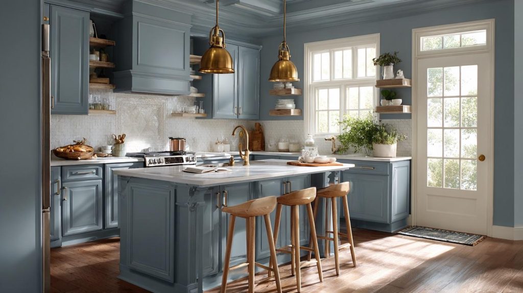
Sherwin-Williams Stardew may look like a simple blue at first, but its subtle mix of undertones is what gives it depth and charm.
1. The Main Players
While blue and gray lead the show, Stardew has some hidden notes that make it interesting.
I’ve studied this color in many homes, and there’s always more to see when you look closely.
2. Green Whispers
In certain lights, you might catch a soft green hint.
It’s gentle – like morning mist over grass.
This touch of green helps the color feel more natural and less stark than pure blue-grays.
3. Warm Base Notes
Deep in Stardew’s mix, there’s a bit of warmth:
- Tiny hints of taupe keep it from feeling icy
- Slight purple traces add richness
- These warm notes balance the cooler tones
4. Why Do These Matter?
Without these subtle touches, Stardew could feel cold or flat.
Instead, you get a color that:
- Feels alive and changes with the light
- Works well with both warm and cool decor
- Creates a welcoming mood
5. My Real-World Findings
I’ve noticed that these undertones appear differently in various spaces.
North-facing rooms bring out the warmer hints, while south-facing rooms let the green notes shine through more often.
Remember: These undertones are subtle.
They won’t jump out at you, but they make the color feel more natural and pleasant to live with day after day.
Color Profile of Sherwin-Williams’ Stardew
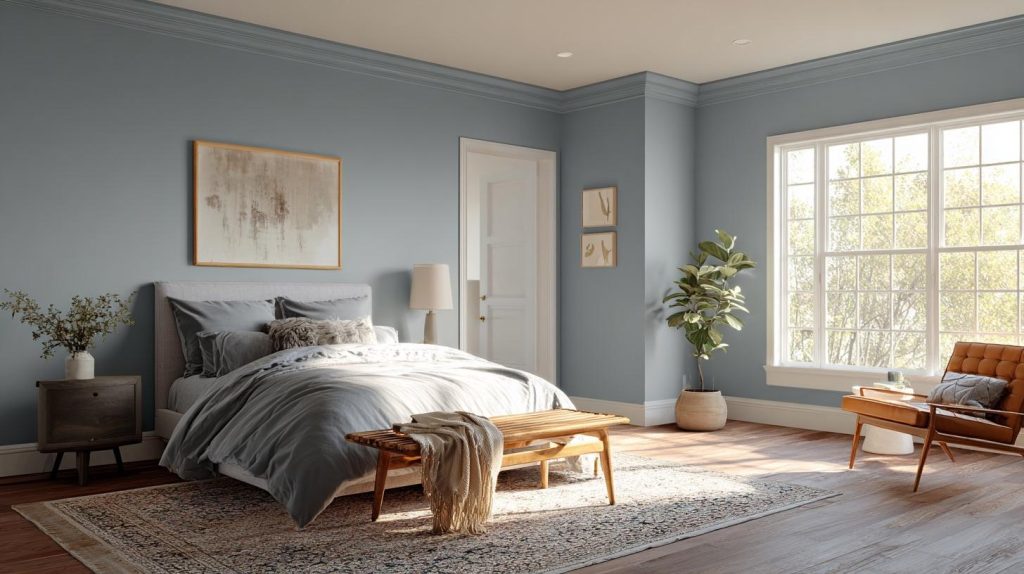
Stardew (SW 9138) sits in the family of blue-grays but with its own personality.
When you first look at it, you’ll notice a gentle blue that feels soft and welcoming.
Think of early morning fog over a lake – that’s the mood it creates. The magic of this shade comes from its perfect mix.
While blue dominates, gray tones keep things down to earth. This balance means it won’t overwhelm your space or feel too cold.
I’ve seen Stardew work wonders in:
- Living rooms as it creates a peaceful backdrop
- Bedrooms as a sleep-friendly shade
- Home offices that need focus without feeling dull
- Bathrooms as it add a spa-like feel
What makes this color special is how it changes throughout the day.
In bright light, the blue notes shine through.
When clouds roll in, the gray aspects become more clear. Yet, it never loses its gentle nature.
How Light Influences the Look of Sherwin-Williams Stardew?
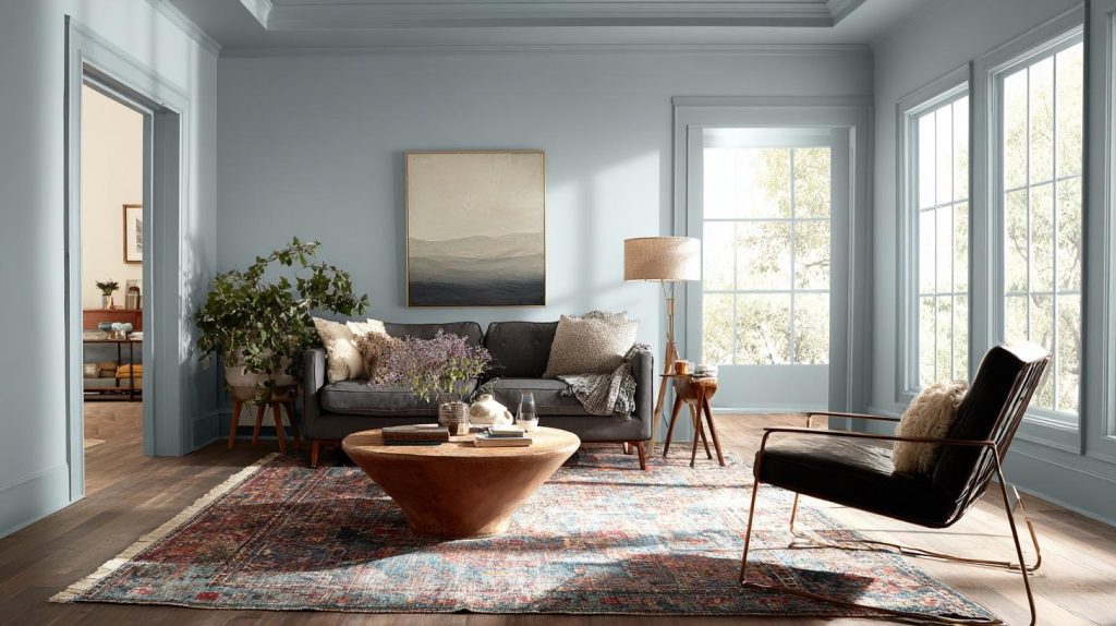
Light plays a big role in how Sherwin-Williams Stardew appears, with its tone shifting gently depending on the time of day and lighting type.
1. Natural Light Changes Everything
By midday, it settles into a balanced blue-gray.
When evening comes, the gray tones become more clear.
Each shift feels natural, like watching clouds move across the sky.
2. Artificial Lighting Matters Too
Different bulbs bring out different sides of this paint:
- Warm white bulbs: Make the gray notes stronger
- Cool white bulbs: Brings out more blue tones
- LED daylight bulbs: Shows the most true-to-color look
3. Room Direction Tips
North-facing rooms receive cooler light. Stardew will look grayer here, perfect for spaces that require extra calm.
- South-Facing Rooms: Bright, warm light all day makes the color look lighter and brings out its blue side.
- East-Facing Rooms: Morning light shows bright blue tones, and afternoon brings out softer grays.
- West-Facing Rooms: The afternoon sun warms up the color, while mornings show its cooler side.
My Best Advice is to test the paint in your room.
Put sample squares on different walls and check them over a few days.
This will allow you to see exactly how the color will look in your space.
Ideal Spaces to Use Sherwin-Williams Stardew in Your Home
Sherwin-Williams Stardew works well in many rooms, offering a soft and calming feel. Below are some great spaces where this color truly shines.
1. Living Rooms
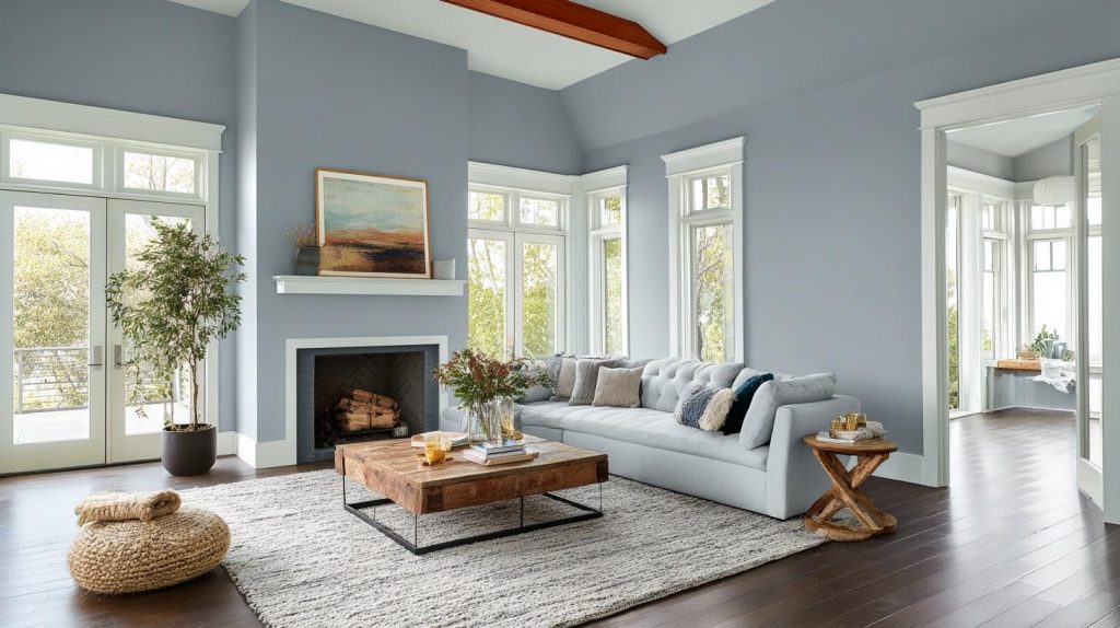
Your living room can become a peaceful gathering spot with Stardew.
I’ve seen how this color creates a perfect background for:
- Family movie nights
- Quiet reading corners
- Social gatherings without feeling too formal
2. Bedrooms
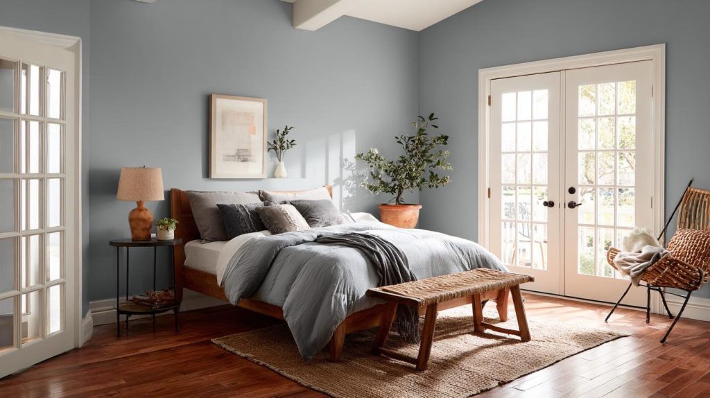
In bedrooms, Stardew really shines. The soft blue-gray tones help create a restful mood.
It works equally well in:
- Main bedrooms
- Guest rooms
- Kids’ rooms where you want a calm feel
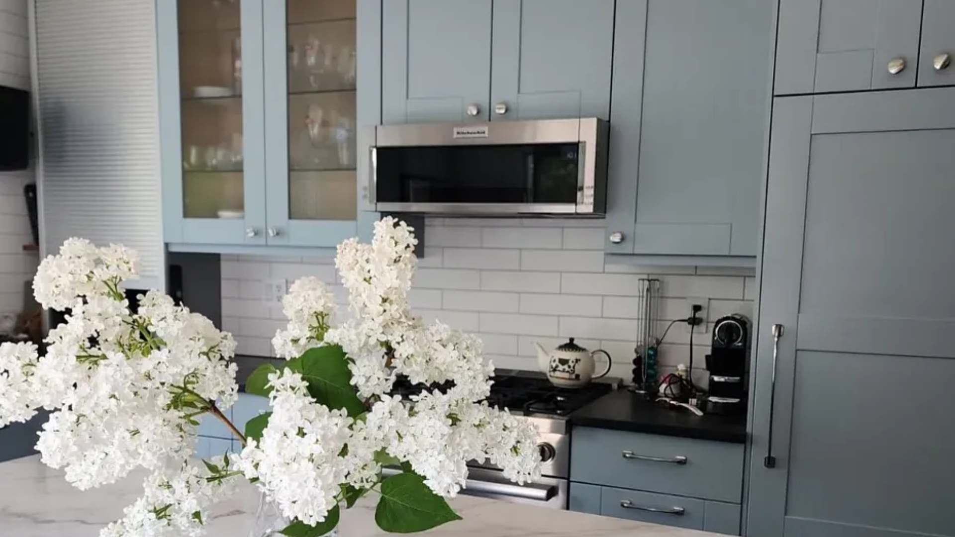
3. Kitchen Choices
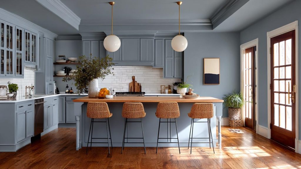
Think beyond white kitchens. Stardew can make your kitchen feel fresh and clean.
It pairs well with:
- White cabinets
- Gray stone counters
- Wood accents and floors
4. Bathroom Benefits
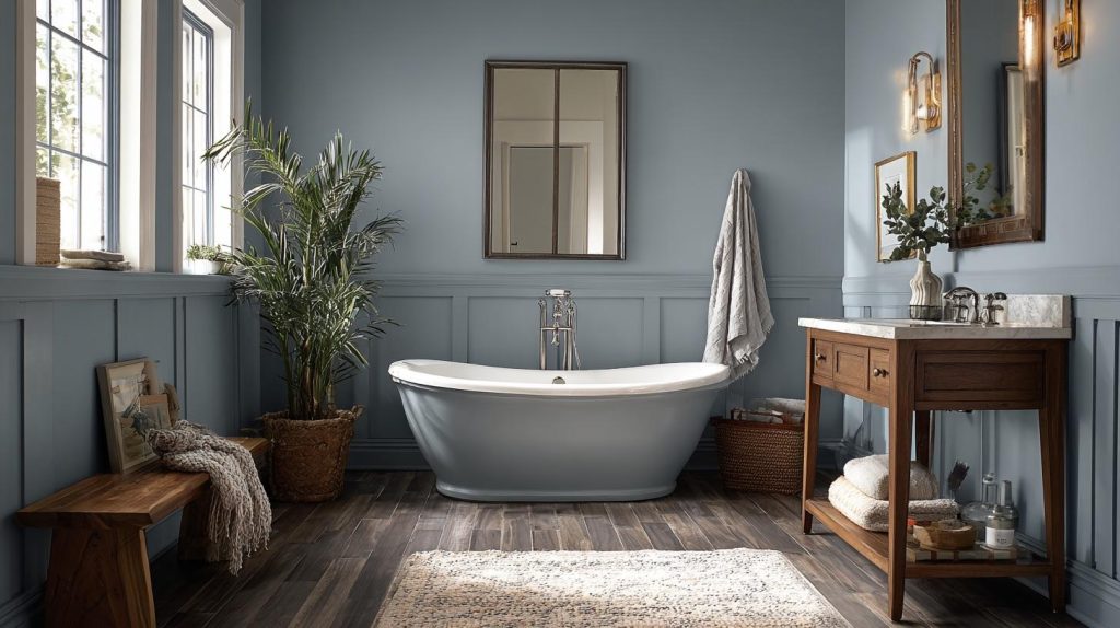
Want a spa feel? Stardew makes bathrooms feel clean and peaceful.
The color works with:
- White tiles
- Chrome fixtures
- Natural stone elements
Sherwin-Williams Stardew Compared to Other Blue-Gray Paints
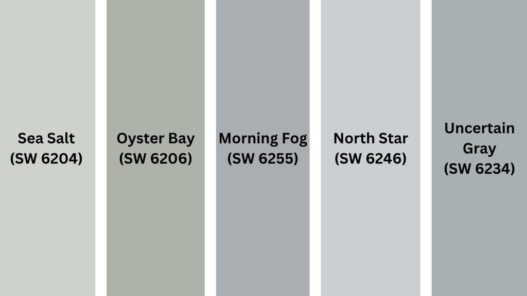
Wondering how Stardew stacks up against other popular blue-gray paints? Below are side-by-side comparisons to help you see the subtle differences more clearly.
| Paint Color | Main Traits | LRV | Best For | Compared to Stardew |
|---|---|---|---|---|
| Stardew (SW 9138) | Balanced blue-gray with soft green hints | 33 | All-around use stays true in most lights | Our baseline |
| Sea Salt (SW 6204) | Lighter, more green-tinted | 63 | Bright, airy spaces | Much lighter, more coastal feel |
| Oyster Bay (SW 6206) | Green-gray with blue hints | 44 | Natural, organic spaces | Greener, less blue depth |
| Morning Fog (SW 6255) | True gray with a slight blue | 42 | Modern, clean spaces | More gray, less character |
| North Star (SW 6246) | Crisp blue-gray | 57 | Fresh, bright rooms | Much lighter, more blue |
| Uncertain Gray (SW 6234) | Warm gray with blue hints | 38 | Cozy, traditional spaces | Warmer, less blue |
Quick Reference Guide
- Want lighter? Pick Sea Salt
- Want warmer? Choose Uncertain Gray
- Want fresher? Go with North Star
- Want natural? Try Oyster Bay
Best Color Pairings for Sherwin-Williams Stardew
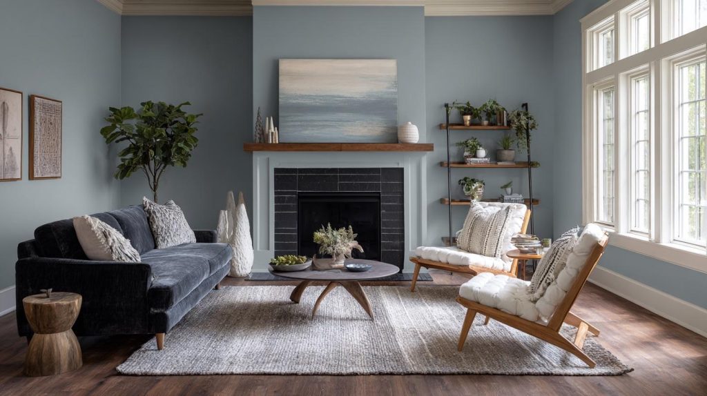
Stardew pairs beautifully with a variety of shades. Below are some of the best color combinations to help you create a balanced and stylish look.
1. Perfect White Trim Options
I’ve tested many whites with Stardew, and these work best:
- Pure White SW 7005 – Clean and bright
- Greek Villa SW 7551 – Soft and warm
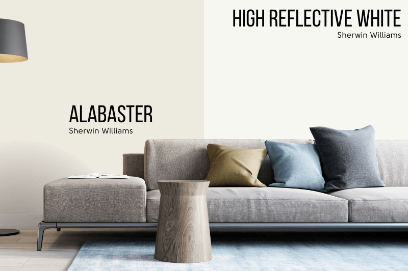
- Alabaster SW 7008 – Gentle and natural
2. Natural Wood Tones
Wood brings warmth to Stardew’s cool tones. Try:
- Light oak floors
- Medium walnut furniture
- Rich mahogany accents
3. Calming Neutral Partners
These shades create smooth transitions:
- Agreeable Gray SW 7029 – For connected spaces
- Repose Gray SW 7015 – For a cooler feel
- Accessible Beige SW 7036 – For added warmth
4. Bold Accent Colors
Want to add some punch? These colors make Stardew pop:
- Navy blue for depth
- Forest green for nature links
- Warm copper tones for sparkle
5. Metal Finishes
The right metal brings extra style:
- Brushed nickel – Clean and modern
- Bronze – Warm and classic
- Chrome – Bright and fresh
6. Textiles and Fabrics
Layer these colors in your room:
- Cream linens
- Soft gray velvet
- Natural beige cotton
- White textured throws
Remember: Keep your main pieces neutral.
Add bolder colors to change items like pillows, art, or vases easily.
Conclusion
After working with Stardew in many homes, I can say this blue-gray stands out for good reasons.
It brings a peaceful feel to any room while staying fresh year after year.
The balanced mix of blue and gray, with subtle green hints, makes it suitable for both bright and dim spaces.
Whether painting a bedroom, living room, or kitchen, Stardew offers something special: a true color that creates a gentle backdrop for your life.
Have you used Stardew in your home? I’d love to see how you’ve made it work in your space.
Share your photos in the comments below, or ask any questions you have about using this versatile shade.
Ready to try it?
Remember to test your sample in different lights before making the final choice.
Frequently Asked Questions
Is Sherwin-Williams Stardew Good for North-Facing Rooms?
Yes. Despite lower natural light, Stardew maintains its character in north-facing rooms.
While it appears more gray, it still creates a cozy, welcoming atmosphere.
Does Sherwin-Williams Stardew Look Blue or Gray on Walls?
It shows both colors, but the balance shifts throughout the day with changing light.
In bright spaces, it leans more blue; in shaded areas, it leans more gray.
Can I Use Sherwin-Williams Stardew on Kitchen Cabinets?
Yes, Stardew works well on kitchen cabinets.
It pairs nicely with marble or quartz countertops and creates a fresh, clean look without being too stark.

