
SW 6184 Austere Gray: A Complete Paint Guide
When I was choosing paint for my home, I didn’t just want a color that looked nice. I wanted something that made the room feel calm. Just soft and easy to live with. That’s when I found Sherwin-Williams Austere Gray.
It’s not plain gray. It has just enough color to feel warm. But it still works in almost any room without standing out too much.
In this post, I’ll tell you what I learned using Austere Gray in my own home. You’ll see:
- How does it change in different kinds of light
- What rooms does it work best in
- What other colors and trim go well with it
- A few tips that helped me feel good about my choice before I even opened the paint can
If you’re struggling to find the right color, this one might make things easier for you, too.
A Closer Look at Austere Gray SW-6184

Austere Gray is part of Sherwin-Williams Living Well – Renew and Pottery Barn Teen collections.
It’s a light, muted gray with a warm feel. The color creates a gentle, settled mood that helps rooms feel grounded.
Here are the technical details:
- HEX: #BEBFB2
- RGB: 190, 191, 178
- HSL: 65°, 9%, 72%
These numbers tell you it’s a warm-toned gray with a soft yellow influence.
Is Austere Gray Warm or Cool?
Austere Gray leans warm. That means it brings a cozy, soft feeling rather than a crisp or icy one.
The yellow undertones make this color feel more inviting. On a color wheel, it sits closer to warm earth tones than blue or cool grays.
This temperature makes Austere Gray a great choice if you want your home to feel relaxed and balanced.
Room-by-Room Guide to Using Austere Gray
Austere Gray fits into many rooms without feeling out of place. You can use it as a main color or as a backdrop for bolder choices. Here’s how it performs in different parts of your home.
1. Living Room

Use Austere Gray on the walls to build a calm base. It pairs well with white trim and natural textures. This makes it a great choice for both open layouts and cozy rooms.
You can add depth with natural wood floors, textured rugs, or warm-toned furniture. In bright spaces, the color stays balanced and never feels too dark or overpowering.
2. Bedroom

The soft gray tones help bedrooms feel restful. Add warm wood or linen tones for extra comfort. Use it behind the bed or on all four walls for a quiet, grounded feel.
It works well with cream or pale blue bedding and doesn’t compete with your decor. This color is also flexible enough for adult or teen bedrooms without needing frequent updates.
3. Kitchen

Use it on cabinets or walls to soften a busy space. It works nicely with brass or black hardware. Austere Gray fits well with natural wood shelves, tile backsplashes, or stone countertops.
It gives kitchens a neat, pulled-together feel without looking too sterile. If you’re updating cabinets, it offers a quiet color that blends with both classic and modern styles.
4. Bathroom

It keeps bathrooms looking clean without feeling cold. Try pairing it with marble or brushed nickel accents. The warm tone works well with light tile and natural finishes.
You can use it on vanities, beadboard walls, or full surfaces. Even in small bathrooms, Austere Gray keeps things open and soft. It also balances well with soft whites or warm flooring.
5. Home Office

It creates a quiet backdrop that doesn’t distract. Use with muted blues or greens to focus the space. This makes Austere Gray perfect for work areas where you need calm, not clutter.
It also cuts screen glare and looks clean on video calls. Add shelves, framed art, or soft textiles to keep it from feeling plain or cold.
6. Cabinets and Furniture
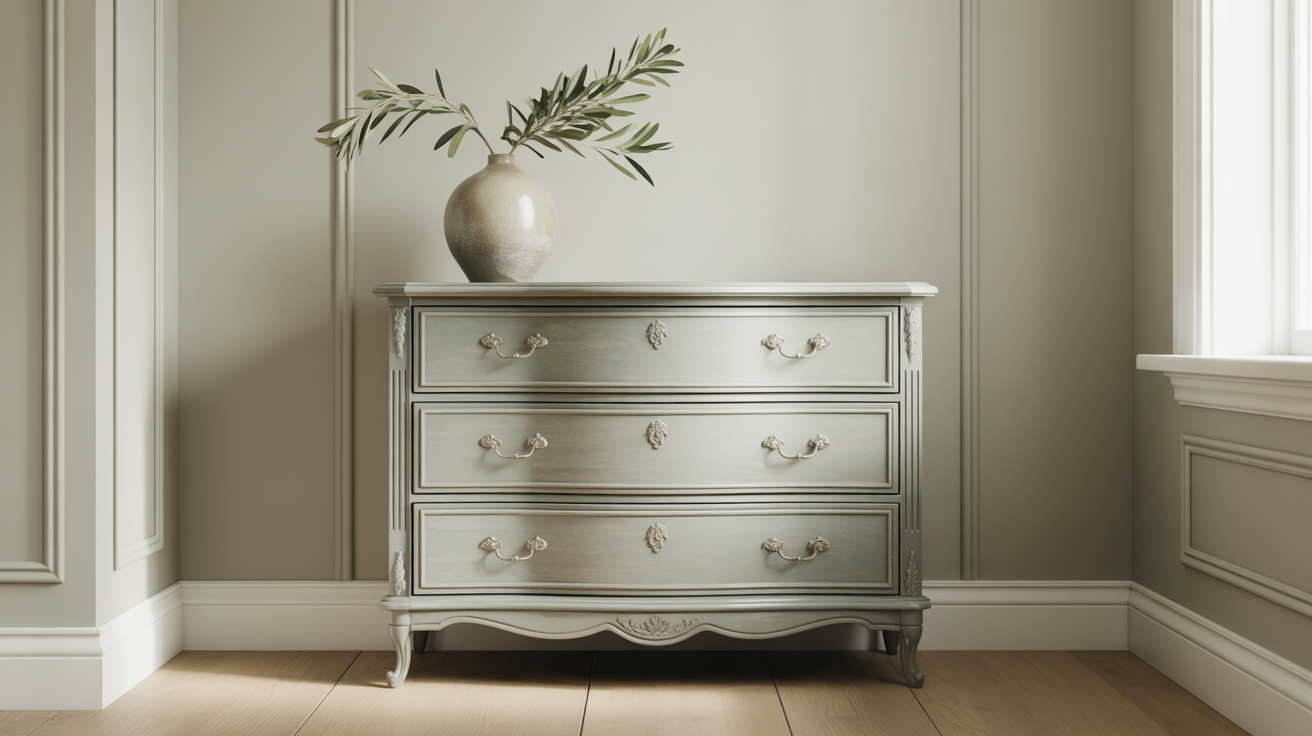
Austere Gray works well on dressers, built-ins, or painted wood furniture. It blends into many color schemes. This color suits items that move between rooms or styles. Use it for nightstands, kitchen hutches, or entry benches.
The tone works well with both silver and brass hardware. It also wears nicely over time, making it a smart pick for everyday use.
How Does Austere Gray Look in Different Lighting?

Lighting plays a big role in how this color shows up. Austere Gray shifts slightly throughout the day, which gives it a more natural feel.
1. Natural Light
In rooms with north-facing windows, it may look slightly cooler or greener. In south-facing rooms, the warmth comes through clearly. It reacts to changes throughout the day, appearing cooler in morning light and warmer by afternoon.
With large windows, the color stays soft without looking washed out. Use it in rooms where you want a natural feel that shifts gently with time.
2. Artificial Lighting
Warm bulbs bring out their yellow tones. Cool bulbs might make it look more muted or neutral. In overhead or task lighting, the shade shifts depending on the bulb type.
Warmer lighting gives it a soft glow, while cooler lighting may bring out a subtle green-gray look. Use bulb temperature to control how Austere Gray behaves in your space.
3. Shadow Effects
In shaded corners, it can take on a slightly deeper tone, which adds depth without becoming dark. It holds its color well even when light is limited. That makes it useful for nooks, hallways, or under shelves.
This quality helps the space feel layered and grounded, even without bright lighting.
Best Coordinating Colors for Austere Gray
Austere Gray pairs well with many colors, but the right match can bring out its best qualities. Here’s how to build a simple, balanced palette around it.
1. Monochromatic Color Pairings
Use lighter or darker grays from the same family to keep the look soft and consistent:
- SW 6197 Aloof Gray: Try Aloof Gray if you want a lighter, cool-toned option that keeps the space feeling relaxed and open.
- SW 7653 Silverpointe: Silverpointe is a soft, clean gray that works well for trim, ceilings, or light-filled rooms.
- SW 6185 Escape Gray: Use Escape Gray when you want a deeper, grounded tone to balance out Austere Gray.
These tones work together to build a smooth, balanced look without strong contrast.
2. Complementary Colors
Try shades on the opposite side of the color wheel for a bit more contrast without going too bold:
- SW 6551 Purple Passage: Purple Passage brings a soft lavender tone that adds color without overpowering Austere Gray.
- Light blues or cool lavenders: You can also try muted tones like SW 6827 Elation or similar pale blues to create contrast that still feels calm.
These pairings brighten up the space and help Austere Gray stand out in a natural, balanced way.
3. Accent Colors for Visual Balance
Add interest with bold accents that bring contrast and character without overwhelming the space:
- Navy or deep indigo: Try a rich tone like SW 9178 In the Navy to ground the room and draw the eye.
- Warm mustard or ochre: A color like SW 6671 Curry adds warmth and energy, especially in accents like pillows or art.
- Muted plum or charcoal black: Use a deep shade like SW 6271 Expressive Plum or SW 7069 Iron Ore to create bold edges or define built-ins.
These accent colors bring balance and depth, helping Austere Gray feel more layered and complete.
Austere Gray vs Other Popular Grays
If you’re torn between Austere Gray and other popular paint colors, this side-by-side comparison can help. Each color has its own tone and feel, and understanding the subtle differences makes it easier to pick the right one for your space.
| Color | Tone & Feel |
|---|---|
| Repose Gray | Slightly cooler and more neutral. Better for brighter or modern spaces. |
| Agreeable Gray | More beige than gray. Feels warmer and softer than Austere Gray. |
| Silverpointe | Cooler and lighter. It leans toward a sleek, clean look. |
| Accessible Beige | Leans tan with a warm feel. Works well if you want less gray and more cream. |
As you can see, even small shifts in tone can change how a room feels. Use these comparisons to narrow down your choice and find the gray that works best in your lighting and style.
Trim and Ceiling Colors That Match Well

Choosing the right trim and ceiling color can help the Austere Gray feel more finished and balanced throughout your space.
Pure White (SW 7005) and Alabaster (SW 7008) are two of the best trim colors to match Austere Gray. They’re clean but soft, giving the walls a subtle frame without harsh contrast.
Go with a slightly darker ceiling color if you want the room to feel taller. If you prefer a sharp contrast, stick with a crisp white ceiling. Cool whites add extra brightness in rooms with limited light, while warm whites blend into the walls for a quiet, seamless look.
Paint Finish Recommendations
The right paint finish depends on the room and how much wear it gets. Matte or eggshell finishes work well in bedrooms, living rooms, and home offices. They have a soft look and are simple to maintain if you need to make small fixes.
In spaces like kitchens, bathrooms, or along trim, satin or semi-gloss finishes are better choices. These reflect more light and are easier to clean.
If you have kids, pets, or a busy hallway, semi-gloss holds up well over time and resists marks from daily use. Matching the finish to the room’s needs helps the color last longer and stay looking fresh.
Try Before You Buy: Samples and Swatches
Before painting, use a sample. Peel-and-stick samples like Samplize are fast and easy to move around.
Test the color in different lighting throughout the day. Tape it to the wall or a board and move it around to see how it changes. This small step helps you feel more confident in your choice.
Conclusion
You’ve seen how Austere Gray works in different rooms, lighting, and design styles. You’ve learned what colors go with it, how to apply it with care, and where it fits best.
This gives you everything you need to feel clear about using it in your own space. If you’re someone who likes calm tones that don’t feel boring, this color is a solid pick. It offers just enough warmth without pulling too much attention.
Before you paint, try a sample and give it time in your space. If you found this helpful, take a look at some other blogs for more color tips, pairing ideas, and home inspiration you can trust.


