Reviewing Benjamin Moore’s Cinnamon Slate (2113-40)
Looking for the right gray-brown paint color can be like searching for a needle in a haystack.
Benjamin Moore’s Cinnamon Slate (1221) is a warm neutral that brings comfort and style to any room.
This gentle mix of gray and brown has gained notice among homeowners.
It works well with modern and traditional decor and creates a welcoming feel that pure grays often lack.
However, choosing the right shade matters, and you need to understand how this color behaves in different lighting and spaces.
In this guide, you’ll learn:
- How Cinnamon Slate looks in various rooms and lighting conditions
- Which colors pair perfectly with it
- Tips for making this color work in your home
Let’s help you decide if Cinnamon Slate is the right choice for your next painting project.
Why Cinnamon Slate Is the Perfect Choice for Your Space?

I’ve seen many paint colors come and go, but Cinnamon Slate has real staying power.
This soft blend of gray and brown creates a sense of calm that makes rooms feel like home.
Here’s what makes it special:
The color shifts subtly throughout the day, warming up in morning light and settling into a rich, cozy tone by evening.
When you paint your walls with Cinnamon Slate, you’ll notice how it makes both small and large spaces feel more welcoming.
It creates a perfect backdrop for artwork and furniture in your living room.
In the kitchen, it pairs beautifully with white cabinets and marble countertops.
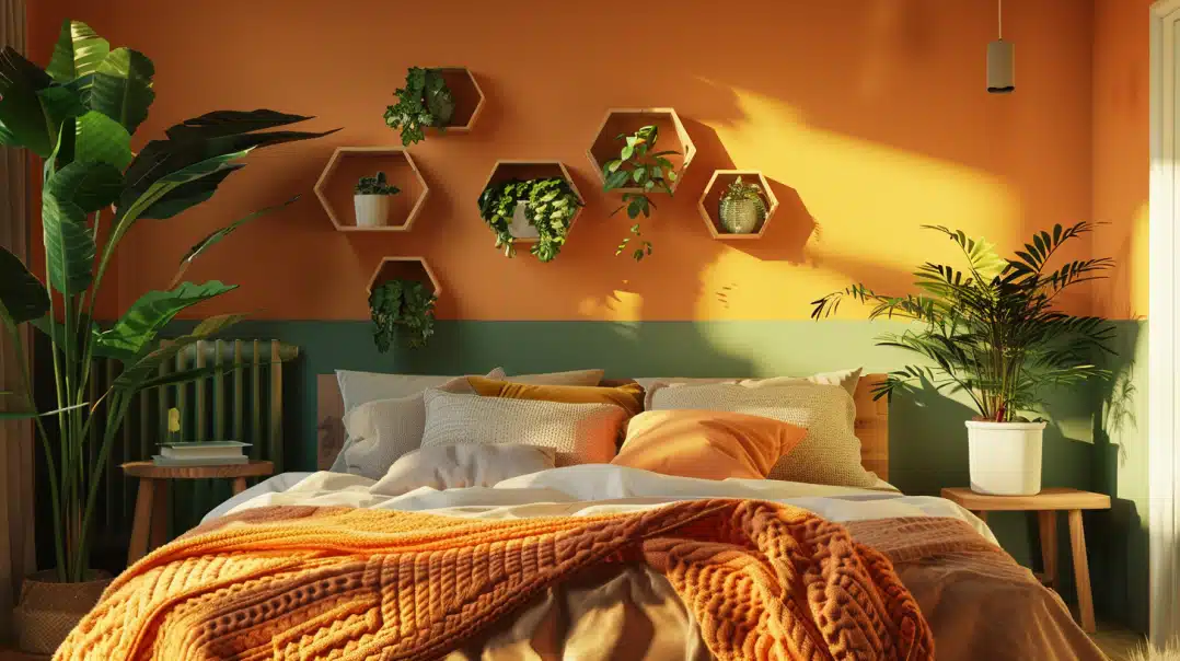
It brings just the right amount of warmth in bedrooms without feeling heavy.
What I really value about this color is its flexibility. When placed next to modern furniture, it works.
Place it with traditional pieces – still works. Add white trim, wood accents, or metal fixtures – they all look good with Cinnamon Slate.
The color also helps hide minor wall imperfections, which is a big plus for older homes.
Unlike pure grays, which can feel cold, this blend combines the clean look of gray with the warmth of brown.
Plus, you won’t need to repaint in a few years. This shade has lasting appeal and keeps looking fresh as styles change.
The Rich Undertones of Cinnamon Slate: What You Need to Know
When I first saw Cinnamon Slate on a wall, I noticed something special.
It’s not just a plain gray-brown – there’s more to it than meets the eye.
Let’s break down what makes this color tick:
The main feature is a soft brown base. But look closer, and you’ll spot hints of red peeking through.
A touch of orange also shows up in bright light.
These hidden colors give Cinnamon Slate its depth and make it feel warm.
Here’s how the color changes throughout your home:
- In bright spaces, the orange tones come forward, making rooms feel sunny
- During evening hours, the brown deepens, creating a cozy feeling
- Under artificial light, the red hints add warmth to the walls
What I find interesting is how these undertones complement different items in your home.
Dark wood furniture will look richer against them. Light fabrics stand out nicely.
Even metal pieces seem to shine more.
Some winning combinations I’ve seen:
- White kitchen cabinets pop against the warm background
- Beige sofas blend smoothly with the walls
- Green plants look fresh and lively against this shade
The color’s depth means it won’t look flat in any room. Instead, it creates interest without taking over the space, which is why it works so well in small rooms and large open areas.
The Psychology of Cinnamon Slate: How It Affects Your Mood
Paint colors do more than make your walls look good—they can also change how you feel in a room.
I’ve seen this firsthand with Cinnamon Slate.
When you walk into a room painted in Cinnamon Slate, you might notice your shoulders drop a bit.
That’s because earth tones like this one help your brain switch to rest mode. It’s like getting a gentle hug from your walls.
The color works in different ways:
- In living rooms, it helps people feel more at ease and ready to chat
- In bedrooms, it sets the stage for better sleep
- In-home offices, it keeps you focused without feeling stressed
What I find most helpful about this shade is how it brings balance.
It’s not so dark that it makes you feel closed in, but not so light that it feels cold or empty.
Real effects you might notice:
- Less stress when you come home after a long day
- Better conversations in your living spaces
- More peaceful mornings in your bedroom
- Easier time wind down in the evening
Think about how you use each room.
\A calm color like Cinnamon Slate can help turn down the noise of a busy day.
It works well in spaces where you want to relax, but it won’t make you feel sleepy in work areas.
The brown notes in the color bring stability, while the gray adds a sense of quiet.
Together, they create a feeling of being grounded and safe in your space.
Remember: Colors affect each person differently.
But in my years of working with paint, I’ve seen Cinnamon Slate bring a sense of peace to many homes.
Where is Cinnamon Slate Best Used in an Interior?
I’ve watched Cinnamon Slate work its magic in many parts of a home.
Let me share the spots where it really shines.
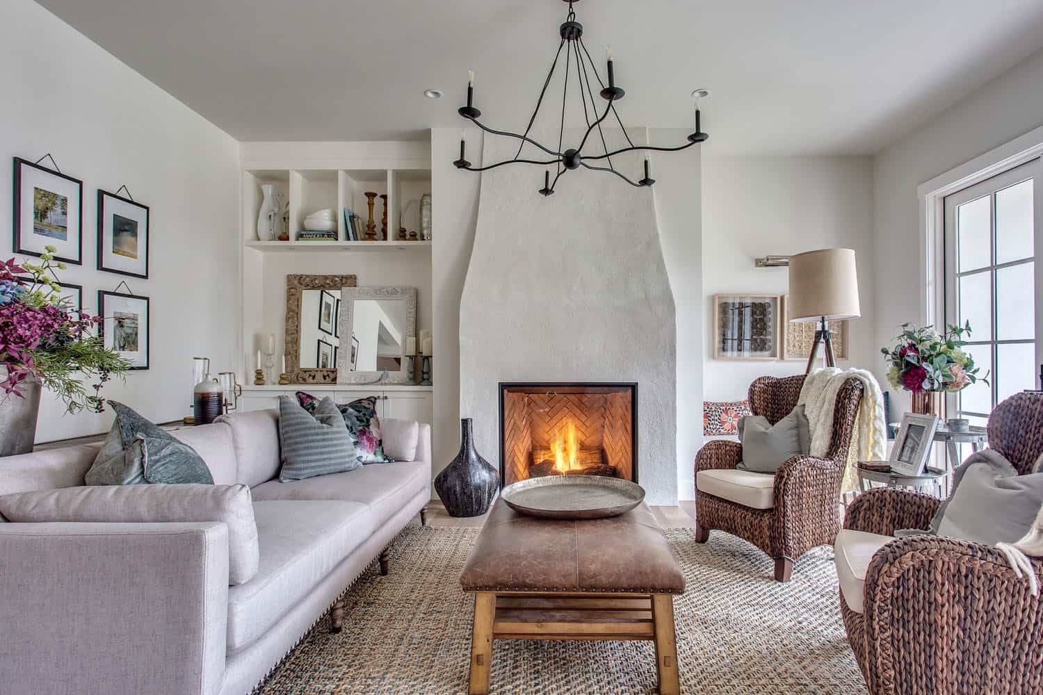
Living Rooms
Your living room is a top spot for this color.
The warm gray-brown creates a perfect setting for family time or having friends over.
I find it especially effective in rooms with lots of natural light, as it keeps the space bright while adding warmth.
Kitchen and Dining Areas
In kitchens, Cinnamon Slate can work in two ways:
- As a wall color with white cabinets
- As a cabinet color with light walls
The dining room is another great place for this shade. It makes meal times feel more special without being too formal.
Bedrooms and Studies
In bedrooms, you can use it to:
- Paint all walls for a cocoon-like feel
- Create one focus wall behind your bed
- Paint built-in shelves or closet doors
Home Offices
This color also benefits home offices.
It helps you stay focused but doesn’t make you feel boxed in during long work hours.
Small Spaces vs. Large Rooms
In small spaces like:
- Powder rooms
- Hallways
- Reading nooks
The color adds depth without making the space feel tiny.
Large rooms bring walls closer, making open areas feel more connected.
As an Accent
You don’t need to paint entire rooms. Try using it on:
- Door frames
- Window trim
- Built-in bookcases
- Lower kitchen cabinets
Remember: Test the color in each space before you commit. The same paint can look different in various rooms based on lighting and room size.
What Kind of Floors Would Look Best with Cinnamon Slate?
Let me share what I’ve learned about pairing floors with Cinnamon Slate walls.
The right floor can make this color look even better.
Hardwood Floors
I find that hardwood creates the most natural match. Here’s what works best:
- Light oak brings out the warm notes
- Dark walnut adds richness
- Mid-tone maple creates balance
The finish matters, too.
A matte finish on wood helps the walls stand out, while semi-gloss adds just enough shine without competing.
Tile Options
When it comes to tile, you have several good choices:
- Cream-colored stone tile softens the look
- Gray porcelain adds a modern touch
- Beige ceramic keeps things simple
Carpet Choices
If you prefer carpet, think about these options:
- Light beige for a clean look
- Warm gray to blend with the walls
- Off-white to brighten the space
Pattern and Texture Tips: The best floor patterns with Cinnamon Slate are:
- Simple wood grain patterns
- Large format tiles
- Low-pile carpet with subtle texture
I’ve noticed that lighter floors often make a room feel bigger, while darker floors make it feel more grounded.
Choose based on your room size and the amount of natural light you get.
A quick tip: Take a paint sample and place it next to your floor choice.
Look at them together at different times of day to make sure you like how they match.
Top Color Combinations with Cinnamon Slate
After testing many color pairings, I’ve found these seven combinations work best with Cinnamon Slate.
I’ll share why each one stands out.
1. Soft White
I love how the pure white trim makes Cinnamon Slate pop. It’s clean and fresh, like:
- White baseboards and crown molding
- White kitchen cabinets
- White window frames
2. Sage Green
This gentle green brings nature inside. Use it for:
- Throw pillows
- Plants and planters
- Accent chairs
3. Navy Blue
Navy adds depth without feeling heavy. Try it on:
- Built-in cabinets
- Furniture pieces
- Area rugs
4. Warm Beige
This creates a smooth, flowing look through:
- Large furniture pieces
- Curtains
- Carpet or rugs
5. Charcoal Gray
For a modern touch, add charcoal through:
- Metal light fixtures
- Picture frames
- Small accent pieces
6. Cream
Softer than white, the cream works well in:
- Upholstered furniture
- Bedding
- Window treatments
7. Natural Wood Tones
Wood brings life to any room with:
- Oak furniture
- Pine shelving
- Bamboo accents
A Note About Metals: Don’t forget metal finishes. I find these work particularly well:
- Brushed nickel for a modern look
- Bronze for warmth
- Simple black for contrast
Cinnamon Slate vs. Other Warm Neutrals: A Comparison
| Cinnamon Slate | Beige | Taupe | Warm Gray |
|---|---|---|---|
| Base Color | Gray-brown with red hints | Yellow-brown | Gray-brown |
| Light Reaction | Warms up in sunlight, stays rich in shadows | Can look washed out in bright light | It can appear muddy in low light |
| Room Size Effect | Makes large rooms cozy and small rooms feel rich | Makes rooms feel bigger but plain | It can make rooms feel smaller |
| Furniture Pairing | Works with both light and dark pieces | Best with darker furniture | Needs contrast to stand out |
| Lighting Needs | Looks good in both natural and artificial light | Needs good natural light | Requires balanced lighting |
| Style Match | Fits both modern and traditional | Mostly traditional | Leans traditional |
| Color Changes | Shows subtle shifts throughout the day | Stays fairly constant | Can shift dramatically |
What Makes Cinnamon Slate Different
- More depth than plain beige
- Less purple than taupe
- Warmer than standard gray
- Better at hiding wall marks
Remember: These differences might seem small on paper, but they make a big impact on your walls.
The right choice depends on your room’s lighting and your style goals.
Conclusion
After years of working with different paint colors, I can say that Cinnamon Slate is a true friend to any room.
This warm gray-brown brings life to walls while blending well with other colors and styles.
Why does this matter to you?
A good neutral paint color forms the backbone of your home’s style.
Cinnamon Slate does this job beautifully, creating fresh and welcoming spaces.
What’s your next step?
Get a sample and test it on your walls. Watch how it changes through the day.
Try it next to your furniture and decor.
Take time to see how it makes you feel in the space.
Want to learn more about paint colors?
Leave a comment below about which room you’re planning to paint.
Frequently Asked Questions
Does Cinnamon Slate Look Different on North-Facing Walls?
In north-facing rooms, Cinnamon Slate takes on cooler tones.
Adding warm lighting can help balance this effect and maintain the color’s rich warmth.
Is Cinnamon Slate Good for Small Bathrooms?
Yes, with good lighting, it adds depth without feeling heavy.
Pair it with white fixtures and a large mirror to keep the space feeling open.
Can I Use Cinnamon Slate on Kitchen Cabinets?
Absolutely.
It works well on cabinets, especially when paired with light countertops and brass hardware.
Just make sure to use the right paint finish.