
Jogging Path (SW 7638) Sherwin-Williams: A Paint Review
Choosing the perfect warm gray isn’t always simple. I’ve been there, trying to avoid something that feels too beige, too cold, or just a little too dull once it’s up on the wall.
That’s exactly why I put this guide together: to help you decide if Sherwin-Williams Jogging Path is the right fit for your home.
I’ll show you how it looks in real rooms, how it compares to other warm neutrals, and what colors it works best with. You’ll also get tips for testing it in your space, choosing the right finish, and finding similar options in other brands. Let’s dig into it.
Getting to Know Sherwin-Williams Jogging Path

Jogging Path (SW 7638) is a warm, soft greige from Sherwin-Williams. It sits somewhere between a light taupe and a muted gray, giving you that cozy, neutral look without veering into yellow or green.
Basic Color Profile
HEX code: #C0B9A9
LRV (Light Reflectance Value): 49
Color family: Warm greige (gray + beige mix)
Jogging Path belongs to the Neutral Paint Colorscollection and is often used in whole-home color schemes. It feels calm, cozy, and versatile, especially in transitional or traditional spaces.
Undertones Explained
Jogging Path has subtle green and beige undertones, but they’re soft and well-balanced.
- In bright natural light, the beige undertone warms up and can look a little sandy.
- In dim or north-facing light, the green-gray undertone comes forward more clearly.
It rarely looks yellow or pink, which is why so many people use it in living rooms, kitchens, and bedrooms.
Still, it’s important to test this color in your own light. The undertones shift based on flooring, furniture, and time of day.
SW Jogging Path in Real Spaces
Jogging Path is one of those flexible neutrals that work just about anywhere, but lighting and room function will shift its feel. Here’s what to expect:
How It Looks in Different Rooms
Kitchens

Jogging Path gives kitchens a soft, grounded look. It pairs beautifully with white cabinets, matte black hardware, and natural stone countertops. It feels warmer than gray but not yellow like some taupes.
Bathrooms

This shade works well in bathrooms, especially when paired with soft whites and brushed nickel. In low-light bathrooms, it may read slightly cooler, so contrast it with warm wood tones or cozy textures.
Living Rooms

In living areas, Jogging Path feels comfortable and timeless. It works with a variety of decor styles, especially if you want a neutral that doesn’t feel cold. It provides great contrast against white trim without being too bold.
Bedrooms

Jogging Path can give bedrooms a calm, slightly earthy feel. It looks especially good with off-white bedding, warm grays, and rustic wood furniture. If you want something softer than greige but deeper than off-white, this hits the mark.
How Lighting Affects It
Jogging Path has an LRV of 49, meaning it reflects a moderate amount of light. That makes it more versatile than darker grays or lighter off-whites.
North-facing rooms: Expect more gray and green-gray undertones.
South-facing rooms: Lightens up and brings out warm beige notes.
East-facing rooms: Feels soft and neutral in the morning, slightly warmer later in the day.
West-facing rooms: Evening light can enhance the beige tone, making it look a bit toastier.
Always try samples on multiple walls. This color can feel very different across rooms and lighting angles.
Jogging Path vs. Other Sherwin-Williams Neutrals
Sherwin-Williams offers plenty of warm neutrals, so here’s how Jogging Path compares to other popular shades.
Jogging Path vs. Accessible Beige
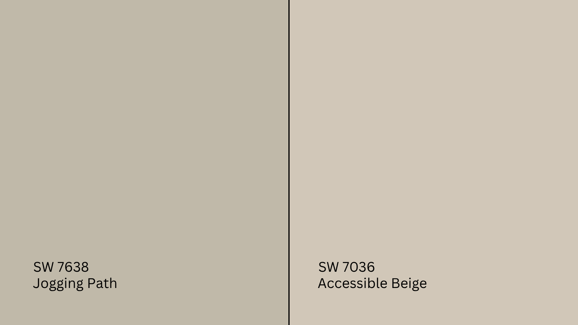
Accessible Beige (SW 7036, #D1C7B8) is a lighter beige-gray with warm undertones.
- Accessible Beige feels creamier and more beige.
- Jogging Path is slightly cooler and more balanced.
Choose Accessible Beige for sunny spaces. Go for Jogging Path if you want something more muted and earthy.
Jogging Path vs. Repose Gray
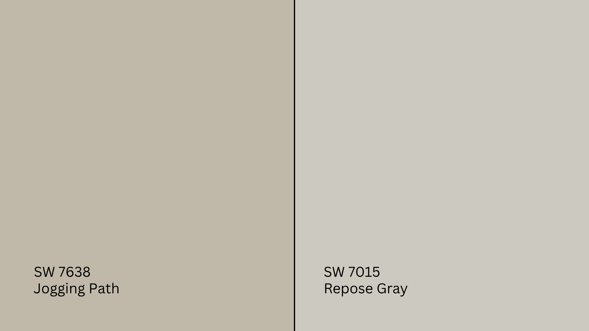
Repose Gray (SW 7015, #CCC9C0) is a light gray with soft purple undertones.
- Repose Gray leans cooler and more modern.
- Jogging Path reads warmer and more traditional.
Repose Gray is better in cool-toned decor. Jogging Path is great if your palette includes taupe, greige, or muted greens.
Jogging Path vs. Worldly Gray
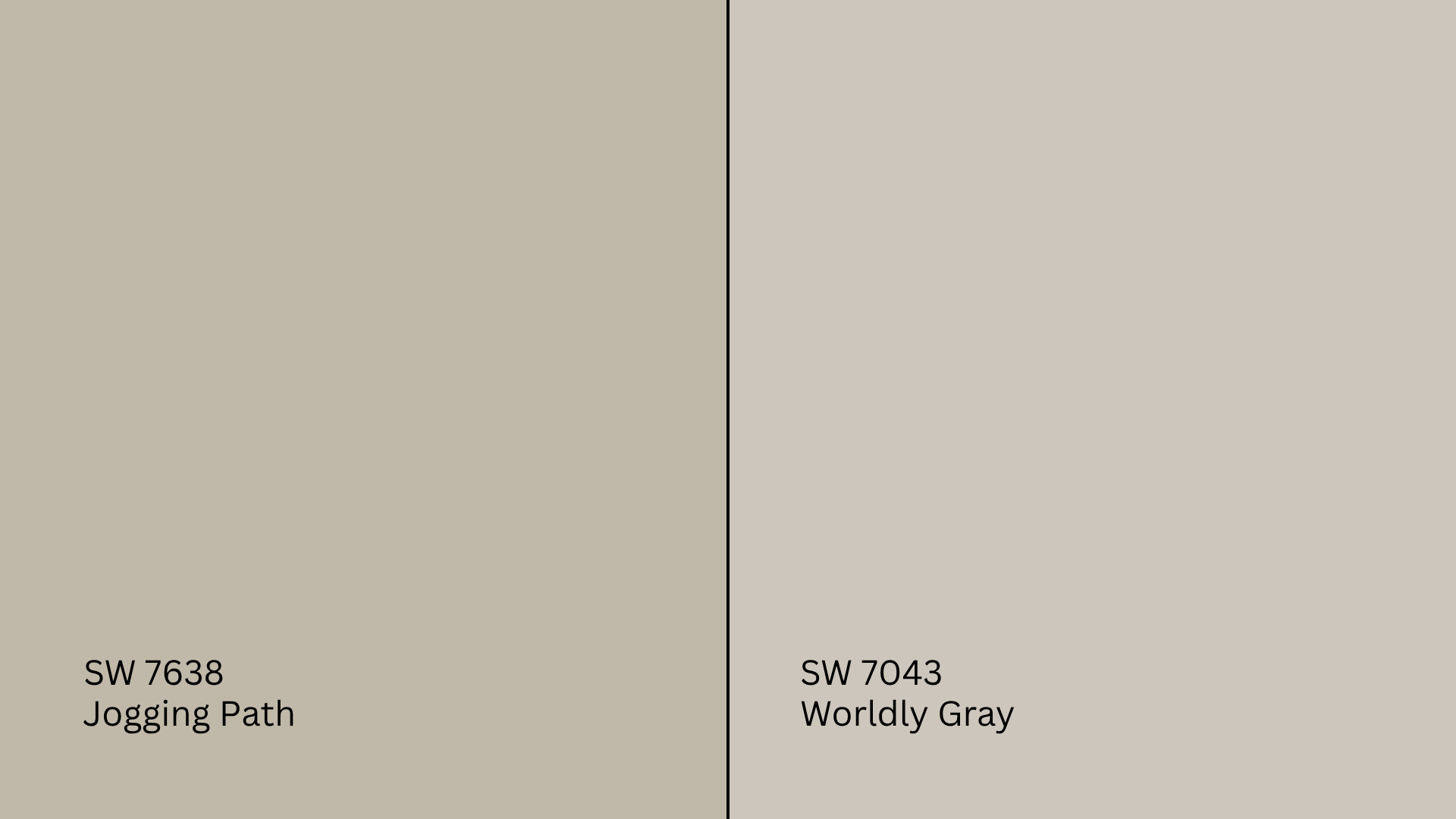
Worldly Gray (SW 7043, #CEC6BB) is a warm gray that sits just above beige on the spectrum.
- Worldly Gray is lighter and a little more flexible across styles.
- Jogging Path has more depth and leans slightly green.
Pick Worldly Gray if you want a light, whole-home neutral. Jogging Path is better when you want contrast without darkness.
Jogging Path vs. Agreeable Gray
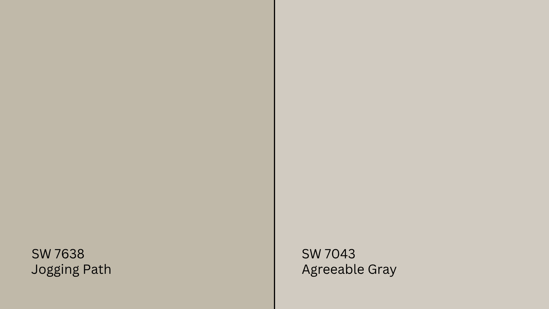
Agreeable Gray (SW 7029, #D1CBC1) is Sherwin-Williams’ most popular greige.
- Agreeable Gray is slightly warmer and brighter.
- Jogging Path is moodier and more grounded.
Agreeable Gray is great if you want something bright and beige-leaning. Jogging Path works if you want a richer, quieter feel.
Undertone and LRV Comparison Table
| Paint Color | Undertones | LRV | Warm or Cool |
|---|---|---|---|
| Jogging Path | Beige, green-gray | 49 | Warm |
| Accessible Beige | Beige, taupe | 58 | Warm |
| Repose Gray | Gray, violet | 58 | Cool |
| Worldly Gray | Beige-gray | 57 | Warm |
| Agreeable Gray | Beige-gray | 60 | Warm |
Test them side by side before choosing. What looks “neutral” on the chip can change quickly on a wall.
Best Color Pairings for Jogging Path
Jogging Path is a dependable backdrop, but it really shines when surrounded by the right colors and finishes.
Trim and Ceiling Suggestions
- Extra White (SW 7006, #EEEFEA): Bright white with no undertones. Great for clean trim contrast.
- Alabaster (SW 7008, #EDEAE0): A softer white for a more cozy, traditional feel.
- Greek Villa (SW 7551, #F0ECE2): Warm and creamy, ideal for classic or transitional rooms.
Use a flat finish for ceilings and semi-gloss for trim for a clean, professional look.
Accent Wall and Furniture Colors
For soft, cozy pairings: Try warm whites, soft sage, clay, oatmeal, or dusty blush.
For contrast: Add navy, charcoal, deep olive, or black accents.
Furniture in natural wood, rattan, leather, or off-white upholstery all work well. You can add boldness with throws, pillows, or artwork in richer jewel tones or warm earth colors.
Hardware and Flooring Compatibility
Jogging Path pairs well with a variety of finishes, making it easy to adapt across different rooms and design styles. Brushed nickel offers a soft, clean look that mixes nicely in kitchens and bathrooms without drawing attention away from the wall color.
Black hardware brings a sharp contrast and structure, especially in modern or farmhouse spaces. It helps the color feel more defined. Aged brass adds warmth and vintage charm, working especially well with traditional decor or wood accents.
For flooring, light woods like oak or pine keep things feeling bright and airy. Mid-toned options like walnut or hickory add depth and balance. Greige or beige tile is a great choice for bathrooms or entryways, offering durability while blending naturally with Jogging Path’s earthy tone.
Paint Finish Recommendations
The finish you choose affects both the look and feel of Jogging Path.
Matte: Best for quiet rooms like guest bedrooms or studies. Softens the overall tone.
Eggshell: Works well in living rooms and dining rooms. Adds a hint of light reflection for a welcoming feel.
Satin: Great for bathrooms, kitchens, and kids’ spaces. Durable and helps the color stand up to moisture and mess.
If you’re unsure, test all three finishes on your wall first. They can shift how warm or cool the color feels.
Sampling and Buying Options
Where to Get Peel-and-Stick Samples
- Samplize: Easy, clean, and repositionable. Real paint, no mess.
- Sherwin-Williams stores: Offer sample pots or pre-painted boards.
- Local retailers: May carry Jogging Path swatches or order them in.
Place samples on multiple walls and check them during daylight and at night to see how the undertones behave.
Where to Buy the Paint
- Sherwin-Williams.com: Buy online and pick up in-store or have it delivered.
- Local Sherwin-Williams stores: Usually carry Jogging Path in multiple finishes.
- Larger hardware stores: May color-match the shade or custom-order it for you.
Pro tip: Watch for Sherwin-Williams 30–40% off sales. They run often!
Paint Equivalents in Other Brands
Looking for a Jogging Path match in other brands? Try these similar colors:
- Benjamin Moore: Try Revere Pewter (HC-172, #CCC4B8) or Abalone (2108-60, #D6CFC7).
- Behr: Look at Natural Gray (PPU18-10, #C4C0BB) or Classic Silver (PPU18-11, #B9B9B4).
- Valspar: Check out Smoked Oyster (6005-1C, #ACA194) or Filtered Shade (4003-1B, #CBC9c4).
Always sample first. Colors that look close on paper can shift quite a bit on the wall.
Conclusion
If you’re looking for a warm, cozy gray that still feels neutral and grounded, Sherwin-Williams Jogging Path might be the one.
You’ve seen how it looks in different rooms, how it shifts with lighting, and how it compares to other popular neutrals.
Before painting, try a peel-and-stick sample or sample pot to make sure it fits your space. Then you can paint with confidence.
Still browsing? Check out my other paint reviews on the website. They follow this same format to help you make the right call for your home.


