How to Choose the Perfect Taupe for Your Space?
I’ve always found Taupe Perfect to be the ultimate neutral—timeless, versatile, and effortlessly chic.
It perfectly balances warm and cool tones, making it adaptable to virtually any room or style.
Whether you’re creating a cozy living room, a serene bedroom, or a modern office, taupe provides a subtle backdrop that enhances the beauty of your décor.
One of my favorite things about taupe is its ability to transform under different lighting. It offers depth and character without overpowering the space.
From soft, earthy hues to sophisticated grays, there’s a shade of taupe for every home.
In this guide, I’ll share tips for choosing the right taupe, where to use it for maximum impact, and which colors pair perfectly with it.
Plus, I’ll include my personal recommendations to help you create a space that feels effortlessly stylish and welcoming.
Let’s dive into the world of perfect taupe.
What is Taupe?
Darling, let me share my 15+ years of experience working with one of the most misunderstood colors in your palette.
Taupe is that gorgeous chameleon gracing the most elegant spaces I’ve designed.
1. Defining Taupe
Taupe is truly a marvel – imagine the perfect marriage between gray and brown, creating this incredibly sophisticated neutral that I absolutely adore.
In my projects, I’ve seen it shape-shift from a warm, cozy hue to a cool, contemporary tone simply by changing the lighting. It’s like having multiple colors in one!
When I’m selecting taupe for my clients, I always look for these distinctive characteristics:
- Base: A harmonious blend of brown and gray
- Undertones: Can range from pink and violet to green and blue
- Depth: Varies from light mushroom to deep granite
2. Why Choose Taupe?
In my 15+ years of interior design, I’ve found taupe to be one of the most versatile neutrals available. What I absolutely love about it is how it can bridge different design styles. It works beautifully in both traditional and contemporary spaces.
When I’m designing living spaces, I often recommend taupe because it creates this wonderful sense of calm while being more interesting than plain beige or gray. I recently used it in a client’s living room.
The taupe walls provided a perfect backdrop for their vibrant blue velvet sofa and brass accessories. The color absorbed and reflected light beautifully throughout the day, keeping the space feeling fresh and dynamic.
From my experience, taupe works exceptionally well in:
- Living rooms, which create a sophisticated backdrop for artwork and furnishings
- Bedrooms, where its calming properties promote relaxation
- Home offices, where its professional yet warm presence helps maintain focus
Tip: When selecting taupe, always test it in your specific space at different times of day.
The way it interacts with your unique lighting can dramatically impact its final appearance.
Choosing the Right Shade of Taupe
1. Warm vs. Cool Taupe
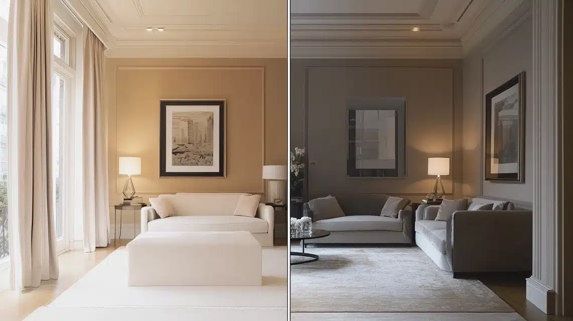
Having worked with countless clients, I’ve learned that choosing between warm and cool taupe isn’t just about personal preference.
For north-facing rooms that receive cooler light, I typically recommend warm-toned taupes with subtle pink or yellow undertones.
These help counteract the coolness and create a more welcoming atmosphere.
In my recent project, transforming a north-facing living room, I used a warm taupe that made the space feel incredibly cozy despite the cool natural light.
For south-facing rooms bathed in warm sunlight, I often suggest cool-toned taupes with gray or purple undertones.
These help balance the warmth while maintaining that sophisticated taupe appeal.
I particularly love how cool taupes can make a sun-drenched room feel more refreshing.
2. Popular Taupe Paint Colors
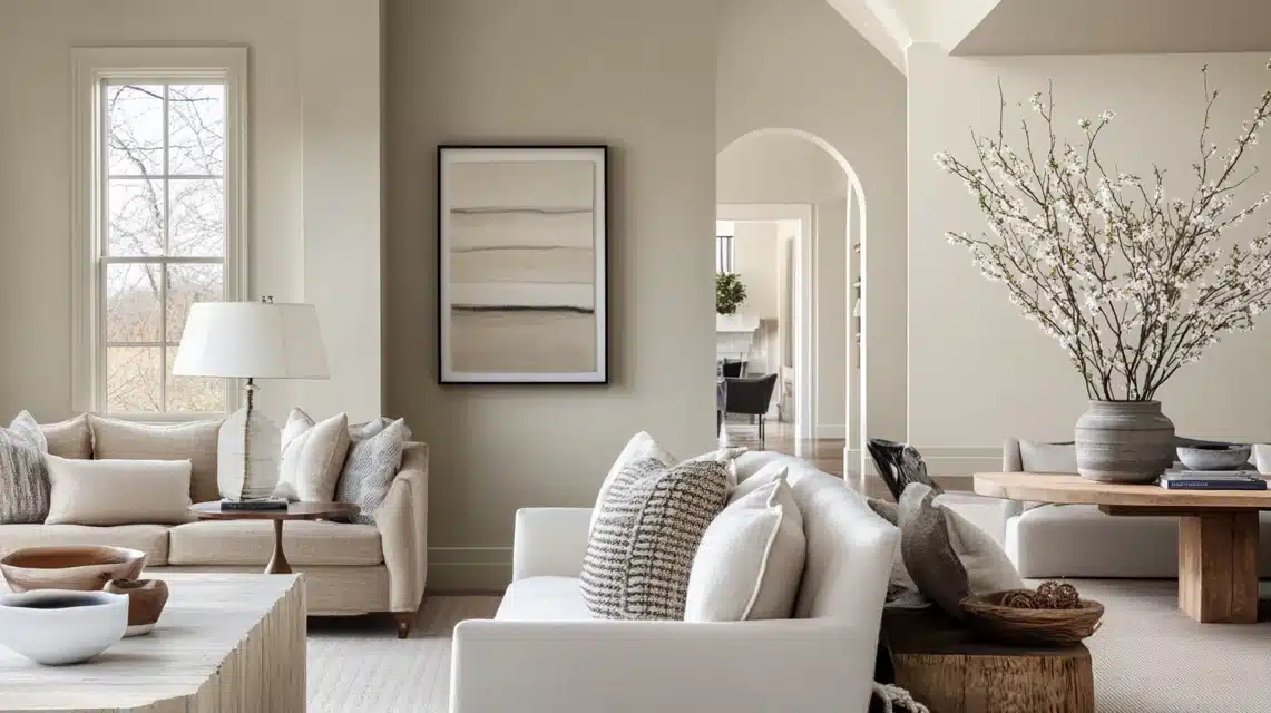
From my extensive experience with different paint lines, here are some standout taupe shades I frequently recommend to my clients
Benjamin Moore’s Revere Pewter (HC-172): This is my go-to “never fails” taupe. It’s a light, warm-leaning taupe that reads differently throughout the day but always looks sophisticated.
I recently used it in a transitional-style home, and it beautifully united traditional architecture with modern furniture.
Sherwin-Williams Perfect Greige (SW 6073): Despite its name, this is actually a beautifully balanced taupe that works wonderfully in spaces with mixed lighting conditions. I’ve found it particularly effective in open-plan living areas.
Behr’s Natural Taupe (N220-4): This is my recommendation for clients wanting a true neutral taupe. It’s neither too warm nor too cool, making it incredibly versatile.
In my last project, it created the perfect backdrop for both cool blue accents and warm wood tones.
3. Testing Taupe in Your Space
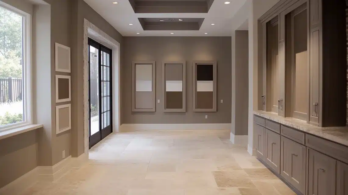
Some professional methods for testing taupe shades:
- Paint at least a 2′ x 2′ swatch on each wall you plan to paint. From my experience, small paint chips are simply not enough with taupe – it’s too complex a color.
- Observe these swatches at different times:
- Morning light (usually coolest)
- Midday sun (strongest light)
- Evening light (warmest)
- Under artificial lighting (how you’ll see it most in winter)
Tip: Look at how the taupe interacts with your existing fixed elements (flooring, cabinetry, countertops).
I once had a client who fell in love with a taupe shade on Pinterest, but when I tested it, I discovered it clashed with their travertine flooring. Testing saved them from an expensive mistake.
Where to Use Taupe?
1. Walls and Ceilings
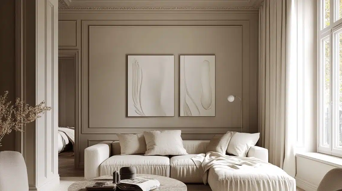
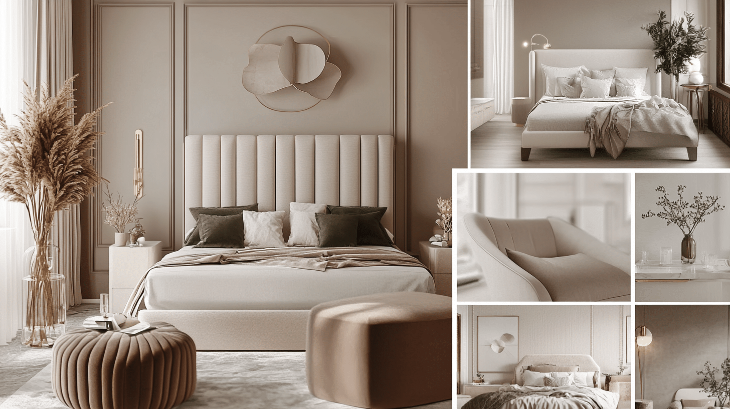
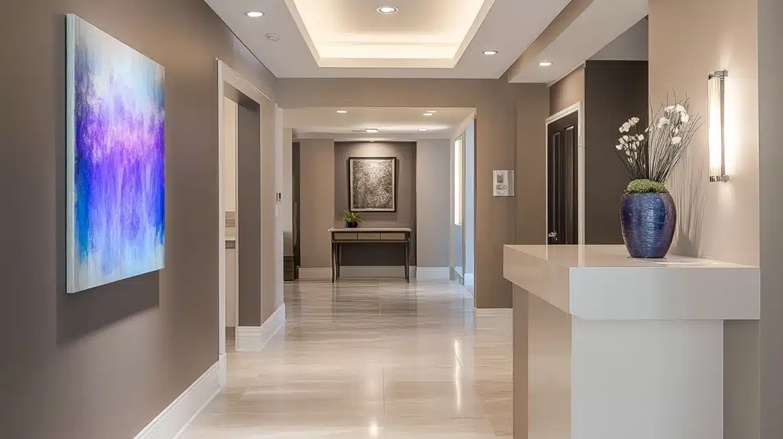
In my practice, I’ve found taupe to be exceptionally powerful on walls. Just last month, I transformed a client’s living room using taupe walls paired with white trim. The result was absolutely stunning.
The taupe created this gorgeous backdrop that made their artwork pop while maintaining an elegant atmosphere.
For ceilings, I love using taupe in unexpected ways. In a recent master bedroom project, I painted the ceiling a shade lighter than the walls, creating this cozy cocoon effect that my clients absolutely adore.
My secret: In rooms with low ceilings, using a lighter taupe on the ceiling can actually make the space feel taller.
2. Furniture and Upholstery
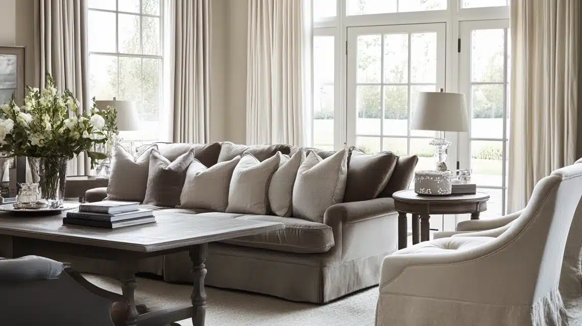
When it comes to furniture, taupe is my secret weapon for longevity. I often recommend taupe upholstery for investment pieces like sofas because:
- It ages beautifully and hides daily wear better than lighter neutrals
- It provides more warmth than gray while being just as versatile
- It works seamlessly with changing accent colors and seasonal decor
In my recent projects, I’ve been loving taupe velvet for dining chairs. It adds this beautiful depth while remaining practical.
For window treatments, I often layer taupe linen curtains with sheer whites for a sophisticated, layered look that filters light beautifully.
3. Accent Pieces
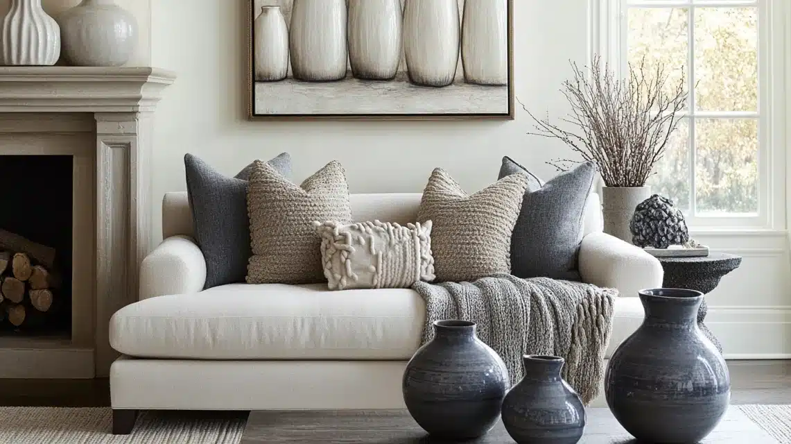
As for accessories, here’s where I have the most fun with taupe! I love creating depth by mixing different taupe tones and textures. For instance:
- A chunky knit taupe throw against a lighter taupe sofa creates a subtle contrast
- Taupe ceramic vases in varying heights add a sophisticated dimension to a mantel
- A hand-knotted wool rug with taupe patterns can anchor a room while maintaining its neutral appeal
One of my favorite recent installations featured a collection of taupe ceramic vessels in varying sizes and finishes that are matte, glossy, and textured.
The monochromatic display created this stunning visual interest while maintaining the room’s serene atmosphere.
Pro tip: When using taupe in accents, I always recommend mixing textures – think smooth with rough, matte with glossy. This creates visual interest while maintaining the sophisticated, cohesive color story that taupe does so well.
Remember, taupe’s beauty lies in its subtlety. In my practice, I’ve found that it works best when you let it build gradually through different elements rather than using it all at once.
This creates a thoughtful, layered look that feels both intentional and effortless.
Colors That Pair Perfectly with Taupe
1. Neutral Pairings
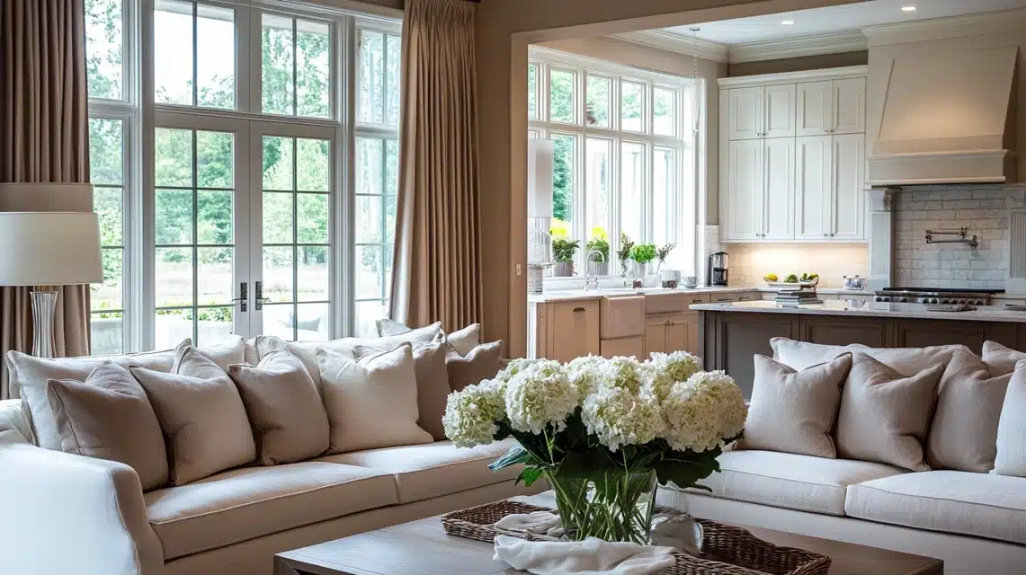
In my design practice, I’ve found that taupe’s magic really shines when layered with other neutrals. Just last week, I completed a living room where I paired warm taupe walls with crisp white trim and soft cream upholstery, the result was absolutely breathtaking.
My go-to neutral palette with taupe:
- Pure white for architectural details – it creates a beautiful definition
- Soft cream for larger furniture pieces – it adds warmth without competing
- Light gray for accent pieces – it introduces depth while maintaining serenity
I especially love using a mix of whites with taupe in kitchens. In a recent project, I used taupe cabinets with white marble countertops and a cream backsplash. The layering created this sophisticated depth that my client adores.
2. Bold Accents
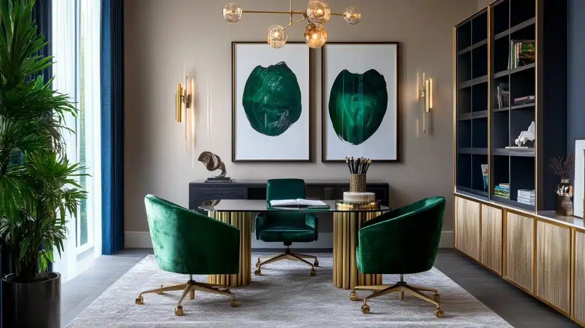
This is where taupe really shows its versatility. In my experience, taupe acts like a sophisticated canvas for bold colors.
I recently designed a home office where I paired taupe walls with emerald green velvet chairs and brass accents – the result was absolutely stunning!
My favorite bold pairings with taupe include:
- Deep emerald green – adds dramatic luxury
- Rich sapphire – creates serene sophistication
- Deep aubergine – brings unexpected warmth
- Navy blue – offers timeless elegance
One of my favorite tricks is using these bold colors in artwork against a taupe wall, it creates this gallery-like effect that makes the colors pop while maintaining the room’s sophistication.
3. Earthy Combinations
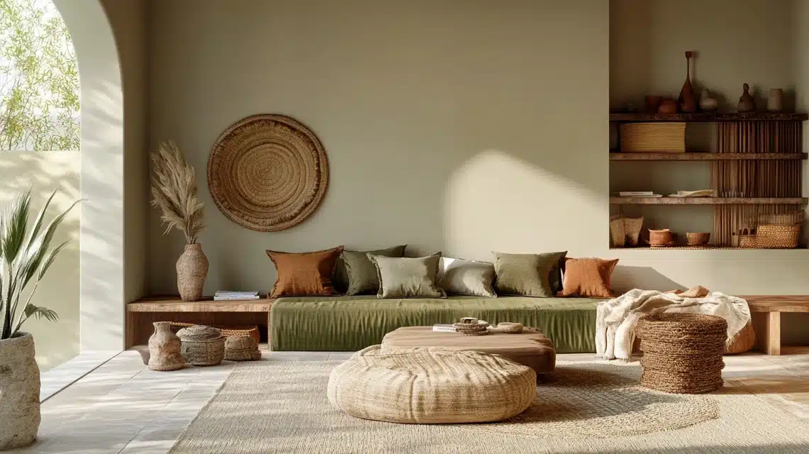
When clients want a nature-inspired space, I love working with taupe as the foundation. It pairs beautifully with organic tones and creates this grounded, calming atmosphere.
My tried-and-true earth-tone combinations include:
- Sage green – brings in a gentle, natural element
- Warm terracotta – adds Mediterranean warmth
- Rich tobacco brown – creates depth and coziness
- Sandy beige – offers a subtle contrast
I recently completed a sunroom where I combined taupe walls with sage green upholstery and natural woven textures.
The space feels like a breath of fresh air! The key was varying the textures while keeping the colors subtle and natural.
Tip: When combining taupe with earthy tones, I always recommend incorporating actual natural materials.
Think wooden furniture, stone accents, or woven baskets.
This grounds the color palette and makes it feel authentic rather than just trendy.
Styling Tips for a Taupe Space
1. Lighting Matters
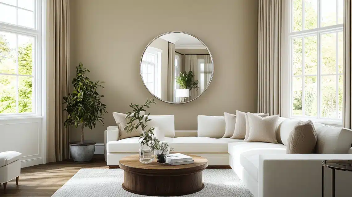
This is where I see many of my clients initially struggle with taupe. Let me tell you about a fascinating transformation in a recent project.
I had this gorgeous taupe living room that looked rather flat in the morning, but by installing strategically placed lighting, I created this amazing depth that evolved throughout the day.
My professional approach to lighting in taupe spaces:
- Natural light: Position mirrors to amplify daylight, but be strategic – I recently placed a large mirror opposite a north-facing window, and it completely transformed how the taupe walls read in the space
- Task lighting: Use warm LED bulbs (2700-3000K) to enhance taupe’s warm undertones
- Accent lighting: Install dimmers to adjust the mood and control how the taupe appears at different times
2. Layering Textures
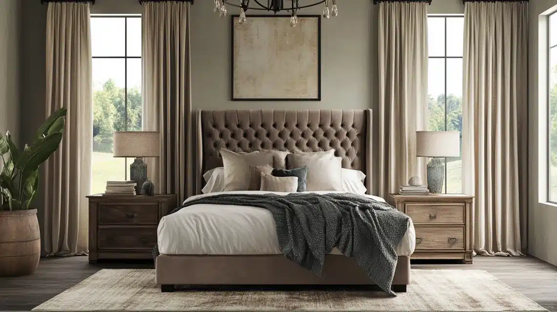
This is my absolute favorite part of working with Taupe.
I always tell my clients that texture is what keeps a neutral space from falling flat in a recent bedroom project.
I created magic by combining:
- A plush taupe velvet headboard
- Nubby linen drapes in a slightly lighter taupe
- Hammered metal light fixtures with a taupe-bronze finish
- Weathered wood side tables
- A high-low wool rug with subtle taupe patterns
The key is to maintain interest while staying within your taupe palette.
I recently had a client who was worried about their space feeling “boring” with just taupe, but after I layered these different textures, they were amazed at how rich and inviting it felt.
3. Balancing Warmth and Coolness
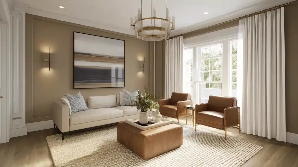
This is where taupe really shows its sophisticated side. From my experience, the secret lies in understanding your base taupe’s undertone and then balancing accordingly.
For Warm-Toned taupe spaces:
- Incorporate brushed silver or chrome accents to add coolness
- Use glass elements to create bright spots
- Add white trim or architectural details for contrast
- Layer in blue-toned textiles for balance
For Cool-Toned taupe spaces:
- Bring in warm brass or gold fixtures
- Add natural wood elements
- Include textiles with warm undertones
- Use cream rather than stark white for contrast
One of my most successful recent projects involved a cool taupe living room where I balanced it perfectly with:
- Warm brass light fixtures
- Rich cognac leather accent chairs
- Natural jute rug
- Creamy white curtains
My secret: I always include at least one element that bridges the warm-cool divide.
In a recent project, I used a stunning piece of artwork that contained both warm and cool tones, which helped unite all the elements in the space.
Purchasing Guide
As an interior designer who regularly sources taupe products, let me share my insider knowledge on where and how to get the best taupe items for your space.
Where to Buy?
Having worked with numerous suppliers, here are my trusted sources for taupe products:
Paint Retailers:
- Benjamin Moore’s signature stores – their color matching is unparalleled
- Sherwin-Williams retail locations – excellent for custom mixing
- Home Depot’s Behr collection – great value while maintaining quality
- Fine Paints of Europe – luxury option with exceptional depth of color
For Taupe Furniture and Decor:
- Room & Board – excellent for taupe upholstery pieces
- Crate & Barrel – reliable for taupe accent furniture
- West Elm – great for modern taupe accessories
- RH (Restoration Hardware) – premium taupe textiles and furniture
- Etsy – wonderful for unique taupe decorative pieces
Online-Specific Options:
- Wayfair – an extensive range of taupe products across price points
- Article – modern taupe furniture with good quality
- Burke Decor – designer-quality taupe accessories
Product Options
Paint Types:
- Flat/Matte: My go-to for sophisticated walls
- Eggshell: Perfect for high-traffic areas
- Satin: Excellent for trim and millwork
- Semi-gloss: Great for doors and cabinets
Available Sizes:
- Sample pots (8 oz) – perfect for testing
- Quarts – good for small projects
- Gallons – standard for room painting
- 5-gallon buckets – ideal for large projects
Special Finishes I Often Recommend:
- Chalk finish for furniture
- Metallic-infused taupe for accent walls
- Zero-VOC options for environmentally conscious clients
- Cabinet-specific formulations
Pricing and Samples
Paint Pricing (approximate ranges):
- Premium brands (Benjamin Moore, Farrow & Ball):
- Gallons: $50-75
- Samples: $8-12
- Mid-range brands (Sherwin-Williams, Behr):
- Gallons: $35-50
- Samples: $5-8
- Budget-friendly options (Store brands):
- Gallons: $25-35
- Samples: $3-5
Getting Samples:
- Order color chips online (usually free)
- Purchase sample pots from stores
- Request large-format swatches (available at most premium paint retailers)
- Use peel-and-stick samples (my preferred method for clients)
Pro Tips for Sampling:
- Always get actual paint samples, not just color chips
- Buy multiple samples of similar shades
- Take advantage of store promotions for reduced sample costs
- Consider ordering sample boards that come pre-painted
- Look for combo sample kits that include multiple finishes
Tip: Many stores offer designer discounts – don’t hesitate to ask about their trade programs if you’re doing a large project. Also, many paint stores now offer virtual color consulting, which can be a cost-effective way to get professional advice before making your final selection.
Conclusion
Taupe is more than just a neutral. It’s a timeless classic that brings warmth, depth, and versatility to any space.
Whether you prefer its cool undertones for a contemporary feel or its warm hues for a cozy ambiance, taupe adapts beautifully to your style and lighting.
From walls to furniture, accents to textures, it creates a foundation that lets your creativity shine.
Incorporating taupe into your home is about finding balance—layering textures, choosing complementary colors, and using lighting to enhance its character.
As I’ve explored, taupe is a sophisticated canvas for bold accents, earthy combinations, or serene neutrals, making it a designer’s dream.
Ready to bring taupe into your home? Start with small updates like an accent wall or throw pillows, or go all in with a taupe-inspired makeover.
Whatever you choose, taupe’s timeless charm will elevate your space, proving that neutral never has to mean boring.
Frequently Asked Questions
Is Taupe More Brown or Gray?
Taupe is a unique blend of both! Think of it as the sophisticated middle ground between brown and gray.
Its undertones can lean either way, which is what makes it so versatile.
In my practice, I’ve found that most taupes are about 50-50 brown and gray, but they can vary slightly in either direction.
Can I Use Taupe in a Small Room?
Absolutely! I frequently use taupe in smaller spaces. The trick is to choose a lighter shade and pair it with good lighting.
In fact, I recently designed a small home office in Taupe, and it created this beautiful, cozy atmosphere while maintaining a professional look.
Are Taupe Walls Easy to Clean?
This depends on the paint finish. In high-traffic areas, I recommend eggshell or satin finish taupe paint as they’re easier to clean. Flat finishes look beautiful but are better suited for low-traffic areas.
How Often Will I Need to Repaint Taupe Walls?
With quality paint, taupe walls typically last 5-7 years before needing a refresh. However, this depends on:
- The amount of daily wear and tear
- The quality of the initial paint job
- The specific finish used
- The amount of direct sunlight exposure
What’s the Most Cost-Effective Way to Incorporate Taupe?
Start small! I often suggest:
- Using taupe in accessories first
- Testing with removable wallpaper
- Starting with a single accent wall
- Incorporating taupe through textiles

