Hale Navy by Benjamin Moore: Your Go-To Painting Guide
After using Hale Navy Benjamin Moore on my kitchen cabinets during my recent makeover in my last blog , I knew it was a winner.
The finish is stunning, modern, timeless, and surprisingly easy to pair with other colors.
In this blog, I’ll share what makes Hale Navy so special, how to use it in your home, and a few tips from my own experience to help you achieve professional-looking results.
What makes Hale Navy truly special is its chameleon-like quality.
In my living room, it reads as a sophisticated deep blue during the day, creating the perfect backdrop for my family photos and artwork.
As evening settles in, it transforms into this incredibly cozy, almost black-blue that makes movie nights feel like I’m in my own personal theater.
The color has this remarkable ability to be both bold and subtle.
At the same time, it’s like that perfect pair of dark jeans that goes with everything.
Where to Use Hale Navy
After living with Hale Navy for several months now, I can confidently share the spaces where this remarkable color has truly transformed my home.
Let me reveal to you how I’ve used it and why it works so beautifully in each space
1. Living Rooms and Bedrooms
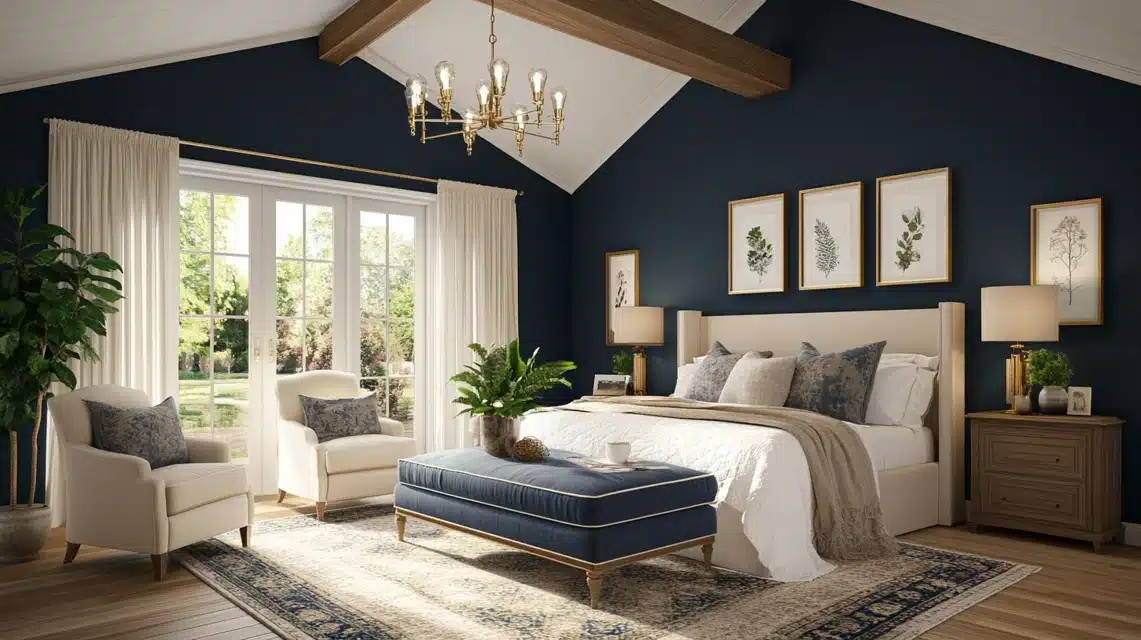
Moving from my previous home’s all-white walls, I wasn’t sure about going dark in my main living spaces.
But painting my living room in Hale Navy turned out to be the best decision I’ve made.
The color creates this incredible cocoon-like feeling that makes my evening family gatherings feel extra special.
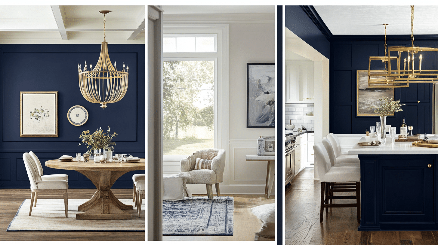
My cream-colored sofa and brass light fixtures absolutely pop against the navy backdrop, and somehow, the room feels larger, not smaller, as I’d initially feared.
In my master bedroom, I used Hale Navy on just one wall behind the bed, and it’s like having a luxury hotel suite at home.
The depth of the color makes my bedding look more luxurious, and the room feels more restful.
Even my husband, who was skeptical about dark colors, now says he can’t imagine the room any other way.
2. Kitchen Cabinets and Islands
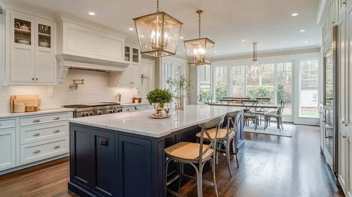
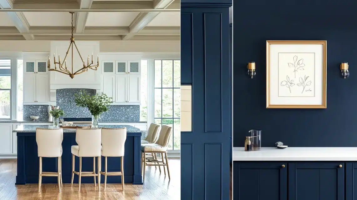
The previous owners had left us with basic white cabinets, but I took the plunge and painted my kitchen island in Hale Navy.
It’s become the anchor of my kitchen, adding sophistication without overwhelming the space.
The contrast between the navy island and my white perimeter cabinets creates this beautiful tension that makes the kitchen feel more intentional and designed.
Pro tip: If you’re thinking about navy cabinets, Hale Navy is forgiving with fingerprints and cooking splatters, which has been a godsend with my active family.
3. Accent Walls
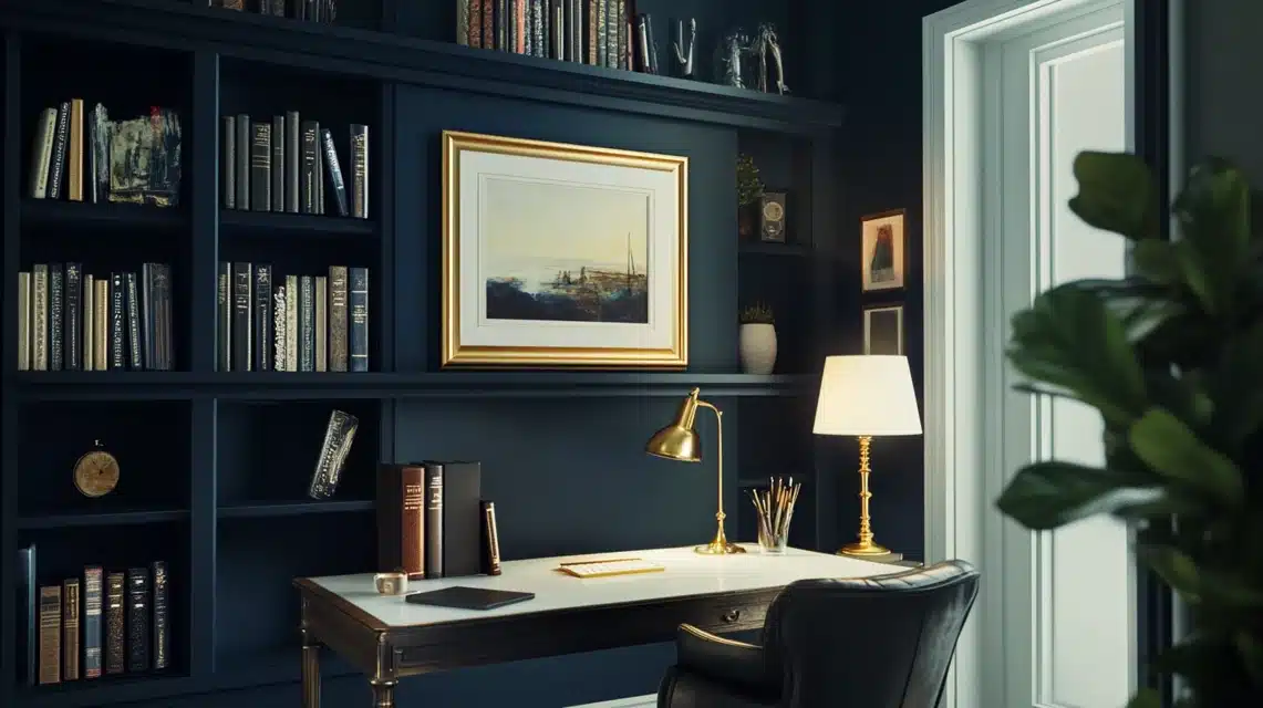
When it came to my home office, I wanted something that would feel professional for video calls but still warm and inviting.
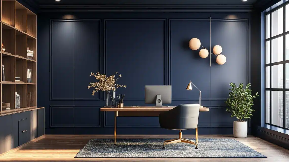
I painted the wall behind my desk in Hale Navy, and it’s become the perfect backdrop for work meetings.
It’s professional without being stuffy, and the color reads beautifully on camera.
The best part is how it makes my white bookshelves and gold-framed art pieces stand out – it’s like having my own curated gallery wall.
4. Exterior Spaces
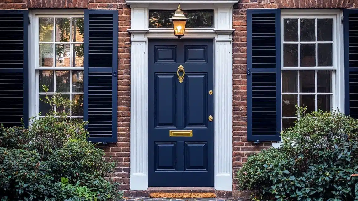
Perhaps my boldest move was painting my front door in Hale Navy. In a neighborhood of traditional colors, my door now stands out in the best possible way.
The color looks different throughout the day – sometimes appearing almost black, other times showing its true navy richness – but it always looks elegant.
I loved it so much that I ended up painting my shutters to match, and the curb appeal has increased dramatically.
I should mention that lighting plays a crucial role in how Hale Navy presents itself. In natural light, it shows its true navy colors, while in the evening, it becomes this deep, moody backdrop that makes every room feel more intimate.
If you’re considering Hale Navy for any space in your home, I’d strongly recommend testing it at different times of the day to see how it works with your specific lighting conditions.
5. Furniture Transformations
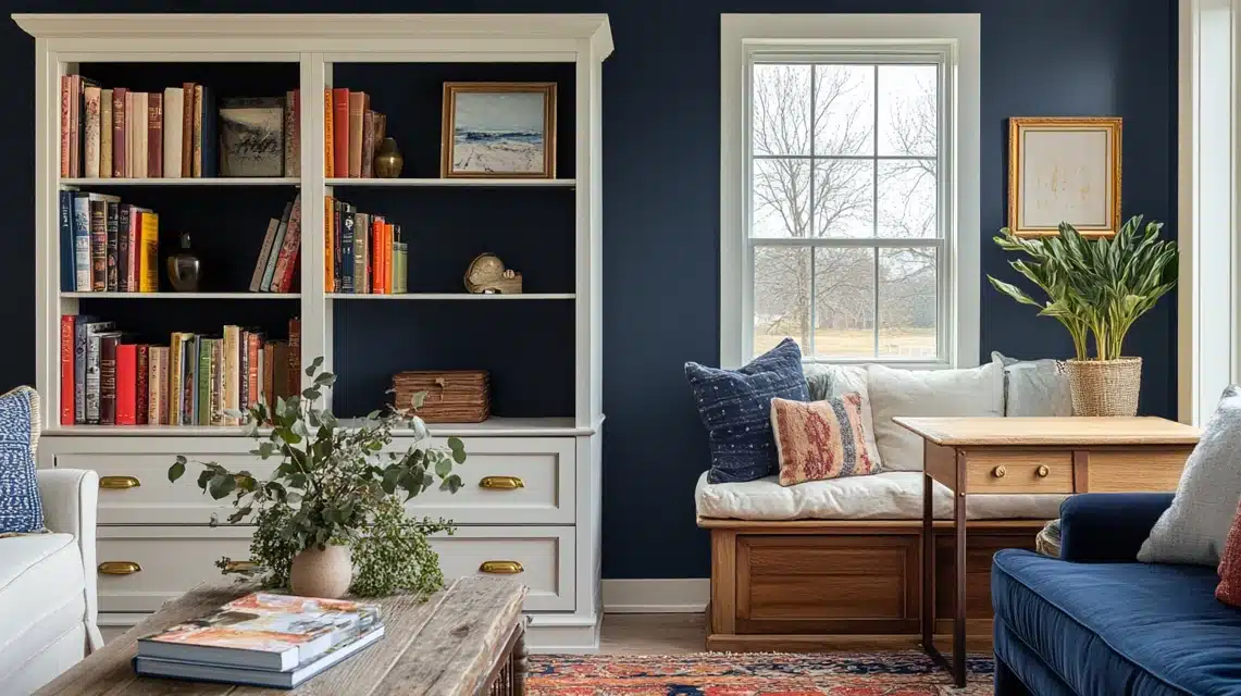
Inside my home, Hale Navy has become my go-to color for furniture makeovers. My first project was an old pine bookshelf that had seen better days.
Two coats of Hale Navy (using Benjamin Moore’s Advance paint for durability) went from dated to designer. The transformation was so successful that it inspired several other projects:
- An inherited dresser that now serves as my dining room buffet
- A pair of vintage side tables that flank my sofa
- A built-in window seat that became a stunning focal point
What I’ve learned about using Hale Navy on furniture is that it acts almost like a neutral, it pairs beautifully with both light and dark woods, and it makes brass hardware absolutely sing.
In my daughter’s room, I painted her desk in Hale Navy and paired it with gold handles, creating a piece that can grow with her through her teenage years.
Pairing Hale Navy with Other Colors
Let me share the combinations that have worked beautifully in my space and might inspire your own color journey.
1. Neutrals
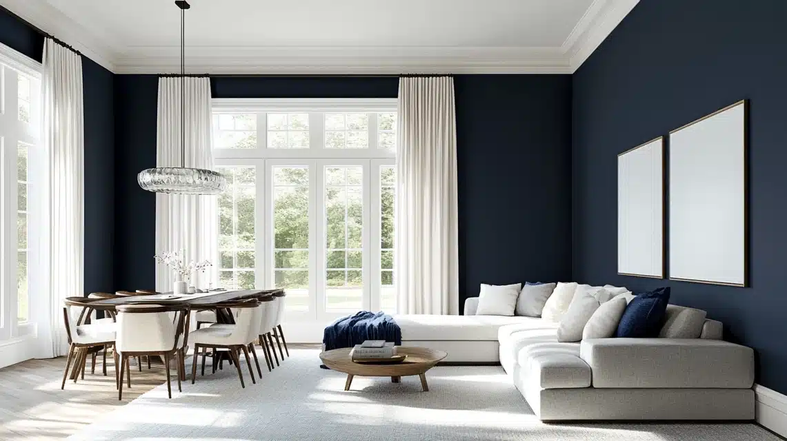
In my living room, I paired Hale Navy walls with Benjamin Moore’s Chantilly Lace on the trim and ceiling, and the contrast is absolutely stunning. The crisp white makes the navy feel even richer while keeping the space feeling fresh and bright.
My ivory linen curtains softly filter light against the navy walls, creating this beautiful interplay of light and depth throughout the day.
What surprised me most was how beautifully Hale Navy works with my existing greige furniture.
I have a large sectional in a warm gray tone (similar to Benjamin Moore’s Revere Pewter), and rather than clashing, the combination feels sophisticated and intentional.
In my dining room, I incorporated natural linen-colored upholstery, and the warmth of the beige tones creates this inviting, elevated atmosphere that’s perfect for entertaining.
2. Bold Accents
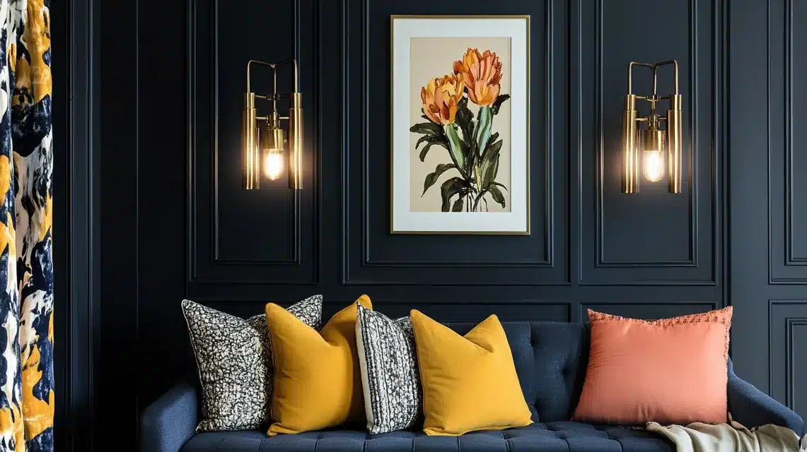
The real magic happened when I started adding bold accents to my Hale Navy spaces.
The vintage brass light fixtures in my entryway absolutely sing against the navy walls – there’s something about the warmth of the metal that makes both colors look more expensive.
In my guest room, I took a chance with mustard yellow throw pillows and artwork, and the combination is unexpectedly dramatic and fun.
One of my favorite discoveries was how beautifully coral and blush tones work with Hale Navy.
In my powder room, I added coral hand towels and a vintage art print with blush tones, and the space feels both sophisticated and fresh.
The navy provides the perfect backdrop for these warmer hues without overwhelming them.
3. Coordinated Color Palettes
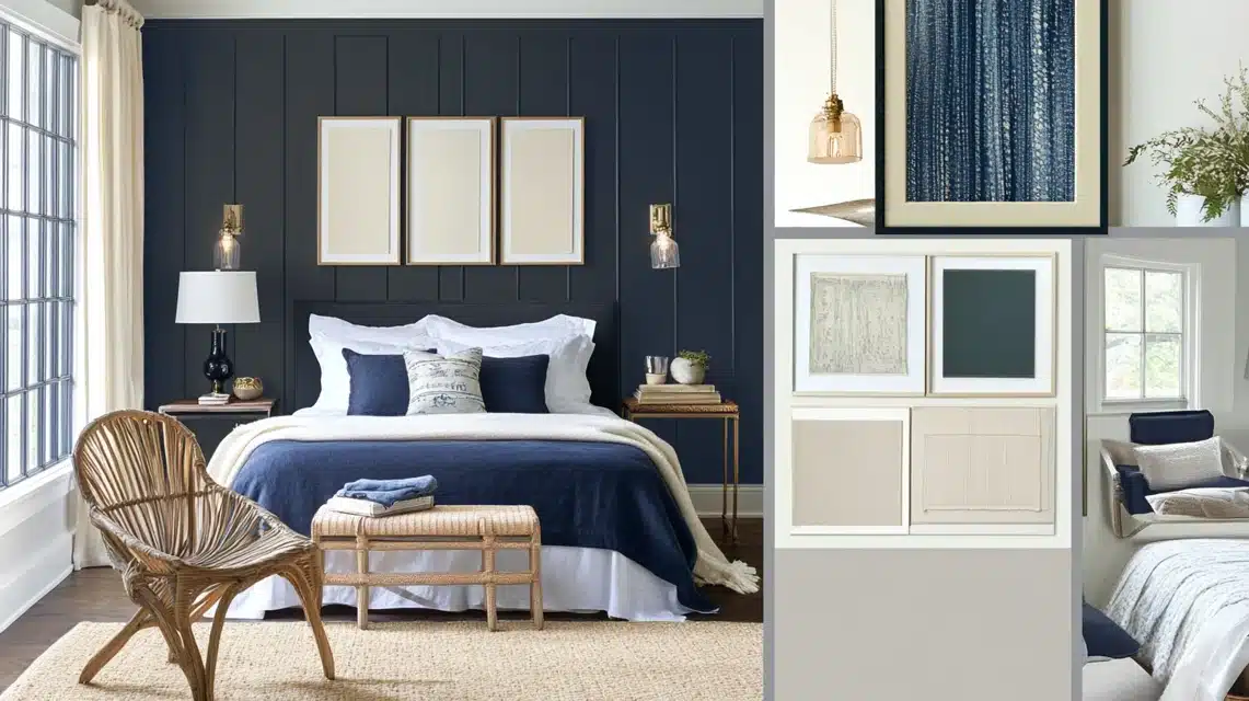
Through trial and error, I’ve found several foolproof color combinations that work beautifully with Hale Navy across different design styles
For the Modern Spaces
- Hale Navy + Chantilly Lace + Brushed Gold + Charcoal Gray This combination gives us that contemporary edge while maintaining warmth.
For the Coastal-Inspired Guest Room
- Hale Navy + Sandy White + Sea Glass Green + Natural Linen The effect is serene and reminiscent of the ocean without being too theme-y
For the Traditional Dining Room
- Hale Navy + Ivory + Warm Bronze + Deep Red This classic combination feels timeless and elegant.
I’ve found that the key to success with Hale Navy is treating it almost like a neutral—it’s substantial enough to anchor a room but versatile enough to support almost any color story you want to create.
The color has this remarkable ability to make other colors in the room look more refined and intentional.
Expert Tips and Insights
1. Interior Designer Advice
During my renovation, I was fortunate to consult with Sarah Mitchell, a local interior designer who’s known for her masterful use of navy in home design. “Hale Navy is like a well-tailored suit,” she told me during my consultation.
It’s powerful enough to make a statement but refined enough to never go out of style.
She suggested viewing the color in three different lighting conditions before committing – advice that proved invaluable in my home office decision.
Another designer, James Rodriguez, who helped with my kitchen transformation, shared an interesting perspective, “What makes Hale Navy special is its chameleon-like quality“.
Unlike other navy blues, it has the perfect balance of warm and cool undertones, making it incredibly adaptable to different spaces and light conditions.
He was right – I’ve noticed how the color shifts beautifully throughout the day in my space.
2. Common Mistakes To Avoid
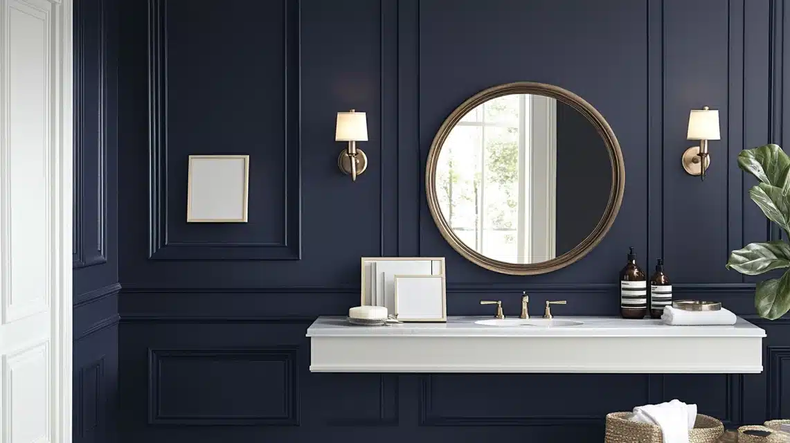
The Small Space Misconception, Initially, I was hesitant to use Hale Navy in my compact powder room, fearing it would make the space feel cramped.
After testing it on one wall, I discovered it actually added depth and made the room feel more intentional.
The key was balancing it with plenty of white trim and a large mirror to reflect light.
The Sample Testing Game-Changer: my biggest near-miss came when I almost painted my entire living room based on a tiny paint chip.
Thankfully, I followed my designer’s advice and painted large sample boards first. The way the color read in my south-facing room was completely different from how it appeared in the store.
I ended up adjusting my lighting plan as a result, adding extra sconces to create the perfect ambiance.
3. Success Stories
My most dramatic transformation happened in the dining room. What started as a bland, builder-beige box is now a sophisticated entertaining space.
I used Hale Navy on all walls but kept the ceiling bright white. Adding brass light fixtures and cream upholstered chairs created a contrast that made the space feel both dramatic and welcoming.
The Kitchen Island Upgrade, my kitchen island transformation became the talk of my recent housewarming party.
The previous blonde wood island disappeared into the floor, but painted in Hale Navy, it’s now a stunning focal point that anchors the entire space.
The key to success was using high-quality cabinet paint and taking time with preparation – three days of work for a result that looks completely professional.
Home Office Victory: Perhaps my most successful application was in my husband’s home office.
I painted the wall behind his desk in Hale Navy, creating a perfect video conference backdrop that draws constant compliments from his colleagues.
The color reads beautifully on camera while maintaining a professional atmosphere.
Conclusion
Moving into my new home was an exciting journey, but it also came with the challenge of making the space truly mine.
Hale Navy by Benjamin Moore played a huge role in that transformation. From updating our kitchen cabinets in the last blog to adding depth and character to other areas, this timeless navy blue brought a sense of elegance and warmth that my home desperately needed.
The kitchen makeover, in particular, has become the centerpiece of our family’s daily life. Hale Navy’s rich tone gives the cabinets a modern yet classic vibe, while its durability makes it perfect for our high-traffic, family-filled kitchen.
Paired with the right accents and lighting, it created a space that feels both cozy and stylish—a place where we love to gather.
If you’re considering a bold color but want something versatile and sophisticated, I can’t recommend Hale Navy enough. It’s not just a paint color. It’s a statement that elevates any space.
Trust me, it’s worth every brushstroke.
Frequently Asked Questions
Does Hale Navy Make Rooms Feel Smaller?
This was my biggest concern initially. From experience, I can tell you it’s quite the opposite. In my living room, the depth of Hale Navy actually makes the walls recede, creating an illusion of more space.
The key is balance, I paired it with white trim and strategically placed lighting to maintain brightness.
How Does It Look in Rooms with Little Natural Light?
I tackled this challenge in our north-facing home office. While Hale Navy does appear darker in low-light conditions, we found it creates a cozy, intimate atmosphere.
The solution was layering artificial lighting – we installed both overhead and wall sconces to maintain the true beauty of the color.
Is It Hard to Coordinate Furniture and Decor with Hale Navy?
This has been one of the most pleasant surprises! We’ve found Hale Navy works like a sophisticated neutral.
In my space, it pairs beautifully with everything from our cream sofa to brass fixtures and even colorful art pieces. It’s incredibly forgiving and versatile.
Does It Show Imperfections in The Walls?
Like any dark color, Hale Navy can highlight wall texture. I learned to prep my walls first carefully.
In our dining room, I actually embraced the slight texture, which adds depth and interest to the space.

