21 Best Blue-Gray Paints for Kitchens, Baths & Bathrooms
I’ve been obsessed with blue-gray paint colors lately. There’s something so soothing about that perfect blend of calm blue and gray.
If you’re staring at your builder-grade beige bathroom, wondering “what now?” or dreaming of a kitchen that feels like a peaceful retreat, blue-gray might just be your answer.
I’ve tested more paint swatches than I care to admit, and I’ve narrowed it down to these gorgeous options that actually work in real homes.
From subtle whispers of color to bold statements, these shades will change your space into something special.
Why Choose Blue-Gray Paint?
The Psychology Behind the Color
Blue-gray tones bring the best of both worlds to your home. Blue naturally promotes feelings of calm and tranquility. Think of how peaceful you feel looking at the ocean or a clear sky.
Gray adds class and neutrality to the mix. Together, they create a color that’s soothing, making your kitchen or bathroom feel like a serene retreat.
These colors also have a timeless quality that won’t feel dated in a few years. Unlike some trendy colors that can feel overwhelming, blue-gray provides just enough personality without being too bold or distracting.
Variety in Design
One of the biggest advantages of blue-gray paint is how well it plays with other colors and materials. It’s like the diplomatic friend who gets along with everyone at the party.
Here’s how it works with different design elements:
- White cabinets: Blue-gray walls create a beautiful contrast with crisp white cabinetry, adding depth without competing for attention.
- Wood accents: If you have warm oak floors or cool maple cabinets, blue-gray complements wood tones beautifully.
- Modern fixtures: Stainless steel appliances and brushed nickel hardware look great against blue-gray backgrounds.
- Natural materials: Stone countertops, marble backsplashes, and ceramic tiles all pair wonderfully with these classy hues.
Best Blue-Gray Paint Colors for Kitchens and Bathrooms
1. Sherwin-Williams Krypton

Sherwin-Williams Krypton is a crisp, airy blue-gray that feels refreshing and clean. Its cool undertones make it perfect for modern interiors, giving kitchens or bathrooms a good yet approachable look.
On lower cabinets, it pairs beautifully with marble or quartz countertops, while in bathrooms, it balances well with white tiles and chrome fixtures.
It’s refined enough for contemporary spaces but not so bold that it takes over the room, making it a great choice.
2. Benjamin Moore Boothbay Gray

Benjamin Moore Boothbay Gray is the definition of a coastal-inspired shade. Think of driftwood and weathered shingles on a beach cottage; this color brings that same relaxed, sun-faded charm indoors.
It has a soft, muted blue undertone that shines in natural light, especially in bathrooms or bedrooms with lots of windows.
The effect is calming and welcoming, giving your home a touch of seaside serenity without feeling overly themed.
3. Farrow & Ball De Nimes

De Nimes by Farrow & Ball is a deep, moody blue-gray that adds instant drama. Inspired by the workwear fabric denim, this color has rich complexity and a classy edge.
It works beautifully in modern or transitional spaces where you want to create a statement, such as an accent wall behind a kitchen island, cabinetry, or a luxurious bathroom backdrop.
Its depth gives a cocooning feel, perfect for spaces where you want to emphasize intimacy.
4. Benjamin Moore Beach Glass

Beach Glass captures the soft, misty essence of sea glass smoothed by the waves. With a dreamy, ethereal quality, it leans toward the lighter side of blue-gray, creating instant tranquility in any room.
It’s especially striking in small spaces like powder rooms, where it brings a spa-like calmness. Pair it with whites, sandy beiges, or soft wood tones for a relaxed coastal feel that never feels overdone.
5. Sherwin-Williams Tradewind

Sherwin-Williams Tradewind is a light, airy blue-gray that’s ideal for making smaller rooms feel larger. It adds just enough color to feel fresh and interesting without overwhelming the space.
Its slightly warm undertone prevents it from feeling too chilly, which makes it usable in both bathrooms and bedrooms.
Use it in areas where you want a breezy, open feel; it’s especially good for creating that subtle “sky meets sea” atmosphere.
6. Benjamin Moore Mount Saint Anne

Mount Saint Anne is a medium-depth blue-gray that strikes the perfect balance between calming and grounding.
It has enough richness to hold its own in a space, yet it’s soft enough to complement natural materials like stone, wood, or tile, and there’s no need to worry about tricky undertones.
This makes it particularly effective in kitchens with detailed backsplashes or bathrooms with statement flooring. Its timeless quality ensures it feels both current and enduring, no matter the design style.
For more inspiration, take a look at these rooms painted in the Mount Sainne Area.
7. Sherwin-Williams Stardew

Sherwin-Williams Stardew is a gentle, approachable blue-gray that strikes the perfect middle ground between color and neutrality. It has just enough blue to feel fresh, yet enough gray to keep it grounded.
This makes it an excellent option for those hesitant to commit to stronger shades. Its variety shines in both traditional homes with crown molding and wainscoting, as well as in sleek, contemporary designs with minimalist furniture.
Stardew pairs beautifully with whites, creams, and warm wood tones, adding a subtle touch of serenity without overpowering.
8. Benjamin Moore Van Courtland Blue

Benjamin Moore Van Courtland Blue is a deeper, more assertive blue-gray that commands attention without being overwhelming. Richer than softer coastal tones, it brings character and confidence into a space.
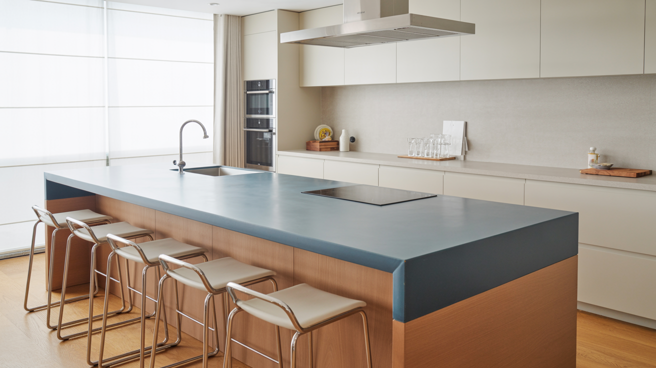
Perfect for focal points like kitchen islands, accent walls, or bathroom vanities, it instantly uplifts the room’s design.
The shade carries historical charm reminiscent of colonial-style blues yet feels just as relevant in modern interiors.
When paired with crisp whites or brass hardware, it delivers a polished, timeless look that makes a memorable impression.
9. Sherwin-Williams Debonair

Sherwin-Williams Debonair is a bold, classy blue-gray that exudes refinement. With its saturated depth, it works best in spaces where cabinetry or furniture needs to be the star of the room.
Imagine a kitchen island painted in Debonair, topped with quartz countertops, or a bathroom vanity accented with sleek gold hardware it instantly becomes a statement piece.
This shade leans toward the luxurious side of the blue-gray family, adding richness without feeling too heavy. It pairs especially well with natural stone and warm metallic finishes.
10. Benjamin Moore Gray Owl

Benjamin Moore Gray Owl is a light, airy neutral with subtle blue-green undertones that make it incredibly adaptable.
Known for its ability to change with the lighting, it can appear warmer in natural sunlight and cooler under artificial light.
This makes it a go-to choice for creating that fresh, Scandinavian-inspired look in kitchens, living rooms, or open-concept spaces. It brings a sense of clarity and simplicity, making rooms feel brighter and more open.
11. Sherwin-Williams Cadet

Sherwin-Williams Cadet is a dark, dramatic blue-gray with a strong personality.
It leans toward the moodier side of the spectrum, making it perfect for accent walls, built-ins, or cozy nooks where you want to create depth and character.
In kitchens, it shines behind floating shelves, creating a striking backdrop for dishware or décor. In bathrooms, it makes a stylish feature wall when paired with crisp tiles and modern fixtures.
12. Benjamin Moore Britannia Blue

Britannia Blue is a striking blue-gray that balances drama with subtlety. It has enough depth to make a statement but isn’t so bold that it dominates a space.
This makes it ideal for modern interiors where you want color to feel deliberate and designed. Use it on feature walls, cabinetry, or even built-ins to create a classy backdrop.
When paired with sleek metal accents like brushed nickel or black, it increases the crispness of contemporary design while maintaining a calm, collected energy.
13. PPG Americana

PPG Americana is a true chameleon of the blue-gray family, leaning more toward neutral than bold.
Its understated nature allows it to pair effortlessly with a wide range of colors, from warm beiges and creams to deeper navy or charcoal.
This adaptability makes it perfect for homeowners who love to switch out décor, pillows, or artwork without worrying about clashing walls.
14. Sherwin-Williams Fountain

Sherwin-Williams Fountain is a lively, brighter take on blue-gray, with just enough punch to add excitement. Unlike muted coastal tones, Fountain has a brightness that makes it particularly well-suited for accents.
It’s coasted behind a floating vanity, in a shower niche, or even as the back wall of open shelving.
Its energetic quality adds freshness to bathrooms or laundry rooms, but in moderation, it can also bring personality to kitchens and entryways without overwhelming the eye.
15. Portola Emerson

Portola Emerson is the epitome of refinement and tailored class. With its rich yet understated blue-gray tone, it feels expensive and effortlessly stylish.
This shade shines when paired with natural wood finishes like walnut or oak, as the warmth of the wood balances Emerson’s cool class.
It works beautifully in high-end kitchens, dining rooms, or office spaces, where the goal is to create a polished and timeless environment. The result is a space that feels both grounded and uplifted.
16. Benjamin Moore Coventry Gray

Coventry Gray is a classic, well-balanced gray with subtle blue undertones, making it one of the most chosen options in the palette.
It manages to be timeless without feeling flat or dull, fitting seamlessly into both traditional and contemporary interiors.
This color works well in every room, from living rooms and kitchens to hallways and bedrooms.
17. Benjamin Moore Wickham Gray

Wickham Gray is an airy, luminous blue-gray that creates a sense of openness and lightness. Known for its almost ethereal quality, it has the unique ability to make small spaces feel larger and brighter.
It’s perfect for compact bathrooms, narrow hallways, or smaller bedrooms where space can feel limited. With its fresh, modern feel, Wickham Gray pairs beautifully with white trim, soft neutrals, and light wood tones.
It’s a favorite among designers who want a subtle backdrop that feels contemporary yet soothing.
18. Sherwin-Williams Gibraltar Cliffs

Gibraltar Cliffs is a confident, commanding gray infused with deep blue undertones. It exudes strength, stability, and a slightly masculine edge, making it perfect for spaces where you want a bold, grounded presence.
This shade shines on accent walls, built-in shelving, or cabinetry, where its depth adds richness and gravitas.
Pair it with warm leather, dark wood, or brass accents to create a classy, tailored look. In modern spaces, it reads sleek and structural, while in traditional rooms, it adds an anchoring, timeless feel.
19. Benjamin Moore Bunny Gray

Bunny Gray is a soft, understated blue-gray that’s incredibly approachable. Its gentle tone makes it easy to use in larger applications, think full-room walls or open-concept spaces, without becoming overwhelming.
It adds just enough color to keep things interesting while maintaining a serene, airy quality.
Perfect for bedrooms, nurseries, or living areas, Bunny Gray pairs beautifully with white trim, muted pastels, or natural linen textures. It’s a go-to shade for creating calm, welcoming interiors that still feel light and fresh.
20. Benjamin Moore Storm Cloud

Storm Cloud is a classy mid-tone gray with a subtle blue cast, striking the balance between neutrality and personality.
It’s bold enough to add character but soft enough to remain good in kitchens, bathrooms, and transitional spaces.
Use it on cabinetry, islands, or feature walls to introduce depth without overpowering lighter finishes.
Paired with marble counters, subway tile, or matte black hardware, it reads crisp and modern; combined with warm woods and soft textiles, it takes on a cozier, more traditional edge.
21. Sherwin-Williams Dusty Cornflower

Dusty Cornflower is a unique, powdery blue-gray with a gentle, calming quality that creates a spa-like ambiance. Its soft undertones create a soothing atmosphere, making it ideal for bathrooms, bedrooms, or any retreat space.
Unlike brighter blues, Dusty Cornflower carries a muted class that blends easily with stone, natural woods, and white finishes.
Comparison Table of Top Blue-Gray Paints
| Paint Name | Brand | LRV | Primary Undertones | Best Uses |
|---|---|---|---|---|
| Krypton | Sherwin-Williams | 63 | Cool, crisp | Kitchen cabinets, bathroom vanities |
| Boothbay Gray | Benjamin Moore | 65 | Coastal, soft | Bright bathrooms, powder rooms |
| De Nimes | Farrow & Ball | 47 | Complex, moody | Accent walls, modern bathrooms |
| Beach Glass | Benjamin Moore | 72 | Misty, ethereal | Full rooms, serene spaces |
| Tradewind | Sherwin-Williams | 69 | Light, airy | Small bathrooms, open kitchens |
| Gray Owl | Benjamin Moore | 69 | Clean, neutral | Minimalist kitchens, modern baths |
| Van Courtland Blue | Benjamin Moore | 44 | Rich, deep | Statement walls, kitchen islands |
| Debonair | Sherwin-Williams | 39 | Bold, sophisticated | Cabinetry, vanities |
Final Thoughts
After painting my own kitchen three times, I can tell you that finding the right blue-gray is absolutely worth the effort.
There’s something magical about walking into a space painted in that perfect shade that just makes you exhale and feel instantly calm.
My biggest piece of advice? Get those sample pots and paint large swatches on different walls. I learned the hard way that what looks dreamy in the store can look completely different in your actual lighting.
Trust me, I once chose a color that looked like a sad dental office under my fluorescent lights.
Doesn’t matter if you’re team moody navy-gray or soft powder blue-gray, one of these shades is calling your name. Which one made you think “that’s it, that’s my color”?

