Benjamin Moore’s Vintage Vogue 462 Color Review
Deep green paint colors are everywhere right now, and Vintage Vogue 462 by Benjamin Moore is one of the most talked-about shades.
Many people choose it for walls, cabinets, or built-ins because it adds depth fast.
In this guide, I’ll walk through the basics of Vintage Vogue 462, explain its undertones and mood, and show how lighting affects it. This will help you decide if it’s right for your space.
Vintage Vogue: Color Basics
Vintage Vogue 462 is a deep, smoky green that often reads almost black in low light. It feels rich, grounded, and classic rather than trendy.
- Color Name: Vintage Vogue
- Brand: Benjamin Moore
- Color Code: 462
- Color Family: Green
- LRV: 11.85, meaning it reflects very little light and looks quite dark
- Overall Look: Deep, smoky green with a muted finish
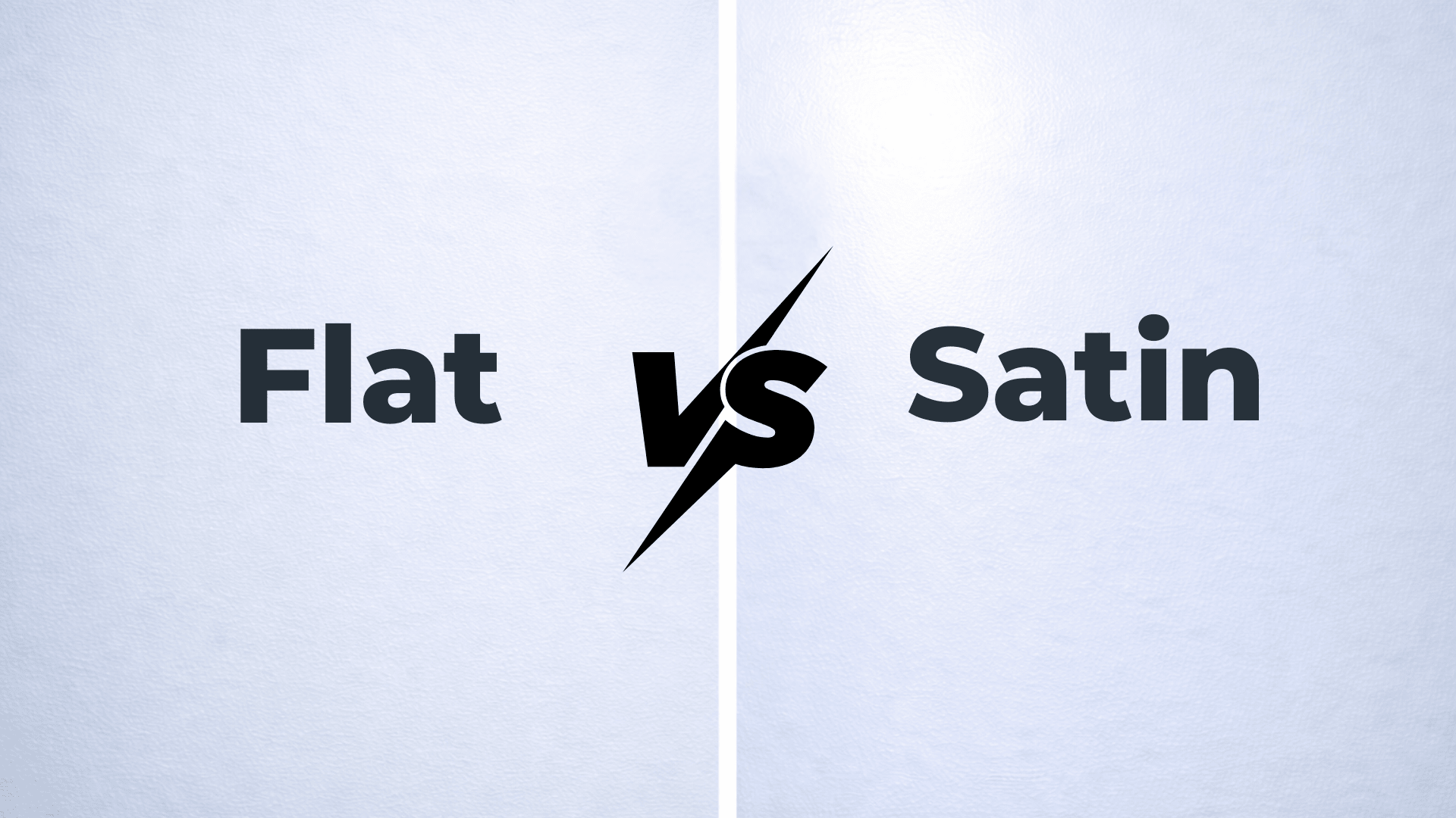
- Finish Tip: Looks best in matte or eggshell on walls, satin or semi-gloss on cabinets
- Design Style Match: Traditional, modern, vintage, and cozy spaces
If you like moody colors that still feel timeless, this one is worth sampling.
Vintage Vogue Undertones and Mood
Vintage Vogue has green as its main undertone, but it also carries soft gray notes. This gray keeps the color from looking too bright or sharp.
In some lighting, you may also notice a slight earthy warmth, which helps it feel cozy instead of cold.
The overall mood is moody, calm, and grown-up. It creates a wrapped-in feeling, especially in smaller or quiet rooms.
This color feels more relaxed than bold. If you want a deep green that looks soft and livable, Vintage Vogue fits that role well.
How Lighting Affects Vintage Vogue
Lighting plays a big role with this color, so testing it is important.
- North-facing rooms: The color looks deeper and darker. It can feel very moody and dramatic.
- South-facing rooms: Natural light brings out more of the green. The color feels richer and clearer.
- Low light or nighttime: It can read almost black, especially on full walls.
My best advice is to sample it on a few walls and check it during the day and at night before painting.
Best Rooms for Vintage Vogue
Vintage Vogue works best in rooms where a deep, moody color feels intentional and cozy. It’s also a great choice for rooms that don’t need to feel bright all day.
1. Living Rooms and Dens
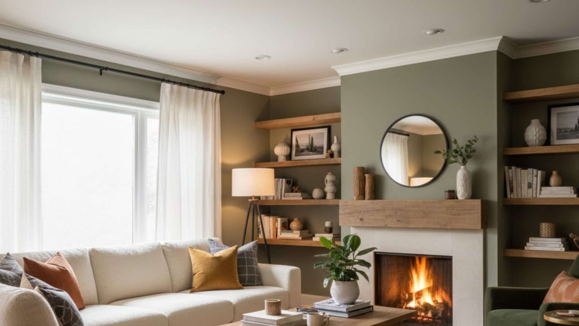
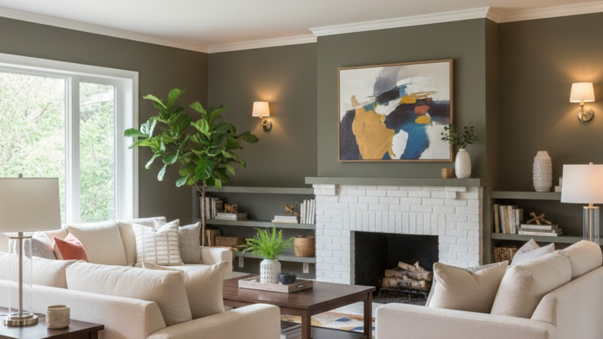
Vintage Vogue can make a living room feel grounded and inviting, especially in spaces used for relaxing. It works well in dens or formal living rooms where you want a calm, layered look.
In brighter living rooms, the color shows more green and feels rich instead of heavy. Adding light trim and warm lighting helps balance the darkness and keeps the room from feeling closed in.
2. Bedrooms
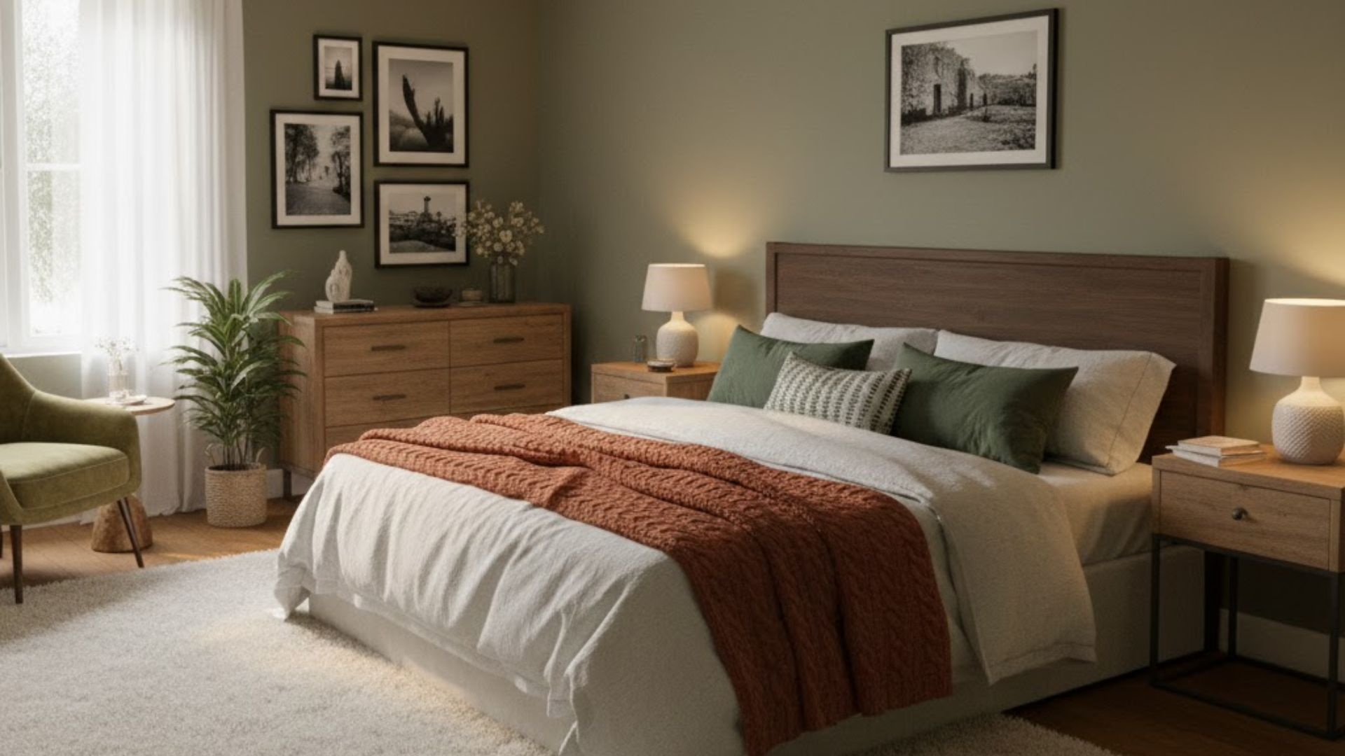
This color is a great choice for bedrooms because it creates a quiet, restful mood. It looks especially good in bedrooms with soft white bedding and warm accent lighting.
In smaller bedrooms, it’s often best used on all walls only if there’s enough natural light. If not, it still works beautifully as an accent wall behind the bed.
3. Home Offices
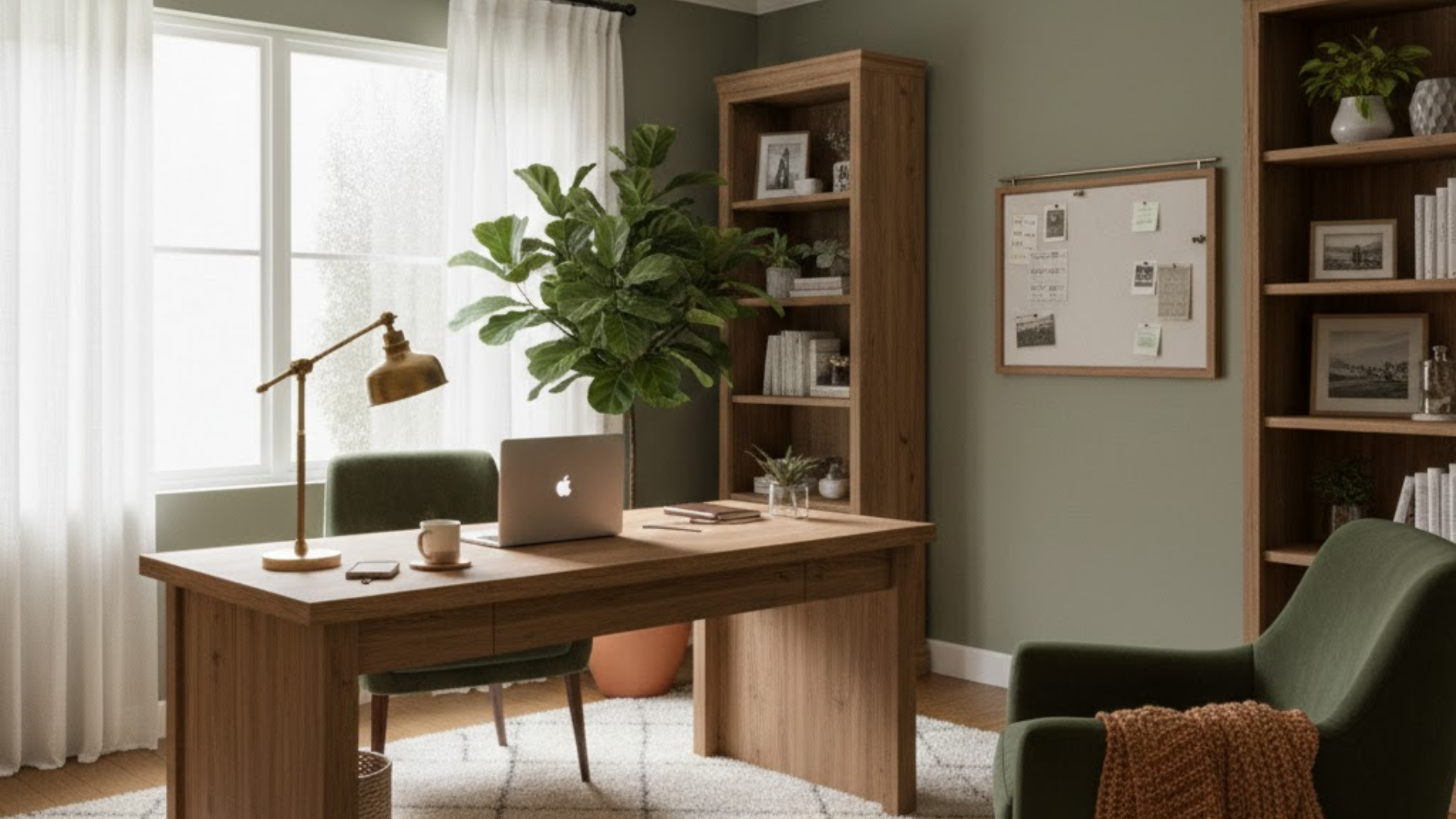
Vintage Vogue is popular in home offices because it feels focused and mature. The deep tone reduces glare and creates a space that feels calm and productive. It pairs well with dark wood desks, brass lamps, and neutral rugs.
This color also helps hide shadows and screen reflections, which is a bonus for long workdays. If your office gets good daylight, the green tones will feel rich and balanced.
4. Kitchens and Cabinets
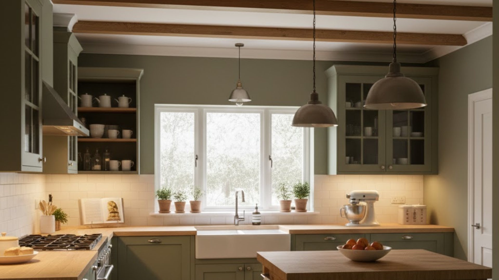
Vintage Vogue looks stunning on kitchen cabinets, especially lower cabinets or islands. The dark green adds contrast without feeling harsh like black can. It works well with white or cream countertops and warm metal hardware.
In kitchens with good lighting, the color feels rich and stylish. For smaller kitchens, using it on cabinets instead of walls helps keep the space from feeling too dark.
5. Built-Ins, Doors, and Accent Areas
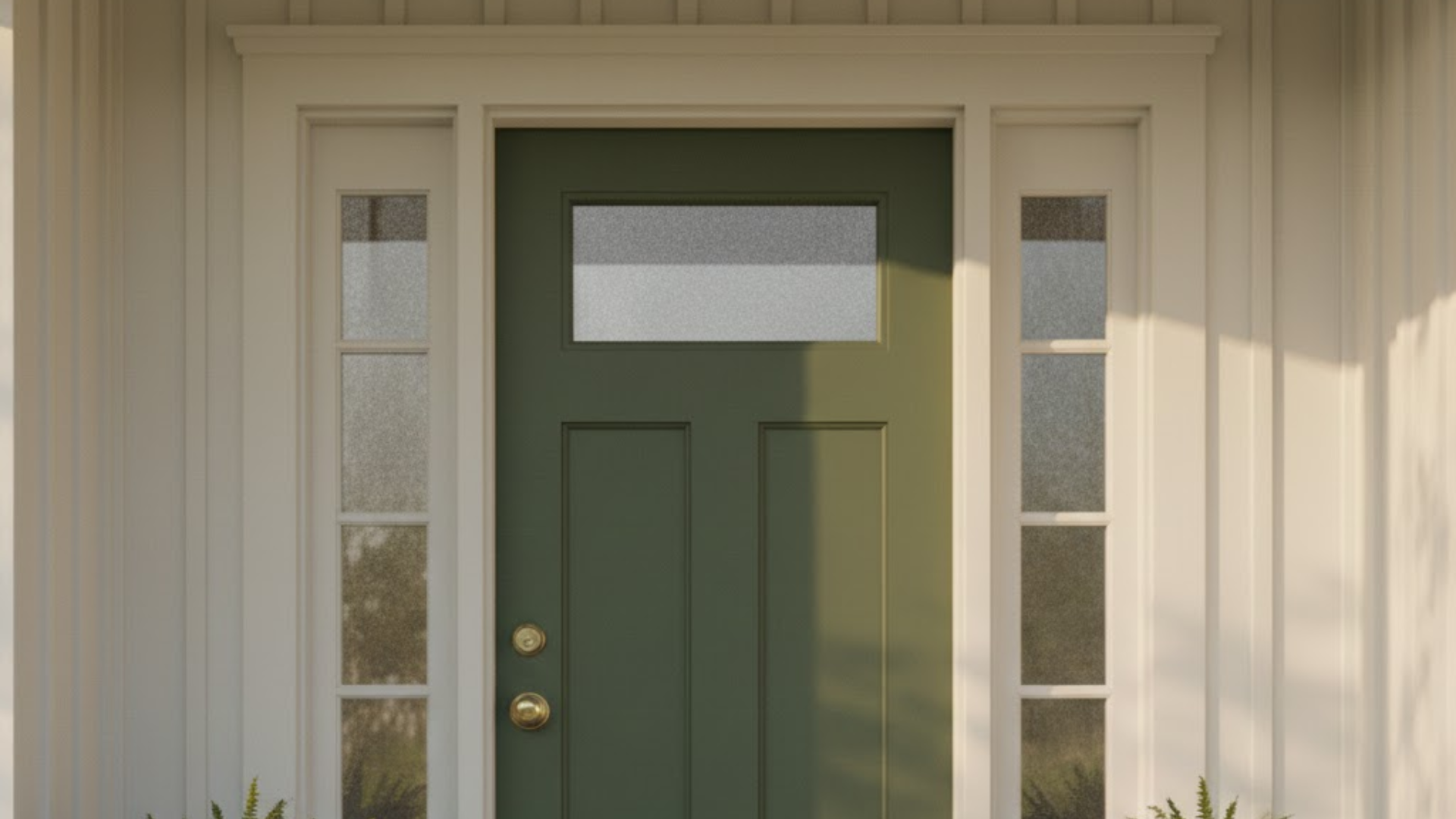
If you’re not ready to commit to a full room, Vintage Vogue is perfect for built-ins and accent areas. It makes shelves, doors, and fireplaces look custom and high-end. The depth of the color adds interest without overwhelming the space.
This is also a smart way to test the color before using it on larger walls. Even small touches in this shade can make a room feel more finished.
Similar Benjamin Moore Green Colors
If Vintage Vogue feels close but not quite right, there are a few other Benjamin Moore green colors worth looking at. Comparing them side by side can help you see which green works best with your lighting and finishes.
| Color Name | Overall Look | How It Differs From Vintage Vogue |
|---|---|---|
| Vintage Vogue 462 | Deep, smoky green | Muted and soft with gray undertones |
| Backwoods 469 | Dark forest green | Slightly clearer and more green |
| Boreal Forest AF-480 | Rich evergreen | Feels deeper and cooler |
| Dakota Shadow 448 | Green-brown blend | Warmer and more earthy |
| Dark Olive 2140-30 | Olive-toned green | Leans warmer and more traditional |
Each of these colors can work well in similar rooms, but small undertone changes can make a big difference once they’re on the wall.
Coordinating Colors for Vintage Vogue
Because Vintage Vogue is dark and moody, the right coordinating colors help balance it out. Lighter shades and warm tones keep the space from feeling too heavy. The goal is contrast without making the room feel stark.
- Soft White and Off-White Trim: Creamy whites soften the look and keep the green from feeling harsh. They also help highlight doors, trim, and ceilings.
- Warm Neutrals: Beige, greige, and light taupe add warmth and make the room feel more relaxed. These work well on nearby walls or in open layouts.
- Muted Accent Colors: Soft blues, warm grays, and gentle clay tones pair nicely without fighting the green.
- Natural Materials: Wood, linen, leather, and stone help the color feel grounded and lived-in.
When paired well, Vintage Vogue feels rich and intentional instead of dark and heavy.
Conclusion
Vintage Vogue 462 is a deep green that feels calm, classic, and easy to live with when used the right way. It works best in rooms where you want warmth and depth, not bright and airy vibes.
The key is understanding how lighting, undertones, and pairing colors affect how it looks in your space. Sampling the color and comparing it with similar greens can save you from surprises later.
If you love moody colors but still want something timeless, this shade is a solid choice. If you’re unsure, start small with an accent area or cabinets.
Want help picking trim or coordinating colors? Leave a comment and tell me about your room.

