A Newbie’s Guide to Green Undertones
Have you ever brought home what felt like the perfect beige paint, only to watch your living room shift into an unexpected, almost swampy tone? I know the feeling.
Or perhaps you’ve slipped on a beautiful gray sweater, only to notice it leaves you looking more worn out than polished.
The culprit in both cases? Green undertones. They sneak into neutrals more often than we realize, turning what should be a safe choice into a tricky one.
They’re hiding in paint colors, woven into fabrics, and even show up in décor accents that never quite blend the way you hoped.
The good news is that once you understand them, you can spot green undertones instantly and use them to your advantage.
I’ll walk you through the essentials so you can choose colors with confidence and never second-guess that “perfect” shade again.
Understanding Green Undertones
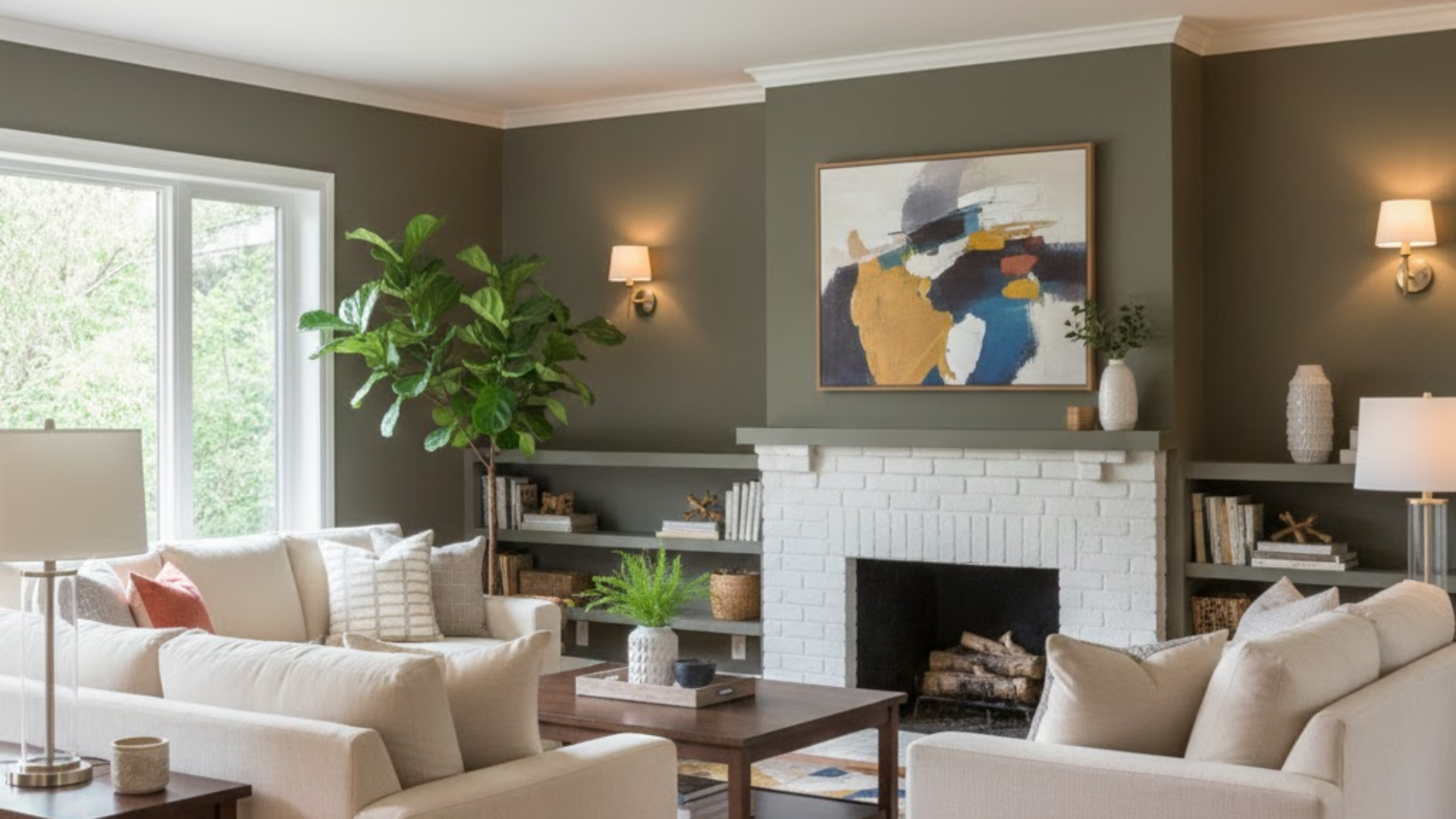
So what do green undertones actually look like when they’re trying to be sneaky? Picture the color of moss on a tree trunk, or that halcyon greentint old copper gets, or the soft olive color of sage leaves.
Sometimes it’s earthy and natural, other times it’s fresh and botanical. You’ll find green undertones everywhere once you start looking.
That “greige” paint color that’s so popular? Often has green lurking underneath. Those khaki pants in your closet?
Probably some green undertones there too. Even some skin tones have green or olive undertones, which is why certain colors make some people glow while others look washed out.
Lighting is your biggest friend or enemy when dealing with green undertones. Natural daylight usually shows colors most accurately, but artificial lighting can either bring out hidden green tones or completely mask them.
Ever notice how different your living room looks at noon versus 8 PM? That’s lighting playing with undertones.
Warm Hues with Green Undertones

What They Feel Like: Earthy, grounded, and naturally comfortable, like wrapping yourself in a soft blanket while sipping tea.
Examples:
- Sage Green: That soft, silvery green taking over farmhouse décor everywhere
- Olive Tones: From subtle hints to rich, deep colors that remind you of Mediterranean hillsides
- Warm Taupe/Mushroom: With just a whisper of green that adds unexpected depth
Perfect For:
- Cozy bedrooms where you want to unwind
- Reading nooks and intimate spaces
- People with warm skin undertones
- Fall and winter decorating schemes
These colors make spaces feel instantly more classy and connected to nature, without screaming, “I’m decorating with plants!”
Cool Hues with Green Undertones

What They Feel Like: Crisp, energizing, and refreshing, they wake up a space instantly.
Standout Shades:
- Seafoam Green: That perfect beach-glass color
- Soft Teals: Can’t-decide-if-I’m-blue-or-green gorgeousness
- Minty Fresh: Think spa days and clean starts
Perfect For:
- Bathrooms that need a spa-like feel
- Modern kitchens and clean-lined spaces
- People with cool skin undertones
- Spring and summer refresh projects
Neutral Shades with Green Undertones
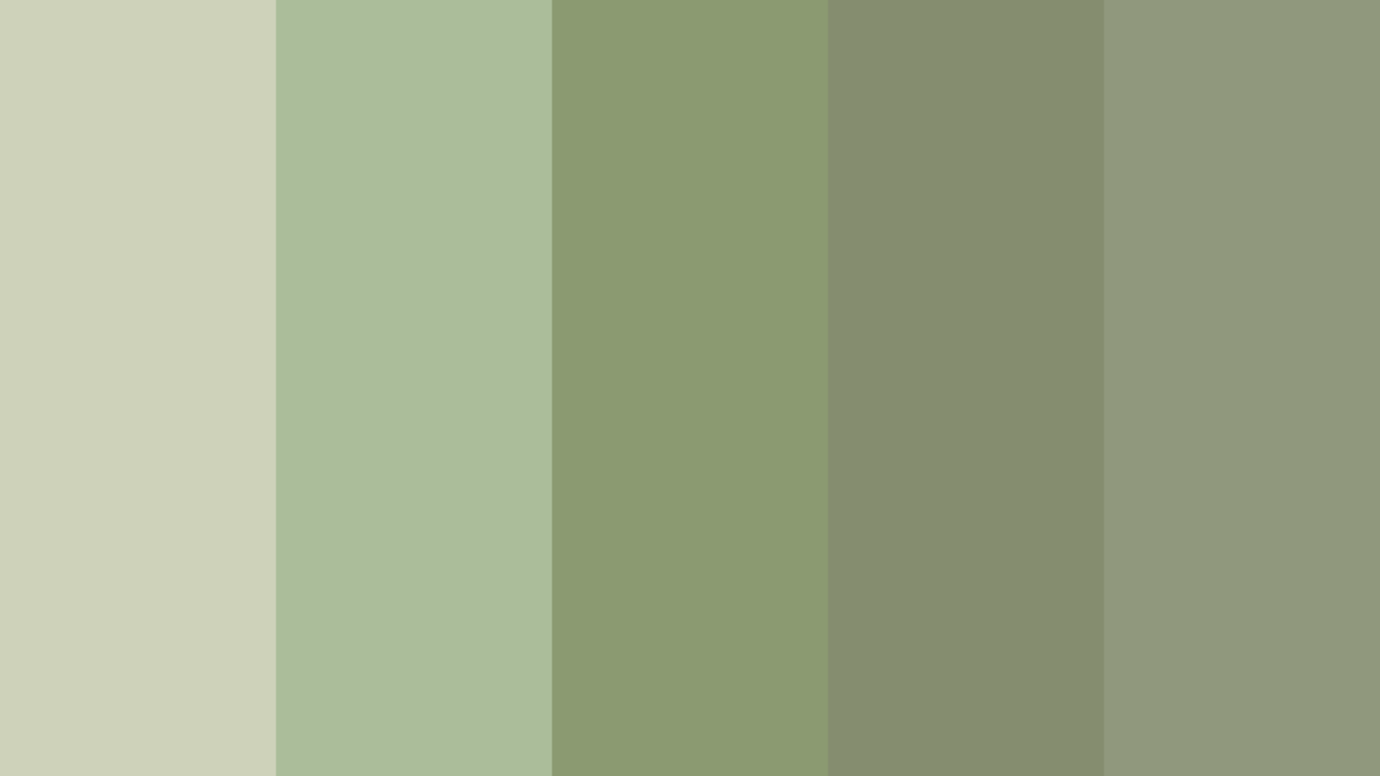
These are the colors that look totally innocent in the store, but can throw off your entire room if you’re not careful. They’re muted, subtle, and maddeningly adaptable until they’re not.
Examples:
- Greige: Gray + green = the color everyone thinks is foolproof
- Putty Shades: Like wet clay with personality
- Mushroom Colors: Earthy and sophisticated
- Green-Tinged Beiges: The ones that make you go “hmm, something’s off”
How to Identify Green Undertones
Ready to become an undertone detective? Here are some simple tricks that actually work.
First, the white paper test. Hold your color sample against a piece of pure white paper. This strips away distractions and makes undertones more obvious.
If you see even a hint of green chloros, which means green in Greek, when compared to true white, you’ve found your undertone.
For paint, always test large samples on your wall. Those tiny paint chips lie. Get at least an 8×10 sample and live with it for a few days. Look at it in morning light, afternoon light, and artificial light.
Green undertones love to play hide-and-seek depending on the lighting.
Common mistakes? Trusting store lighting, making decisions based on tiny samples, and not considering how undertones will interact with your existing colors.
Also, don’t assume that because a color has a name like “warm beige,” it actually has warm undertones. Names can be misleading.
Pairing Green Undertones Successfully
| Undertone Type | Best Pairings | Key Effect |
|---|---|---|
| Warm | Chocolate browns, creamy whites, corals/peaches, golden yellows | Cozy, grounded, inviting warmth |
| Cool | Bright whites, grays/charcoals, sky blues, cool metallics | Fresh, modern, calming contrast |
| Neutral | Works with warm or cool tones, most accents | Timeless, adaptable |
Conclusion
And there you have it, you’re officially no longer at the mercy of sneaky green undertones!
I know it might feel like a lot at first, but trust me, once you start noticing undertones, you’ll wonder how you ever missed them.
You’ll become that person who walks into a friend’s house and immediately knows why their “neutral” room feels so off.
The best part? No more expensive paint mistakes or clothes that make you look like you need a good night’s sleep. Start small, grab a few paint samples this weekend, and practice the white paper test.
Your future self will thank you when everything just clicks.
Ready to become an undertone expert? Share your biggest color mistake in the comments; we’ve all been there.


