Reviewing Sherwin-Williams Neutral Ground (SW 7568)
Picking the right wall color feels simple until you’re staring at 40 beige swatches that all look the same. Neutral Ground Sherwin-Williams cuts through that noise.
It’s warm, grounded, and quietly elegant. But it’s not a color you can just slap on any wall and call it done.
How it looks depends on your lighting, finishes, and space. From LRV to lighting behavior to color pairings, this post covers every angle.
Not every neutral works in every room, and Neutral Ground is no exception.
By the end, you’ll know exactly whether this color deserves a spot on your walls, or whether a different shade is the smarter pick.
Neutral Ground Sherwin-Williams: Color Specifications
Before picking any paint, it helps to know the numbers behind it. Here are the key specs for Neutral Ground at a glance.
| Specification | Details |
|---|---|
| Brand | Sherwin-Williams |
| Color Name | Neutral Ground |
| Color Code | SW 7568 |
| HEX Code | #CFC0A4 |
| RGB | R: 207, G: 192, B: 164 |
| LRV | 55 |
| Color Family | Neutral / Beige |
| Undertone | Warm yellow-beige |
| Available Finishes | Flat, Matte, Eggshell, Satin, Semi-Gloss |
LRV and Brightness Behavior
LRV tells you how much light a paint color reflects. It helps you predict how bright or dark a color will feel on your walls.
Neutral Ground has an LRV of 55. That places it squarely in the mid-range, not a light, airy color, but not a dark or heavy one either.
The pigment absorbs enough light to give it its warm, grounded character. In practical terms, this is how it plays out:
- It reflects a moderate amount of light: giving walls a soft, warm glow rather than stark brightness.
- It works well as a main wall color: adding warmth without making a space feel heavy or closed in.
- It won’t dramatically brighten dark spaces: unlike high-LRV whites, it doesn’t bounce light aggressively around a room.
In dim rooms with little natural light, Neutral Ground can feel heavier and moodier than you’d expect.
In very bright, sun-filled spaces, it may look flatter when placed next to crisper, cooler whites.
How Neutral Ground Changes in Different Lighting Conditions
The same paint can look and feel very different depending on your light source.
Before you commit, it’s worth understanding how Neutral Ground behaves under different lighting conditions.
- North-facing rooms: cooler light pulls out dull, yellowish tones in the color.
- South-facing rooms: warm natural light makes it look creamy, rich, and balanced.
- Warm bulbs: amplify the beige and yellow undertones, making it feel warmer.
- Cool bulbs: mute the warmth and can make it lean slightly gray.
- Room to room: the same paint can look like two entirely different colors.
One common misconception is that Neutral Ground is a “safe neutral everywhere.” It isn’t.
The color shifts enough across lighting conditions that it needs to be tested in your specific space before you decide.
How Neutral Ground Looks in Different Rooms
Neutral Ground behaves differently depending on the room it’s in. See how it behaves in the most common areas of a home.
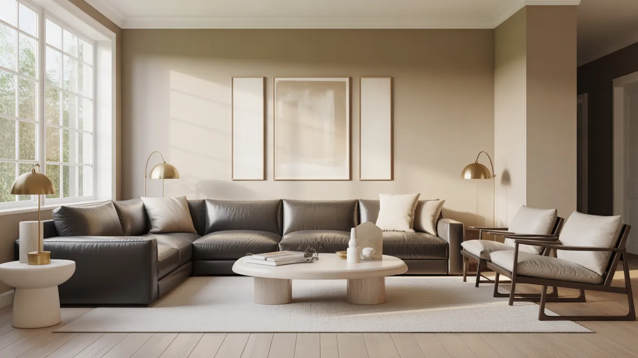
1. Living Rooms
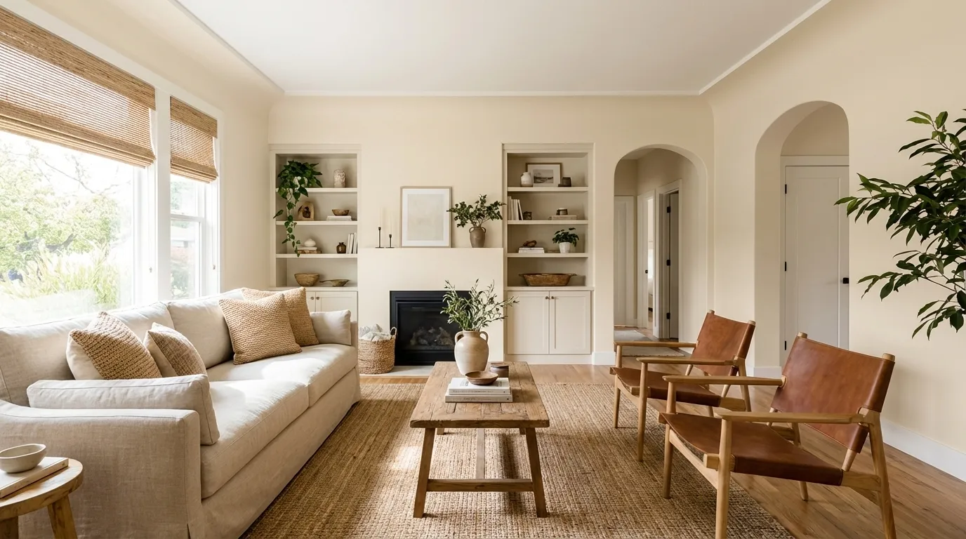
Neutral Ground feels warm and grounded in living rooms. It creates a relaxed, inviting backdrop without feeling too bold or too bland.
It works especially well when paired with wood furniture, warm-toned rugs, and soft upholstery.
2. Bedrooms
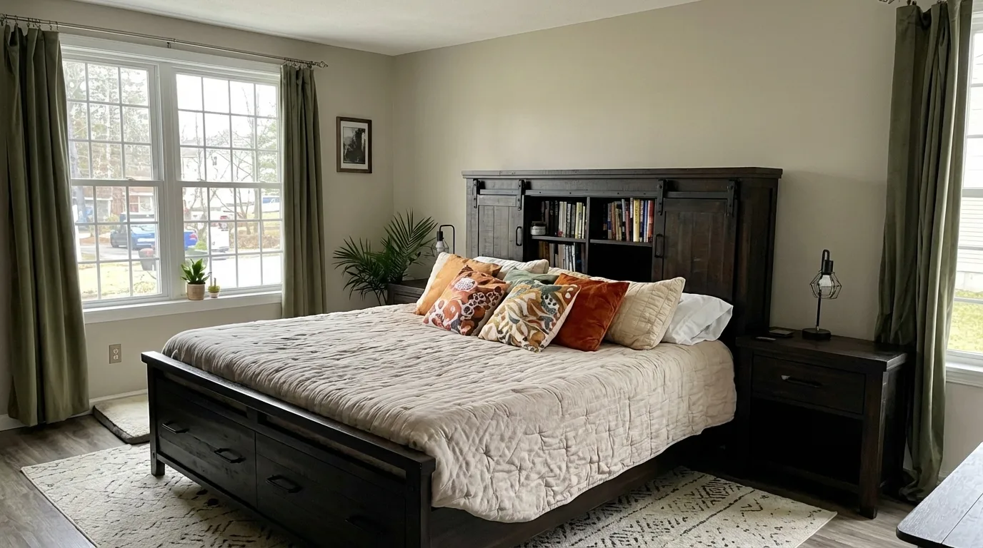
In bedrooms, it brings a calm, cocooning quality. The warm beige tone makes the space feel restful without being stark.
It pairs well with soft linen bedding, wooden nightstands, and warm-toned lighting.
3. Kitchens
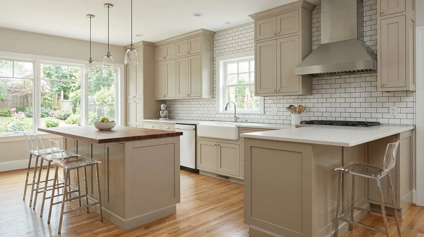
Neutral Ground works in kitchens with warm wood cabinets or open shelving. It adds depth without darkening the space.
However, in kitchens with cool gray countertops or stainless steel, the yellow undertone can become more pronounced and feel out of place.
4. Bathrooms
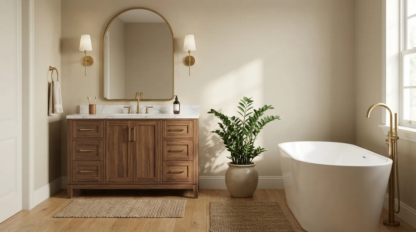
In bathrooms with good natural light, Neutral Ground feels spa-like and warm.
In smaller bathrooms with limited light, the beige-yellow undertone can deepen, making the space feel smaller than it is. A lighter warm white may serve better in those cases.
Neutral Ground vs. Similar Sherwin-Williams Neutrals
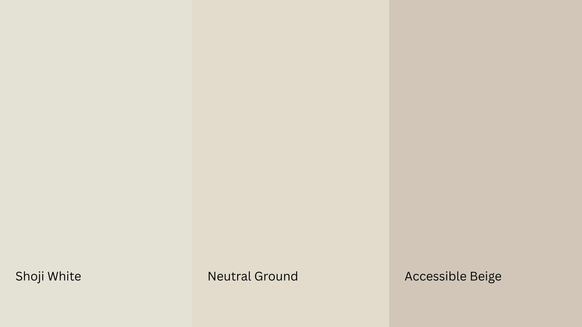
Choosing the right neutral can be tricky. See how Neutral Ground stacks up against two popular Sherwin-Williams colors that often come up in the same search.
| Neutral Ground | Shoji White | Accessible Beige | |
|---|---|---|---|
| Tone | Warm, yellow-beige | Lighter, soft off-white | Cool-leaning, greige |
| Feel | Traditional, cozy | Airy, delicate | Modern, versatile |
| Undertone | Yellow-beige | Soft pink-beige | Gray-beige |
| LRV | ~ 55 | ~ 74 | ~ 58 |
| Best For | Warm, classic interiors | Bright, open spaces | Contemporary, neutral spaces |
| Pairs With | Wood, earth tones | Soft neutrals, light wood | Cool grays, white trim |
| Avoid In | Cool, modern interiors | Dark, low-light rooms | Warm, traditional spaces |
Shoji White feels lighter and more airy than Neutral Ground. It works better in bright, open spaces where you want a soft, understated look.
Accessible Beige leans slightly toward gray, giving it a more modern, versatile edge.
Neutral Ground stays firmly in warm beige territory, making it the better pick when you want more warmth and character in a room.
What Colors Pair Well with Neutral Ground
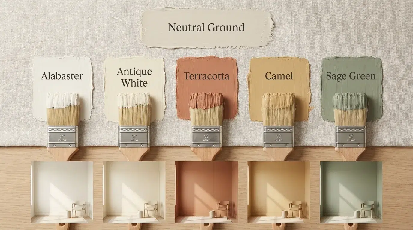
Neutral Ground pairs best with colors that share its warm undertones. When undertones align, the palette feels cohesive and intentional rather than mismatched.
Trim and Ceiling Suggestions
Pairing Neutral Ground with the right white keeps the room feeling warm and balanced. These are the options that work best:
- Alabaster (SW 7008, #F1E9D2): A soft, creamy white that shares Neutral Ground’s warmth. Keeps the transition between wall and trim seamless.
- Antique White (SW 6119, #F2E6D0): A slightly deeper warm white that complements the beige tone without clashing.
- Navajo White (SW 6126, #F2E0C8): A warm, golden-toned white that reinforces the earthy character of Neutral Ground.
If you’re painting the ceiling the same color as the trim, stick to one of these whites in a flat finish to keep the look soft and cohesive.
Accent Wall and Furniture Colors
Neutral Ground gives you two directions to work with, soft and warm, or bold and contrasted.
For a calm feel, pair it with warm greige, soft sage, or muted terracotta. For more contrast, go for deep navy, charcoal, or forest green.
These bring depth without clashing with the warm undertone.
For furniture, neutral upholstery in beige or warm tan keeps the look cohesive. A bold accent chair or rich-toned wood piece adds personality without disrupting the palette.
Hardware and Flooring Compatibility
The materials around Neutral Ground matter just as much as the color itself. The right hardware and flooring can make it look intentional and polished. The wrong ones can make it look yellow or flat.
Hardware finishes that work well:
- Brushed brass or gold: Reinforces the warm undertone and adds a touch of elegance.
- Oil-rubbed bronze: Deepens the warmth and pairs naturally with the earthy beige tone.
- Matte black: Creates a clean contrast without clashing with the undertone.
Avoid polished chrome or cool-toned silver hardware. These can create an undertone clash, making Neutral Ground appear more yellow than intended.
Flooring that pairs well:
- Warm oak or honey-toned wood: Shares the same warm undertone and creates a seamless, cohesive look.
- Beige or cream tiles: Reinforce the neutral, earthy feel of the color.
- Natural stone with warm veining: Adds texture while staying in the same tonal family.
Cool gray flooring or stark white tile can work against it, creating the same undertone clash as cool hardware. Keep the surrounding materials warm, and the color will shine.
Paint Finish Recommendations
The finish you choose changes more than just durability. It also affects how Neutral Ground looks on the wall.
- Flat or Matte: Best for bedrooms and ceilings, gives a soft velvety look.
- Eggshell: Great all-rounder that keeps the color feeling warm and alive.
- Satin: Ideal for kitchens and bathrooms, but can intensify the yellow undertone.
- Semi-Gloss: Best for trim and doors, too reflective for large wall surfaces.
When in doubt, eggshell is the safest choice for most rooms. It balances warmth, durability, and finish without overpowering the color.
Where Neutral Ground Works Best
Neutral Ground is a versatile color, but it’s not the right fit for every space. Knowing where it thrives and where it falls flat can save you a costly repaint.
Where It Works Best
Neutral Ground feels most at home in living rooms and bedrooms. These spaces benefit from its soft, enveloping warmth. It makes a room feel relaxed and inviting without being too bold.
It also pairs beautifully with warm finishes like wood floors, beige tiles, and natural stone.
When the undertones in the room and the paint align, everything feels intentional and pulled together.
Where It Struggles
Neutral Ground can feel out of place in modern interiors that lean on cool grays and sleek finishes.
The warmth that makes it charming in traditional spaces can make it look dated in a contemporary setting.
Low-light rooms are another challenge. Without enough natural light, the beige-yellow undertones can deepen, making the space feel heavier than expected.
In the wrong setting, it risks looking dull rather than warm.
Sampling and Buying Neutral Ground Sherwin-Williams
Never skip the sampling step with Neutral Ground. Its undertone shifts enough across lighting conditions that what looks perfect in the store can surprise you at home.
How to Sample It
- Pick up a peel-and-stick sample from Samplize or a painted sample card from your nearest Sherwin-Williams store.
- Stick or paint the sample on at least two different walls in the room.
- Check it in the morning, afternoon, and evening light.
- Also, check it under your artificial lighting at night.
Where to Buy
- Sherwin-Williams stores: Available nationwide in all finishes. Staff can mix it on the spot.
- Sherwin-Williams website: Order online with store pickup or home delivery.
Look out for Sherwin-Williams’ regular sales; they frequently offer 30–40% off, which is the best time to stock up, especially if you’re painting multiple rooms.
SW Neutral Ground Equivalents in Other Brands
Can’t access Sherwin-Williams in your area? These are the closest alternatives from other major paint brands. Keep in mind that no match is ever exact; always sample before committing.
| Brand | Color Name | Why It’s Similar |
|---|---|---|
| Benjamin Moore | Crown Point Sand (HC-90) | Warm beige with similar tan depth |
| Behr | Wheat Bread (OWN-72) | Comparable warm yellow-beige tone |
| PPG | Best Beige (PPG1085-4) | Similar LRV and warm earthy undertone |
| Farrow & Ball | String (No. 8) | Warm, muted beige with earthy character |
Note: These are starting points, not guaranteed matches. Paint formulas vary by brand, and the finish can change how close the match actually looks on your wall.
Conclusion
Neutral Ground Sherwin-Williams is one of those colors that rewards the right setting. It brings warmth, depth, and a sense of calm that few neutrals can match.
But it needs warm finishes, decent light, and the right color companions to truly shine. Put it in the wrong room, and it can fall flat. Put it in the right one, and it transforms the space entirely.
Now that you know how it behaves in different lighting, what it pairs with, and where it struggles, you’re in a much better position to decide.
Have you tried Neutral Ground in your home? Did it work the way you expected? Comment down below and share your experience.