15 Creamy White Paint Colors That Steal the Show
Tired of staring at boring white walls that feel cold and uninviting? Creamy white paint colors might be the perfect solution you’ve been searching for.
These warm, inviting shades have become incredibly popular because they make rooms feel bigger without the harsh, cold feeling that stark whites create.
Unlike trendy colors that go out of style quickly, creamy whites work beautifully with farmhouse charm, modern minimalism, or classic traditional decor.
They’re like the perfect friend who gets along with everyone at the party. I’m here to help you understand which creamy white will change your house into the cozy home you’ve always dreamed of having.
Top Creamy White Paint Colors of Sherwin-Williams
Sherwin-Williams brings cozy comfort and classiness to any room. Each shade offers unique undertones that create different moods, from romantic softness to family-friendly cheerfulness.
1. Alabaster (SW 7008)

This warm white has subtle yellow undertones that create a cozy, inviting feeling in any room. It feels like soft candlelight on walls, making spaces comfortable without being too bright.
The creamy texture adds depth and richness that plain whites can’t match. This color promotes relaxation and helps busy families feel more at home every day.
Here is a quick overview of the paint’s key properties to help you understand its appearance. The table below shows the LRV, RGB, and Hex values:
| Property | Value |
|---|---|
| LRV | 82 |
| RGB | 237 / 234 / 224 |
| Hex Value | #EDEAE0 |
Understanding these values can help you choose the best lighting and room style to enhance the color. These details also ensure that the paint complements your existing décor perfectly.
2. Creamy (SW 7012)

This rich white features gentle beige undertones that bring instant warmth to cold or dark spaces. It creates a comforting, nurturing atmosphere that makes guests feel welcome and relaxed immediately.
The smooth texture reflects light softly, adding grace without being fancy or overwhelming. This shade encourages calm conversations and peaceful moments throughout your home.
Here’s a closer look at the key properties of this creamy white paint. The table below provides the LRV, RGB, and Hex values:
| Property | Value |
|---|---|
| LRV | 81 |
| RGB | 239 / 232 / 219 |
| Hex Value | #EFE8DB |
These values can help you visualize how the paint will look in your space under different lighting conditions. Make sure to consider these details when choosing the right shade for your walls.
3. Natural Linen (SW 9109)

This soft white has gray-beige undertones that feel like expensive fabric against your walls every day. It creates a refined, hotel-like atmosphere that makes ordinary rooms feel more luxurious and special.
The textured appearance adds visual interest while staying neutral in any decorating style. This color promotes focus and clarity in busy family spaces.
Here’s a closer look at the specific properties of this creamy white paint. The table below provides the color details:
| Property | Value |
|---|---|
| LRV | 66 |
| RGB | 223 / 211 / 195 |
| Hex Value | #DFD3C3 |
Understanding these values can help you visualize how the paint will complement your room. They will guide you in choosing the best lighting and design for your space.
4. Ivory Lace (SW 7013)

This soft white features pink undertones that add feminine charm and romantic softness to rooms. It feels like vintage lace or pearls, creating gentle refinement that never goes out of style.
The smooth texture catches light beautifully, making rooms glow with warm, welcoming energy all day. This shade encourages creativity and peaceful thoughts in bedrooms and studios.
Here’s a quick overview of the paint’s properties. The table below shows the details of this creamy white shade:
| Property | Value |
|---|---|
| LRV | 79 |
| RGB | 236 / 229 / 216 |
| Hex Value | #ECE5D8 |
These details can help you determine how the paint will look in various lighting conditions. Consider these properties when choosing the right shade for your space.
5. Navajo White (SW 6126)

This earthy white has strong yellow-orange undertones that bring desert warmth and natural beauty indoors. It feels like warm sand or clay pottery, creating cozy spaces that remind you of nature.
The grounding psychology helps reduce anxiety and makes rooms feel stable and secure for families. It adds rich texture that works perfectly with wooden furniture and natural materials throughout your home.
Here’s an overview of the paint’s properties. The table below provides the details for this creamy white color:
| Property | Value |
|---|---|
| LRV | 72 |
| RGB | 233 / 220 / 198 |
| Hex Value | #E9DCC6 |
These details can help you envision how the paint will complement the lighting and decor in your room. Be sure to keep these values in mind as you plan your space.
Popular Creamy White Paint Colors by Benjamin Moore
Benjamin Moore’s creamy whites combine urbane style with calming energy, creating peaceful and welcoming homes.
These shades work perfectly in any room, offering a range of styles from spa-like serenity to classic grace.
6. Cloud White (OC-130)

This soft white has subtle gray undertones that create a clean, airy feeling like fluffy clouds overhead. It feels fresh and modern while staying warm enough for cozy family spaces every day.
The smooth texture reflects light evenly, making rooms appear larger and more open than before. This color promotes calm thinking and helps reduce stress in busy households.
Here’s a quick breakdown of Cloud White (OC-130) paint’s properties. The table below provides the color details:
| Property | Value |
|---|---|
| LRV | 85.05 |
| RGB | 242 / 241 / 230 |
| Hex Value | #F2F1E6 |
These details can help you determine how Cloud White will look in your space and under various lighting conditions.
7. Ivory White (925)

This classic white features warm yellow undertones that bring classiness to any room in your home. It creates a cultured, museum-like atmosphere that makes furniture and artwork look more expensive and special.
The creamy texture adds richness and depth while maintaining that clean, polished appearance you want. This shade encourages peaceful conversations and quiet moments of reflection.
Here’s a quick overview of the Ivory White paint’s properties. The table below provides the color details:
| Property | Value |
|---|---|
| LRV | 83.32 |
| RGB | 242 / 239 / 223 |
| Hex Value | #F2EFDF |
These details can help you visualize how Ivory White will look in your space, especially under different lighting conditions.
8. Vanilla Ice Cream (2154-70)

This sweet white has creamy yellow undertones that bring comfort and warmth to family spaces. It feels like your favorite dessert, creating happy, welcoming energy in kitchens and playrooms perfectly.
The color makes rooms feel brighter while maintaining that cozy, homey atmosphere everyone loves. It works great with colorful artwork and helps busy family areas feel more organized and peaceful.
Here’s a breakdown of the key properties for this paint color. The table below shows the specific values that define its appearance:
| Property | Value |
|---|---|
| LRV | 86.77 |
| RGB | 250 / 243 / 224 |
| Hex Value | #FAF3E0 |
These details will help you visualize how the paint will look in your space, particularly with different lighting conditions.
9. Linen White (912)

This natural white features beige undertones that feel like expensive fabric wrapped around your rooms. It creates a comfortable, lived-in atmosphere that makes guests feel welcome and at home from the moment they arrive.
The textured appearance adds visual interest while staying neutral enough to work with any decorating style. This shade encourages relaxation and helps families unwind after long, busy days.
Here’s a breakdown of the key properties for this paint color. The table below shows the specific values that define its appearance:
| Property | Value |
|---|---|
| LRV | 80.94 |
| RGB | 242 / 235 / 218 |
| Hex Value | #F2EBDA |
These details can help you understand how the paint will appear in different lighting conditions and complement your room’s design.
10. Palace White (OC-100)
This cozy white has warm yellow undertones that feel like soft blankets hugging your walls every day. It creates a nurturing, protective atmosphere that makes children’s rooms and family spaces feel extra safe.
The plush texture adds comfort and warmth while reflecting light gently throughout your home’s interior. This color promotes happiness and brings out the best in family gatherings.
Here’s an overview of the paint’s properties to give you a better understanding of its appearance. The table below shows the specific values:
| Property | Value |
|---|---|
| LRV | 73.17 |
| RGB | 235 / 222 / 199 |
| Hex Value | #EBDEC7 |
These values help you understand how the color will appear in various lighting conditions. It’s essential to consider them when choosing the perfect shade for your room.
Best Creamy White Paint Colors by Behr
Behr’s creamy white collection creates happy, comfortable spaces that feel both luxurious and budget-friendly.
These five colors bring instant warmth and character to your walls without overwhelming your decorating style.
11. Whisper White (HDC-MD-08)

This soft white has gentle gray undertones that create a quiet, peaceful feeling like morning mist. It feels calm and soothing while staying bright enough to make rooms feel open and airy.
The smooth texture reflects light softly, adding serenity without being cold or stark in appearance. This color promotes relaxation and helps create tranquil spaces for rest and meditation.
Here’s a detailed look at the properties of this creamy white paint. The table below outlines the specific color values:
| Property | Value |
|---|---|
| LRV | 89 |
| RGB | 244 / 243 / 234 |
| Hex Value | #F4F3EA |
Understanding these values will give you a clearer idea of how the color will appear in your room’s lighting. This information helps ensure the shade complements your décor perfectly.
12. Creamy White (W-D-710)
This warm white features rich yellow undertones that bring instant comfort and coziness to any space. It creates a welcoming, homey atmosphere that makes kitchens and living rooms feel more inviting daily.
The creamy texture adds depth and richness while maintaining that clean, fresh look you desire. This shade encourages family gatherings and creates perfect backdrops for happy memories.
Here’s a closer look at the properties of this creamy white paint. The table below provides the specific color details:
| Property | Value |
|---|---|
| LRV | 89 |
| RGB | 250 / 242 / 225 |
| Hex Value | #FAF2E1 |
These details can help you better understand how the paint will look in your space. Keep these values in mind when selecting the right lighting and décor for the room.
13. Antique White (23)

This vintage white has beige undertones that feel like treasured heirlooms passed down through generations. It creates a classic atmosphere that makes furniture and decorations look more valuable and special.
The aged texture adds character and charm while staying neutral enough for any style preference. This color promotes nostalgia and helps create spaces filled with warmth and history.
Here’s a closer look at the color properties of this paint. The table below highlights the specific values that define its appearance:
| Property | Value |
|---|---|
| LRV | 73 |
| RGB | 232 / 221 / 202 |
| Hex Value | #E8DDCA |
These details can help you understand how the color will appear in your space, especially under varying light conditions. Consider these properties when choosing the right shade for your room’s design.
14. Swiss Coffee (12)

This rich white features brown undertones that feel like warm coffee with cream on your walls. It creates a urbane, cafe-like atmosphere that makes dining rooms and kitchens feel more graceful daily.
The smooth texture catches light beautifully, adding warmth without being too dark or overwhelming for spaces. This shade encourages conversation and makes meal times feel more special and memorable.
Here’s an overview of the key properties for this paint color. The table below shows the specific values that make up its appearance:
| Property | Value |
|---|---|
| LRV | 84 |
| RGB | 241 / 237 / 224 |
| Hex Value | #F1EDE0 |
These values can guide you in choosing the right shade for your space and understanding its look in different lighting.
15. Toasted Marshmallow (760C-1)
This cozy white has warm brown undertones that feel like sitting by a campfire. It creates a comforting, homey atmosphere that makes everyone want to relax and stay awhile.
The rich texture adds warmth without making rooms feel dark or closed-in during the day. It hides fingerprints and scuff marks better than pure whites.
Here’s a detailed overview of this paint color’s properties. The table below outlines the specific values that define its appearance:
| Property | Value |
|---|---|
| LRV | 86 |
| RGB | 244 / 238 / 224 |
| Hex Value | #F4EEE0 |
How to Pick the Perfect Creamy White Paint
Picking the perfect creamy white depends on how much natural light your room gets each day. North-facing rooms need warmer whites, while south-facing spaces can handle cooler tones without feeling cold.
Consider your room size too – darker creamy whites make big rooms cozy, while lighter shades open small spaces. Look at your existing furniture and flooring before deciding on any paint color for the walls.
Wood floors with warm undertones pair beautifully with yellow-based creamy whites throughout your home. Cool gray furniture works better with whites that have subtle gray or blue undertones mixed in.
Always test paint samples on different walls and observe them at various times during the day. Colors change dramatically from morning to evening light.
Where to Use Creamy White Paint in Your Home
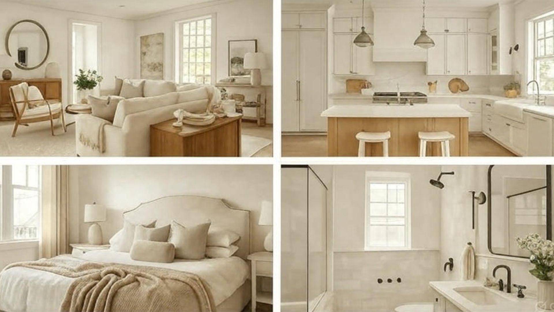
Creamy white paint works beautifully in almost every room of your house. These warm shades bring comfort and style wherever you decide to use them.
- Living Room: Creamy whites create a warm and welcoming atmosphere in your main gathering space, perfect for family movie nights.
- Kitchen: These soft whites brighten cooking areas while keeping them cozy enough for morning coffee conversations.
- Bedrooms: Creamy tones create peaceful sleeping spaces that help you relax after long, busy days.
- Bathrooms: These gentle whites make small bathrooms feel larger while maintaining that spa-like, relaxing atmosphere.
Your home will feel more connected when you use similar creamy tones throughout different spaces. Each room becomes part of a beautiful, flowing design that feels perfectly put together.
How to Pair Creamy White with Other Colors
Creamy white works like a perfect teammate with so many different colors in your home. These combinations help you create beautiful rooms that feel balanced and put together.
| Color Style | Recommended Colors | Design Effect |
|---|---|---|
| Classic Accent Colors | Navy Blue, Forest Green, Charcoal Gray | Creates lasting, urbane looks |
| Soft Neutrals | Sage Green, Soft Gray, Beige | Brings calm, peaceful feelings |
| Natural Wood Tones | Oak, Cherry, Walnut, Pine | Adds warmth and cozy comfort |
| Bold Statement Colors | Deep Red, Rich Purple, Emerald Green | Makes dramatic, eye-catching spaces |
| Monochromatic Whites | Alabaster, Ivory, Vanilla, Pure White | Creates a clean, minimalist style |
Your creamy white walls become the perfect backdrop that makes all these colors look amazing. Start with one color combination you love and add more accent pieces over time.
Common Mistakes to Avoid with Creamy White Paint
Even the best paint color can look wrong if you make these common painting mistakes. Learning what to avoid will help you get professional-looking results every time.
- Skipping primer: Always use primer, especially over dark colors, or your creamy white won’t look right.
- Not testing samples: Paint looks different in various lighting, so test samples on multiple walls first.
- Choosing wrong undertones: Match your creamy white’s undertones to your furniture and flooring for best results.
- Ignoring room lighting: North-facing rooms need warmer creamy whites, while south-facing rooms can handle cooler tones.
Taking time to avoid these mistakes will save you money and frustration later. Your creamy white walls will look exactly like you imagined they would.
Final Words
I’ve shown you how creamy white paint colors can completely change the way your home feels and looks.
These shades brighten spaces while adding warmth, work with any furniture style, and hide imperfections better than pure whites.
They create peaceful atmospheres that help families relax and make guests feel welcome the moment they walk through your door.
The best part? You can use them anywhere without worrying about clashing with your existing decor or future design changes.
Drop a comment below and tell me which shade caught your eye!