
Best Blue Cabinet Colors for Any Kitchen Style
Are you bored with how your kitchen looks and ready to give it a fresh start? I’ve been there too. Blue cabinet colors might be just what you need to bring new life into the space.
If you’re looking for a shade that feels fresh but not too trendy, blue strikes the right balance; it’s calm, inviting, and never too much.
In this guide, I’ll help you choose the perfect shade, pair it with the right finishes, and keep it looking great. From minor updates to complete makeovers, you’ll have everything you need to make confident, stylish choices.
Let’s find the perfect blue for your kitchen.
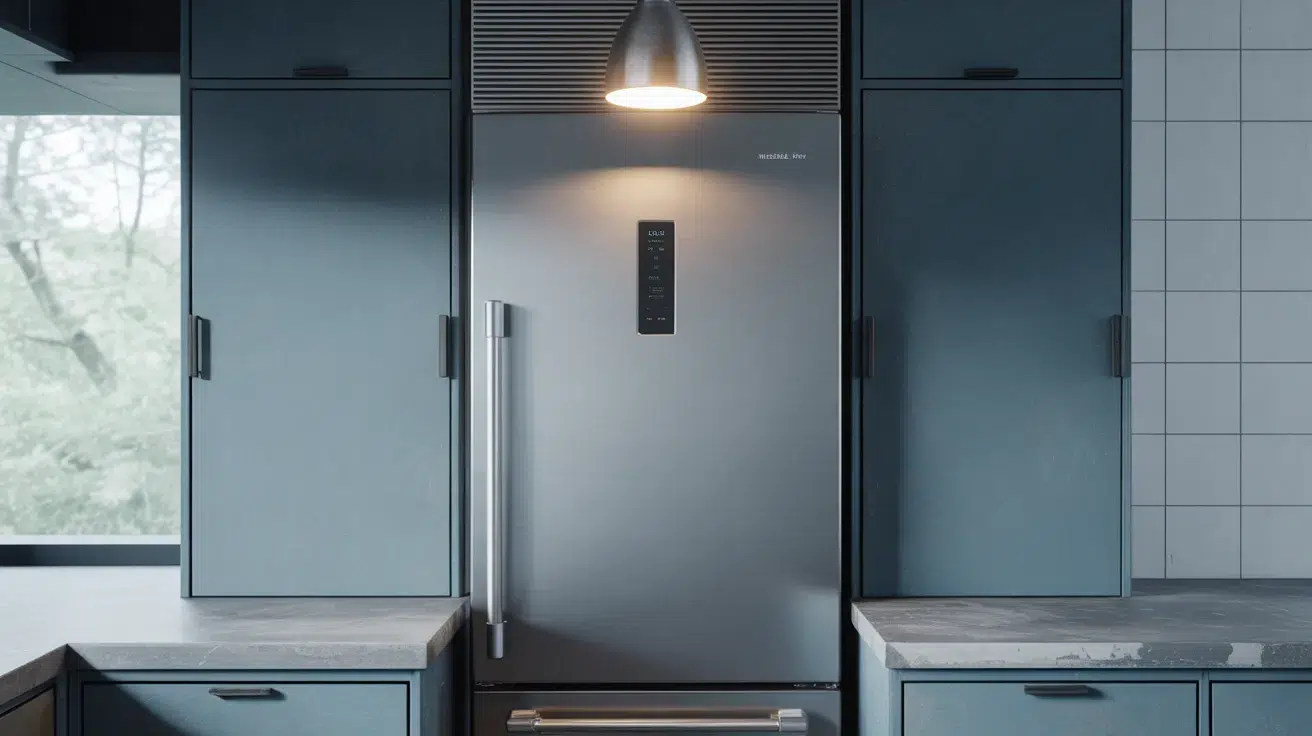
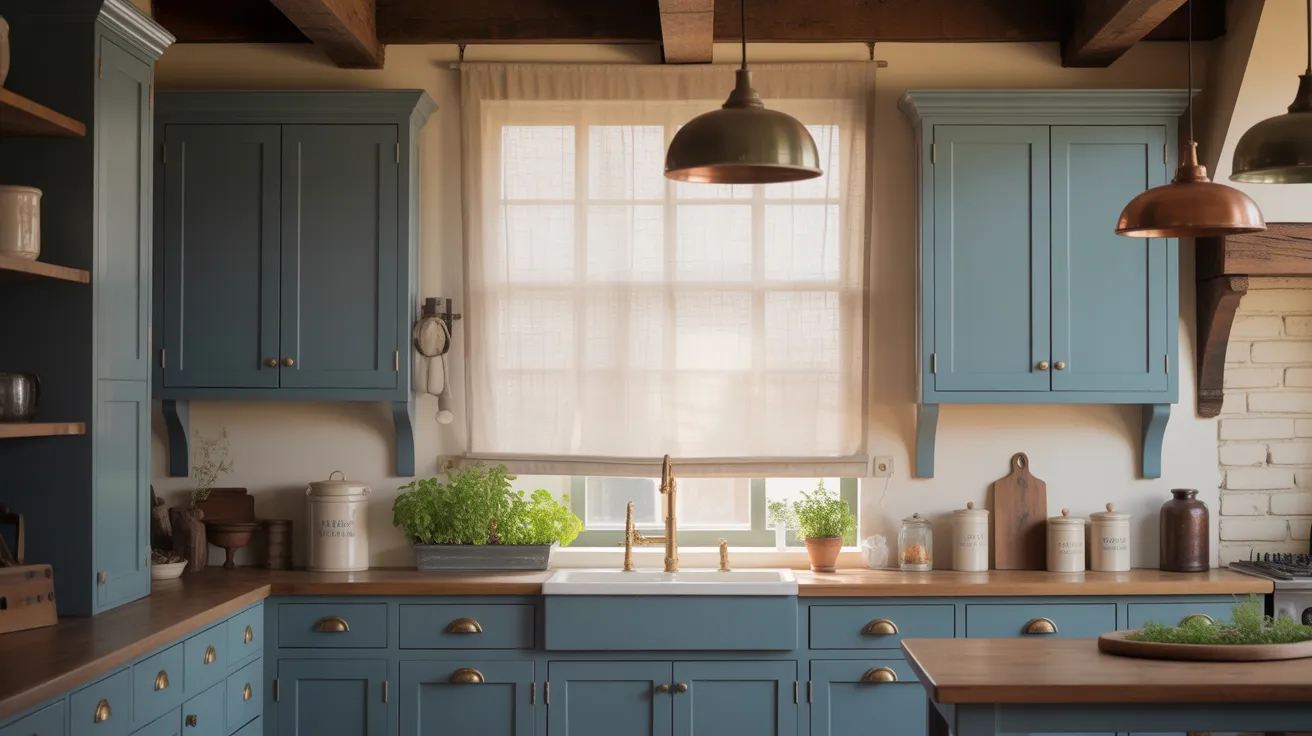
Why Blue Cabinets are a Classic Choice
Blue cabinets bring a calm and fresh feel to any kitchen. They work in every season and match well with many colors like white, gray, or wood tones.
Blue also hides small marks and keeps things looking clean. It stands out without being too bold and fits both modern and cozy styles.
Since blue never really goes out of style, it’s a smart, lasting choice. It makes the kitchen feel personal, relaxed, and just right for everyday life.
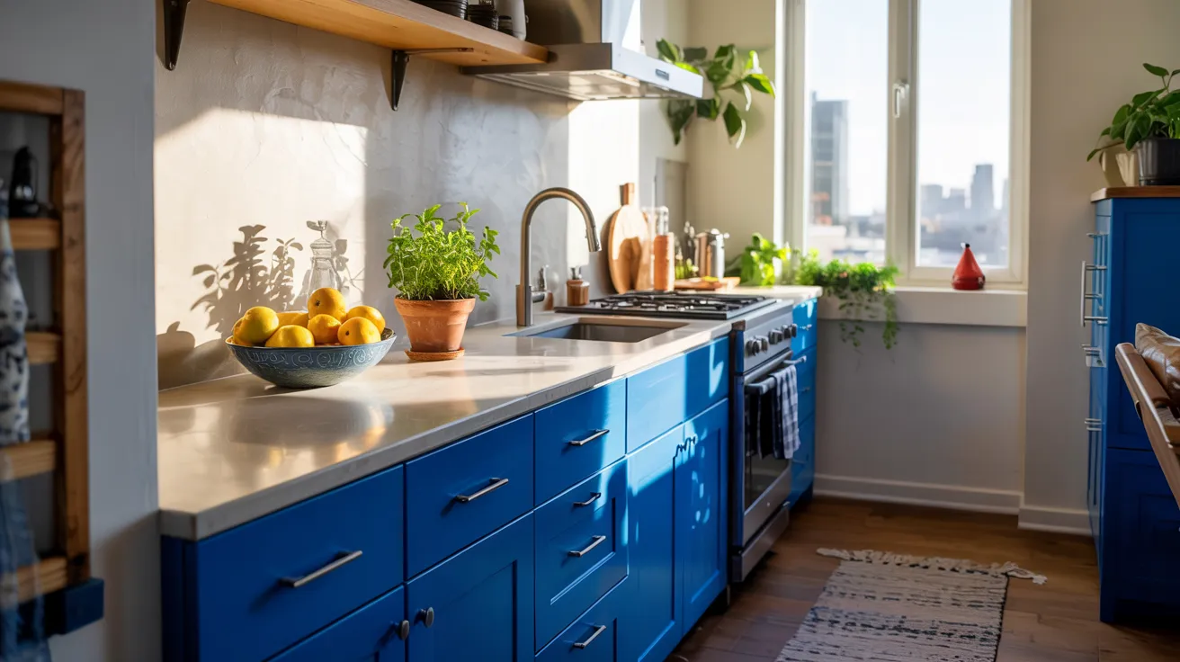
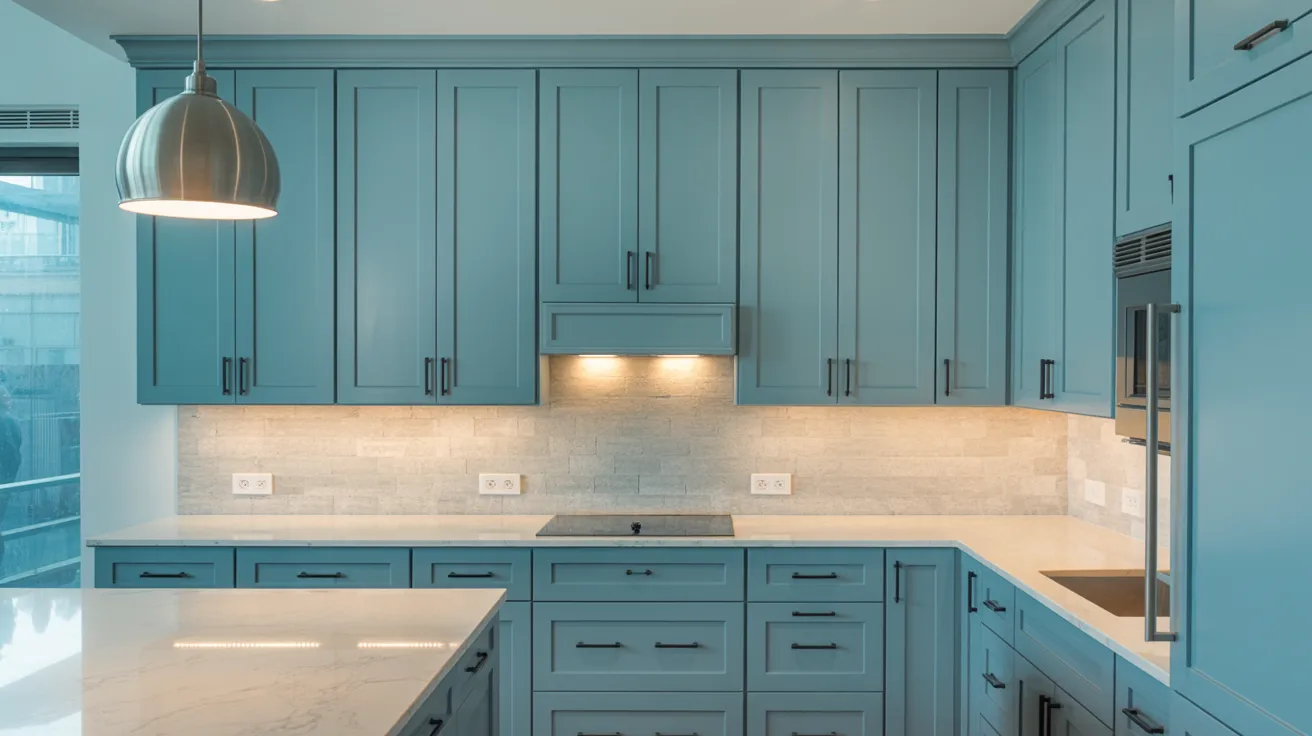
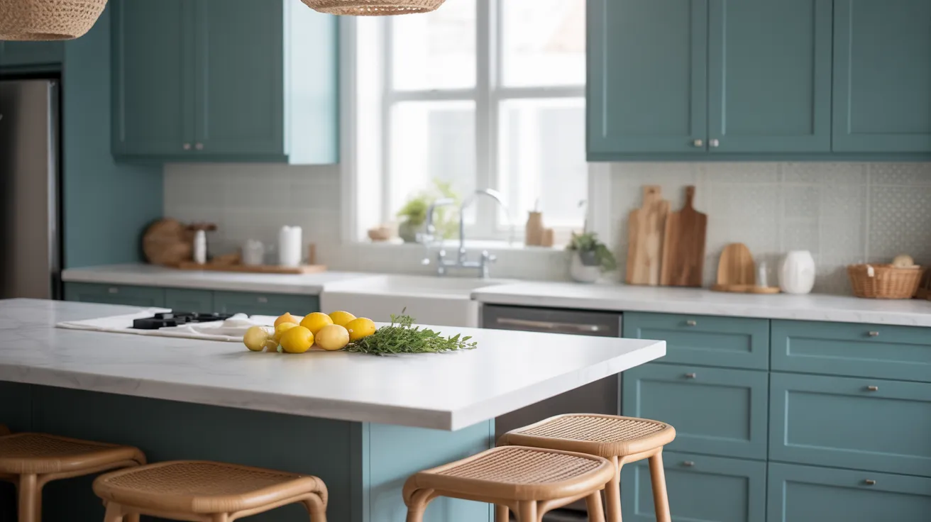
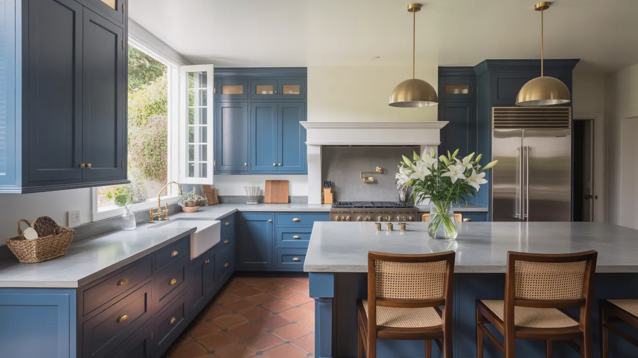
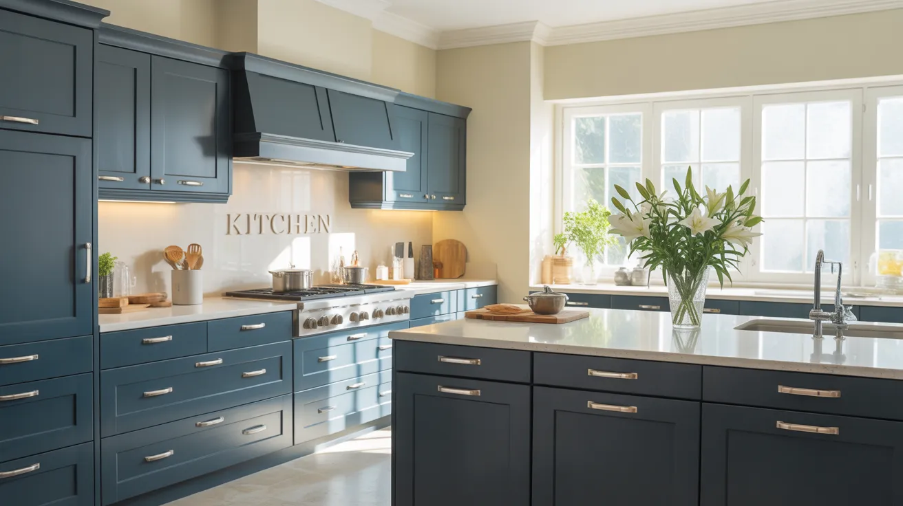
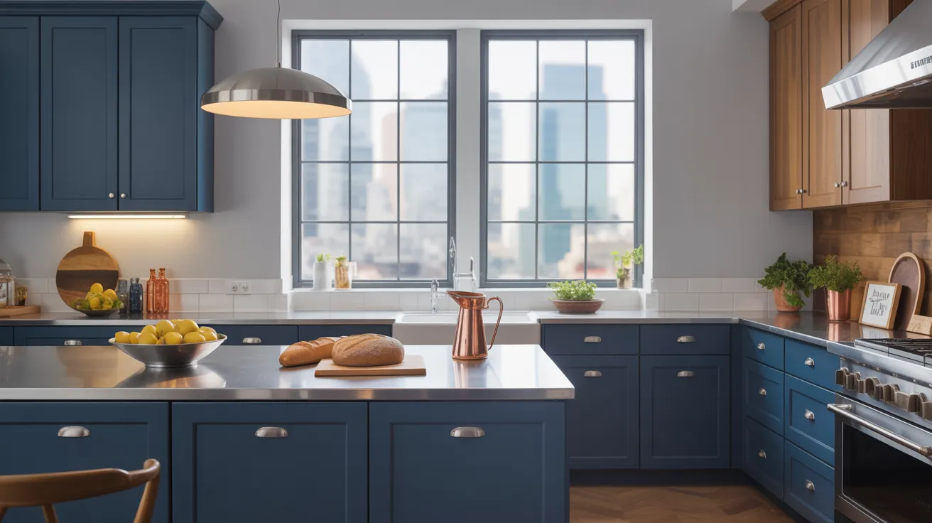
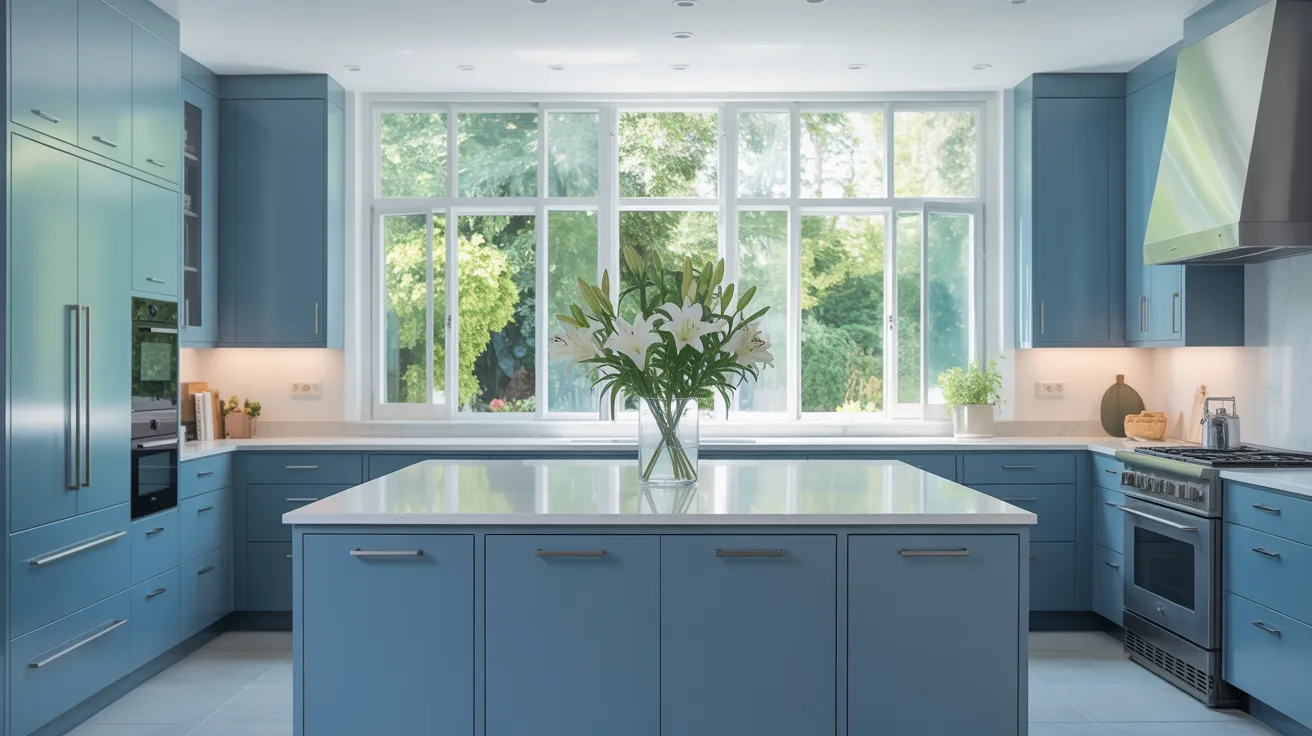
Blue Cabinet Colors You’ll Love
1. Naval

Naval is a deep, inky blue that adds bold sophistication to any kitchen. It offers a dramatic contrast without overwhelming the space.
Ideal for anyone seeking a grounded, modern look. It pairs beautifully with white marble or black granite and works especially well in industrial or contemporary kitchens.
2. Blueberry
Blueberry is a vibrant and energetic shade that brings life to any kitchen. It’s bold without being brash, creating a cheerful yet modern atmosphere.
Best paired with sleek hardware and neutral countertops. A fun, confident choice for urban spaces with personality
3. Newburyport Blue
Newburyport Blue is a classic navy shade that gives a strong and traditional touch. It’s deep but not too dark and adds a feeling of richness to cabinets.
Works well with white trim and light walls for contrast. You can add brass or bronze handles for a bold effect. Best used in colonial-style kitchens where classic design rules the space.
4. Van Deusen Blue

Van Deusen Blue is a balanced navy that feels strong without being too bold. It has just enough warmth to keep the kitchen feeling cozy.
You can pair it with natural wood, silver accents, or white walls. It stands out while staying classy. Best used in classic kitchens that need a solid and calm color to anchor the room.
5. Gale Force

Gale Force is a strong blue that leans into darker tones. It adds a cozy, quiet feel that works best in large, open kitchens.
If your space has high ceilings or big windows, this color shines. Works best with gold or matte hardware. Best used in urban kitchens that mix cool tones with metal finishes and clean shapes.
6. Oxford Blue

Oxford Blue is a royal navy that brings a rich, deep feeling. It’s bold but never loud. This shade looks great with both shiny and matte hardware.
Use it with light stone counters or warm wood floors. It gives a tidy, finished look. Best used in contemporary kitchens where clean shapes and simple color blocks keep things looking sharp.
7. Blue Dusk

Blue Dusk is a soft twilight blue that gives a dreamy, peaceful feel. It’s light enough to brighten the room, yet rich enough to give depth.
This shade pairs well with white tile and open shelves. It creates a space that feels light, easy, and calm. Best used in cottage-style kitchens with soft lines and lots of natural light.
8. Sea Serpent Ocean Blue
Sea Serpent is a bold oceanic blue with hints of green and navy. It feels rich and grounded without being too dark. This color works best with gold handles or natural wood accents.
It brings energy while keeping things cozy and refined. Best used in coastal kitchens, especially those with lots of light, white tile, or sandy wood floors that balance bold cabinets with breezy touches.
9. Copen Pale Blue
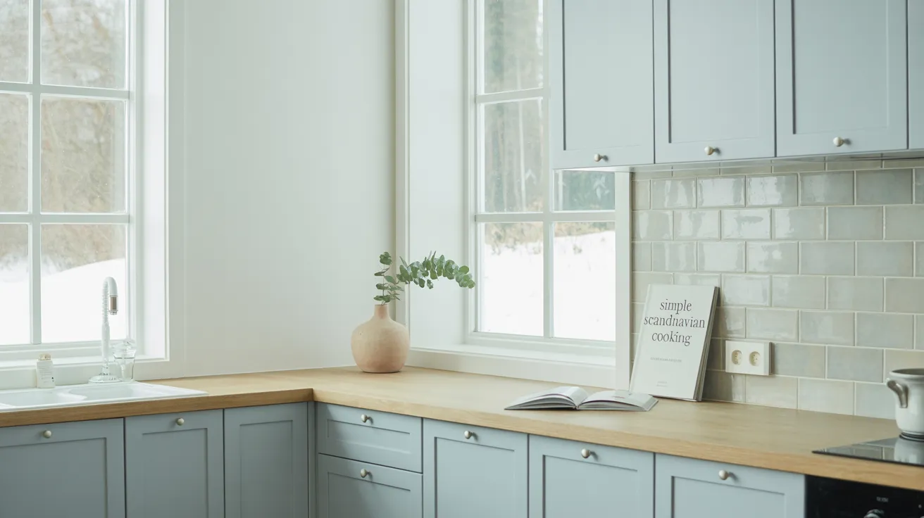
Copen Blue is a fresh pale blue with soft gray tones. It adds a light, breezy feeling without being too cold. This shade makes a small kitchen feel larger and brighter.
Pair with white or warm wood counters. Works well in bright or softly lit rooms. Best used in Scandinavian-style kitchens where simplicity and gentle colors help create a calming, open space.
10. Mineral Alloy
Mineral Alloy is a dark, industrial blue that adds depth and cool style. It leans more gray in low light and bluer in daylight.
This color works well with stainless steel and stone surfaces. Use it to create a sharp contrast with white walls or tile. Best used in industrial kitchens that combine metal, glass, and clean cabinet lines for a strong, city-ready style.
11. Baltic Sea
Baltic Sea is a cool sea blue that feels calm and strong at once. This shade pairs nicely with both warm and cool materials, think butcher block, marble, or brushed nickel.
It brings a peaceful touch to the kitchen without fading into the background. Best used in transitional kitchens where a mix of traditional and modern features come together in a balanced way.
12. Mount Saint Anne
Mount Saint Anne is a light blue-gray that feels clean and crisp. It makes the kitchen feel open and calm, without feeling too cold.
It pairs nicely with soft woods or white quartz. Works especially well in rooms with lots of daylight. Best used in minimalist kitchens where simplicity, light, and gentle tones create an easy and peaceful space.
13. Still Water
Still Water is a dusty teal that adds calm energy to the kitchen. It has just enough color to pop, but still feels grounded.
This color blends beautifully with light tile or white marble counters. It’s a strong yet soft choice. Best used in coastal or boho kitchens where natural textures and laid-back vibes bring the space to life.
14. Dress Blues
Dress Blues is a rich marine blue that feels sharp and formal. It gives cabinets a clean, bold look without overwhelming the space.
Pair with white tile or concrete for balance. Add brass handles for warmth. Best used in classic or transitional kitchens where a bold blue can serve as the main focus without looking too trendy or loud.
15. Indigo Batik

Indigo Batik is an inky denim tone that adds boldness and depth. It’s a strong color that anchors the kitchen without being too dark.
Works well with crisp whites, brushed steel, or natural wood. It gives a high-end look while still feeling down-to-earth. Best used in modern kitchens where strong contrast and bold choices bring out clean design lines.
16. Charcoal Blue
Charcoal Blue is a gray-based navy that brings quiet power into the kitchen. It feels mature, steady, and slightly moody.
Pair it with white or cream accents to lighten the look. This shade works great in kitchens with clean lines and little clutter.
Best used in contemporary kitchens where calm, deep tones support a neat, organized space with a modern edge.
17. Anchors Aweigh
Anchors Aweigh is a submarine blue that leans deep and cool. It gives cabinets a bold presence without making the space feel small.
Looks great with soft grays or oak finishes. Add silver or matte black handles for contrast.
Best used in urban kitchens where a deep-toned palette adds confidence, structure, and a stylish, no-fuss feel.
18. Water’s Edge
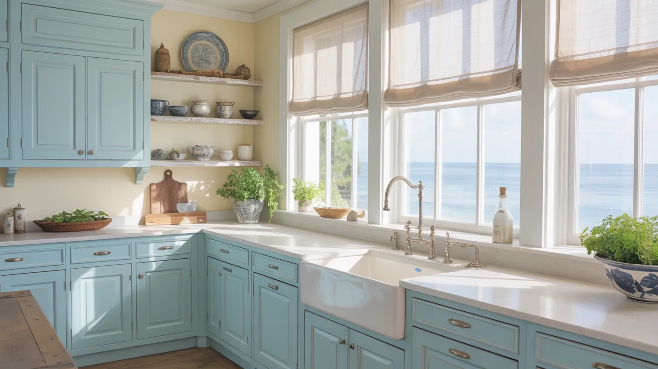
Water’s Edge is a washed coastal blue with soft green undertones. It brings a fresh, open feel to any kitchen, especially ones filled with light.
Match it with soft creams or whitewashed wood for a cozy but breezy look. Best used in coastal kitchens, where it helps capture the relaxed vibe of life near the water.
19. Moody Blue
Moody Blue is a soft teal with gray hints that gives off a peaceful but bold vibe. It blends well with soft whites, muted metals, or rustic wood accents.
This shade adds personality without shouting. It’s both steady and stylish.
Best used in farmhouse kitchens where charm and comfort meet subtle color that doesn’t overwhelm the space.
20. Blue Fjord
Blue Fjord is an icy cobalt that adds bright energy while staying cool. It gives cabinets a clean and crisp look, especially in bright light.
Works well with stainless steel or matte black accents. This shade is best used in modern kitchens that need a pop of color without losing a sleek and tidy appearance.
21. Slate Blue

Slate Blue is a modern gray-blue that brings balance and peace. It pairs perfectly with brushed nickel, light floors, and natural light.
This tone makes the kitchen feel fresh without going overboard. It’s easy to match and easy to live with. Best used in minimalist kitchens that need just a hint of color to break up the clean lines.
22. Cool Space

Cool Space is a pale urban blue that feels light, smooth, and crisp. It’s not flashy but still has personality. Great for small kitchens or spaces with little natural light.
Pairs well with silver hardware and glossy tiles. Best used in city kitchens, where soft colors help keep the room feeling open, clean, and simple without looking dull.
Paint Finish Guide for Cabinets
Choosing the right paint finish is just as important as selecting the color. It affects how your cabinets look, feel, and hold up over time. Here’s how different finishes compare:
- Satin: Soft shine with a smooth feel. Hides minor marks well. An excellent choice for most kitchens.
- Semi-Gloss: Has more shine and is easy to wipe clean. Ideal for busy kitchens or homes with kids.
- Matte: No shine at all. It has a soft, modern look, but is more challenging to clean. Best for low-traffic areas.
Most people opt for satin or semi-gloss finishes, as they’re easier to clean and hold up better without being too shiny.
Durability Tips for Kitchen Cabinets
To make sure your cabinets last and stay looking great:
- Use high-quality paint made for cabinets
- Always sand, prime, and clean the surface before painting
- Add a topcoat or sealer for extra protection
- Choose semi-gloss for high-use kitchens, as it resists chips and stains better
- A strong finish means fewer touch-ups and a longer-lasting look.
Cleaning & Maintenance Advice
To keep your painted cabinets looking fresh, it’s essential to clean them the right way. Always wipe up spills right away using a soft, damp cloth to prevent stains and surface damage.
For deeper cleaning, stick to mild soap and warm water; avoid any harsh cleaners, as they can wear down the paint over time. Avoid soaking the cabinets or using excessive water, as this can cause bubbling or peeling.
It’s a good idea to check for chips or scratches about once a month. If you spot any damage, do a quick touch-up to keep everything neat and well-maintained. With regular care, your cabinets will stay clean and last for years.
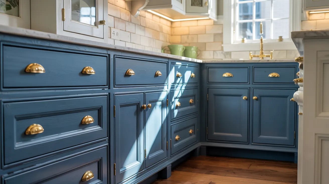
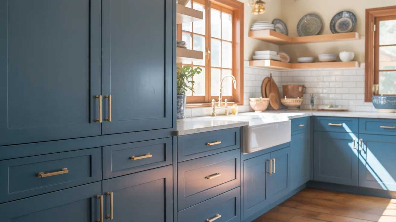
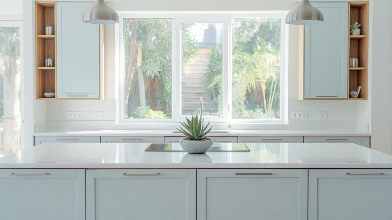
Design Inspiration and Color Pairings
Blue cabinets are bold, but they can work with many styles. Here’s a simple guide to help you match materials and colors easily.
|
Element |
Great Pairings |
Why It Works |
|
Countertops |
White quartz, butcher block |
Clean and natural finishes balance bold blues well. |
|
Hardware |
Brass, matte black |
Brass adds warmth; black gives a sleek, modern contrast. |
|
Backsplash |
White subway tile, Moroccan tile |
Detailed or straightforward patterns give depth without clashing. |
|
Wall Colors |
Light gray, white, sage green |
Soft neutrals or muted greens keep the space light and calm. |
Pairing right finishes with blue cabinets creates a kitchen that feels pulled together, fresh, and easy to enjoy daily.
Final Tips
Before you go all-in on blue cabinets, take a few smart steps. These final tips will help you avoid surprises and get the exact look you want in your kitchen.
- Order samples before committing: Small swatches help you see the real color before painting your whole kitchen. What looks great online may look different at home.
- Test in your kitchen’s lighting: Light changes everything. Try samples on different walls and see them in the morning, afternoon, and evening.
- Try cabinet paint kits for a weekend project: These kits make it easy to refresh cabinets without needing pros.
Conclusion
Now that you’ve seen some amazing blue cabinet colors, along with tips on finishes, care, and pairings, you’re ready to choose the one that fits your style.
Blue cabinets make your kitchen feel relaxed and stylish, without going overboard. With the right prep and paint, they’ll hold up beautifully for years.
So, are you ready to make a change? Pick your favorite shade and start your refresh this weekend. You don’t need a full remodel to give your kitchen a brand-new feel, just the right blue.
Want more paint ideas and easy upgrades? Check out my other blogs to keep the inspiration going.


