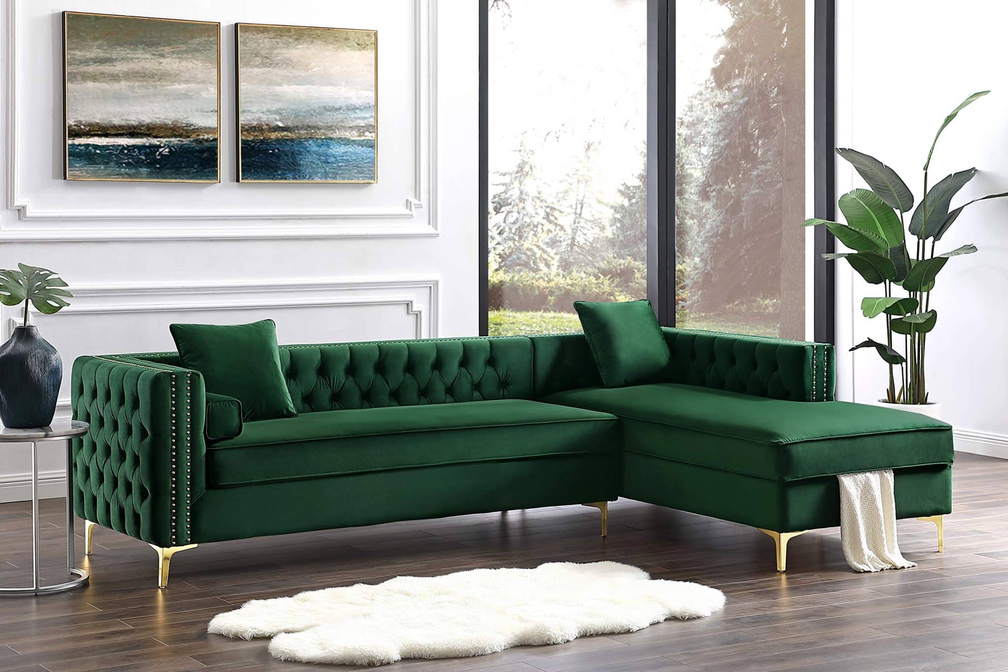
Sherwin Williams Anonymous (SW 7046): A Complete Color Guide
Choosing the right neutral paint can be frustrating when every swatch starts to look the same. I’ve been there too, searching for something warm but not beige, grounded but not too dark.
That’s where Sherwin-Williams Anonymous (SW 7046) comes in, a deep, earthy neutral that strikes the perfect balance.
In this guide, I’ll show you how Anonymous looks in real spaces, how it compares to other popular neutrals, and what colors it works best with. You’ll also get tips on sampling, buying, and what to expect in different lighting. Let’s figure this out together.
Getting to Know Sherwin-Williams Anonymous

Anonymous (SW 7046) by Sherwin-Williams is a rich, muted paint color often described as a green-gray neutral. It brings depth and warmth to interiors and exteriors, working equally well in modern, rustic, or transitional spaces.
Basic Color Profile
HEX code: #8A8574
LRV (Light Reflectance Value): 20
Color family: Earthy gray with green undertones
This shade is part of Sherwin-Williams’ Neutral Paint Colors lineup and is ideal if you want a cozy but moody foundation for your room.
Anonymous sits comfortably in the darker neutral range. It doesn’t feel blacked out or muddy; instead, it reads grounded and warm without overwhelming the space.
Undertones Explained
Anonymous has a green-gray undertone that shifts subtly throughout the day. It doesn’t feel overly cool or sterile, but it does lean earthier than a true taupe.
- In daylight, Anonymous often reveals more of its soft green-gray base.
- Under warm artificial light, it can appear slightly browner or more muted.
This chameleon quality makes Anonymous flexible, but it also means you should test it on your walls before committing.
Anonymous in Real Spaces
Anonymous changes depending on the space and lighting. Here’s how it typically performs in different areas of the home.
How It Looks in Different Rooms
Kitchens
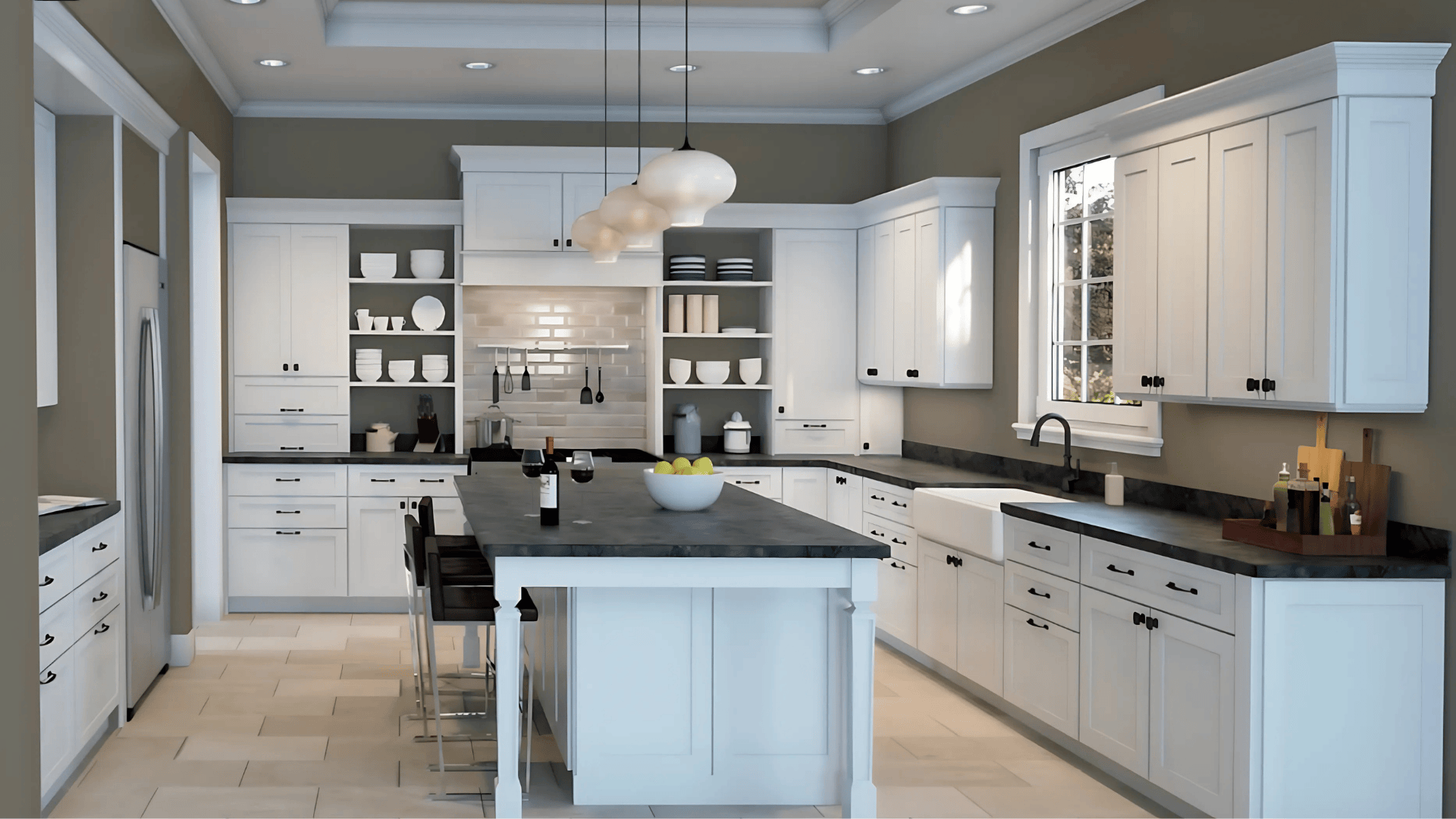
Anonymous adds depth and contrast to kitchen cabinetry or walls. It pairs well with white quartz, wood countertops, and black or brass hardware. Its muted tone keeps the space cozy without making it feel dark.
Bathrooms
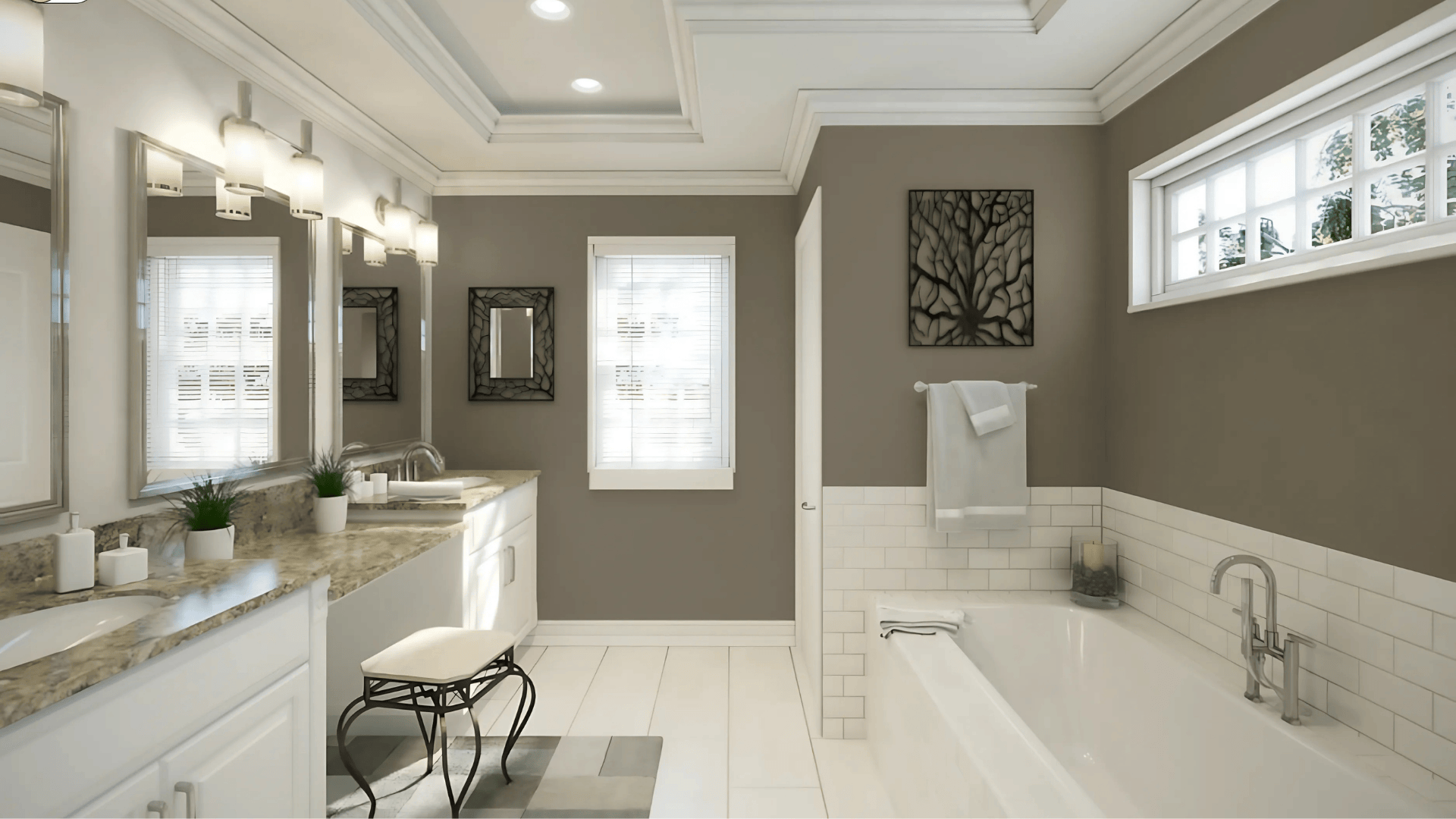
This color brings a calming, spa-like quality to bathrooms. Paired with white tile, matte black fixtures, and soft linens, it feels both grounded and serene. Natural light enhances its green tones, while small bathrooms benefit from lighter trim to balance the depth.
Living Rooms
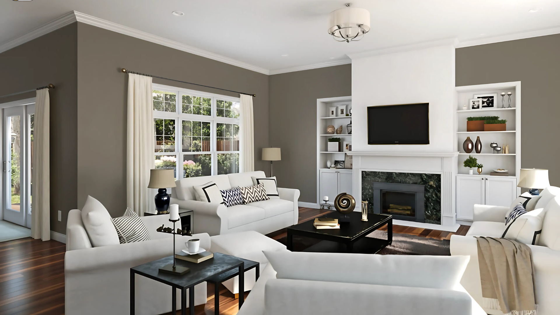
In living areas, Anonymous offers a cozy, cocoon-like atmosphere. It supports both rustic and refined decor, working beautifully with natural wood, metal accents, and textured fabrics. The depth adds richness without stealing the spotlight.
Bedrooms
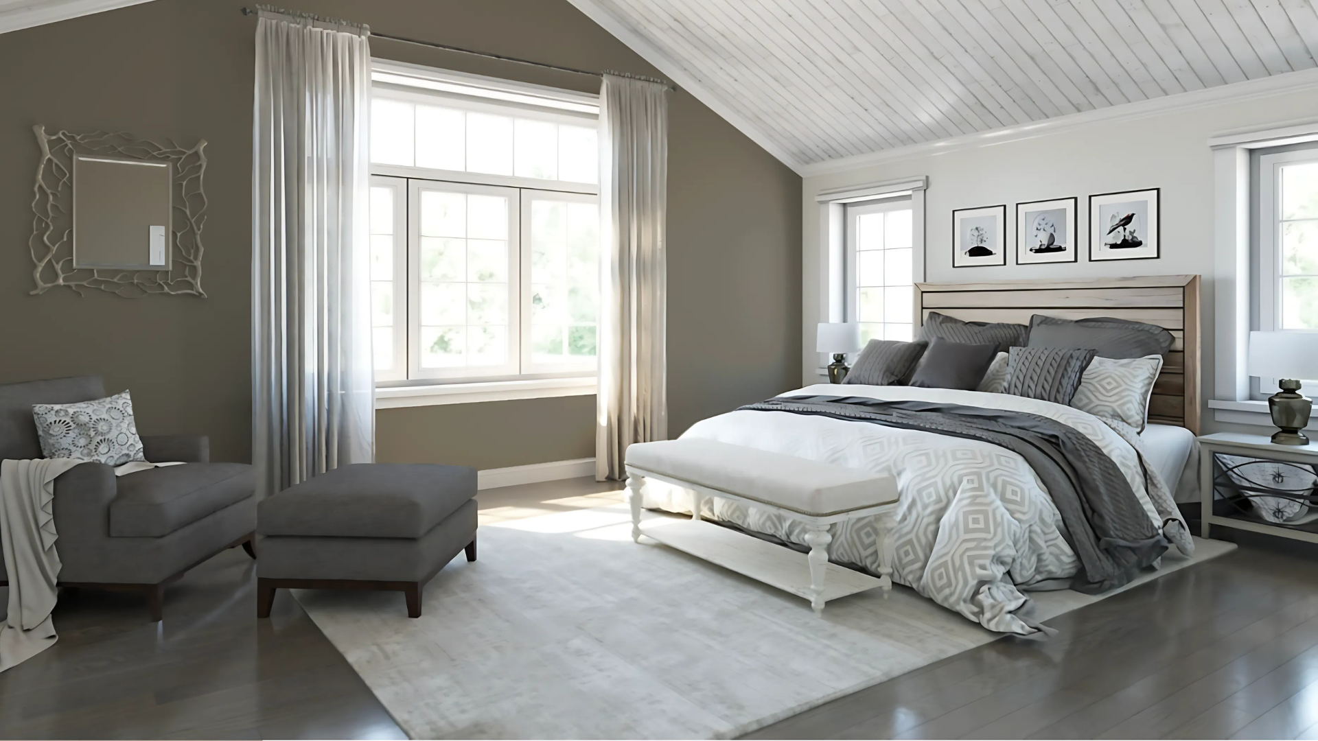
Anonymous works well in bedrooms if you want a warm, restful palette. It’s ideal for full-room coverage or a feature wall behind a bed. Pair it with off-white bedding, walnut furniture, and brass lighting for a cohesive, grounded retreat.
Exterior Spaces
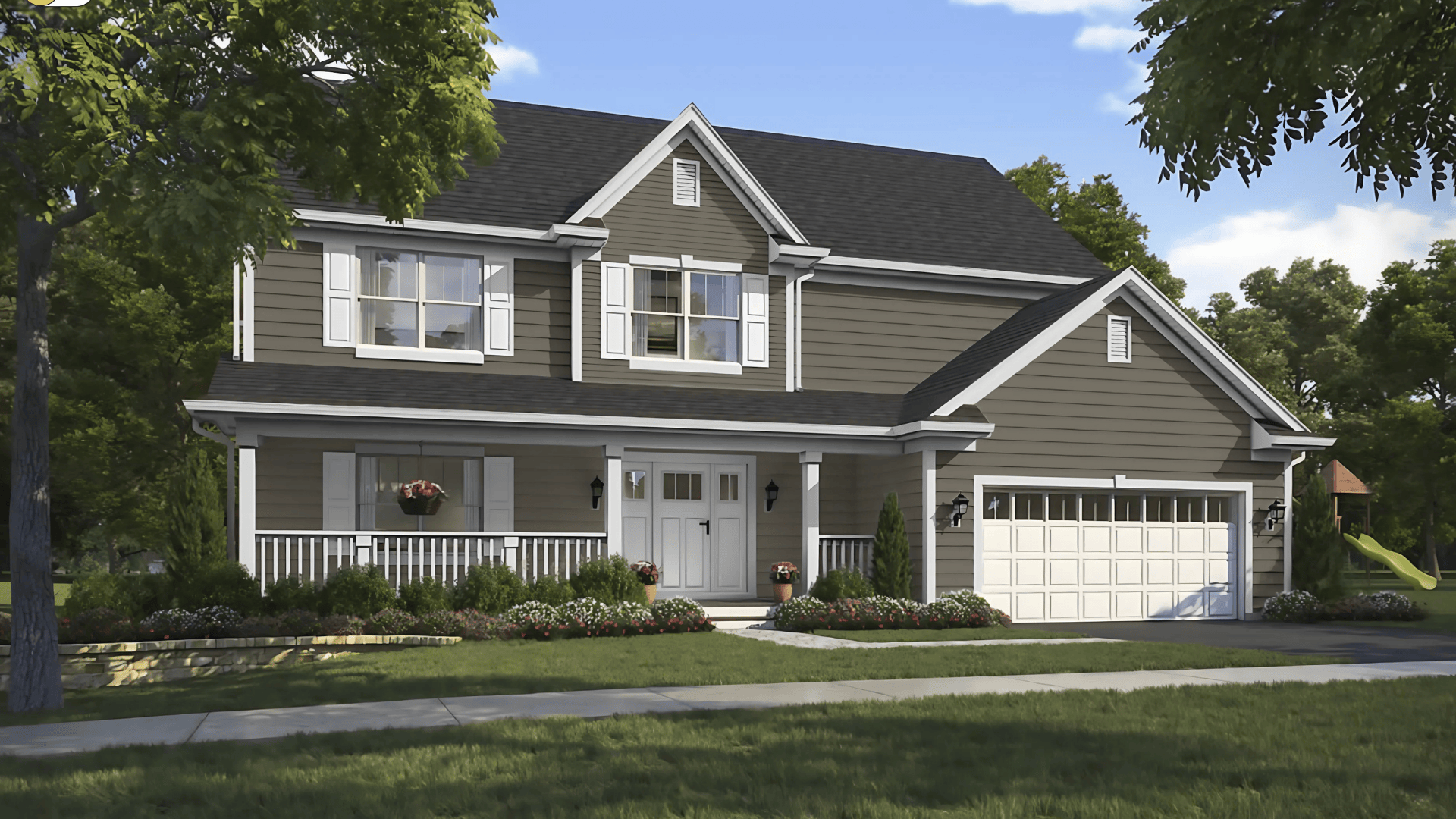
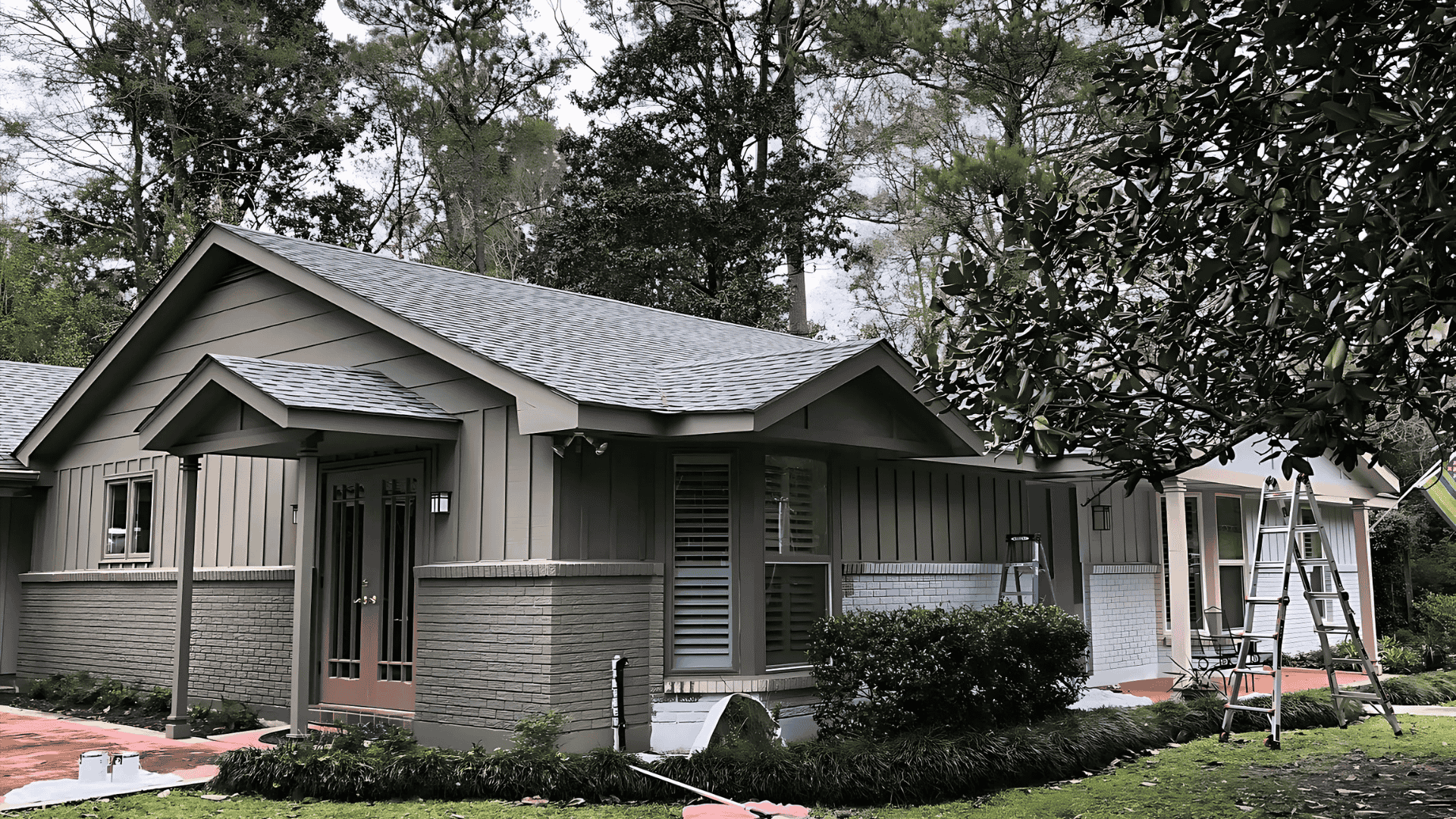
This shade also looks great outside. Whether used on siding, shutters, or a front door, Anonymous brings warmth and structure. In the sun, it leans slightly brown; in the shade, more gray-green. Pair with creamy white trim for a classic exterior.
How Lighting Affects It
Lighting has a big impact on how Anonymous reads.
- North-facing rooms: Can bring out its cooler, more muted gray tones
- South-facing rooms: Bright light adds warmth, softening the color
- East-facing rooms: Morning sun brings out a crisp, earthy balance
- West-facing rooms: Evening light adds depth and draws out green undertones
Always sample on multiple walls and check it at various times of day to see how it shifts.
Anonymous vs. Other Sherwin-Williams Neutrals
There are lots of deep neutrals out there. Here’s how Anonymous compares to some favorites:
Anonymous vs. Porpoise
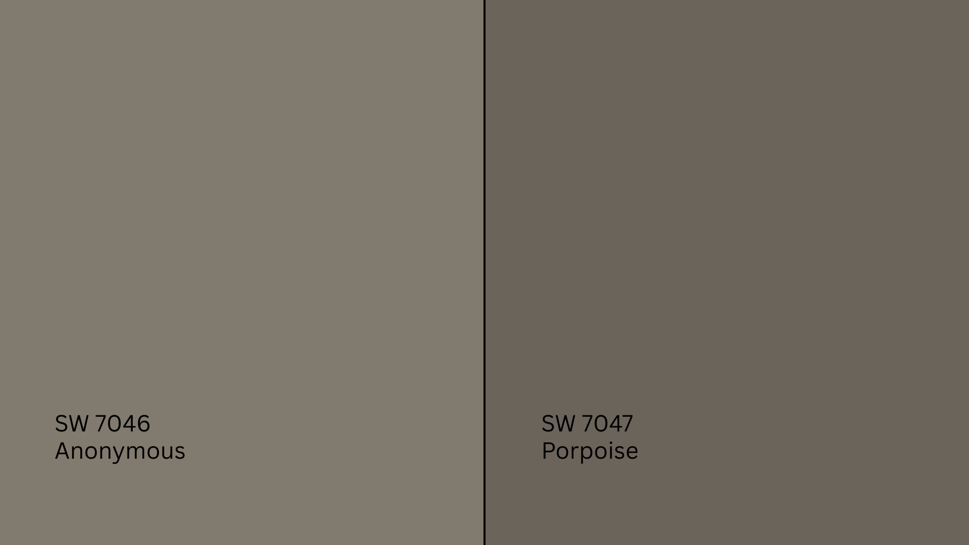
Porpoise (SW 7047, #625D52) is deeper and browner. It has an LRV of 13, making it richer and more dramatic. Porpoise is better suited for accents or bold trim, while Anonymous is more versatile for full rooms.
Anonymous vs. Urbane Bronze
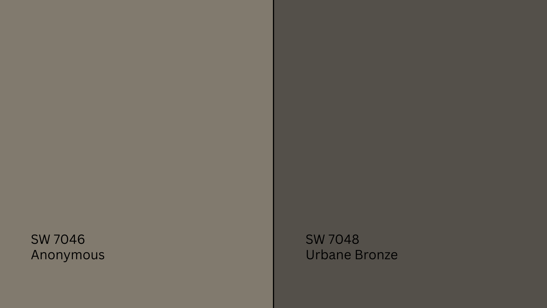
Urbane Bronze (SW 7048, #5B5349) is much darker with a deeper brown-gray base. With an LRV of 8, it’s best for high-contrast statements or trim. Anonymous, by contrast, is a mid-dark shade suitable for broader use.
Anonymous vs. Repose Gray
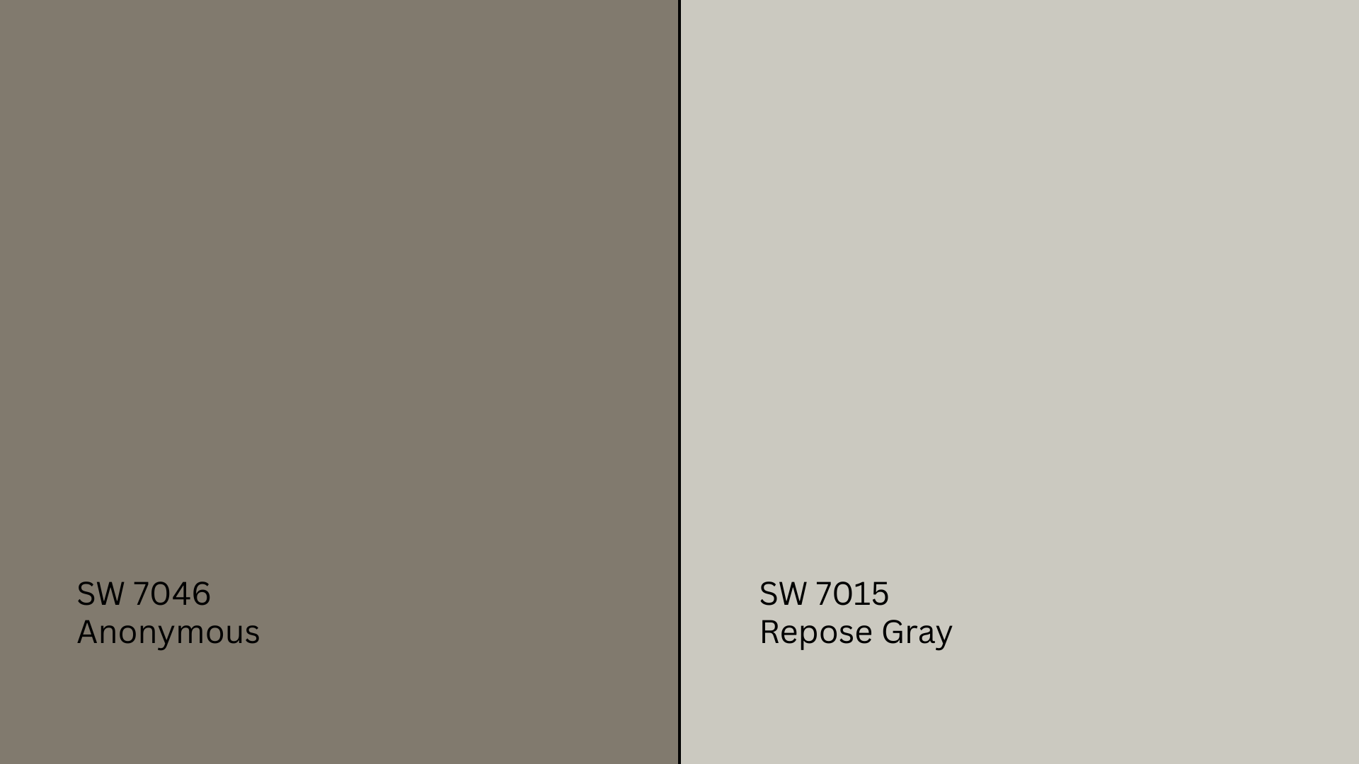
Repose Gray (SW 7015, #CCC8C1) is significantly lighter with an LRV of 58. It’s great for bright, airy rooms but lacks the grounded depth of Anonymous. Choose Repose Gray if you want something lighter but still warm.
Undertone and LRV Comparison Table
| Paint Color | Undertones | LRV | Warm or Cool |
|---|---|---|---|
| Anonymous | Green-gray | 20 | Warm |
| Porpoise | Warm gray-brown | 13 | Warm |
| Urbane Bronze | Deep brown-gray | 8 | Warm |
| Repose Gray | Warm gray | 58 | Warm |
Each of these paints has a purpose, but Anonymous is the sweet spot between depth and softness.
Best Color Pairings for Anonymous
Anonymous is flexible, but it looks best when paired with complementary shades and finishes.
Trim and Ceiling Suggestions
To keep the look balanced, pair Anonymous with soft whites:
- Pure White (SW 7005): A clean white with a subtle warmth
- Alabaster (SW 7008): Creamier and cozy, great for traditional spaces
- Shoji White (SW 7042): A greige white that complements Anonymous’ earthy tones
Use these for trim, ceilings, or doors. They add just enough contrast without making the room feel high-contrast or cold.
Accent Wall and Furniture Colors
To add dimension:
- Dried Thyme (SW 6186): Enhances Anonymous’s green undertones
- Urbane Bronze (SW 7048): Adds drama and grounding for accent walls
- Sea Salt (SW 6204): A soft green-blue that feels light and airy
These colors work well behind beds, fireplaces, or built-ins.
Hardware and Flooring Compatibility
Anonymous shines next to matte black, brushed brass, and antique bronze finishes. Brass adds warmth, while black brings modern contrast.
For flooring, use:
- Light oak or whitewashed wood for openness
- Medium-toned walnut or hickory for warmth
Note: Avoid cool gray floors that clash with Anonymous’ earthy base.
Paint Finish Recommendations
Finish affects how Anonymous reads:
Matte: Softens the color, ideal for guest rooms or ceilings
Eggshell: Adds a touch of sheen; good for living areas
Satin: Reflects more light, great for kitchens, bathrooms, or trim
Always sample your chosen finish; it can highlight or mute undertones.
Sampling and Buying Options
Before you commit, test Anonymous in your space. Lighting and surroundings can change the color dramatically.
Where to Get Peel-and-Stick Samples
- Samplize: Offers mess-free, repositionable paint swatches
- Sherwin-Williams stores: Provide small tester cans for brushing on walls
- Local hardware stores: May carry samples or swatches to take home
Try samples on multiple walls and check them throughout the day.
Where to Buy the Paint
- Sherwin-Williams.com: Order online or for local pickup
- In-store: Find full-size cans or testers in most Sherwin-Williams retailers
Paint Equivalents in Other Brands
If you can’t access Sherwin-Williams, here are some close alternatives to Anonymous (SW 7046) from other major paint brands. Just remember to always sample before committing, as formulas and finishes can vary.
Behr:
- Squirrel (790D-5, HEX #8D877A): A soft, taupe-leaning gray with warm undertones
- Mined Coal (PPU18-18, HEX #7A746A): A deep, earthy gray with hints of brown and olive
Benjamin Moore:
- Chelsea Gray (HC-168, HEX #A6A29A): A refined mid-tone gray with a balanced undertone
- Rockport Gray (HC-105, HEX #8E8579): A grounded, slightly warm gray with subtle green notes
Valspar:
- Smoked Oyster (6005-1C, HEX #ACA194): A warm, muted gray with a hint of mauve
- Filtered Shade (4003-1B, HEX #CBC9C4): A soft, cool-leaning gray for balanced contrast
Conclusion
Now that you’ve seen how Sherwin-Williams Anonymous behaves in different spaces and lighting, you can decide if it fits your home’s personality.
It’s grounded, warm, and deep enough to make a statement without overwhelming. If you’re painting a bedroom, a bathroom, or your home’s exterior, Anonymous offers both mood and flexibility.
Still unsure about SW Anonymous? Take a look at my other Sherwin-Williams color guides on the website to help you choose with confidence.
