Sherwin Williams Stardew (SW 9148): Paint Review
Choosing a blue-gray paint sounds easy until you see how many soft blues and stormy grays are out there. I’ve been in that same spot, trying to find a shade that feels calm without looking cold or boring.
That’s exactly why I put this guide together: to help you decide if Sherwin-Williams Stardew is the right choice for your home.
I’ll walk you through how it looks in real rooms, how it compares to other popular blue-grays, and what colors pair well with it. Let’s figure it out together.
Stardew (SW 9138) by Sherwin-Williams

Sherwin-Williams Stardew is a cool, cloudy blue with a soft gray base. It has a fresh and quiet vibe that feels right at home in bedrooms, bathrooms, and kitchens.
If you’re going coastal, traditional, or transitional, it fits in without trying too hard. This shade gives you that peaceful, misty-morning look without feeling icy or flat.
Basic Color Profile
HEX code: #A2B6B5
LRV (Light Reflectance Value): 43
Color family: Blue-gray
Stardew belongs to the Living Well – Unwindcollection from Sherwin-Williams and sits in the blue-gray range with a soft, muted presence. It walks the line between airy and grounded, which makes it easy to use across different styles and lighting situations.
Undertones Explained
Stardew has a true mix of blue and gray, with just a touch of green that sneaks in under certain lights. It doesn’t lean purple or icy like some cool tones, and that’s what makes it so approachable.
- In natural daylight, it leans bluer and feels crisp without being bright.
- Under warm or low lighting, the gray tones come forward, softening the blue into a cozy, lived-in color.
This color responds easily to its environment, so it’s worth testing in different spots before painting the whole room.
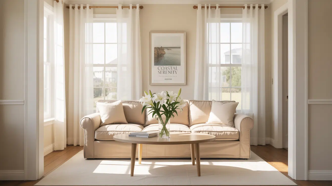
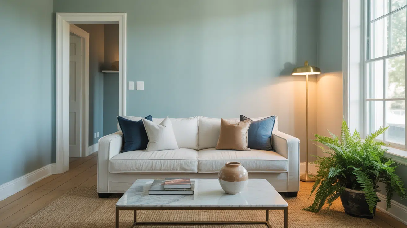
Stardew in Real Spaces
Stardew is a versatile color that complements many areas of the home. It works well in both large and small spaces, making it easy to use across various styles, lighting conditions, and design needs.
Living Rooms

Stardew adds a soft, breezy touch to living rooms. It pairs nicely with white trim, beige couches, and light woods. You get a color that holds its own but still keeps things mellow and open.
Bedrooms
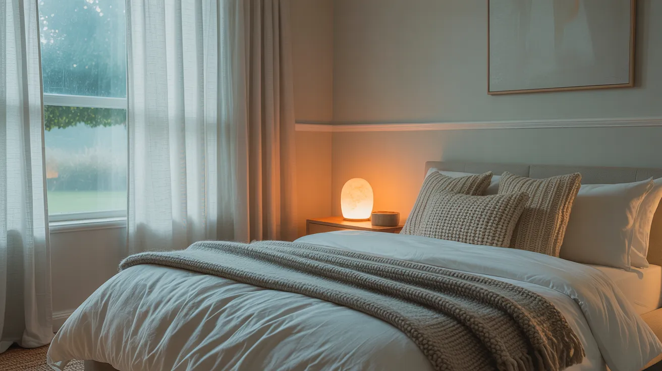
In bedrooms, Stardew brings a restful, quiet feel. Use it on full walls or behind the bed, and style it with warm lights, layered textures, and off-white bedding to keep it soothing but not too cool.
Bathrooms
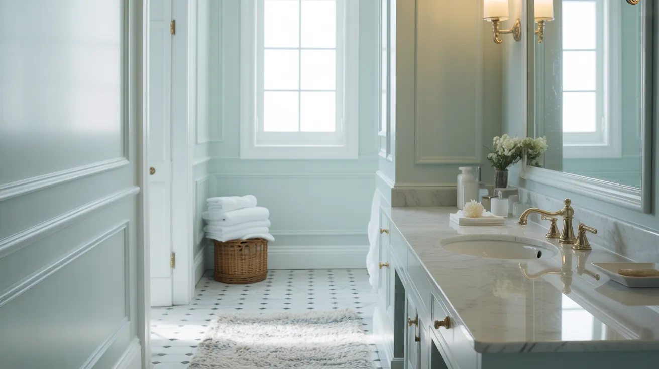
Stardew works well in bathrooms because it reflects light in a soft, fresh way. White tile, chrome or matte black fixtures, and fluffy white towels all make it feel bright and balanced.
Kitchen Cabinets & Islands
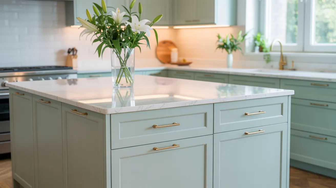
For kitchens, Stardew is subtle but noticeable. It works well on cabinets or islands when you want something soft with a little color.
Pair it with white walls, brass hardware, and natural wood accents for a clean, coastal-inspired look.
Exterior Use
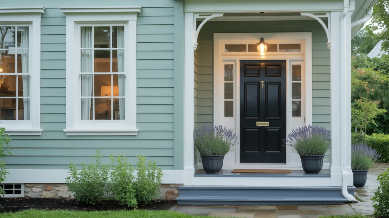
On exteriors, Stardew can shift depending on the weather. Sometimes it reads as soft gray-blue; other times, a more grounded blue-gray. It pairs well with white trim, stone accents, and black shutters.
How Lighting Affects It
Lighting really shapes how Stardew looks in your home. The direction and time of day can change how warm or cool it feels.
North-facing rooms: Stardew will lean grayer and look more muted.
South-facing rooms: Brighter sun warms it slightly, making it feel a bit more blue-green.
East-facing rooms: Morning light brings out its fresh blue side.
West-facing rooms: Evening light can bring depth and make the gray tones more visible.
Light changes constantly, so test it out in different spots and times of day before committing.
Stardew vs. Other Sherwin-Williams Colors
Sherwin-Williams has no shortage of soft blues and gray-blues. Here’s how Stardew compares to other popular picks.
Stardew vs. Upward
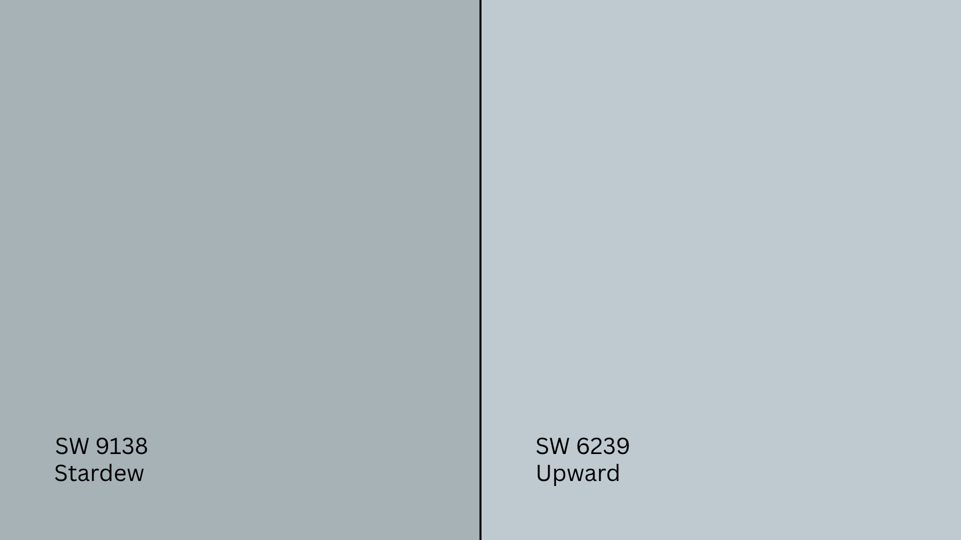
Upward (SW 6239, #C0CAD3) is lighter and airier. It leans more sky blue than Stardew and feels brighter in most rooms.
Pick Upward if you want something more crisp.
Stick with Stardew if you want something a little moodier and grounded.
Stardew vs. Jubilee

Jubilee (SW 6248, #ACB3B6) is grayer and moodier. It’s slightly darker and works well when you want more depth.
Choose Jubilee for a bolder, more stormy look. Go with Stardew if you want something soft and balanced.
Stardew vs. Krypton

Krypton (SW 6247, #BAC2C5)is cooler and sharper, with a higher LRV. It leans icy under some lighting.
Krypton works in modern, cooler-toned rooms. Stardew brings a touch more warmth and versatility.
Undertone and LRV Comparison Table
| Paint Color | Undertones | LRV | Warm or Cool |
|---|---|---|---|
| Stardew | Blue-gray | 43.00 | Cool |
| Upward | Blue with cool gray | 57.00 | Cool |
| Jubilee | Blue-gray | 45.00 | Cool |
| Krypton | Blue with icy gray | 52.00 | Cool |
All of these have a soft, relaxed feel, but test them together to see which one works best in your space.
Best Color Pairings for Stardew
Stardew works best with clean whites, soft neutrals, and muted accents. It can stay subtle or feel bold depending on how you layer it.
Trim and Ceiling Suggestions
Pure White (SW 7005, #F8F8F6): Crisp and clean. Keeps the space bright and modern.
Alabaster (SW 7008, #EDEAE0): A warmer white that adds softness and balance.
Extra White (SW 7006, #F4F4F4): A cool, bright white that frames the color with contrast.
Use any of these in a flat finish on ceilings to avoid glare.
Accent Wall and Furniture Colors
- For a soft, cozy palette: try beige, taupe, soft greige, or blush pink.
- For contrast: go with navy blue, charcoal, deep walnut, or matte black.
- Upholstery ideas: oatmeal, linen, off-white, or soft gray for balance; leather or navy for pop.
Hardware and Flooring Compatibility
I’ve noticed that Stardew works well with all kinds of materials, but pairing it with the right metal finishes and flooring really brings out its soft character.
For hardware, brushed brass adds a little warmth and gives Stardew a polished, welcoming edge.
If you want something more modern and clean, go with polished chrome; it keeps the space crisp. Prefer bold contrast? Matte black stands out and adds definition against the soft blue-gray.
When choosing flooring, white oak or light maple will keep the room feeling open and breezy.
Medium brown tones like walnut add richness and make Stardew feel more grounded. If you’re using tile or stone, stick to soft grays with similar undertones for a subtle, cohesive look.
No matter what you choose, always test samples together in your space. Stardew is quiet but responsive, and lighting can change how everything ties together.
Paint Finish Recommendations
The finish changes how Stardew shows up on the wall and how practical it is.
Matte: Great for bedrooms or ceilings. Keeps the tone soft and hides imperfections.
Eggshell: A nice all-purpose finish for living rooms or hallways. Soft sheen adds a little life.
Satin: Works well for kitchens, baths, and cabinets. Adds durability and a bit more color clarity.
Always try your finish in a test patch; lighting and surface texture can shift the look.
Sampling and Buying Options
Before you commit, test Stardew in your own space. Its tone shifts depending on the lighting and surroundings.
Where to Get Peel-and-Stick Samples
- Samplize: Ships real Sherwin-Williams paint on removable sheets.
- Sherwin-Williams stores: Offer sample cards and small jars.
- Hardware stores: Some may have chips or testers you can pick up locally.
Stick samples in different spots and check them morning, afternoon, and night.
Where to Buy the Paint
- Sherwin-Williams.com: Order online for delivery or pickup.
- Sherwin-Williams stores: Get custom advice and all finish options.
- Local hardware stores: May be able to tint Stardew using SW formulas.
- Many stores offer curbside pickup or delivery, too.
Paint Equivalents in Other Brands
If you’re working with a different brand, here are some similar options that match Stardew’s vibe.
Benjamin Moore:
- Boothbay Gray (HC-165, #B5BEBD): Soft blue-gray, very close in tone and LRV.
- Silver Gray (2131-60, #C6D1D2): A bit lighter but gives a similar airy blue-gray feel.
Behr:
- Intercoastal Gray (MQ 5‑23, #CBD4D2): A near match in soft blue-gray tones, very close in brightness and feel.
- Shadow Blue (N480‑3, #BACBD0): A richer, moodier blue-gray that deepens the tone without shifting temperature.
- Hazy Skies (PPU 14‑12, #CBDBDC): A lighter, fresher version that keeps Stardew’s softness with a little extra brightness.
Always test side by side, because formulas vary across different brands, and the final look can shift.
Conclusion
If you’ve made it this far, you’ve got a solid picture of what Sherwin-Williams Stardew (SW 9138) brings to a room.
You’ve seen how it reacts to different lights, how it compares to similar shades, and what colors, trims, and finishes work best with it.
Before painting, always try a sample in your own home. Light, texture, and nearby materials can all influence the final look.
If you’re still browsing, be sure to check out my other color guides on the website; they follow the same format and help you choose with confidence.