Reviewing Benjamin Moore’s October Mist (1495)
Looking for the perfect paint color can be overwhelming.
Many homeowners want a shade that works well in any room without feeling too bold or plain.
Benjamin Moore’s October Mist is a gentle greenish-gray that brings a sense of calm to your walls.
This soft, nature-inspired color has won many hearts because it pairs well with warm and cool tones.
From living rooms to bedrooms, October Mist creates fresh and inviting spaces.
In this guide, you’ll learn:
- How October Mist changes in different lighting
- Which colors work best with it
- Tips for using it in your own home
With my expert advice and real-life examples, you’ll know exactly how to use October Mist to create spaces you’ll love for years to come.
Why October Mist Is the Perfect Choice for Your Space?
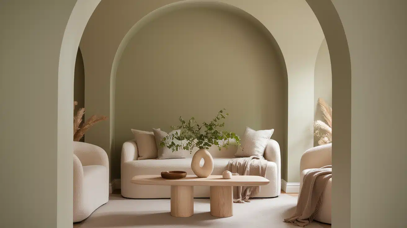
Ever noticed how some colors make you feel at peace when you walk into a room?
October Mist does exactly that. This gentle greenish-gray shade brings a sense of nature indoors, making spaces open and peaceful.
I’ve seen how this color works magic in different settings.
It’s like a chameleon—it shifts subtly as the light changes throughout the day but always stays pleasant.
Here’s what makes October Mist stand out:
- It catches morning light beautifully, warming up your breakfast nook
- During midday, it keeps rooms bright without being too showy
- In evening light, it creates a cozy feeling that helps you wind down
You can pair it with just about any style.
For a modern look, add black-and-white furniture. For rustic charm, natural wood pieces look right at home.
Even bold red or deep blue accents work well against this balanced backdrop.
What I like about October Mist is how it simplifies decorating.
You don’t need to worry about your yellow throw pillows clashing with your blue artwork—this color plays nicely with everything.
It’s like having a blank canvas that’s more interesting than plain white.
Think of it as the middle ground between too bold and too boring.
Your space stays fresh without trying too hard.
The Rich Undertones of October Mist: What You Need to Know
Let’s talk about what makes October Mist so special.
At first glance, you might see it as just another gray paint color. But look closer, and you’ll notice something more.
I want to show you what I’ve learned about its unique mix of colors:
- The green hints remind me of early morning fog over a garden
- The gray base gives it a soft, cloudy day feeling
- When these mix, they create a color that feels alive
Here’s what happens in different lights:
The morning sun brings out the green notes, while evening shadows highlight the gray.
It’s like watching the color breathe and change as the day progresses.
The best part? These subtle shifts ensure that your walls never look flat or dull.
Think of how sea glass catches light—similar to what October Mist does in your home.
I’ve found that these color changes help make spaces feel larger and more open.
The walls seem to respond to your room’s natural light, creating depth without being too strong.
Remember – the key to loving this color is understanding that it’s not just one shade but many working together.
The Psychology of October Mist: How It Affects Your Mood
Colors shape how we feel in a space.
I’ve noticed that when people walk into a room painted in October Mist, their shoulders often relax, and their voices soften.
There’s science behind this reaction.
Here’s what I’ve observed about how this color affects people:
- It reminds us of misty mornings in nature
- The soft green notes help ease tired eyes
- Its gentle gray tones create a sense of quiet
Think about your most peaceful moments.
Many of them probably happened outdoors, in spaces filled with soft natural colors.
October Mist brings that same feeling inside your home.
I’ve used this color in many spaces, and here’s what people tell me:
- Their kids do homework more calmly in rooms with this shade
- They feel less stressed when working from home
- Guests often comment on how welcome they feel
Here’s something interesting: Unlike bright whites, which can feel harsh, or dark colors, which might feel heavy, October Mist finds the sweet spot in between.
It’s like a gentle buffer between you and the busy world outside.
When choosing a color to live with, consider how it makes you feel.
October Mist works because it doesn’t demand attention—it quietly helps you feel at ease in your own space.
Remember: Your home should be a place where you can breathe easier.
That’s what makes this color such a smart choice for creating a peaceful home environment.
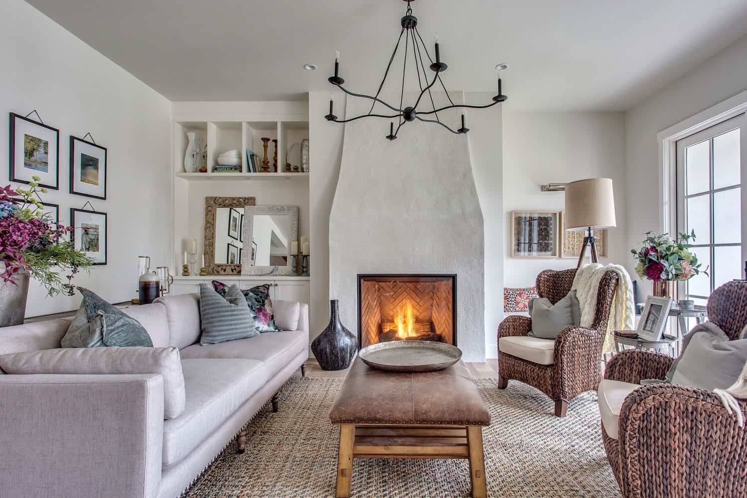
Where is October Mist Best Used in an Interior?
Let me share what I’ve learned about using October Mist in different rooms.
After seeing this color in many homes, I can tell you it’s more flexible than you might think.
Living Rooms
- Makes large spaces feel cozy without being too dark
- Creates a perfect backdrop for family photos and art
- Helps your furniture stand out without fighting for attention
Bedrooms
- Sets a peaceful mood for better sleep
- Looks soft and gentle in the morning light
- Makes the room feel bigger without being too bright
Kitchens
I’ve seen October Mist work wonders.
It pairs well with white cabinets and dark countertops, making the space feel clean and fresh without being stark white.
Dark Spaces
This color has a special way of brightening dim corners.
I’ve used it in:
- Hallways with little natural light
- North-facing rooms
- Basement spaces
Large Areas
Big rooms can sometimes feel empty.
October Mist helps by:
- Adding just enough color to feel welcoming
- Creating a sense of warmth
- Making high ceilings feel less overwhelming
Remember, the best part about this color is that it flows well from room to room.
You won’t have to worry about it clashing as you move through your home.
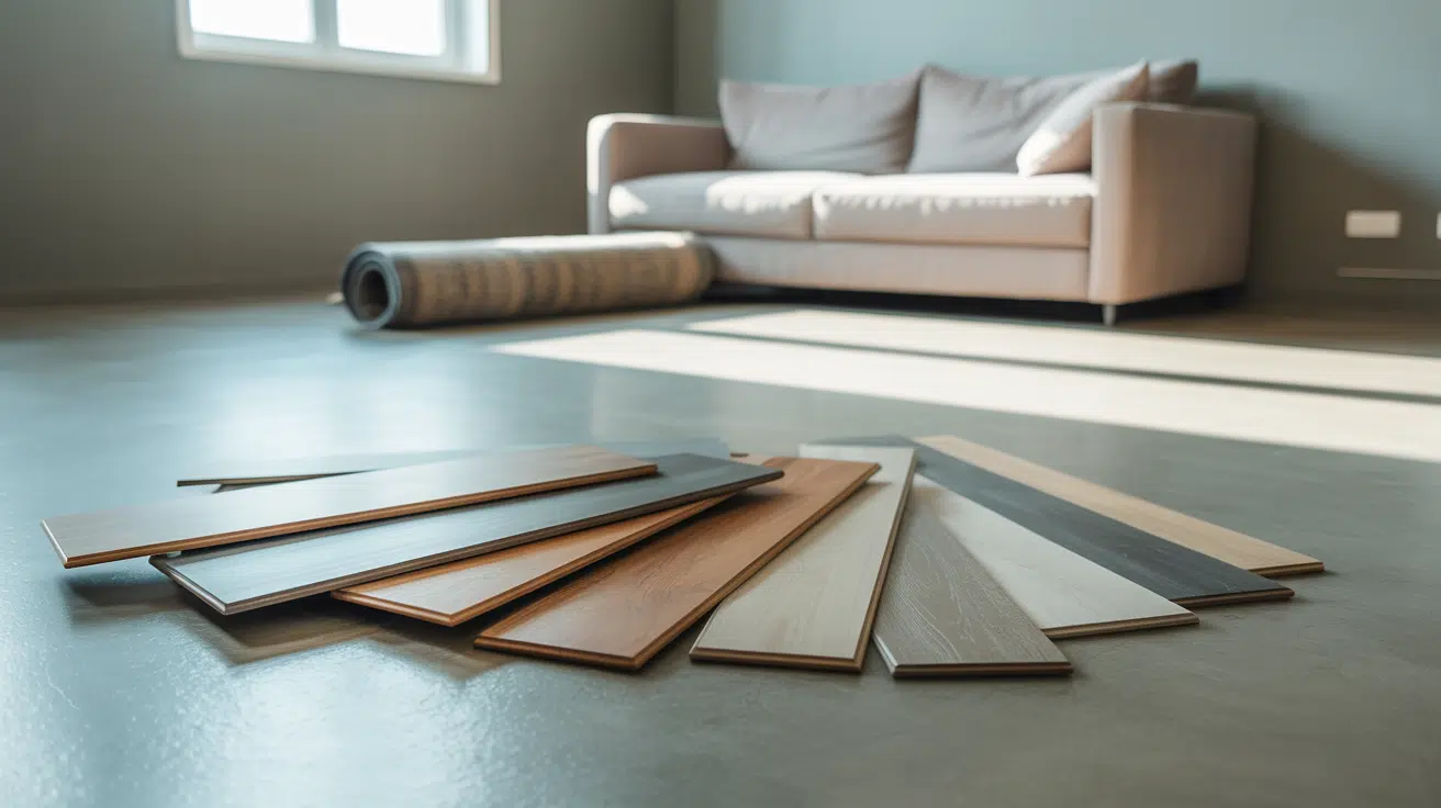
What Kind of Floors Would Look Best with October Mist?
Let me walk you through the best flooring choices I’ve seen paired with October Mist.
I’ve noticed some impressive combinations after helping many homeowners with this color.
Light Wood Floors
- White oak brings out the warm notes
- Maple creates a bright, open feel
- Bleached wood makes spaces feel larger
Warm Hardwoods
I’ve found that medium-brown woods work really well.
They give your room a solid foundation without stealing attention from the walls.
Think walnut or cherry – they add warmth without being too dark.
About Floor Finishes
Here’s what I’ve noticed about different finishes:
- Matte floors create a soft, balanced look
- Semi-gloss adds a subtle shine that brightens the room
- High gloss can make the wall color appear lighter
Tile Options
If you’re thinking about tile, consider these choices:
- Light gray stone tiles blend smoothly
- Cream-colored porcelain keeps spaces bright
- Natural stone with mixed tones adds interest
My Tips:
- Very dark floors can create too much contrast
- Pure white floors might look too stark
- Natural materials often work better than synthetic ones
Remember: The finish of your floor matters as much as its color.
A matte finish helps create a calming space, while some shine can make your room feel more lively.
Test your floor samples in the room at different times of the day.
This helps you see how they work with October Mist as the light changes.
Top Color Combinations with October Mist
Looking for the perfect color partners for October Mist?
I’ve tested many combinations, and these seven pairings consistently get the best results.
1. Warm White
- Works like a perfect friend to October Mist
- It makes trim and doors look clean and fresh
- Creates bright, open spaces without harsh contrast
2. Soft Brown
- It brings natural warmth to your space
- Think coffee-with-cream color
- It feels cozy and welcoming
3. Navy Blue
- Makes a strong but pleasant contrast
- Great for furniture pieces
- Adds depth without feeling too bold
4. Soft Gold
- It warms up the space beautifully
- Perfect for light fixtures and handles
- It adds a touch of shine without being flashy
5. Deep Green
- Creates a nature-inspired look
- Works well for accent pieces
- It makes plants look even better
6. Light Gray
- Blends smoothly with October Mist
- Perfect for larger furniture pieces
- It keeps the room feeling balanced
7. Black
- Creates clear, clean lines
- Great for window frames
- It makes other colors look more crisp
My Tested Tips:
- Start with one or two accent colors
- Add metals like brass or silver for small touches
- Use natural textures to bring the whole look together
Remember: You don’t need to use all these colors at once.
Pick two or three that match your style and build from there.
How to Incorporate October Mist Into Your Home Decor
Want to start using October Mist without painting every wall?
I’ve got some simple ways to bring this color into your home, no matter your style.
Start Small
- Add throw pillows in October Mist
- Try a soft blanket in this shade
- Paint a small side table
- Choose curtains in this color
For Minimalist Spaces
I’ve found that October Mist works perfectly in simple rooms. Try these ideas:
- Paint one wall as a gentle focal point
- Choose basic furniture in this shade
- Add simple art pieces with this color
In Traditional Rooms
- Use it on built-in cabinets
- Paint window trim and doors
- Select upholstered pieces in this tone
For Mix-and-Match Styles
Here’s what works well:
- Paint old furniture pieces
- Mix in patterned fabrics that include the color
- Add wallpaper with October Mist as a background tone
My Favorite Quick Updates
- Paint the inside of a bookshelf
- Update picture frames
- Choose a rug with October Mist woven in
- Add planters in this shade
Remember: You don’t need to change everything at once.
Start with one piece or area and see how you like it.
The best part about October Mist is that you can keep adding it bit by bit.
October Mist vs. Other Warm Neutrals: A Comparison
Let me help you understand what distinguishes October Mist from other popular neutral colors.
I’ve tested it alongside many similar shades, and here’s what stands out.
October Mist vs. Accessible Beige
- October Mist has green notes, while Accessible Beige leans brown
- October Mist feels fresher in the morning light
- Accessible Beige reads warmer in the afternoon
October Mist vs. Silver Drop
- Silver Drop stays more gray throughout the day
- October Mist shows more life and movement
- Silver Drop can feel cooler in north-facing rooms
What Makes October Mist Special
I’ve noticed these key differences:
- The green undertones feel more natural
- It changes more with the light
- It works better with both warm and cool colors
In Different Spaces
Here’s what I’ve seen:
- Small rooms: October Mist makes them feel more open
- Large spaces: It adds more interest than plain neutrals
- Bright rooms: The color stays true without washing out
- Dark corners: It helps reflect more light than similar shades
Remember: The best way to see these differences is to paint sample boards and move them around your space.
What looks similar on small swatches can look very different on your walls.
Conclusion
October Mist brings something special to any room.
Its mix of green and gray tones works well in different lights and spaces.
I’ve seen it make small rooms feel bigger and large rooms feel more welcoming.
October Mist could be your answer if you’re looking for an easy-to-work-with color.
It pairs well with most furniture and decor choices and creates a peaceful feeling in any room.
Are you unsure if it’s right for you?
That’s okay.
The best color for your home is one that makes you feel good when you walk in the door.
Feel free to try a few samples and see what speaks to you.
Want to learn more about finding your perfect paint color?
Let me know in the comments below.
Frequently Asked Questions
Does October Mist Work Well In Bathrooms?
Yes, it adds a spa-like feel to bathrooms.
The color looks great with white tiles and chrome fixtures, plus it handles moisture without showing water spots.
Can October Mist Make A Room Feel Cold?
No, its green undertones keep spaces feeling warm.
Unlike pure grays that might feel chilly, October Mist maintains a cozy atmosphere year-round.
How Many Coats Of October Mist Do I Need?
Most walls need two coats for even coverage.
Use a quality primer first, especially on dark walls or new drywall.