33 Best Dark Green Paint Colors from Various Brands
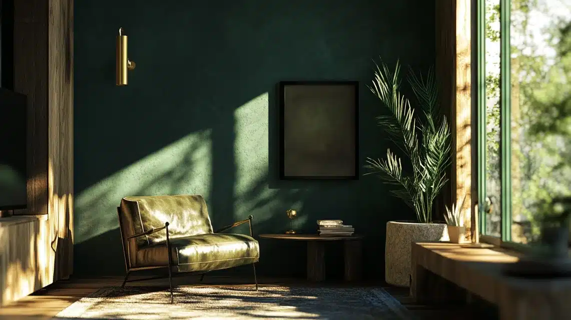
I want to share my experience working with dark green paint colors and help you find the right one for your home.
In this guide, I’ve broken down 33 different dark greens from Benjamin Moore, Farrow & Ball, Sherwin Williams, Clare Paint, and Backdrop Home.
Each color has specific qualities that make it better suited for certain spaces and lighting conditions.
I’ll tell you exactly what each color looks like, where it works best, and what to pair it with.
Best dark green paint colors from Benjamin Moore, Farrow & Ball, Sherwin Williams, and more…
Benjamin Moore’s dark green paints
1. Great Barrington Green
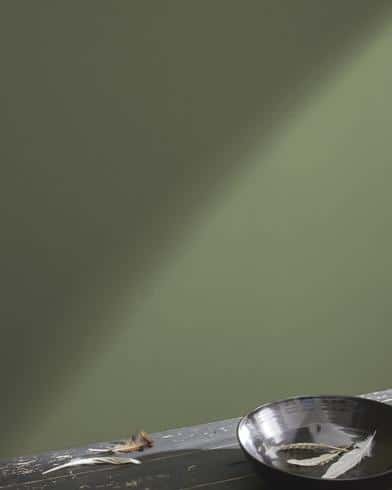
- Color Description: A dramatic deep green with slightly cool undertones
- Best Use/Applications: Perfect for powder rooms and statement walls
- Lighting Impact: Creates a softening effect when paired with gilded hardware
- Complementary Colors: Works well with gold accents and geometric patterns
2. Mediterranean Teal
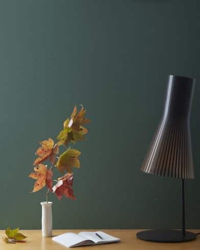
- Color Description: A blue-leaning green, deeper than standard teal shades
- Best Use/Applications: Ideal for warming up stark spaces
- Lighting Impact: Shows its full depth in well-lit areas
- Complementary Colors: Pairs well with warm whites and natural textures
3. Amazon Green
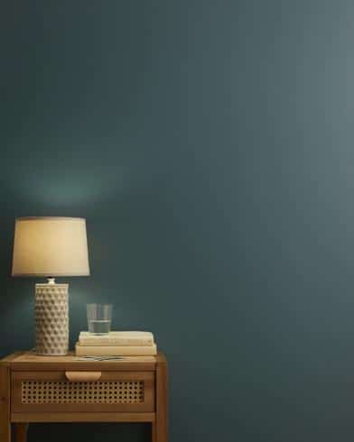
- Color Description: A saturated green that works well in high-gloss finish
- Best Use/Applications: Excellent for bar areas and built-ins
- Lighting Impact: The glossy finish helps reflect light
- Complementary Colors: Looks stunning with metallic accents
4. Black Forest Green
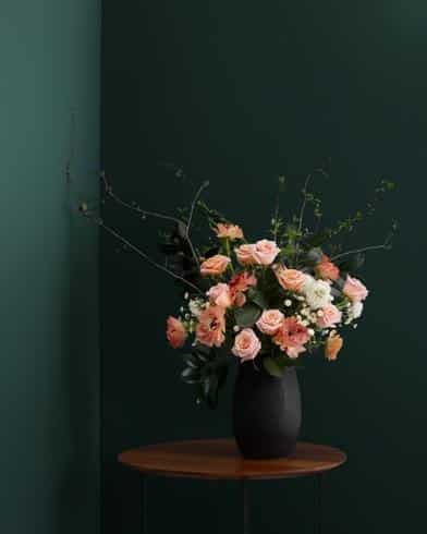
- Color Description: Deep green infused with black undertones, especially striking in a glossy finish
- Best Use/Applications: Beautiful in bathrooms, ideal for statement walls
- Lighting Impact: Shows richness in both natural and artificial light
- Complementary Colors: Stands out with clover patterns and mirrored elements
5. Seaweed
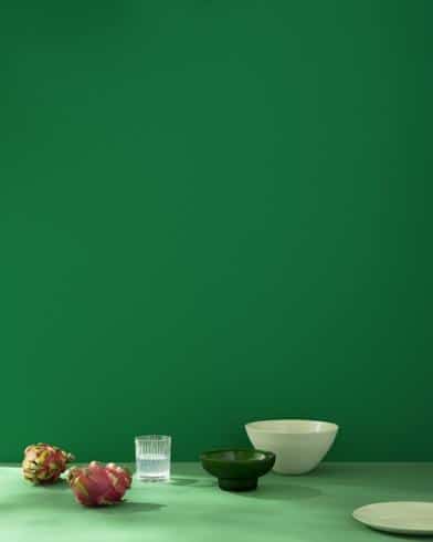
- Color Description: Rich green suitable for high-gloss applications
- Best Use/Applications: Works well in bars and entertainment spaces
- Lighting Impact: Reflects light beautifully in a glossy finish
- Complementary Colors: Pairs nicely with brass elements
6. Caribbean Teal
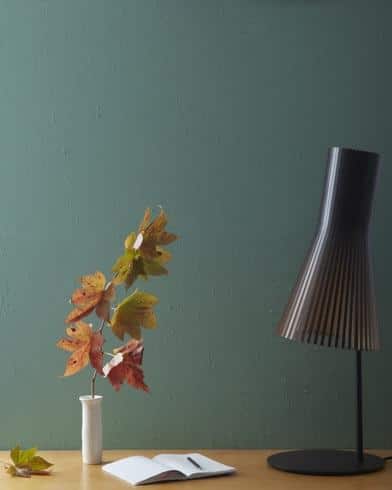
- Color Description: A royal blue-green blend, more balanced than Mediterranean Teal
- Best Use/Applications: Living rooms and traditional spaces
- Lighting Impact: Maintains color consistency throughout the day
- Complementary Colors: Works well with traditional furnishings
7. Backwoods
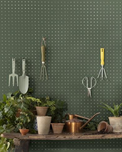
- Color Description: Rich dark, muted green similar to forest or deep moss
- Best Use/Applications: Perfect for creating cozy spaces
- Lighting Impact: Shows lighter, vibrant green in natural light; brown undertones emerge in low light
- Complementary Colors: Natural wood tones and earthy elements
8. Essex Green
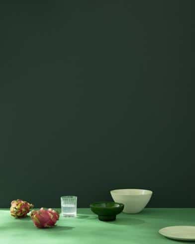
- Color Description: Deep, dark green with subtle blue undertones
- Best Use/Applications: Libraries and formal spaces
- Lighting Impact: Can appear almost black in certain lighting
- Complementary Colors: Works with classic trim colors and brass fixtures
9. Vintage Vogue
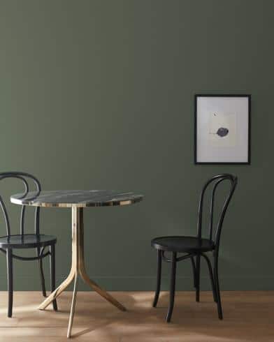
- Color Description: Deep green with olive undertones and slightly smoky quality
- Best Use/Applications: Versatile for both modern and traditional spaces
- Lighting Impact: Olive undertones become more pronounced in natural light
- Complementary Colors: Harmonizes with warm neutrals and soft whites
10. Dark Olive
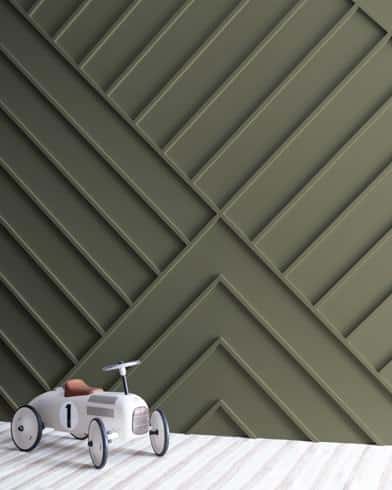
- Color Description: Rich, deep green with strong olive base and brown/gray undertones
- Best Use/Applications: Perfect for creating natural, grounding spaces
- Lighting Impact: Closely resembles dark olive leaves in natural light
- Complementary Colors: Works well with warm taupes and natural materials
11. Goodwin Green
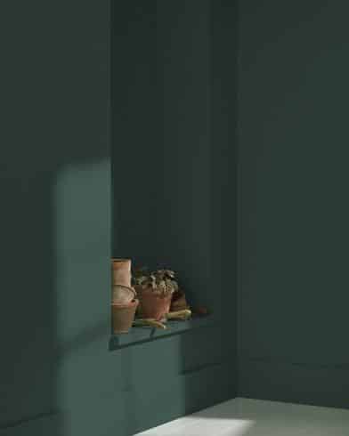
- Color Description: Intense green reminiscent of rainforest foliage
- Best Use/Applications: Ideal for monochromatic looks and full-room coverage
- Lighting Impact: Maintains its depth in various lighting conditions
- Complementary Colors: Pairs well with deeper greens and natural textures
12. Enchanted Forest
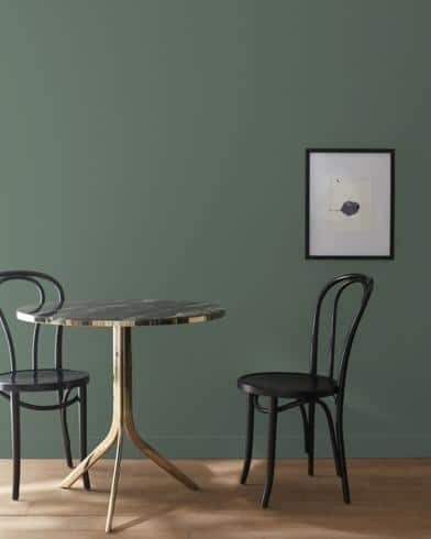
- Color Description: Misty green with neutral-like qualities
- Best Use/Applications: Alternative to standard neutrals like taupe or gray
- Lighting Impact: Creates a relaxing atmosphere in any light
- Complementary Colors: Works with both warm and cool color schemes
13. Nature’s Reflection
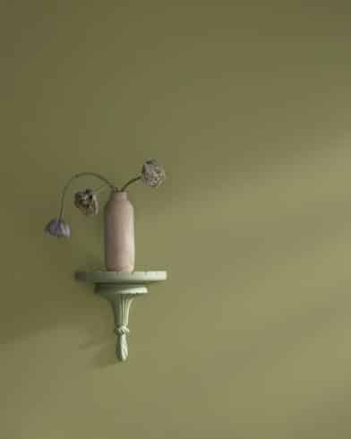
- Color Description: Green with earthy undertones
- Best Use/Applications: Versatile for main living spaces
- Lighting Impact: Maintains consistency throughout different times of day
- Complementary Colors: Natural materials and warm wood tones
14. Secret Path
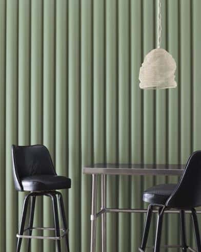
- Color Description: Fresh eucalyptus green, bright yet sophisticated
- Best Use/Applications: Works in both historic and contemporary spaces
- Lighting Impact: Maintains its springy brightness throughout the day
- Complementary Colors: Pairs well with classic whites and natural finishes
15. Waller Green
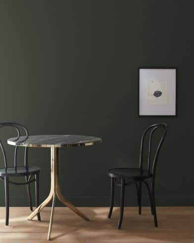
- Color Description: Sophisticated smoky green, more nuanced than charcoal
- Best Use/Applications: Perfect for dignified bedrooms and dining rooms
- Lighting Impact: Reads as a more complex alternative to dark neutrals
- Complementary Colors: Works with silver tones and cool whites
16. Nicolson Green
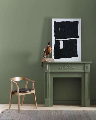
- Color Description: Deep, cool-toned green from Colonial Williamsburg’s revival palette
- Best Use/Applications: Traditional spaces and historic-inspired rooms
- Lighting Impact: Maintains its elegant appearance across lighting conditions
- Complementary Colors: Traditional whites and period-appropriate accents
Farrow & Ball’s dark green paints
17. Ash Grey
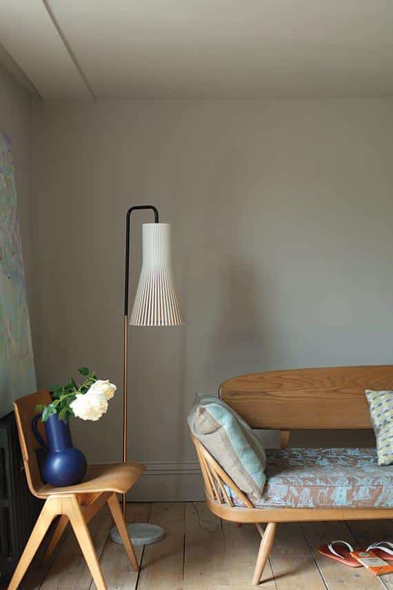
- Color Description: A snug green-gray blend that reads more green than gray
- Best Use/Applications: Perfect for intimate spaces like snugs and reading nooks
- Lighting Impact: Works well against mountain or outdoor views
- Complementary Colors: Natural materials and mountain-inspired palettes
18. Bancha
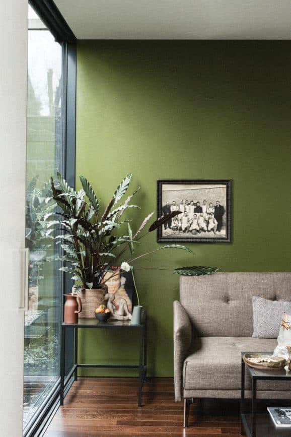
- Color Description: Cool-toned dark green that brings outdoor elements inside
- Best Use/Applications: Formal sitting rooms and spaces connected to outdoor views
- Lighting Impact: Reflects natural light while maintaining depth
- Complementary Colors: Oak planks, natural limestone, courtyard greenery
19. Treron
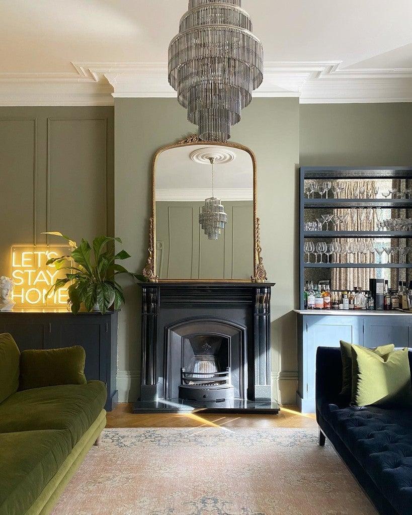
- Color Description: Calming gray-green blend suitable for coastal settings
- Best Use/Applications: Bedrooms and relaxation spaces
- Lighting Impact: Shows well in rooms with shiplap or textured walls
- Complementary Colors: Beach-inspired neutrals and natural wood
20. Calke Green
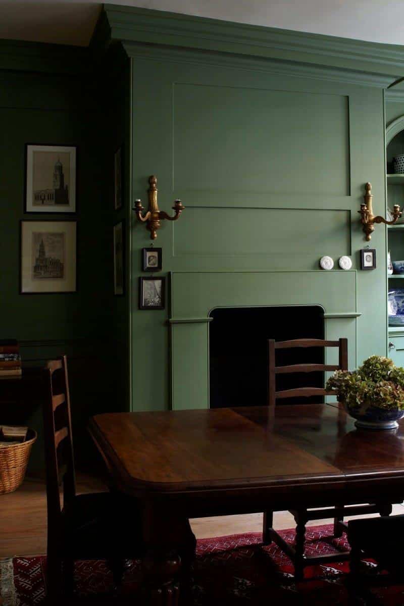
- Color Description: Rich basil green, deeper than traditional greens
- Best Use/Applications: Libraries and spaces needing renewed life
- Lighting Impact: Adds depth while maintaining visibility
- Complementary Colors: Traditional wood tones and classic furnishings
21. Studio Green
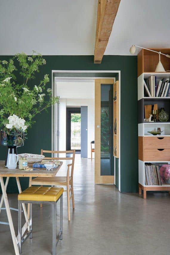
- Color Description: Exceptionally rich shade that reads near-black
- Best Use/Applications: Moody bedrooms and intimate spaces
- Lighting Impact: Appears almost black in dim light, reveals emerald tones in natural light
- Complementary Colors: Metallic accents and light textiles
22. Duck Green
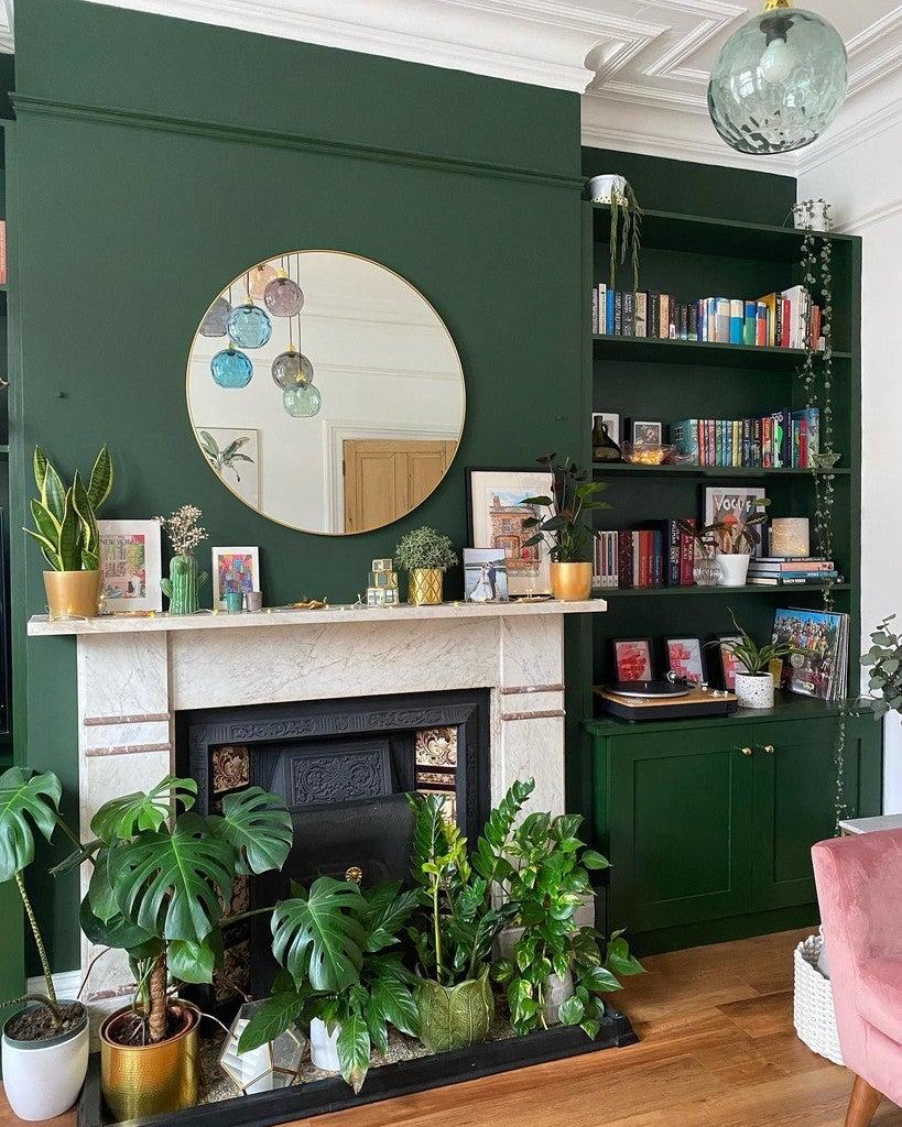
- Color Description: Dark, rich, jewel-like green with mature undertones
- Best Use/Applications: Bedrooms and dining rooms need sophistication
- Lighting Impact: Maintains its sumptuous quality in varying light
- Complementary Colors: Rich fabrics and classic furnishings
Sherwin Williams’ dark green paints
23. Country Squire
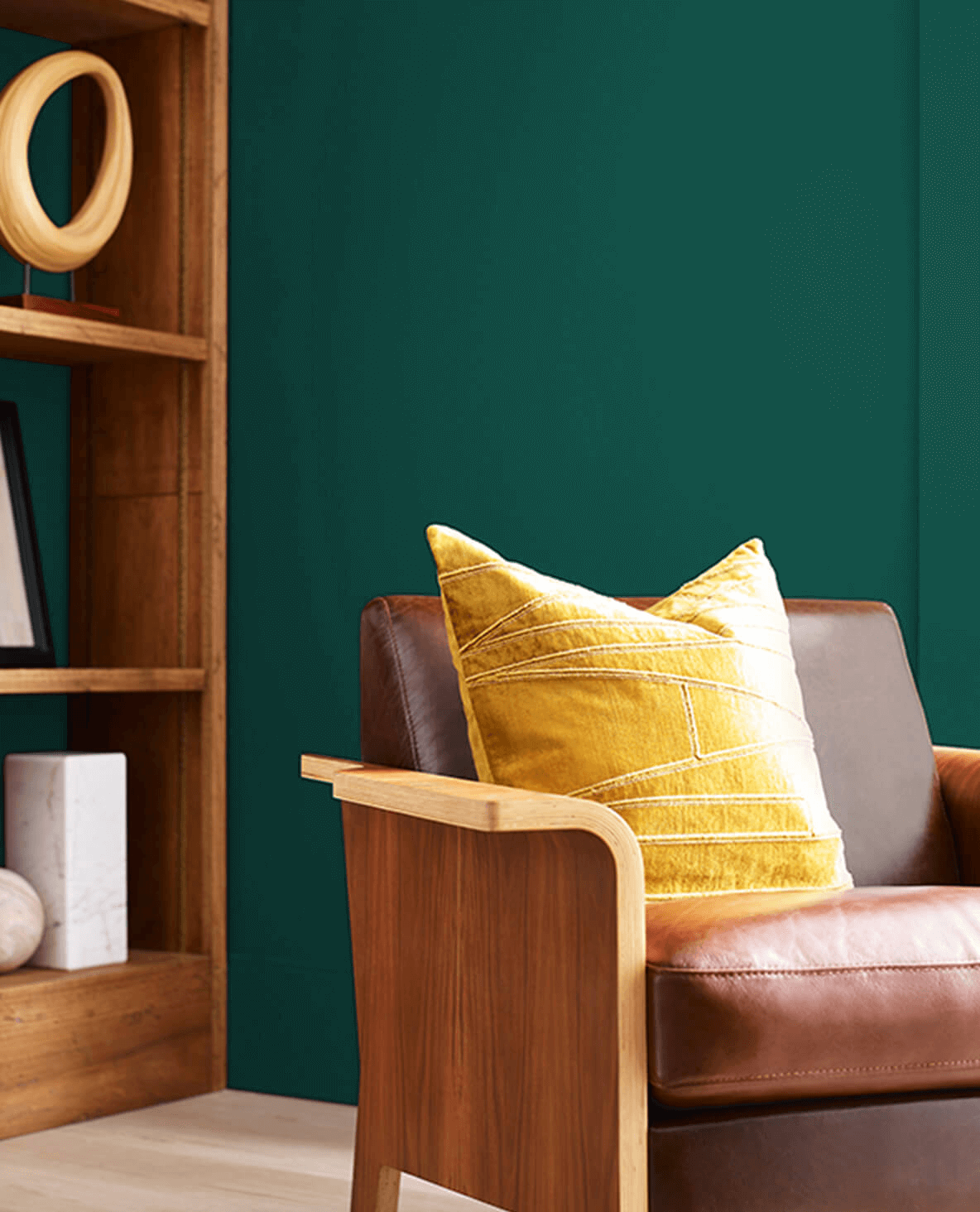
- Color Description: Deep emerald green with a strong classic presence
- Best Use/Applications: Perfect for mudrooms and transitional spaces
- Lighting Impact: Creates depth and character in entryways
- Complementary Colors: Black-and-white tiles, vintage iron accents
24. Ripe Olive
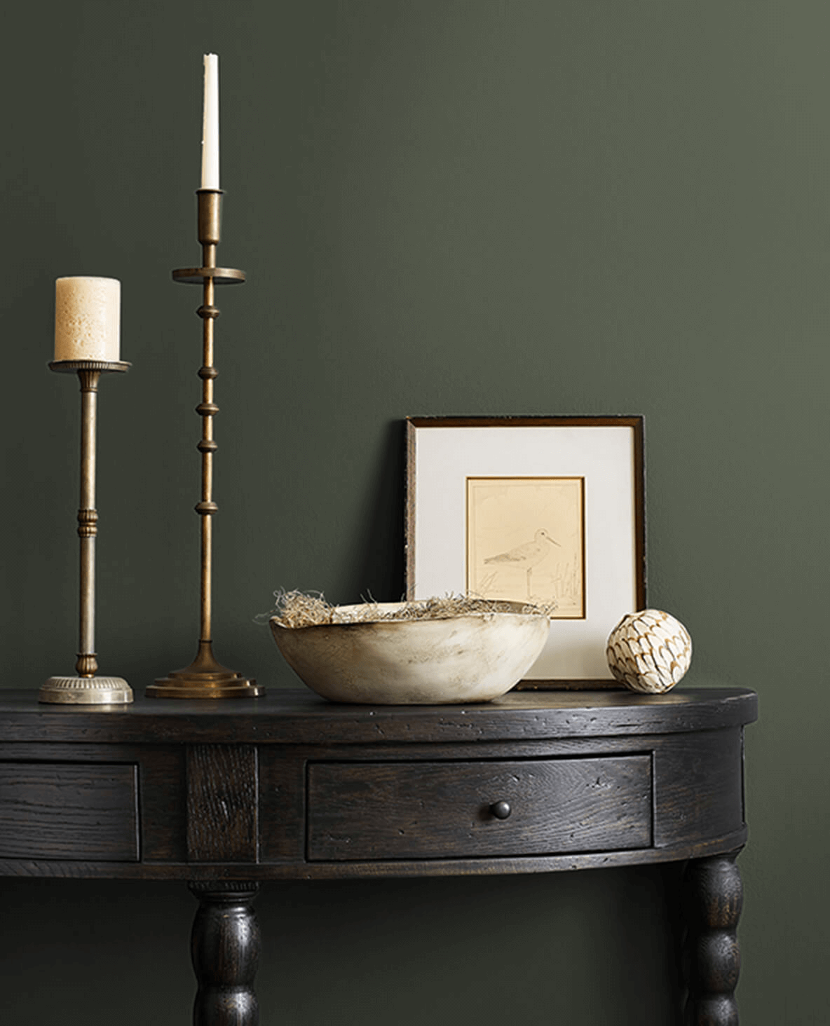
- Color Description: Deep clay green that borders on black
- Best Use/Applications: Breakfast nooks and intimate dining areas
- Lighting Impact: Sets a moody scene in any lighting condition
- Complementary Colors: Light woods and cream-colored textiles
25. Pewter Green
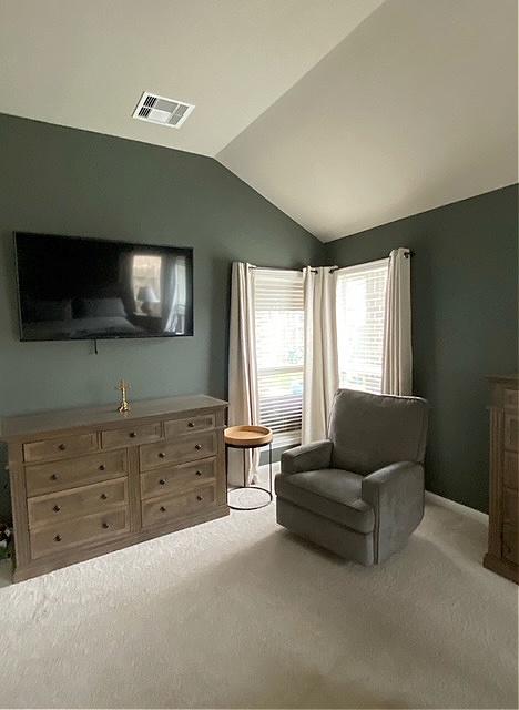
- Color Description: Muted green with sophisticated gray undertones
- Best Use/Applications: Versatile for any room, especially living spaces
- Lighting Impact: Appears lighter in natural light and shows warm brown undertones
- Complementary Colors: Natural woods, whites, warm metals
26. Sage Green Light
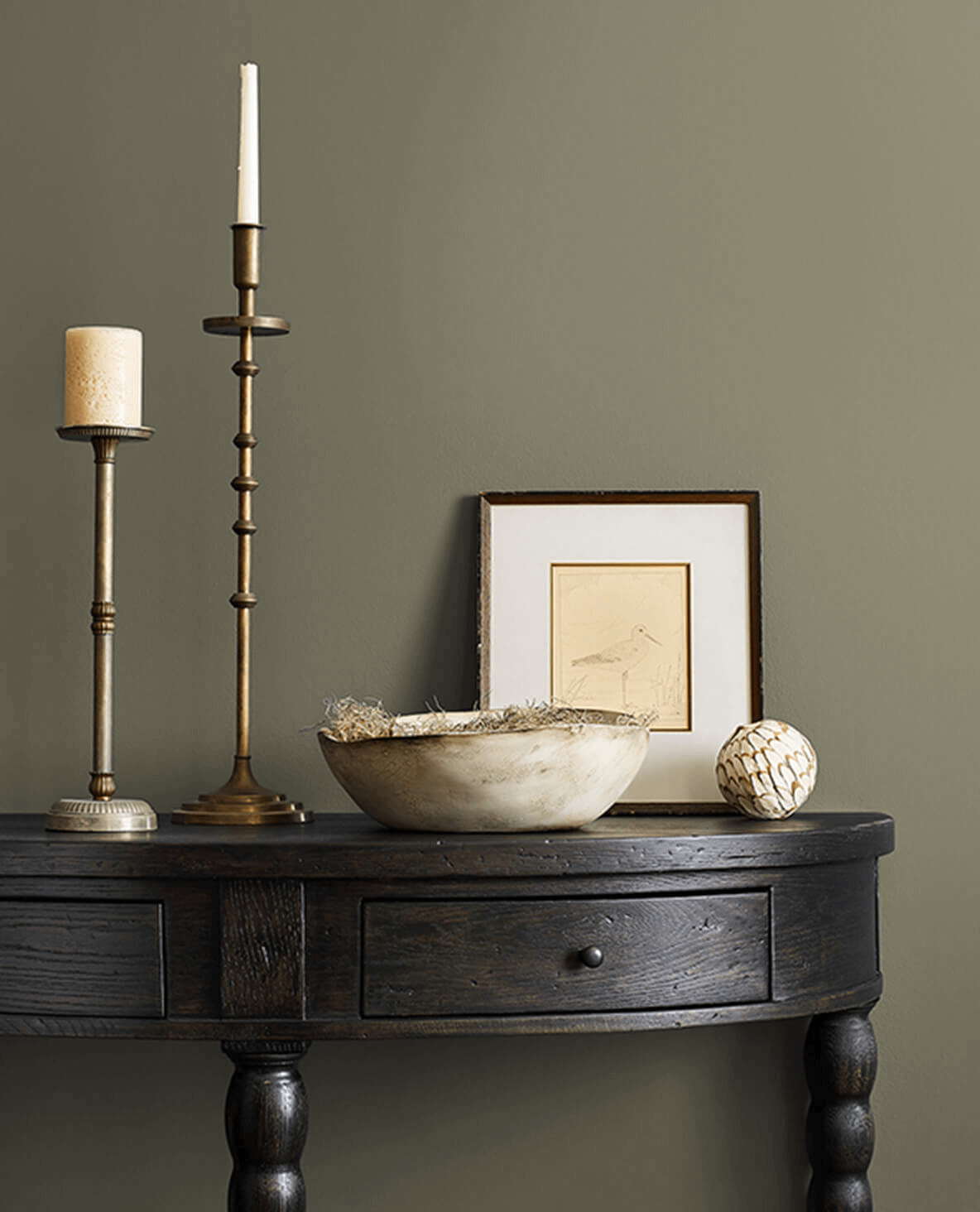
- Color Description: Soft, muted green with subtle gray and yellow undertones
- Best Use/Applications: Living spaces and rooms needing a calm atmosphere
- Lighting Impact: Adapts well to different lighting conditions
- Complementary Colors: Works with various color schemes and natural materials
27. Secret Garden
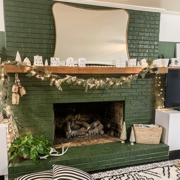
- Color Description: Deep, rich green with noticeable brown and gray undertones
- Best Use/Applications: Spaces where you want to create warmth and depth
- Lighting Impact: Shows more vibrancy in natural light, becomes muted in low light
- Complementary Colors: Earth tones and warm whites
28. Dried Thyme
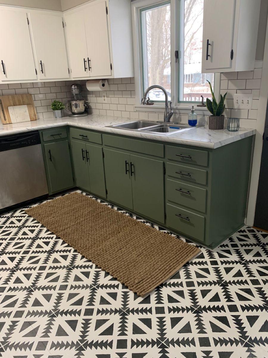
- Color Description: Medium to dark muted green with earthy qualities
- Best Use/Applications: Versatile for various spaces needing natural warmth
- Lighting Impact: More vibrant in bright light, muted and cozy in dim conditions
- Complementary Colors: Gray and brown neutrals, natural textures
Clare Paint’s dark green paints
29. Daily Greens
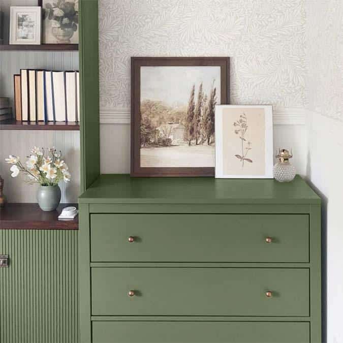
- Color Description: Deep olive green with a modern twist
- Best Use/Applications: Offices and walls with mantels, full wall coverage
- Lighting Impact: Maintains richness while staying fresh and current
- Complementary Colors: Luxe finishes and vintage furnishings
30. Current Mood
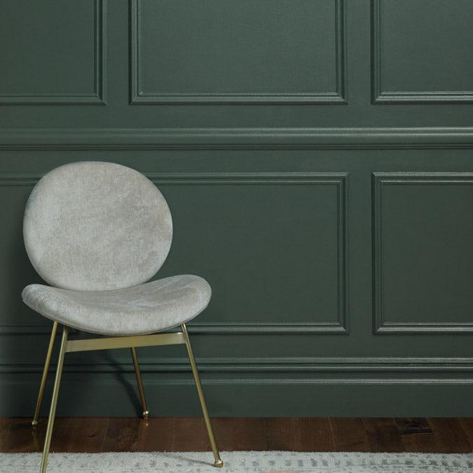
- Color Description: Deep blue-green with modern freshness
- Best Use/Applications: Works for full wall coverage and ceilings
- Lighting Impact: Adapts well to bright spring colors and natural light
- Complementary Colors: Dusty pink and light spring colors
31. Field Trip

- Color Description: Perfect medium-deep olive green with a natural appeal
- Best Use/Applications: Accent walls and wainscoting
- Lighting Impact: Visually stimulating without being overwhelming
- Complementary Colors: Natural woods and neutral accents
Backdrop Home’s dark green paints
32. Lawn Party
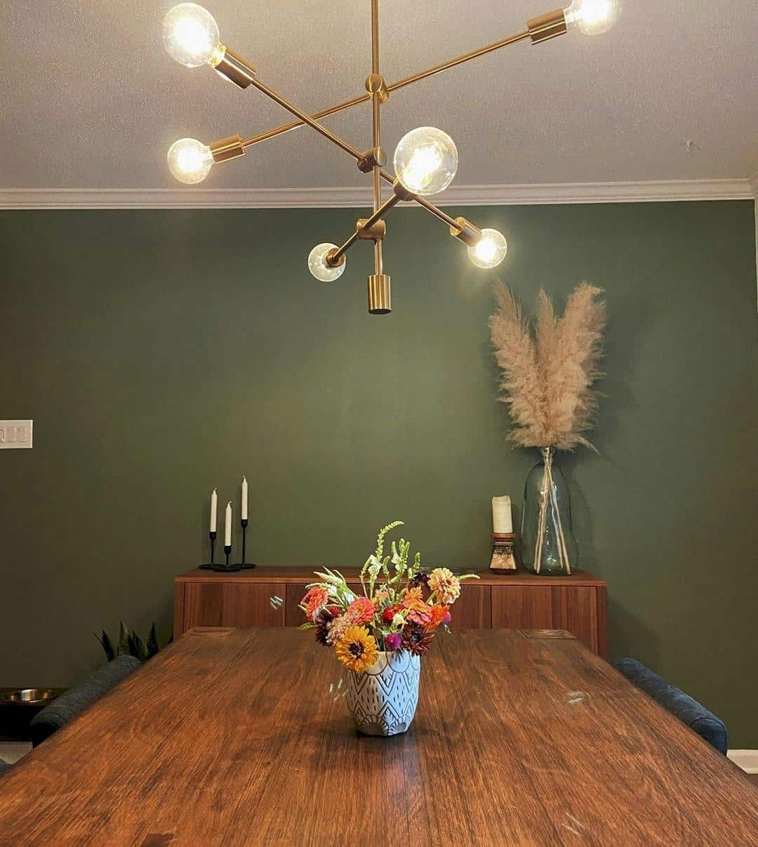
- Color Description: Matte moss-green with spa-like qualities
- Best Use/Applications: Rooms seeking a peaceful, retreat-like feel
- Lighting Impact: Creates a calming atmosphere in any light
- Complementary Colors: Painterly accents and relaxed furniture pieces
33. Kismet
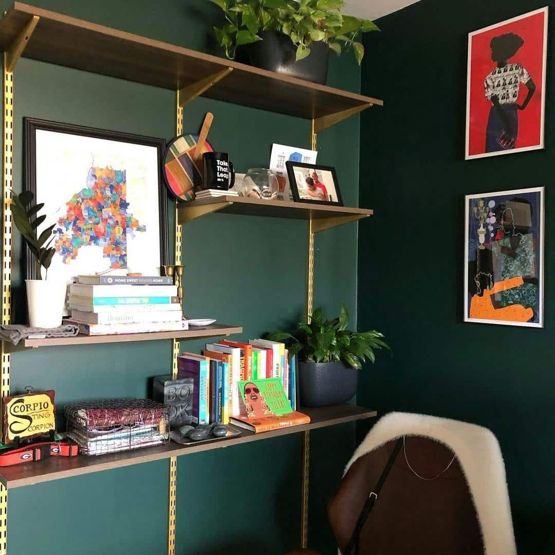
- Color Description: Deep hunter green that works as a refined neutral
- Best Use/Applications: Kitchen islands and white kitchen accents
- Lighting Impact: Provides perfect contrast in bright spaces
- Complementary Colors: White countertops, leather accents
Answering some additional queries you might have regarding dark green paint
How will dark green paint affect the mood of a room?
Dark green brings nature’s calming effect indoors. It creates a sense of peace and balance, making spaces feel more grounded.
I’ve found that dark greens make rooms feel sophisticated yet cozy – perfect for creating intimate spaces where people naturally want to gather and relax.
Which dark green paint colors are currently trending?
- Pewter Green (Sherwin Williams) – For its versatile gray undertones
- Studio Green (Farrow & Ball) – Popular for dramatic spaces
- Current Mood (Clare Paint) – Modern take on traditional green
- Essex Green (Benjamin Moore) – Classic choice for traditional homes
- Backwoods (Benjamin Moore) – Gaining popularity for its forest-inspired depth
How does lighting influence the appearance of dark green paint?
Natural light brings out the true color and undertones of dark greens.
Morning light often shows warmer sides, while evening light emphasizes cooler tones.
Some colors, like Studio Green, appear almost black in dim light but show rich emerald tones in bright conditions.
This is why I always recommend testing paint samples at different times of day in your specific space.
What finishes work best with dark green colors?
- Matte – Creates a soft, velvety look ideal for bedrooms
- Eggshell – Best for living spaces with some wear and tear
- Satin – Perfect for bathrooms and kitchens
- High-gloss – Makes a statement on cabinets or focal points
How can I coordinate dark green walls with my existing décor?
Dark greens work well with:
- Natural wood tones
- Gold and brass fixtures
- Cream and white fabrics
- Natural stone
- Leather furniture
- Black accents
- Warm metals
Are dark green paints suitable for small or large spaces?
Dark greens work in small and large spaces, but each needs a different approach.
Dark green creates an intimate, cozy feeling in small rooms —perfect for powder rooms or reading nooks.
In large spaces, it adds warmth and helps break up overwhelming areas. The key is balancing the dark green with lighter elements and proper lighting.
Summing Up
Dark green paints can change a room’s feelings, and picking the right one makes a big difference.
The 33 colors I’ve covered serve different purposes – some work better in bathrooms, others in living rooms or kitchens.
The key is knowing what you want from the space and testing the paint in your room.
Check how it looks during different times of day, and make sure it fits with your furniture and decor.
With this guide, you should be able to find a dark green that works for your space.

